


The dietary supplement market in Poland — including adaptogens like mushroom, plant, and root extracts — is dominated by brands with a medical, pharmacy-like character. Brown bottles and communication focused solely on ingredients are everywhere, with no sense of lifestyle or aesthetics that would speak to modern, conscious consumers.
When creating Have a G Day, we wanted to build something radically different — a brand that’s not only effective but also visually appealing and culturally relevant. Our challenge was to design a brand that talks about balance and wellbeing in a fresh, approachable, and distinctive way. From the start, the ambition was to go beyond being ‘just a supplement.’ Have a G Day was meant to become part of a daily ritual and a reflection of a new, thoughtful approach to self-care.
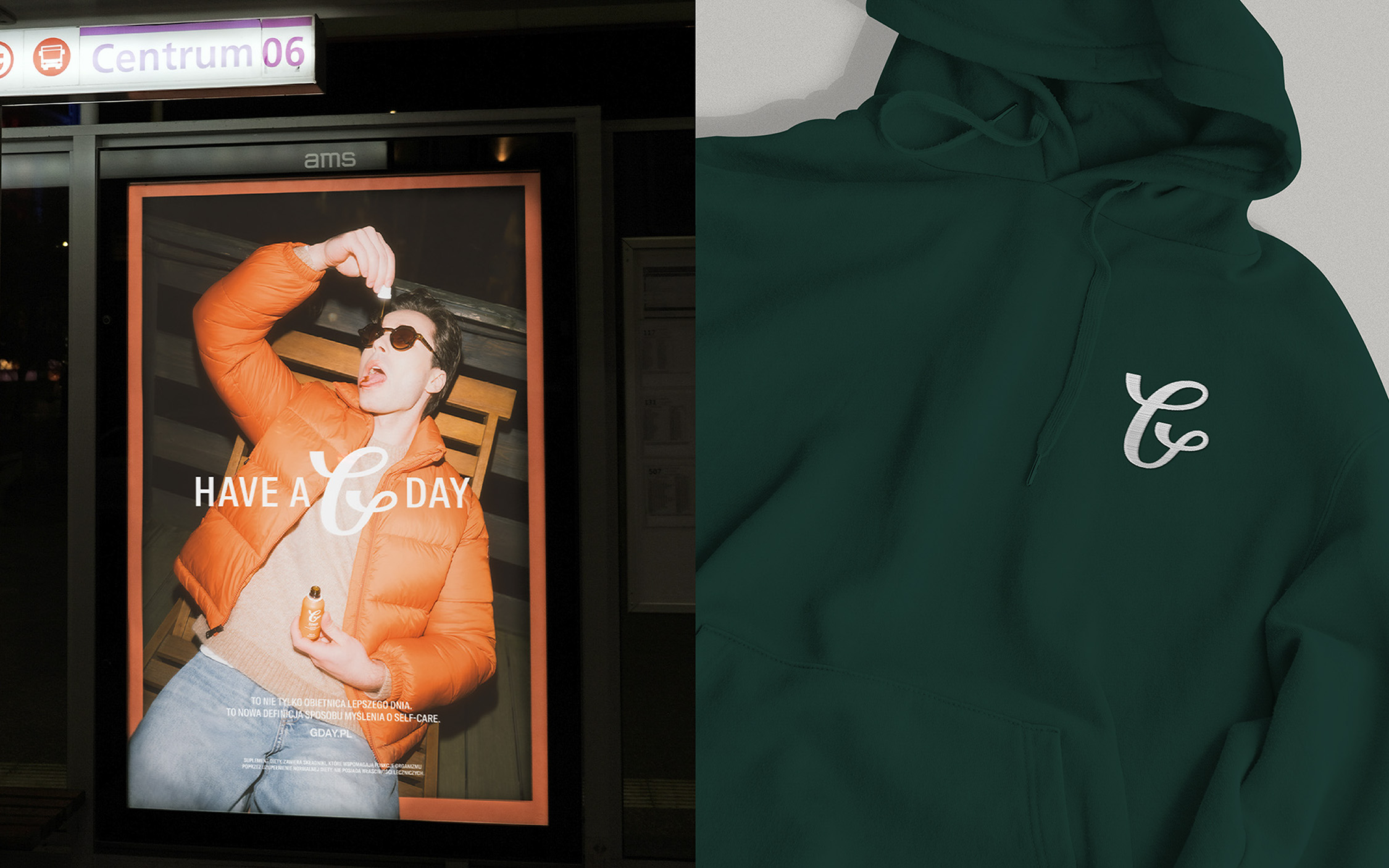
The idea behind Have a G Day is to redefine the category — instead of speaking about adaptogens through the language of science, we started speaking about them through the language of lifestyle. Inspired by streetwear, classic fashion brands, and a New York state of mind, we created a brand that connects health and design in a conscious, engaging way.
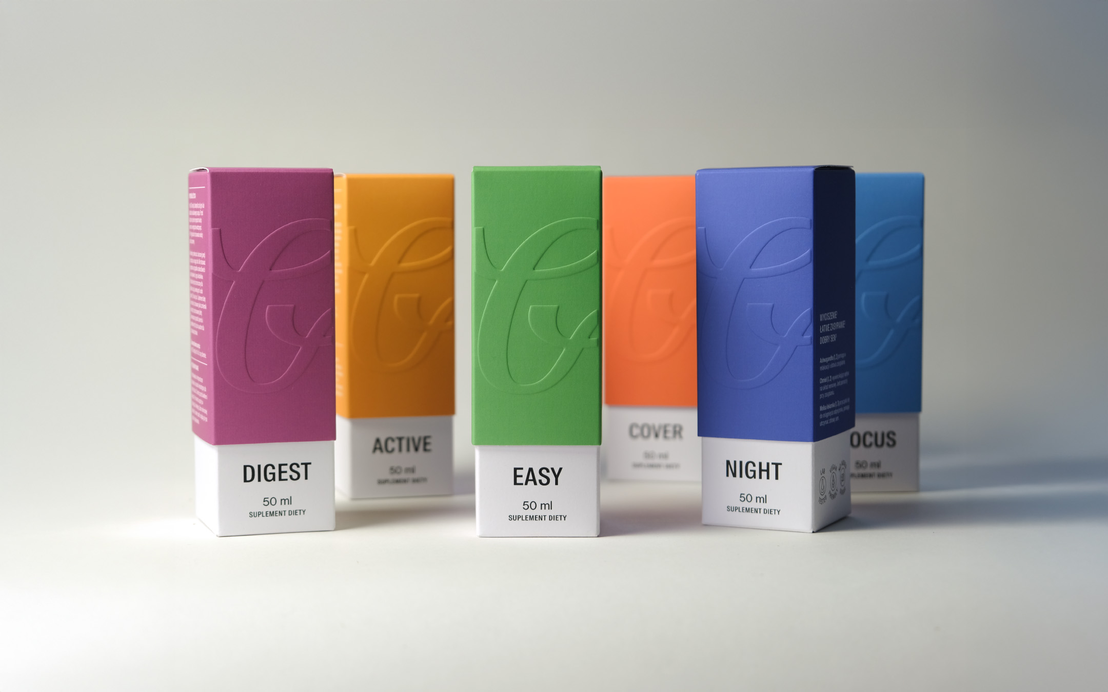
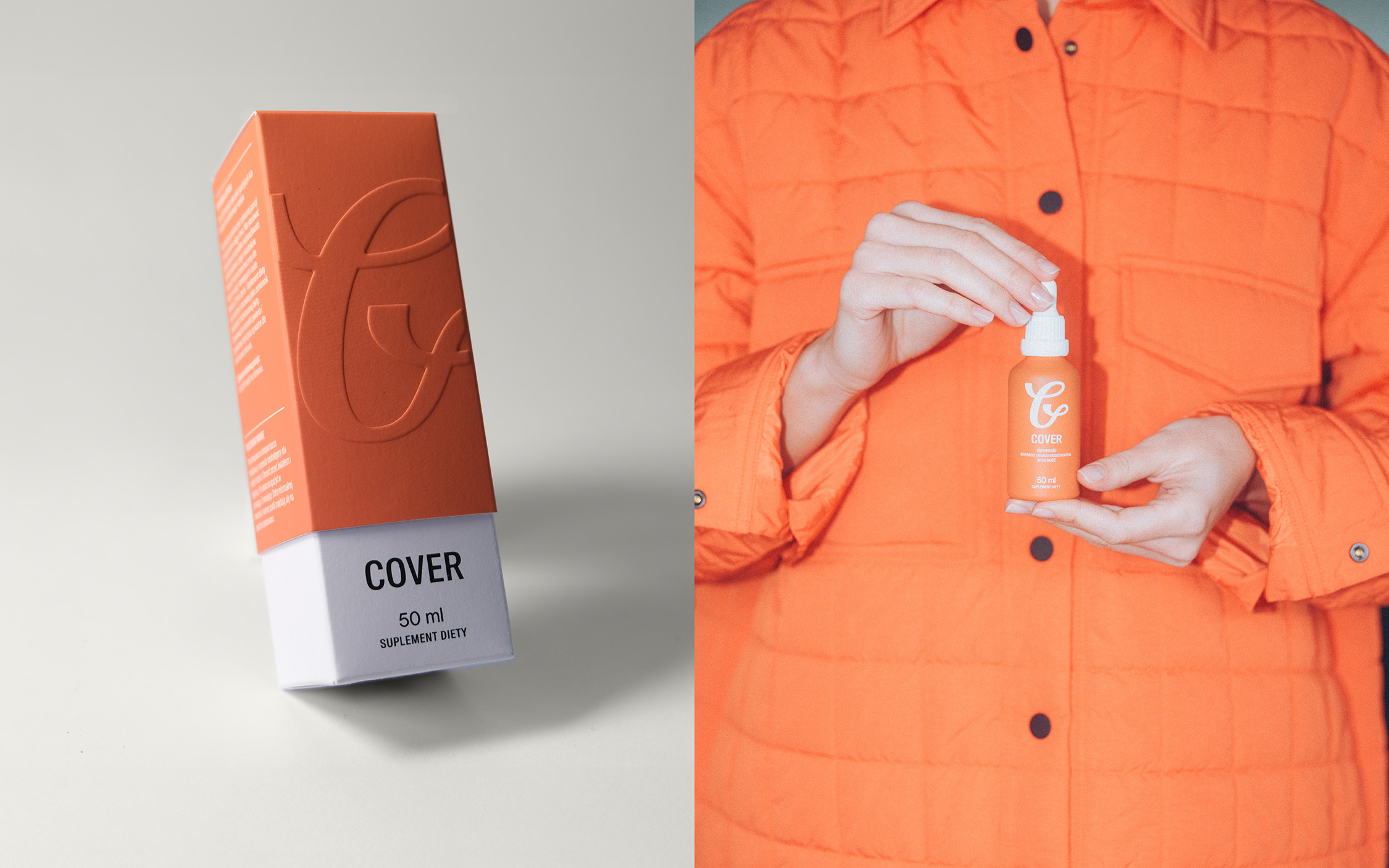
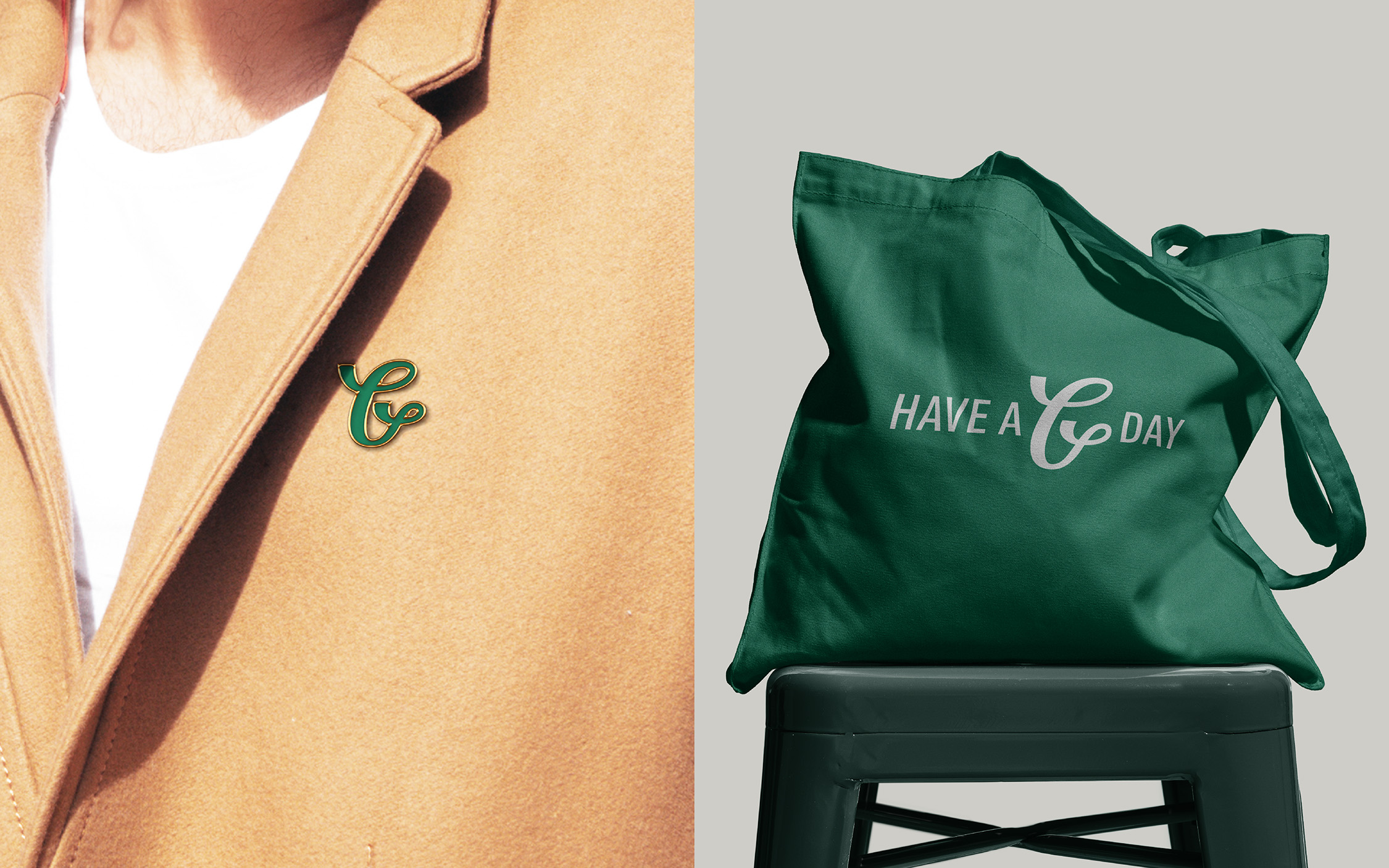
From the beginning, the “G” in the name was meant to stand out and become the leading element of the visual identity — simple, elegant, and memorable, with the potential to become iconic. The brand colors were designed to feel elegant and subtle while referencing the natural origins of the ingredients. At the same time, the system allowed for a diverse color palette across the product line.
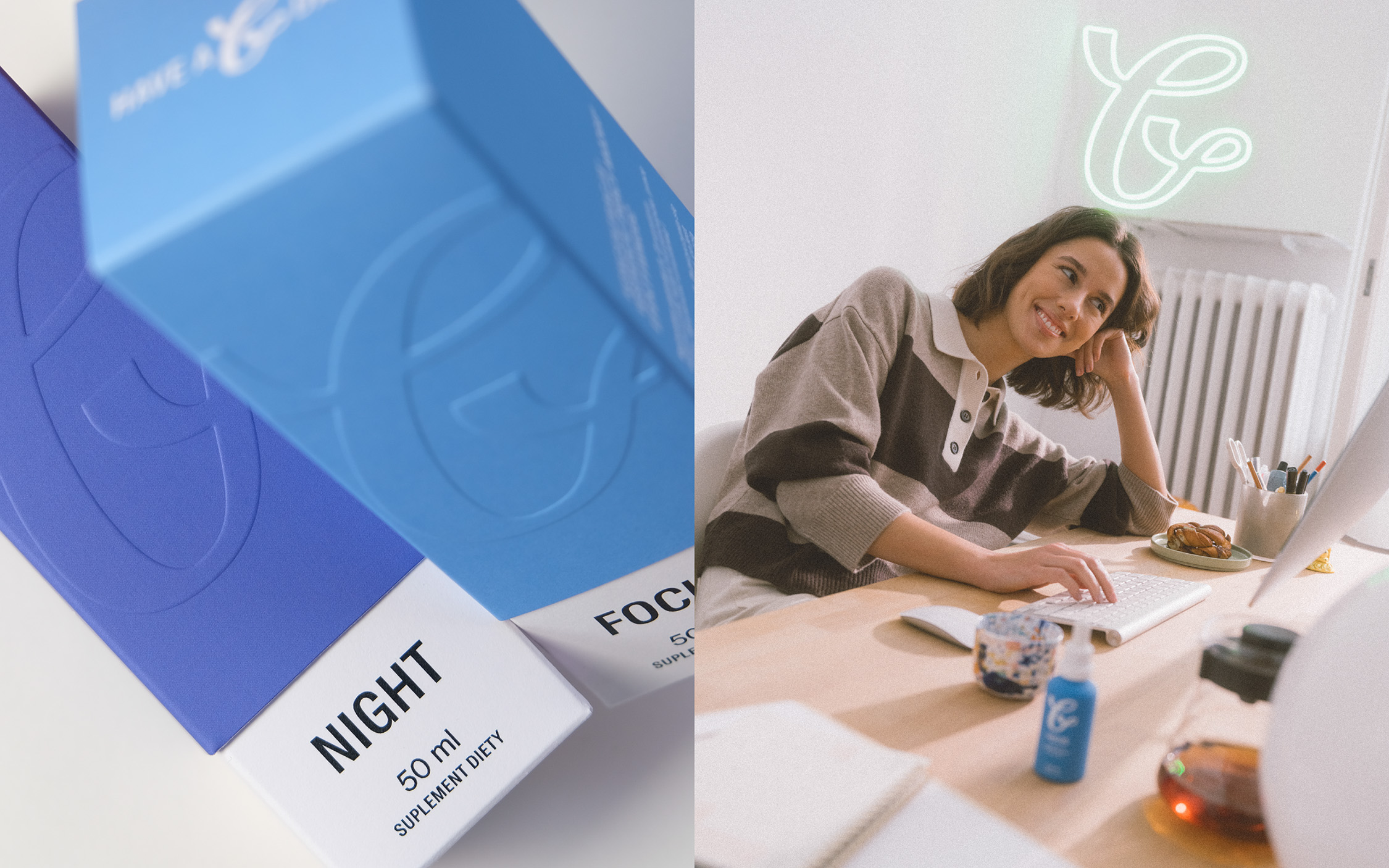
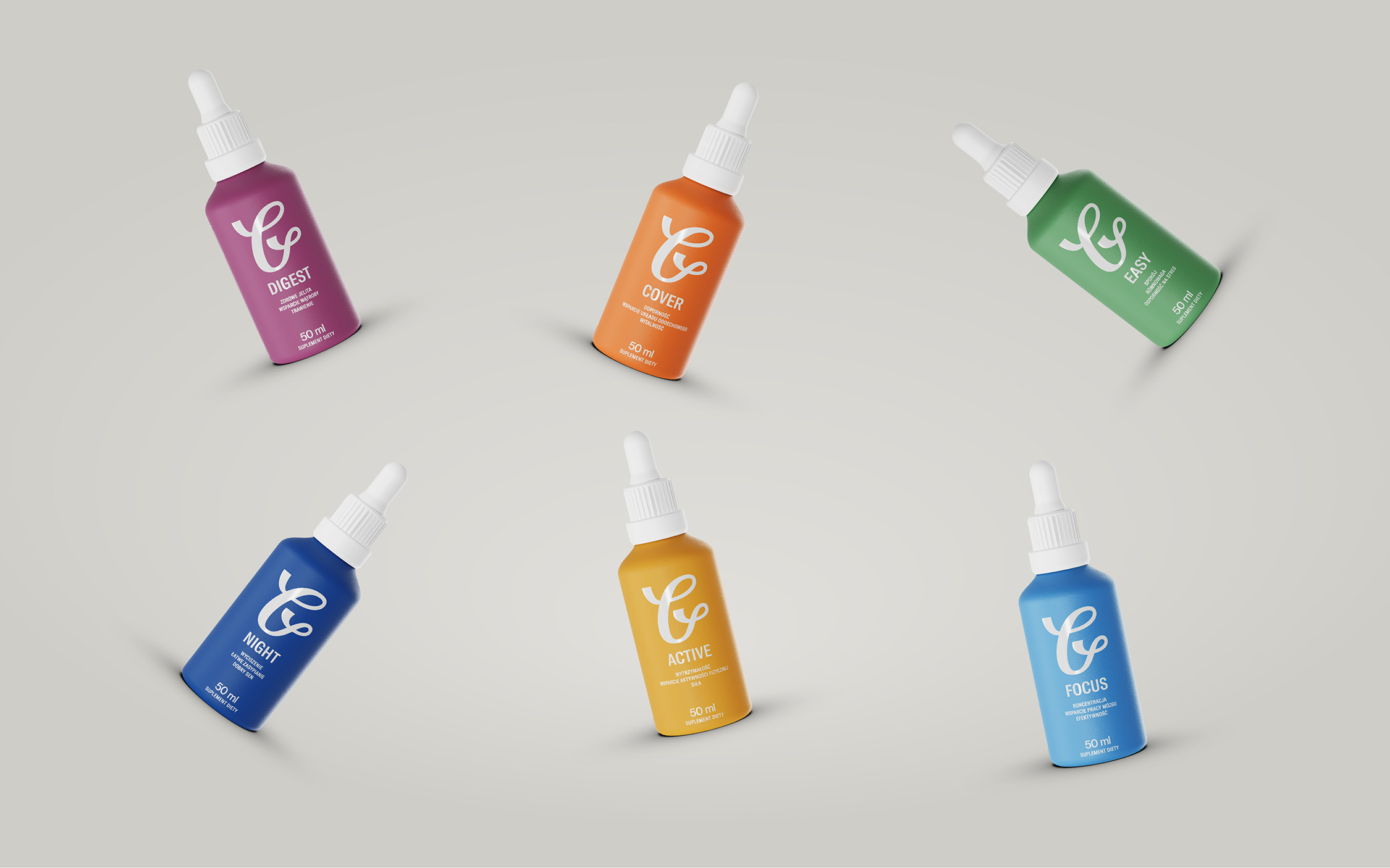
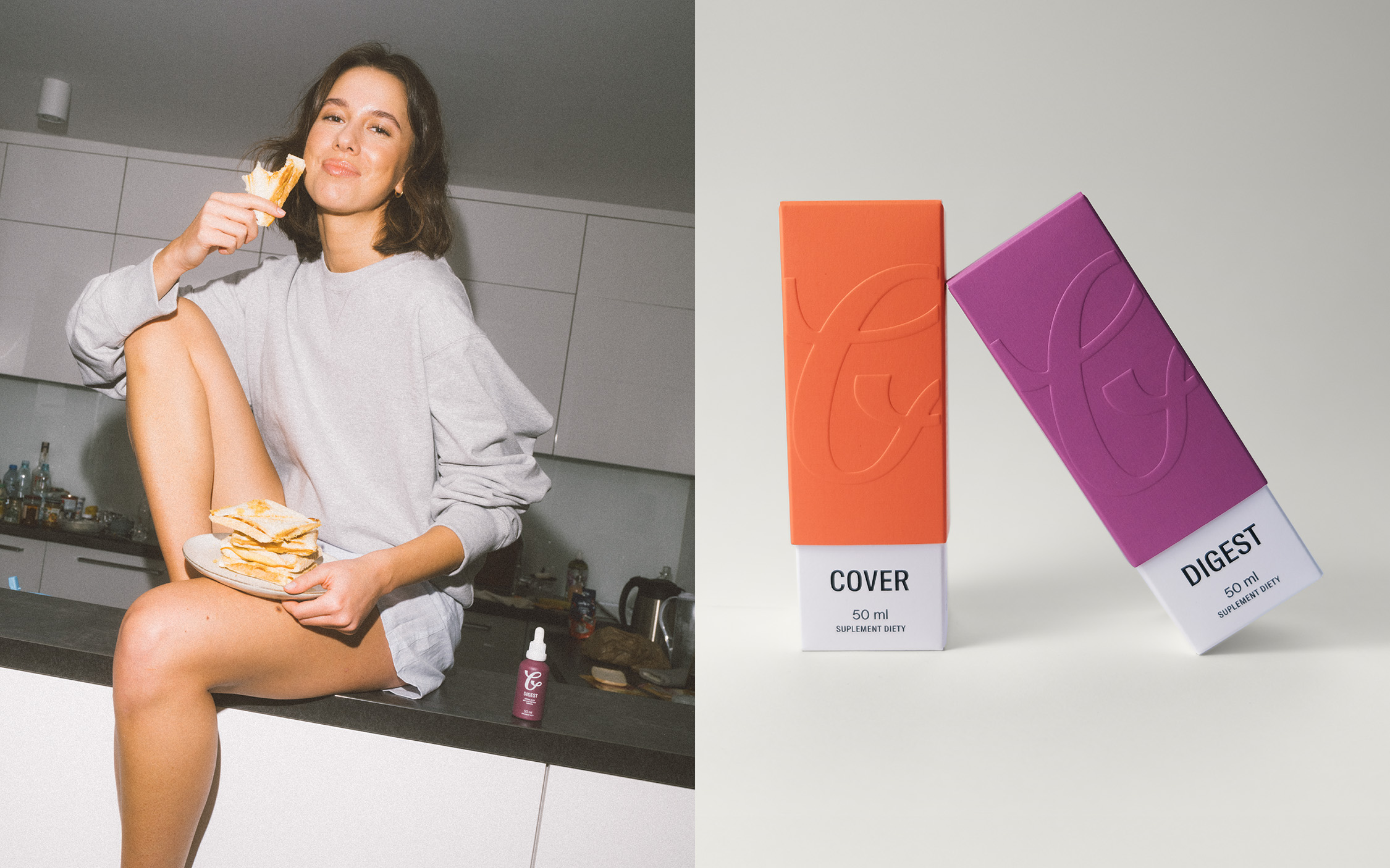
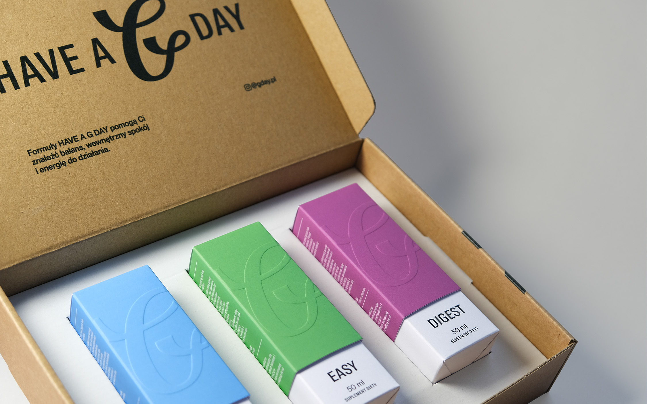
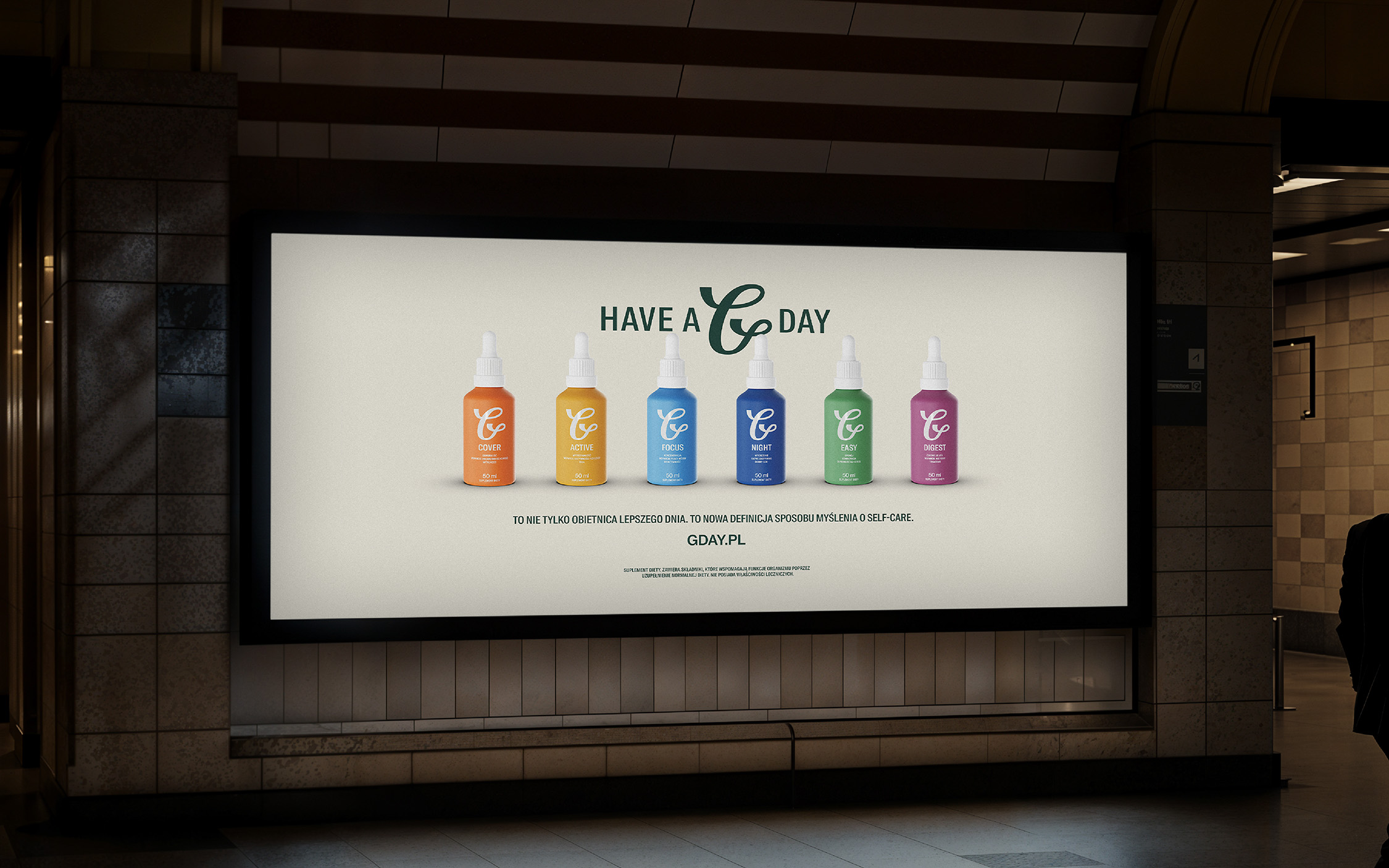
The Have a G Day identity is a flexible system for six products, each addressing a different need: immunity, energy, focus, sleep, stress relief, and digestion. Each variant has its own color, intuitively connected with its benefit. Color plays both an aesthetic and navigational role, strengthening brand recognition. The “G” symbol was designed as a fluid, organic mark — symbolizing both the liquid form of the product and the idea of flow. It’s emblematic and easy to adapt across all brand touchpoints.
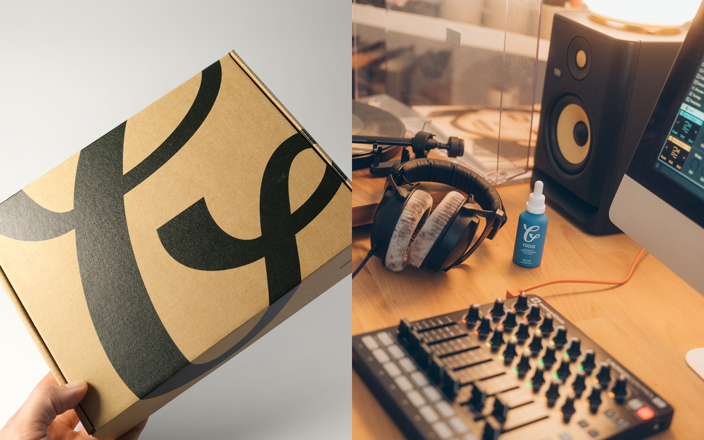
The glass bottles, painted twice for a matte finish, use screen printing directly on the glass instead of a label. The pipettes include a 1ml measure, a non-slip grip, and a tamper-evident seal. Minimalist shipping boxes, printed with a bold, oversized “G” symbol, complete the brand experience.
The visual communication — photography, videos, and illustrations — draws inspiration from city life and fashion culture. Everything was designed to position Have a G Day as part of a lifestyle, not just another supplement brand.
Since its launch in January 2025, Have a G Day has been very well received — both in terms of sales and brand image. The brand was quickly picked up by industry and lifestyle media, earning organic reach and coverage without paid media. Thanks to its cohesive identity and fresh approach to packaging and communication, Have a G Day quickly built partnerships beyond the supplements industry.
From the beginning, the brand has positioned itself as a lifestyle name, becoming part of daily rituals and urban living. Have a G Day is more than a product — it’s the beginning of a community redefining what modern self-care can be.
CREDIT
- Agency/Creative: Transatlantico Studio
- Article Title: Have a G Day: From Pharmacy Shelves to Lifestyle Routines
- Organisation/Entity: Agency
- Project Type: Packaging
- Project Status: Published
- Agency/Creative Country: Poland
- Agency/Creative City: Warsaw
- Market Region: Europe
- Project Deliverables: 2D Design, 3D Modelling, Animation, Art Direction, Brand Design, Brand Guidelines, Brand Identity, Brand Mark, Creative Direction, Design, Identity System, Logo Design, Packaging Design
- Format: Bottle, Box
- Industry: Health Care
- Keywords: adaptogens, plant-based supplements, brand identity, packaging,
-
Credits:
Art Direction & Brand Design & Packaging: Sebastian Mojsa
Photo: Miłosz Rebeś
Video: Łukasz Jaśniak
Production: Julia Bakalarska
Illustration: Jakub Leśniewski
3d Artist: Lucas Acurso
Graphic Designer: Małgorzata Marzec
Actress: Amanda Kowalska
Actor: Marcel Opaliński
Stylist: Adrian Boczkowski
Make Up Artist: Iza Kućmierowska


