


Prime Nest is a modern, luxury-focused real estate brand, conceptualized to cater to the evolving needs of premium homebuyers and investors who seek design-driven architecture, stability, and trust. This brand identity system was developed to establish a strong visual presence in the real estate market while reflecting sophistication, confidence, and structural elegance.
As cities evolve and vertical living becomes the norm, the demand for premium spaces that combine comfort and bold design increases. Prime Nest was envisioned to bridge that demand by positioning itself as a brand that builds not just homes, but symbols of excellence and security. The challenge was to create a brand system that visually communicates all of this without overwhelming the audience with complexity.
1. Brand Strategy and Creative Direction:
The branding direction for Prime Nest was built around three primary pillars:
Trust & Stability: The visual identity needed to reflect architectural strength and dependability.
Premium Lifestyle: A modern yet timeless brand that evokes class.
Scalability & Recognition: The logo and visual elements needed to be scalable across multiple platforms—print, digital, environmental graphics, and advertising.
The creative direction embraced minimalism, bold geometric forms, and a restricted but striking color palette to maintain elegance and professionalism.
2. Logo Design Concept:
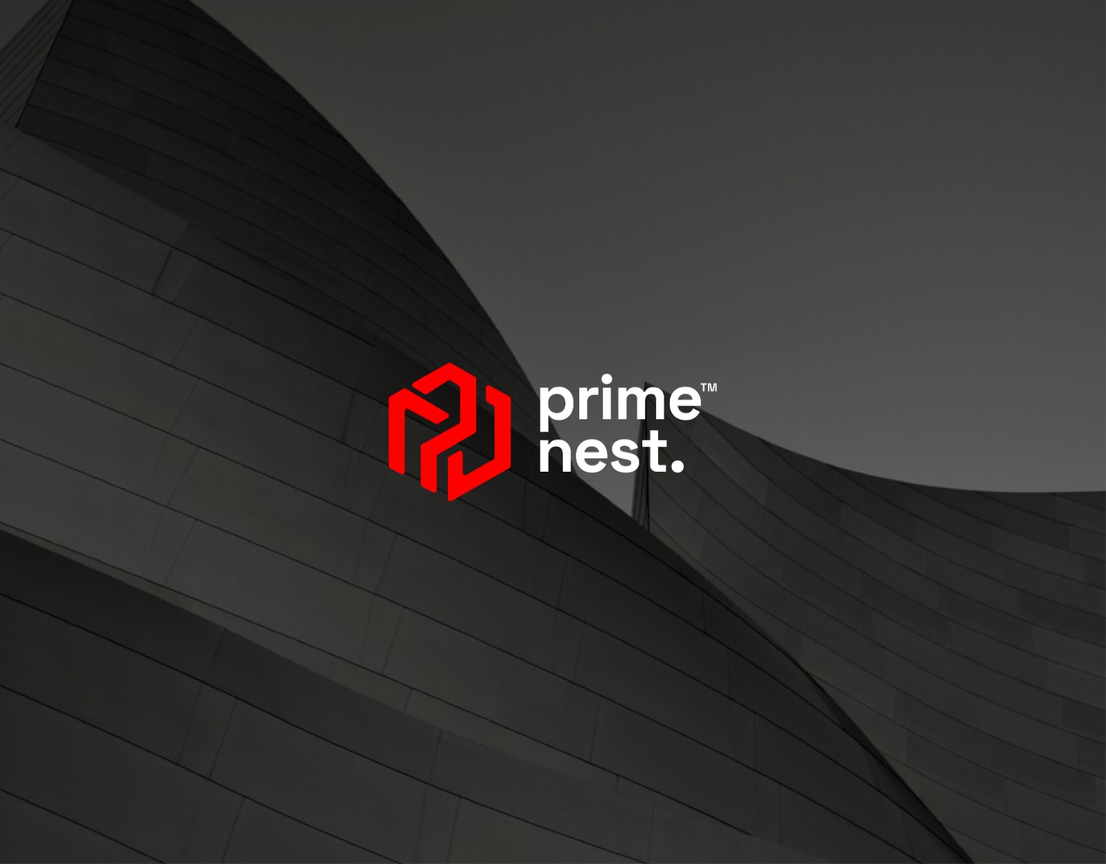
The Prime Nest logo is a monogram formed by combining the letters “P” and “N” into a single geometric shape. Inspired by interlocking construction blocks, the form subtly mimics building structures and gives the impression of strength, growth, and unity.
The angles and line weights are precise, reflecting structural integrity—just like the brand’s promise. The final shape works well as a standalone icon, favicon, app icon, signage mark, and even merchandise branding.
This modularity allows it to behave as a truly scalable identity mark that maintains recognizability at any size.
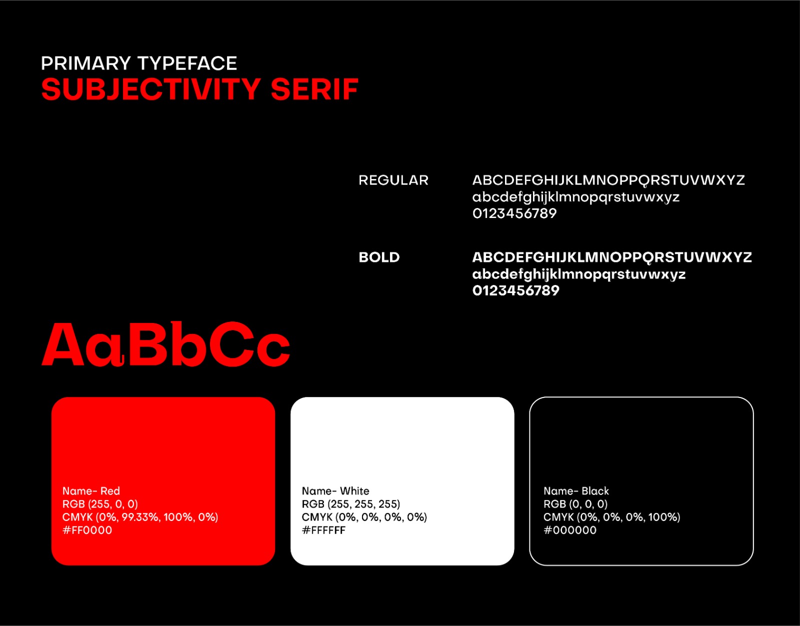
3. Typography:
We chose Subjectivity Serif as the primary typeface for its contemporary take on classic serif fonts. It brings a unique balance of modern luxury and readability. The Regular and Bold weights are used selectively to establish hierarchy while maintaining visual harmony.
The serif style gives the brand a sophisticated feel, while the minimal layout ensures the design doesn’t feel dated or overly traditional.
4. Color Palette:
The visual identity uses a tri-color palette that reinforces brand meaning:
Red (#FF0000): Represents passion, power, and boldness. Red is emotionally intense and captures attention immediately, which suits a confident real estate brand.
White (#FFFFFF): Provides space, clarity, and cleanliness. It helps make the design breathe and contrasts well with both red and black.
Black (#000000): Symbolizes luxury, strength, and depth. It complements red and white by adding balance and visual weight.
This classic and impactful combination makes the brand memorable while supporting both print and digital usage.
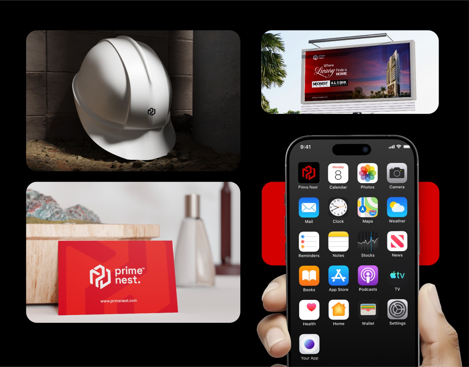
5. Brand Applications:
A powerful identity is one that holds consistency across all mediums. Prime Nest’s brand system was applied across a wide range of assets to demonstrate this:
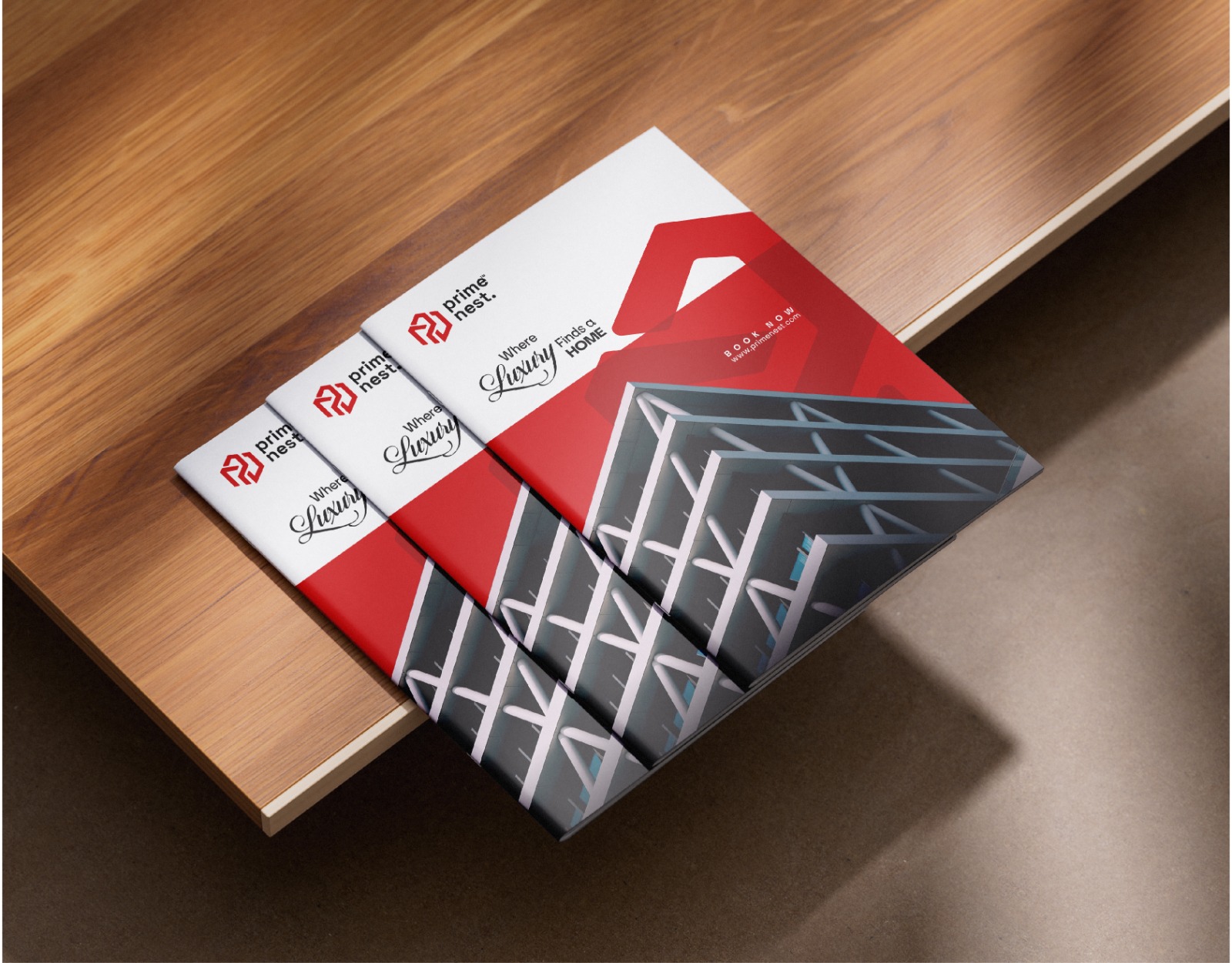
Business Cards: Clean, minimal, with strong visual hierarchy. The red background ensures the brand leaves an instant impression.
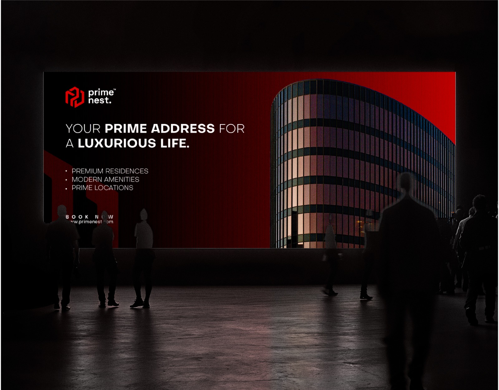
Billboards: Large-scale environmental ads featuring high-resolution renders of the real estate projects paired with the logo and sharp headlines.
Construction Helmets: Subtle branding on white helmets with the monogram adds professionalism to on-ground workers.
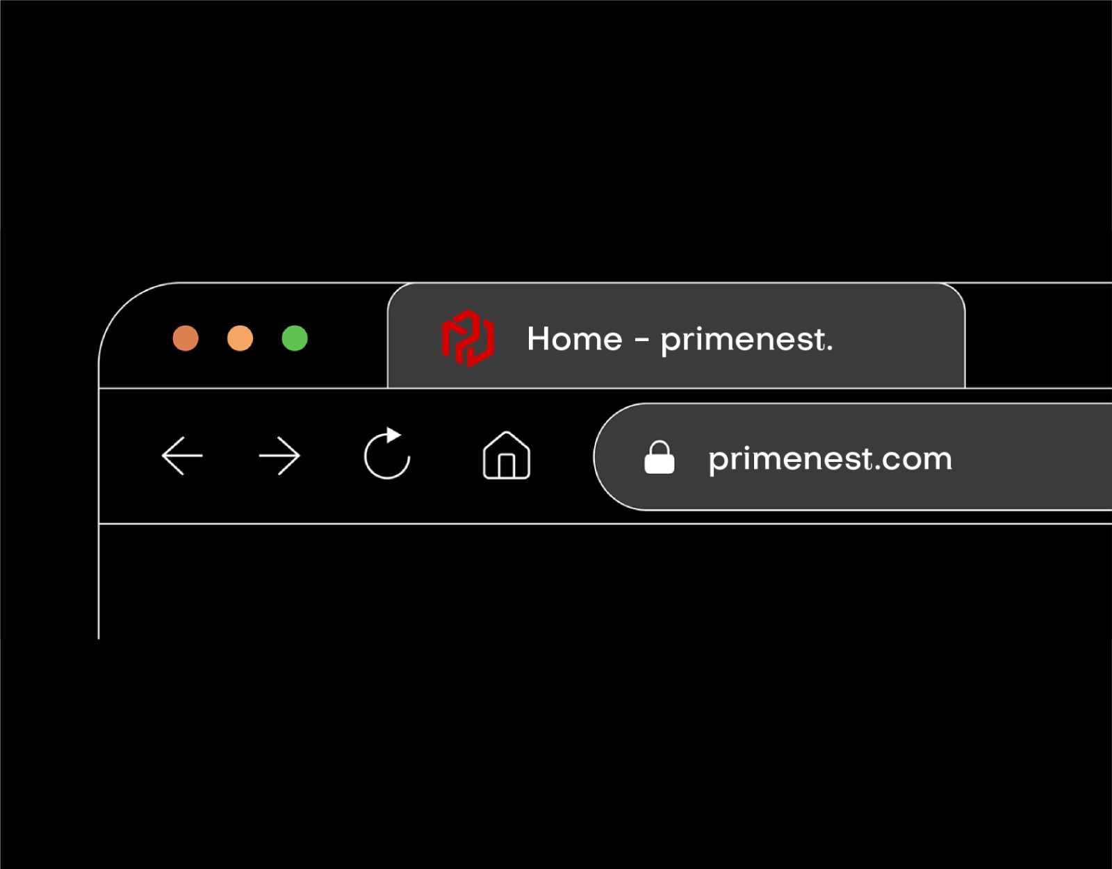
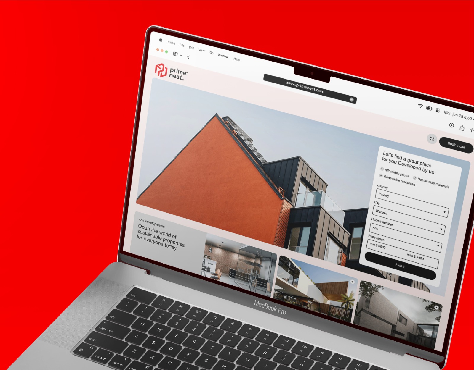
Website & Browser Tab: The favicon and typography blend well with digital interfaces, ensuring brand consistency.
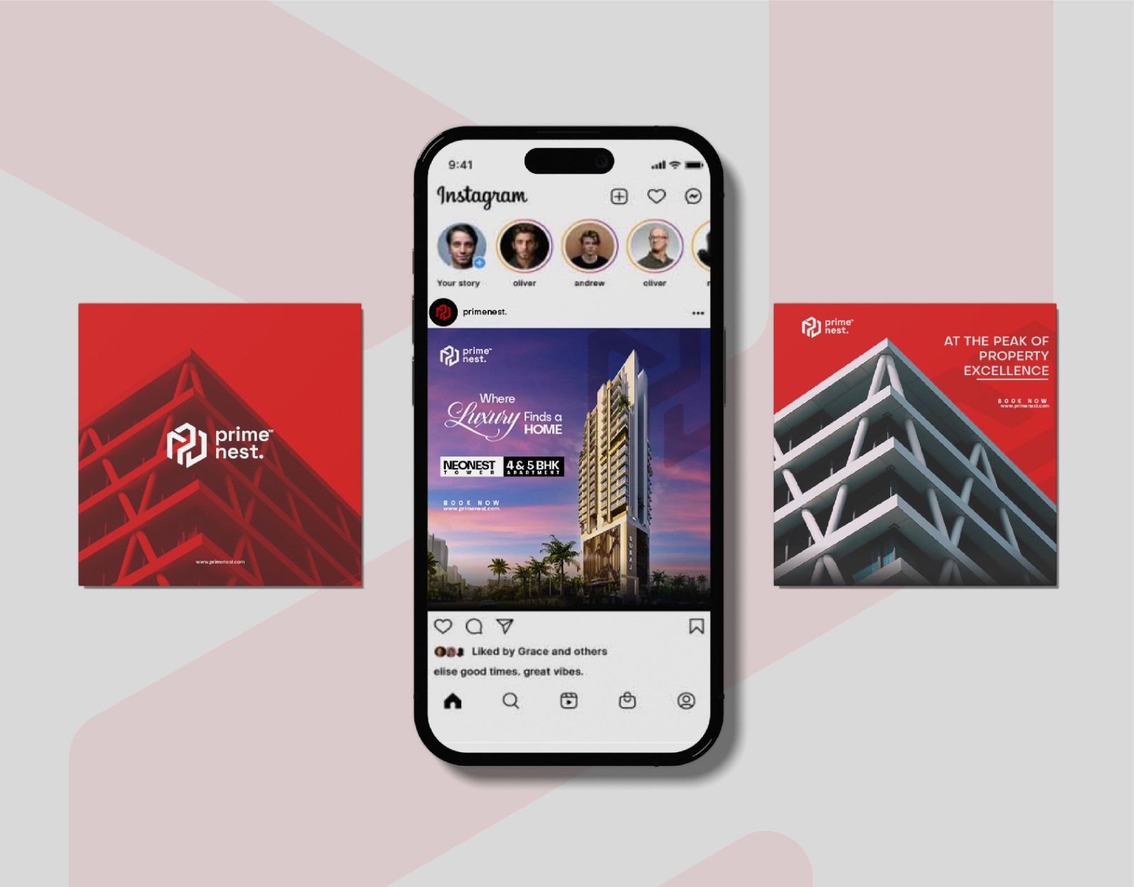
Social Media Templates: Instagram visuals and highlight covers using red & black tones, sharp architecture photography, and bold type.
Mobile App Mockups: The logo fits perfectly as an app icon, demonstrating its flexibility.
Each asset was designed to deliver a clear, luxury-first message while being functional and aesthetically aligned.
6. Design System and Consistency:
The brand uses a strict grid system for layout, ensuring consistency in spacing, alignment, and visual balance. The consistent use of the color palette, typeface, and logo sizing guidelines across media helps strengthen the overall brand equity.
Visual templates were created for future usage by the internal marketing team, making it easier to maintain the same quality without needing constant design input.
7. Visual Storytelling & Messaging:
The tagline used in advertisements, such as “Where Luxury Finds a Home” and “At the Peak of Property Excellence,” complement the visual identity and add a layer of narrative to the brand. The storytelling was structured to appeal to an audience that values class, credibility, and architectural innovation.
Rather than loud marketing, the tone of voice is poised, refined, and confident—just like the visual identity.
8. Outcome & Feedback:
The branding was well-received by both the client and early customers. It gave the real estate project a strong digital and physical presence even before the property was completed.
There was a noticeable uplift in client confidence, website engagement, and social media visibility post-branding. The red-and-white palette particularly stood out in a market saturated with blue and gold property logos.
The brand system not only served its functional needs but also became a long-term asset that can grow as the company expands into future real estate ventures.
9. Conclusion:
Prime Nest proves that real estate branding can go beyond just logos and brochures. It shows how design can shape perception, add emotional value, and build long-lasting trust.
This project was an opportunity to merge strategic thinking with bold visuals, ultimately creating a branding system that speaks both to the heart and the mind.
The identity system crafted for Prime Nest is more than a design—it’s a foundation. One that the brand can confidently build its future upon.
CREDIT
- Agency/Creative: Mohammad Zaid
- Article Title: Prime Nest Premium Real Estate Identity System by Mohammad Zaid
- Organisation/Entity: Freelance
- Project Type: Identity
- Project Status: Published
- Agency/Creative Country: India
- Agency/Creative City: Aligarh
- Market Region: Global
- Project Deliverables: 2D Design, Brand Creation, Brand Design, Brand Guidelines, Brand Identity, Brand Strategy, Branding, Design, Logo Design
- Industry: Real Estate
- Keywords: Brand Identity Logo Design Visual Identity Branding System Minimal Design Bold Typography Modern Branding Luxury Branding Grid-based Design Geometric Logo
-
Credits:
Graphic Designer: Mohammad Zaid


