


Flamingo is a lifestyle photography studio with a visual identity grounded in elegance, emotion, and artistic storytelling. Known for its natural light portraiture and thoughtful session experiences, the studio approached us to build a brand system that felt both intimate and elevated — one that could reflect the personal nature of its work while remaining professional and cohesive across platforms.
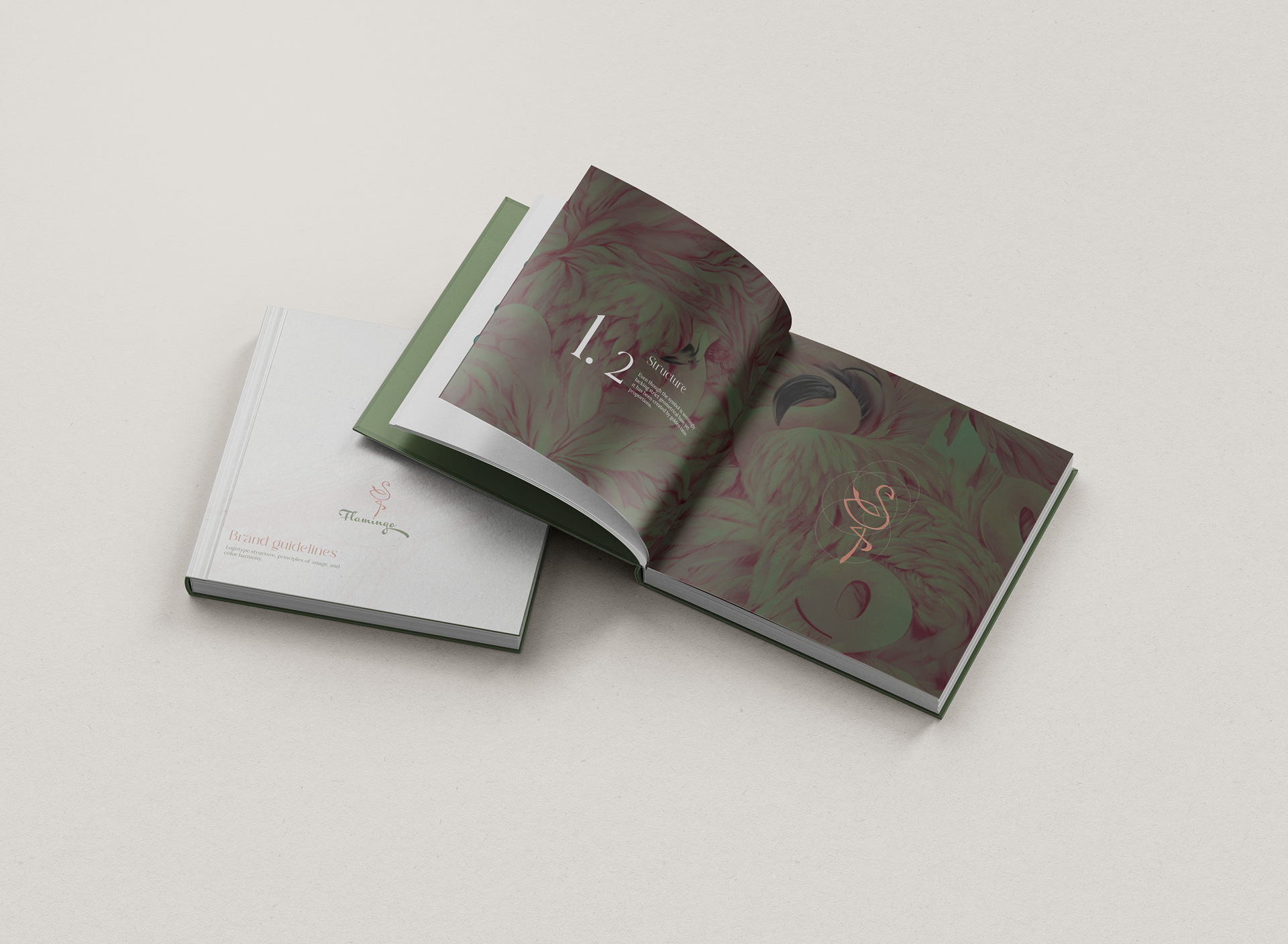
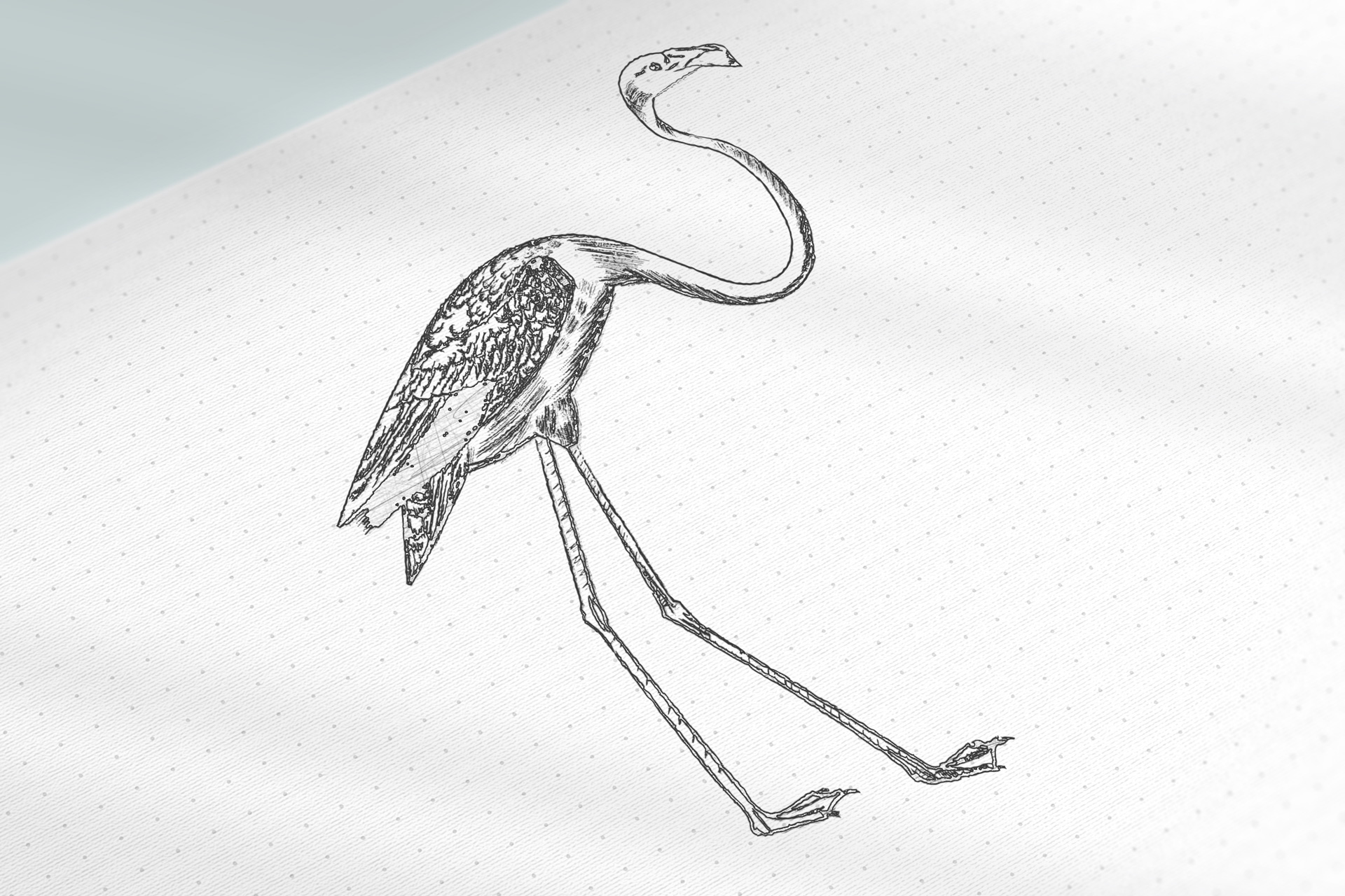
Our creative exploration began with archival flamingo illustrations — from vintage scientific studies to delicate 19th-century naturalist sketches. These references informed both the tone and aesthetic direction: graceful, poised, and emotionally resonant. Drawing inspiration from these historical depictions, we developed a custom logomark — a calligraphic symbol that loosely evokes the flamingo’s form, designed to resemble the fluid motion of ink on paper. While organic in nature, the mark is structured using golden-ratio geometry to maintain visual balance across all applications.
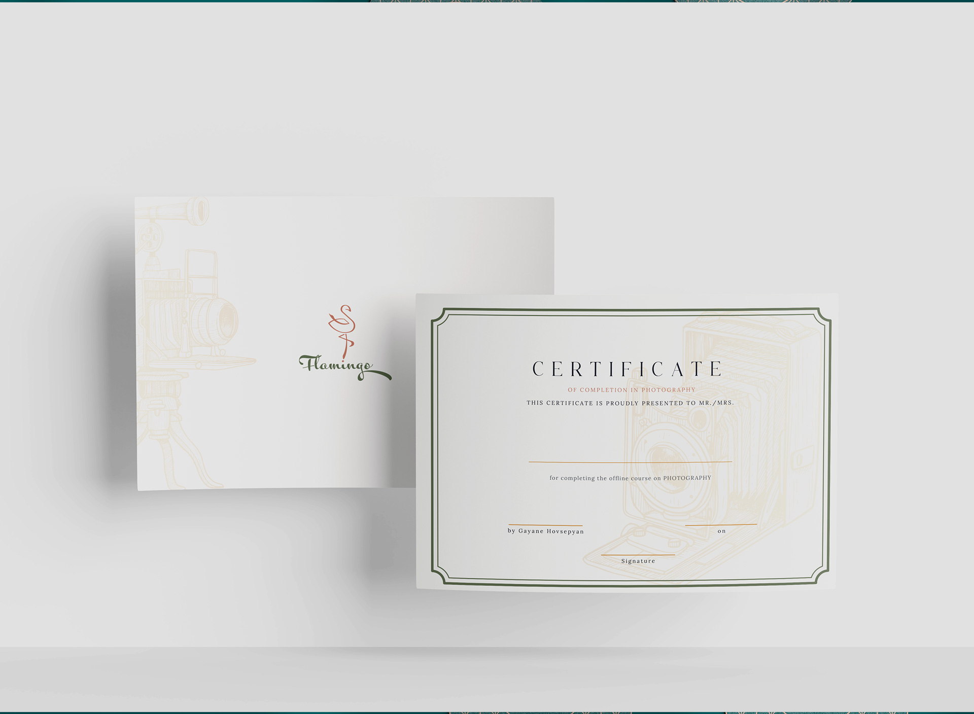
To further enrich the identity, a series of hand-drawn flamingo illustrations were created in-house. These were designed to function as atmospheric background elements across printed materials and digital layouts, adding depth, texture, and a subtle nod to the brand’s narrative inspiration.
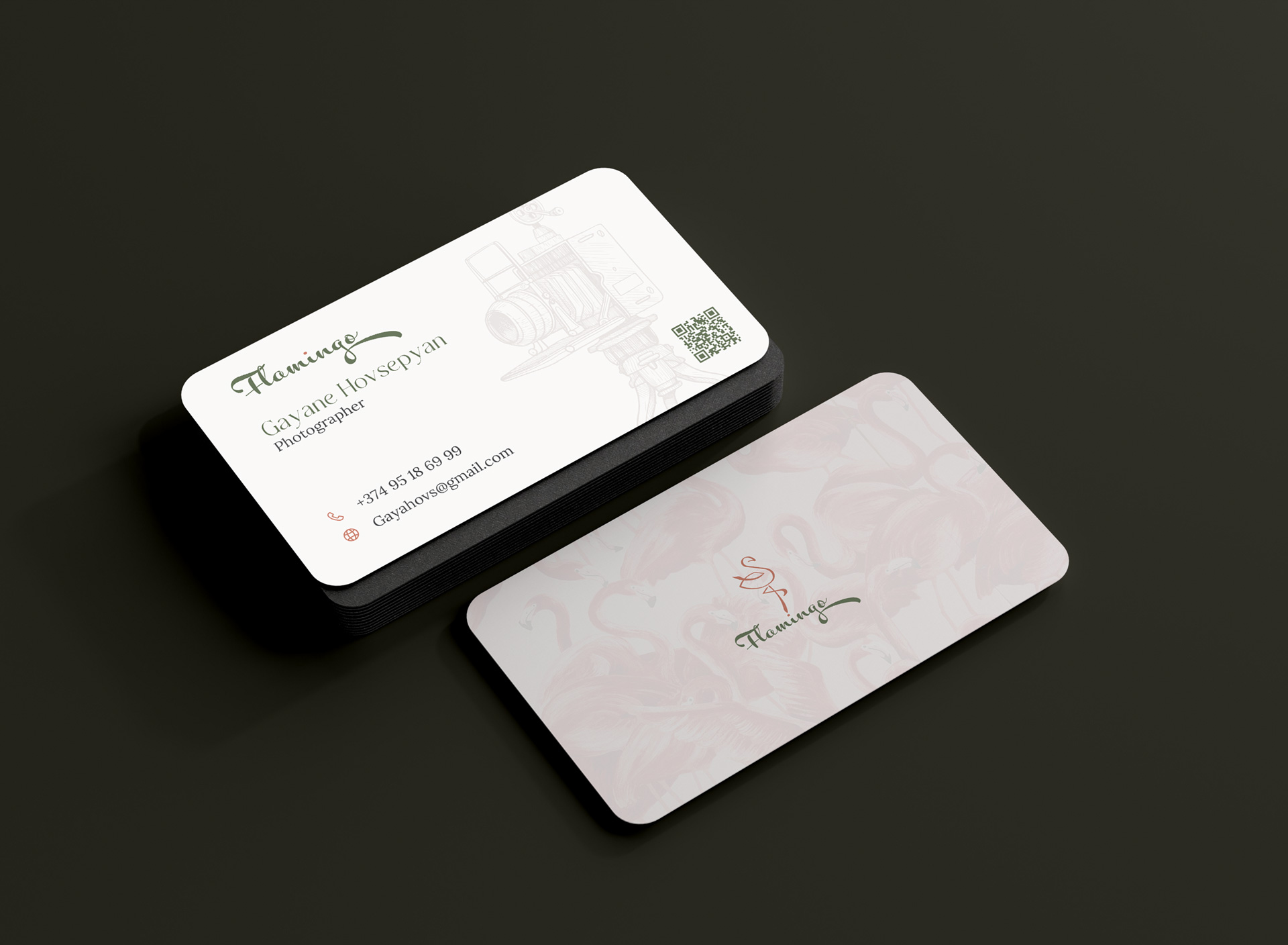
The visual system is anchored in a warm, earth-toned palette — pastel khakis, soft bronzes, and neutral grays — evoking light-drenched spaces and quiet elegance. Typography combines refined serif styles with playful cursive forms, reflecting the brand’s duality of clarity and intimacy. The result is a voice that is expressive, graceful, and unmistakably personal.
A full suite of printables was developed, including photo boxes, care cards, session vouchers, and thank-you notes — all produced with tactile materials and minimalist layouts to elevate the client experience. Digital assets such as watermark systems, online gallery treatments, and social templates were also created to maintain consistency across every brand touchpoint.
The final identity system allows Flamingo to scale gracefully while preserving its human core. It’s a brand that doesn’t shout — it gently invites, captures, and remembers. Rooted in narrative, shaped by craft, and carried by emotion, Flamingo now has a timeless identity worthy of the stories it tells.

CREDIT
- Agency/Creative: Hypnotica
- Article Title: Flamingo Brand Identity for a Lifestyle Photography Studio by Hypnotica
- Organisation/Entity: Agency
- Project Type: Identity
- Project Status: Published
- Agency/Creative Country: Armenia
- Agency/Creative City: Yerevan
- Market Region: Europe
- Project Deliverables: Brand Design, Brand Guidelines, Brand Identity, Illustration, Packaging Design
- Industry: Entertainment
- Keywords: Flamingo, photography branding, lifestyle studio, creative identity, elegant logo, visual storytelling, handcrafted brand, brand design, printables, visual system, watermark design, soft color palette, calligraphic logo, branding for photographers, studio branding, refined typography, minimal identity, emotional branding, premium photo studio
-
Credits:
Graphic Design: Rima Khachatryan
Brand Strategist: Gayane Melkonyan


