


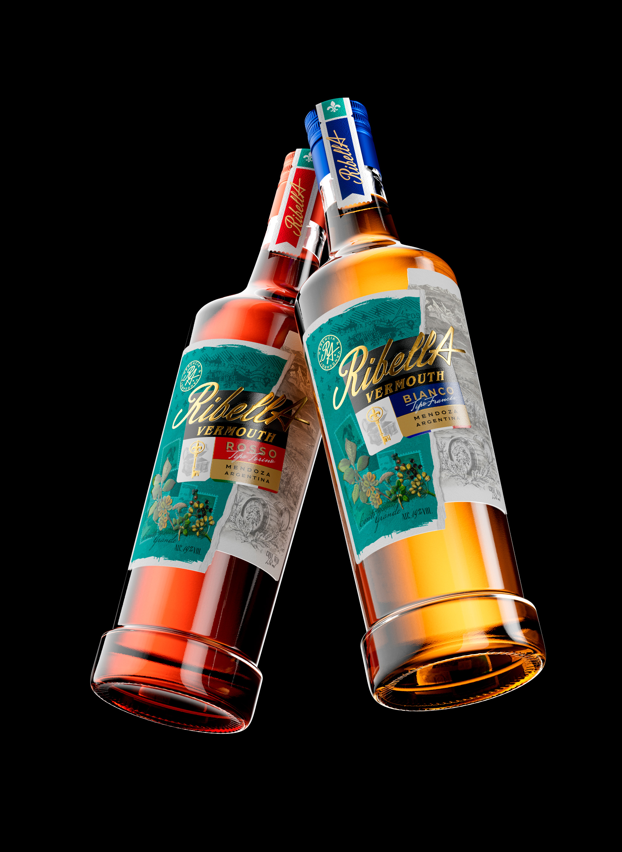
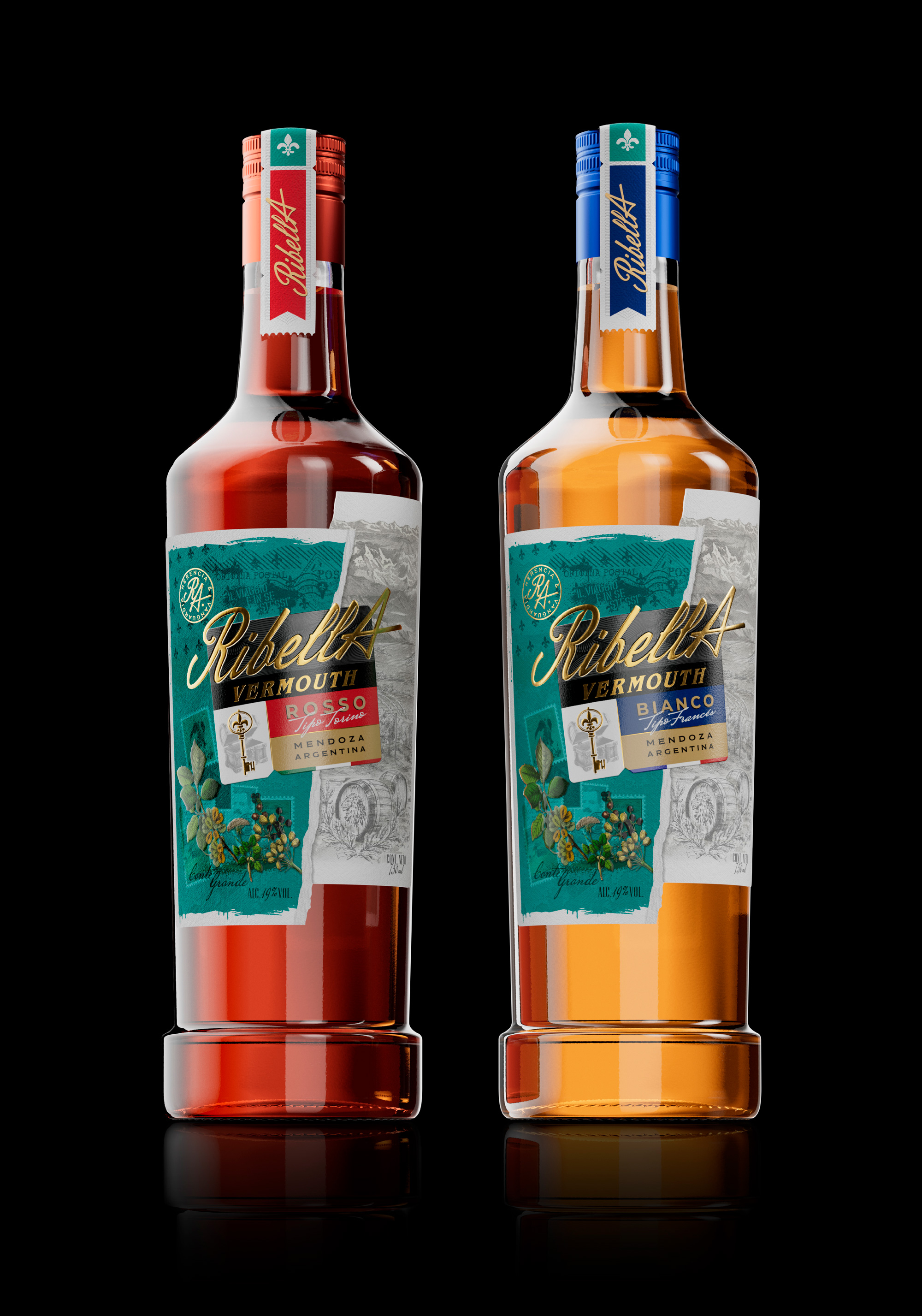
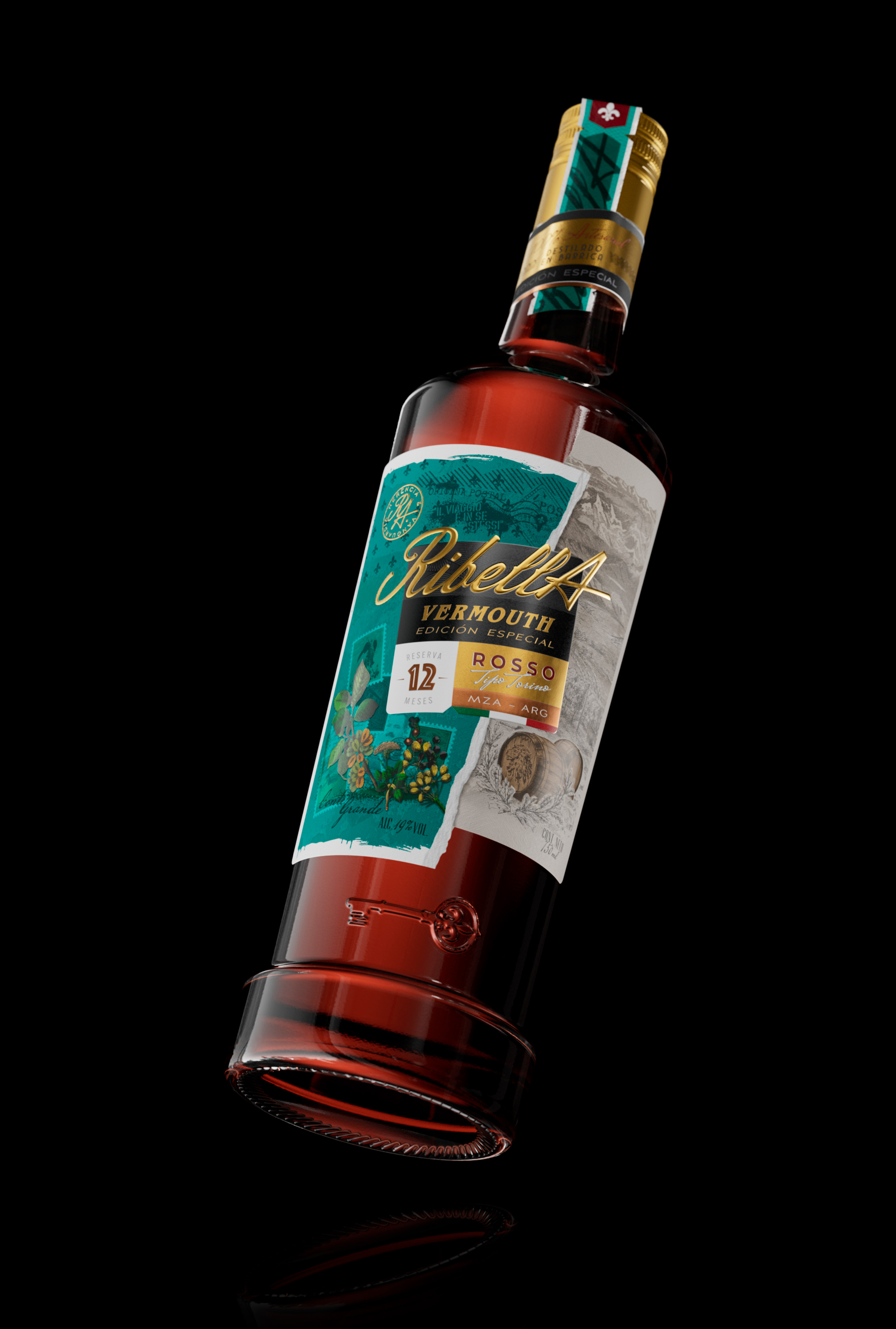
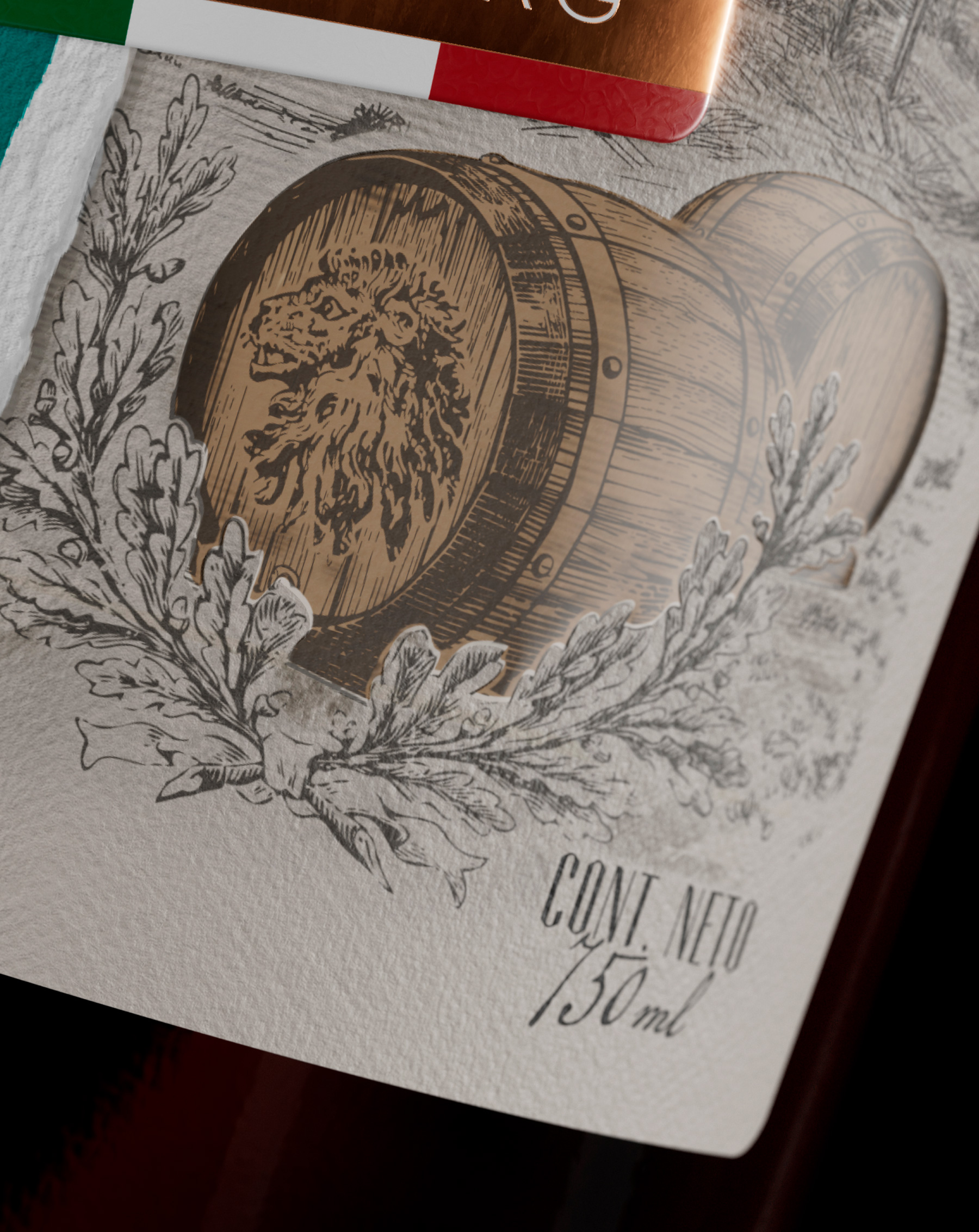
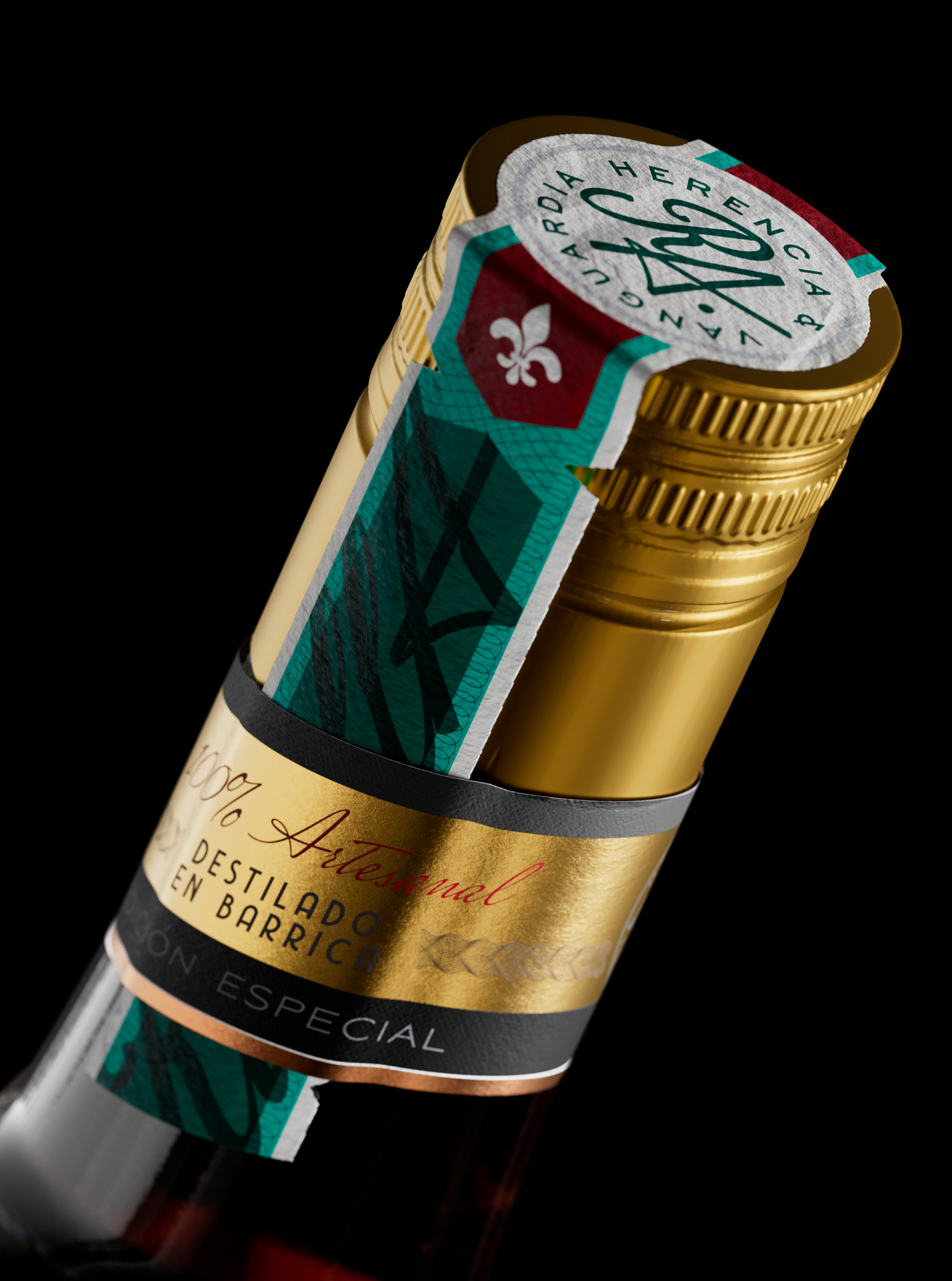
RibellA is a vermouth that tells a story, inspired by the word “ribelle” (rebel in Italian), it not only communicates the trite idea of “Rebellion”, but it tells us how it is important to honor the roots and foundations that our parents and grandparents built and then seek our own path.
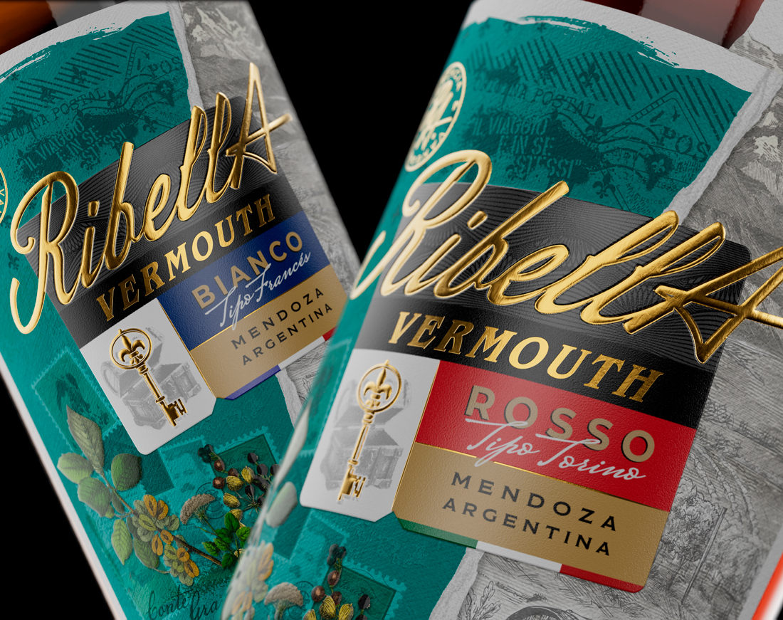
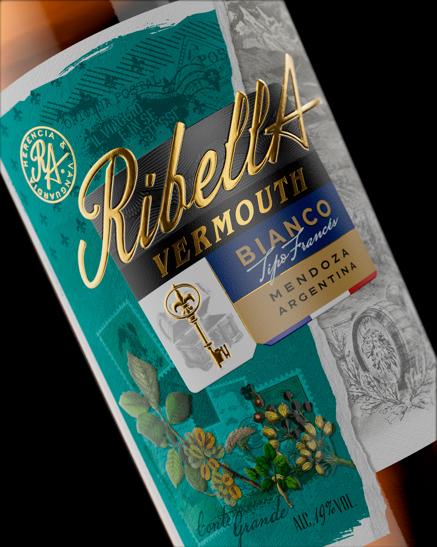
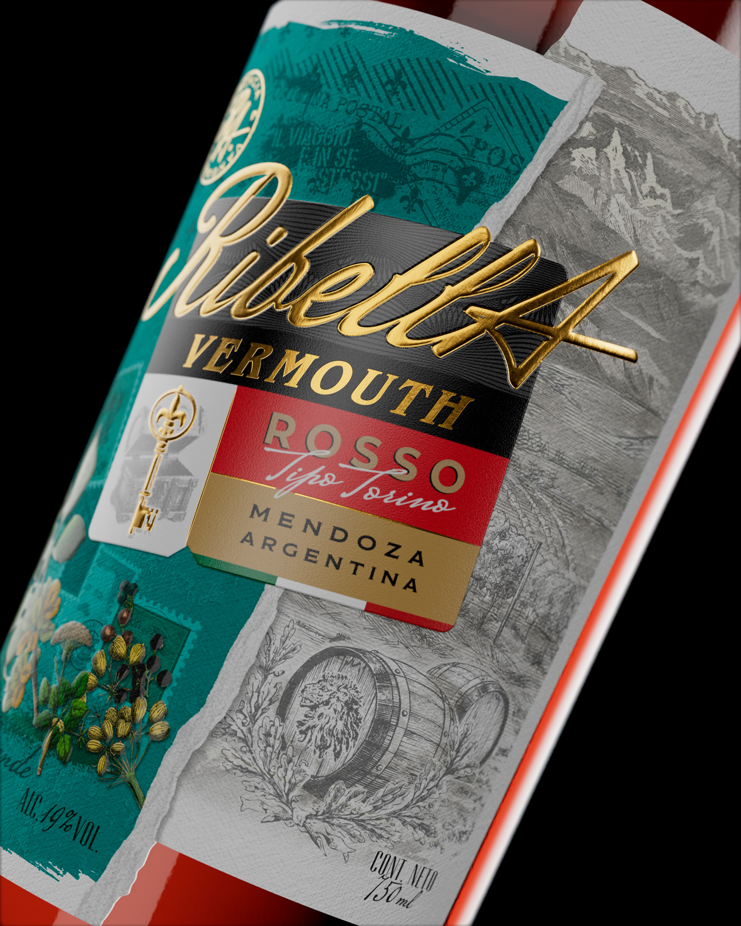
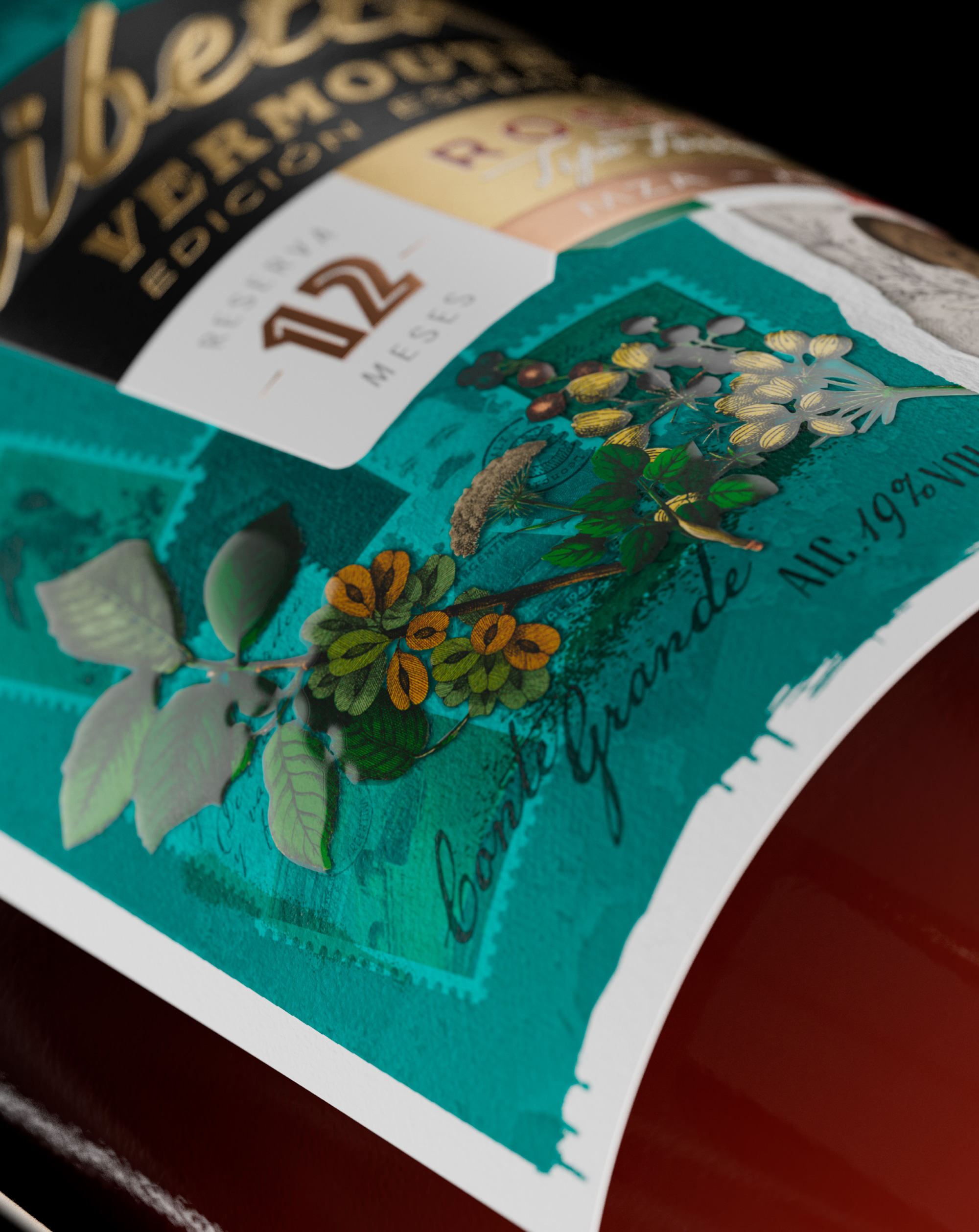
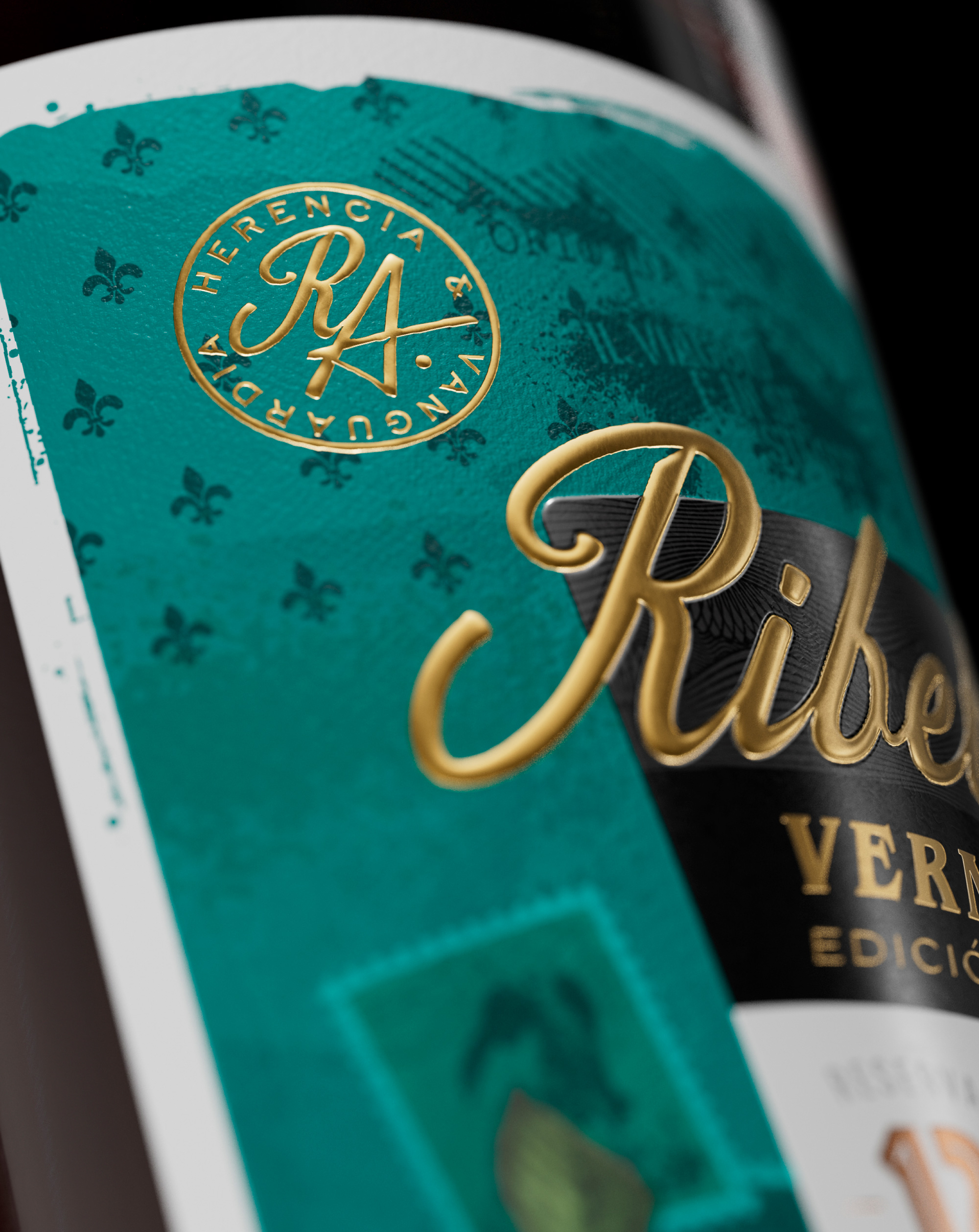
We see two labels in one, on one side history and tradition are represented, on the other the avant-garde and exploration “the rebellious side”, both are united by a new label: “La RibellA”, which stands out from the other two, a metaphor that appeals to the break and therefore the union of both worlds…
There is some RibellA in every person who chooses his own path. That honors their history, but doesn’t let it limit them.
Brand identity development and label design for Ribella Vermouth packaging.
CREDIT
- Agency/Creative: Cupla Studio
- Article Title: Cupla Studio Creates a Dual Narrative for RibellA Vermouth Packaging
- Organisation/Entity: Agency
- Project Type: Packaging
- Project Status: Published
- Agency/Creative Country: Argentina
- Agency/Creative City: Mendoza
- Market Region: Europe, South America, Global
- Project Deliverables: 2D Design, 3D Modelling, Brand Identity, Graphic Design, Illustration, Packaging Design
- Format: Bottle
- Industry: Food/Beverage
- Keywords: Vermouth, Aperitif, Label Design, Packaging design
-
Credits:
Creative Director: Facundo Valenzuela


