


Wata – Branding & Visual identity
In the era of Industry 4.0, businesses must not only innovate to survive but also undergo digital transformation to thrive. Wata Company is a leading provider of digital transformation and data management solutions, helping enterprises optimize processes, enhance efficiency, and unlock breakthrough value.
Our Services
Comprehensive Digital Transformation: Consulting, designing, and implementing tailored digital solutions for different business models.
Data Management & Analytics: Systemizing, storing, and leveraging data to support precise decision-making.
AI & Big Data Integration: Applying artificial intelligence and big data to optimize operations and predict trends.
Cybersecurity & Data Protection: Providing data security solutions that comply with international standards.
Software Development & Enterprise Management Systems: Building technology platforms that enable flexible and efficient business operations.
With a team of experienced experts and cutting-edge technology, Wata is committed to accompanying businesses on their digital transformation journey, helping them achieve sustainable growth, optimize costs, and gain a competitive edge.
In the field of digital transformation and data management, brand identity must not only reflect professionalism but also convey a sense of modernity, technology, and reliability. Following a minimalist approach, the brand identity focuses on simplicity, sophistication, and efficiency, using three primary colors:
Green – Symbolizing innovation, sustainable growth, and advanced technology. This color conveys a message of progress, connectivity, and positive energy.
Black – Representing strength, professionalism, and trustworthiness. It enhances contrast and creates a bold, sharp brand presence.
White – Signifying clarity, modernity, and transparency. White space keeps the design clean, making it visually appealing and user-friendly.
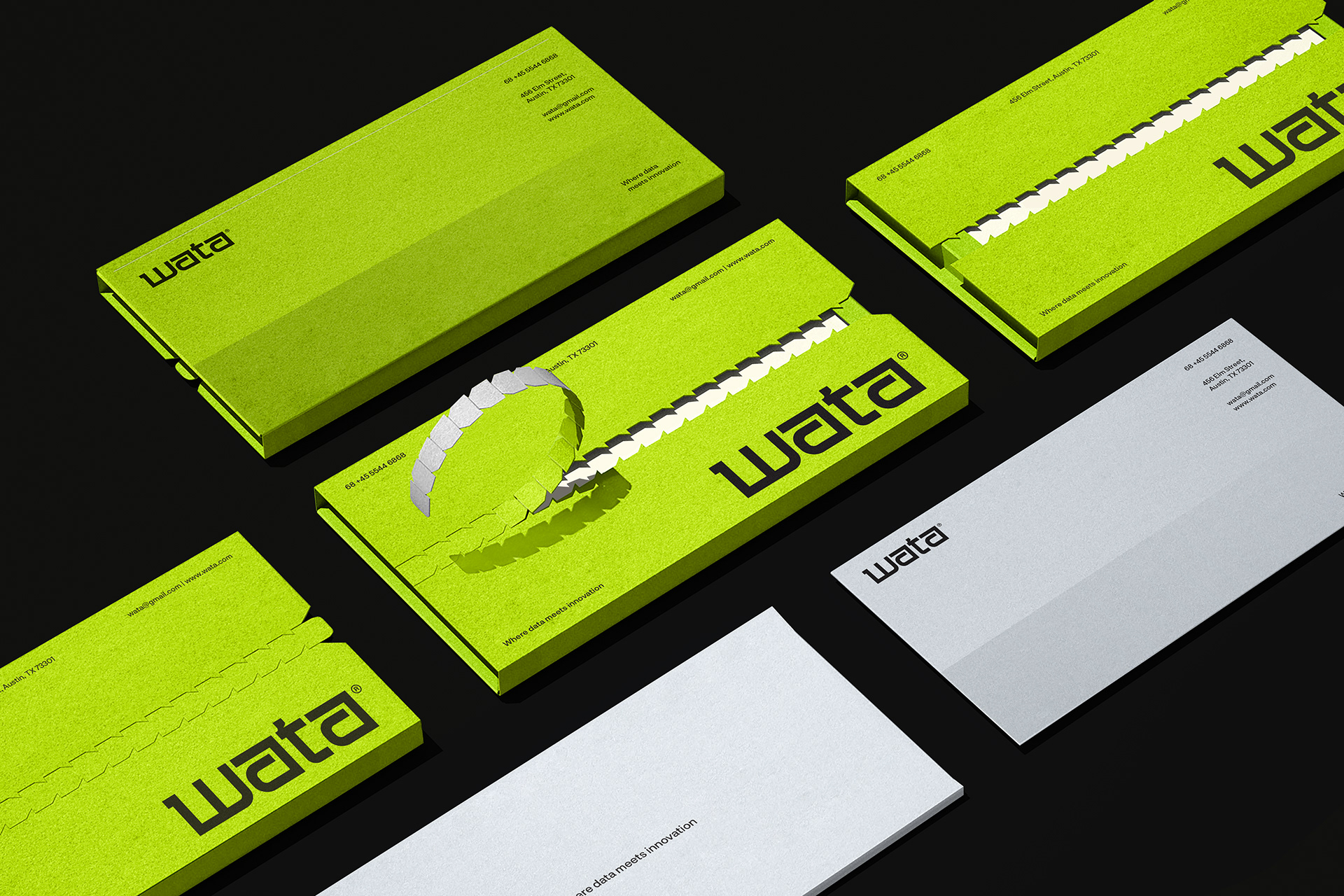
Design Applications
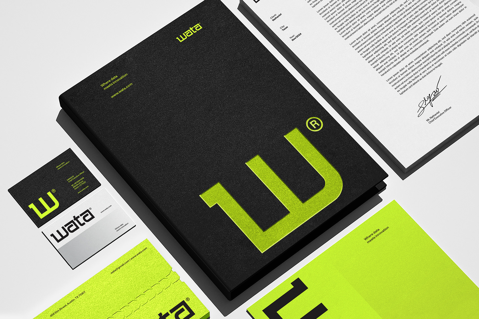
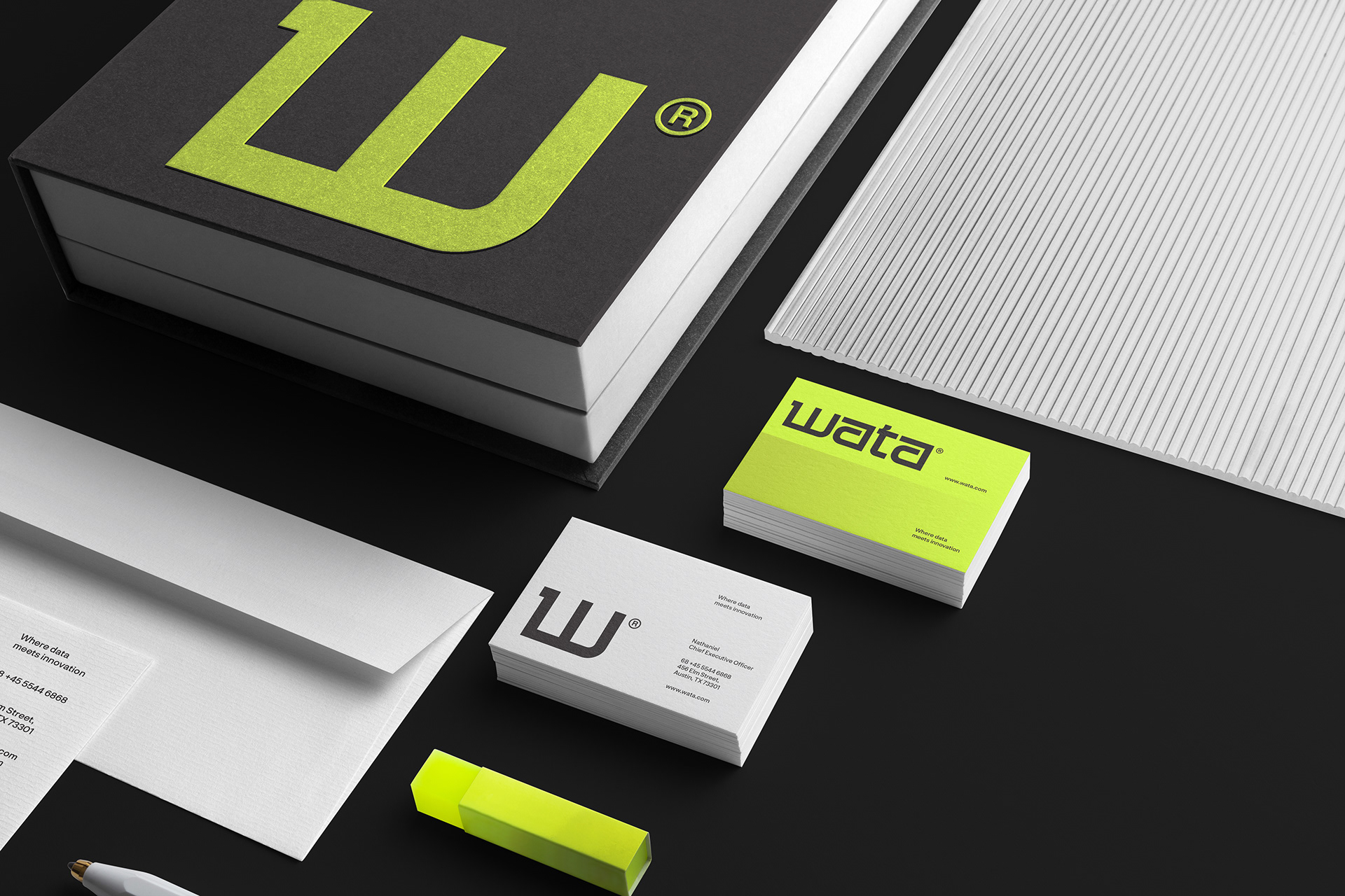
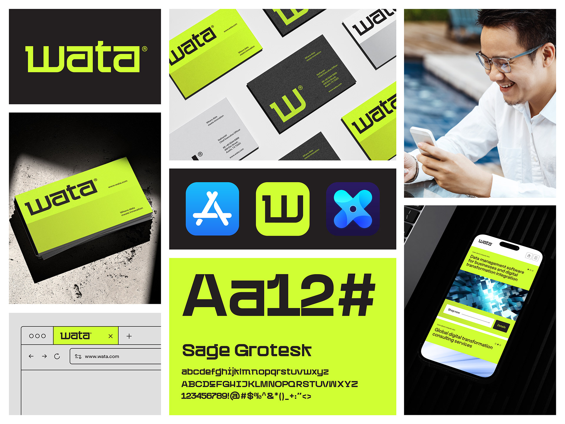
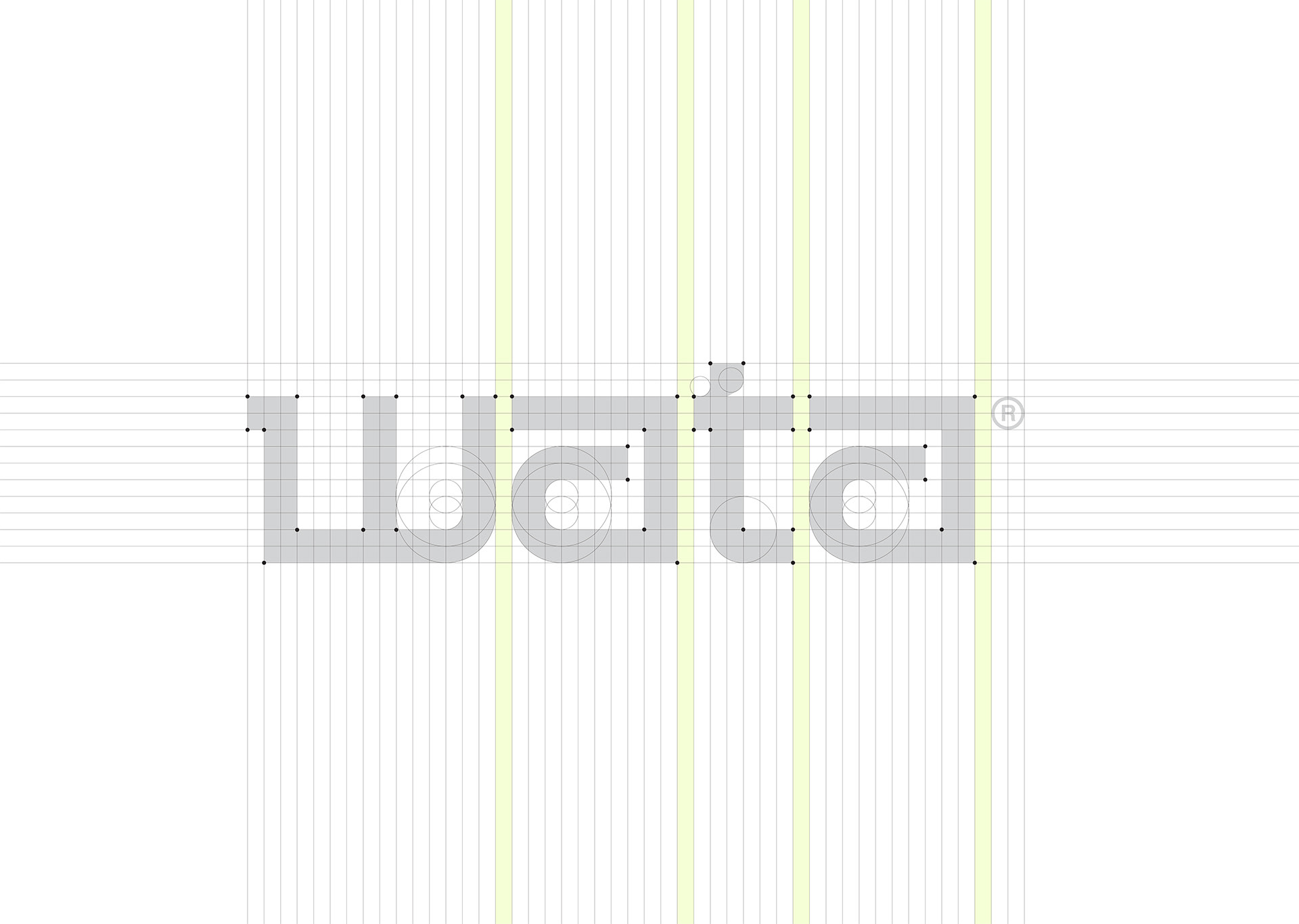
Logo: Minimalist, using clean lines with a modern sans-serif font to create a professional and memorable look.
Website & App Interface: Flat design with green as the highlight color on a white background, combined with black elements for depth and contrast.
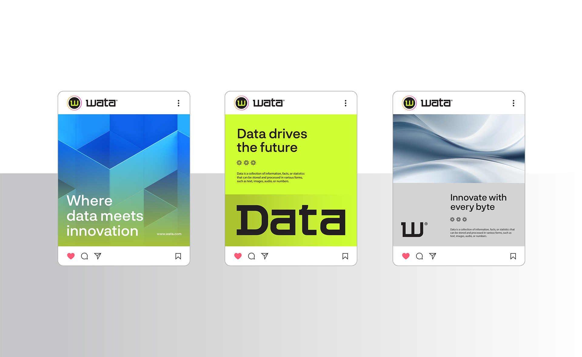
Marketing & Digital Materials: A clean layout with ample white space for readability, enhanced by intuitive icons for effective information delivery.
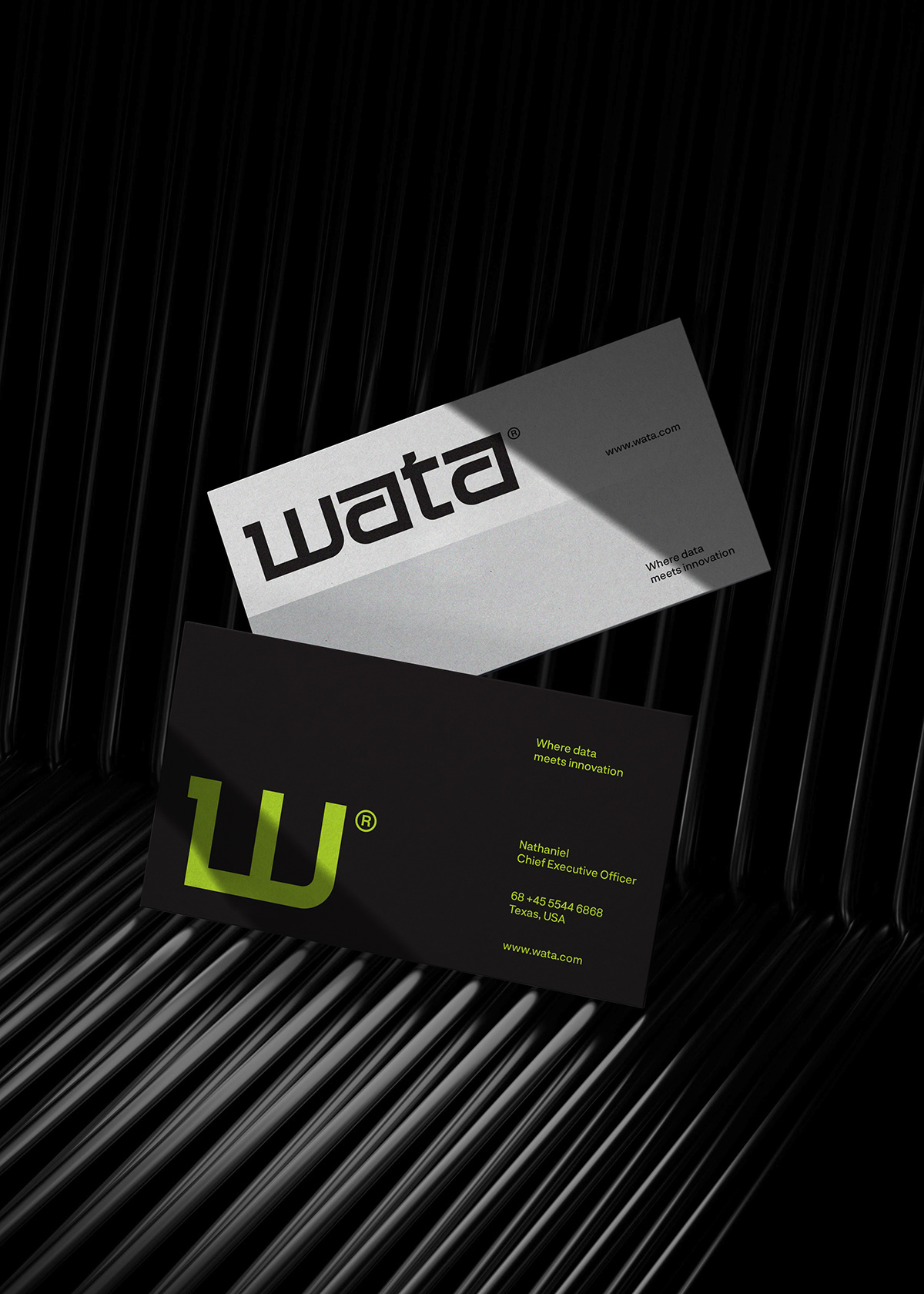
Business Cards & Office Stationery: High-contrast color usage to ensure clarity and leave a strong impression.
A minimalist design, the brand identity not only enhances professionalism but also communicates technological innovation, creativity, and reliability to clients and partners.
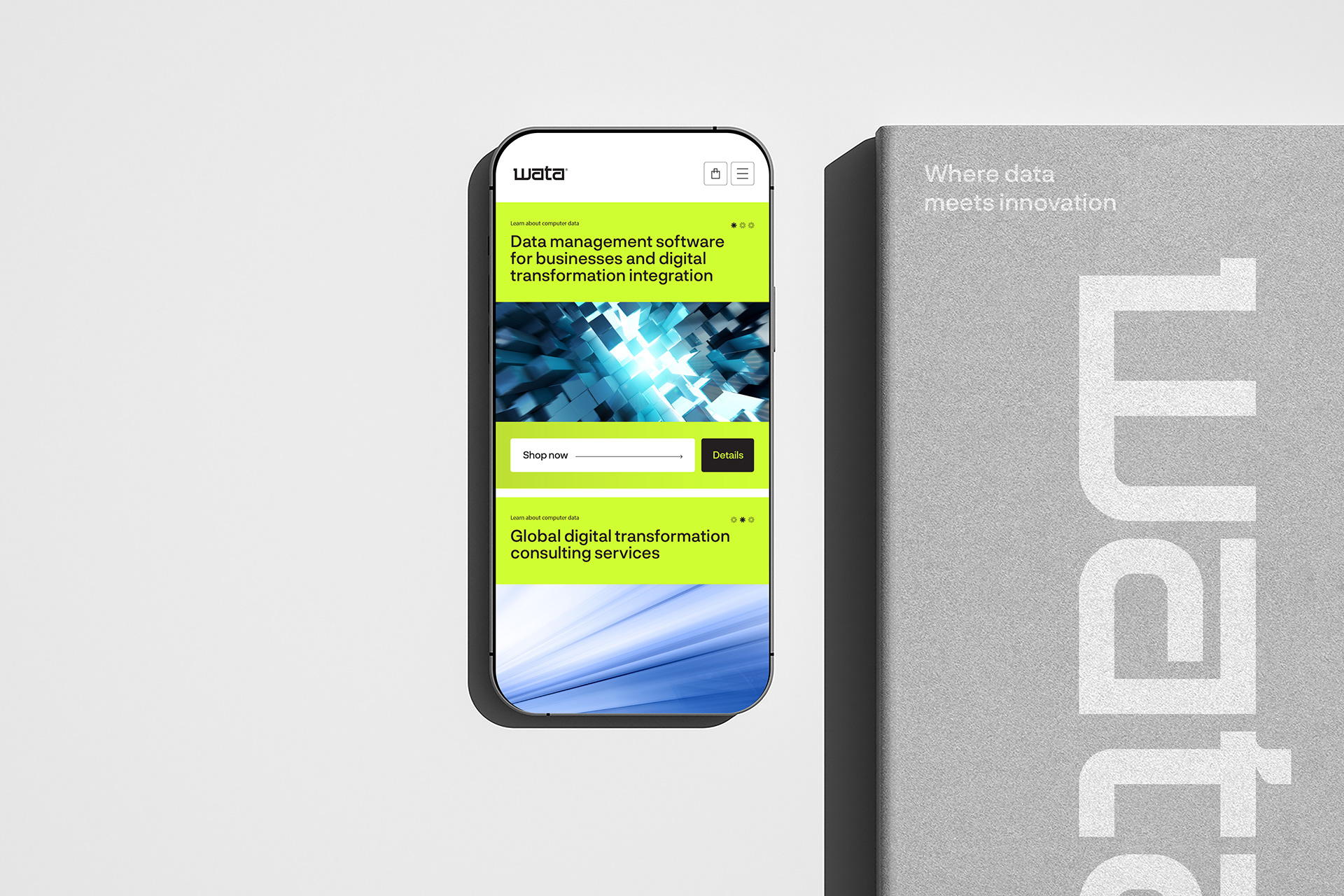
UX/UI (Website & Digital Platforms)
Flat and intuitive interface design: Avoiding excessive shadows and focusing on usability.
Clear structure with ample white space: Enhances readability and conveys professionalism.
Balanced color contrast: Green as the primary highlight for buttons and headings, white for a clean background, and black for bold accents.
High consistency: Buttons, icons, and typography remain uniform across all platforms to ensure a smooth user experience.
User experience (UX) optimization: Easy navigation, fast loading speeds, and a user-friendly layout.
Applications: Corporate websites, data management platforms, and business-supporting mobile applications.
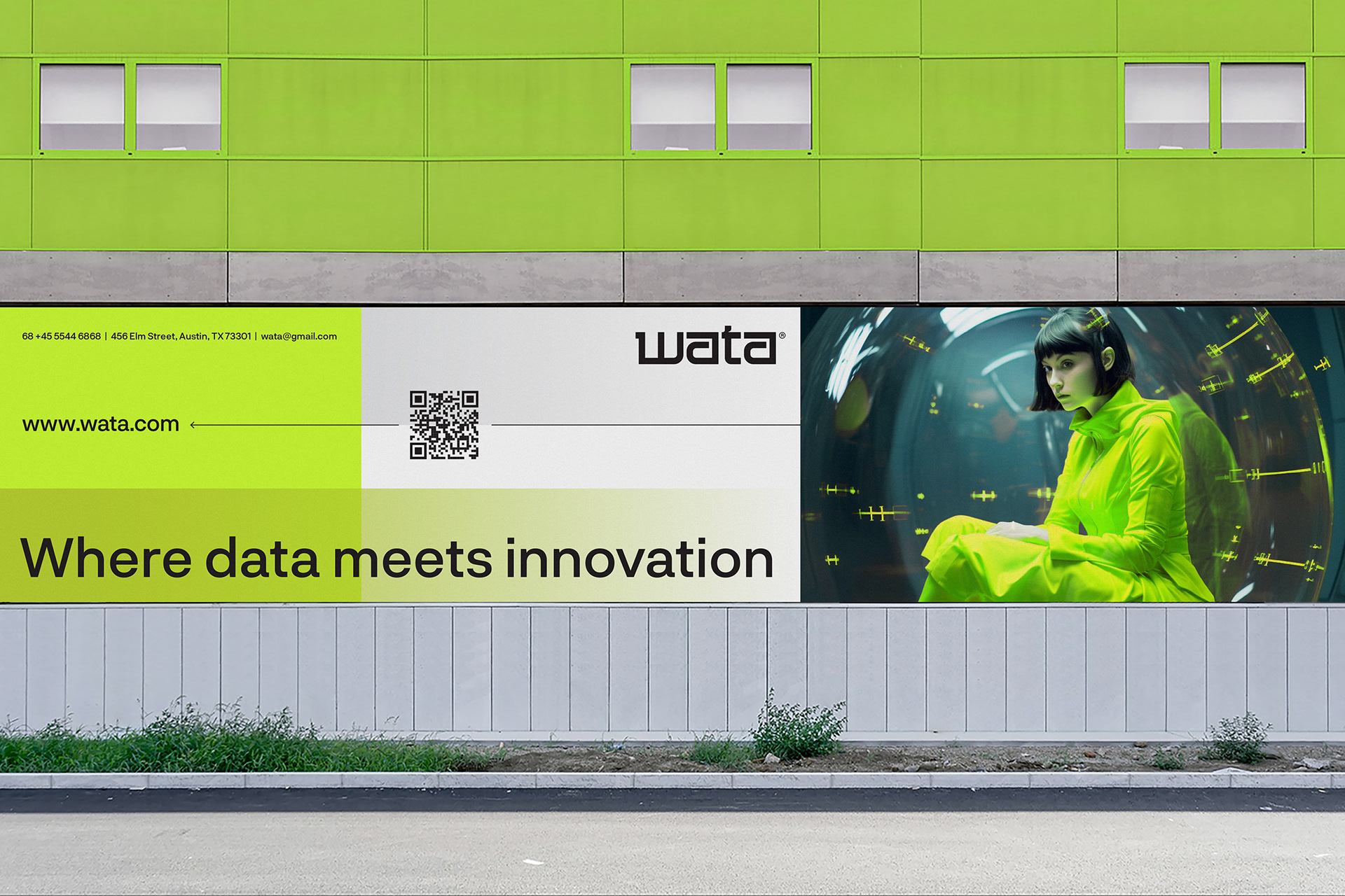
Signboards & Outdoor Billboards
Clean and minimalist design: A white or black background with green highlights to create contrast and enhance visibility.
Clear and readable typography: Modern sans-serif fonts with large text and well-spaced elements for easy recognition from a distance.
Effective use of negative space: Prevents visual clutter, creating a professional and premium feel.
Tech-inspired visual elements: Incorporating sleek digital-themed graphics, abstract line patterns, and icons to convey innovation.
Applications: Outdoor billboards, LED screens at airports, office buildings, and technology hubs.
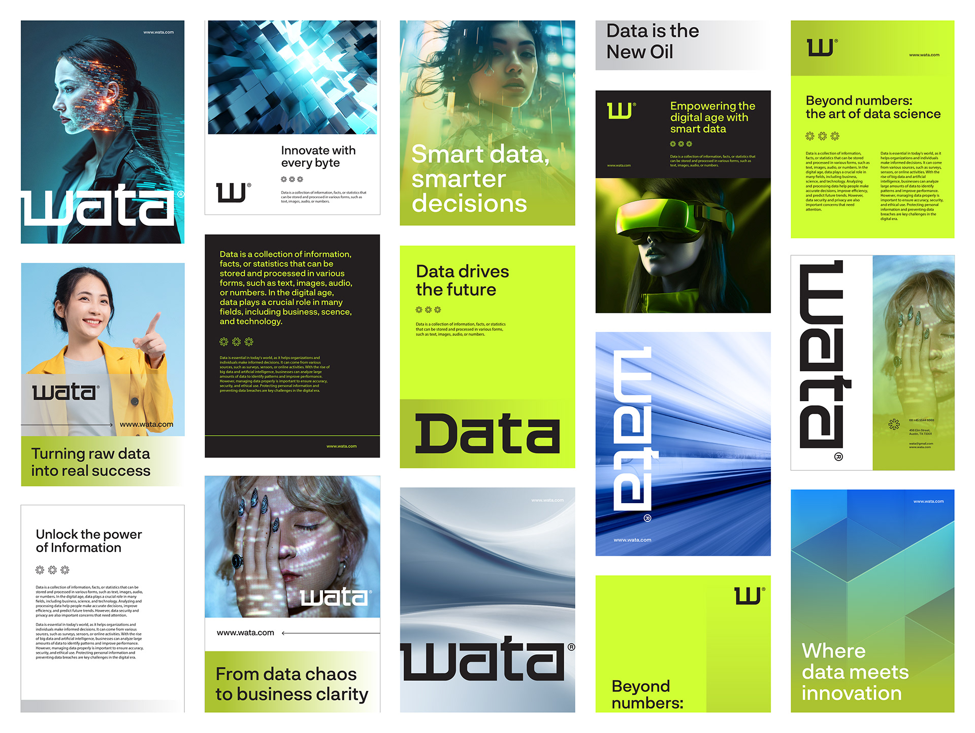
Poster & Advertising Materials
Spacious layout focusing on key messages: Minimal distractions, ensuring a quick and strong impact.
Green highlights on a white or black background: Creating a modern yet dynamic and professional look.
Subtle tech-related elements: Incorporating abstract shapes, digital symbols, or QR codes for enhanced interactivity.
Applications: Posters in shopping malls, tech exhibitions, and corporate events.
CREDIT
- Agency/Creative: Keey Studio
- Article Title: Wata Branding and Visual Identity by Keey Studio
- Organisation/Entity: Freelance
- Project Type: Graphic
- Project Status: Published
- Agency/Creative Country: Vietnam
- Agency/Creative City: Ho Chi Minh City
- Market Region: Asia
- Project Deliverables: 2D Design, Brand Architecture, Brand Creation, Brand Design, Brand Experience, Brand Guidelines, Brand Identity, Brand Mark, Brand Naming, Brand Redesign, Brand Refinement, Brand Rejuvenation, Brand Strategy, Brand World, Branding, Digital Art, Graphic Design, Icon Design, Identity System, Logo Design, Rebranding
- Industry: Telecoms
- Keywords: Wata® - Branding & Visual identity
-
Credits:
Creative Director: Keey Studio


