xuro was established in Australia in early 2025 as a global platform specializing in fast, flexible, and secure money transfer services.
The company was created to meet the needs of individuals supporting friends and family, freelancers receiving international payments, and anyone seeking smart, simple financial solutions that transcend geographical boundaries.
Driven by this vision, xuro’s visual identity was developed to reflect innovation and trust. It’s built on a carefully balanced blend of technology and simplicity, aiming to deliver a seamless and highly secure user experience.
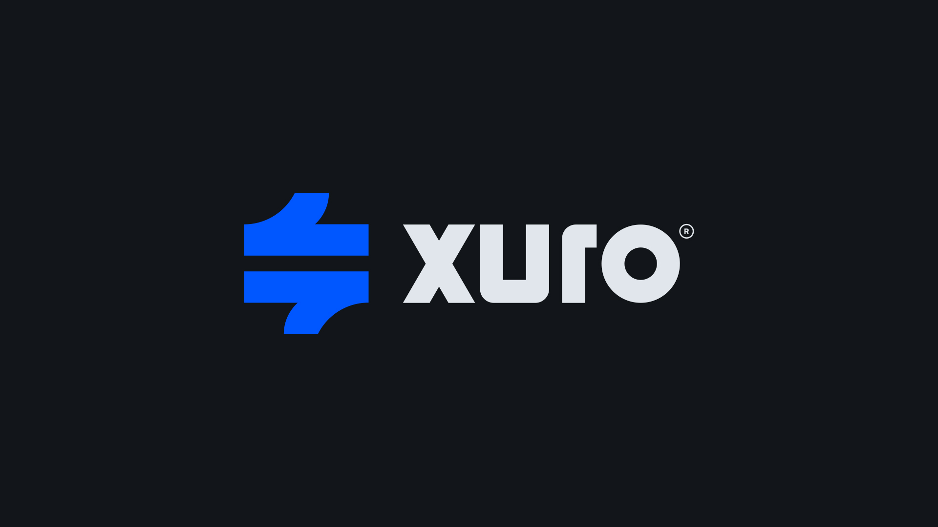
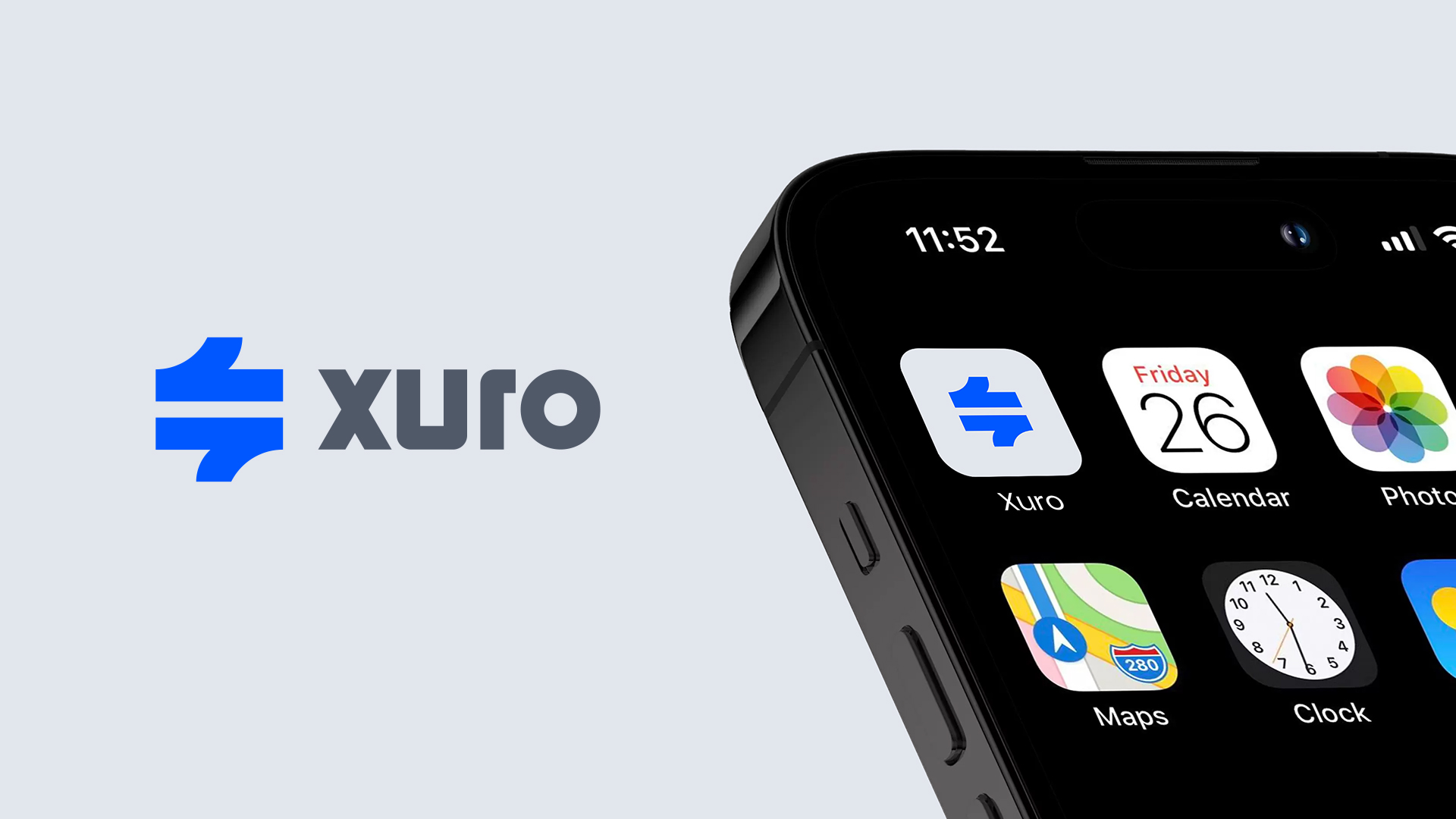
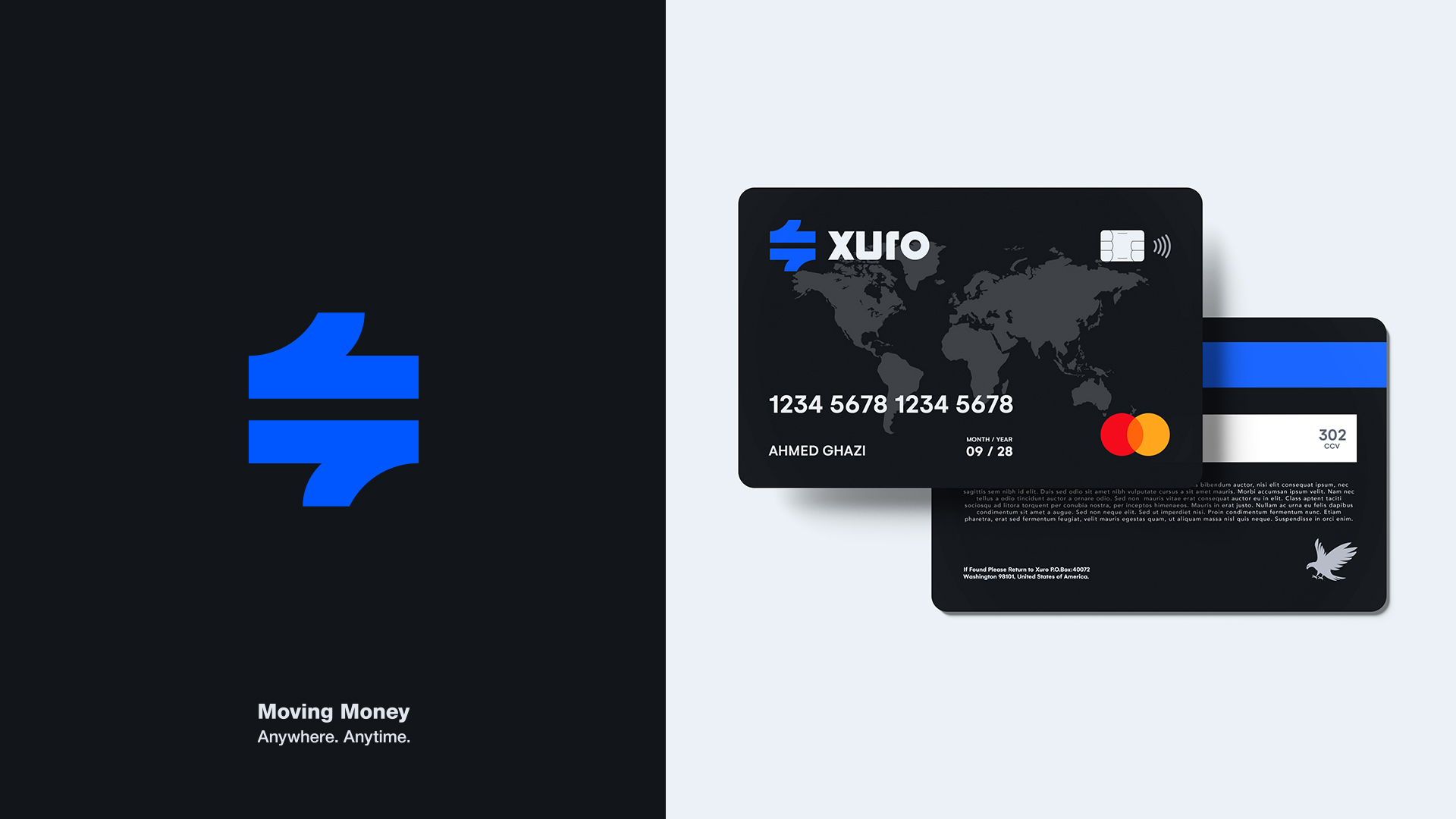
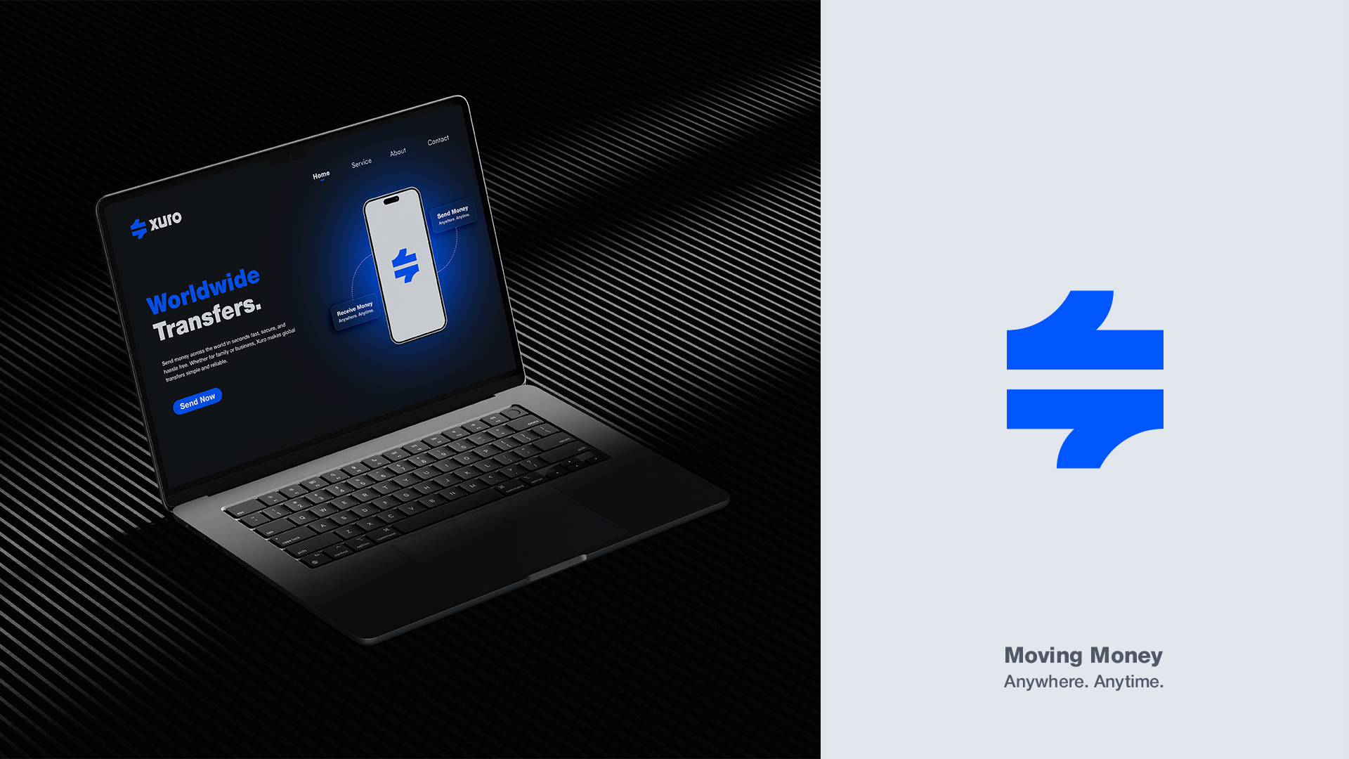
The xuro logo embodies the essence of the company’s mission through a design inspired by the flow of money between two parties.
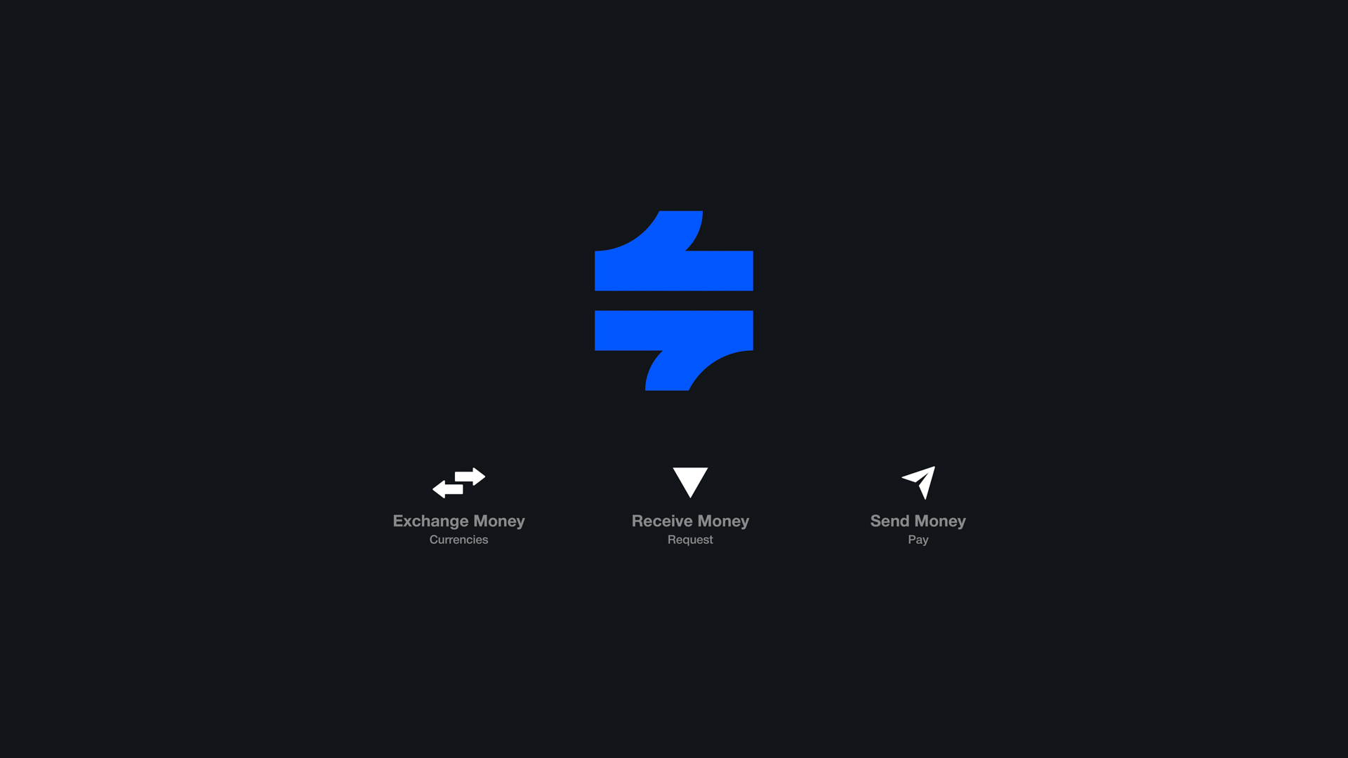
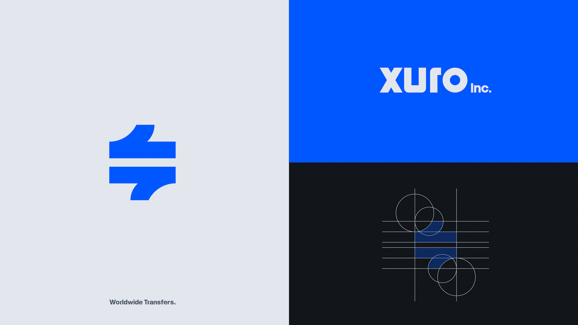
It features two parallel lines separated by smooth curves, symbolizing the sending and receiving process, balance, and fluidity in both directions. This concept is presented through a clean and balanced visual form that communicates the message clearly and directly.
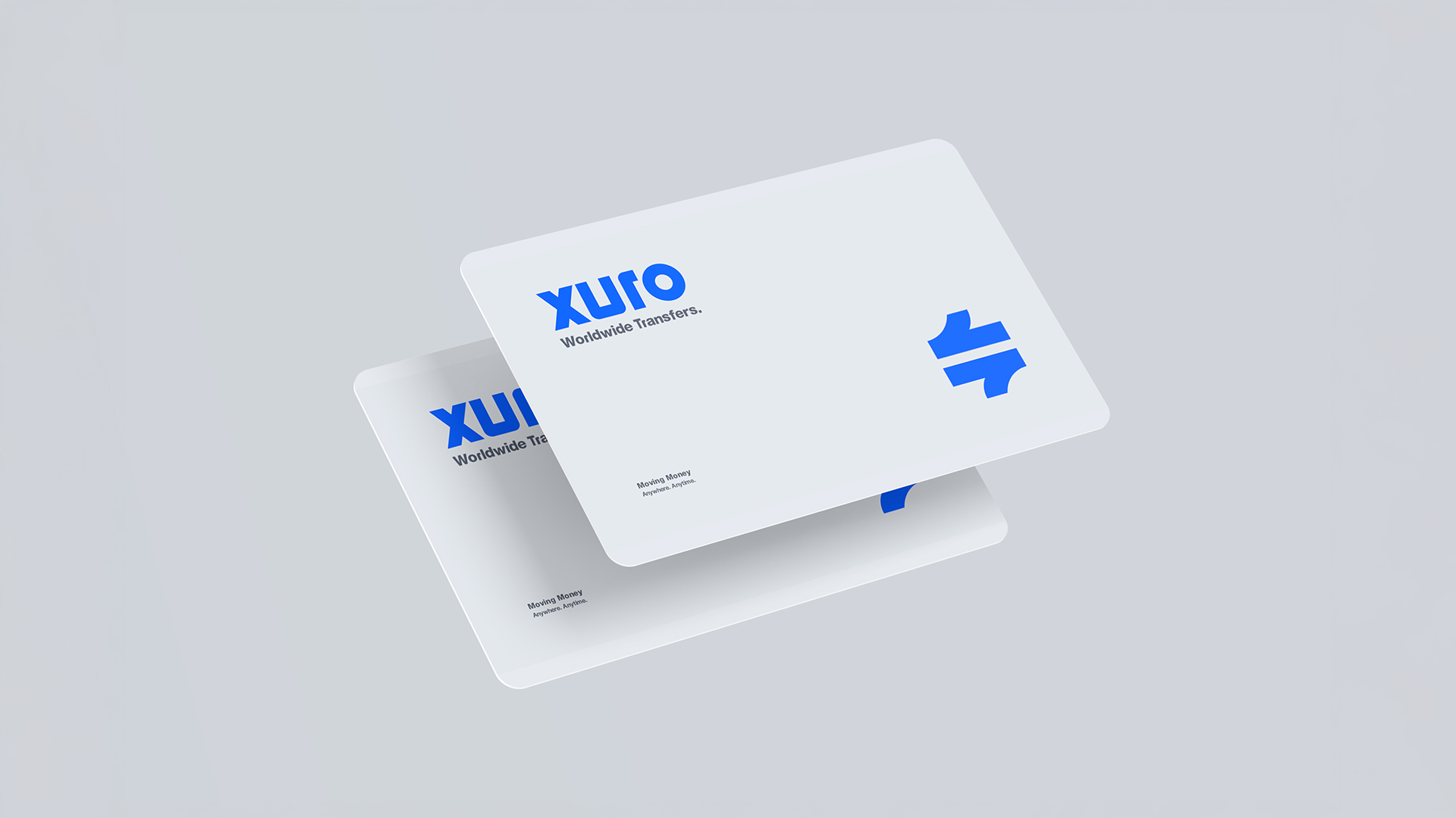
One of the logo’s most distinctive features is use of negative space. Between the letters x and u in the word xuro, a hidden and integrated arrow subtly appears. This arrow represents the core concept of transfer from sender to receiver and visually reinforces the company’s purpose. This element becomes even more evident when the wordmark is used without the icon, offering a clever visual cue that strengthens brand recognition and clearly reflects the service’s function.
The logo also symbolizes xuro’s three core services: sending money, receiving funds, and currency exchange.
These services are supported by the company’s local branches across Australia, providing customers with reliable and convenient access to currency exchange.
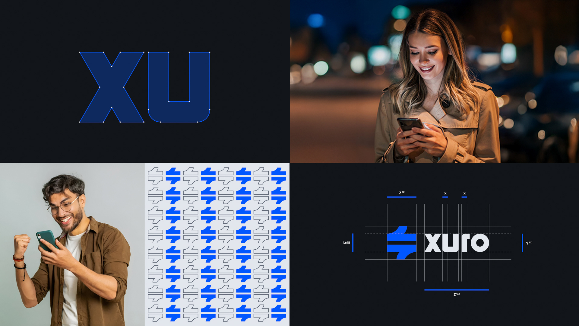
One of the major design challenges was to create a visual identity that combines strength with clarity, a design that balances speed, precision, and memorability. For this reason, a modern geometric typeface was chosen for the “xuro” name, reinforcing a sense of stability and trustworthiness.
The color palette was carefully selected to reflect the brand’s core values.
Blue represents trust, innovation, and digital security. White symbolizes clarity and transparency, while dark blue adds a professional and deep tone, enhancing the brand’s credibility and long-term presence. Together, these colors create a calm and trustworthy user interface that supports the visual message of global reach, simplicity, and safety.
With every transaction, users receive instant notifications within a visually reassuring environment, strengthening the sense of security and highlighting that xuro is not just a financial intermediary, but a trusted digital partner delivering precise and fast services.
xuro offers a smooth and transparent money transfer experience from start to finish,
providing upfront information about fees and delivery times. Customers can choose their preferred payment method, such as debit or credit cards, to ensure a convenient and secure process.
For those seeking fast and smart financial tools, the xuro debit card offers a seamless and secure shopping experience, powered by an integrated digital banking system.
Business owners also benefit from our tailored financial solutions
whether it’s receiving payments, managing payroll, or handling invoices and suppliers, all within a flexible and reliable financial ecosystem that supports business growth with confidence and stability.

CREDIT
- Agency/Creative: Ahmed Ghazi
- Article Title: Xuro Brand Identity by Ahmed Ghazi
- Organisation/Entity: Freelance
- Project Type: Identity
- Project Status: Non Published
- Agency/Creative Country: Kuwait
- Agency/Creative City: Salmiya - Kuwait
- Market Region: Asia
- Project Deliverables: Brand Guidelines, Brand Identity, Logo Design
- Industry: Financial
- Keywords: money, transfer, financial, blue, Australia
-
Credits:
Creative Art Director, Brand Designer: Ahmed Ghazi


