


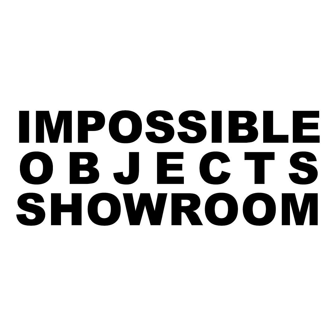
Impossible Objects (2024) is a visual identity and campaign system designed for a temporary fashion collective pop-up that took place during Paris Fashion Week. The project was not just a design commission, but a chance to interrogate what an identity system might look like when the very ideas of coherence, authorship, and permanence are intentionally destabilized.
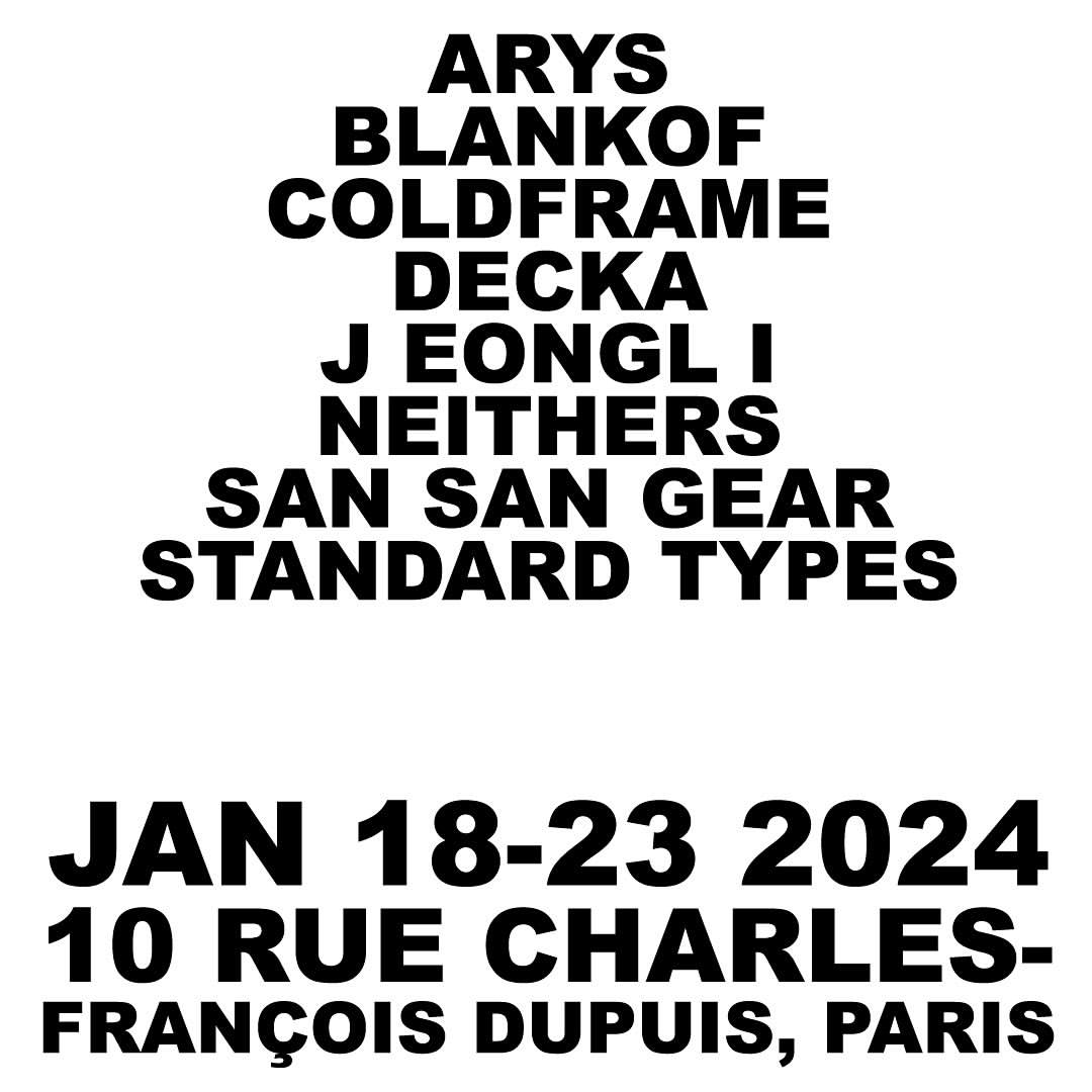
At its core, Impossible Objects treats instability not as a problem to be solved, but as a structural and aesthetic strategy. The collective behind the event was composed of emerging designers from varied cultural and creative backgrounds, brought together for a one-week exhibition and sales space. Their practices were distinct, their references scattered, and their voices individual. My role was to build a visual framework that could reflect this fragmentation without smoothing it over—a system that would not neutralize difference but amplify it.
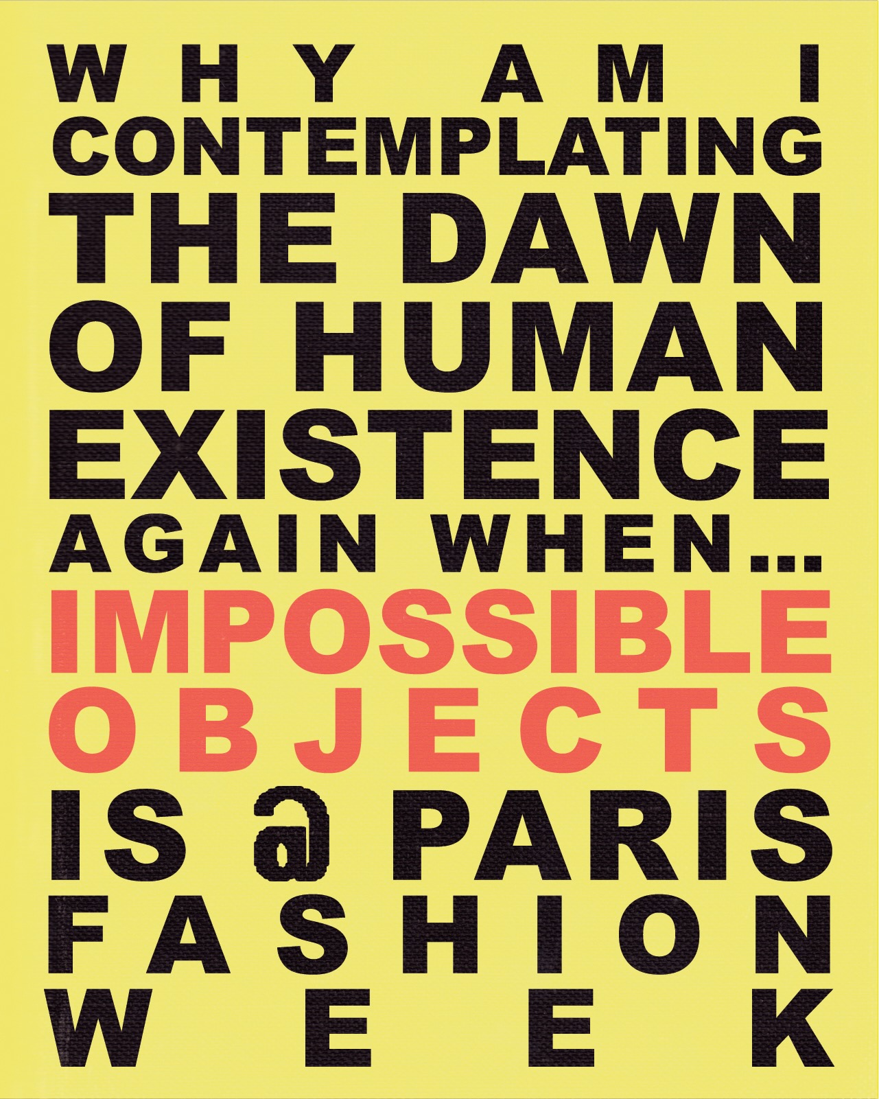
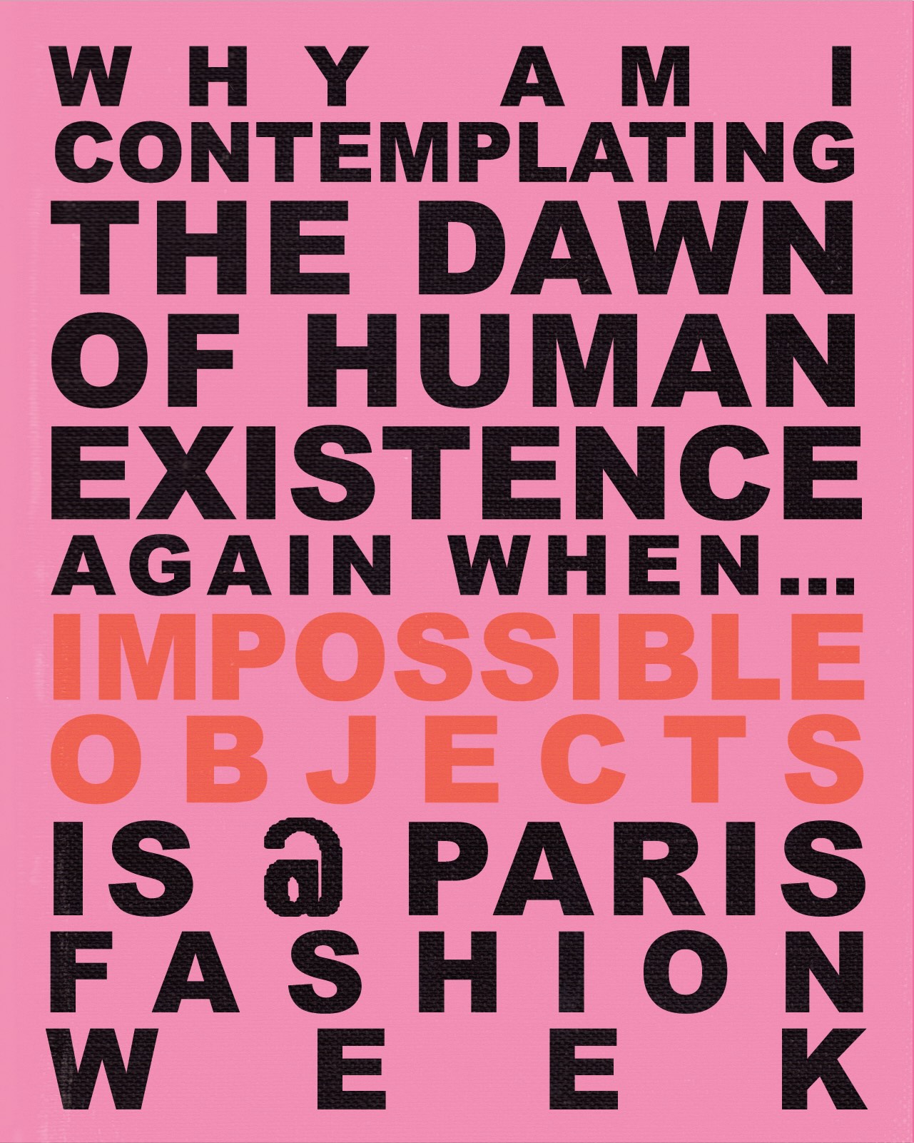
Rather than developing a single logo or stable typographic lockup, I created a modular type system—a kit of parts—that could expand, contract, fracture, and recombine. Letterforms were constructed from interchangeable components, allowing text to behave like a living organism: mutating depending on context, medium, or even mood. Layouts were built without a master grid; instead, they operated on overlapping axes, misalignments, and near-collapse, constantly resisting the urge to resolve.
Each visual element—typography, color, layout, distortion—was treated as a material to be stretched, misused, or glitched. The goal wasn’t to make something broken for the sake of being “edgy,” but to explore how visual breakdowns could speak to deeper questions: What does it mean for fashion to be “collective” in a system that prizes singular branding? How do we represent identities that are fluid, unstable, or still in the process of becoming?
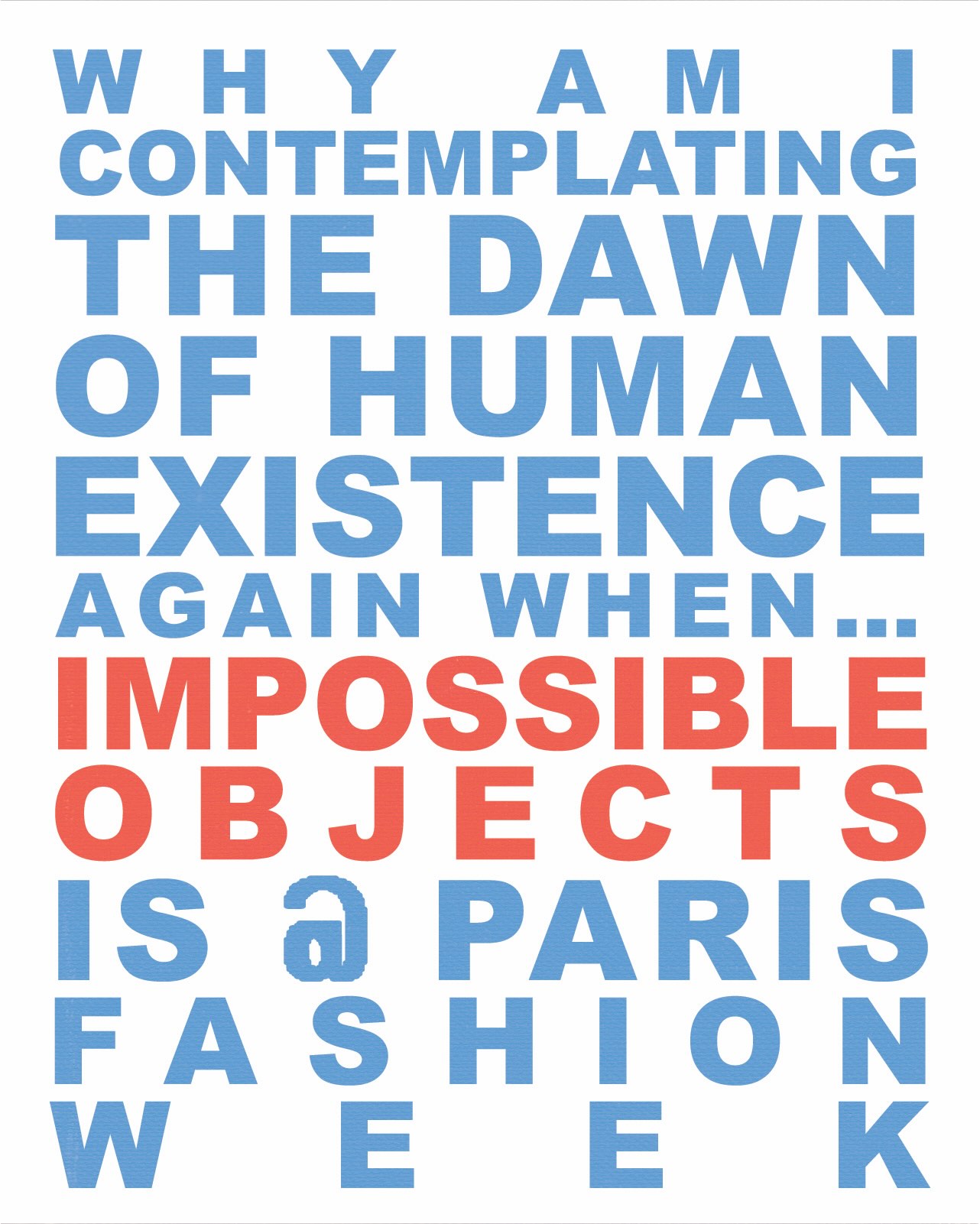
Visually, the work borrows from system aesthetics—those of software errors, corrupted images, fake interfaces, counterfeit goods, and early internet advertising. These references are not nostalgic, but strategic: they point to a world where design tools are both accessible and uncontrollable, where authorship becomes murky, and where surface manipulation is a form of storytelling. The posters, whether seen online or in the streets of Paris, intentionally looped, flickered, and refused to settle. Motion graphics were embedded into the identity not as add-ons, but as intrinsic elements that mimicked the glitches of worn-out files or broken code.
Color choices pushed this sensibility further—sharp contrasts, artificial gradients, and washed-out tones were used not for aesthetic harmony, but for tension. Everything was slightly “off.” Type spilled past margins. Alignments didn’t quite align. Every decision was a controlled departure from standard branding logic.
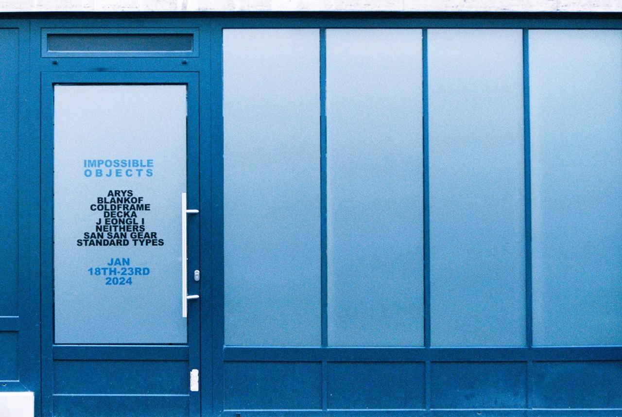
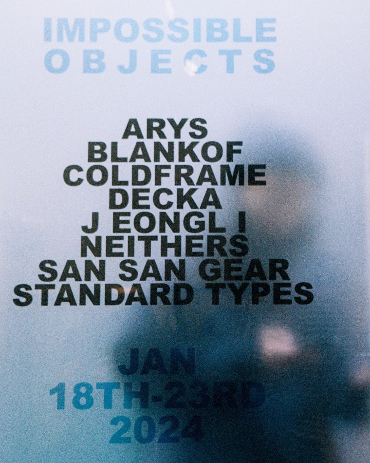
The campaign included a range of outputs: animated digital posters for social media, print collateral pasted on walls and pillars across the Marais, event signage, and a printed lookbook that reassembled the identity into static form. In each instance, the system had to reinvent itself slightly—sometimes more minimal, sometimes hyperactive, but always keeping instability at the core. This was a brand system without a center: non-hierarchical, anti-monolithic, and deliberately impermanent.
Conceptually, the title Impossible Objects refers to visual paradoxes—those Escher-like forms that cannot exist in physical space. But it also speaks to the nature of the collective: a group that resists branding in the conventional sense. In an industry obsessed with “personal brands” and “signature aesthetics,” this project tried to suggest a counter-image: a swarm rather than a symbol. Something unstable by design.
From a design process standpoint, the project evolved iteratively. I began by researching forms of glitch aesthetics, modular typography, and unstable design systems. Early prototypes involved breaking down type structures and running them through various forms of interference—compression artifacts, illegible filters, and generative distortions. I tested how much a visual could be degraded before it lost its communicative power, and what kinds of “mistakes” might actually open new aesthetic space.
At the same time, I was thinking about influence: how counterfeit and imitation culture, especially in fashion, reshapes our understanding of authenticity. I was interested in knock-off logos, pirated software, fake interfaces—things that pretend to be something else, and in that pretending, become something new. These references bled into the final system, not as direct quotations, but as a kind of logic: the identity itself would behave like a fake—it would imitate being a system, while constantly undermining itself.
There’s also a political undercurrent to the work. While this project functioned within the fashion week ecosystem, it quietly critiqued the industry’s obsession with coherence, polish, and exclusivity. Instead of presenting fashion as a perfected surface, this campaign suggested that disorder, flux, and even failure might be more honest expressions of how things are made—and unmade—in real time.
Impossible Objects sits somewhere between design and fiction, system and anti-system. It resists the kind of seamless “branding” that often flattens the chaos of collaboration. It is not clean, but not purely chaotic either—it’s a negotiation. And perhaps most importantly, it is temporary. Like the pop-up itself, it was never meant to last. But that doesn’t make it any less real.
In the end, this project was about translation: translating collective energy into a visual field that could shift, mutate, and contradict itself. A brand that doesn’t brand. A voice made of many voices. A system that breaks open, then rebuilds itself from the cracks.
CREDIT
- Agency/Creative: The Real Travel Agency
- Article Title: The Real Travel Agency Designs a Shape-Shifting Identity for Impossible Objects
- Organisation/Entity: Freelance
- Project Type: Graphic
- Project Status: Published
- Agency/Creative Country: United States
- Agency/Creative City: BROOKLYN
- Market Region: Europe
- Project Deliverables: 2D Design
- Industry: Fashion
- Keywords: Pop-up/FashionWeek/Graphic Design/Poster Design
-
Credits:
Graphic Designer: Chenguang Deng
Strategist: Leah Coulter
Strategist: Kimberly Baldo
Creative Director: Zack Cohen
Creative Director: Mac Shafer


