


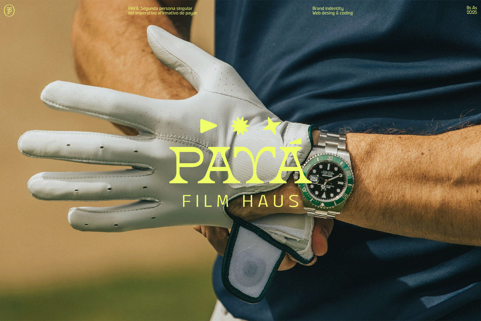
Payá: Aligning Vision and Perception in Audiovisual Storytelling
Crafting a brand identity that truly resonates requires a delicate balance. For Payá, an audiovisual studio, the challenge was to translate their unique approach – filming as if improvising a payada, with technique, a sharp ear, and a nomadic spirit – into a cohesive visual language. How do you represent a duo that captures sailing regattas and golf tournaments, while also documenting architecture, gastronomy, and cultural heritage? And how do you convey that balance between territory and sophistication without seeming either folkloric or overly aspirational?
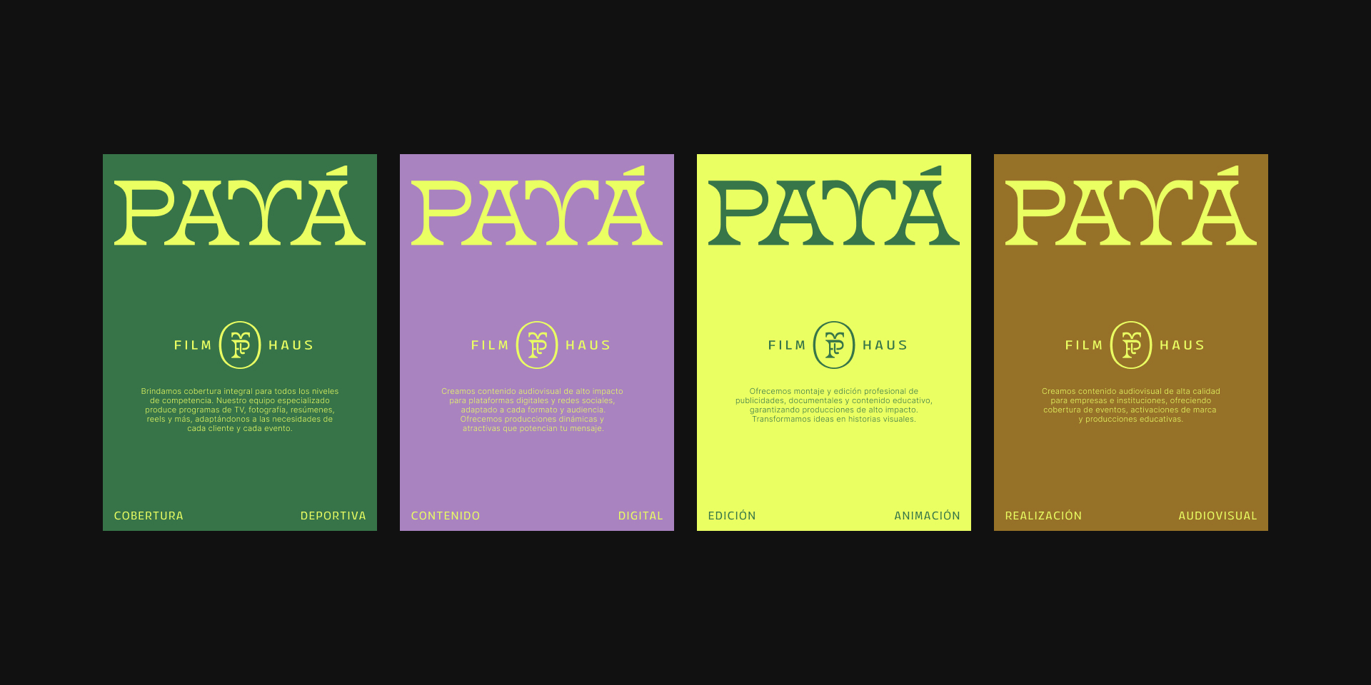
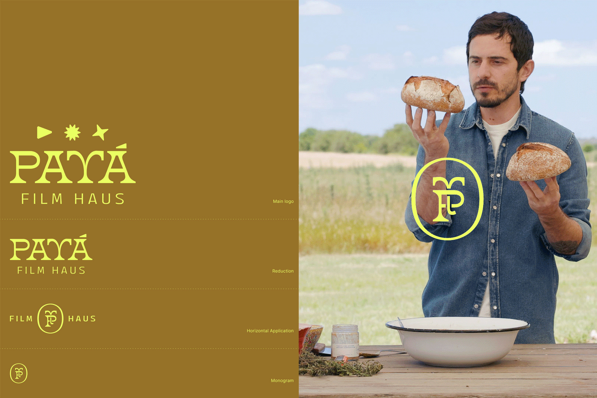
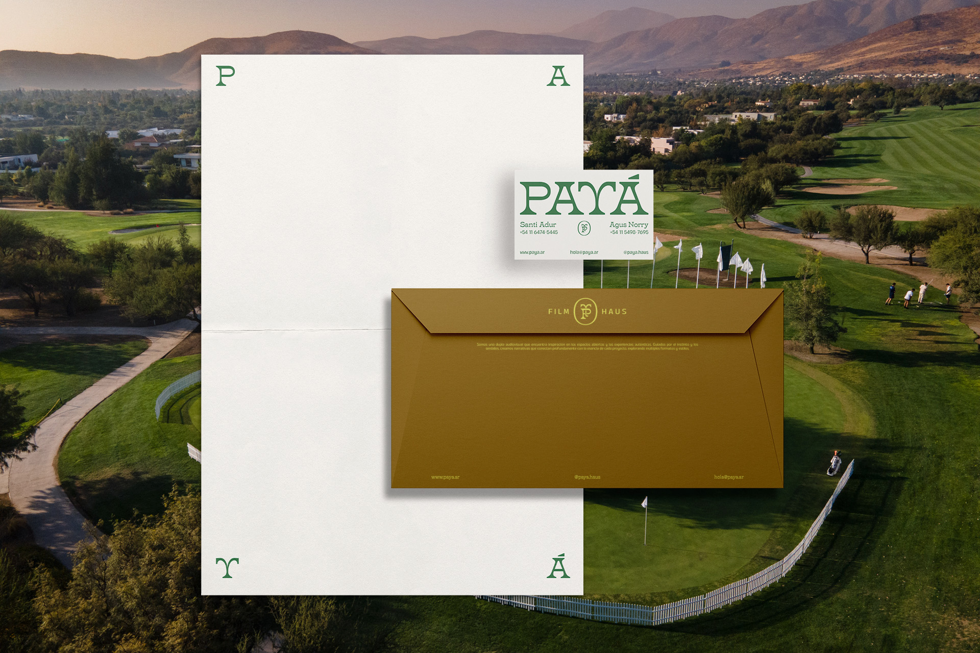
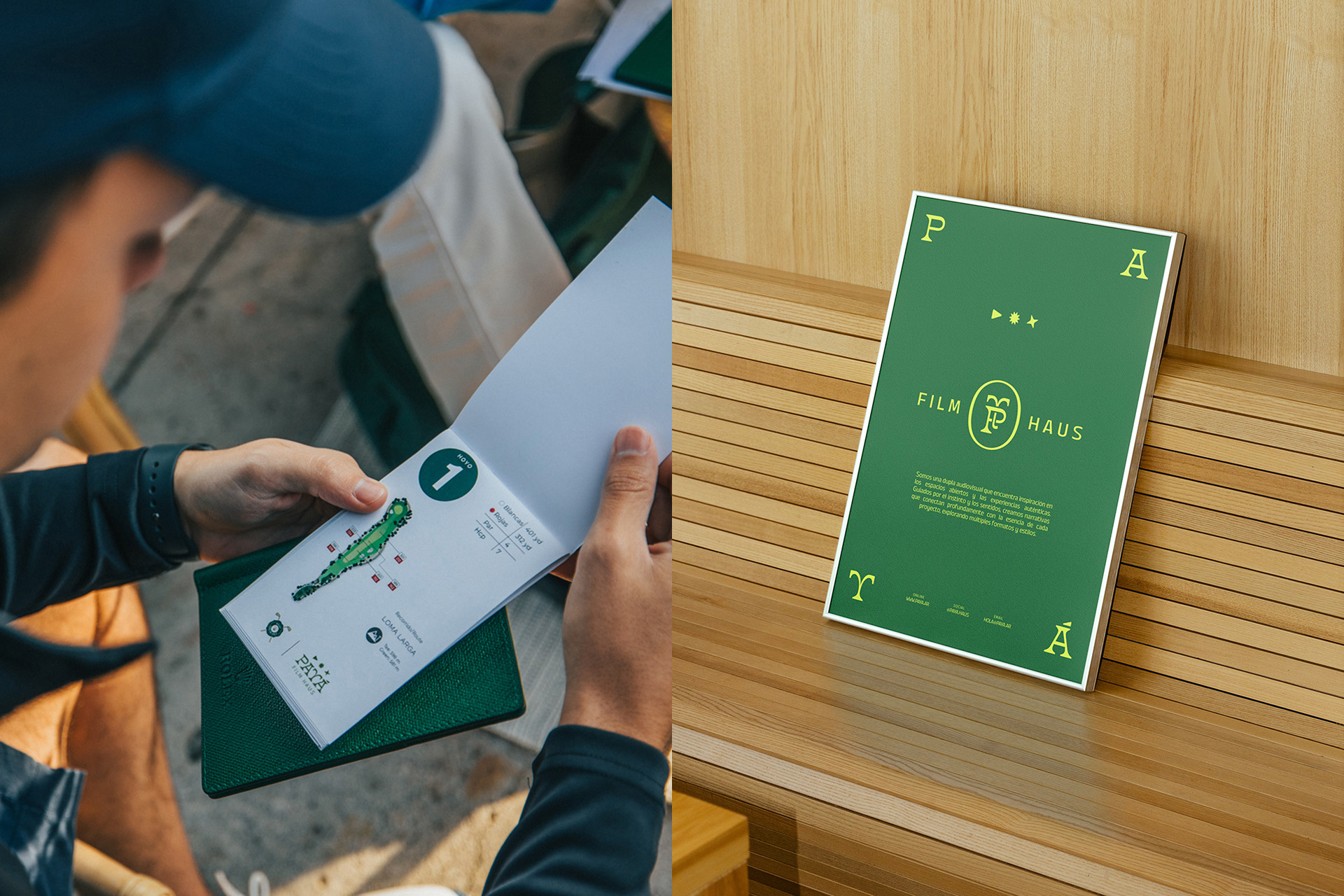
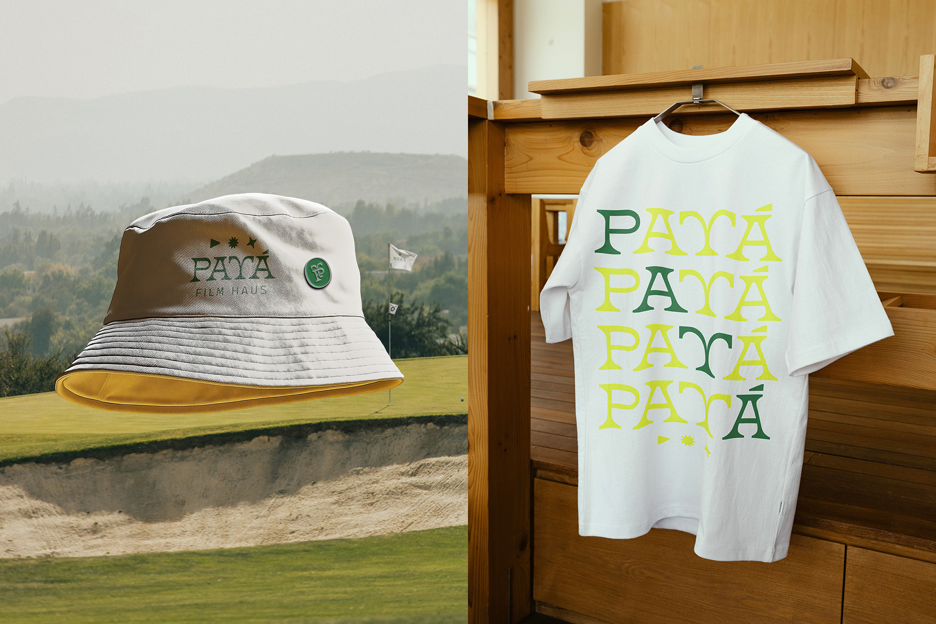
Payá is not just another production company. They produce imagery under open skies, with cameras moving through premium events, yet their roots are deeply rioplatense. We created an identity that sought to bridge this duality, translating their vision into a brand that balances the classic and the popular, luxury and the land, and sustains it with visual coherence.
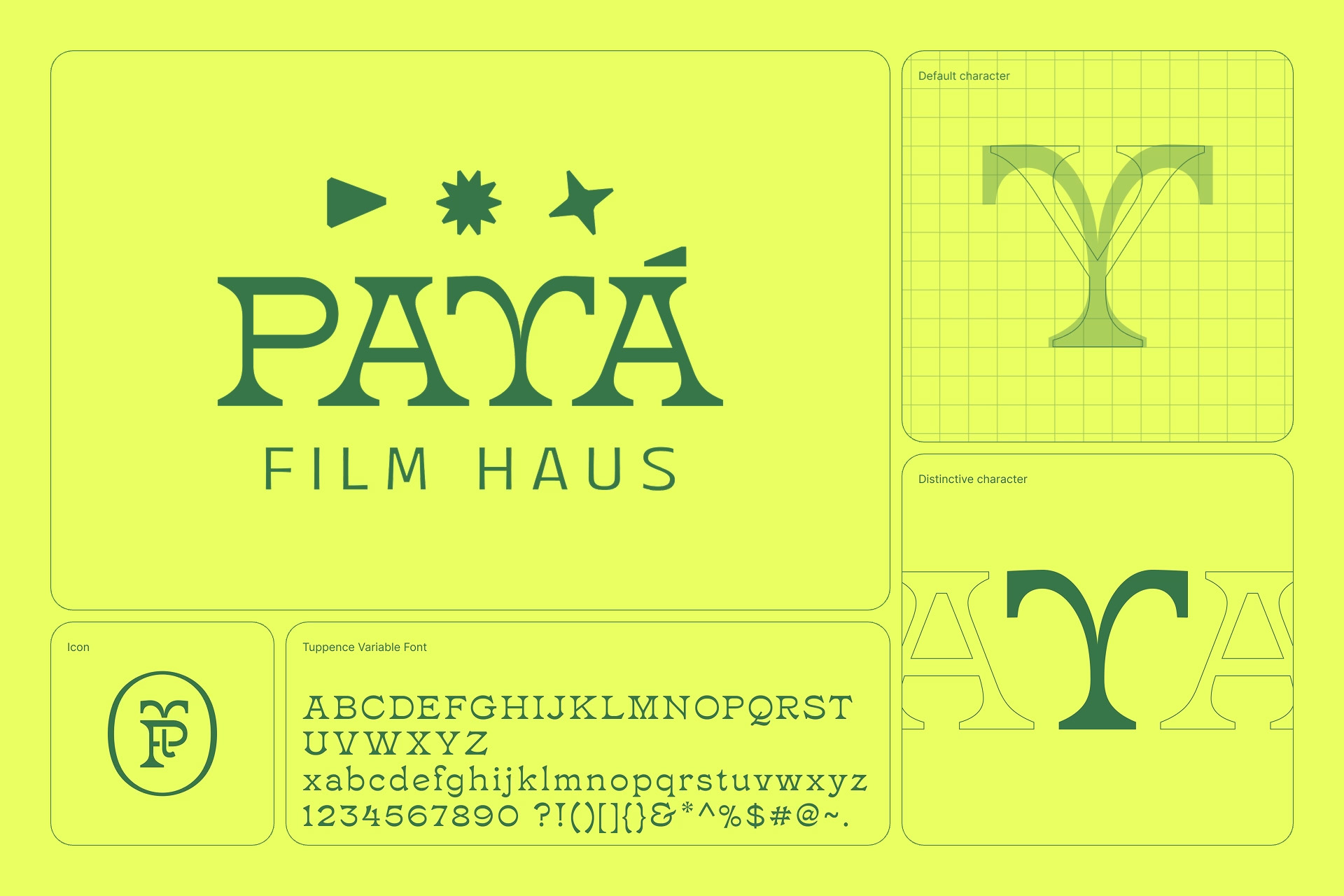
A System Built on Concept and Refinement
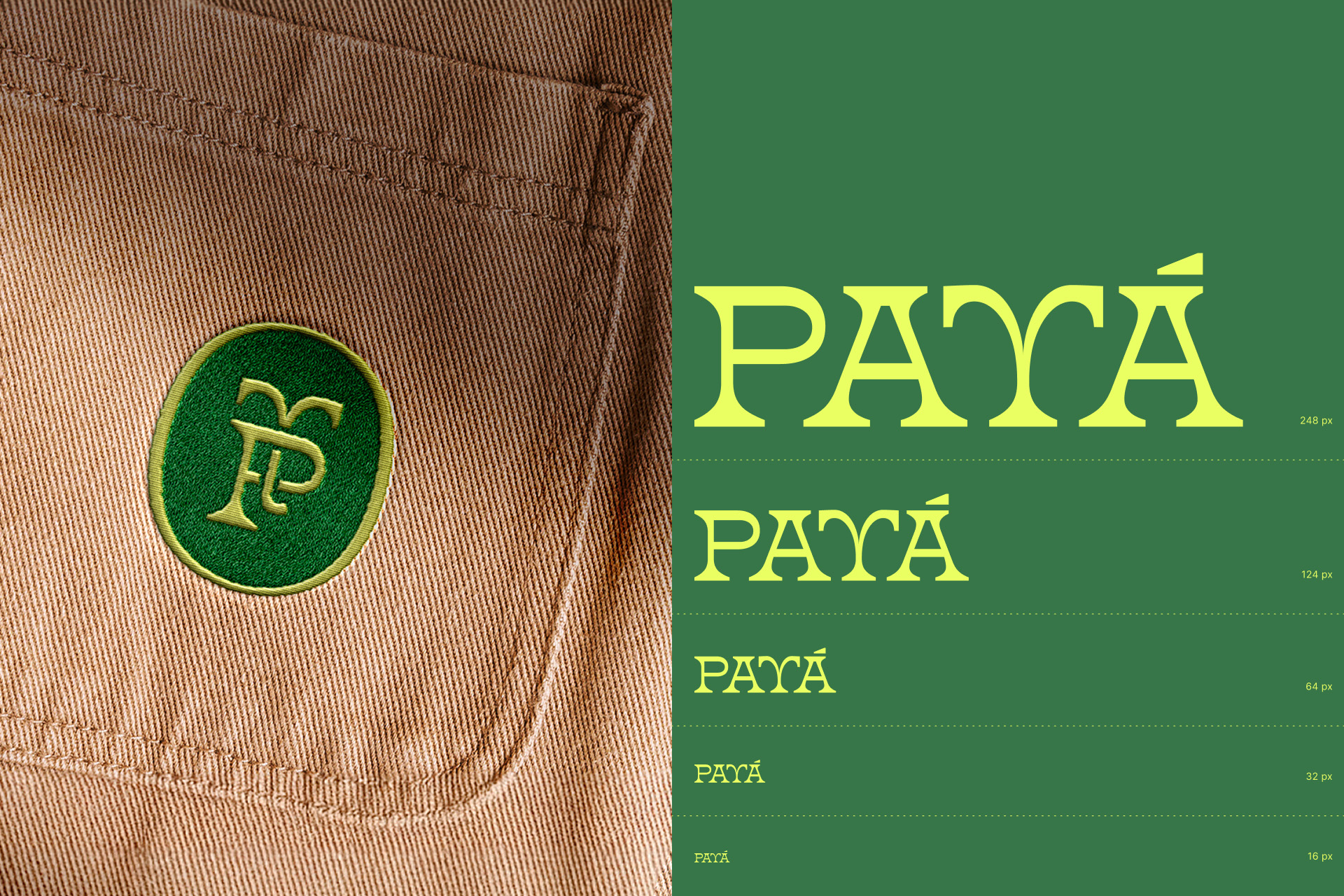
The name Payá comes from the payada, and we drew from golf’s visual language to build their graphic world – reinterpreting it with warmth and closeness. This conceptual insight allowed us to create a sober, adaptable, and refined aesthetic. This is a brand that doesn’t aim to look luxurious, but rather refined in its authenticity. At Tricota, our goal was to deliver a system that allows them to grow solidly and express themselves clearly, not just a logo.
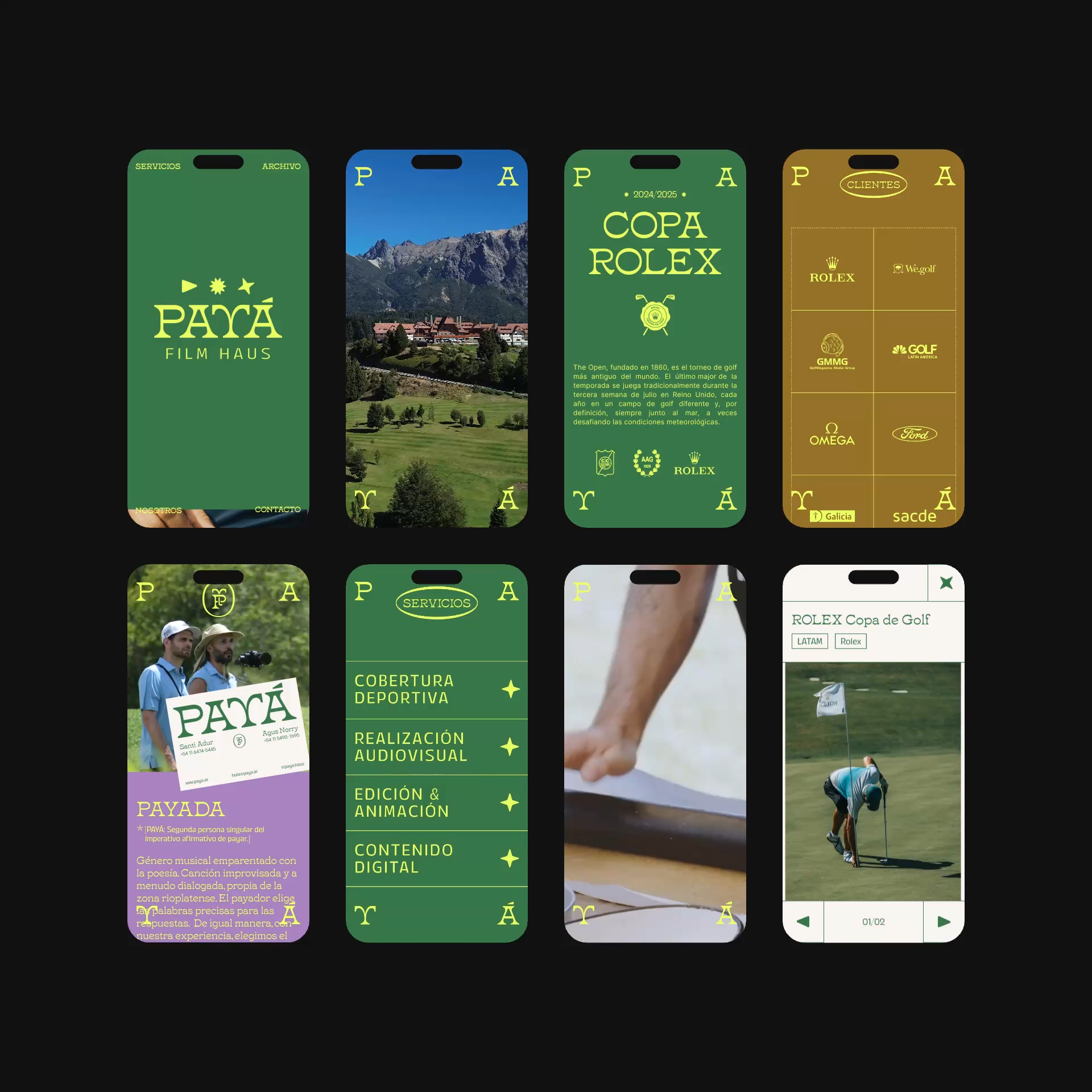
Alongside the visual identity, we designed their portfolio website. The main challenge was to create a navigation experience that clearly communicates the diverse fields Payá works in – offering multiple entry points to the same content while maintaining a seamless and intuitive flow. The website organizes its portfolio in a clear, navigable, and segmented way by type of work, allowing multiple readings of the same content.
Ultimately, the identity for Payá is about aligning vision and perception, creating a cohesive brand that authentically represents their unique blend of premium event documentation and profound cultural connection.
CREDIT
- Agency/Creative: Tricota Design
- Article Title: Tricota Design Builds Paya’s Brand Around Territory, Movement, and Sophistication
- Organisation/Entity: Agency
- Project Type: Identity
- Project Status: Published
- Agency/Creative Country: Argentina
- Agency/Creative City: Buenos Aires
- Market Region: South America
- Project Deliverables: Brand Design, Brand Guidelines, Brand Identity, Brand Strategy, Brand Tone of Voice, Branding, GIF Animation, Icon Design, Identity System, Logo Design, Type Design, Typography, Web Design
- Industry: Professional Services
- Keywords: latin, roots, folklore, club, sophisticated, outdoor
-
Credits:
Project Lead: Ezequiel Norry
Branding Lead: Juan Pablo Bustos Peralta
Product Lead: Francisco Negri


