


When we were approached to craft the branding for Rise Engineering, we immediately recognized the depth of expertise and vision embedded in the company’s ethos. Founded in 2020, Rise Engineering is more than just a collective of seasoned professionals—it’s a convergence of passion, precision, and purpose. With a diverse portfolio of services ranging from master planning and interior design to engineering and architectural solutions, the firm’s ambition is to not only meet expectations but to consistently exceed them. Our role as branding specialists was to translate that philosophy into a visual identity system that would elevate their reputation and communicate their capabilities with clarity and confidence.
The branding process began with an in-depth discovery phase, where we immersed ourselves in the world of Rise. Through conversations with the founders and key stakeholders, we uncovered the company’s motivations, values, target markets, and aspirations. What stood out was their commitment to excellence, their collaborative spirit, and their drive to solve complex challenges through elegant and technically sound solutions. This understanding shaped every decision we made throughout the branding journey.
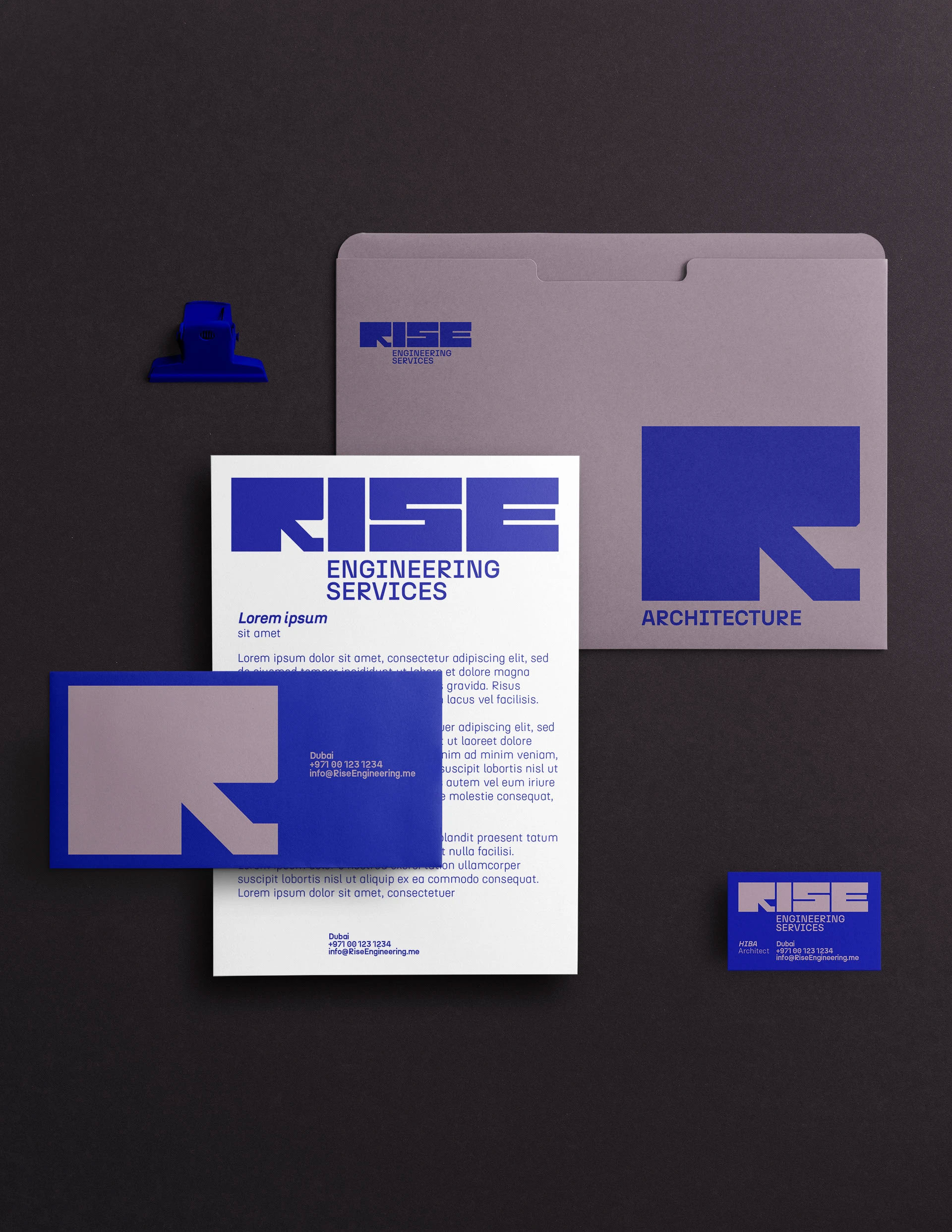
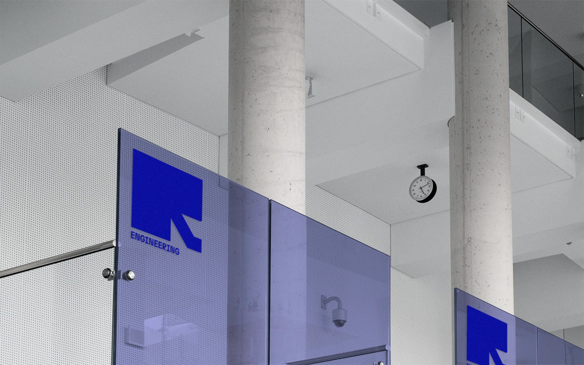
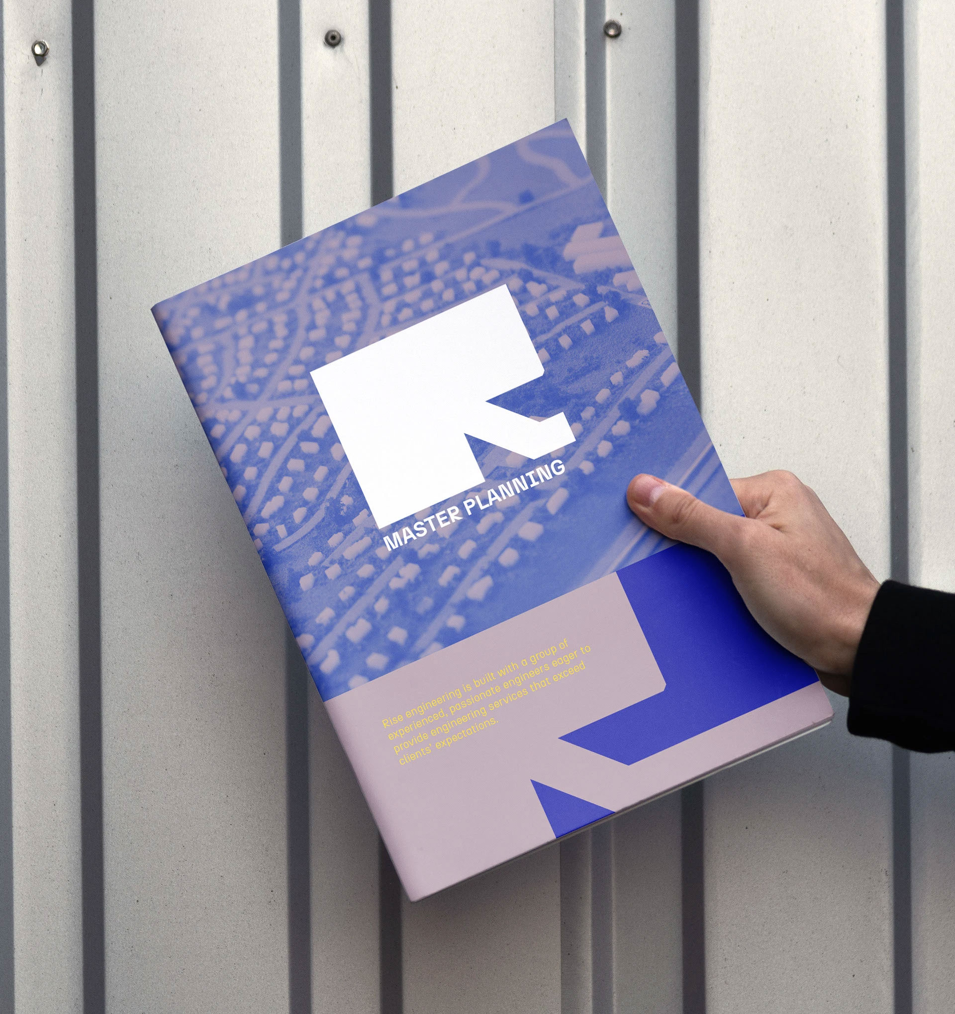
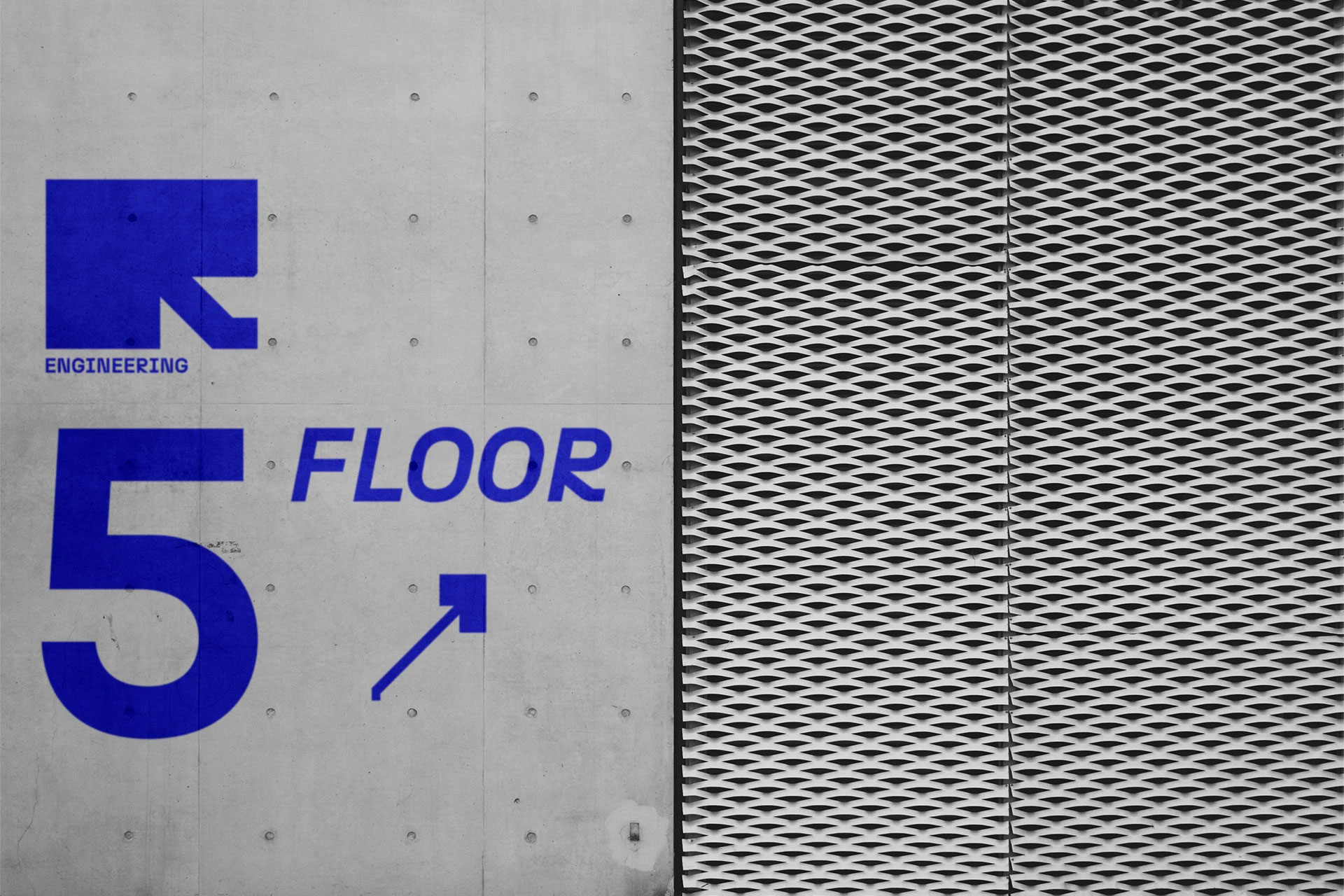
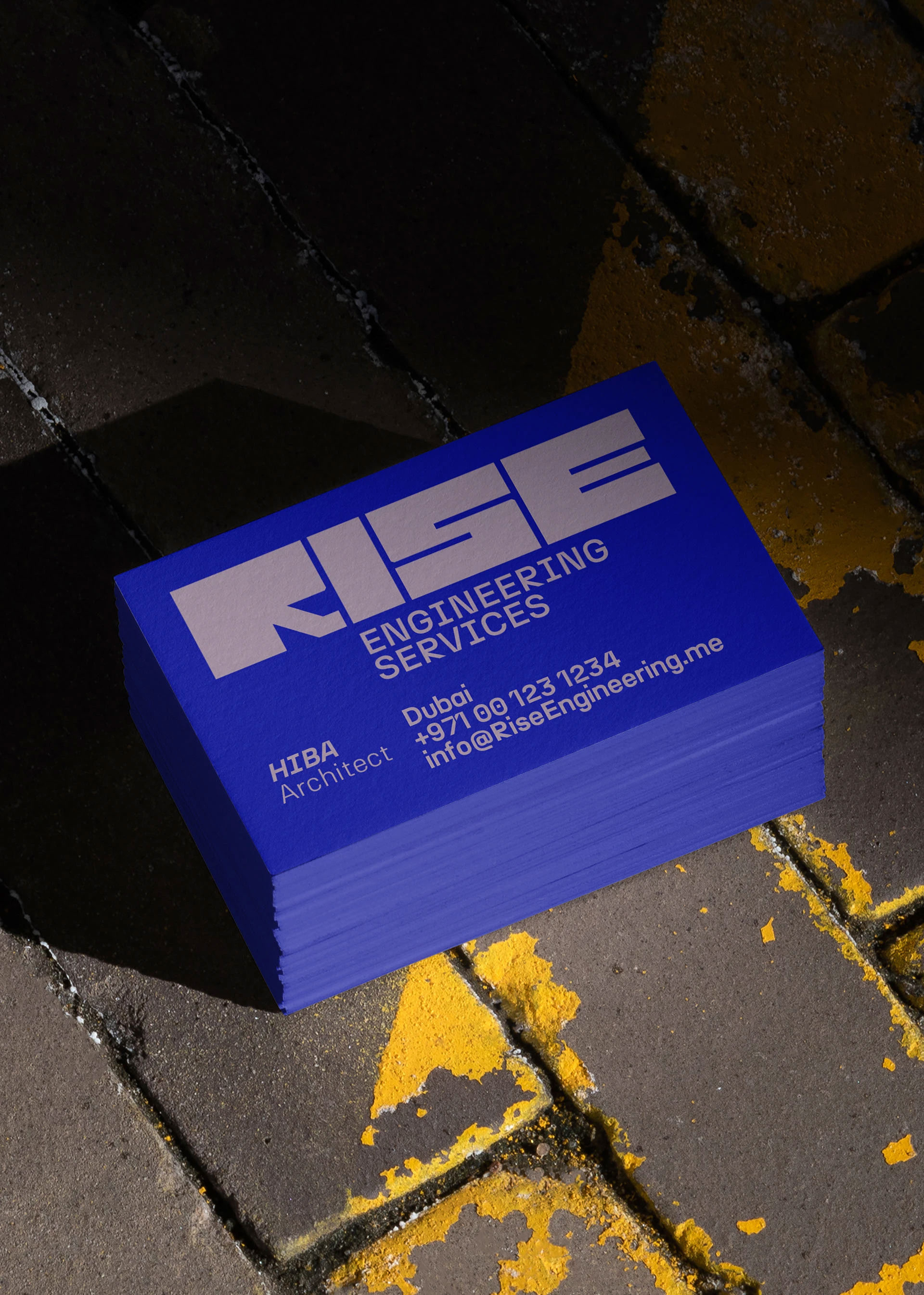
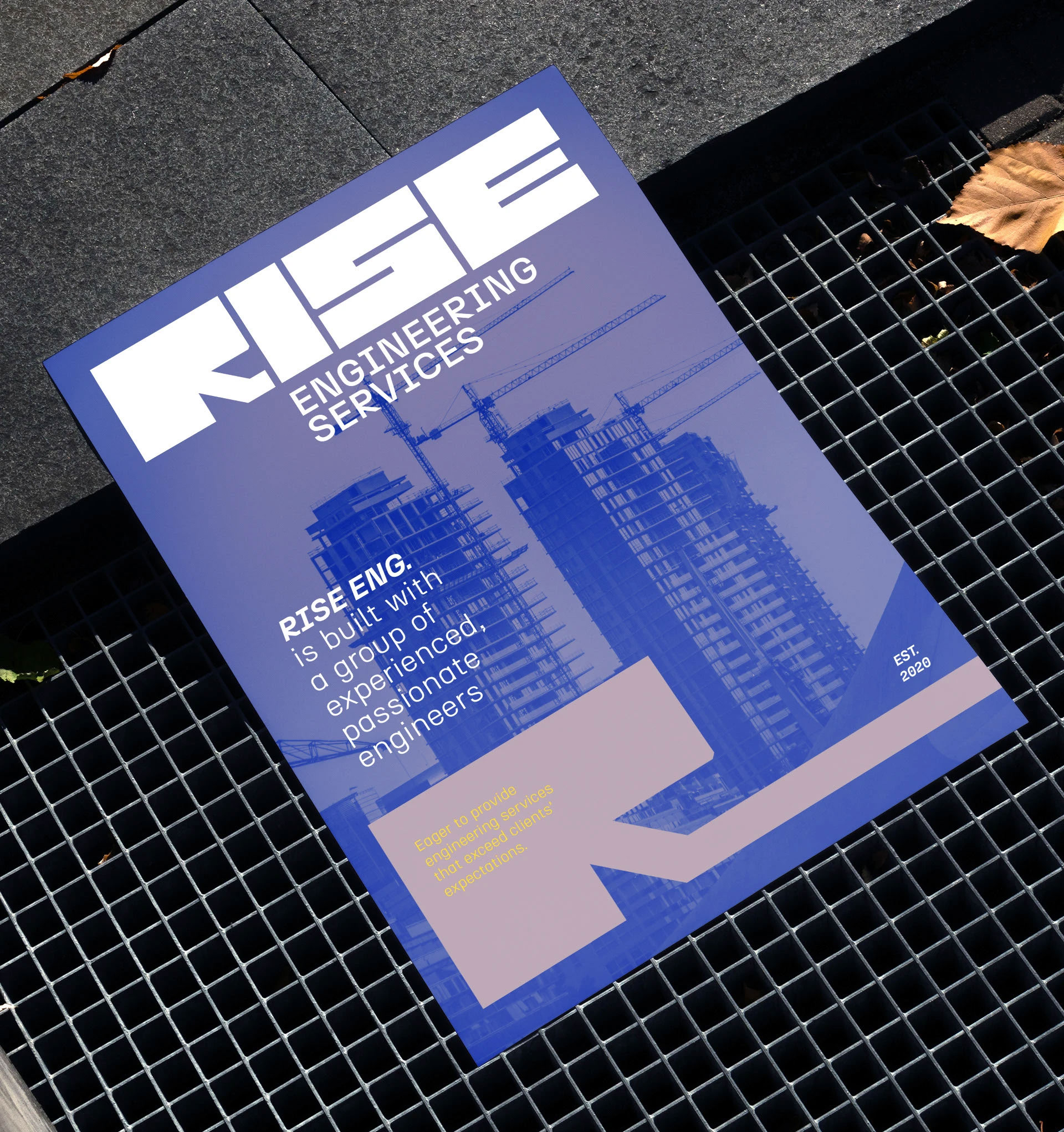
Visually, we needed to balance innovation with reliability. The Rise logo, which you see above, was designed to evoke strength, modernity, and upward momentum—echoing the very name of the firm. The geometric forms and bold typography speak to the technical precision and systematic approach of engineers and architects, while the slight forward-leaning stance in the letterforms gives it an energy that suggests progress and forward-thinking. The custom-cut “R” in the logo adds a dynamic feel, capturing the idea of building or shaping—a fitting metaphor for what Rise does for its clients.
Color played a vital role in our system. The deep, electric blue background connotes trust, stability, and professionalism, while the muted metallic mauve of the logotype conveys sophistication and a distinct break from the overly common color palettes seen in the industry. This duality of solid foundation and refined creativity mirrors the company’s engineering rigor and design sensitivity. We extended this palette across collateral and digital assets, maintaining consistency while allowing room for flexibility depending on the context—whether technical documents, proposal decks, or project signage.
Typography was another area where we were meticulous. We paired the bold, customized logotype with a clean, modern sans-serif font family for all brand communications. This ensured legibility while reinforcing the brand’s contemporary tone. In application, we established a typographic hierarchy that could adapt across platforms—everything from CAD presentation templates to architectural project reports and social media visuals. The result was a brand that could maintain a strong, coherent voice whether speaking to government clients, commercial developers, or peer firms.
Beyond the visual identity, we worked closely with Rise Engineering to craft their brand narrative. Their tagline, “Engineering Possibility,” was developed to succinctly capture the aspirational core of the brand. It’s not just about buildings or systems; it’s about enabling innovation, shaping the future, and creating spaces and infrastructures that empower people. This line became a foundational piece across all touchpoints—from brochures and web copy to environmental graphics in their headquarters.
In hindsight, what made this project so successful was the synergy between our team and the leadership at Rise Engineering. They were open to bold ideas, trusting in the process while offering insightful feedback. That mutual respect and collaboration allowed us to create a brand that not only represents who they are today but can also grow with them as they expand their reach and impact. Rise Engineering is now well-positioned in the market as a forward-thinking, client-centric firm—one that embodies technical excellence with a human touch. The brand we built isn’t just a logo or a color scheme; it’s a complete language that captures the essence of a company built on ambition, intelligence, and the desire to elevate the built environment.
CREDIT
- Agency/Creative: Ziad Al Halabi
- Article Title: Rise Engineering Unveils a Strategic Visual System by Ziad Al Halabi
- Organisation/Entity: Freelance
- Project Type: Identity
- Project Status: Published
- Agency/Creative Country: United Arab Emirates
- Agency/Creative City: Ziad Al Halabi
- Market Region: Middle East
- Project Deliverables: Brand Design, Brand Identity, Branding, Logo Design
- Industry: Construction
- Keywords: Ziad Al Halabi, RISE Engineering, زياد الحلبي, Freelance Branding, Syria, Branding, Graphic Design, Logo
-
Credits:
Creative Art Director, Graphic Designer: Ziad Al Halabi


