


Self Image Labs is a personal development brand rooted in intentional self-transformation. The intended audience is women who strongly desire meaning, empowerment, and clarity. They value depth, honesty, transparency, and realness.
We were tasked with building a complete visual communication system, with the goal of shaping a brand that feels simultaneously modern and bold, yet trustworthy and elegant. The goal was to create a distinct visual identity that would communicate clarity, confidence, and authority without being cold. It was also important that the end product be clean and sophisticated, but allow space for expressiveness. All of this was the foundation we built the visuals – combining neutral tones with sharp blue accents, spacious layouts with strong typographic presence, and editorial elegance with digital functionality.
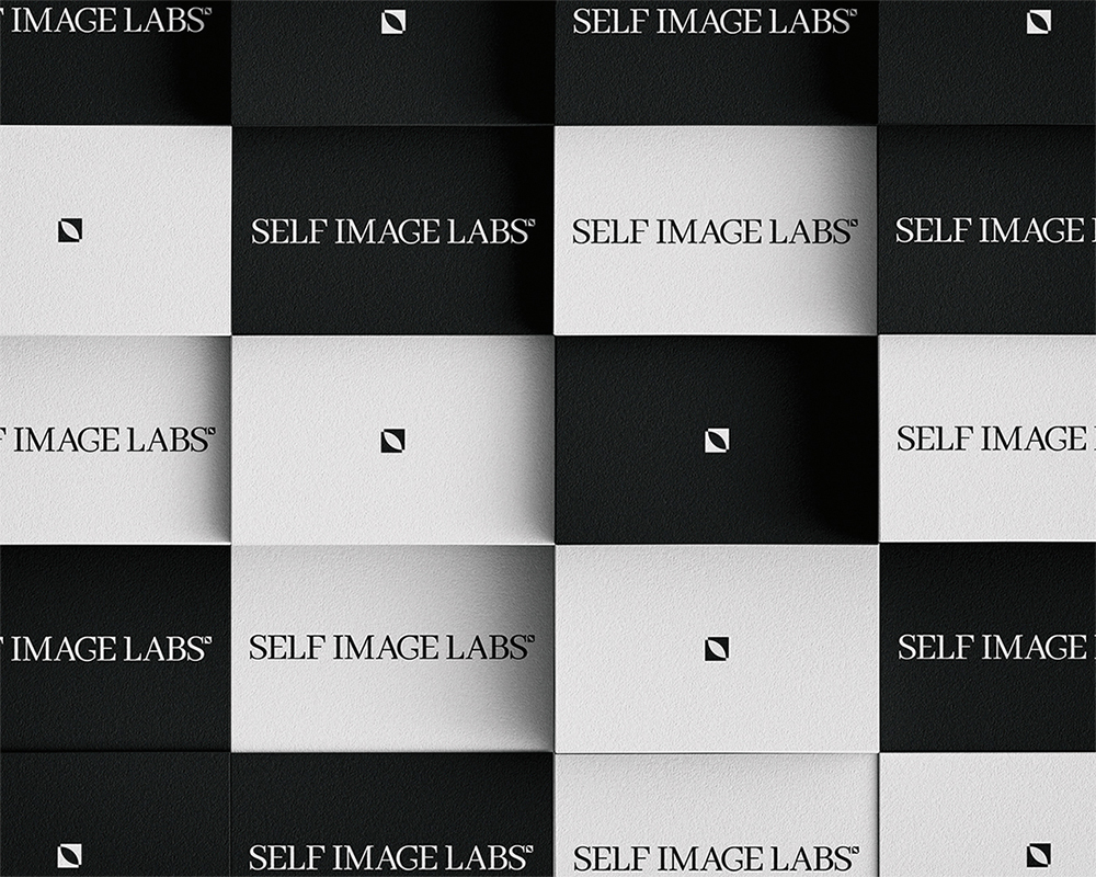
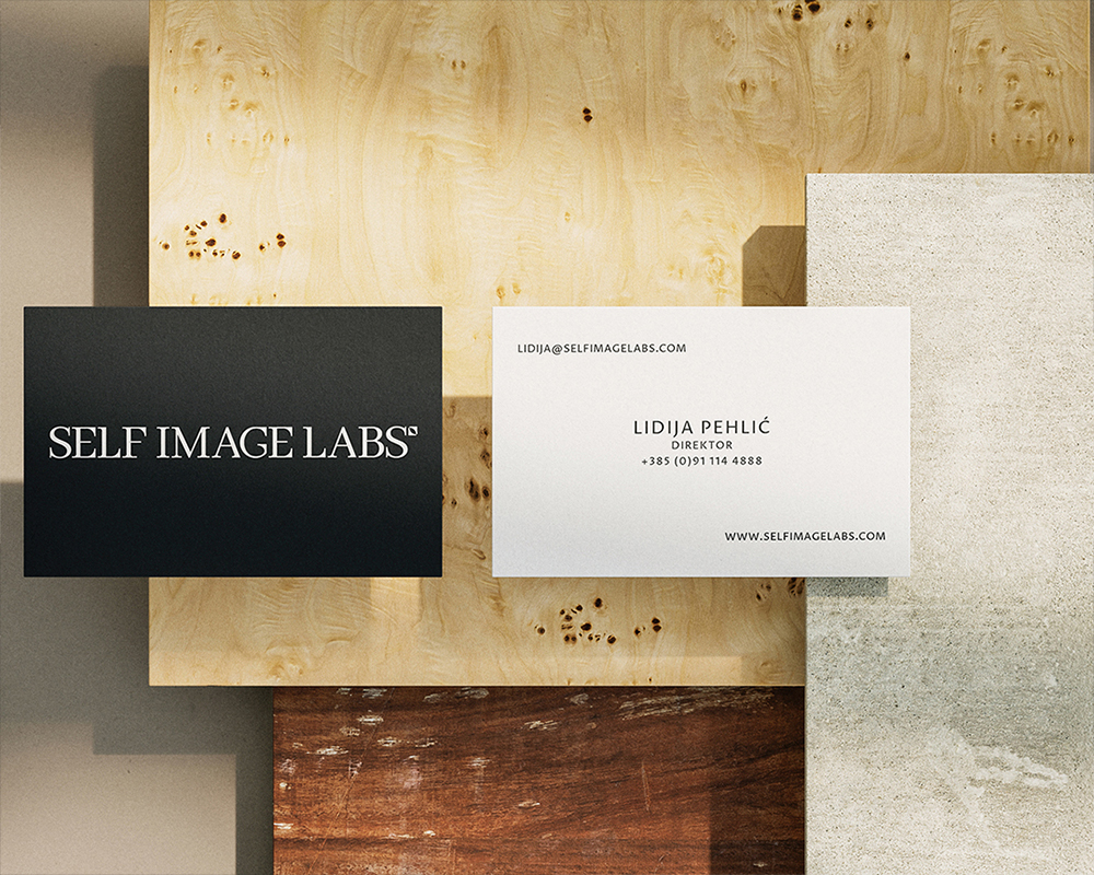
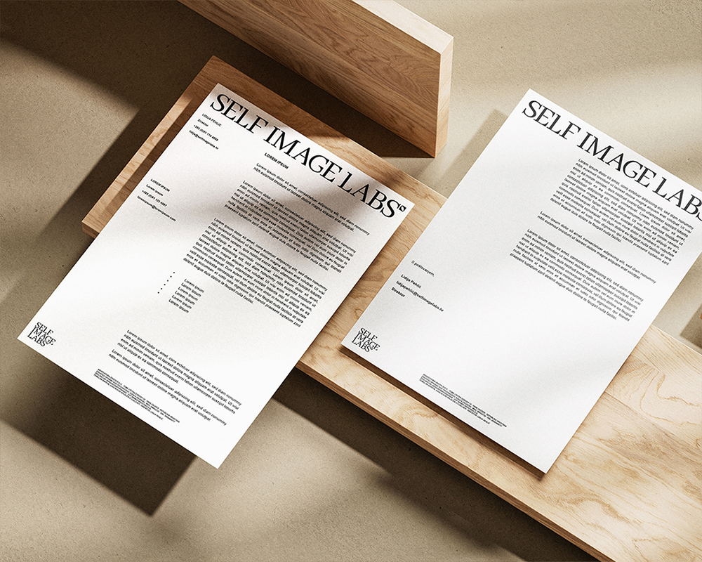
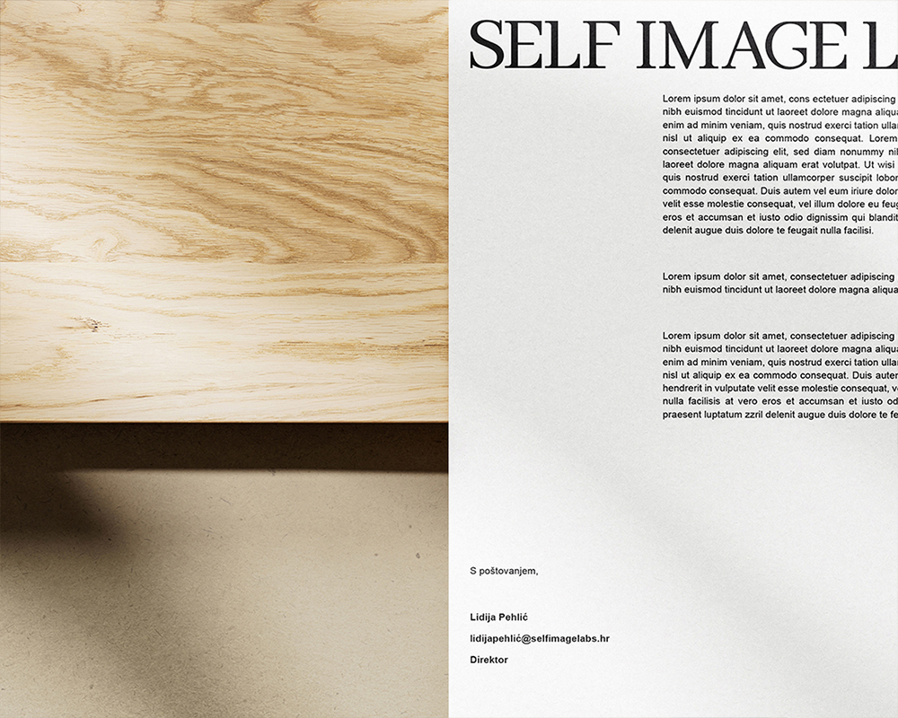
The logotype is minimal yet confident, designed to function in different digital and print environments. It is supported by a typographic system that pairs a classic serif (used in headlines and emotionally driven content) with a clean sans-serif for readability and structure. This duality mirrors the brand’s tone.
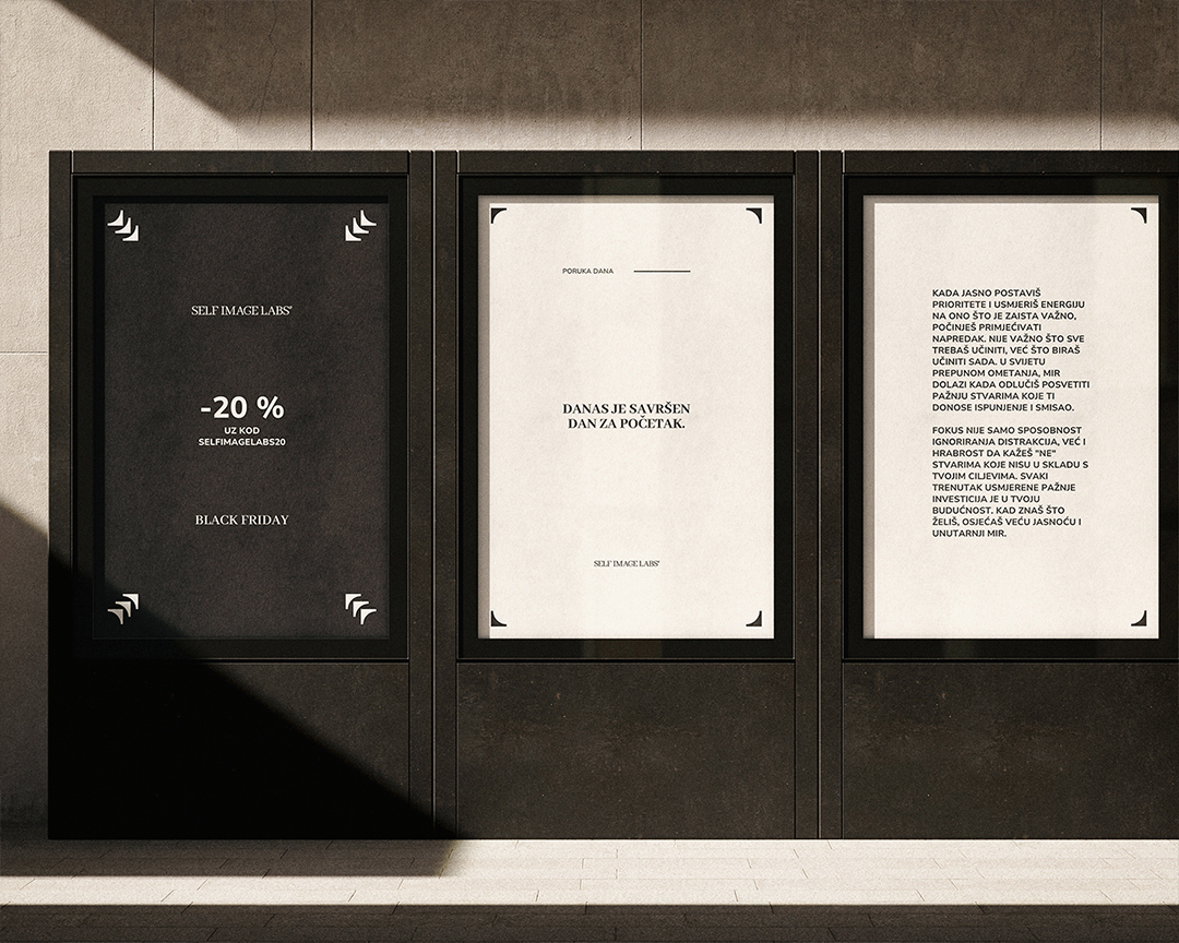
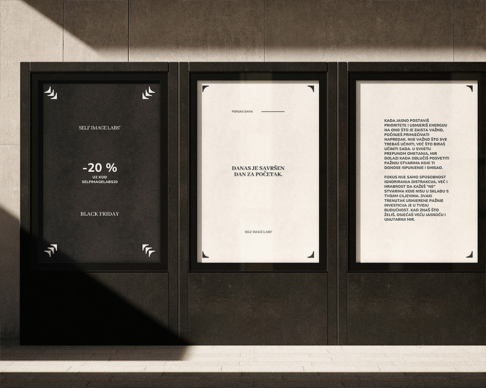
The color palette is calm and contemporary—built with a soft off-white, deep charcoal, and a muted but lively blue tone. These colors support a sense of calm professionalism while allowing room for bolder moments when needed. We also established clear spacing rules and visual rhythm for all aspects of use. The consistent margins, alignments, and white space ensure that every piece of content feels intentional and connected to one another.
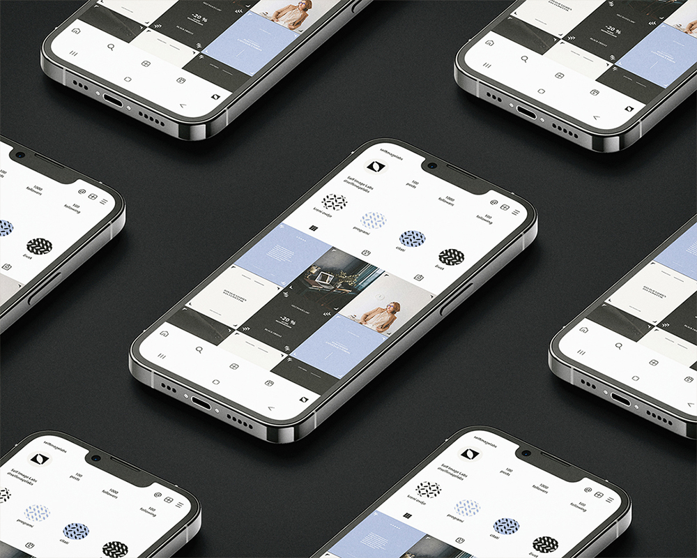
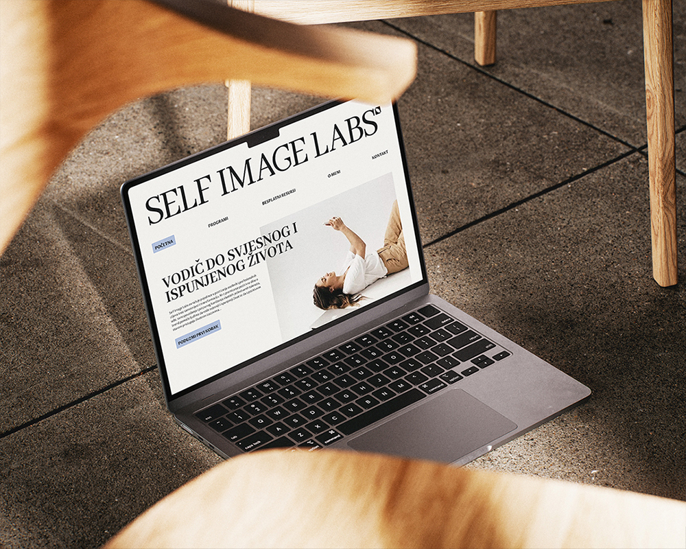
A major component of the project was the creation of a modular social media template system. The design templates are developed to accommodate multiple types of content: personal storytelling, program announcements, educational quotes, customer reviews, and interactive calls to action. Each template follows typographic hierarchy and visual rules but allows enough flexibility for a variety of content and future brand evolution. Additionally, even though we did not develop the website, we designed initial mockups and layout guidelines with a clear direction for the developers. It was important that the website feel connected to other digital and print formats.
Every design choice of this project supports the user’s emotional journey. There’s a quiet confidence in the visuals—never overwhelming and always cohesive. The clean visuals leave space for the content, ensuring the messages are clear and in focus. The overall perception is a brand that feels stable, peaceful, confident, contemporary and fearless. Self Image Labs now has a design identity ready to support its digital growth, product expansion, and long-term community building.


CREDIT
- Agency/Creative: Nikola Mišel Puklin
- Article Title: Nikola Mišel Puklin Shapes a Confident Visual Identity for Self Image Labs
- Organisation/Entity: Freelance
- Project Type: Identity
- Project Status: Published
- Agency/Creative Country: Croatia
- Agency/Creative City: Zagreb
- Market Region: Europe
- Project Deliverables: 3D Design, 3D Modelling, 3D Motion, Animation, Art, Art Direction, Brand Architecture, Brand Creation, Brand Design, Brand Experience, Brand Guidelines, Brand Identity, Brand Mark, Brand Strategy, Brand Tone of Voice, Brand World, Branding, Copywriting, Creative Direction, Design, Editing, Editorial Design, GIF Animation, Graphic Design, Icon Design, Identity System, Logo Design, Motion Graphics, Pattern Design, Photography, Photography Styling, Poster Design, Typography, User Experience, User Interaction, Visual Effects, Visualisation, Web Design
- Industry: Professional Services
- Keywords: WBDS Creative Design Awards 2025/26 , brand identity, graphic design, identity, brand system, logo, visual identity, art direction
-
Credits:
Multidisciplinary designer & artist: Nikola Mišel Puklin
Graphic designer: Dora Bosner


