


In response to invaluable insights gathered from both retailers and consumers, Sxollie is taking a bold and exciting step forward to rejuvenate its brand as it gears up for a promising new phase of growth. The task at hand is to conceptualize a striking new 4-pack design that highlights the brand’s premium qualities and aligns seamlessly with the evolving trends in retail and consumer preferences. This initiative will refresh the brand’s visual identity, allowing it to communicate clearly and precisely across all customer touchpoints.
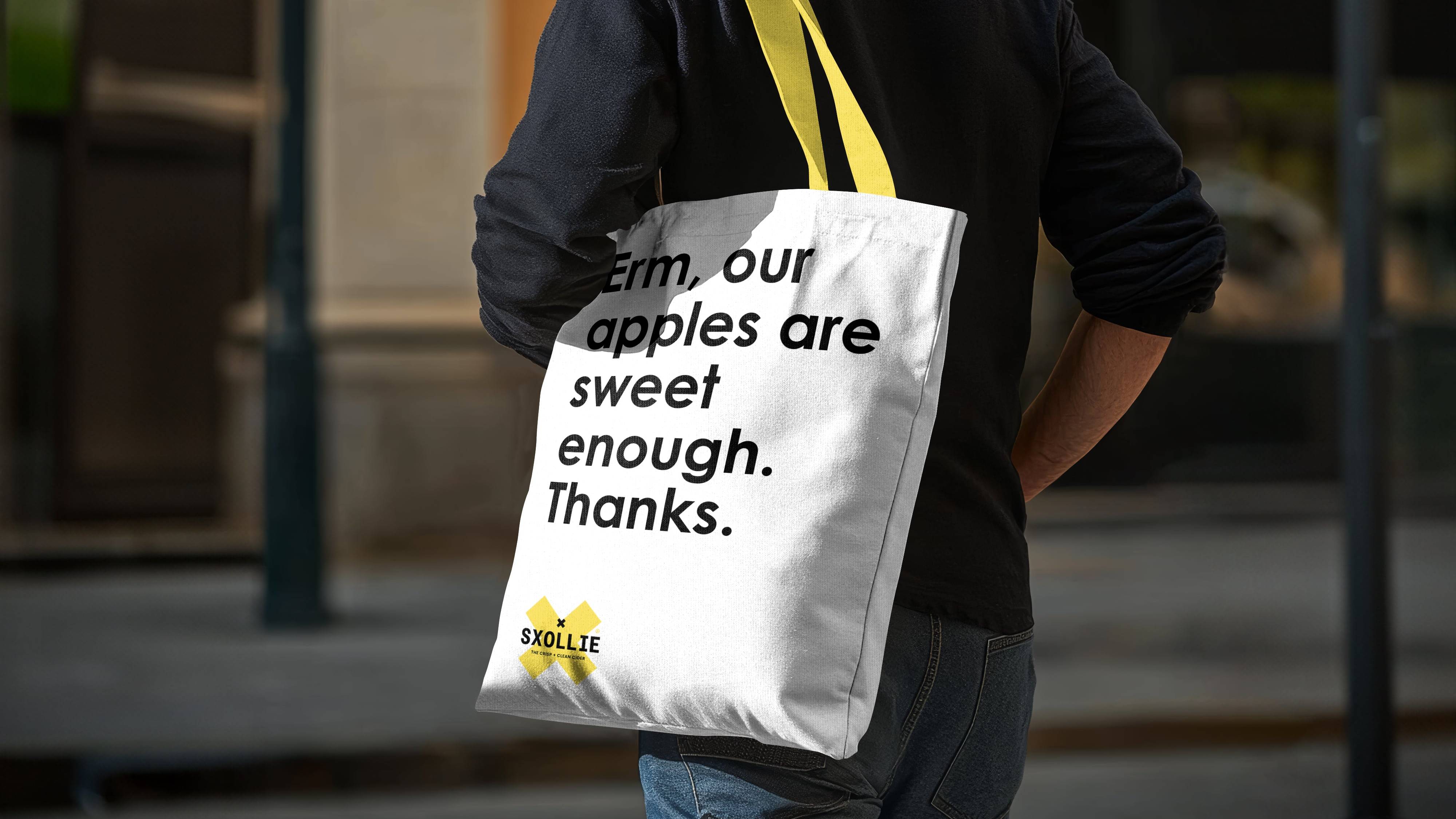
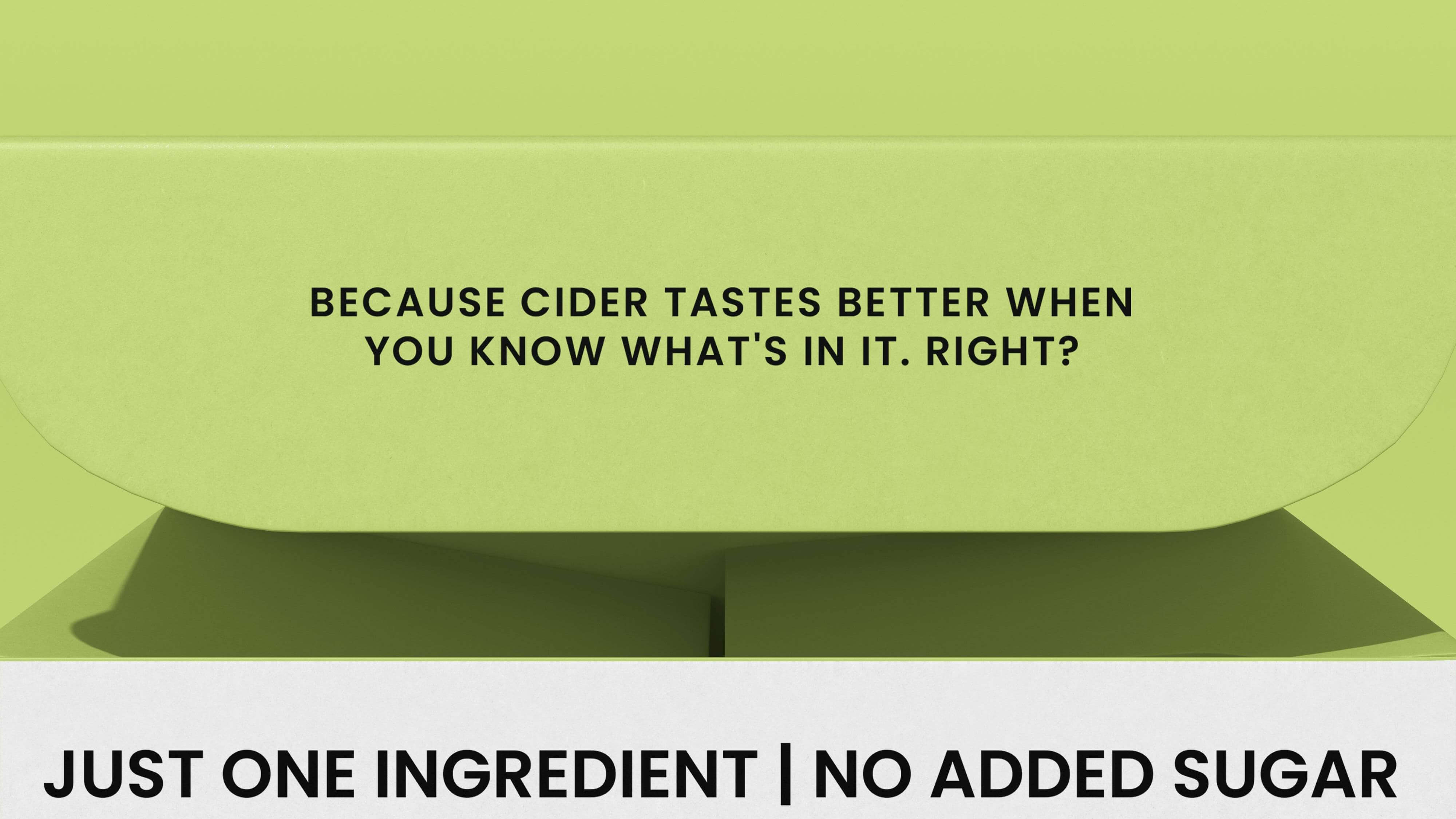
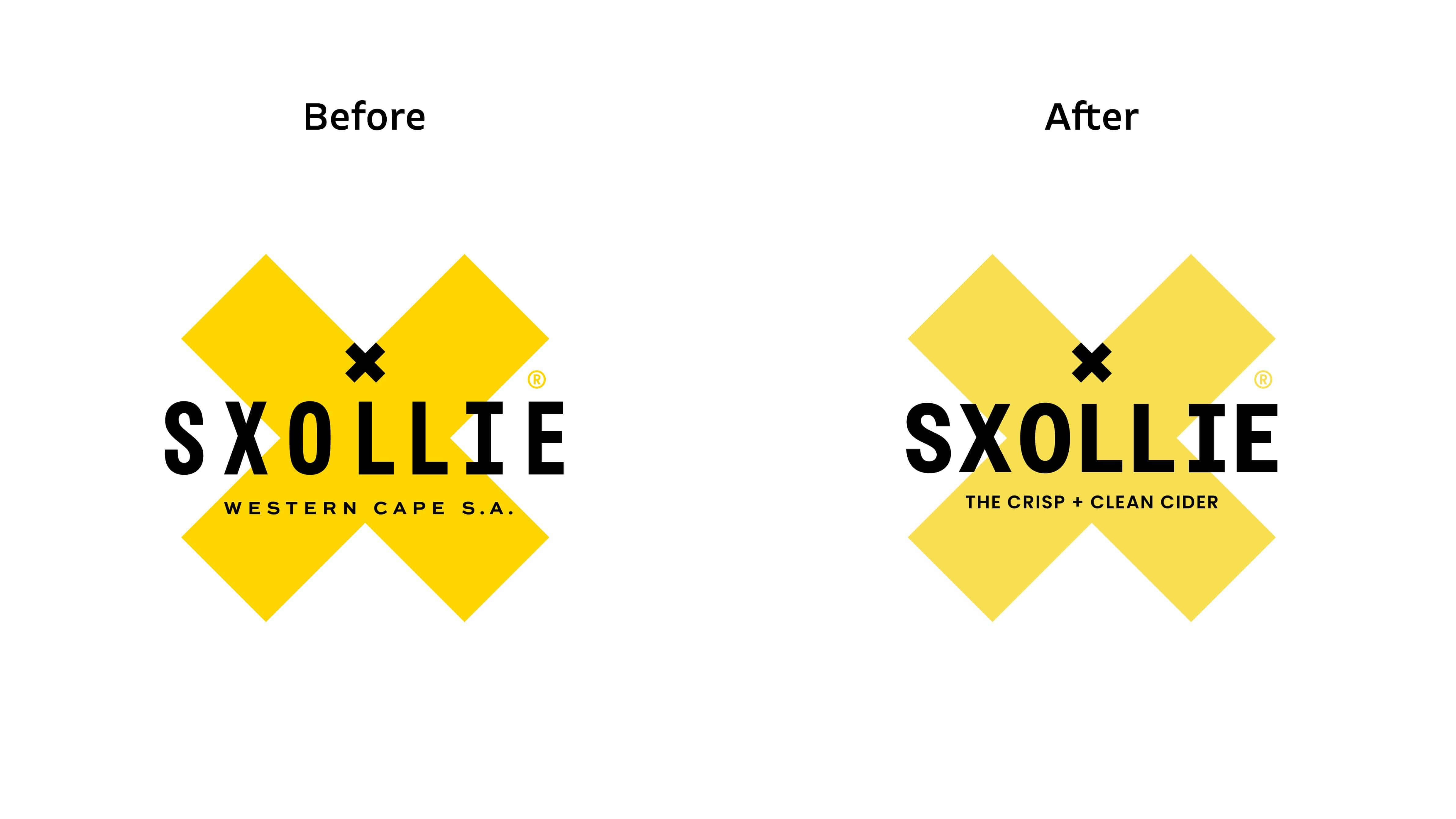
In recognizing the confusion retailers and consumers had regarding the brand’s appearance, our objective became clear: we aimed to ensure that the brand’s visual identity authentically reflected its core values and essence—refreshing, bold, and authentic. This alignment is essential, as it instils a profound sense of reassurance and confidence in the direction the brand is heading. We want every interaction with Sxollie to resonate positively, conveying not just a product but an experience anchored in authenticity and trust.
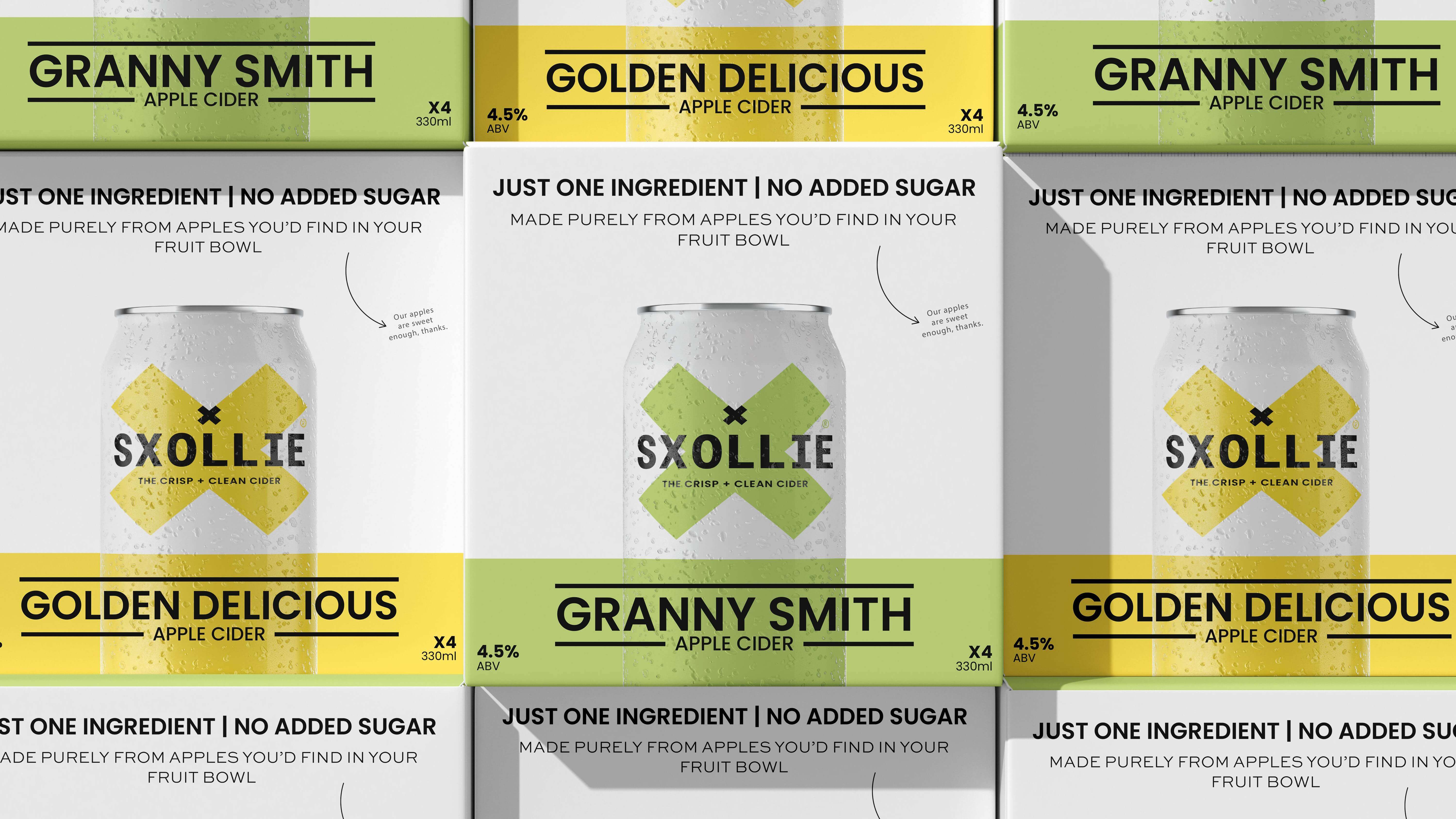
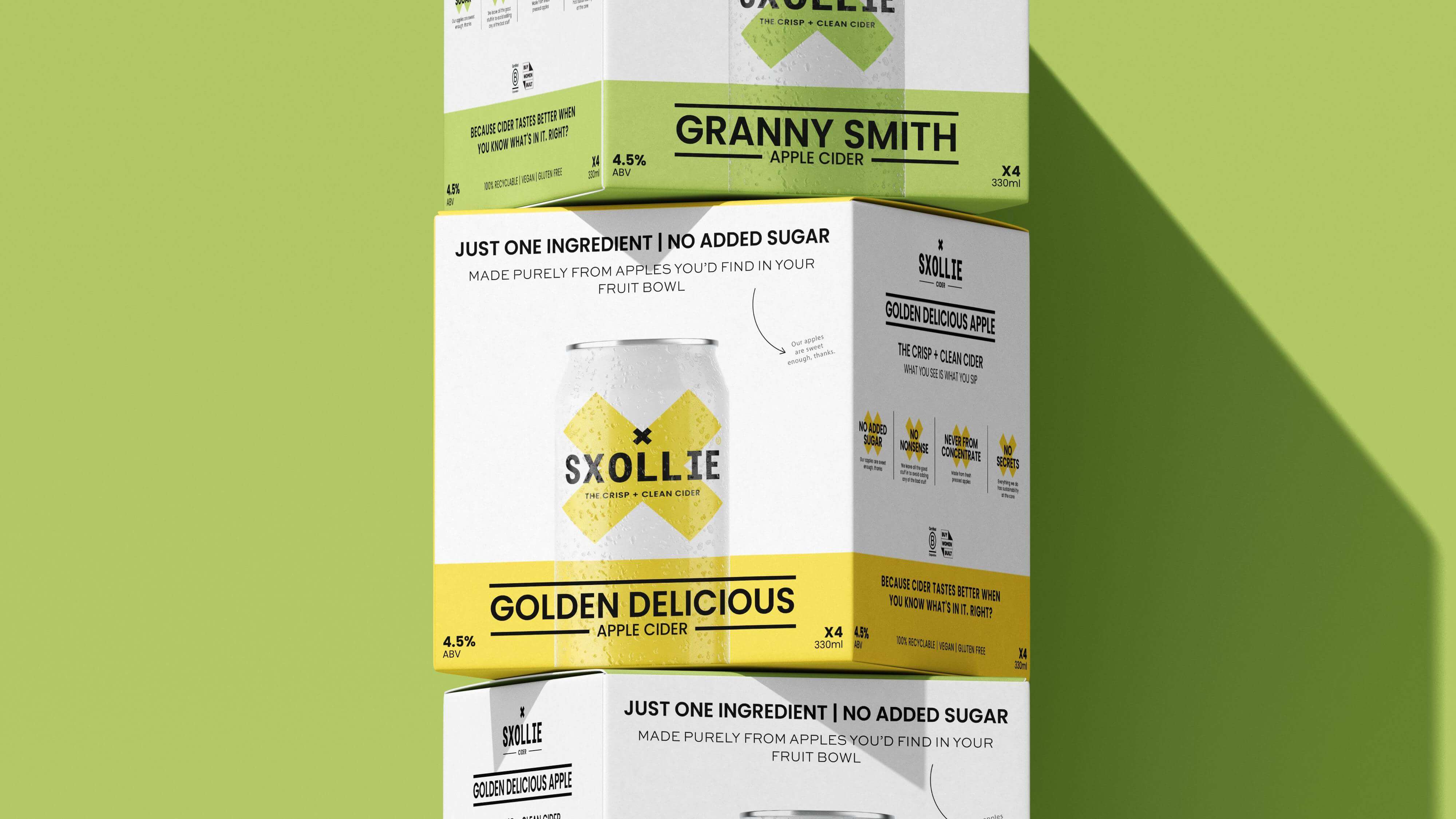
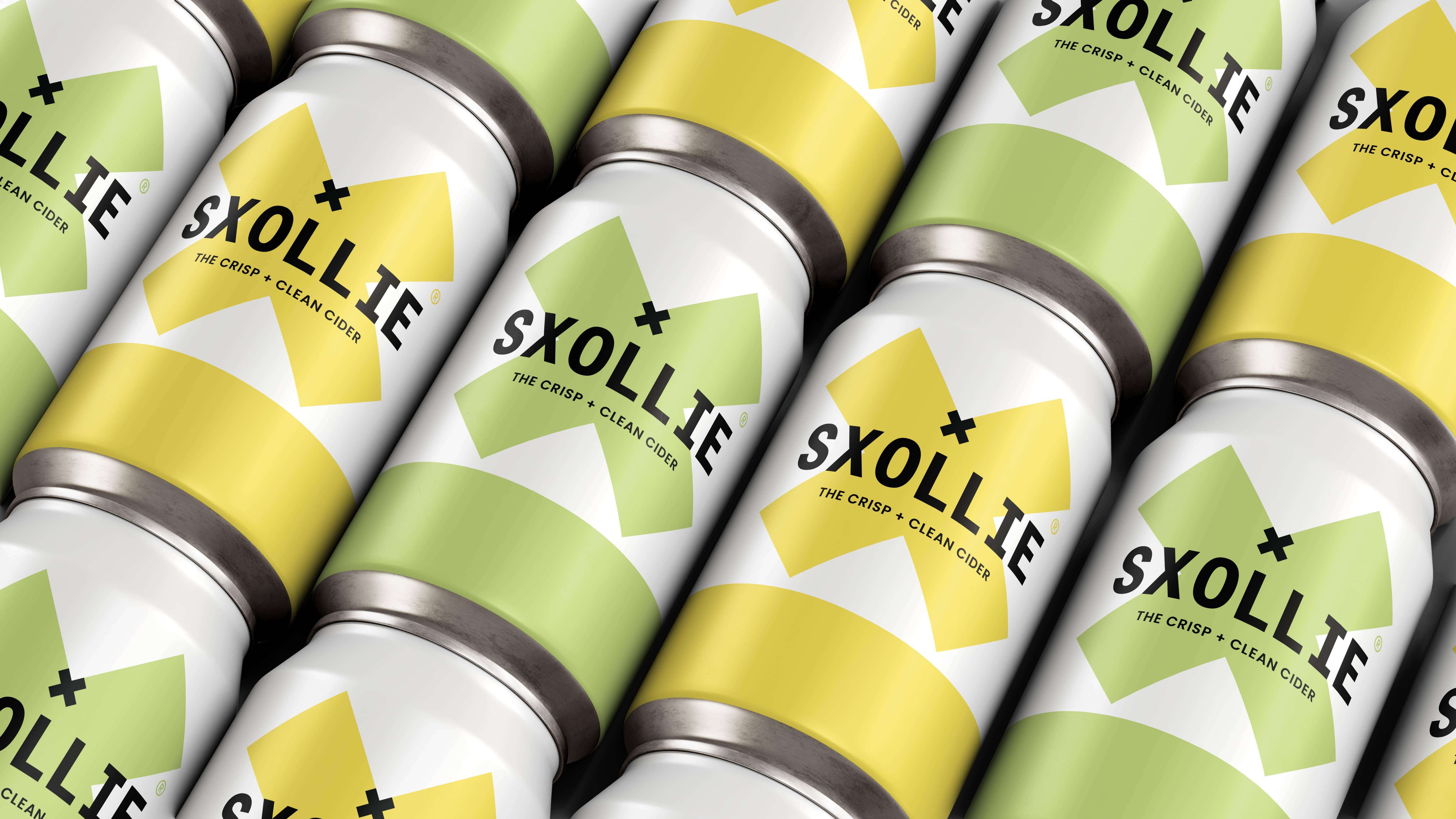
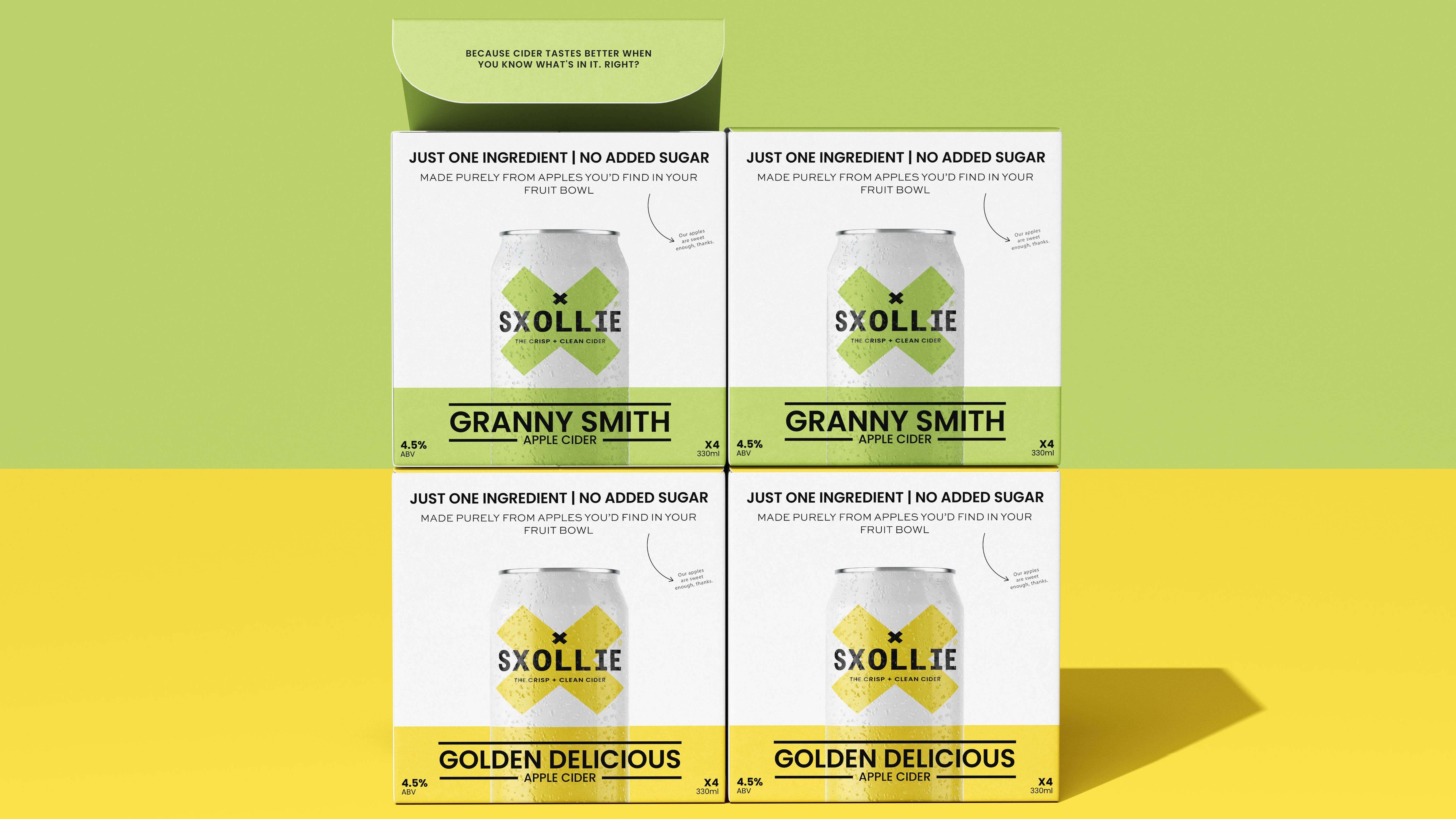
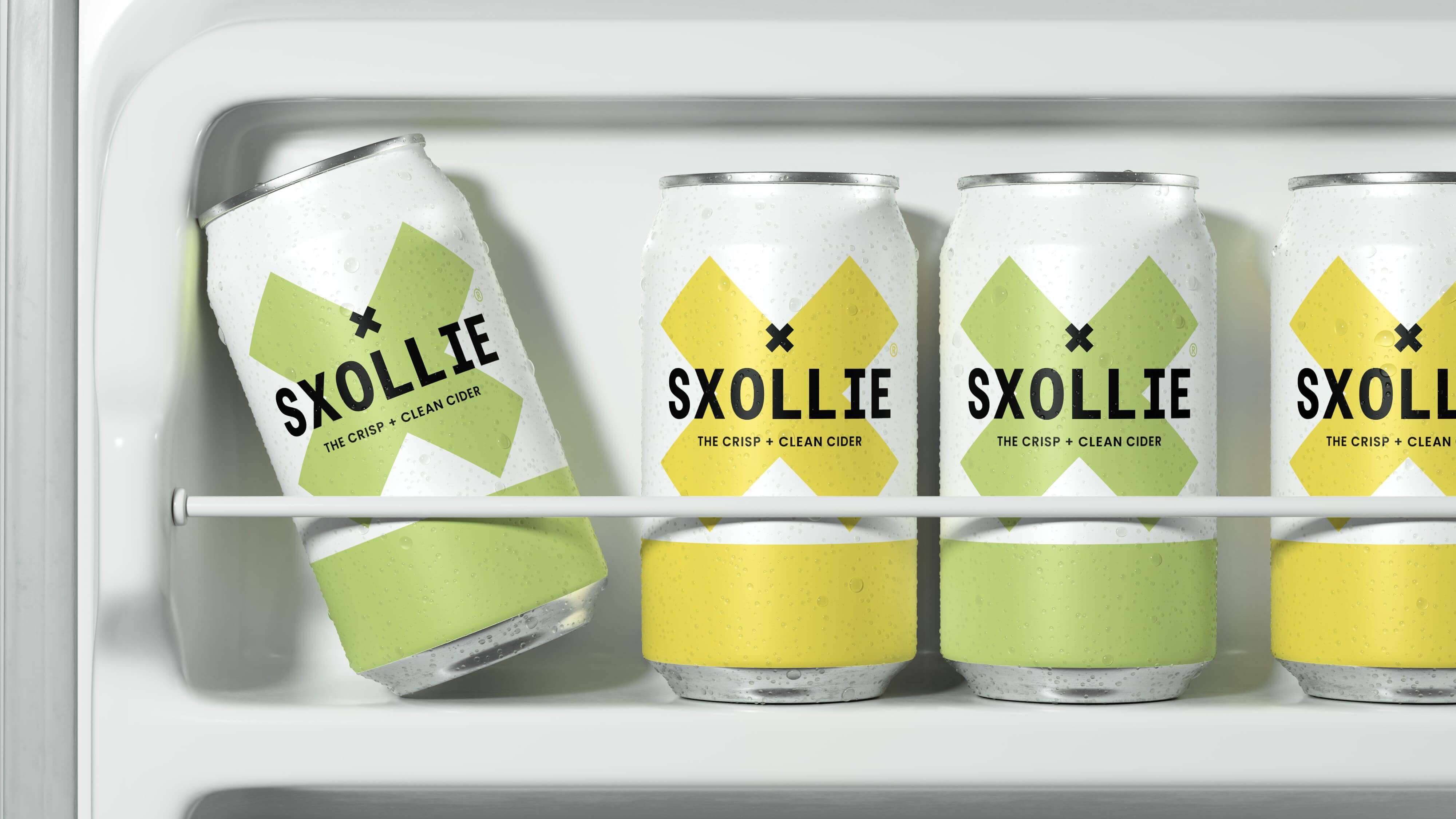
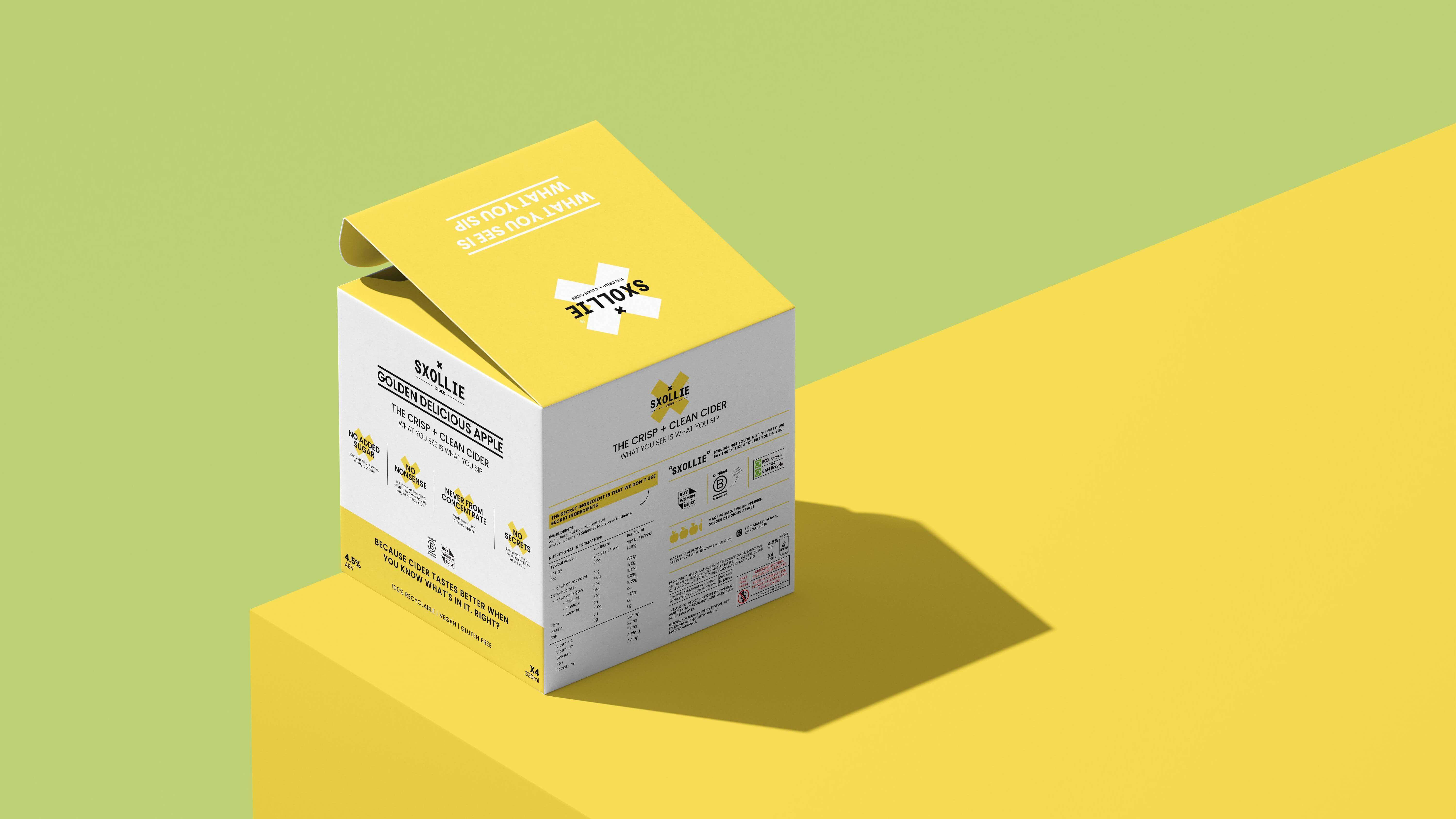
To bring this vision to life, we have meticulously integrated a cleaner, more sophisticated font family with subtly softer, inviting colours. This intentional selection makes the brand more approachable and retains its striking appeal, setting it apart in a crowded market. The visual refresh, combined with the innovative new 4-pack design, ensures that every aspect of the brand’s essence is masterfully represented.
The new design will feature vibrant imagery that embodies the freshness of Sxollie’s offerings, with a layout that invites exploration. The use of thoughtful negative space will provide a sense of elegance and modernity, allowing the product to take centre stage while enhancing its premium feel. This design initiative speaks to a broader narrative of clarity and connection, inviting consumers to engage with the brand on a deeper level.
With every design detail, from typography to colour palette, we are crafting a cohesive visual story that will resonate not only with existing customers but also attract new audiences eager for authentic brand experiences. Ultimately, this endeavour is not merely about aesthetics; it’s about building a lasting relationship with consumers, ensuring that Sxollieremains a source of inspiration and joy in their lives. By embracing this transformation, we aim to set a new standard in the industry—one that reflects the bold spirit of Sxollie while paving the way for a vibrant and sustainable future.

CREDIT
- Agency/Creative: Noramble
- Article Title: Noramble Refreshes Sxollie for New Retail Growth
- Organisation/Entity: Agency
- Project Type: Packaging
- Project Status: Published
- Agency/Creative Country: United Kingdom
- Agency/Creative City: Manchester, UK
- Market Region: Europe
- Project Deliverables: Brand Design, Logo Design, Packaging Design
- Format: Box, Can
- Industry: Food/Beverage
- Keywords: Rebrand, packaging, packaging design, beverage packaging, beverage branding, alcohol branding, alcohol packaging
-
Credits:
Founder: Daniel Poll


