


Sunshine is one of the largest optical retailers in Sergipe and aims to go beyond the traditional eyewear model. With a focus on style, visual care, and customer experience, the brand offers a fresh perspective on the industry. The rebranding process is rooted in listening, freedom of choice, and a curated approach that respects individuality. Every touchpoint — from customer service to design — reflects the brand’s values of closeness, authenticity, and transparency.
Within this perspective, the goal is to align messaging with practice, strengthening brand identity across all channels. More than selling glasses, Sunshine seeks to express personalities and build real connections. The rebranding project set out to capture this essence, amplify its expression, and create emotional resonance with the audience.
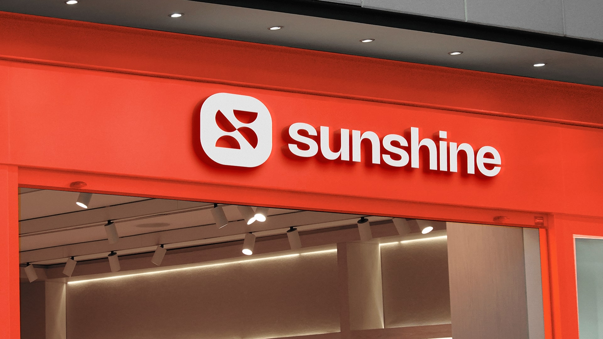
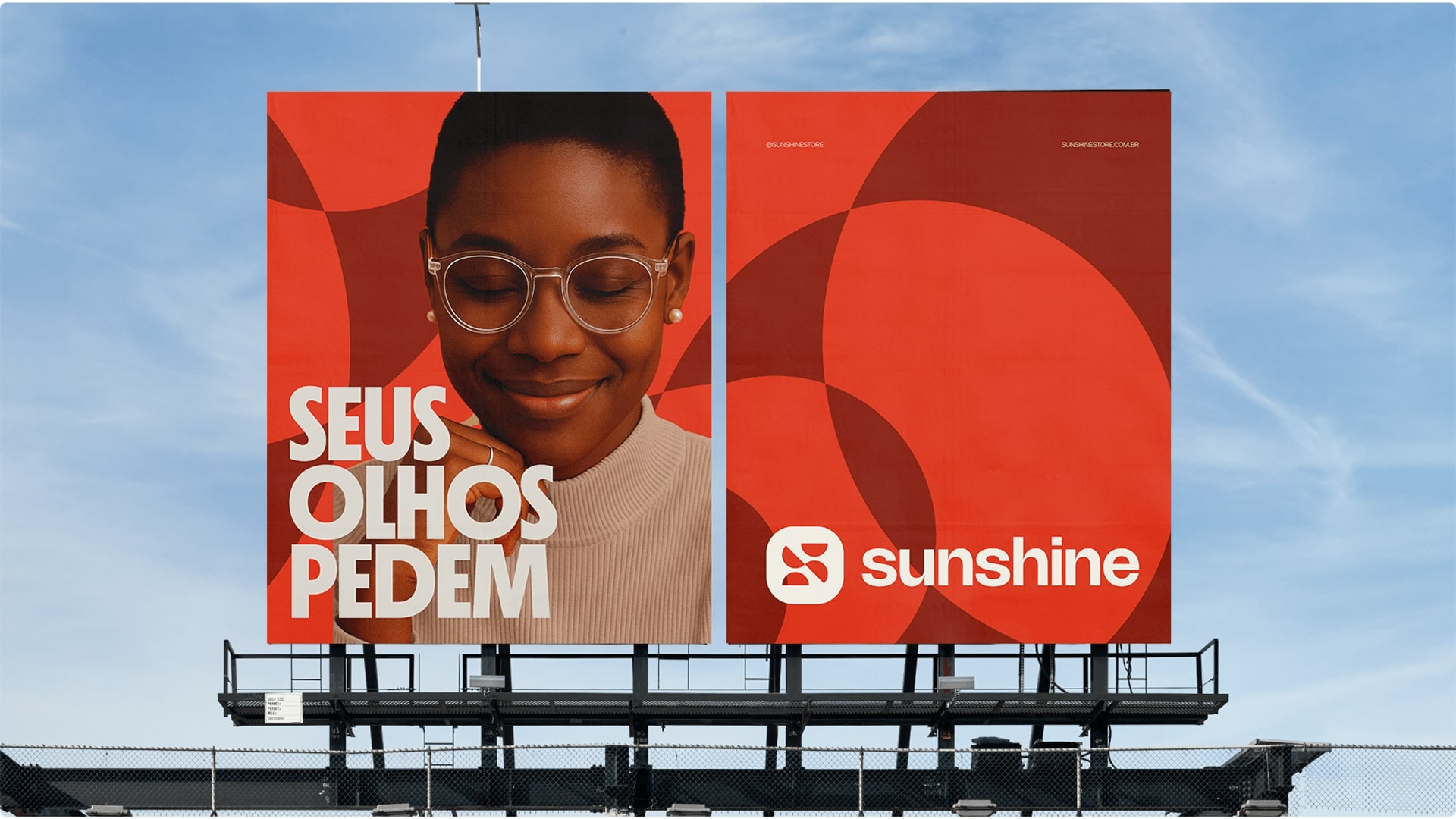
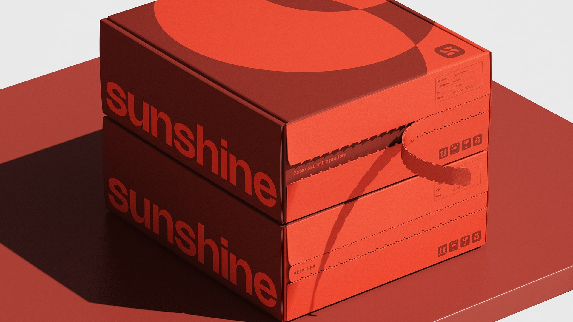
The circle, a symbol of unity and continuity, is central to Sunshine’s identity, referencing both the sunrise and eyeglasses. In this new chapter for the brand, the pinwheel was chosen as a symbol of transformation and constant movement. Its semi-circular shape reinforces the circular iconography already present in Sunshine’s visual language.
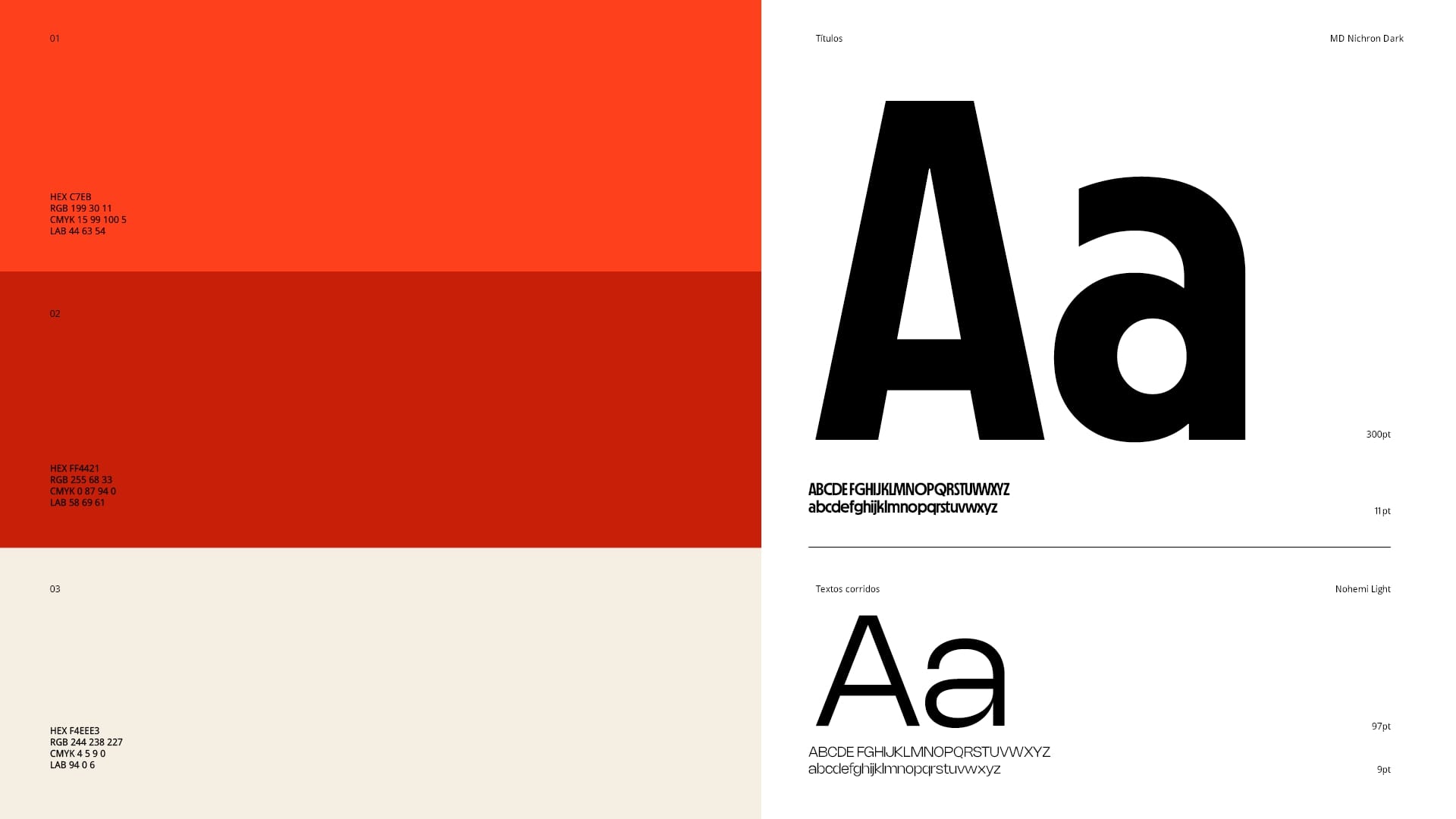
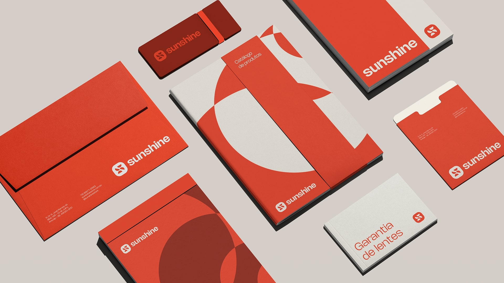
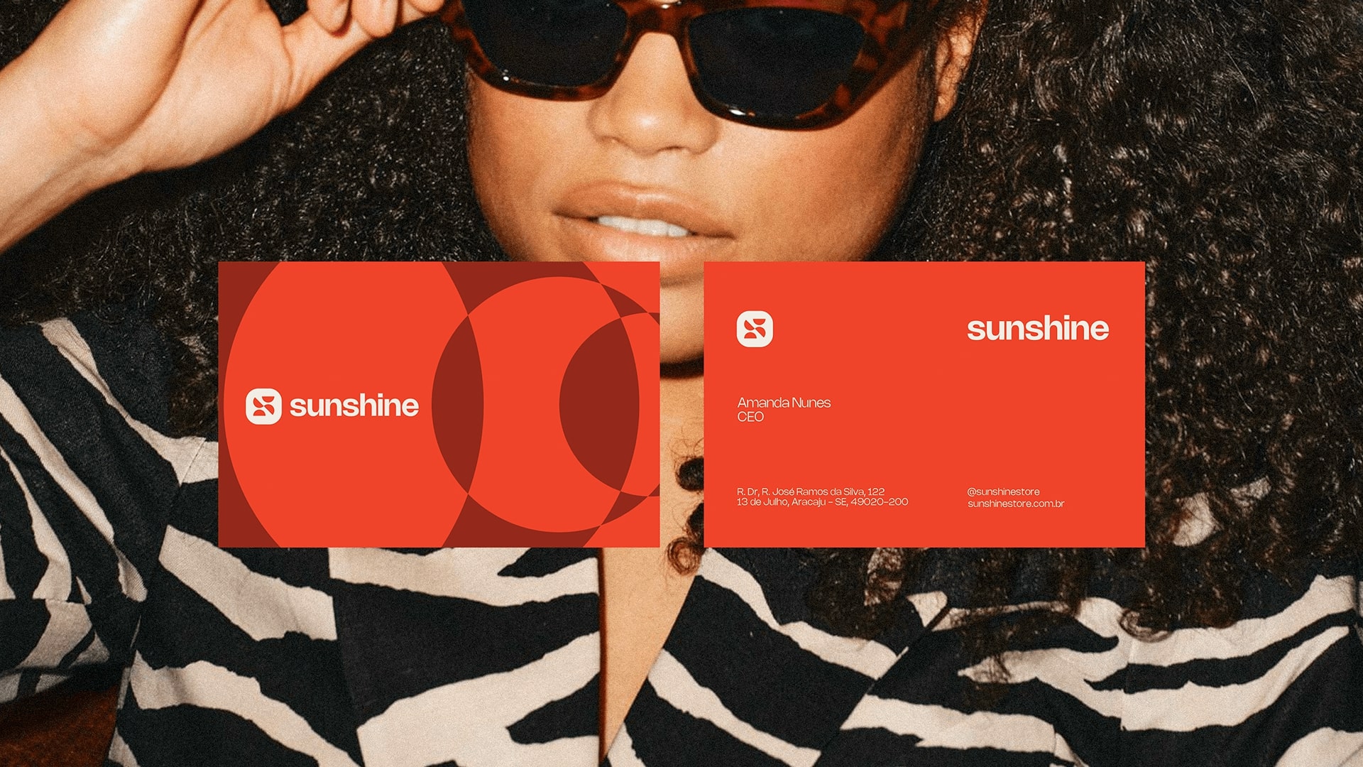
The new patterns follow this same visual and symbolic logic, appearing across print and digital materials. Inspired by the Bauhaus movement, they use circular forms that connect with the optical universe and the brand’s modern style.
Beyond aesthetics, the rebranding reinforces Sunshine’s commitment to human-centered design and emotional relevance. It’s about creating a brand experience that mirrors the values of its audience — people who seek more than products, who want to be seen, understood, and celebrated. From campaigns that highlight real stories to in-store experiences that feel personal and inclusive, every detail was thought out to build a sense of belonging.
This transformation isn’t only visual — it’s strategic. The new identity strengthens brand recognition while also opening up space for innovation, new collections, and partnerships that reflect Sunshine’s evolving role in people’s lives. With a vibrant and dynamic personality, the brand embraces change without losing its essence. Sunshine now positions itself not just as a place to buy glasses, but as a hub of style, care, and expression.
Through this rebranding, Sunshine affirms its belief in a future where vision care and design walk hand in hand, and where the customer experience is always at the center. It’s about seeing and being seen — clearly, confidently, and authentically.


CREDIT
- Agency/Creative: Chá de Bold Estúdio
- Article Title: Chá De Bold Estúdio Gives Sunshine an Eye-candy Rebranding
- Organisation/Entity: Agency
- Project Type: Identity
- Project Status: Published
- Agency/Creative Country: Brazil
- Agency/Creative City: Aracaju
- Market Region: South America
- Project Deliverables: Brand Guidelines, Brand Identity, Brand Tone of Voice, Packaging Design, Rebranding
- Industry: Retail
- Keywords: Eyewear, rebranding, visual identity
-
Credits:
Account Manager: Vapor Filmes
Brand Designer: Chá de Bold Estúdio
Copywriter: Pedro Carvalho


