


DimeTyd, a pioneering SaaS-based platform, addresses a nuanced and critical problem for large-scale vendors operating within the Amazon ecosystem—profit leakage. Despite consistent sales, many vendors face unexplained revenue losses due to chargebacks, shortages, and various operational discrepancies. DimeTyd automates the detection, recovery, and prevention of these losses through a seamless and intelligent interface, saving millions for enterprises. The company approached Multia with the need for a comprehensive rebranding to align its digital presence with the sophisticated, problem-solving nature of its product. Their existing brand presence, though functional, lacked a strong visual and verbal identity to communicate their revolutionary impact within a competitive and fast-paced marketplace.
Our branding objective was to establish DimeTyd as a thought leader and a mission-critical tool in the Amazon vendor management space. We aimed to create an identity that is not only visually distinctive but also clearly conveys the platform’s role in saving revenue, time, and operational effort for Fortune 500 clients. This required a complete overhaul—strategy, design, language, and digital experience—to make the brand trustworthy and approachable for C-level executives, e-commerce managers, and procurement teams alike. Our process began with understanding the psyche of both DimeTyd’s internal stakeholders and their external audience. We led multiple discovery sessions, diving deep into their platform’s capabilities, key client pain points, and the emotional resonance behind “profit leakage.”
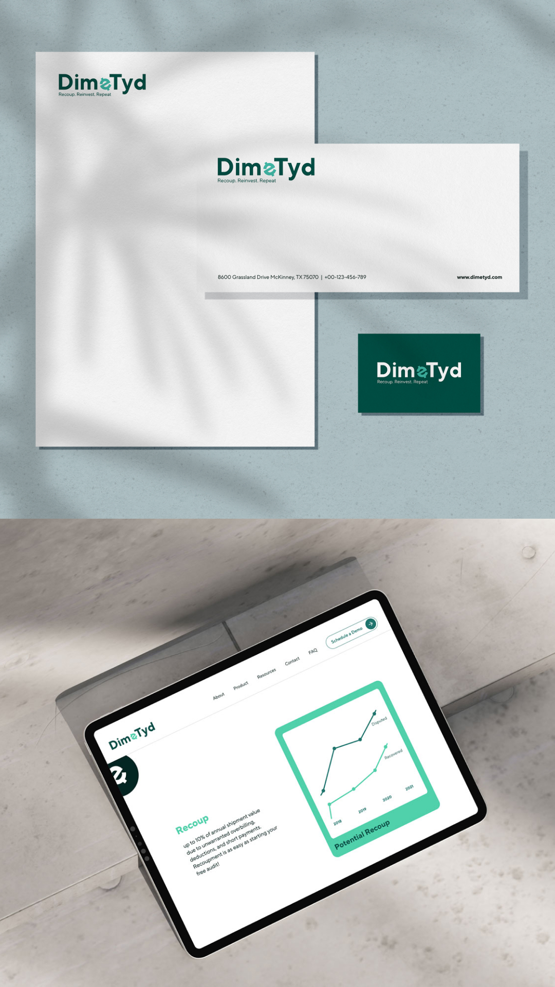
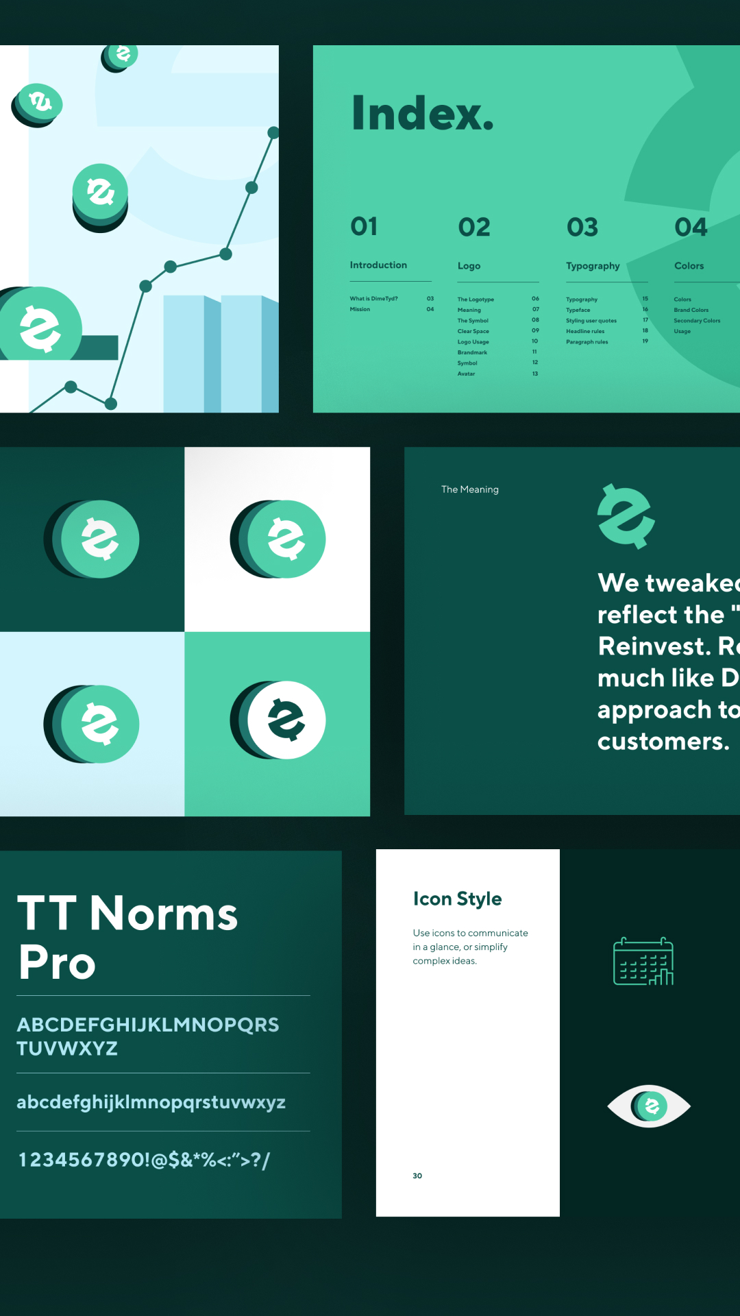
The name DimeTyd—already unique and metaphorical—formed the bedrock of the new identity. It evokes the imagery of a rising tide saving every dime—a metaphor that perfectly encapsulates the brand’s promise of recovery and value retention. Drawing from this, we developed a brand language that balances financial seriousness with modern SaaS efficiency. The visual identity is rooted in minimal, sharp elements with a futuristic tone—featuring a striking logomark inspired by the flow of capital and data. The brand colors—ranging from deep navy and electric blue to accents of digital green—were selected to denote intelligence, trust, and clarity.
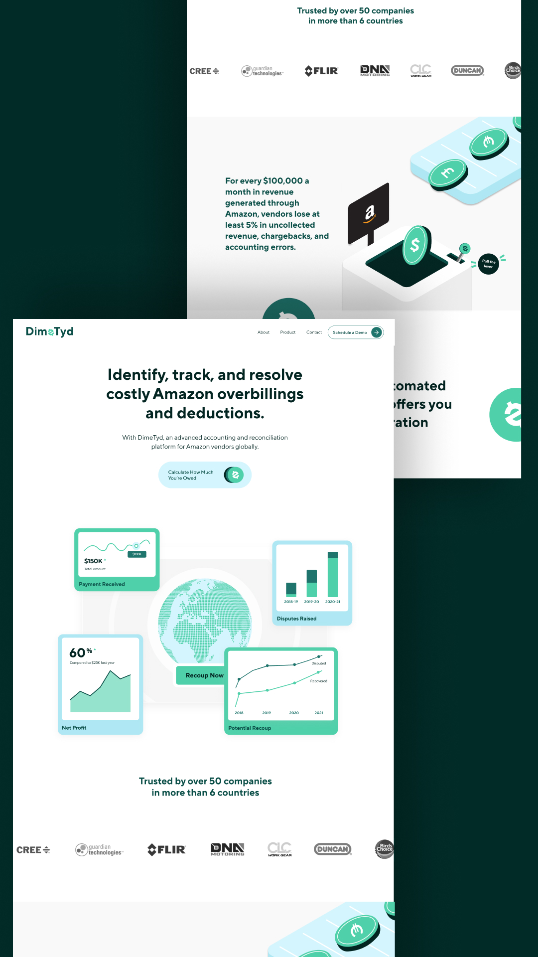
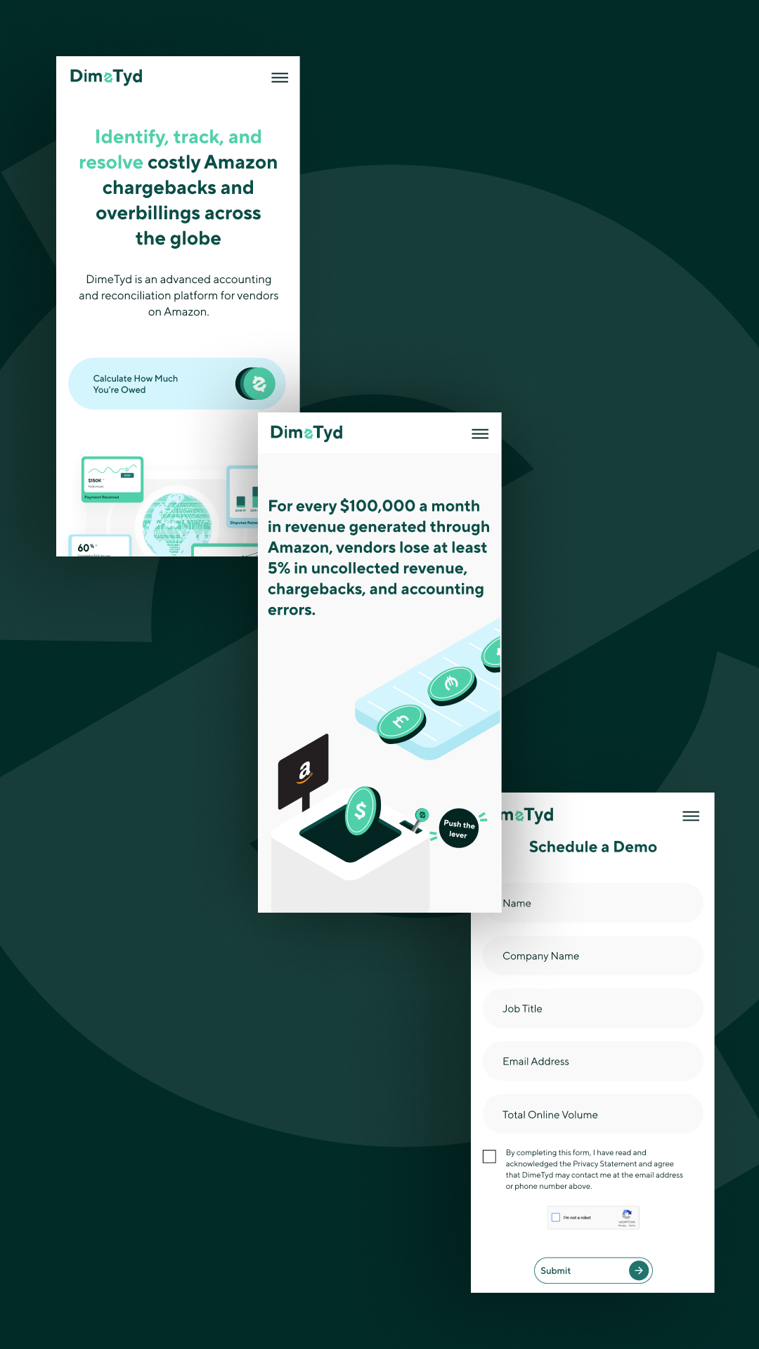
One of the cornerstones of the rebrand was the website redesign. The previous website offered limited engagement and clarity around DimeTyd’s core offerings. Our redesigned experience delivers a compelling story that walks the user through the why, how, and what of the product. Using custom illustrations, interaction-rich animations, and a copy system that distills complex processes into simple language, we created a conversion-optimized experience. The goal was to ensure that decision-makers landing on the site could quickly understand the problem DimeTyd solves and see the value in acting fast. We incorporated interactive infographics and case study breakdowns to visualize recovery results, enhancing credibility.
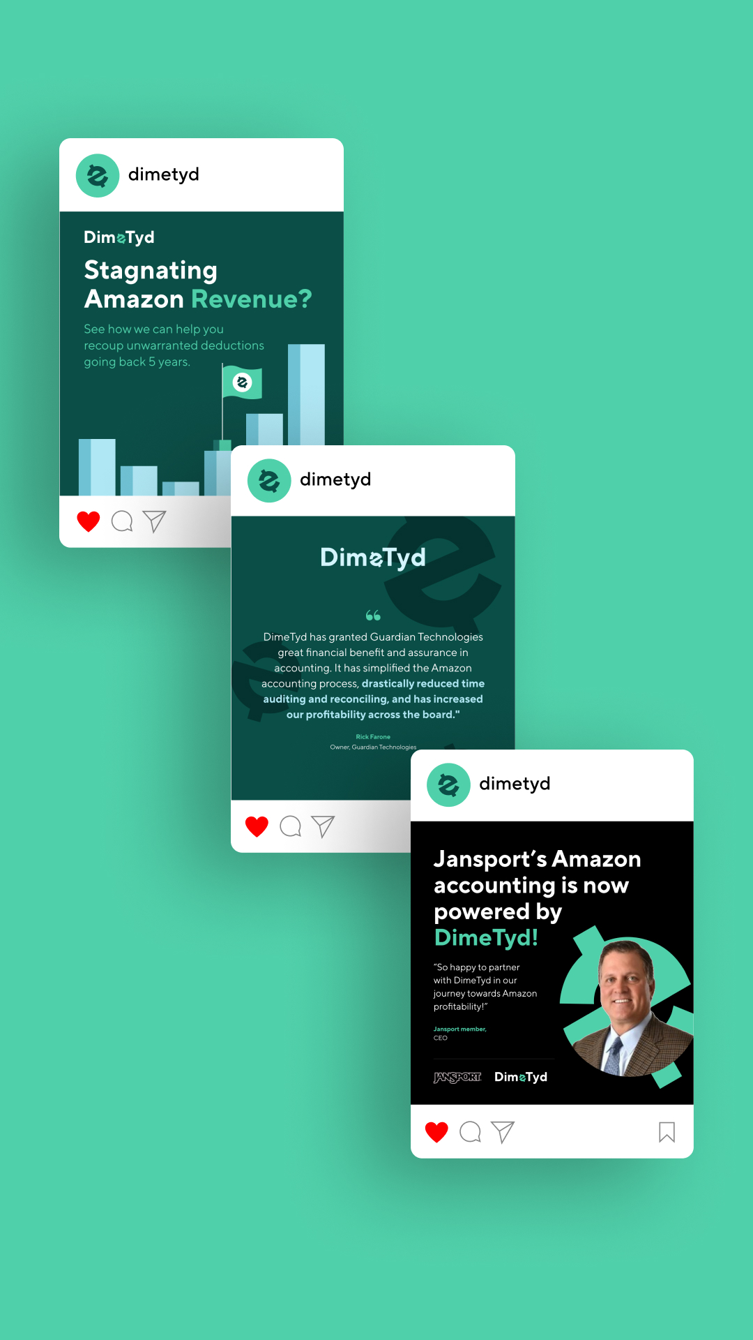
The tone of voice adopted for DimeTyd is assertive yet empathetic. Given that the brand deals with real losses and frustrations that impact entire supply chains, the messaging needed to convey confidence without being overly technical. Every line of copy was carefully crafted to maintain clarity, relatability, and strategic persuasion. From the homepage headline “Stop Profit Leaks. Start Recovering Millions.” to product benefits and CTAs, every word is designed to maximize comprehension and response. The brand language extends into pitch decks, social media, and client onboarding communication—ensuring seamless consistency.
From a typographic standpoint, we opted for a modern sans-serif family that supports readability across digital touchpoints while maintaining a contemporary, intelligent personality. The font aligns with DimeTyd’s identity as a tech-first company with a finance-driven mission. Iconography and UI components were built from scratch to complement the data and recovery-driven nature of the platform, ensuring that the website and digital collaterals feel coherent, easy to understand, and rooted in purpose.
Brand photography, where used, focuses on abstract representations of value recovery, data ecosystems, and e-commerce operations—steering away from generic stock visuals. This approach helps build an image that feels proprietary and uniquely DimeTyd. We also created motion design elements, micro-interactions, and scroll-based animations on the website to break down complex recovery mechanisms into digestible and engaging visual narratives. This served to reduce cognitive load while increasing user retention.
As part of the broader branding toolkit, we developed collateral templates for DimeTyd’s internal and external communications. These included decks, case studies, investor updates, social media templates, and more. Everything was aligned to the brand’s new visual tone, ensuring cohesion in every stakeholder interaction. Moreover, we supported the internal marketing team in applying these assets consistently across channels like LinkedIn, email campaigns, and presentations to potential clients and partners.
The final result was a DimeTyd brand that looks, speaks, and functions like the intelligent revenue partner it is. The transformation from a generic SaaS platform to a highly specialized, high-value service provider has already started yielding results. Website traffic quality has improved, stakeholder engagement has gone up, and the platform’s story is now resonating at the boardroom level. The clarity in value proposition and design has reduced friction in the sales funnel, enabling quicker conversions and deeper trust.
Ultimately, the DimeTyd rebrand is a case study in clarity cutting through noise to convey a message of undeniable value. It represents how design, copy, and strategy can come together to elevate not just perception but actual business performance. For a brand that saves dimes and millions at once, the new identity is more than aesthetics it’s functional storytelling at its best. Through careful discovery, intelligent systems thinking, and visual precision, Multia helped position DimeTyd exactly where it belongs in the spotlight of business transformation and operational excellence.

CREDIT
- Agency/Creative: Multia
- Article Title: Multia Repositions DimeTyd as the Go-To Platform for Eliminating Amazon Vendor Profit Leaks
- Organisation/Entity: Agency
- Project Type: Graphic
- Project Status: Published
- Agency/Creative Country: India
- Agency/Creative City: Pune
- Market Region: Asia
- Project Deliverables: Brand Experience, Brand Identity, Web Design
- Industry: Financial
- Keywords: B2B SaaS Website, Enterprise Design System, User-Centric Interface, Visual Identity Revamp, Product-Led Storytelling
-
Credits:
Designer: Multia


