


In an industry where design is often ornamental, Louers vodka turns it into an ideology. This is not just packaging. This is statement. Symbol. Sculpture. A deliberate fusion of heritage, innovation and defiant luxury — designed in the Netherlands, built for the world.
At the heart of the Louers vision lies a single idea: born to stand out. Every facet of the brand, from the liquid to the object, was created to challenge norms and redefine what a luxury vodka can represent.
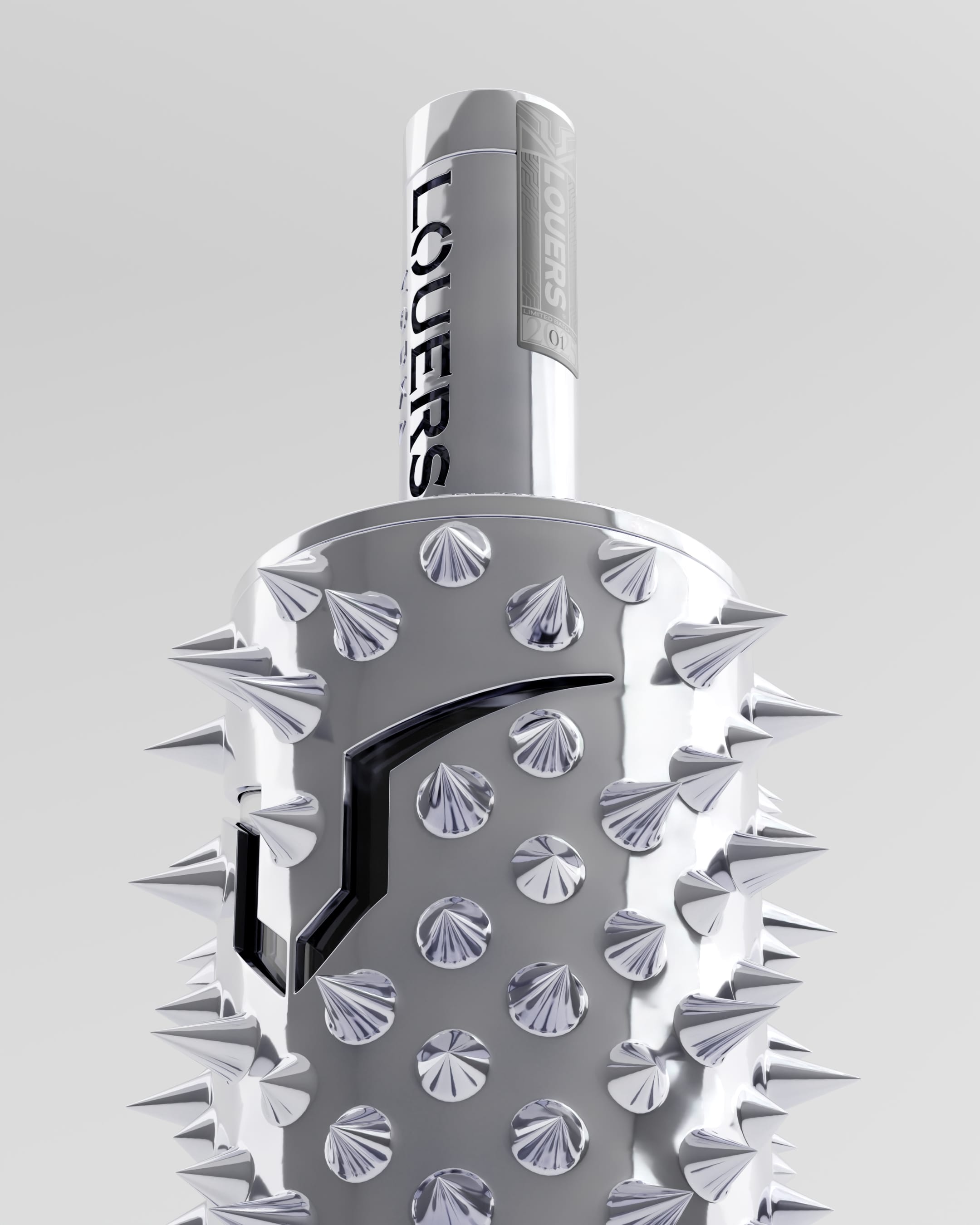
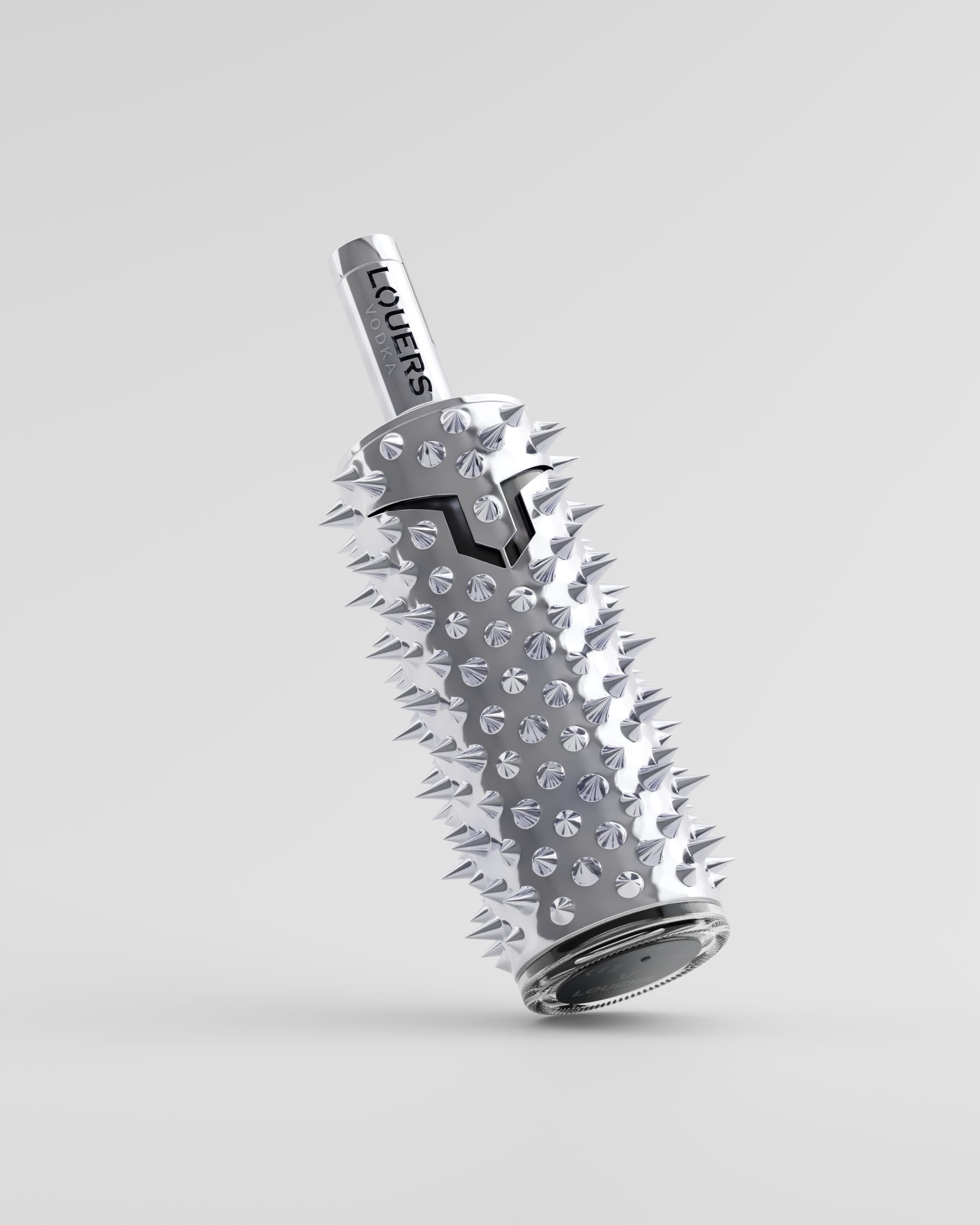
Louers vodka was born from a clear inspiration: the Dutch lion. The creators envisioned a spirit that would capture its strength, elegance and unyielding pride. But they did not stop at symbolism. They embedded that vision into every angle and surface of the bottle.
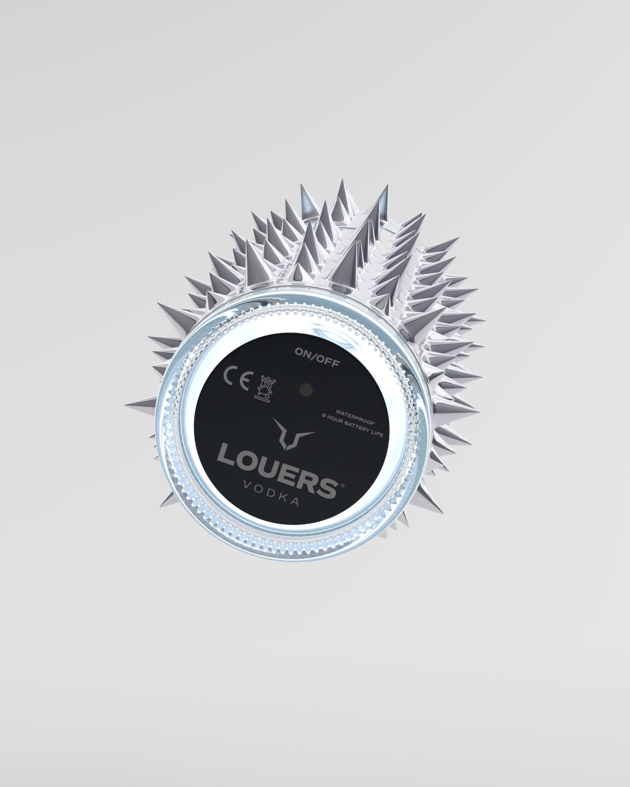
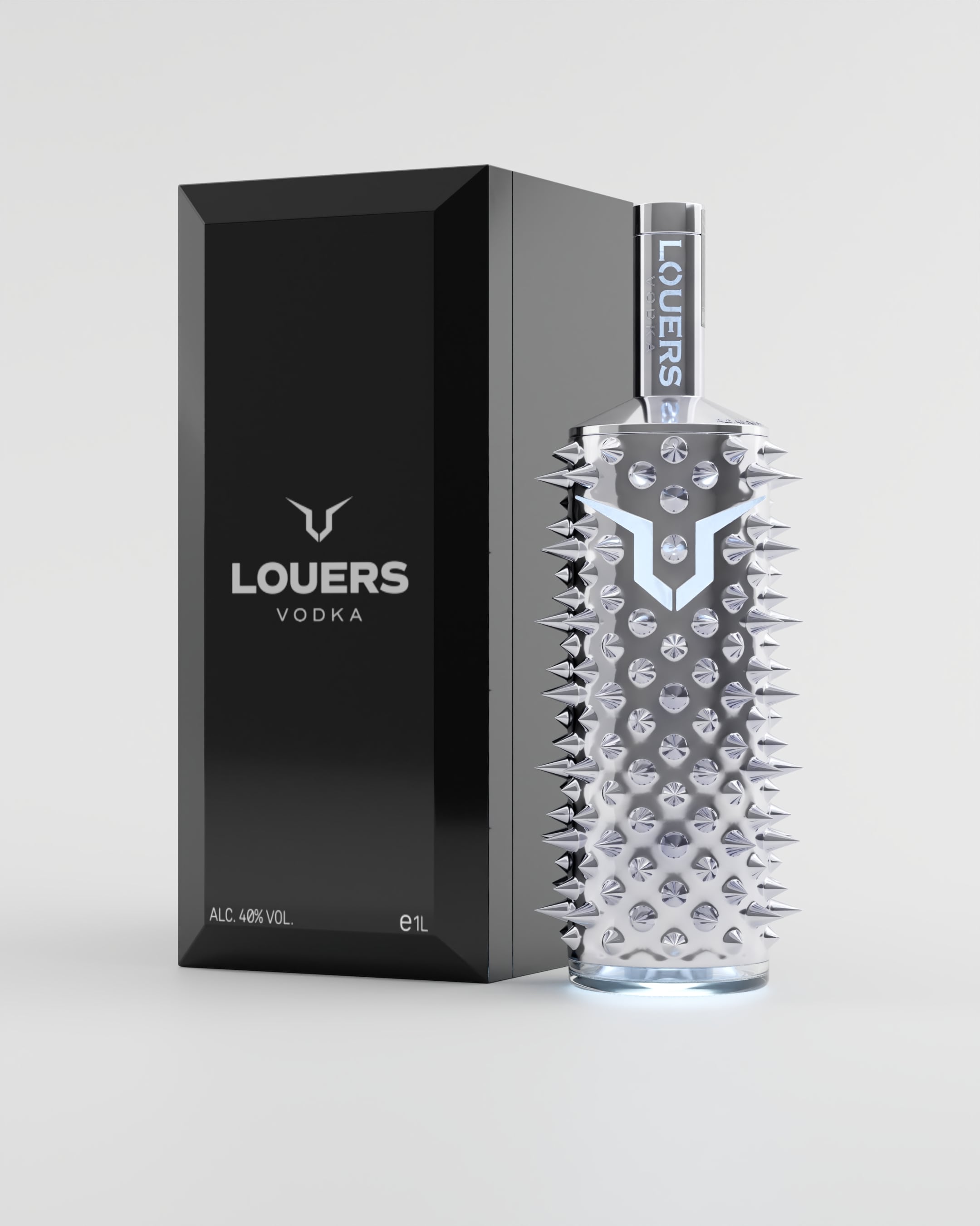
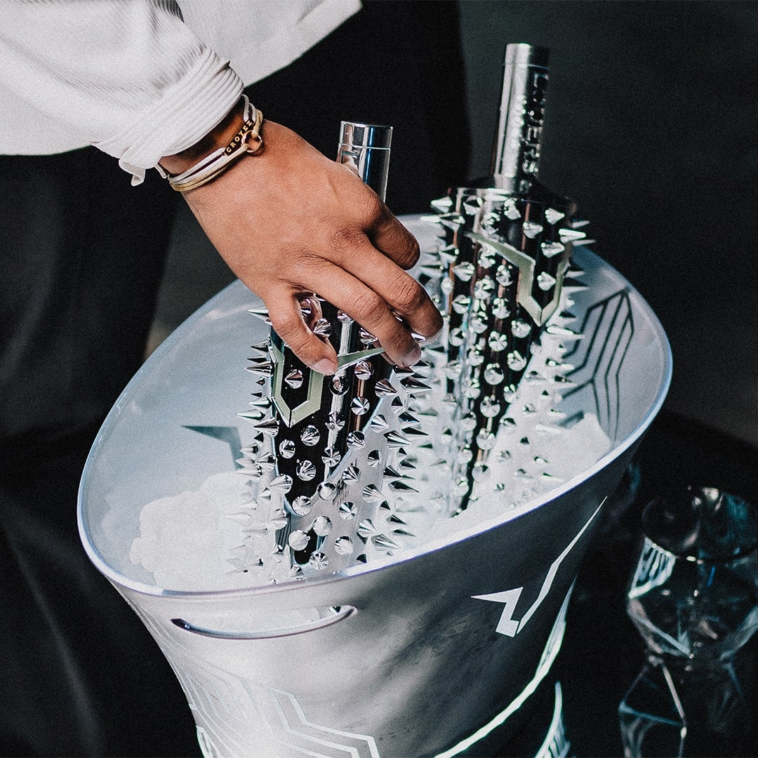
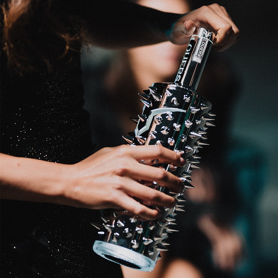
The result is unlike anything in the market. A bottle finished in sleek silver chrome, armoured with sculptural spikes, and a built-in LED that luminates the branding elements on the bottle. Each detail pays homage to Dutch resilience and craftsmanship. The chrome reflects the country’s legacy of precision. The spikes represent defiance in the face of challenge.
A Masterpiece of Craft
Louers is proudly produced in the Netherlands using 100 percent Dutch wheat and natural spring water. The vodka is distilled six times and filtered through twelve layers of superfine charcoal dust — a process designed to remove every flaw without stripping away character. What remains is a spirit of extraordinary clarity. Silky on the tongue. Clean on the finish. Effortless to sip, but never forgettable.
Each bottle is assembled and packaged by hand. Dutch craftsmen ensure that no detail is overlooked. No seam is visible. No compromise is made. The build quality is on par with high-end luxury goods. This is not a bottle to be thrown away. It is a display piece. A conversation starter. A trophy.
The Dutch Standard
Designed by its founder Willem Louwers, the bottle is inspired by legacy. Its form honors the Dutch tradition of innovation, while its spirit remains unshakably modern. The brand does not chase mass appeal. It serves those who appreciate bold moves, architectural form, and luxury with backbone.
In a marketplace full of safe, smooth, forgettable bottles, Louers offers something rare. An experience that begins with the eyes, lives in the hand, and ends in the memory. It invites you to choose differently. To choose power. To choose presence.
This is not vodka for everyone. This is vodka for those who dare to stand apart.
CREDIT
- Agency/Creative: Louers vodka
- Article Title: Louers Vodka: Illuminating Dutch Craftsmanship Through Iconic Design
- Organisation/Entity: In-House
- Project Type: Product
- Project Status: Published
- Agency/Creative Country: Netherlands
- Agency/Creative City: Louers vodka / Willem Louwers
- Market Region: Europe, Global
- Project Deliverables: 3D Design, Brand Creation, CGI, Product Design
- Industry: Food/Beverage
- Keywords: louers vodka, dutch, vodka, design, bottle, spirits, luxury design
-
Credits:
Founder & CEO: Willem Louwers


