


Overview
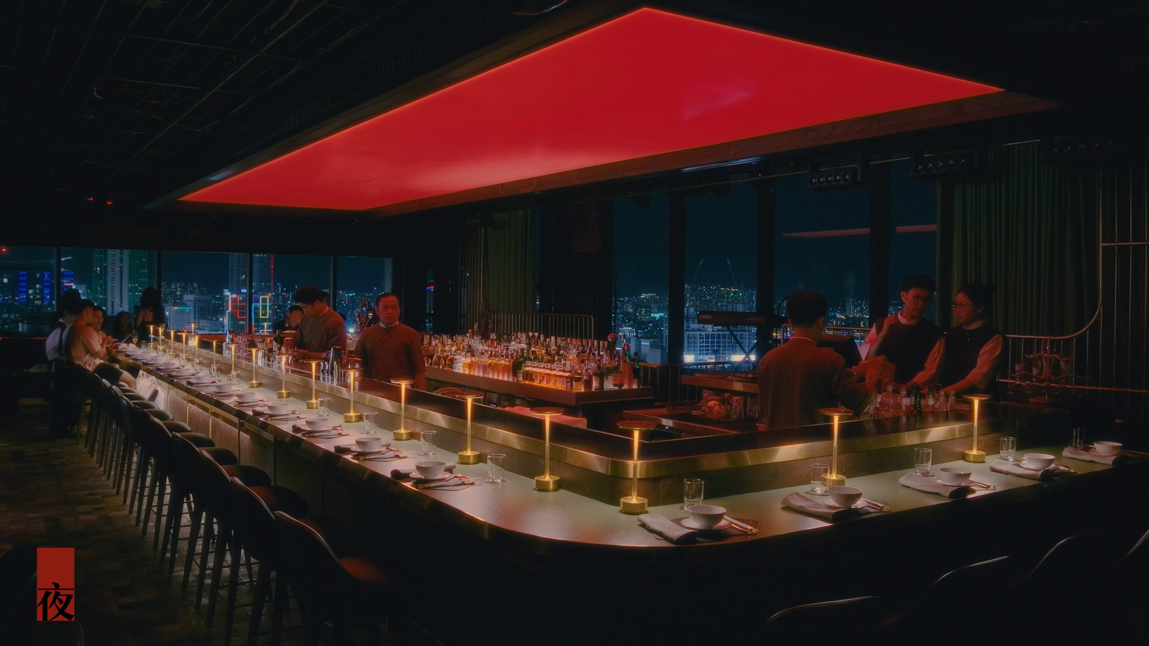
Perched atop Centec Tower in the heart of Saigon,
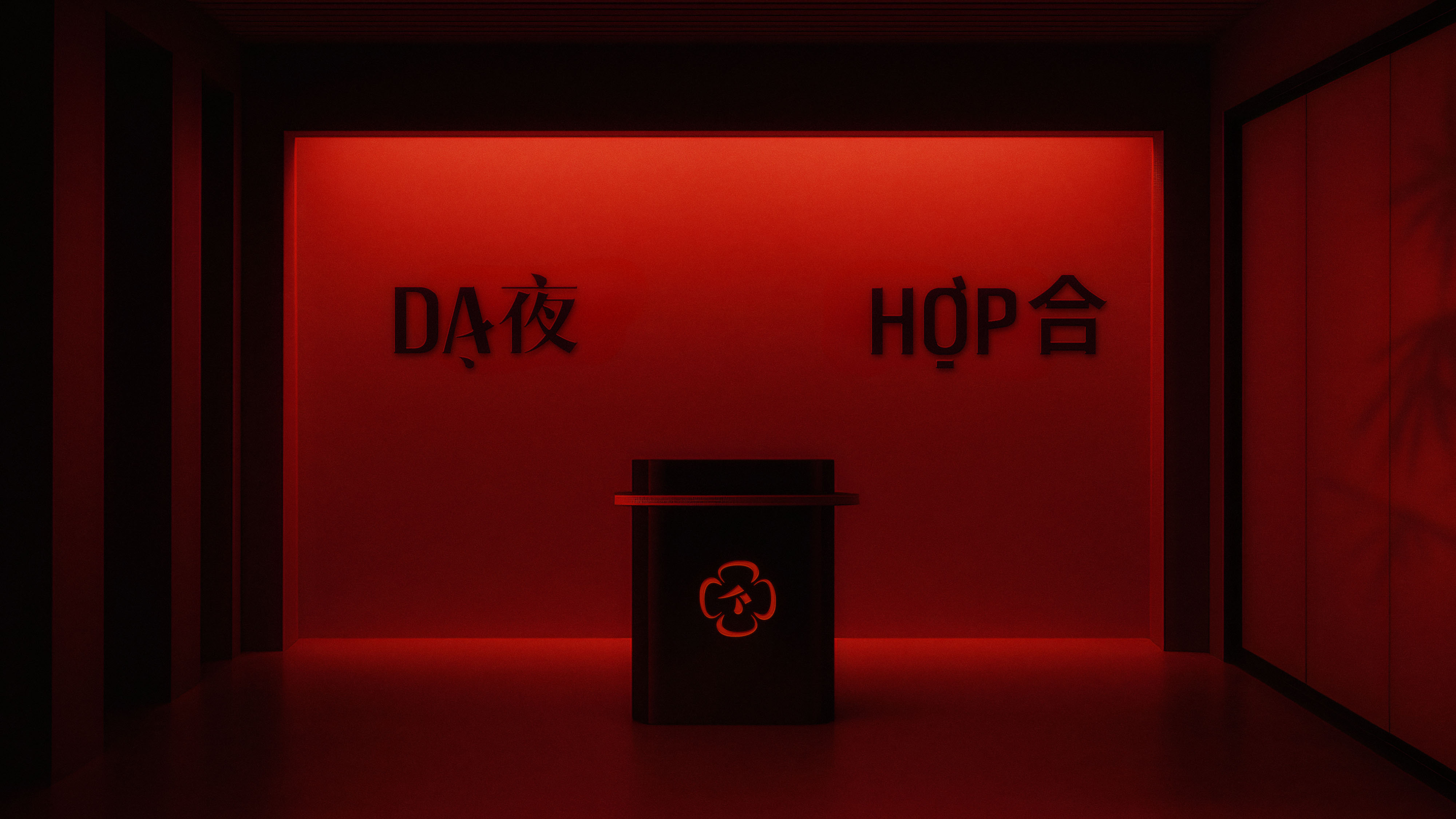
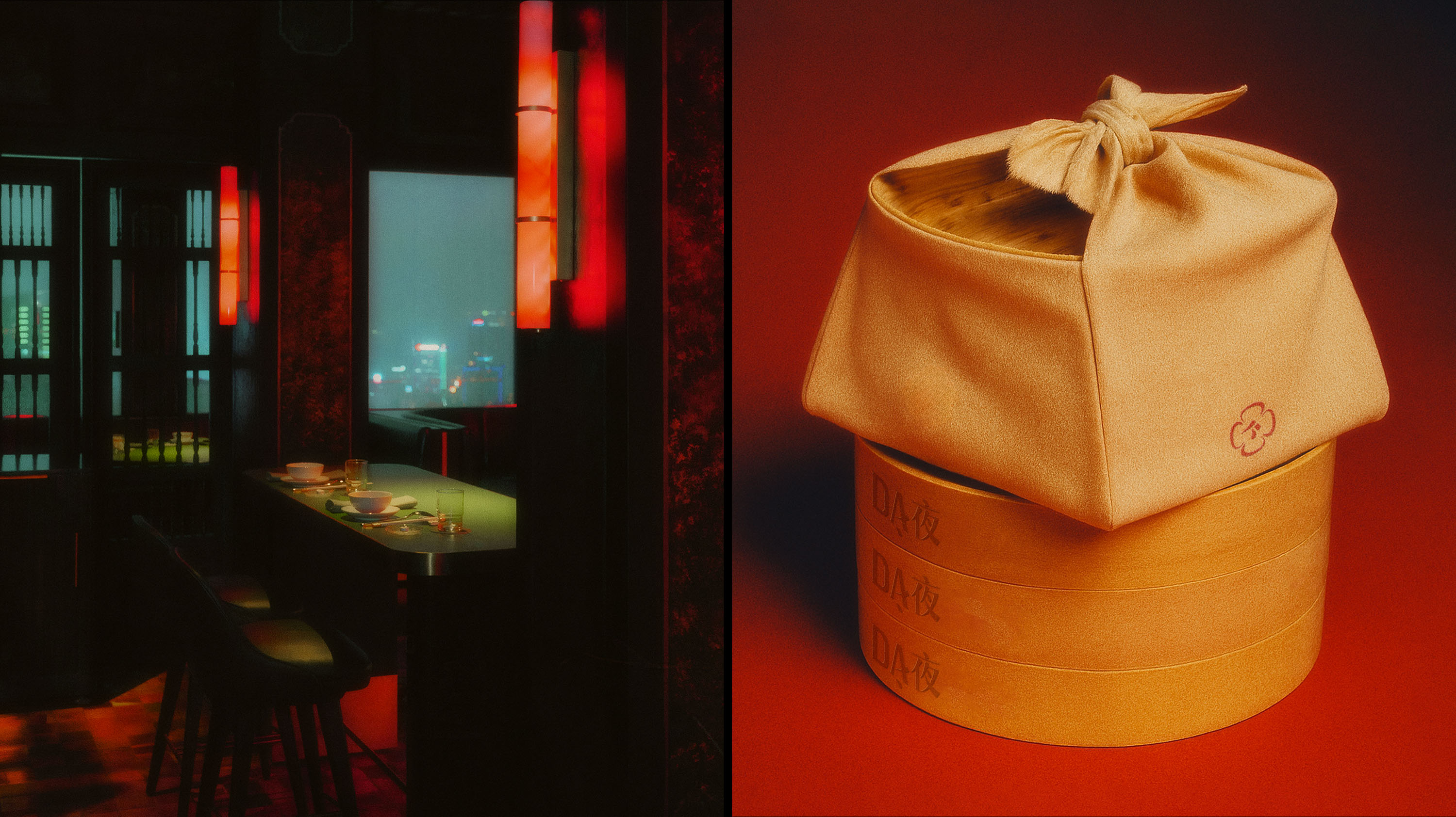
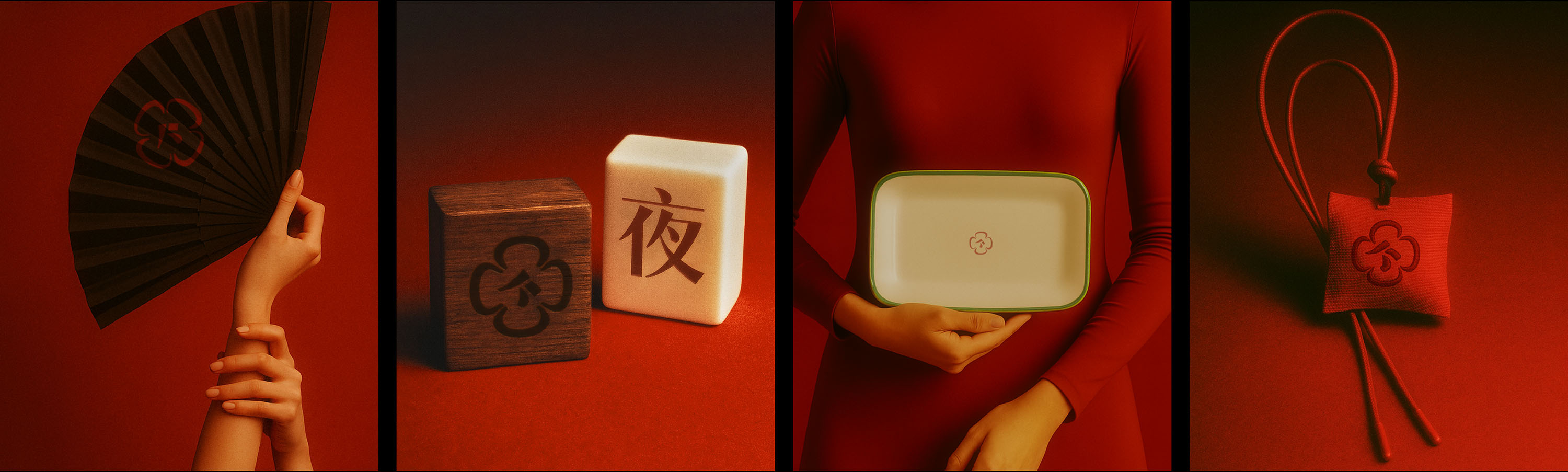
Dạ 夜 (pronounced “yè”) and Hợp 合 (pronounced “hop”) come together as Dạ-Hợp, a seamless two-story unique F&B concept named after the poetic magnolia coco flower, which only blossoms at night.
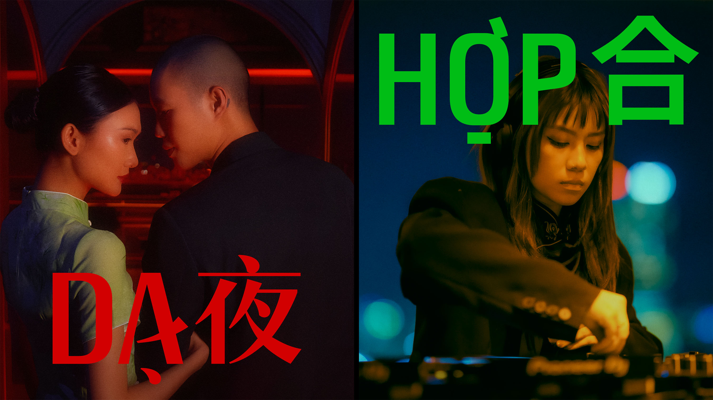
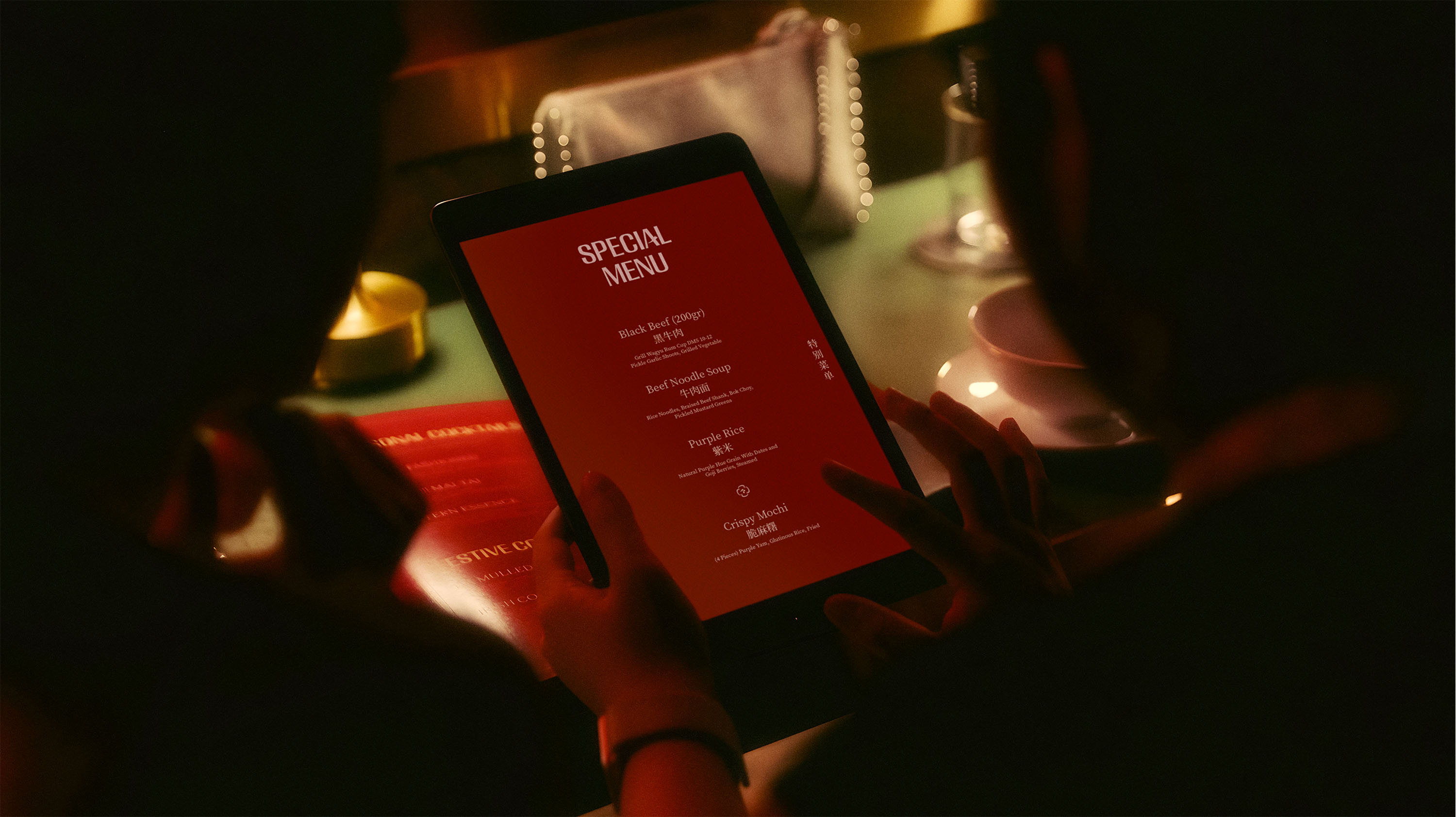
Inspired from the flower, this experience comes alive after sunset, unfolding in two evocative chapters. Begin the evening at Dạ 夜, where dining takes on the spirit of cabaret. Here, contemporary Asian cuisine is paired with curated live performances, transforming dinner into an immersive, multi-sensory event—moody, cinematic, and full of flavor.
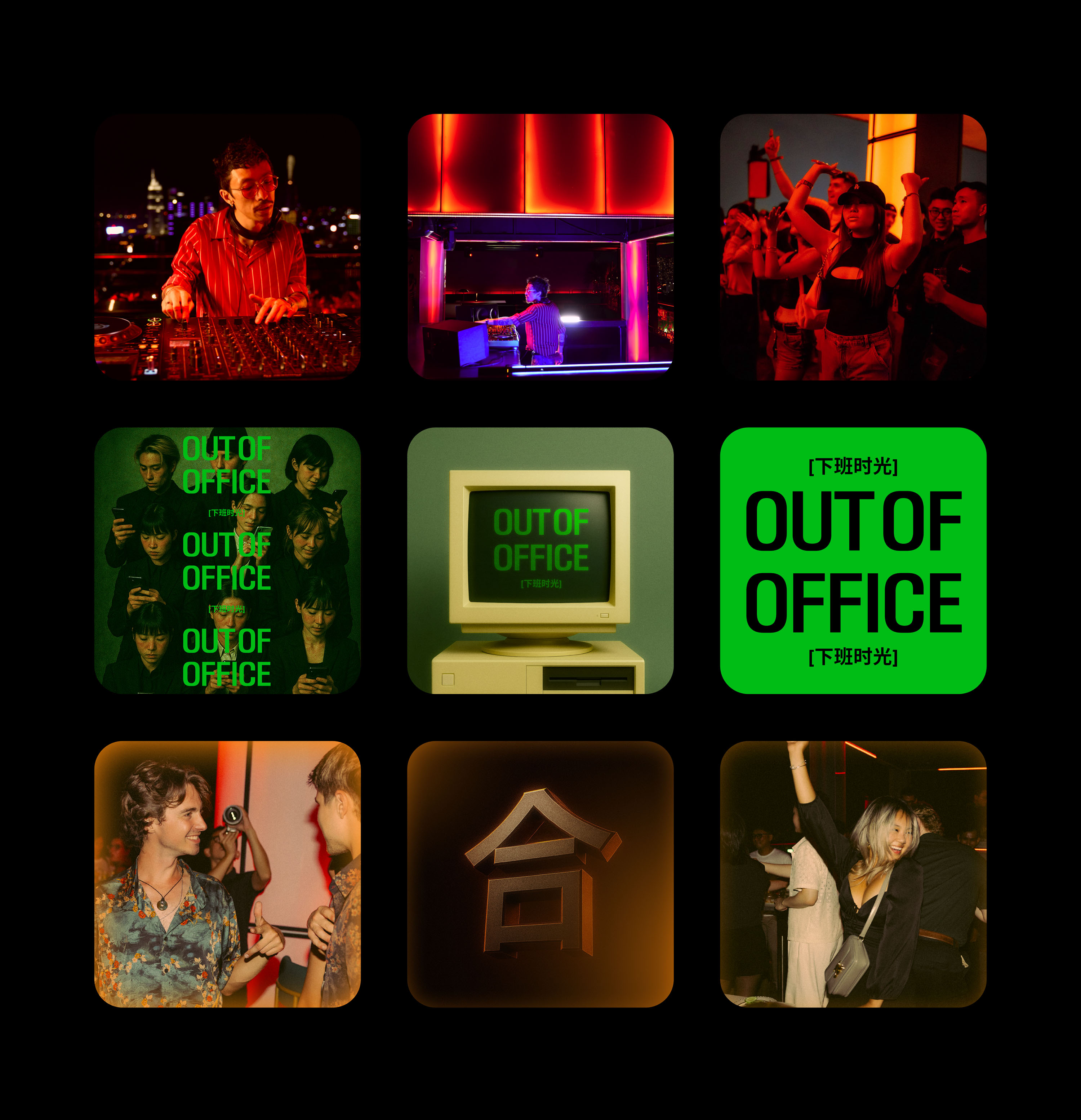
Then ascend to Hợp 合, the rooftop bar above, where fusion Asian cocktails and dance music form the pulse of the night. With sweeping city views and bold soundscapes, Hợp 合 offers a dynamic contrast—celebratory, electric, and ever-evolving.
Dạ-Hợp is more than a destination. It’s a journey through taste, rhythm, and mood—where dining meets performance, cocktails meet culture, and the night blooms in full.
Logo
The logo is rooted in calligraphic expression and theatrical form.
At its heart lies a stylized stroke—evoking traditional brushwork—capturing the poised movement of the main performer on stage. This central motif is encircled by petal-like shapes inspired by the magnolia coco flower.
Brand Strategy Process
The brand began with a clear vision: to create a unique F&B destination centered on Asian fusion cuisine. From that starting point, we developed a strategy that fused two distinct yet connected experiences the downstairs restaurant and the rooftop bar.
Research → Naming & Concept Architecture → Brand Narrative → Visual Identity → Brand Experience Touchpoints & Spatial Direction
MN Da Hop
The custom typography for Dạ Hợp is designed with verticality in mind—echoing the venue’s elevated location on top of the city. Combining with traditional Chinese calligraphic-inspired stems and diacritical marks, the font represents a fusion touch.
Two sister display weights represent the duality of the concept:
Dạ adopts a high-contrast serif style, reminiscent of calligraphy but stripped of terminal “legs” for a sleek, sculptural presence—evoking elegance and theatrical flair.
Hợp features a clean sans-serif form, offering a contemporary, rhythmic tone aligned with nightlife, music culture, and broader visual adaptability.


CREDIT
- Agency/Creative: M — N Associates
- Article Title: M — N Associates Unveils Dạ-Hợp as Saigon’s Elevated Fusion of Dining and Nightlife
- Organisation/Entity: Agency
- Project Type: Identity
- Project Status: Published
- Agency/Creative Country: Vietnam
- Agency/Creative City: Ho Chi Minh City
- Market Region: Asia
- Project Deliverables: Architecture Concept, Art, Art Direction, Brand Architecture, Brand Creation, Brand Design, Brand Experience, Brand Guidelines, Brand Identity, Brand Mark, Brand Naming, Brand Strategy, Brand Tone of Voice, Brand World, Branding, Cinematography, Graphic Design, Motion Graphics, Photography, Type Design, Typography
- Industry: Hospitality
- Keywords: restaurant, bar, rooftop, vietnam, chinese, fusion, dạ, hợp, m - n associates
-
Credits:
Branding Firm: M — N Associates


