


Raka Happiness Sparkling Wine
The Design Challenge
Following the successful pack upgrades for the Raka Flagship and Premium wine tiers, the focus shifted to Raka Happiness, the brand’s sparkling wine. Positioned as an endorser brand within the portfolio, the design challenge was to create a look and feel distinct from the Raka Flagship and Premium ranges while subtly connecting back to the mother brand.
The essence of Raka Happiness is to capture the spirit of celebration — a fun-loving, approachable sparkling wine that embodies the sentiment of “A Splash of Joy.” The objective was to craft a packaging design that shifts away from the current classic aesthetic and embraces a more vibrant, occasion-driven space while maintaining a delicate balance between fun and elegance.
Design Inspiration
Inspired by the timeless words of Eleanor Roosevelt, “Happiness is not a goal, it is a by-product of a life well lived,” the design aimed to convey the irresistible, joyful essence of Raka Happiness. Since happiness can be a feeling, a moment, or a sensory experience, we sought to evoke that instant spark of joy through the packaging, making it a sensory delight for consumers.
Design Solution
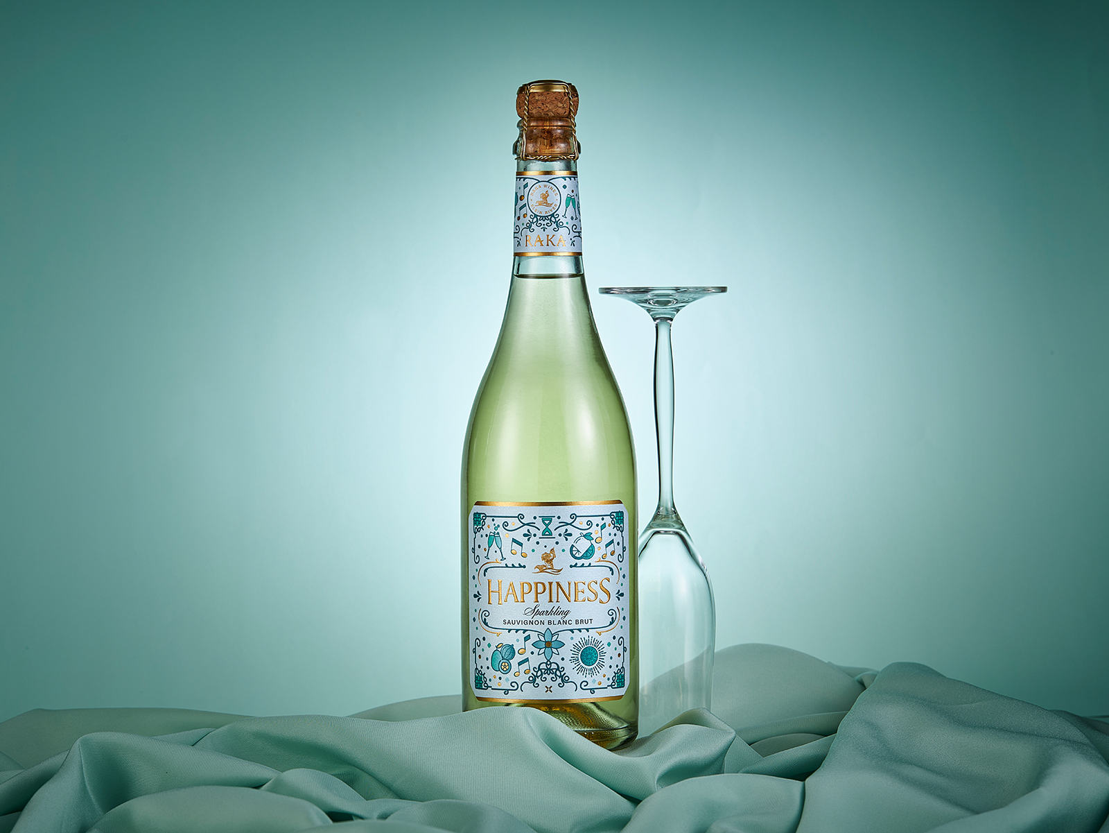
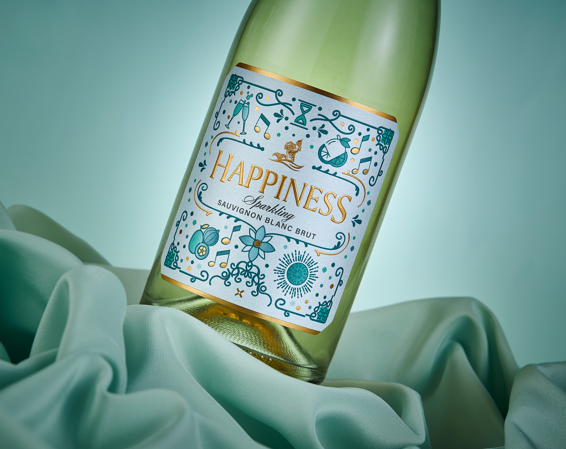
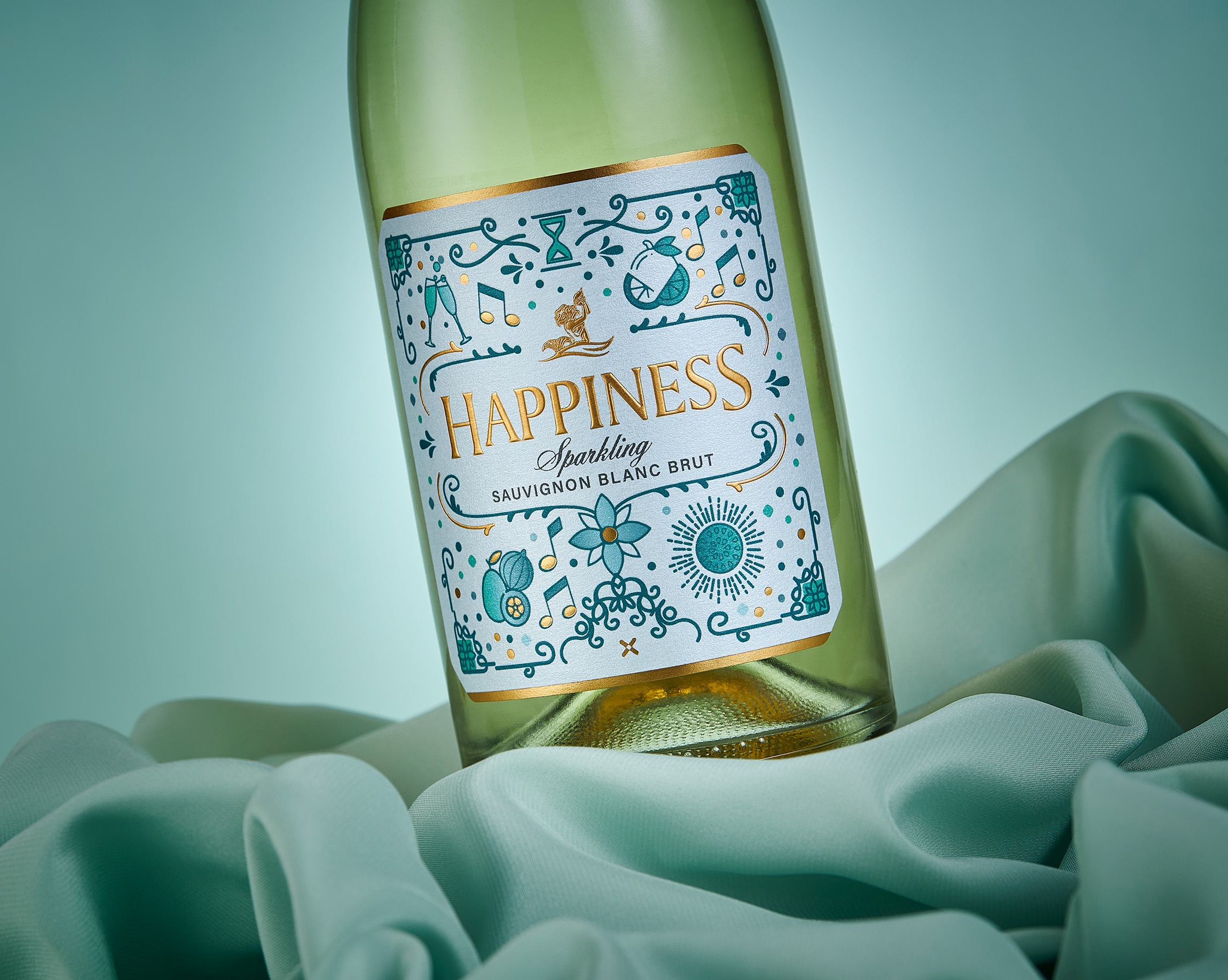
The design features a series of bespoke illustrations, including wine glasses, sunrays, flowers, clinking glasses, and fruit — each representing the flavour notes and celebratory nature of the wine. Arranged in a playful, confetti-like pattern, these illustrations envelop the striking, gold-foiled “HAPPINESS” logo, creating a sense of movement and joy.
The chosen teal-blue hue ties back to Raka’s evolving colour palette, serving as a secondary brand colour that subtly links the sparkling wine to the core range. The harmonious blend of cool teal and warm gold achieve a refined contrast, exuding both sophistication and playfulness. Gold foils, embossing, and the Opallux pearlescent paper further elevate the design, creating a tactile, sensory experience that mirrors the wine’s bubbly nature.
The Result
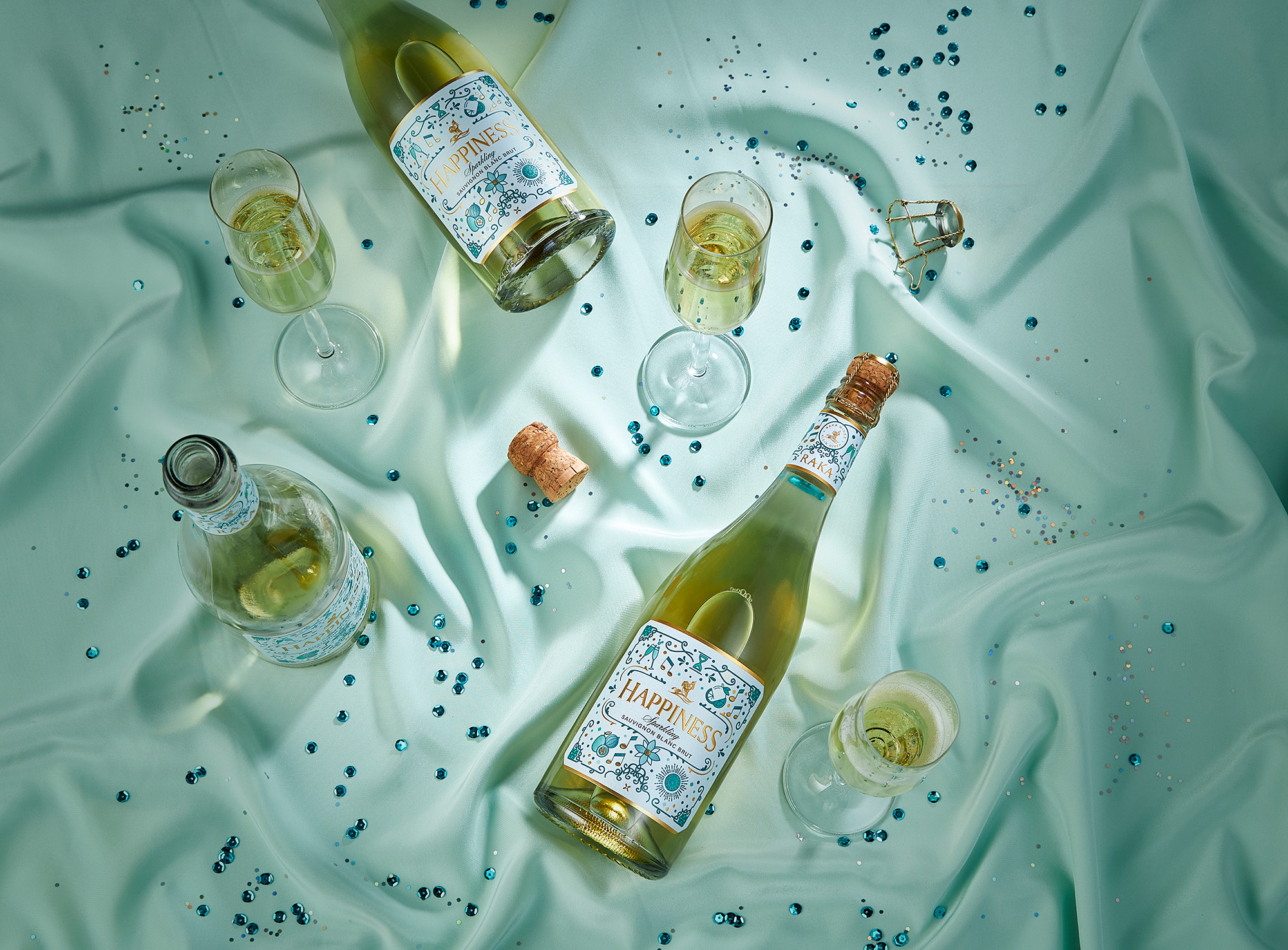
The revamped packaging for Raka Sparkling Sauvignon Blanc radiates with joyful energy, embodying the brand’s mission to uplift spirits and spread happiness with every pour. Since the launch, the new design has significantly increased brand engagement and boosted sales, proving that a splash of joy can truly leave a lasting impression. Raise your glass to Happiness.
CREDIT
- Agency/Creative: Just Design
- Article Title: Raka Happiness Sparkling Wine Shines with a Fresh Look by Just Design That Balances Elegance and Fun
- Organisation/Entity: Agency
- Project Type: Packaging
- Project Status: Published
- Agency/Creative Country: South Africa
- Agency/Creative City: Cape Town
- Market Region: Africa
- Project Deliverables: Label Design
- Format: Bottle
- Industry: Food/Beverage
- Keywords: WBDS Agency Design Awards 2025/26 , Sparkling Wine, Raka Wine
-
Credits:
Creative Director: Thelmarie Toerien
Designer: Maderi Hoffman


