


In the dynamic and visually rich tapestry of the Indian fashion market, particularly within the burgeoning streetwear sector, creating a brand that truly resonates and cuts through the noise demands a potent combination of cultural understanding and innovative design. Wortham Digital, a passionate creative agency based in Ghaziabad, India, has risen to this challenge with their striking brand identity for DAP-OUT Apparel, a male fashion brand spearheaded by two enigmatic female founders. This design isn’t just about aesthetics; it’s a carefully constructed visual language that speaks directly to the spirit of individuality and rebellion prevalent amongst India’s youth.
Decoding the Indian Zeitgeist:
India’s young generation is a fascinating blend of global influences and deeply ingrained local identities. They are expressive, opinionated, and increasingly seeking brands that reflect their unique perspectives. DAP-OUT taps into this desire for self-expression with a brand that boldly rejects conformity. Wortham Digital understood this core value and translated it into a visual identity that is both contemporary and culturally relevant.
The Power of Symbolic Design:
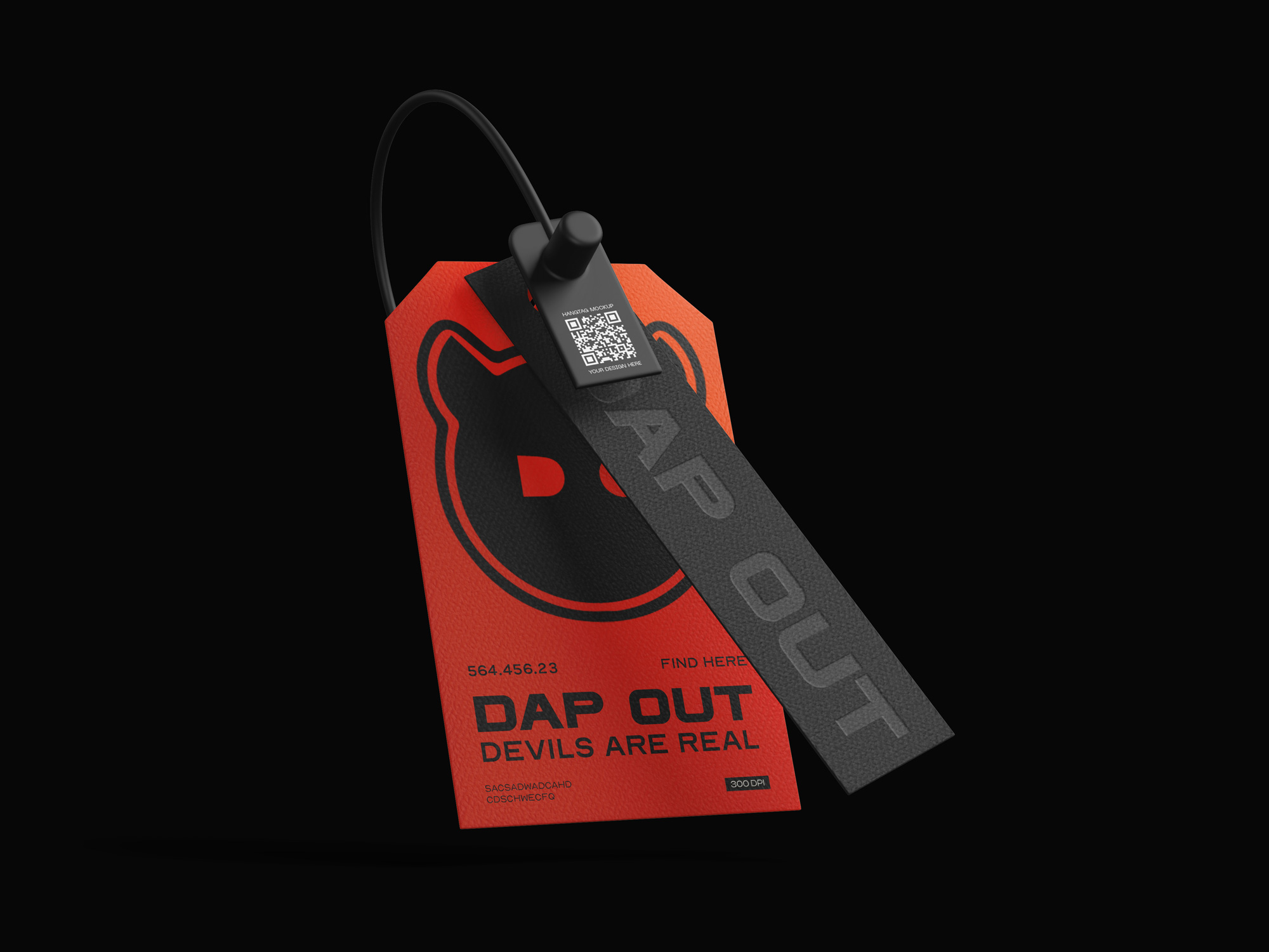
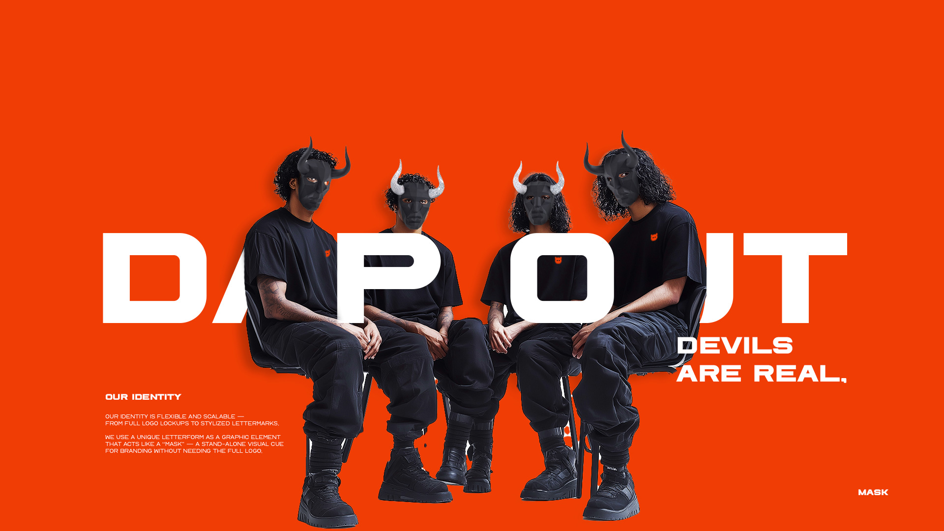
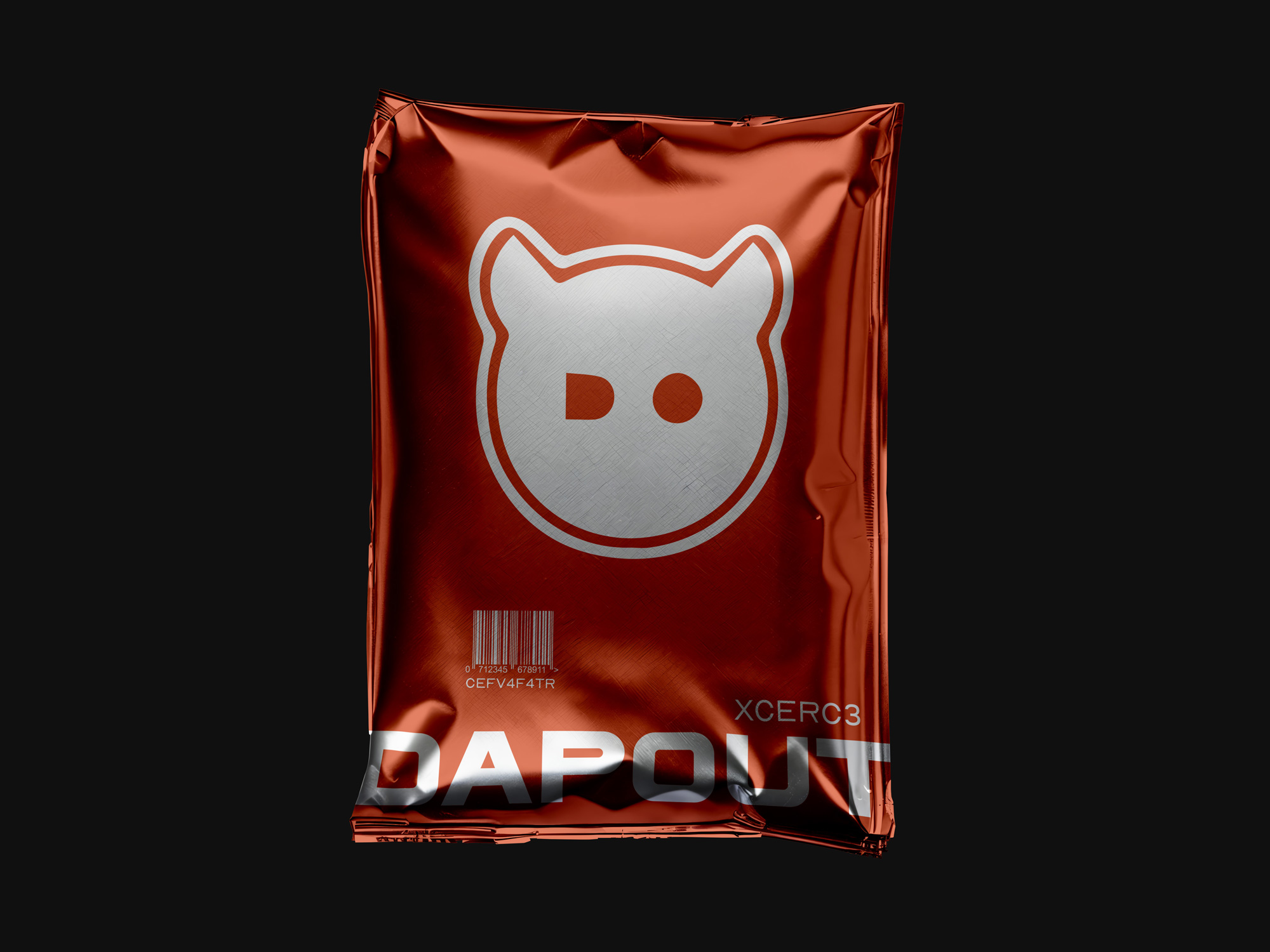
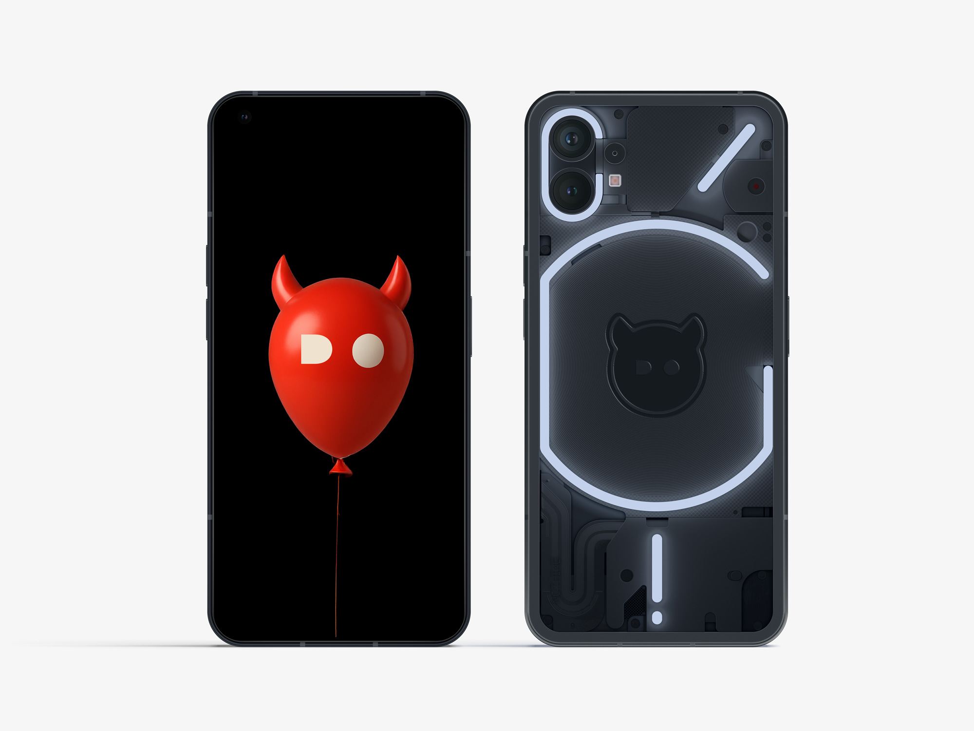
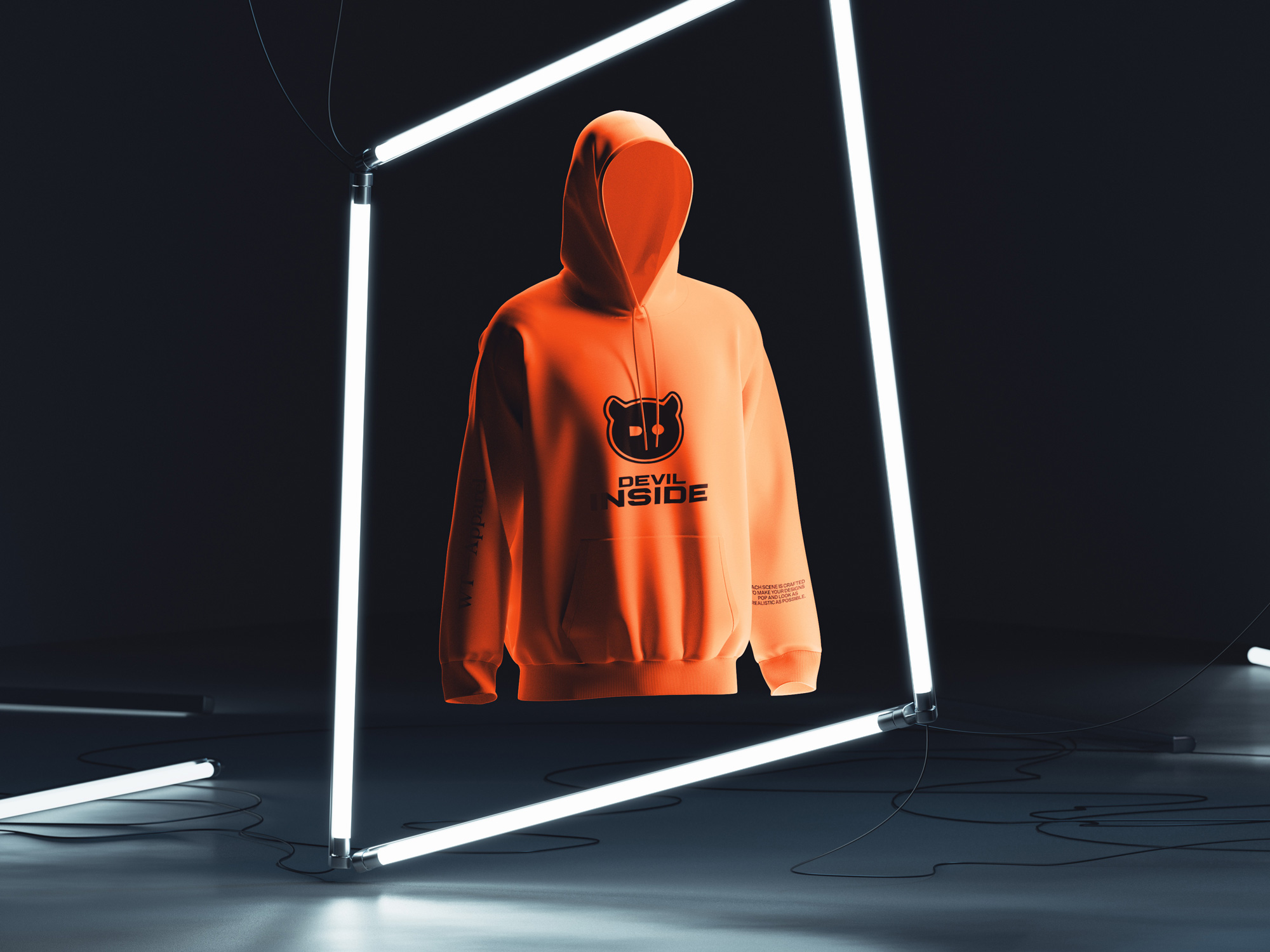
The core of DAP-OUT’s visual identity rests on two compelling symbols: the ubiquitous face mask and the playfully subversive devil horns.
The Face Mask: A Contemporary Indian Icon: The face mask holds a unique significance in India. Beyond its practical applications, it has evolved into a symbol of resilience and a subtle form of personal expression in the country’s diverse and often crowded urban environments. Wortham Digital astutely recognized this, reinterpreting the mask as a visual shorthand for anonymity, individuality, and a shared modern experience. In the bustling streets of Mumbai, the vibrant college campuses of Delhi, or the tech hubs of Bangalore, the DAP-OUT mask subtly signals belonging to a tribe that values both style and a degree of enigmatic self-possession.
The Devil Horns: Injecting Playful Rebellion: The devil horn motif adds a crucial layer of playful defiance, a spirit that resonates deeply with the energetic and often irreverent attitude of India’s youth. It’s a visual wink, a way to express a non-conformist streak without being overtly aggressive. This unexpected element injects memorability and sets DAP-OUT apart from more conventional brands vying for attention.
A Bold Visual Language:
Complementing these central symbols is a carefully curated visual language:
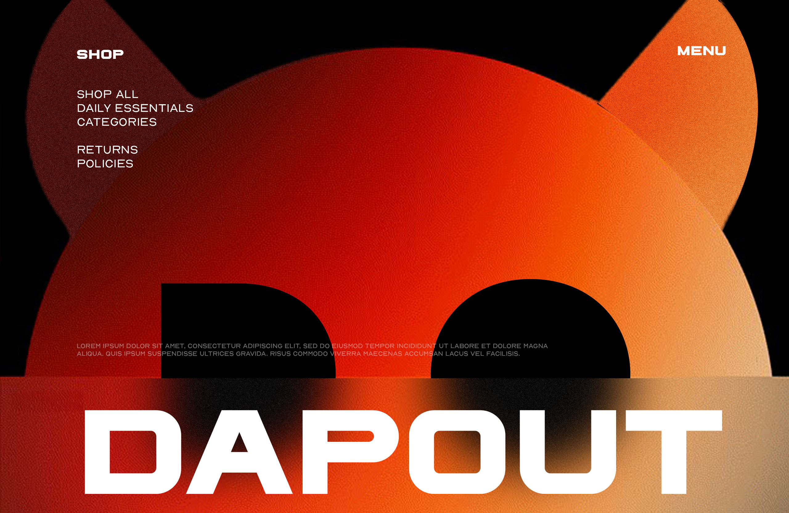
Assertive Typography: Strong, contemporary fonts convey confidence and modernity, providing a solid anchor for the more expressive visual elements.
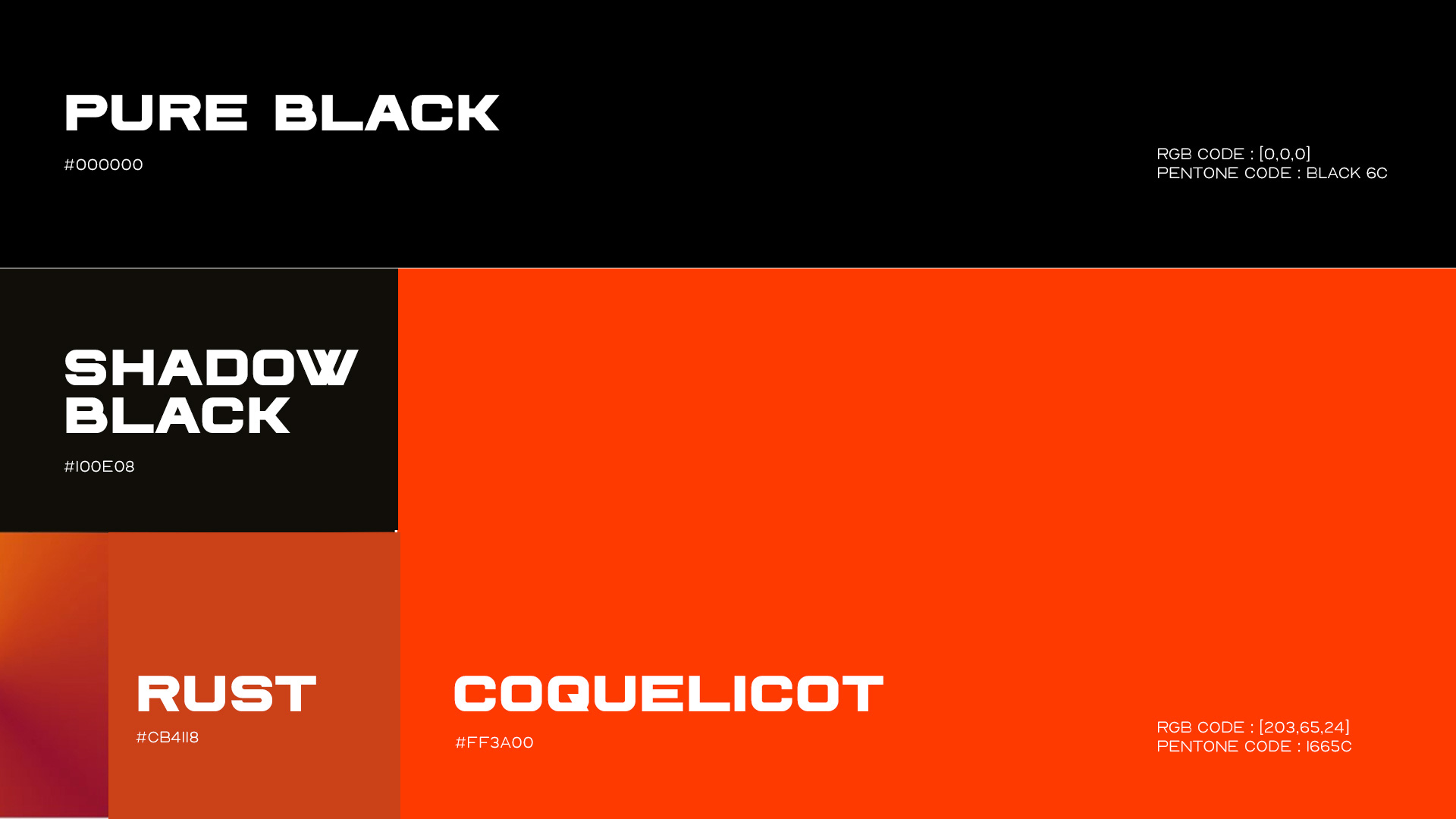
Striking Color Palettes: Bold and contrasting color combinations amplify the brand’s energy and ensure visual impact in a visually saturated market.
Modern Geometric Elements: Abstract geometric shapes add a layer of sophistication and versatility, allowing for dynamic application across various brand touchpoints.
The Wortham Digital Approach: Strategic Creativity Rooted in Culture:
Wortham Digital’s approach went beyond simply creating cool visuals. Their process involved a deep understanding of DAP-OUT’s core values and the nuances of the Indian consumer landscape. They meticulously crafted a visual identity that is not only aesthetically striking but also strategically resonant.
Symbol Integration: The seamless integration of the face mask and devil horn motifs into the logo and overall brand language creates a powerful and instantly recognizable visual signature.
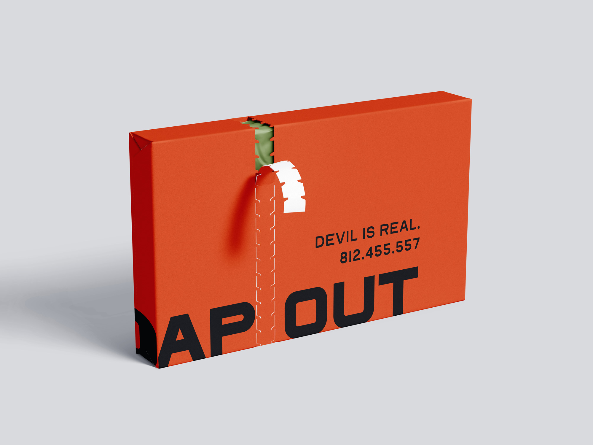
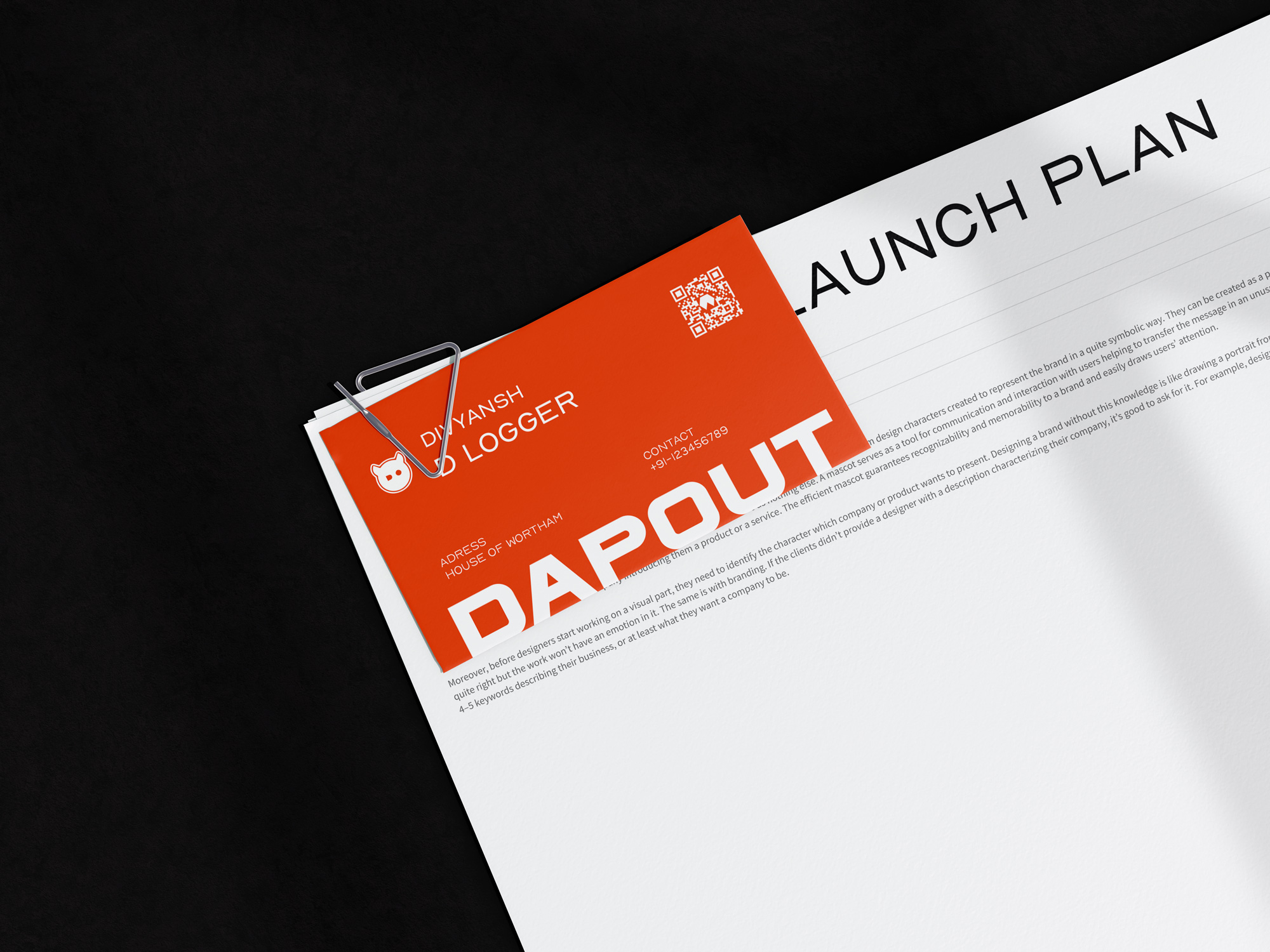
Versatile Application: The identity is designed to be adaptable across a wide range of applications, from apparel graphics and packaging to digital platforms and social media, ensuring a consistent and impactful brand experience.
Cultural Sensitivity: The choice of the face mask as a central symbol demonstrates a keen awareness of contemporary Indian culture and its evolving visual lexicon.
Impact and Potential:
The brand identity created for DAP-OUT by Wortham Digital is poised to make a significant impact on the Indian streetwear market. Its bold symbolism, contemporary aesthetic, and understanding of the target audience’s values create a powerful foundation for growth and recognition. This is a design that not only stands out visually but also connects with consumers on a deeper, cultural level.
CREDIT
- Agency/Creative: Wortham Creative Inc.
- Article Title: Beyond Trends: DAP-OUT’s Unique Brand Identity by Wortham, Captures the Spirit of Indian Youth
- Organisation/Entity: Agency
- Project Type: Identity
- Project Status: Published
- Agency/Creative Country: India
- Agency/Creative City: Delhi
- Market Region: Asia
- Project Deliverables: Brand Design, Brand Experience, Brand Guidelines, Brand Identity, Brand Mark, Brand Strategy, Brand World, Branding
- Industry: Fashion
- Keywords: Fashion logo, Branding, GenZ fashion Brands
-
Credits:
Designer: Divyansh
Creative Director: Samyak
Brand Coordinator: Dr. Nanika
Brand Manager: Harsha Chaudhary


