


Creative agency The Working Assembly has partnered with Public School 9 (PS9), an elementary school located in Manhattan’s Upper West Side, to launch a dynamic new visual identity that celebrates the school’s commitment to curiosity, exploration, and academic achievement.
Serving students from Pre-K through fifth grade, PS9 fosters a growth mindset and lifelong learning. At the heart of the school is a spirit of discovery, symbolized by its iconic glass mosaic, Man in Space by Vincent Cavallaro. Commissioned in 1963, the mosaic honors scientific and continues to inspire students in the school’s auditorium foyer.
While PS9 has always been very clear on who it is and what it stands for, it lacked a cohesive brand identity that communicated these values to a wider audience. Enter The Working Assembly.
“The challenge was to embody the spirit of exploration while standing strong as an academic institution,” said Billur Eda Bilgi, brand designer at The Working Assembly. “We needed to create something that resonated with parents, teachers, and students: something both playful and credible. It was a delicate balance to strike.”
Ease of use was a key consideration in the design process. “The people who would be using the system are busy teachers who don’t have time to fuss with complex layouts or intricate type systems,” Eda explained. “Our solution had to be clean, intuitive, and flexible.”
Eda says they started by anchoring the new brand identity for PS9 in a simple grid system. “The grid system not only creates a strong framework for easy use of the brand system, but also evokes a sense of structure and academic authority, essential aspects of the PS9 brand,” she explains.
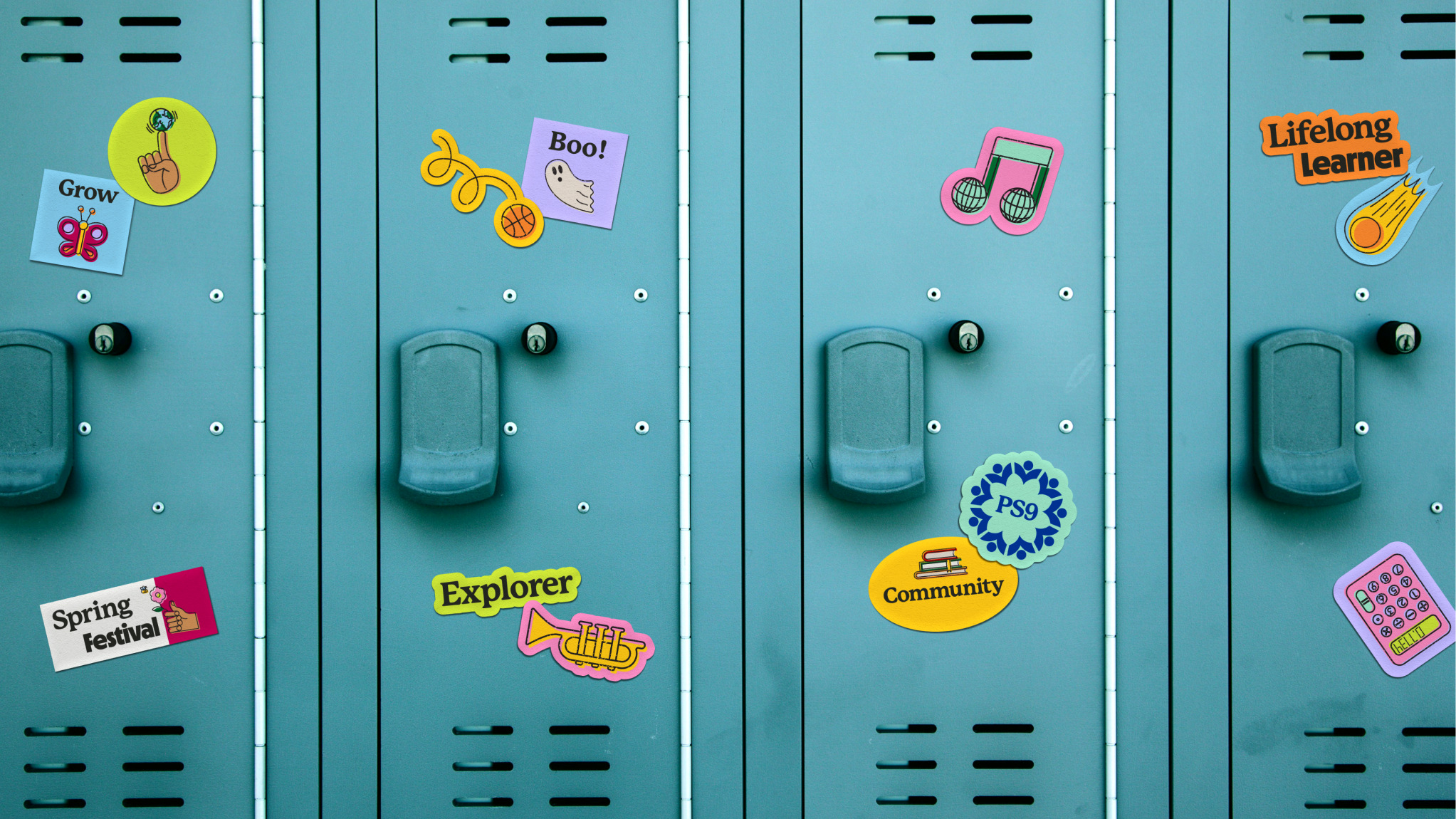
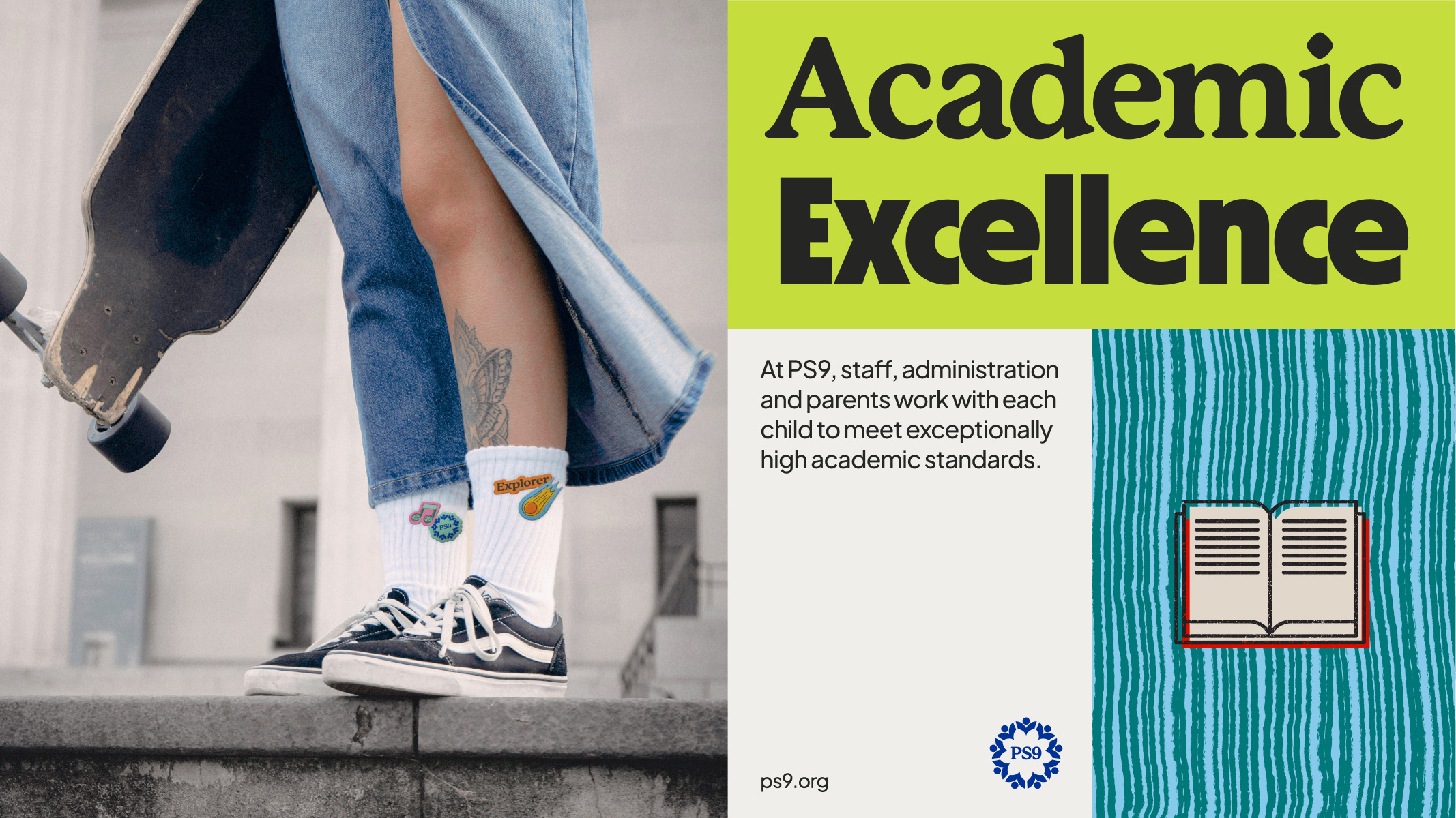
Building from PS9’s encouragement of exploration, illustrations celebrate the imperfect. The outline and fill are slightly offset to create an intentional misprint effect.
Alongside illustrations, Eda explains how custom patterns add another layer of playfulness to the brand: “The brush styles used to make the PS9 patterns reference materials one would find in a classroom. The intention was to make every aspect of the brand identity feel like it’s inherently tied to the school and its people.”
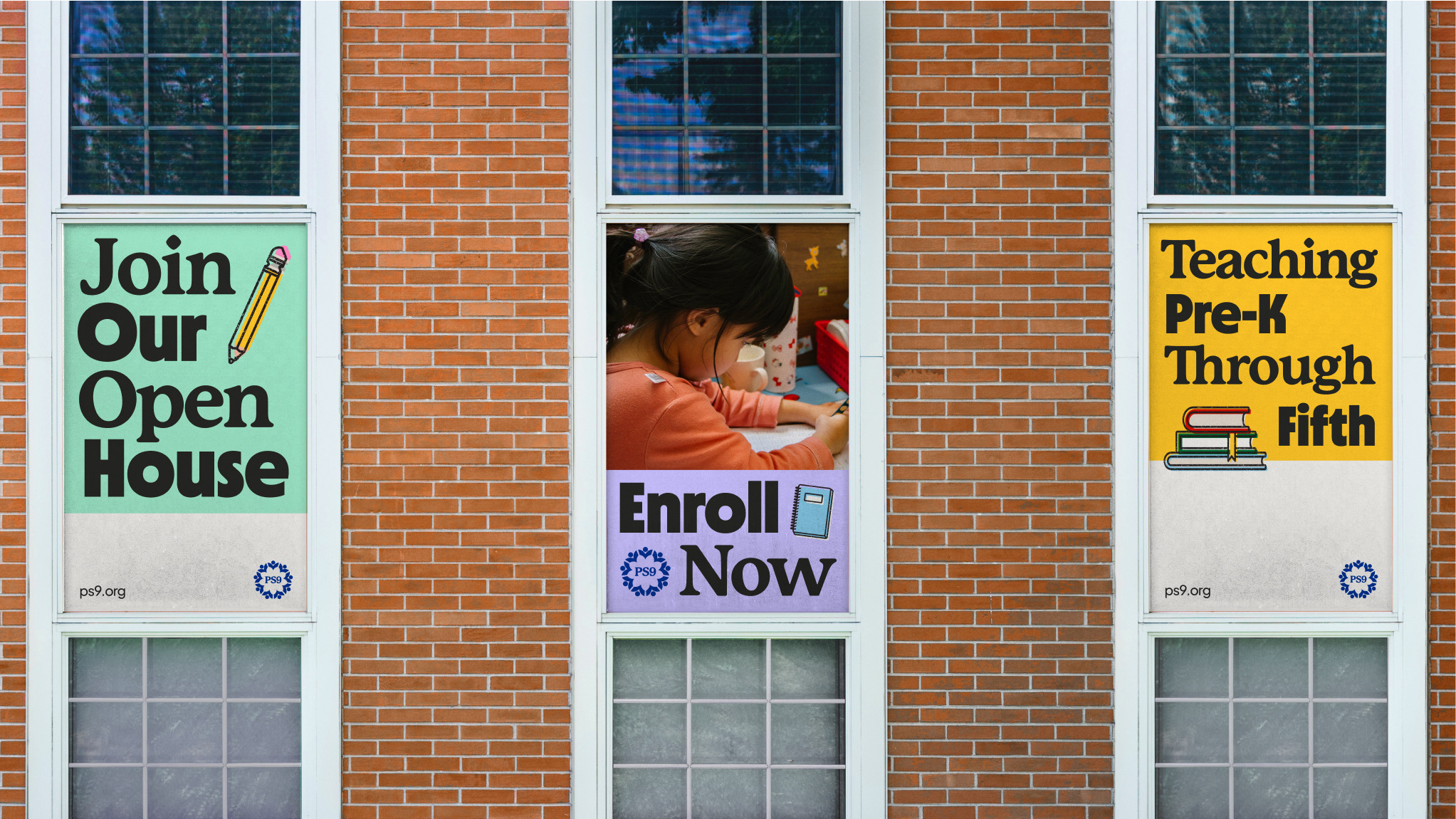
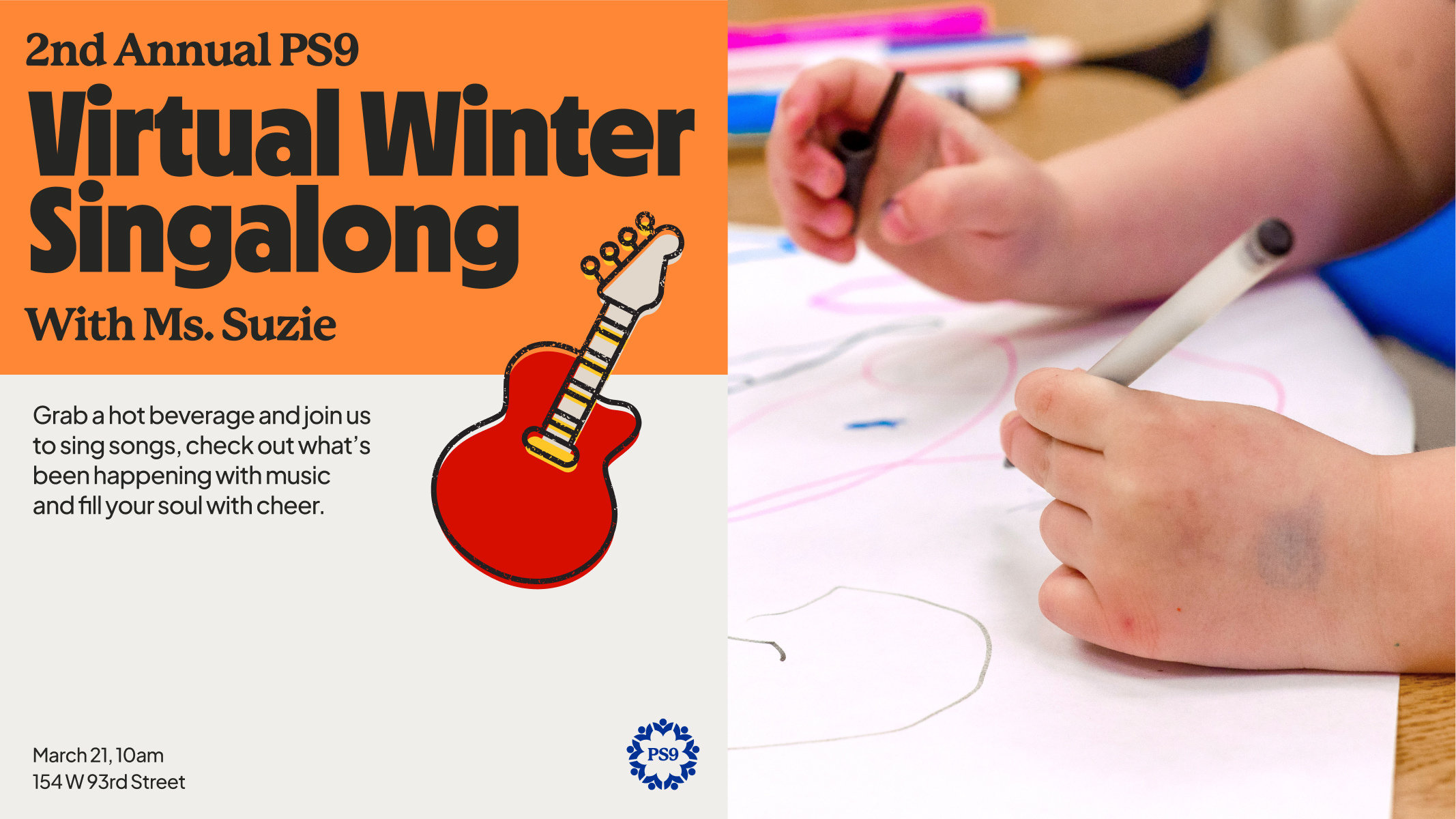
These patterns, illustrations, and the vibrant color palette evoke whimsy, while strong typography and uncluttered layouts highlight PS9’s commitment to academic excellence.
The type system also embodies both facets of the PS9 brand by alternating between two headline fonts: An academic yet approachable serif, Mackinac by P22, is combined with a bold sans serif, Nichrome by Mass-Driver.
Eda explains why Nichrome was the perfect choice for the brand identity: “Nichrome was designed to reference typography in 1970’s/80’s sci-fi paperbacks. It felt like the right bold sans, because it acts as another subtle nod to the PS9 space mosaic.”
The resulting brand identity for PS9 is simple yet striking, reflecting PS9’s core values and giving the school a strong, confident visual presence within the community.


CREDIT
- Agency/Creative: The Working Assembly
- Article Title: The Working Assembly Unveils Brand Identity for Public School 9, Blending Whimsy with Academic Excellence
- Organisation/Entity: Agency
- Project Type: Identity
- Project Status: Published
- Agency/Creative Country: United States
- Agency/Creative City: New York
- Market Region: North America
- Project Deliverables: Brand Design, Brand Identity, Brand Strategy, Illustration
- Industry: Education
- Keywords: Brand identity, Education
-
Credits:
Brand designer: Billur Eda Bilgi


