


Rechitskoe LiTE Pils is a fresh addition to one of the most recognizable beer brands around.
The Challenge
Our task was to craft a bold, on-trend image for this new light beer in the Rechitskoe lineup — LiTE Pils. To highlight the beer’s crisp, easy-drinking taste while staying true to the brand’s identity. At the same time, we wanted to make it more appealing to a younger, fast-paced, urban audience.
The Concept
The core idea behind the branding was inspired by the energy of the city — its rhythm, skyline, neon lights, and non-stop motion. Rechitskoe LiTE Pils is made for those who live life in the fast lane, who appreciate great taste, effortless style, and vivid experiences. The city is their stage, and LiTE Pils fits perfectly into the vibe of lively nights, good friends, and real emotion.
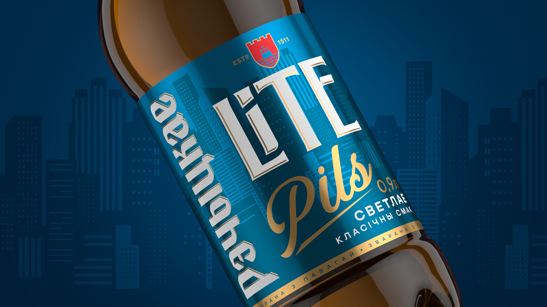
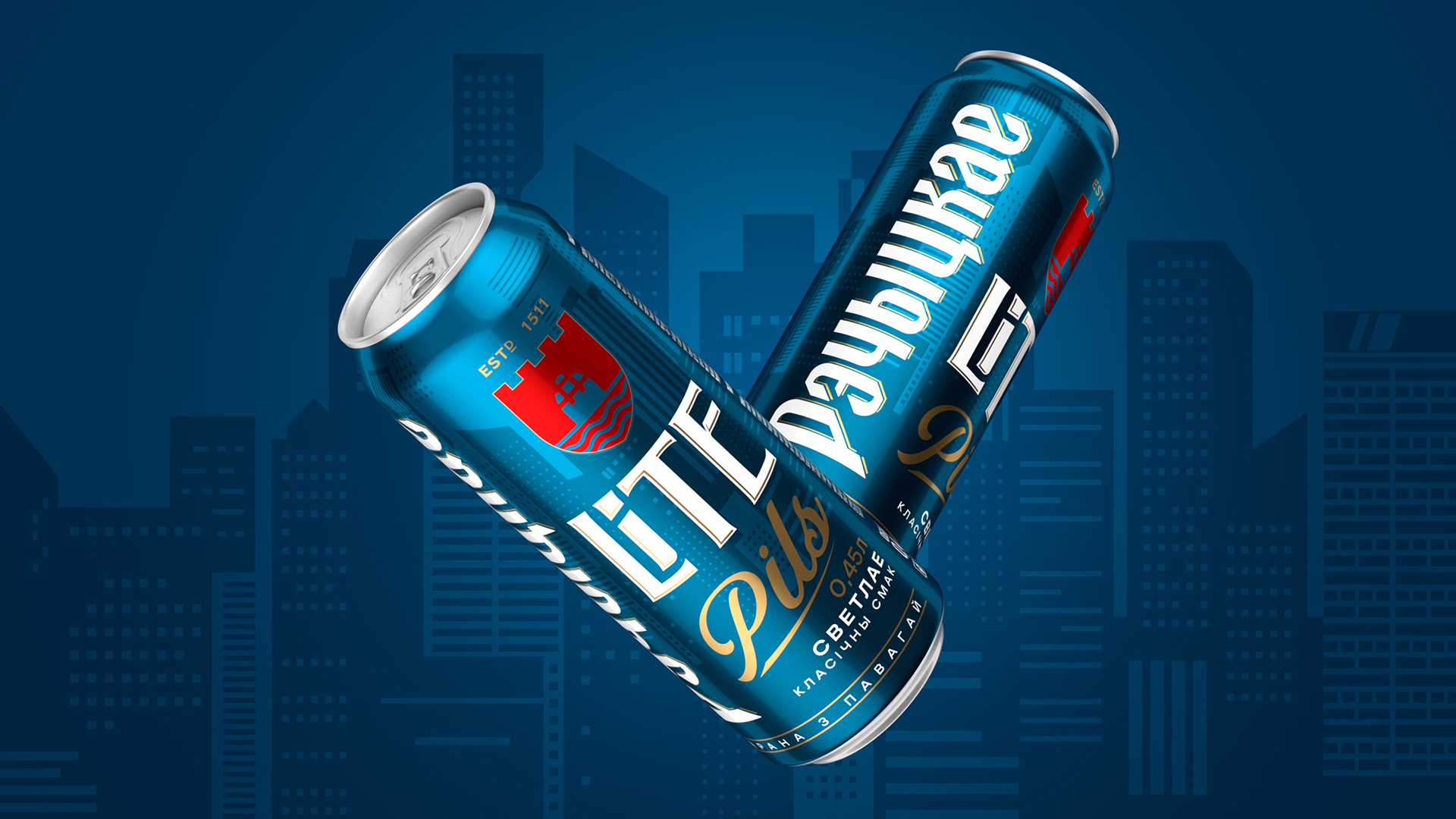
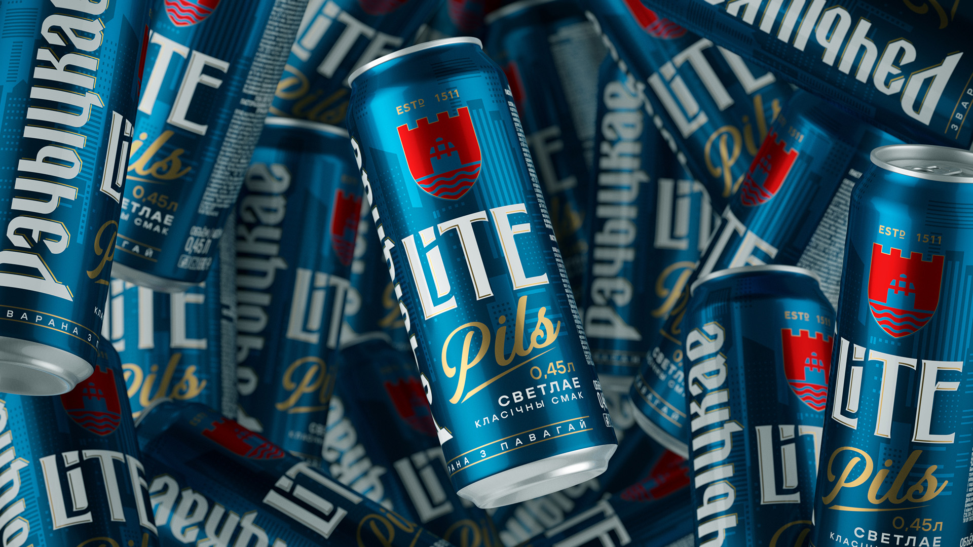
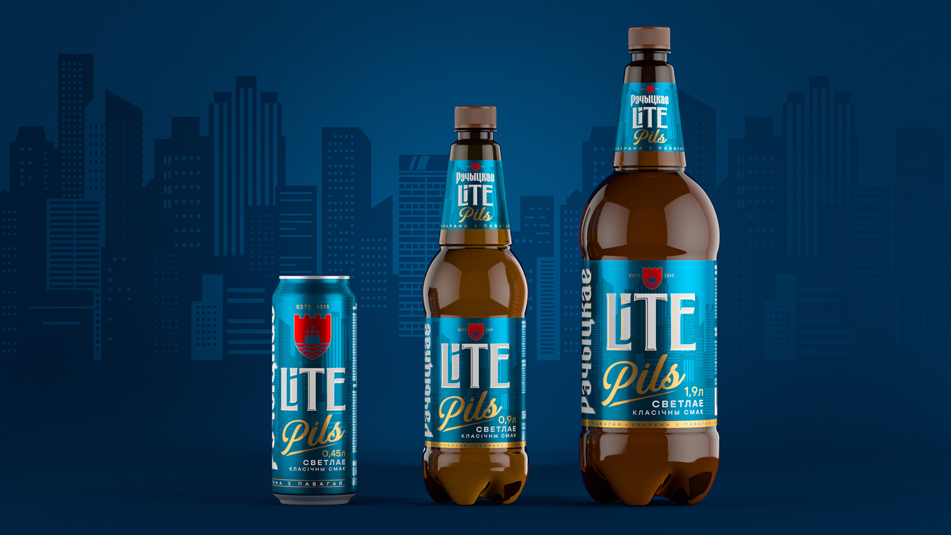
We reimagined the brand’s traditional visual language and blended it with a dynamic urban aesthetic. The deep azure-blue background with high-rise silhouettes evokes the feel of the city at night — glowing storefronts, bustling streets, and that unmistakable energy of a modern metropolis.
The label design features the word LiTE in a sleek, modern typeface with a soft contrast and 3D shadow that makes it shine like a neon sign on the shelf. The contrasting Pils type nods to classic pilsners. The vertical “Рэчацкае” and shield emblem are a respectful nod to the brand’s heritage — a visual anchor tying together the past and future.
The packaging design is flexible and works seamlessly across different formats while keeping the look impactful and readable. The color scheme ensures the product pops on the shelf, helping it stand out as bold, fresh, and relevant.
LiTE Pils is a modern twist on the Rechitskoe range, fitting naturally into the brand’s DNA. Thanks to the thoughtful branding and label design, it has a personality of its own and speaks directly to a new generation — confidently, energetically, and with great taste.
CREDIT
- Agency/Creative: PinotAgency
- Article Title: PinotAgency Injects Urban Energy into Rechitskoe LiTE Pils with a Vivid New Identity
- Organisation/Entity: Agency
- Project Type: Packaging
- Project Status: Published
- Agency/Creative Country: Russia
- Agency/Creative City: Saint-Peterburg
- Market Region: Europe
- Project Deliverables: Art Direction, Brand Creation, Brand Design, Brand Tone of Voice, Packaging Design
- Format: Bottle, Can
- Industry: Food/Beverage
- Keywords: beer packaging, label design, brand design
-
Credits:
Creative Director: Dmitrii V Ivancenko


