


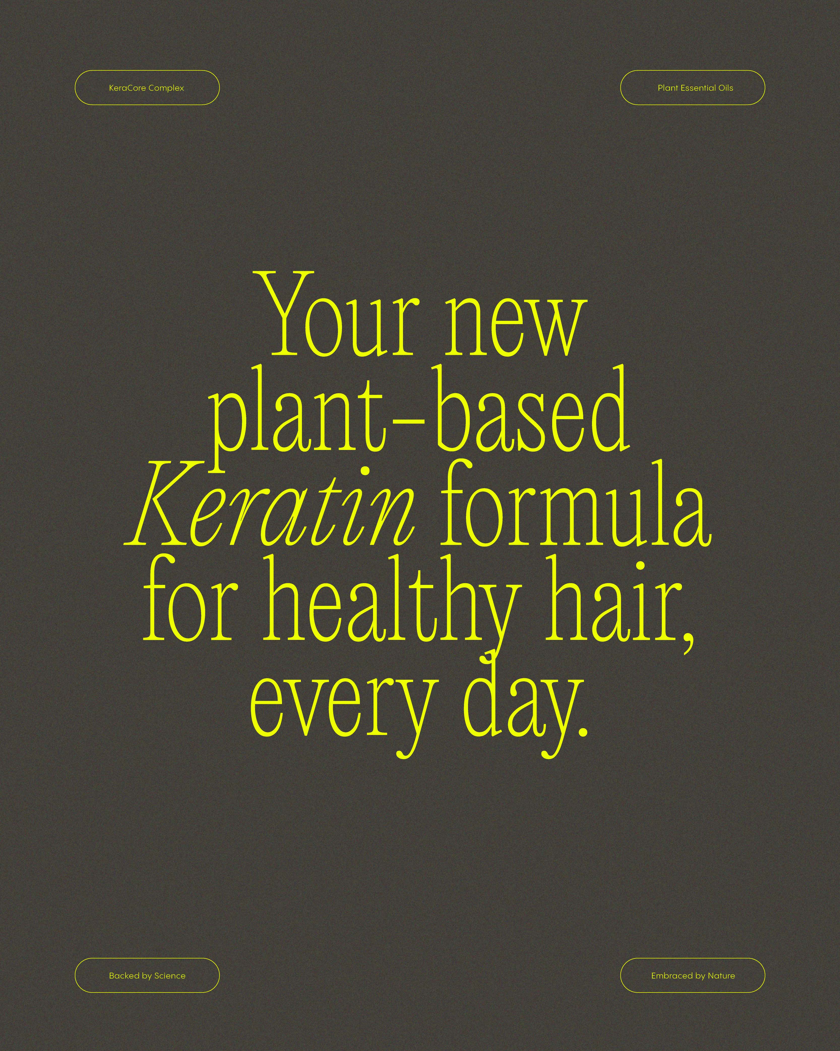
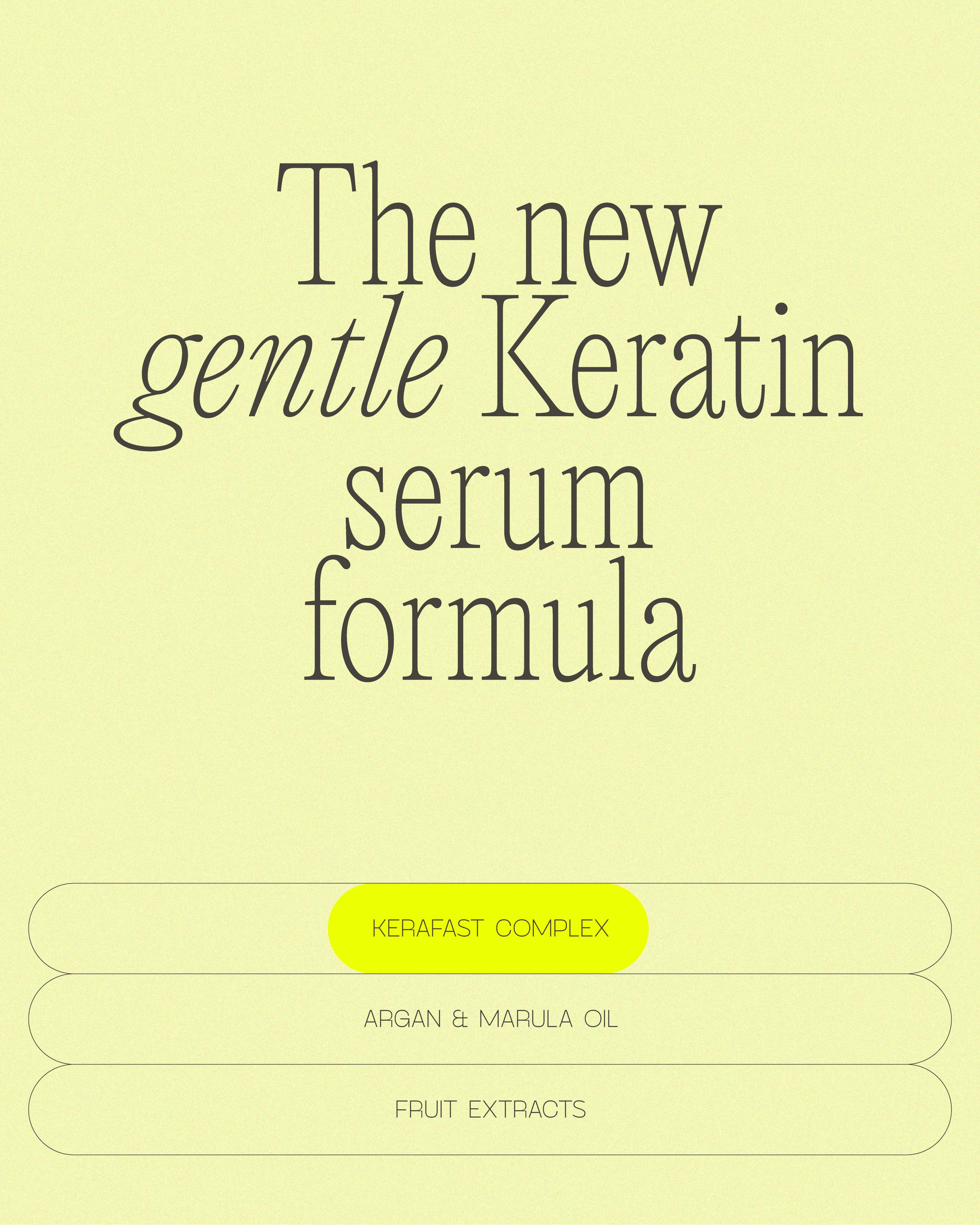
Unknown Friends teamed up with their friends at KPURE to challenge the harsh perception of keratin-based products by crafting a more approachable and trusted identity. Instead of following the usual rebranding path, the team set out to design a bold, science-driven system that could balance professional performance with visual clarity and real-world accessibility. While KPURE’s formulas already featured advanced keratin technology, amino acids, and plant-based oils, the market perception of keratin remained tied to aggressive, chemical-heavy treatments. Unknown Friends saw the opportunity to shift this narrative — making the science feel more human, and the brand feel like a confident, modern ally.
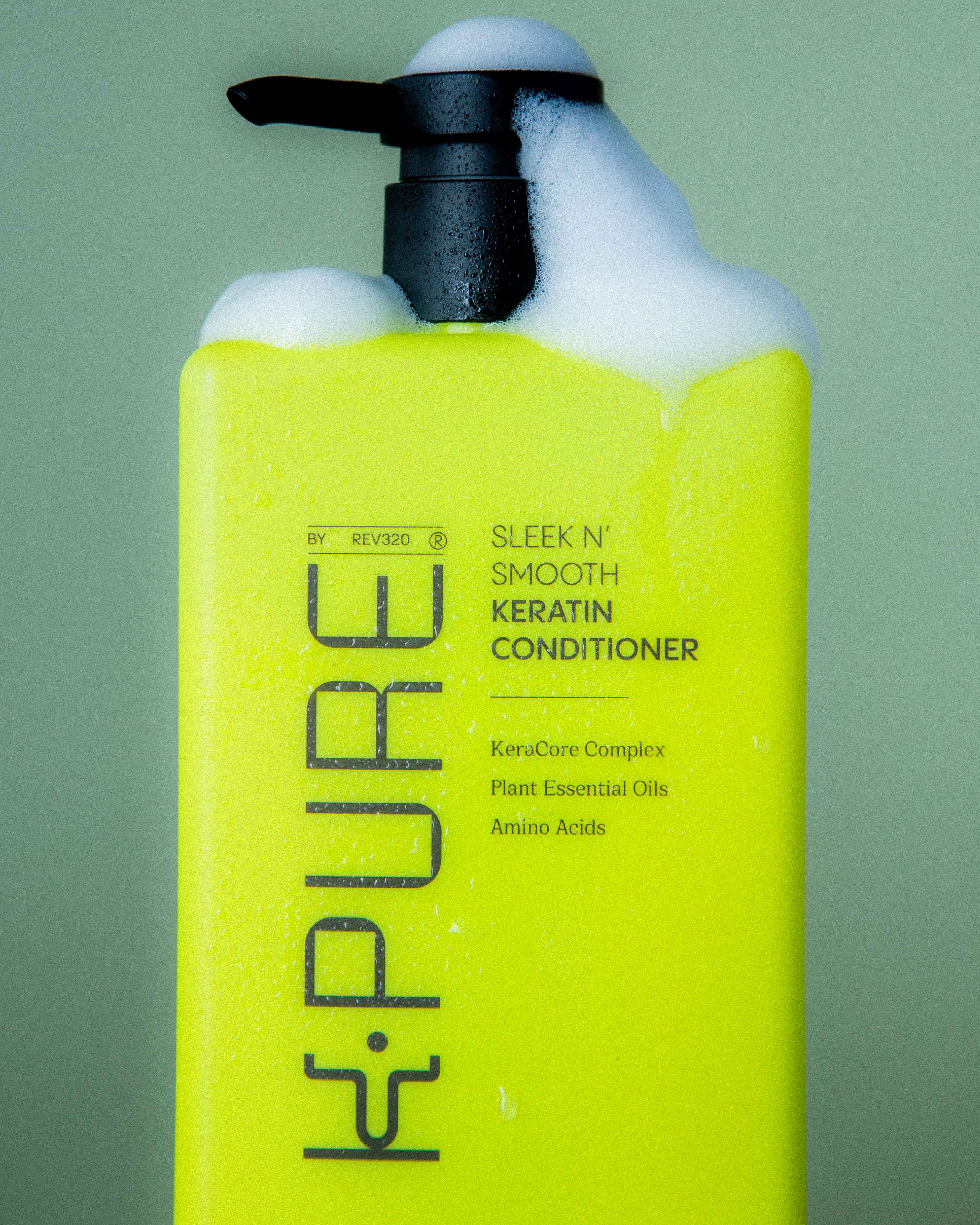
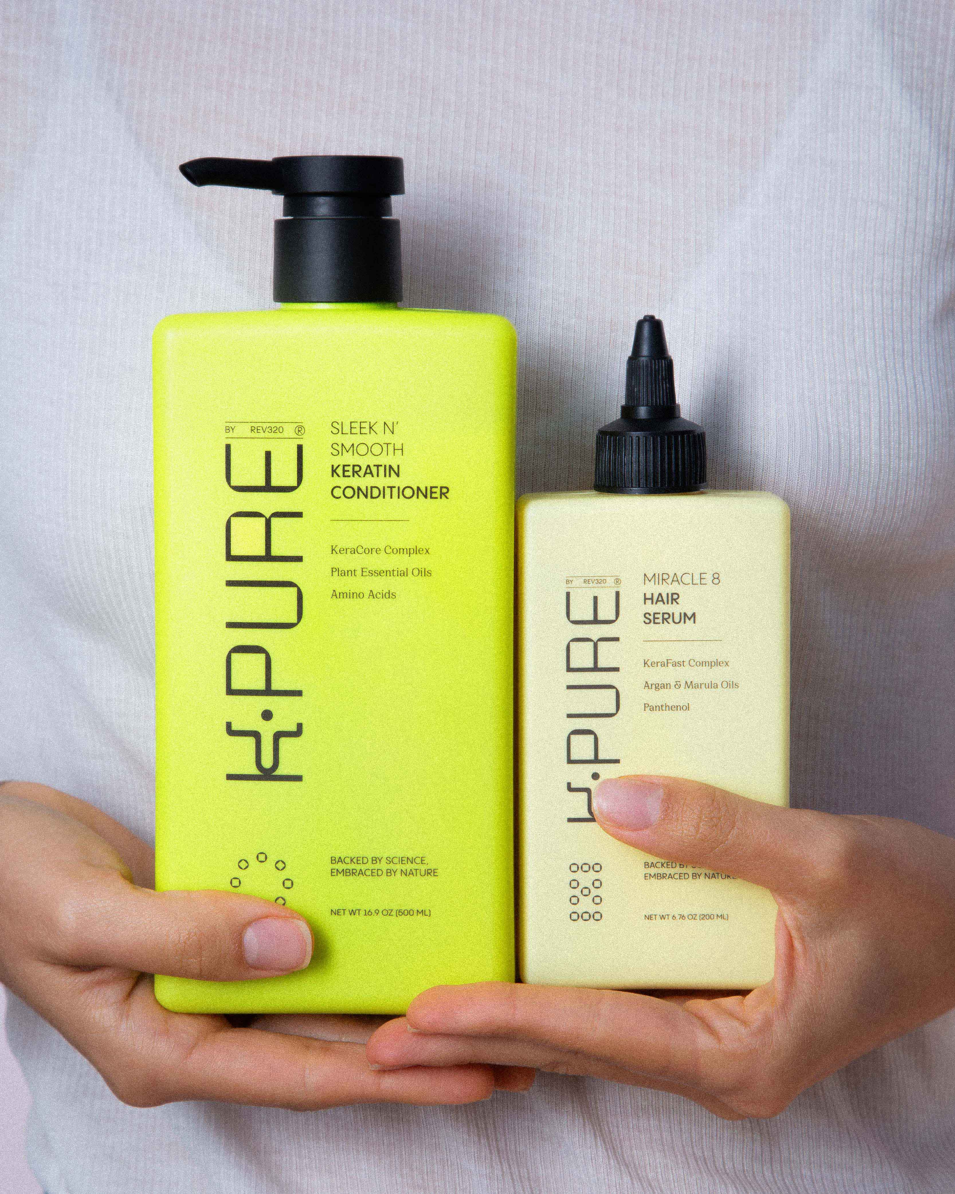
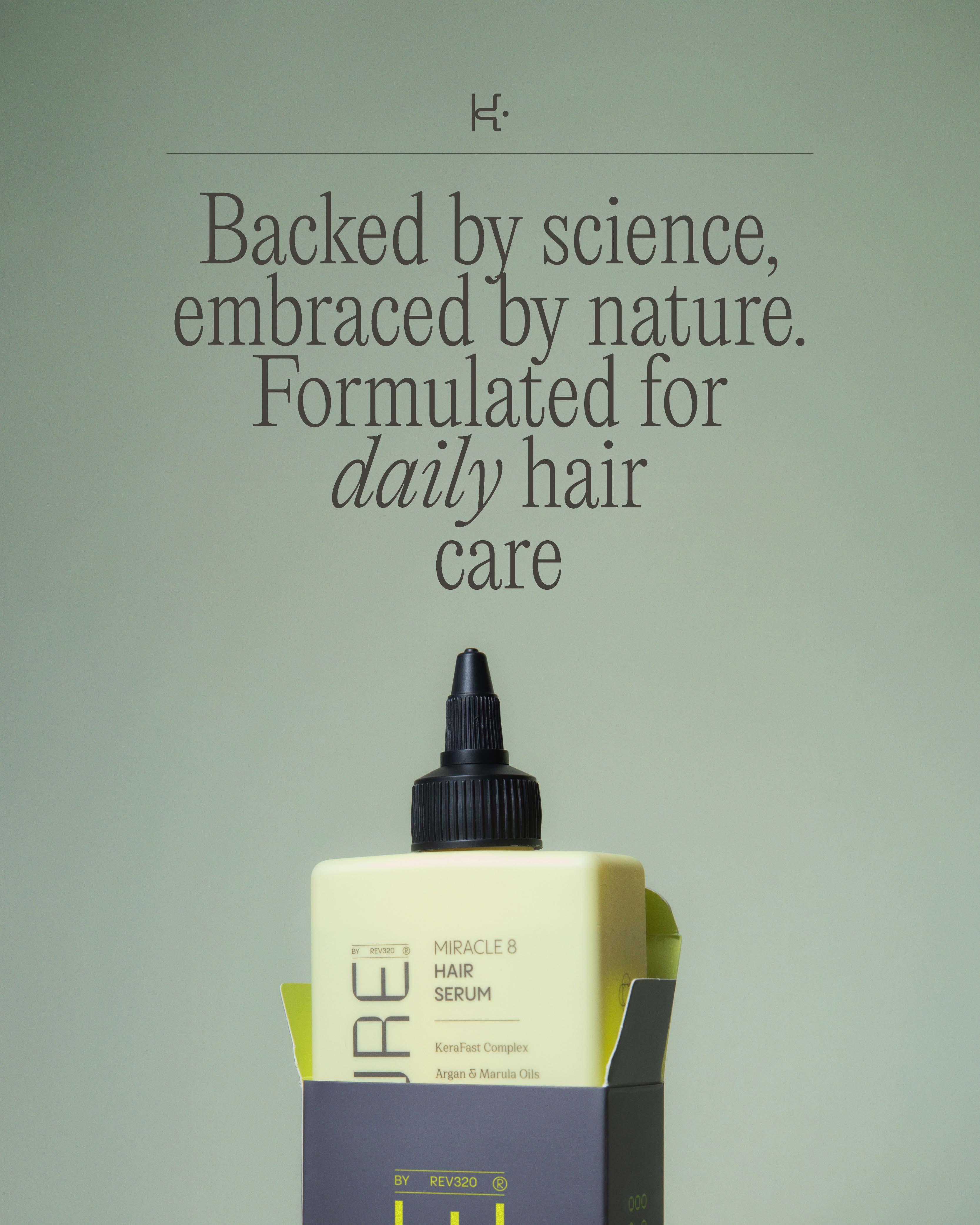
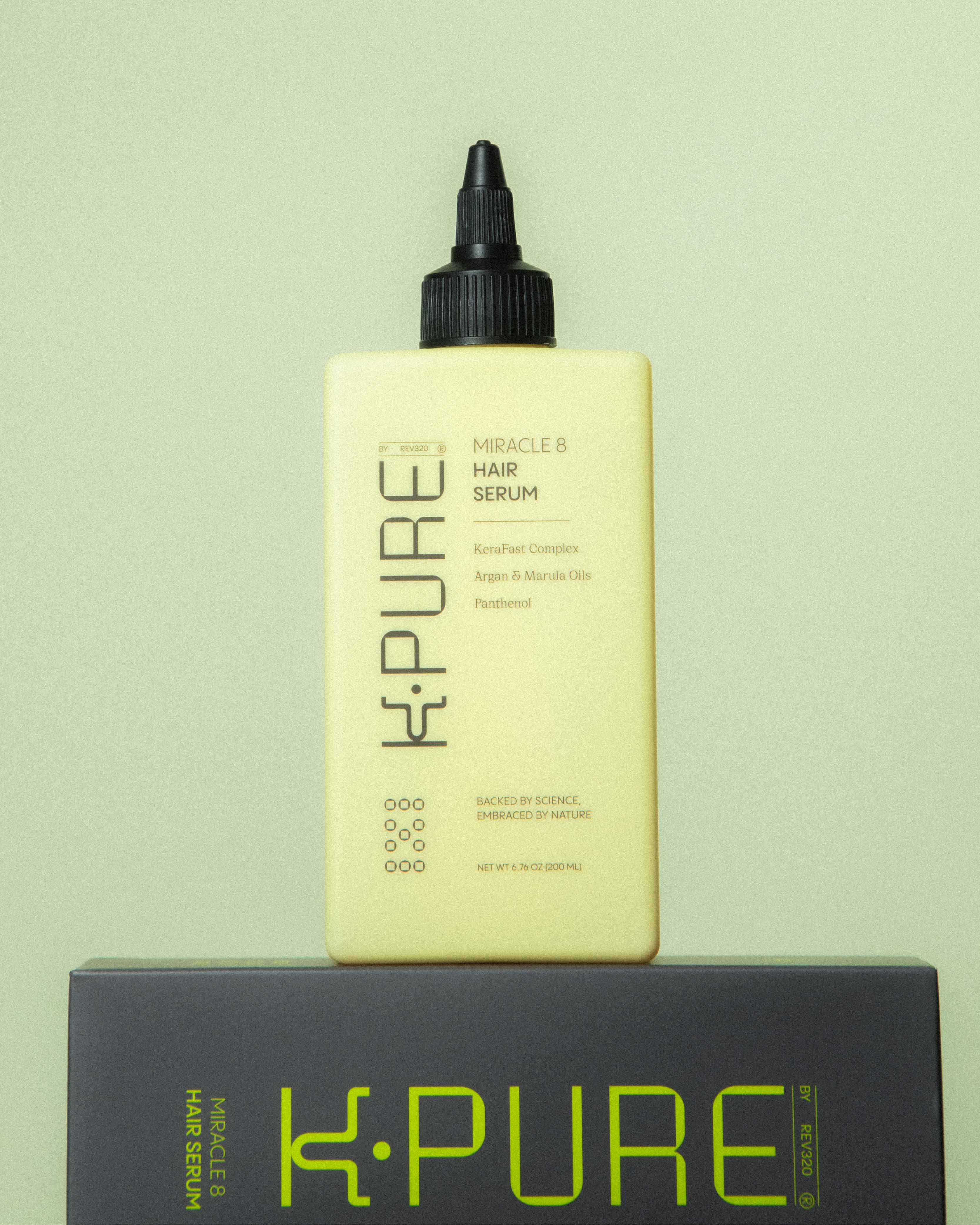
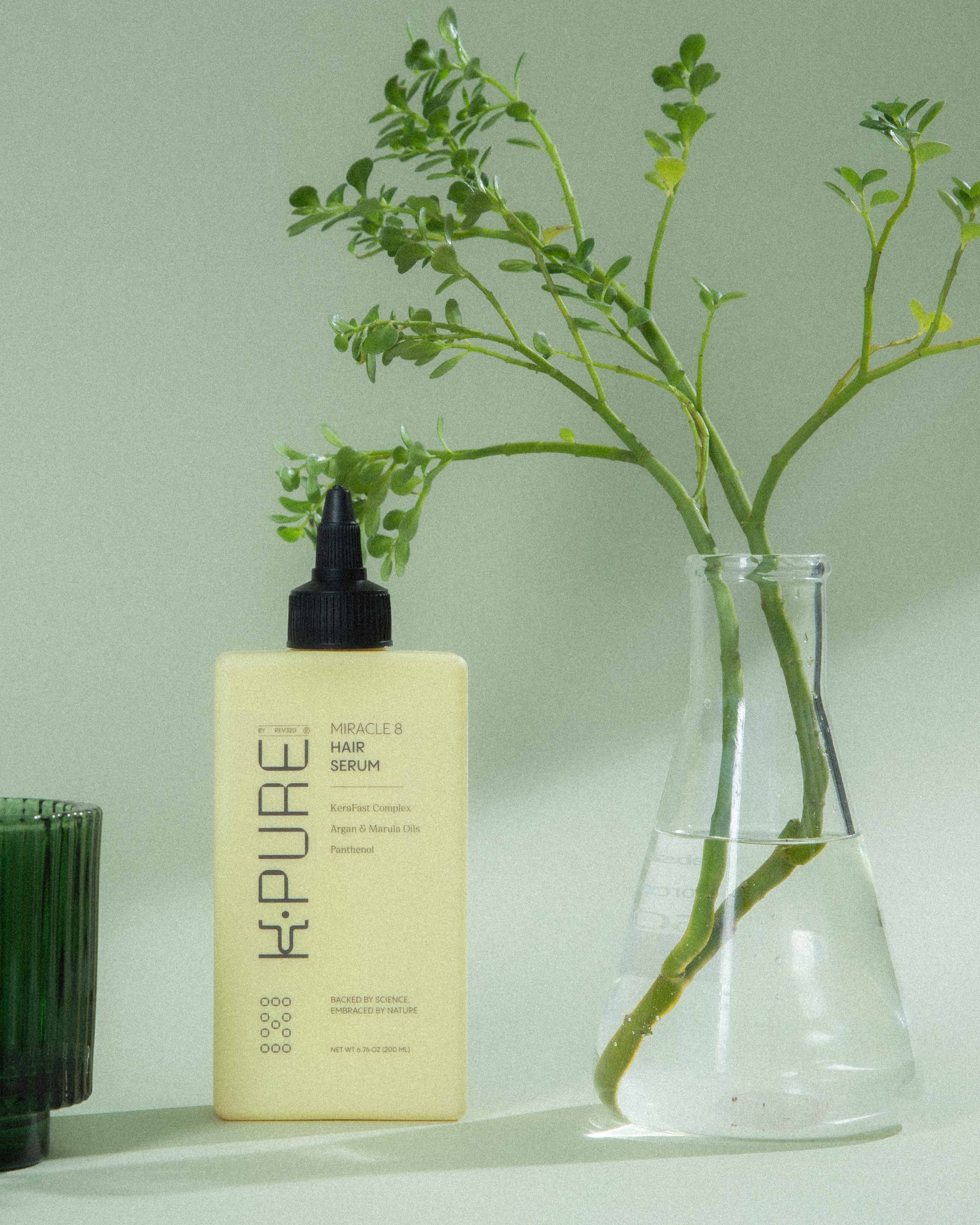
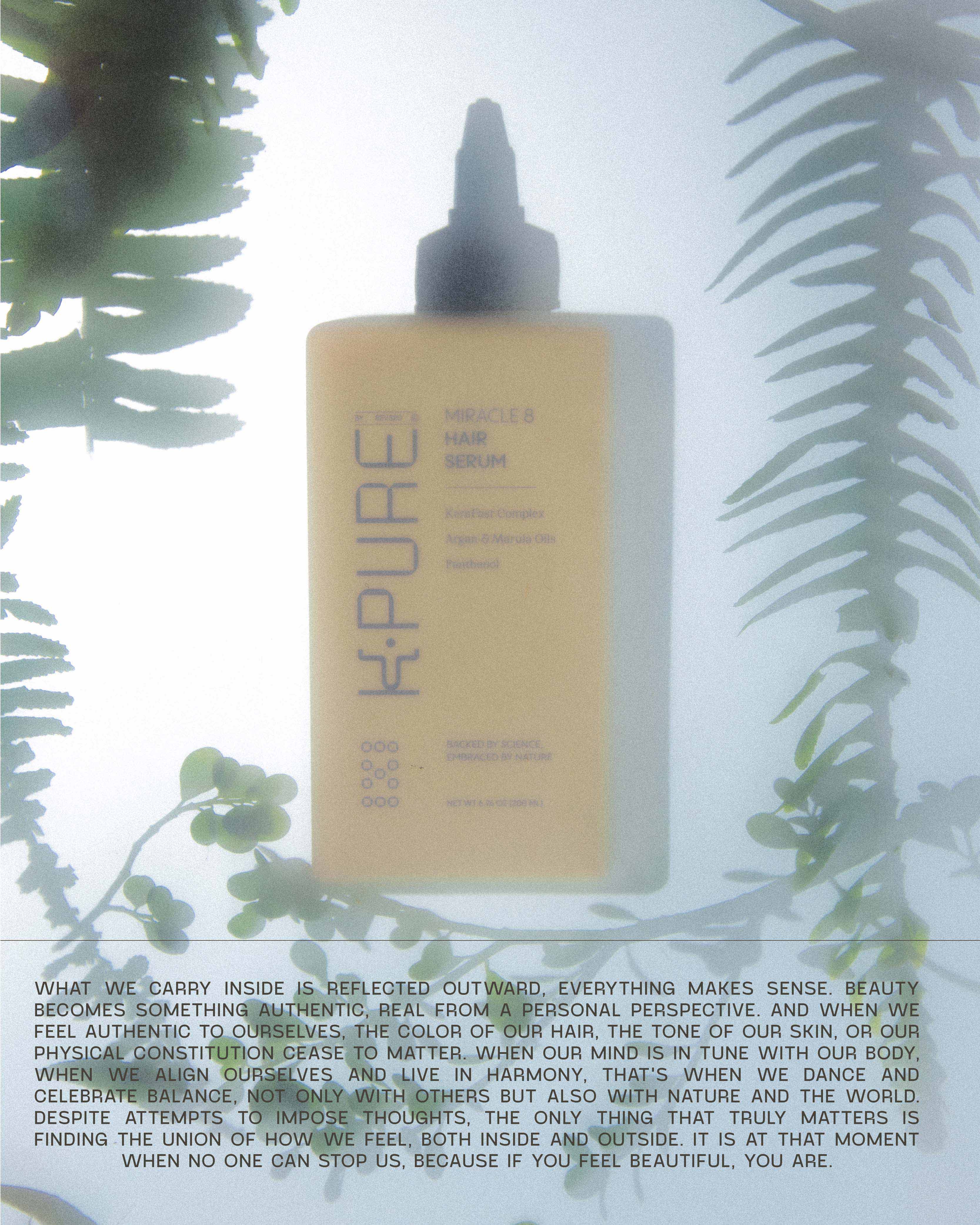
The new brand system was designed to simplify complexity without losing depth. Unknown Friends developed a modular packaging architecture anchored by a unified bottle silhouette, bold vertical typography, and a modular color palette that intuitively organizes the product families. Molecular-inspired icons and subtle graphic elements hint at the scientific expertise behind each formula, while maintaining a clean, approachable design language that feels equally at home in salons and on everyday shelves.
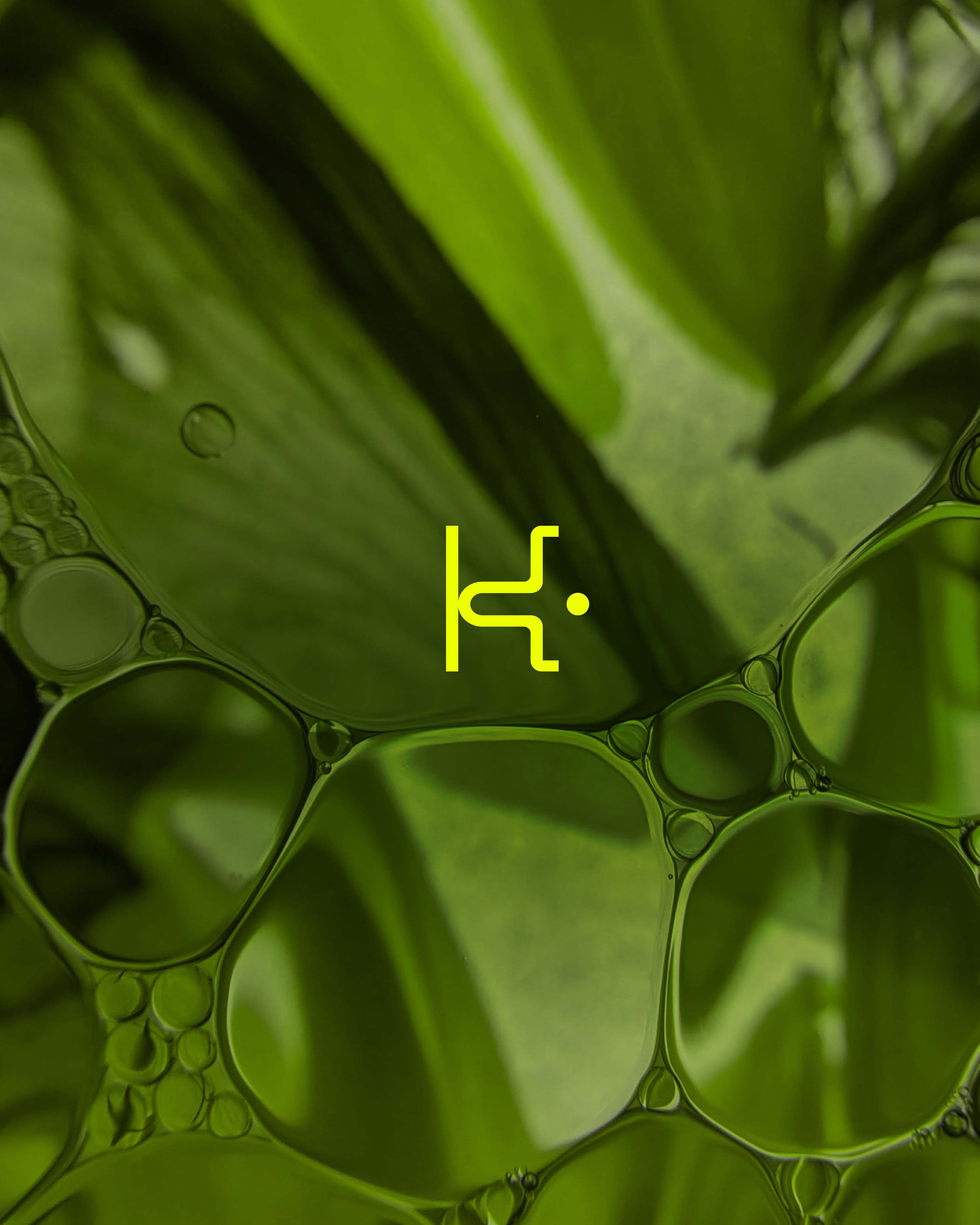
At the core of the system is the custom “K” symbol — a dynamic mark inspired by molecular structures and the movement of energy. It acts as the visual nucleus of the brand, bringing together science, fluidity, and strength in a single, iconic form.
The result is a cohesive brand platform that redefines what keratin-based haircare can be: powerful, reliable, and surprisingly gentle. Through collaboration, experimentation, and a shared belief in doing things differently, Unknown Friends helped KPURE build an identity that looks forward — one where performance and perception finally align.
CREDIT
- Agency/Creative: The Unknown Friends
- Article Title: The Unknown Friends Teamed Up With Kpure to Build a Gentler Future for Keratin Products
- Organisation/Entity: Agency
- Project Type: Identity
- Project Status: Published
- Agency/Creative Country: Colombia
- Agency/Creative City: Medellín
- Market Region: North America, South America
- Project Deliverables: Brand Identity, Brand Strategy, Identity System, Packaging Design
- Industry: Beauty/Cosmetics
- Keywords: Haircare, hair products, shampoo, organic products
-
Credits:
Creative Direction: Kev Pineda


