Robot Food – Mr Kipling International rebrand
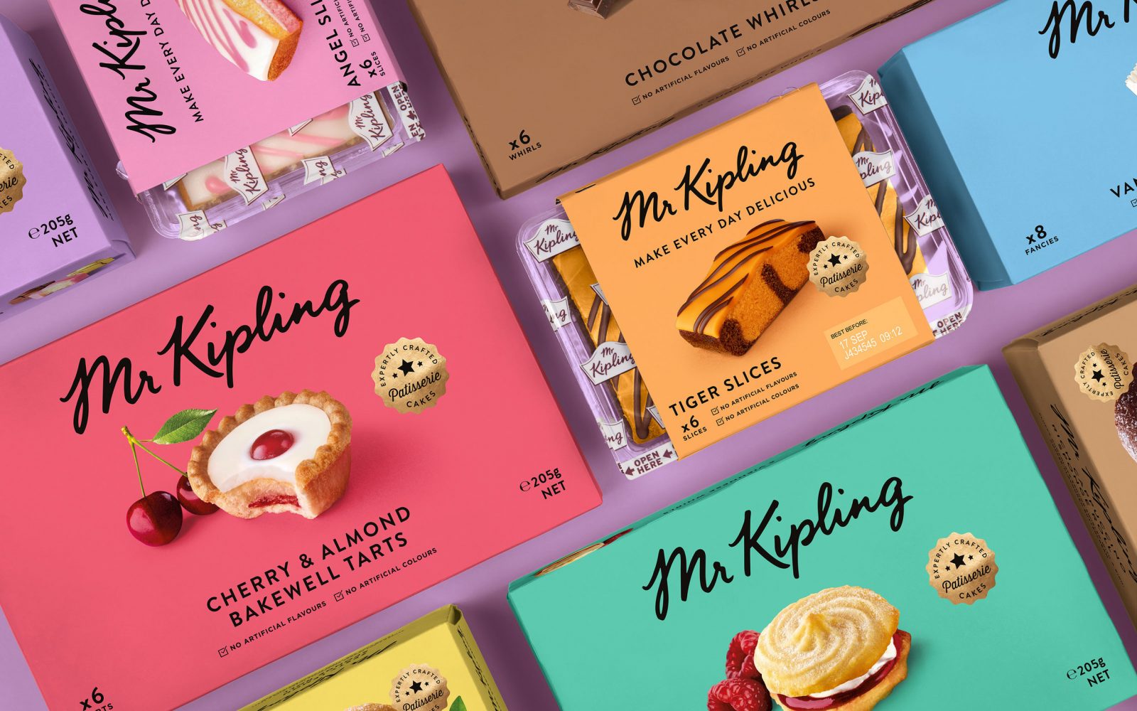
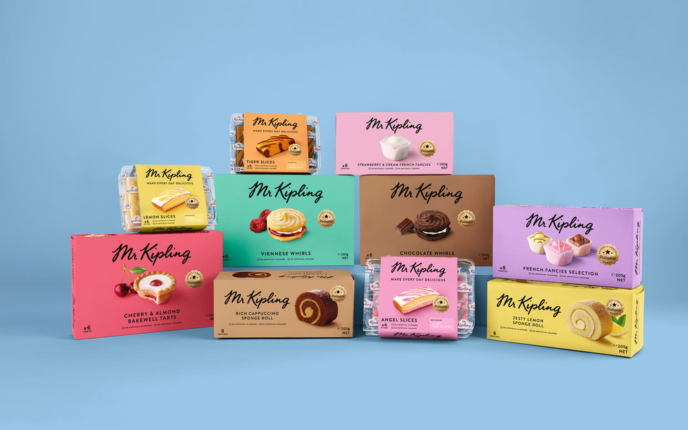
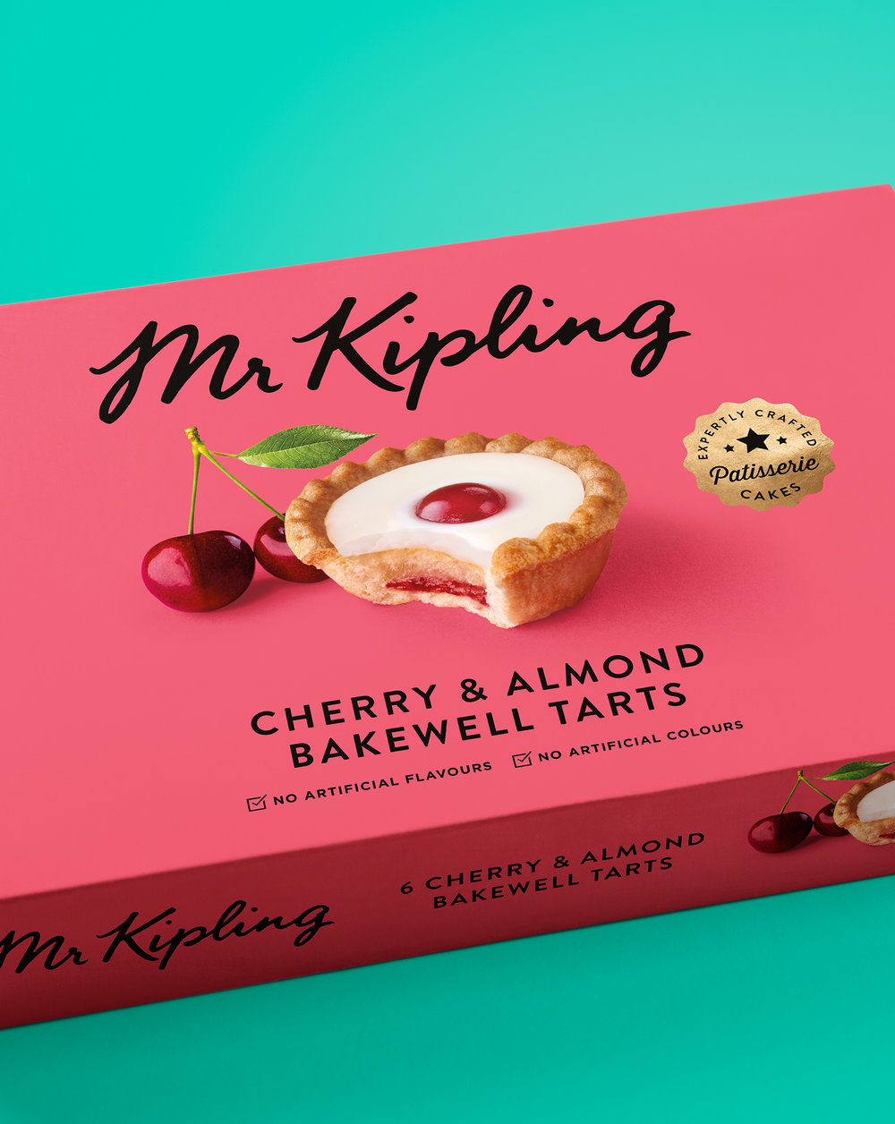
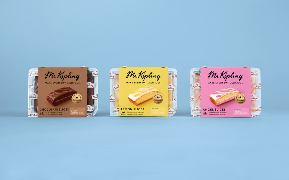
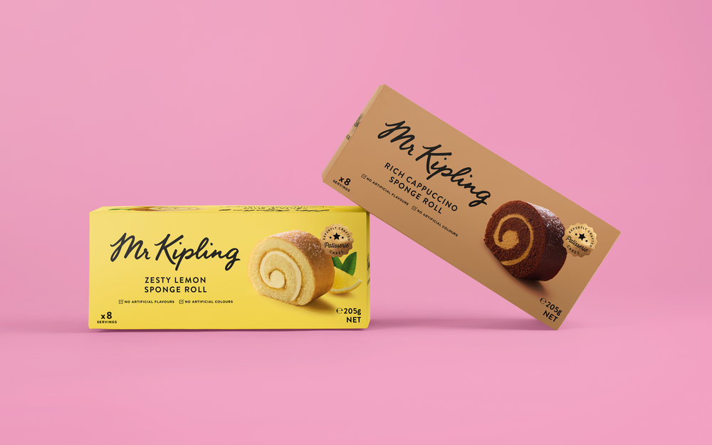
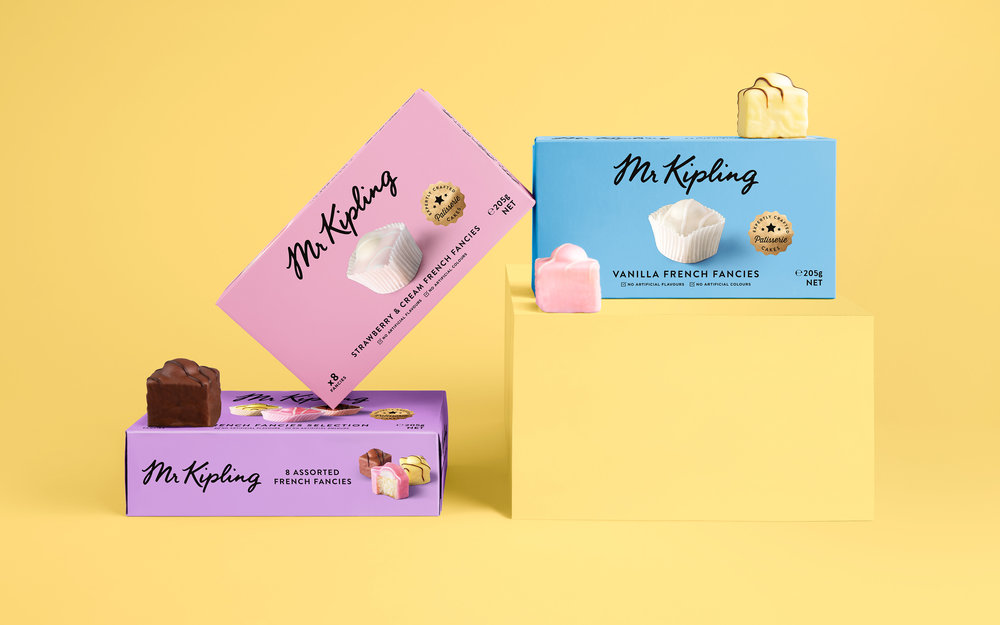
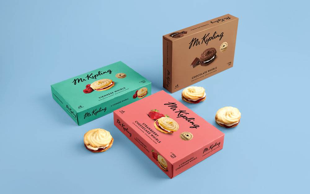
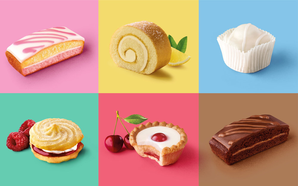
“Stacked with stale dated brands, the cake aisles of further afield proved a tasty opportunity for Premier Foods’ International Team. Mr Kipling needed a confident international expression and Leeds-based strategic branding agency, Robot Food, were chosen to deliver. For many in the UK, Mr Kipling’s range of iconic cakes holds a special place, but internationally the ‘exceedingly good’ brand is relatively unknown. Kimberley Tonge, Senior Brand Manager for International Sweet Treats at Premier Foods, said: “It was clear there was a great opportunity in both the US and Australia for Mr Kipling to provide a sophisticated, high-quality packaged cake, but entering as a challenger brand, Mr Kipling would need a bold new presence to compete.” In Australia, private label dominated 80% of the market share while the US preferred long-standing, nostalgic brands and own-label bakery treats. On both fronts, Mr Kipling could compete head-to-head on quality and freshness, so instead of relying on the brand’s UK-centric equity, Robot Food chose to focus on establishing Kipling’s creations as icons in their own right. With no strong existing equity in the international market, the team could reinvent Mr Kipling as a true challenger, infiltrating a tired and old-fashioned category with a design that felt exciting and premium. Martin Widdowfield, Creative Director at Robot Food, said, “we found most popular US products were actually pre-packed with super long shelf lives, but Australian consumers almost always preferred ‘just baked’. ‘Fresh quality’ was our common ground to work from and key to communicate.” “Cake is the hero and, wherever possible, product shots are accompanied by prominent ingredients. We drew inspiration from European patisseries and chose bright pastels for a fresh, contemporary aesthetic over stronger bold colours that risked feeling artificial.” To complement an ever-changing colour pallet, the classic Mr Kipling wordmark stands strongly front and centre on pack while straight-talking language brings a younger confidence to the brand. That’s right, the team chose to replace the famous strapline with a compelling reason to believe for a brand-new audience. ‘Make every day delicious’.Initially intended as two separate executions, Robot Food chose to develop a more holistic expression with variations considered for each respective market. On the finished result, Tonge said “We love it, the design is still the brand without relying on nostalgia. It’s fresh and iconic.””



CREDIT
- Agency/Creative: Robot Food
- Article Title: Mr Kipling Hits International Shelves with a Tantalising Redesign
- Organisation/Entity: Agency Commercial, Published
- Project Type: Packaging
- Agency/Creative Country: United Kingdom
- Market Region: Multiple Regions
- Format: Box, Sachet, Sleeve
- Substrate: Plastic, Pulp Paper
- Industry: Food/Beverage


