


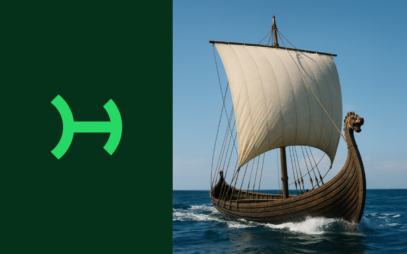
For Haakon, we created an identity that goes far beyond visuals — it tells a powerful and strategic story. The starting point was the brand name itself, chosen not only for its phonetic strength but for its deep historical meaning. “Haakon” has Scandinavian roots, referencing legendary leaders and the bold, visionary spirit of Viking explorers. These references became the foundation for the brand concept: a brand built on courage, movement, and global reach.
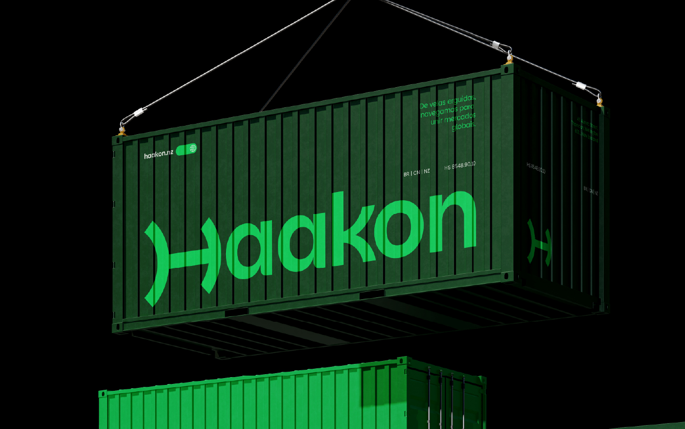
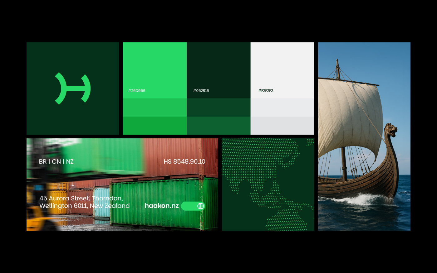
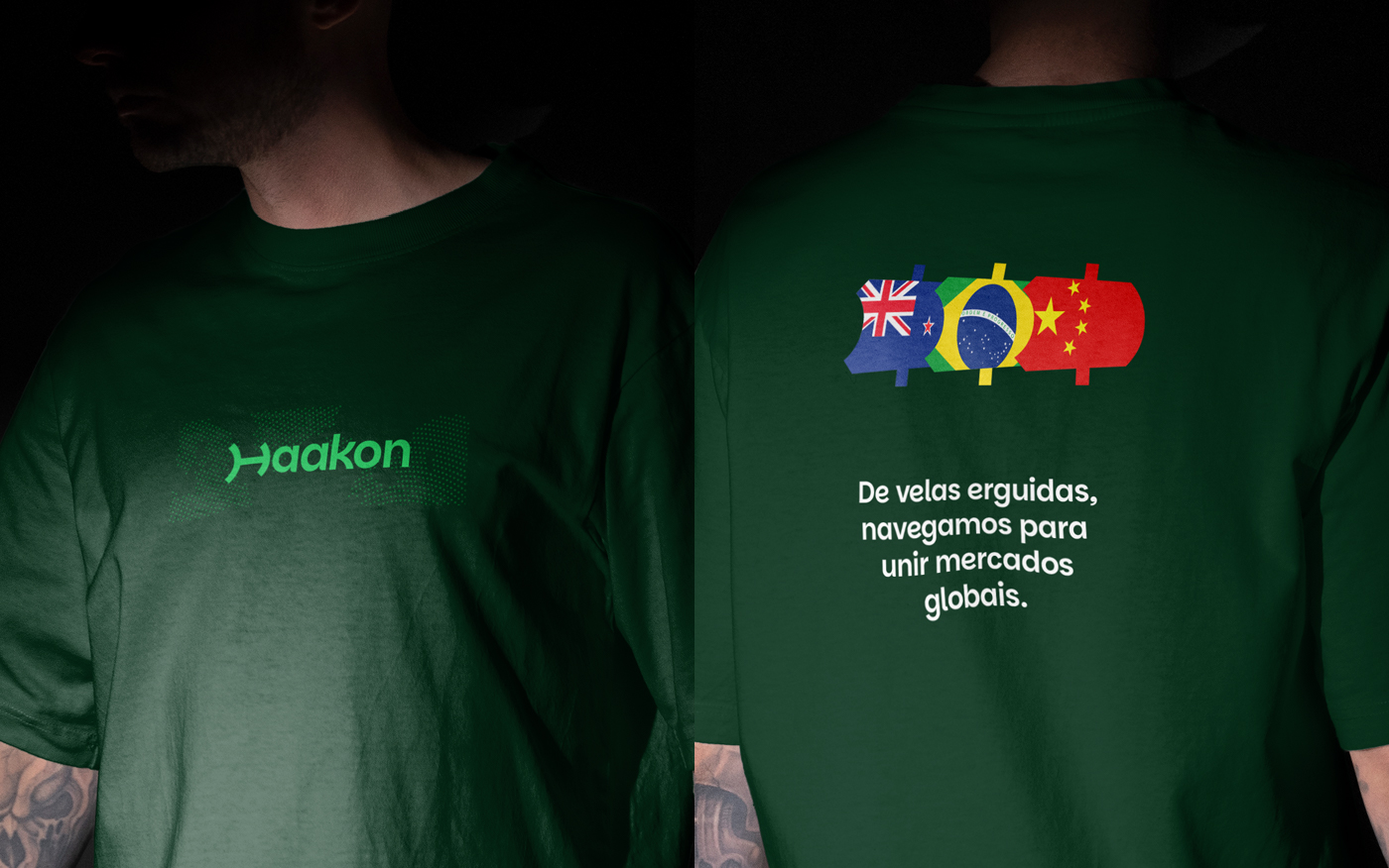
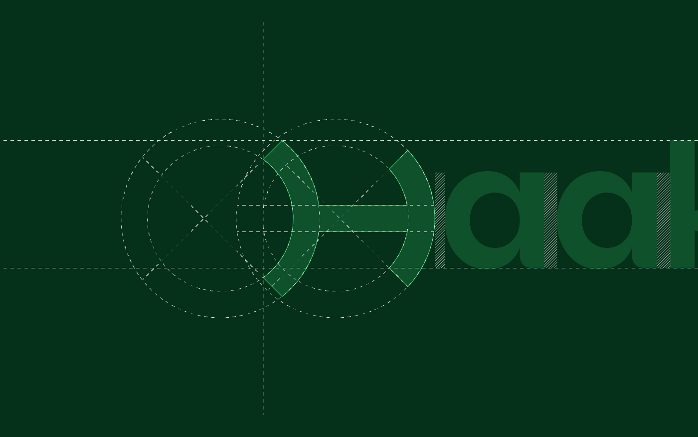
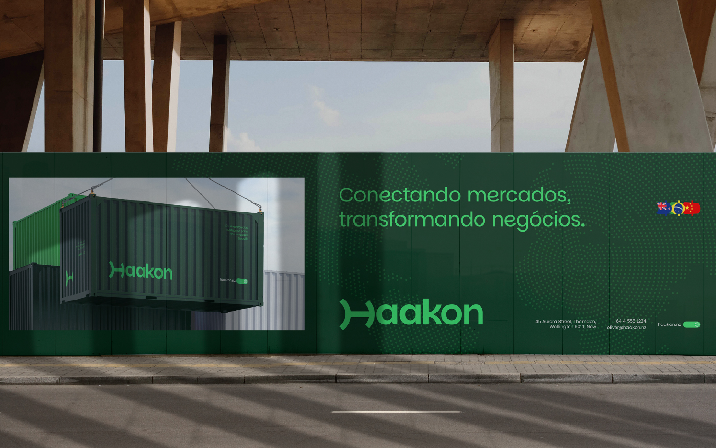
From this foundation, we developed an icon with dual interpretation — the letter “H” cleverly merged with the sails of a Drakkar ship, a timeless symbol of navigation, expansion, and fearless exploration. This visual solution perfectly captures the brand’s purpose of connecting distant markets, particularly Brazil, China, and New Zealand. The design reflects the idea of breaking boundaries and the confidence needed to conquer new territories.
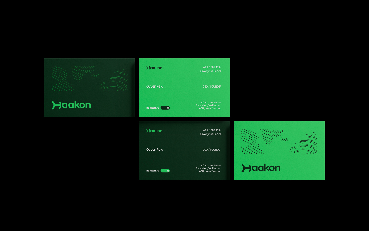
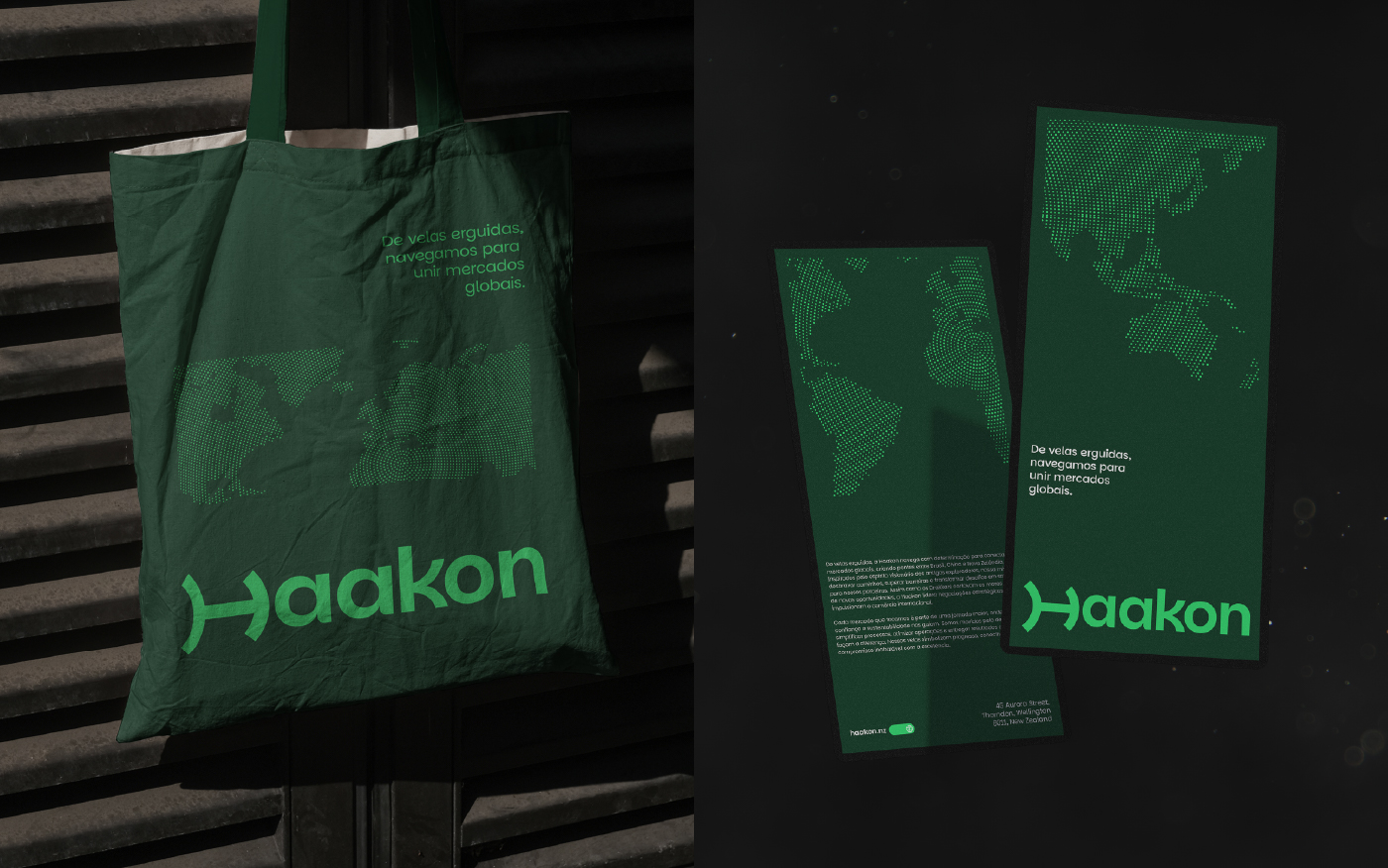
The design system was carefully crafted to reflect these values. The color palette conveys stability, trust, and sophistication, essential qualities for a brand aiming to establish itself as a reliable leader in international markets. The graphic elements were inspired by world maps and trade routes, further expanding the narrative of movement and connection. These elements visually communicate a world interconnected by Haakon, always in motion, linking places, people, and businesses across the globe.
The modern, functional typography ensures legibility and consistency across languages, formats, and cultural contexts, reflecting the brand’s flexible and adaptive personality. The result is a bold, flexible, and memorable identity, seamlessly blending heritage with modern business vision. Haakon is not just a company, but a bridge between worlds, navigating with intention, confidence, and a clear path to global impact.
CREDIT
- Agency/Creative: Studio Virgo
- Article Title: Haakon by Brand Identity by Studio Virgo
- Organisation/Entity: Agency
- Project Type: Graphic
- Project Status: Published
- Agency/Creative Country: Brazil
- Agency/Creative City: Colombo
- Market Region: South America, Global
- Project Deliverables: Brand Creation, Brand Design, Brand Guidelines, Brand Identity, Brand Strategy
- Industry: Professional Services
- Keywords: Global Trade, Import & Export, International Logistics, Brand Identity, Drakkar Ship, Scandinavian Inspiration, Visual Strategy, Global Connections, Corporate Branding, Modern & Trustworthy, Dual-Meaning Icon, Brazil, China, New Zealand, Navigation & Exploration, Versatile Branding, Elegant Design.
-
Credits:
Brand Designer: Valdemir Alves da Silva Junior


