


Gurman is a turnkey stretch ceiling installation company. The brand required a clear positioning to set itself apart from competitors and not be “just one of” the many companies providing similar services. In addition, it was necessary to build a new name association in the minds of the audience that was not related to cooking.
The installation of stretch ceilings is always ordered at the final stage of renovation.The owners of the house, as a rule, are already tired, they want to finish all the renovation work as soon as possible, they sincerely wish that someone finally took the responsibility off their shoulders and took over.
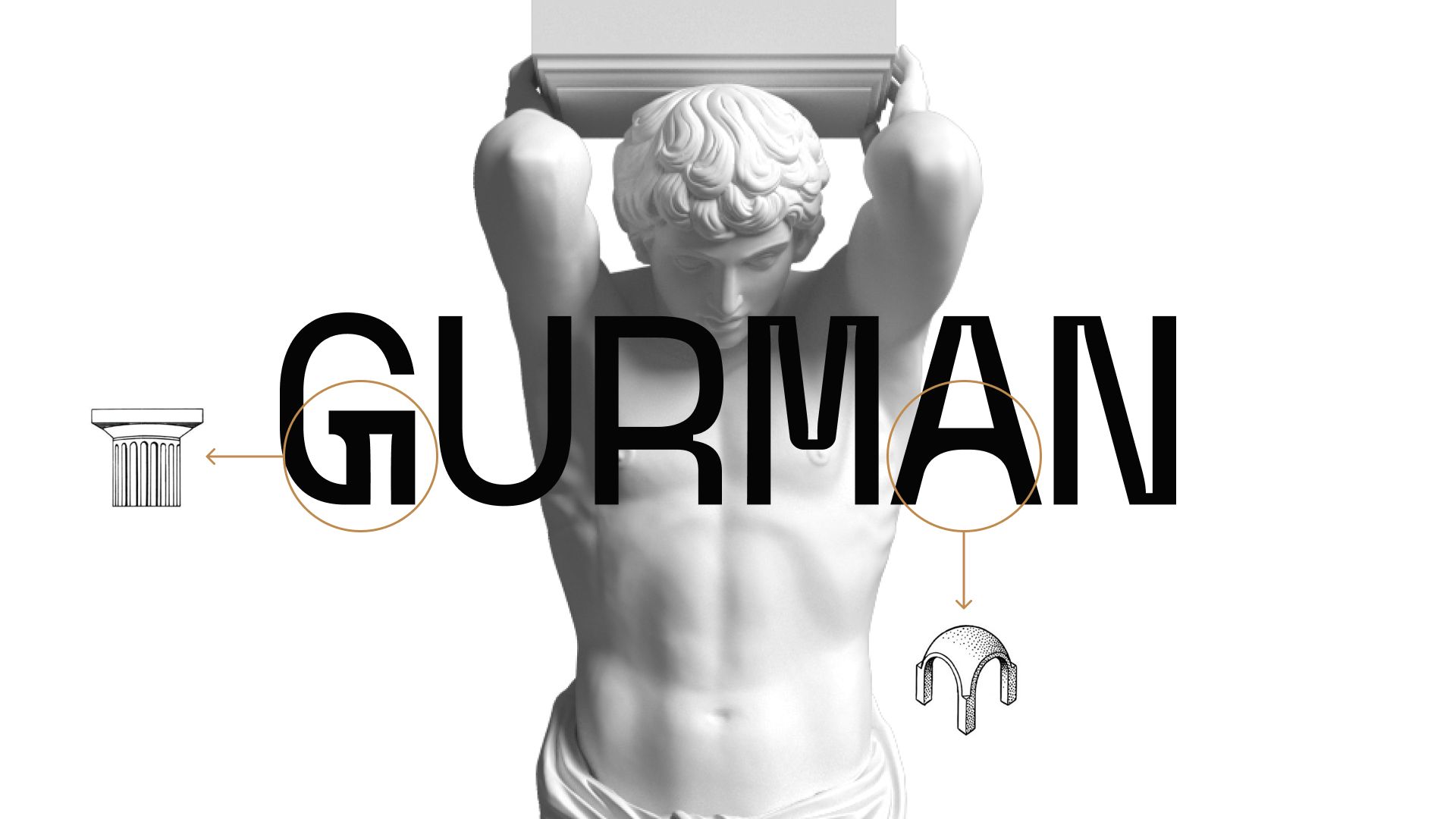
We presented Gurman as a team of craftsmen who are ready to put renovation worries on their shoulders and do the job quickly, honestly and qualitatively. For this purpose we used the image of an Atlantean.
In Greek mythology, an Atlantean is a titan who was ordered by Zeus to hold the vault of heaven. The vault of heaven is by default a heavy burden, so the atlante is strongly associated with resilience, confidence in decision making and responsibility. Emotionally, he symbolizes reliable support, and rationally, he symbolizes longevity.
Just as the mythological Atlantean held up the sky, so the Atlanteans of Gurman stretch ceilings support their customers and hold everything on their shoulders. Yes, the brand statement sounds exactly like this: Stretch Ceiling Atlantes. Team Gurman is beginning to be associated with reliability, resilience and confidence.
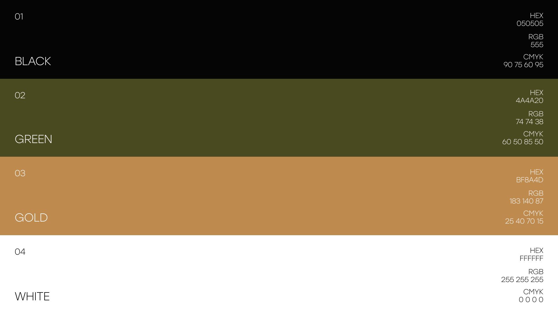
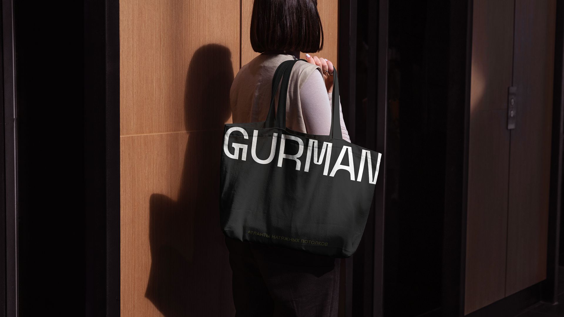
The main colors of the brand are white and black. Additional colors are green, gold and their combinations. The 4 colors complement each other well, creating a readable working contrast. The color palette of the brand refers to wreaths of wild olive – an easily recognizable ancient symbol. Such wreaths were given to the winners of sports competitions in ancient Greece. The palette looks exquisite, emphasizing the style and quality that the company offers to its customers.
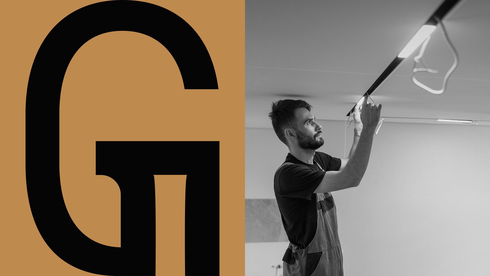
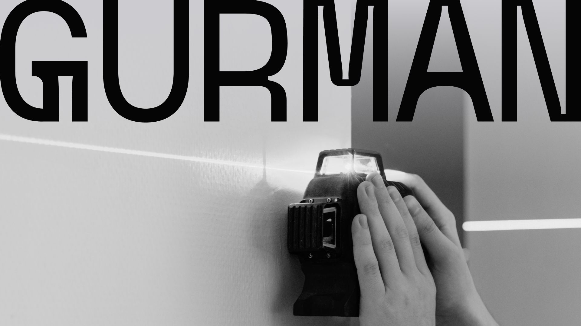
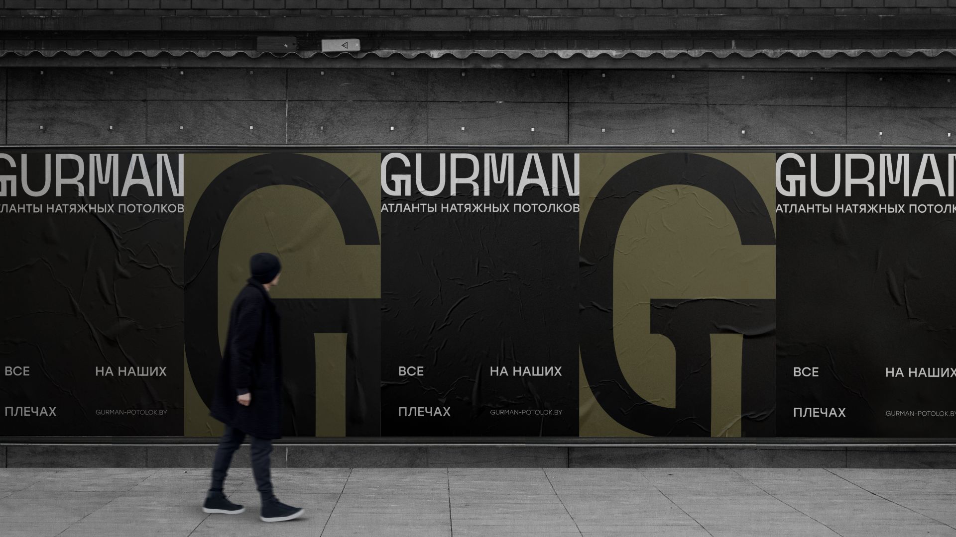
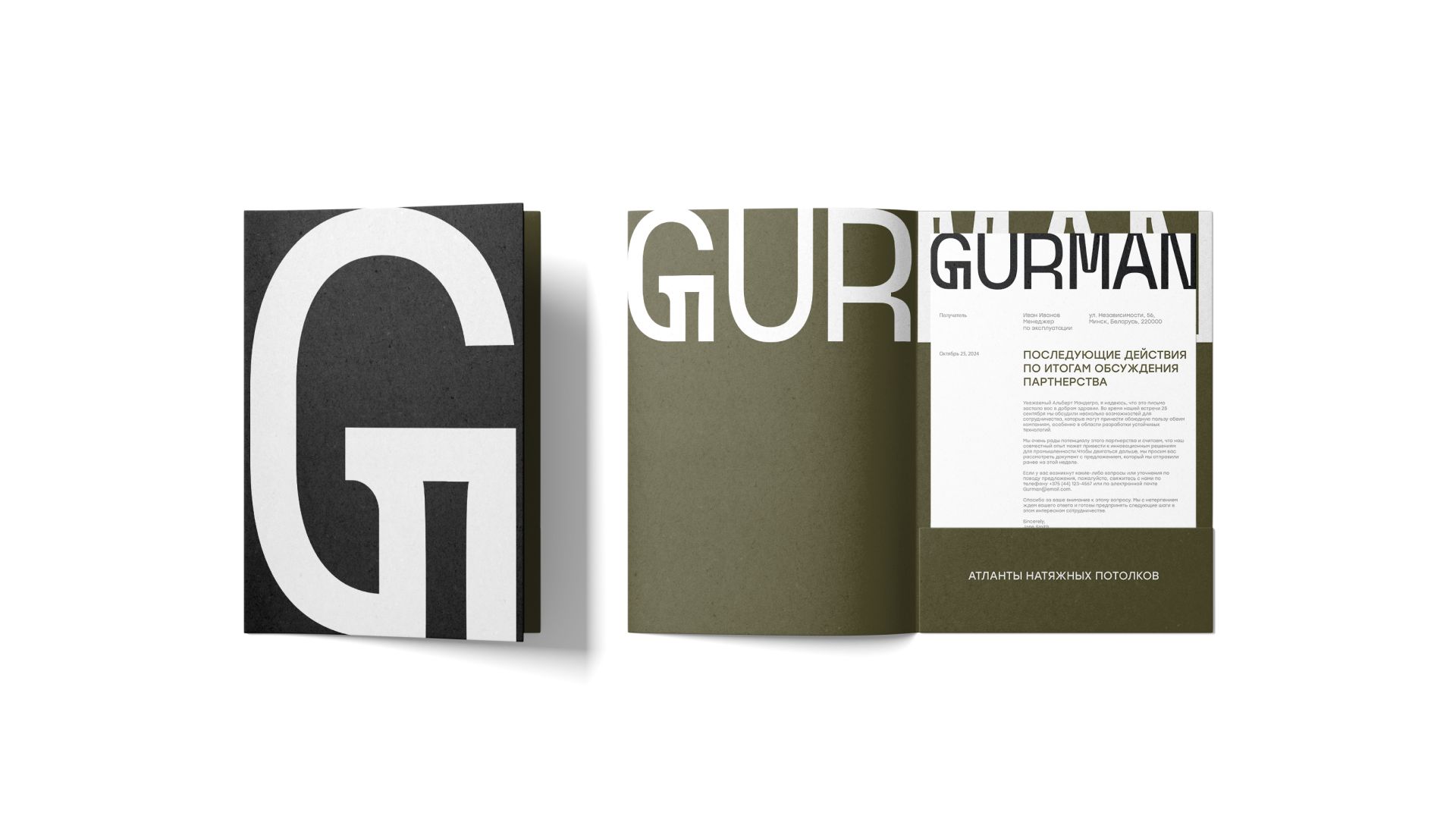
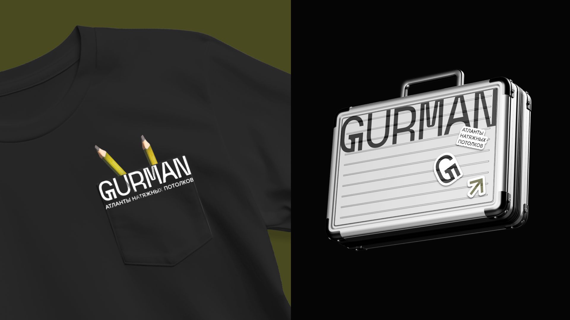
The logo is characterized by a unique font solution. In the design of the letters we applied elements of the ancient order system in a simplified form, adapted to modern trends of use in print and digital environment.
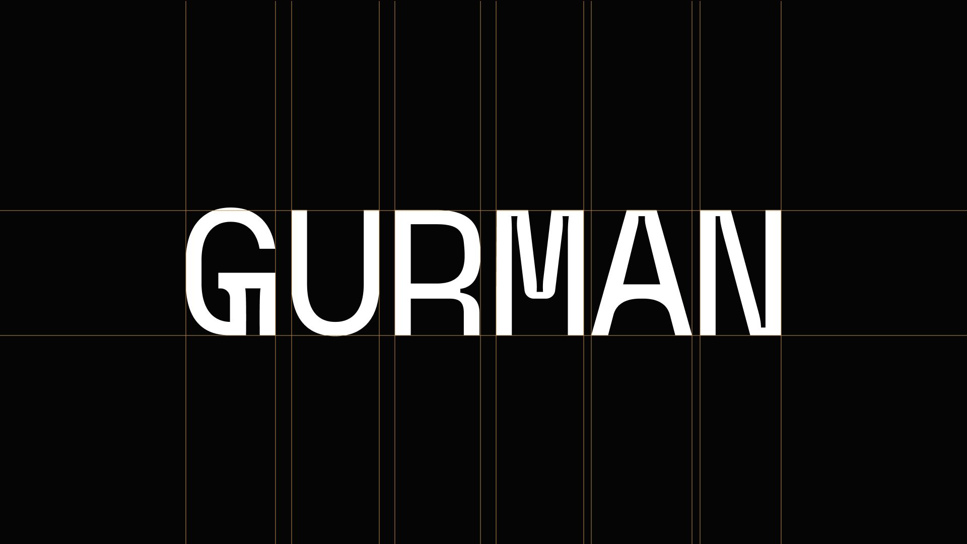
The distance between some letters is specially reduced to create a more compact and harmonious perception of the logo as a whole. The first letter G is used as a sub-logo, which works well both as a whole and when framed – such a technique is used for special accents on communication media.
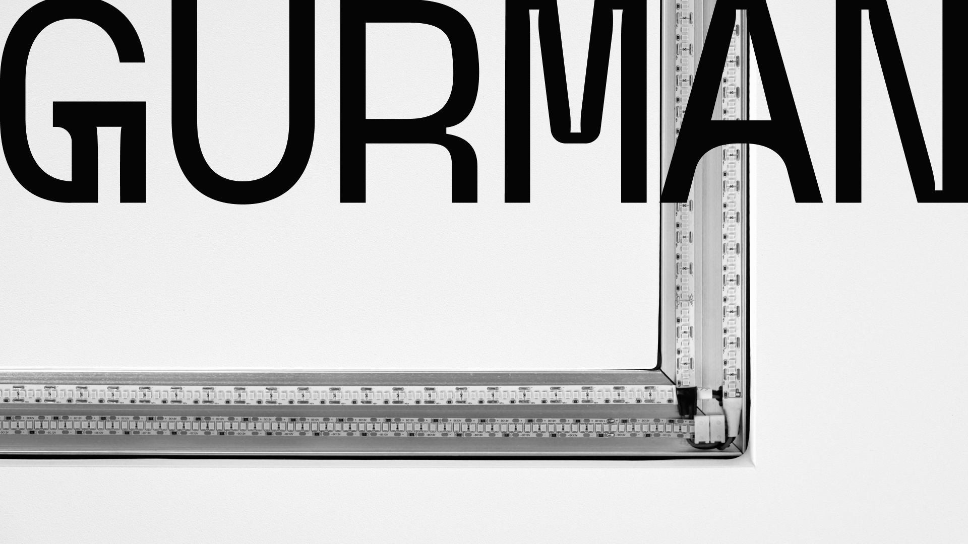
The GURMAN logo literally holds the “ceiling” of any visual media, attaching itself to their upper boundary. On all layouts, the logo is placed at the top and aligned to the width.
The brand essence of Stretch Ceilings Atlantes is also a descriptor to the logo, telling the audience about the reliability of the brand team.
CREDIT
- Agency/Creative: Moloko. Branding Sidekicks
- Article Title: Gurman: Antique Images in a Modern Identity by Moloko Branding Sidekicks
- Organisation/Entity: Agency
- Project Type: Identity
- Project Status: Published
- Agency/Creative Country: Lithuania
- Agency/Creative City: Vilnius
- Market Region: Europe
- Project Deliverables: Brand Design, Brand Identity, Identity System
- Industry: Construction
- Keywords: Branding, visual identity, logo, ancient symbolism, design, typography, mythological reference, communication
-
Credits:
Creative Director: Dzianis Misiulia
Brand Designer: Alina Kozhbakova
Brand Creator: Anna Chaplygina
Brand Strategist: Anastasia Eliseeva


