


FXMaster presents a bold and refined brand identity tailored for the modern financial landscape. Positioned as a forward-thinking solution for businesses navigating the complexities of cross-border transactions, its branding is built on three key pillars: clarity, control, and global fluidity. Through strategic messaging such as “Break borders in finance” and “Built for control,” FXMaster communicates both its purpose and value with precision. These phrases aren’t merely slogans—they represent a deeper brand philosophy: empowering businesses to move money globally with confidence and simplicity.
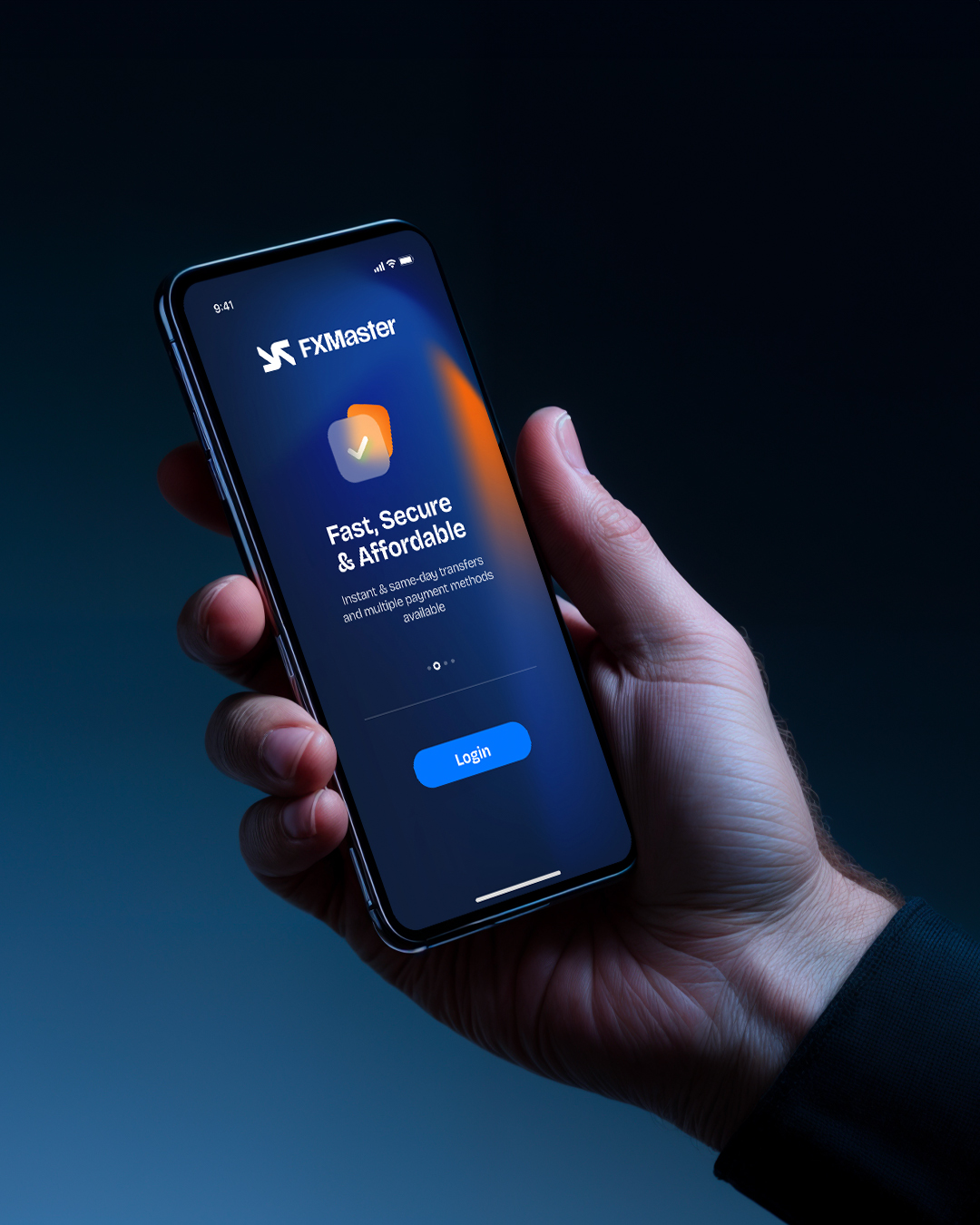
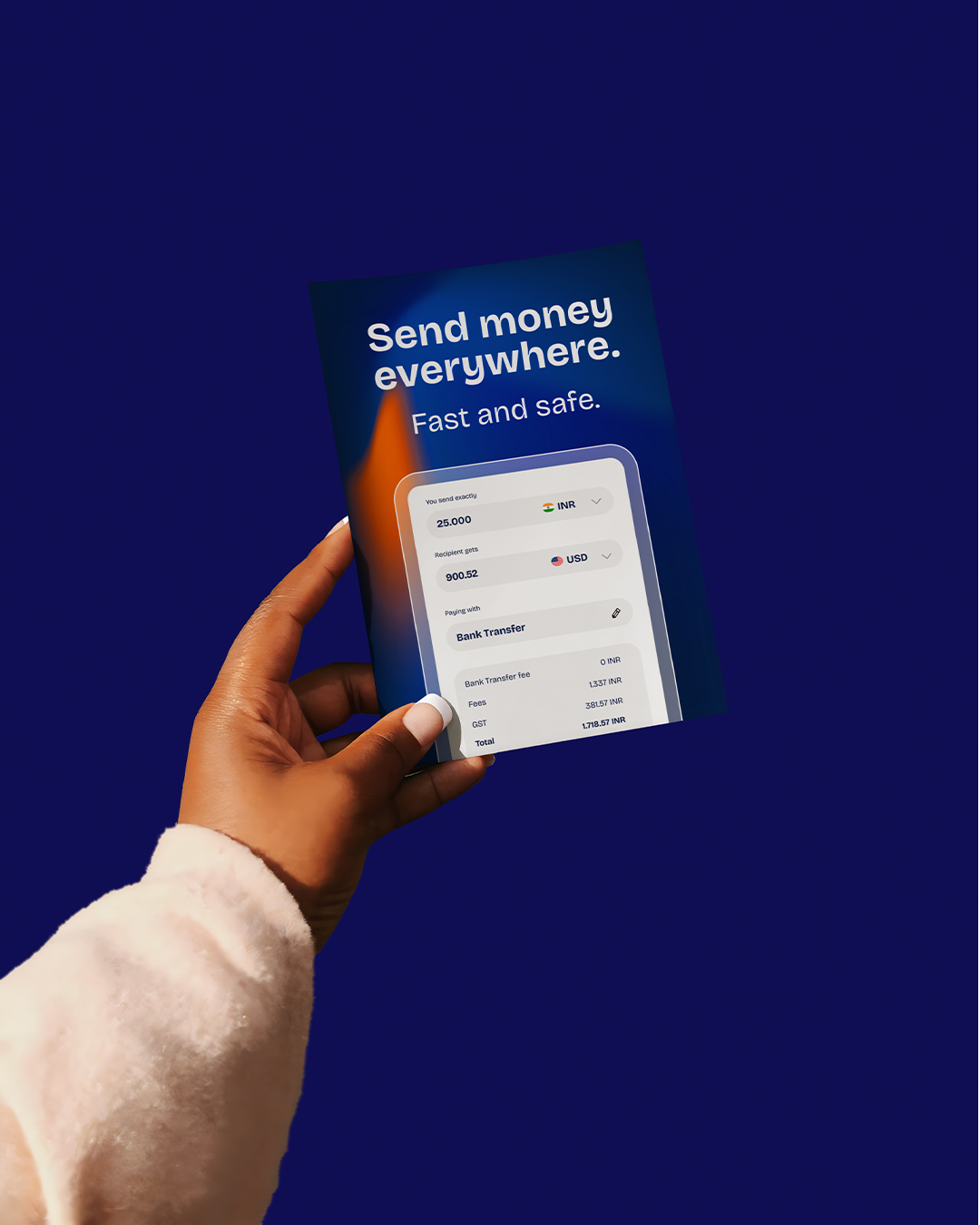
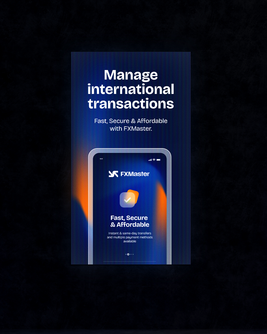
Visually, FXMaster’s identity is both contemporary and timeless. The use of a deep navy blue establishes a foundation of trust and authority, while vibrant orange accents inject energy, urgency, and modernity. This contrast is further supported by the use of Bricolage Grotesque, a bold sans-serif typeface that feels robust yet approachable—ideal for a brand operating at the intersection of fintech and enterprise services. Together, these visual choices create an identity that feels deliberate, clean, and immediately recognizable.
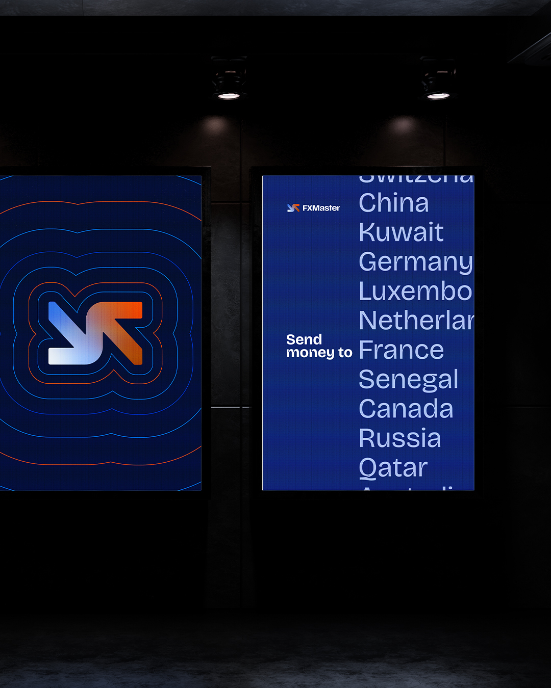
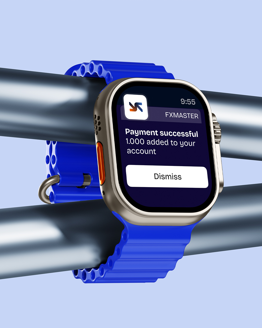
At the core of the visual system is the FXMaster symbol: a geometric, grid-constructed logomark that subtly suggests movement, flow, and balance. It’s a smart visual metaphor for currency exchange—structured, fluid, and mathematically precise. This motif carries through across digital interfaces, promotional assets, and brand applications, ensuring consistency at every touchpoint. Whether seen on a mobile login screen or a billboard campaign, the identity scales effortlessly and remains unmistakably FXMaster.
Every design decision—from interface minimalism to concise copywriting—supports the brand’s promise of efficiency and professionalism. It avoids unnecessary embellishments in favor of clean layouts, intentional spacing, and a rhythmic use of typographic hierarchy. FXMaster’s visual and verbal identity work in tandem to convey a message of trust, innovation, and seamless functionality. In a saturated market of payment providers, FXMaster stands apart as a brand that not only facilitates global business—but elevates it.


CREDIT
- Agency/Creative: Antonio Morsillo
- Article Title: Antonio Morsillo Shapes a Confident and Contemporary Look for FXMaster
- Organisation/Entity: Freelance
- Project Type: Identity
- Project Status: Published
- Agency/Creative Country: Italy
- Agency/Creative City: Milan
- Market Region: Europe
- Project Deliverables: Brand Creation, Brand Design, Brand Guidelines, Brand Identity, Brand Mark
- Industry: Financial
- Keywords: FXmaster, Money Exchange, Brand Identity, FinTech, Fintech design
-
Credits:
Creative Director: Antonio Morsillo


