


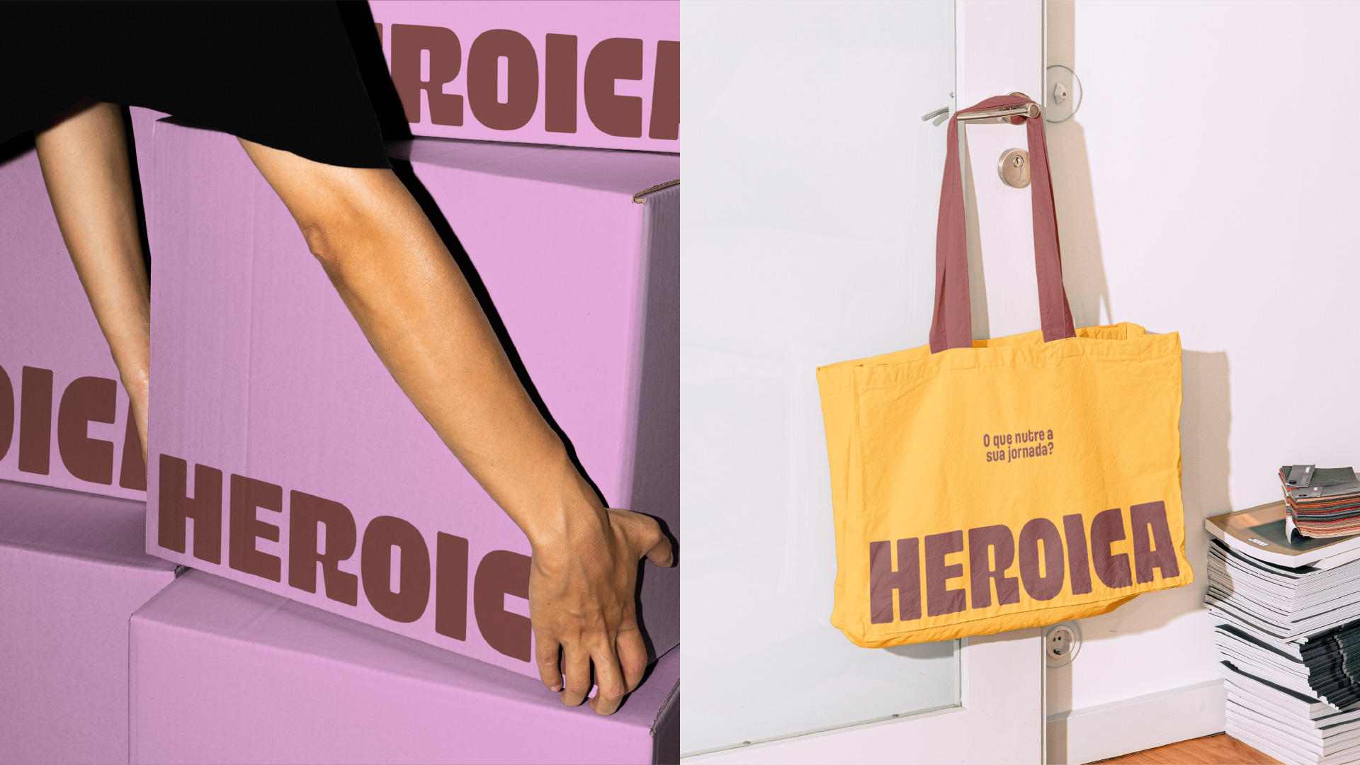
Heroica is a healthy food brand born in Florianópolis, Brazil, with the mission of proving that eating well doesn’t mean giving up flavor, practicality, or enjoyment. More than just encouraging healthy choices, the brand promotes small lifestyle changes that lead to a more active and balanced life.
The Heroica project began with a repositioning of the brand. After three years in the market, the company needed to reinvent itself to reach new spaces — without giving up the care, dedication and manual touch that have always been part of its DNA. From then on, we were responsible for creating the new name, visual identity and packaging system.
The redesign of Heroica’s packaging was a key part of the project — created to bring the brand’s new identity to life in a bold, consistent, and flexible way. The main challenge was to translate Heroica’s vibrant energy into a visual system that could work across multiple formats while maintaining strong shelf presence and brand recognition.
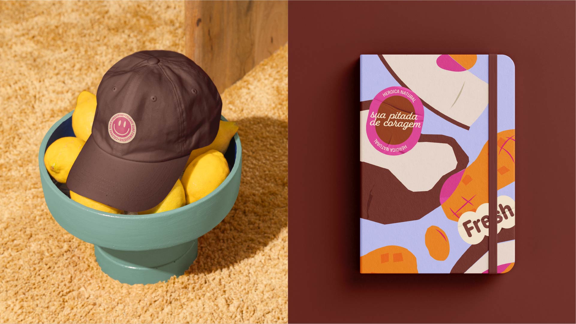
We developed a modular system that ensures flexibility without compromising coherence. At the core of the layout is a semicircle element, which helps structure the composition, create visual hierarchy, and connect to the overall identity. This shape also conveys a sense of motion and transformation, aligning with Heroica’s purpose.
Ingredient illustrations play a central role in storytelling. They present the product mixes in a fun and unexpected way, reinforcing the brand’s playful character. Overlapping elements represent the combination of ingredients and highlight the richness and uniqueness of each recipe.
To help differentiate flavors, each SKU uses a distinct background color, carefully selected to create contrast and ensure readability on the shelf. A bold pink tone was used as a brand signature — appearing in the intersections of the illustrations and serving as a unifying visual element across the line.
We also designed a premium version for the nut butter line, featuring darker backgrounds, gold accents, and refined finishes that elevate the product’s perceived value while maintaining visual consistency with the rest of the brand. The result is a packaging system that’s cohesive, recognizable, and full of personality.

CREDIT
- Agency/Creative: Bradda Design
- Article Title: Bradda Design Brings Vibrancy and Flexibility to Heroica’s Packaging
- Organisation/Entity: In-House
- Project Type: Packaging
- Project Status: Published
- Agency/Creative Country: Brazil
- Agency/Creative City: Florianópolis
- Market Region: South America
- Project Deliverables: Brand Design, Brand Naming, Illustration, Packaging Design, Rebranding
- Format: Jar, Pouch
- Industry: Food/Beverage
- Keywords: natural food, packaging, rebranding, visual identity, naming
-
Credits:
Project Manager: Natalia Favero
Brand Strategist: Rafaela Sotuyo
Brand Strategist: Hemelyn Haertel
Designer: Lucas Guidi
Illustrator: Beatriz Bastos
Motion Designer: Diony de Lara
Photographer: Luísa Colombi
Photographer: Linda Laranja


