


Ichthyo is an environmental consultancy specialized in addressing issues related to both terrestrial and aquatic fauna and flora. Our challenge was to develop a visual identity that would break away from the clichés of the industry while expanding the brand’s symbolic reach — moving beyond the image of a fish and embracing a broader representation of nature. The result is a visual system that communicates balance, distinction, and strategy.
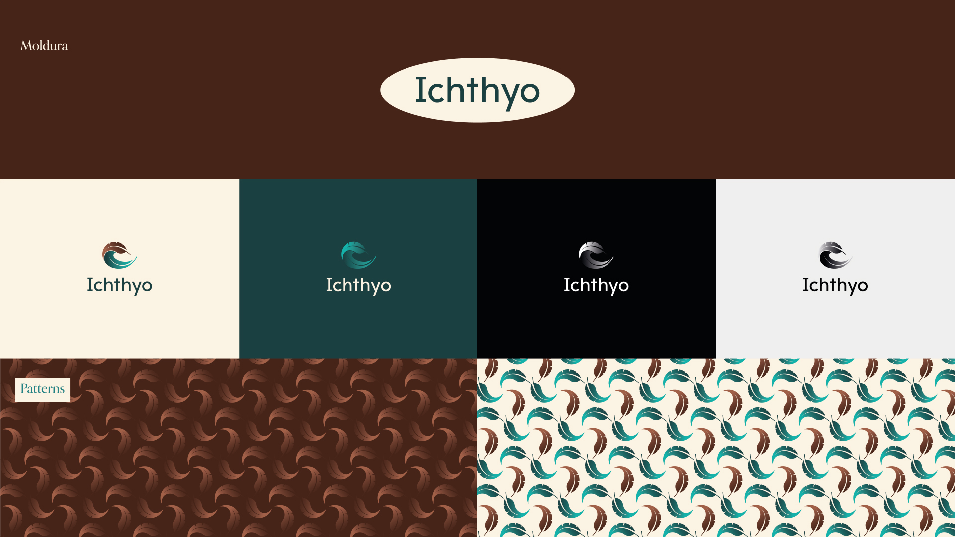
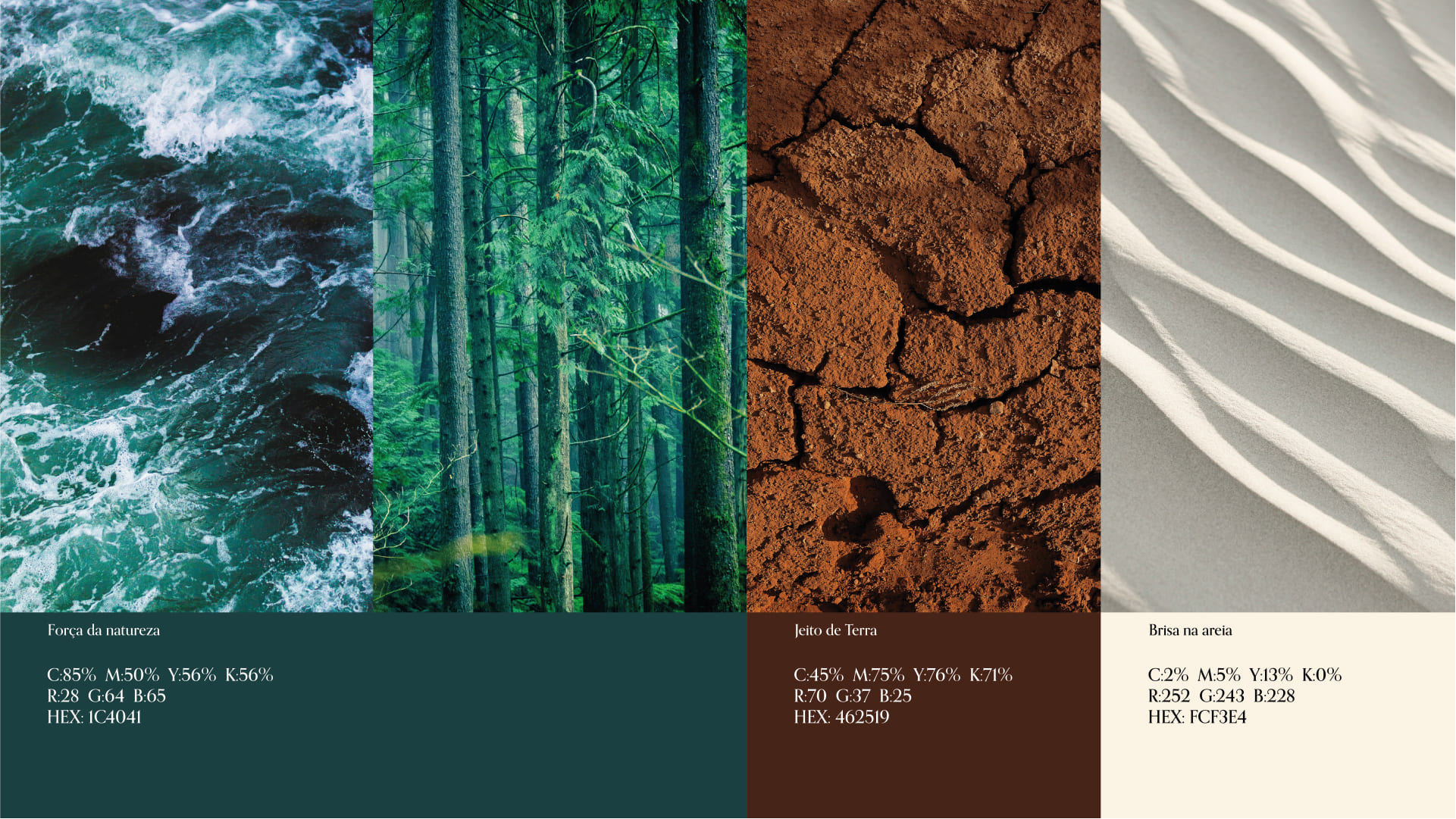
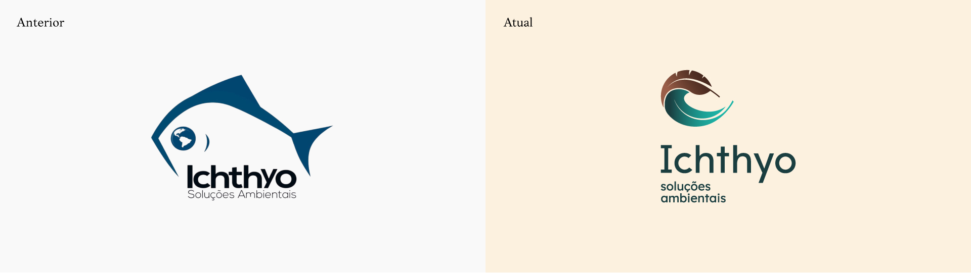
From the start, it was clear that Ichthyo needed to position itself institutionally, without losing its emotional connection to the environment. The brand had to be part river, part tree. A blend of technical and poetic. This duality was translated into the identity through a carefully crafted color palette. The primary hue is a subtle blend between green and blue — evoking both lush forests and flowing waters. To create contrast, we introduced an earthy brown tone that grounds the identity and refers to fertile soil, distinguishing the brand within its category.
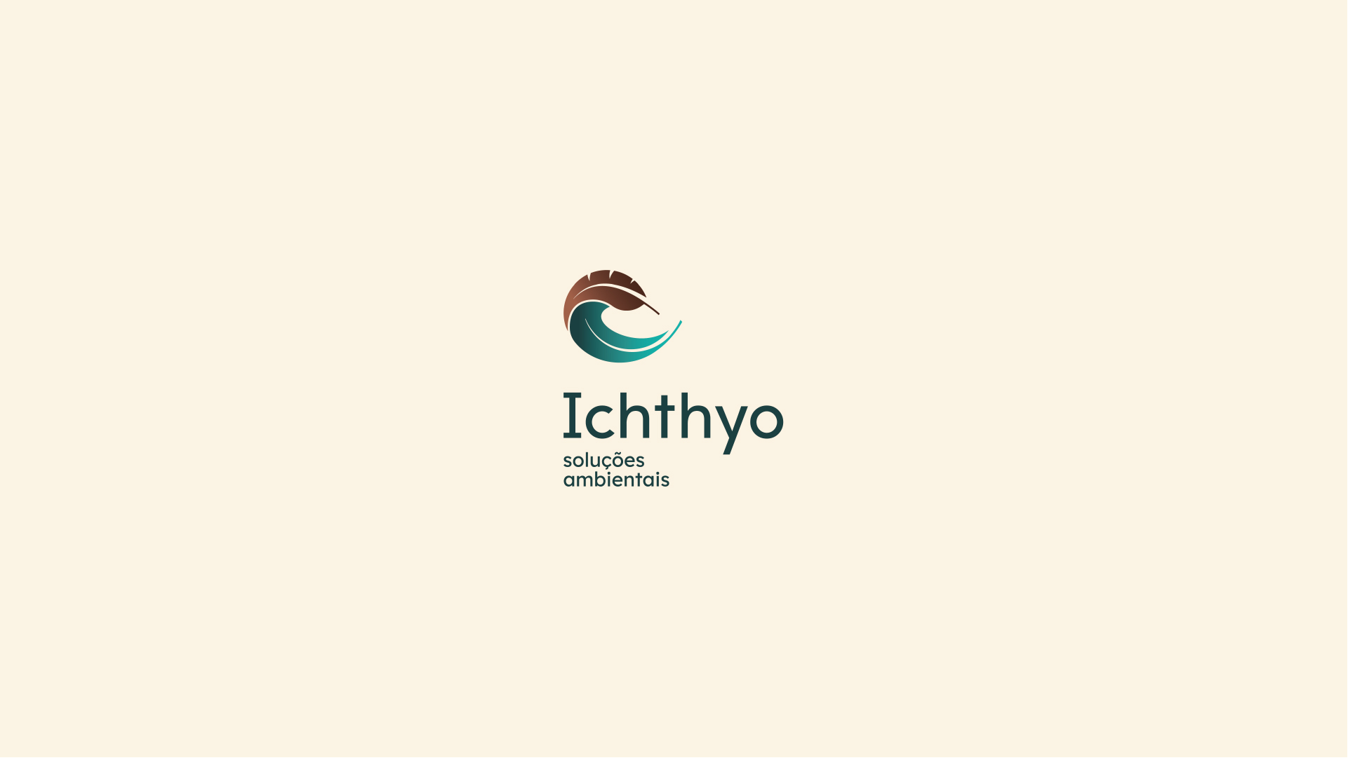
The brand symbol is one of the highlights of the project. It merges natural elements — such as a leaf, a feather, water movement, and wave curvature — into an abstract yet versatile form. This visual synthesis captures the essence of the company in a refined and modern way, breaking free from illustrative or literal approaches. It’s a symbol that evokes movement, depth, and lightness — precisely the impact Ichthyo seeks to have on the market and the ecosystem.
On the typographic front, we refined the original logo type to make it easier to read, especially considering the phonetic complexity of the name “Ichthyo.” This involved careful adjustments to spacing (kerning), form refinement, and alignment. The new wordmark is now more harmonious and memorable, supported by an institutional font (Lexend) used across communication materials — ensuring consistency and accessibility in technical content.
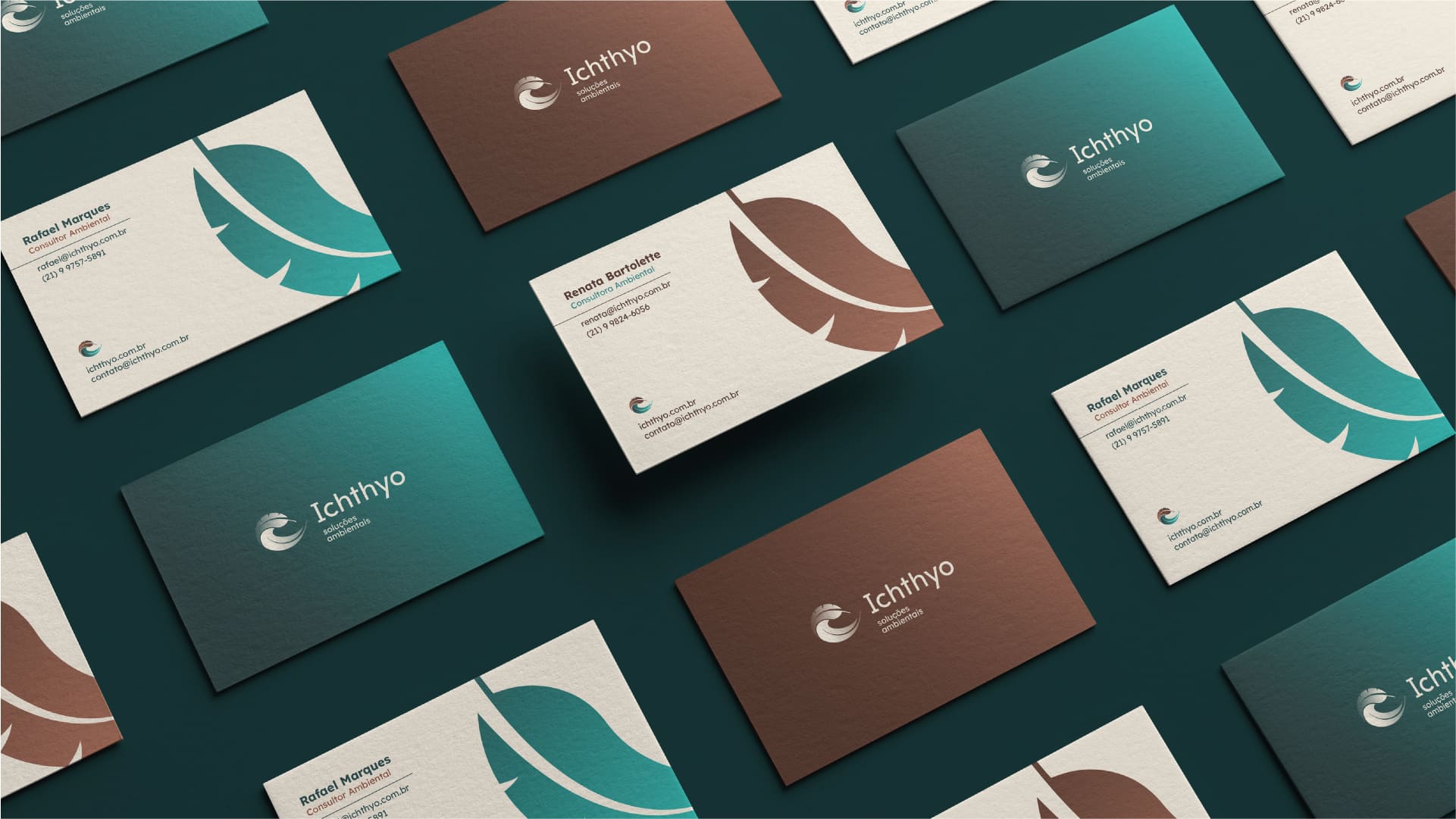
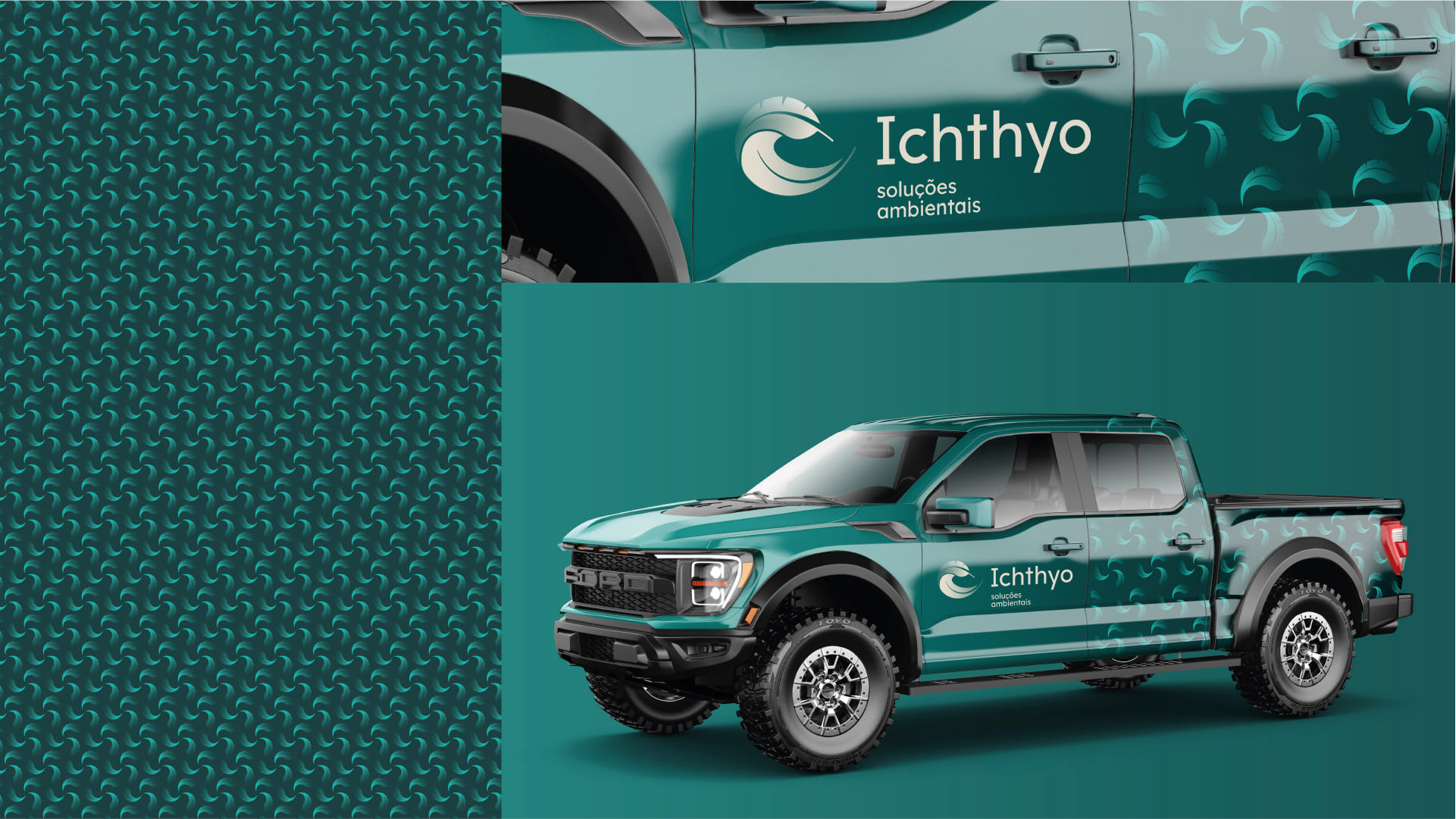
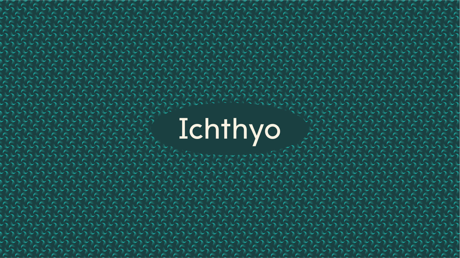
The identity is completed with graphic elements inspired by natural textures and patterns derived from the symbol itself, applicable across a wide range of brand touchpoints — from presentations to field apparel. This is not just a logo; it’s a full visual ecosystem. A brand with flexibility, recognition, and functional usability — essential for a consultancy operating across diverse environmental contexts.


CREDIT
- Agency/Creative: Olman Branding
- Article Title: Olman Branding Redefines Environmental Identity With a Symbolic System for Ichthyo
- Organisation/Entity: Freelance
- Project Type: Identity
- Project Status: Published
- Agency/Creative Country: Brazil
- Agency/Creative City: Muriaé
- Market Region: South America
- Project Deliverables: Brand Design, Brand Mark, Logo Design
- Industry: Professional Services
- Keywords: nature, green, wave, leaf, logo, visual identity
-
Credits:
Creative Director: Thiago Morais
Designer: Isaac Carvalho
Legal Consultant: Hannah Assis


