Striking Wine Label Design: DEUCE Red Band
A Wine Label Where Boldness Meets Aesthetics
A Label That Commands Attention
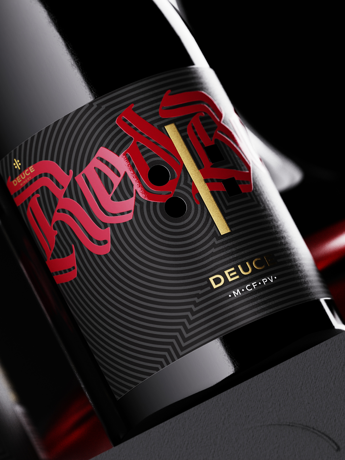
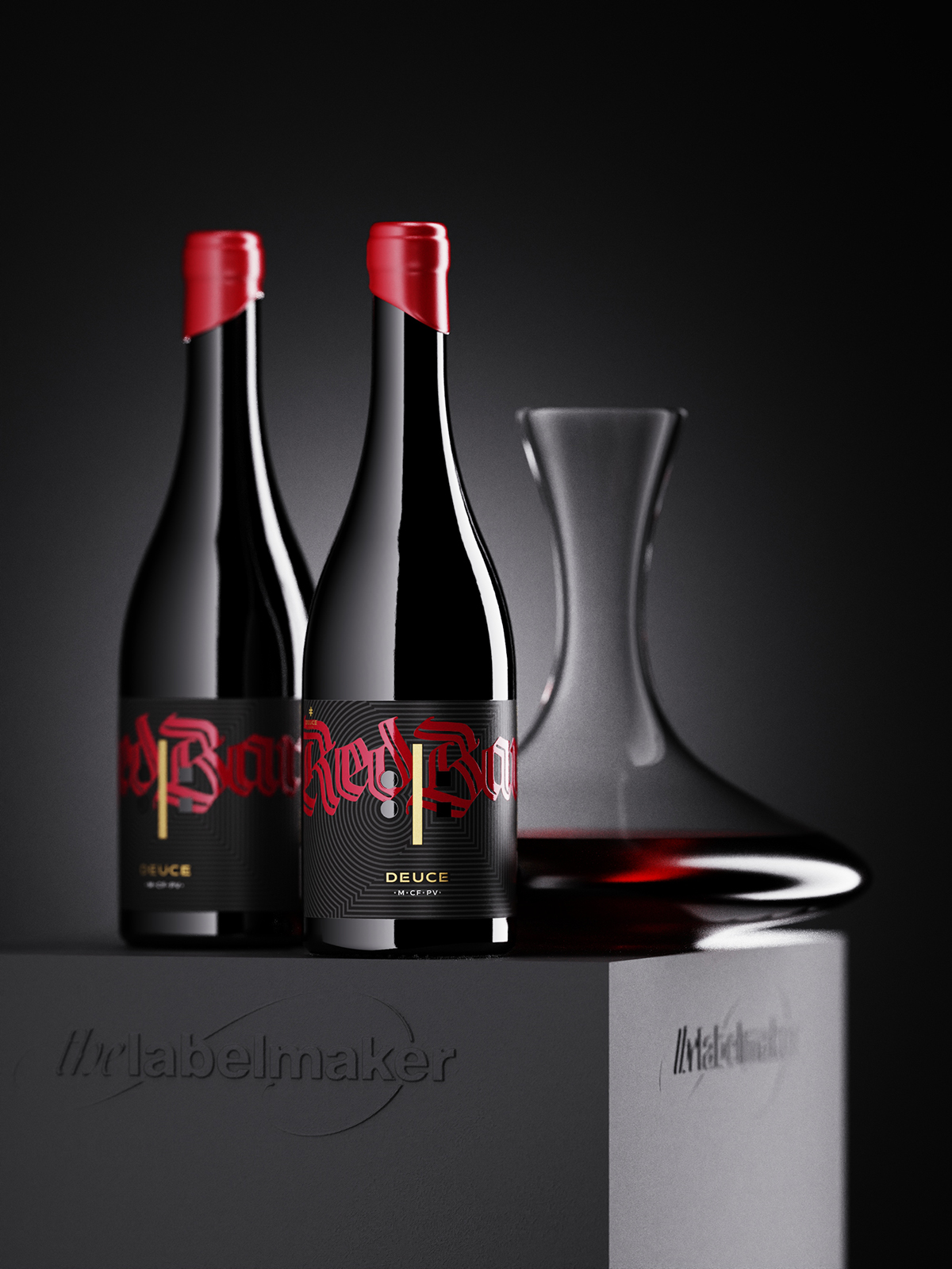
Deuce Winery has always stood out with bold and unconventional aesthetics, and their latest release, Deuce Red Band, is no exception. This striking wine label design is crafted to capture attention instantly—an electrifying presence on the shelf that mirrors the wine’s youthful energy and daring character.
The Power of the Red Band
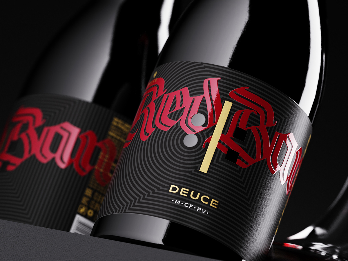
At the core of the design is the iconic red “Band”, a bold statement expressed through classic Fraktur typography, printed in deep red and enhanced with a structured relief varnish for added impact.
Signature Deuce Elements
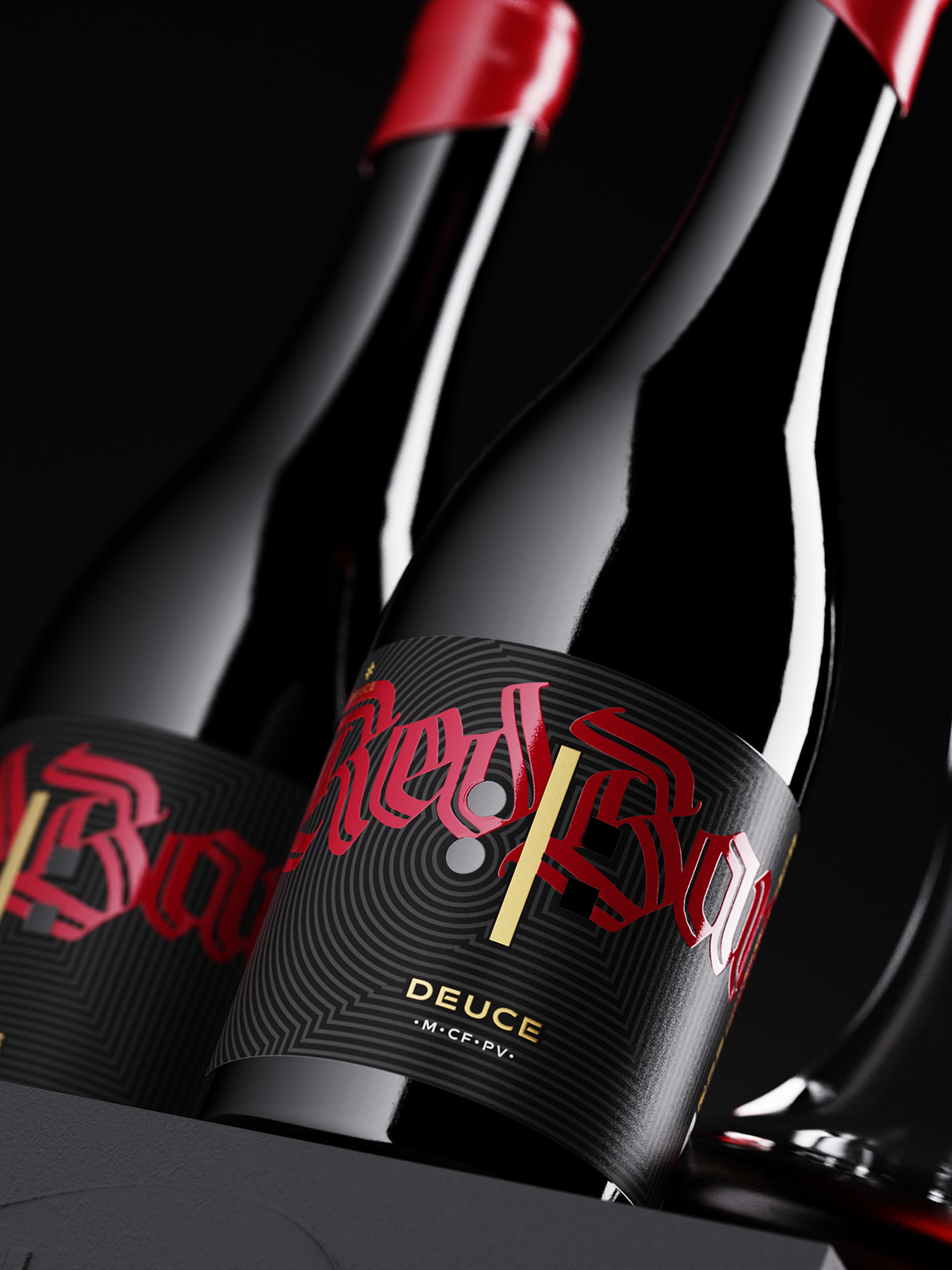
The label follows Deuce’s signature visual identity, incorporating custom die-cut elements that repeat the brand’s recognizable motif: a vertical gold line, two circular cutouts on the left, and two square cutouts on the right—a detail consistently featured across all Deuce wines.
Mystery in Minimalism
The grape varieties appear in an abbreviated form on the front, an intentional design choice to maintain balance and intrigue, inviting the audience to discover more.
Dark Texture for Maximum Impact
The background retains Deuce’s signature black textured surface, enriched with subtle, dark concentric lines that reinforce the brand’s presence and direct focus to the central emblem.
A Bold, Unforgettable Identity
The result is a label that is bold, aggressive, and unforgettable—a seamless continuation of the Deuce brand’s uncompromising style while encapsulating the invigorating essence of this exceptional wine.
Executed to perfection by Dagaprint, the print quality brings the design to life, with impeccable precision and an impressive finish.
For those intrigued by Deuce’s distinctive aesthetic, take a look at the previous Deuce project and the Deuce brand original identity.
This striking wine label design once again reaffirms that a great label is more than just packaging—it’s a statement, a provocation, and an experience waiting to unfold.


CREDIT
- Agency/Creative: the Labelmaker
- Article Title: The Labelmaker Creates a Striking Visual for Deuce Red Band’s Unconventional Identity
- Organisation/Entity: Agency
- Project Type: Packaging
- Project Status: Published
- Agency/Creative Country: Bulgaria
- Agency/Creative City: Sofia
- Market Region: Europe
- Project Deliverables: Advertising Photography, Brand Design, Branding, CGI, Graphic Design, Label Design, Packaging Design
- Format: Bottle
- Industry: Food/Beverage
- Keywords: wine label design, wine branding, premium wine packaging, custom wine labels, wine label designer, wine packaging design, boutique wine design, luxury wine labels, wine brand identity, wine logo design, creative wine labels, high-end wine design, wine marketing strategy, modern wine labels, award-winning wine design, bespoke wine packaging, elegant wine branding, wine label printing, minimal wine labels, wine brand storytelling, the labelmaker, jordan jelev
-
Credits:
Design & CGI Photo: the Labelmaker


