Gogiya is a Korean barbecue restaurant where friends and family gather around sizzling grills. The name Gogiya means “Hey meat!” in Korean, matching the restaurant´s fun feel. every meal here is authentic, social and delicious.
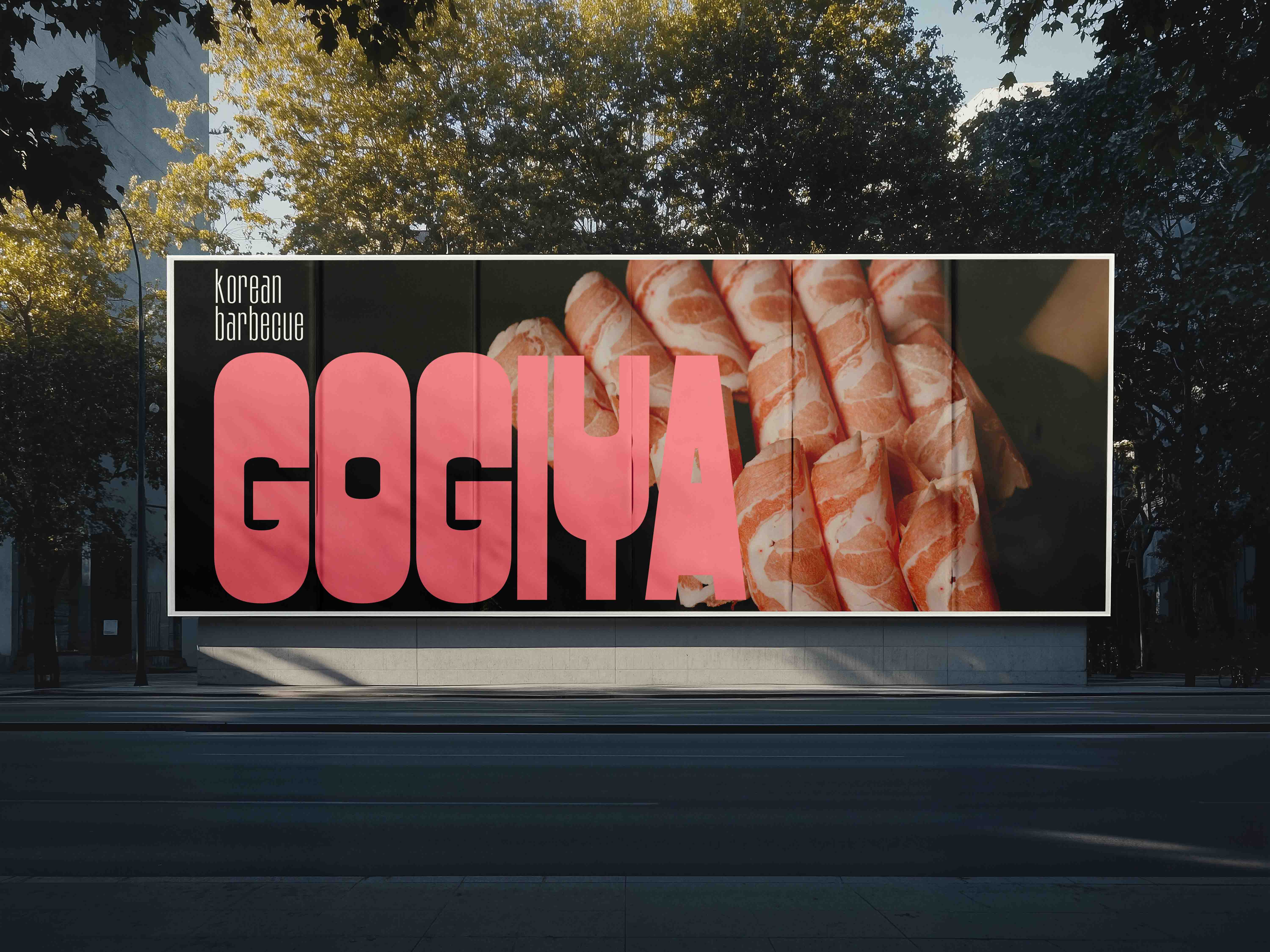
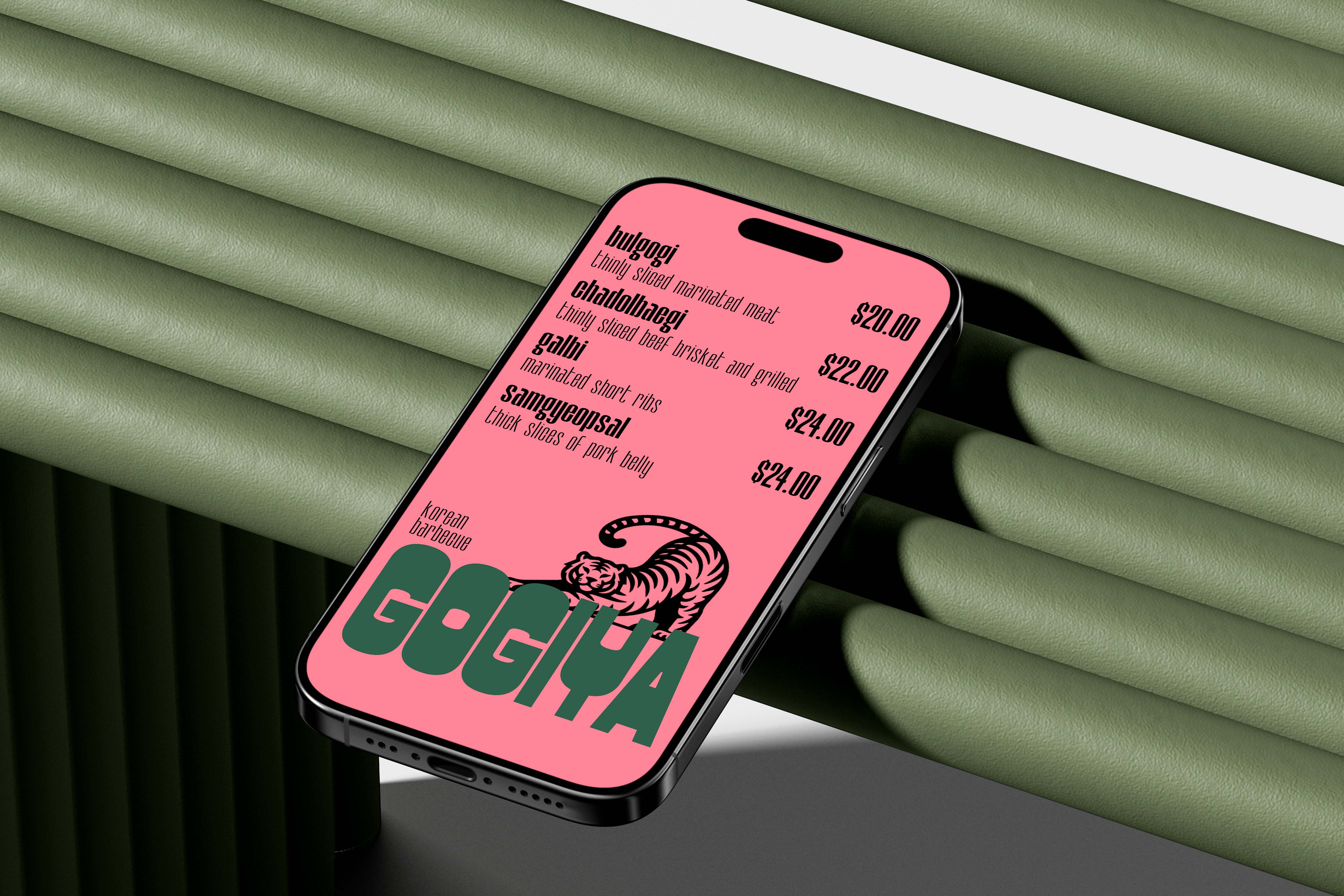
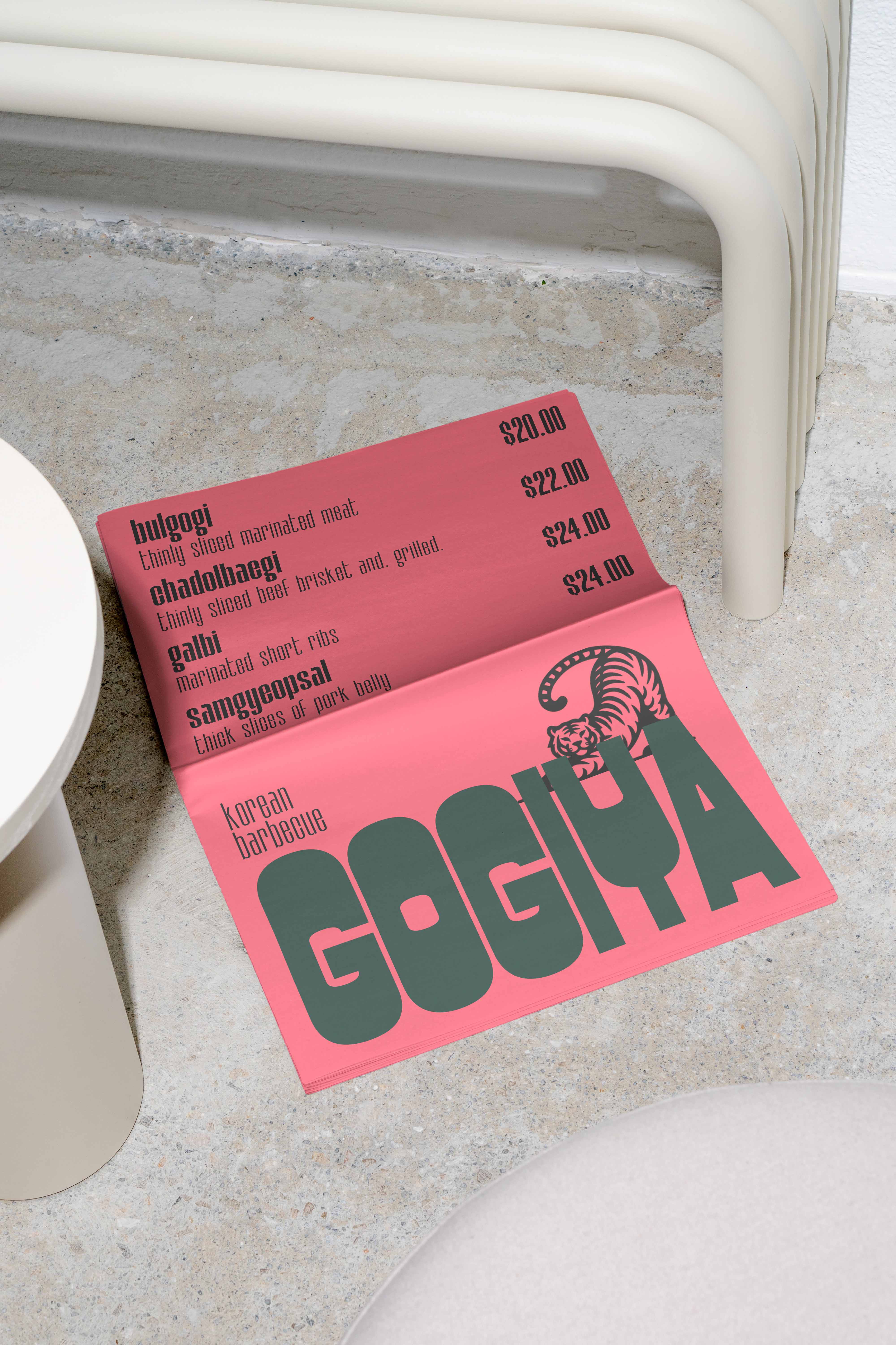
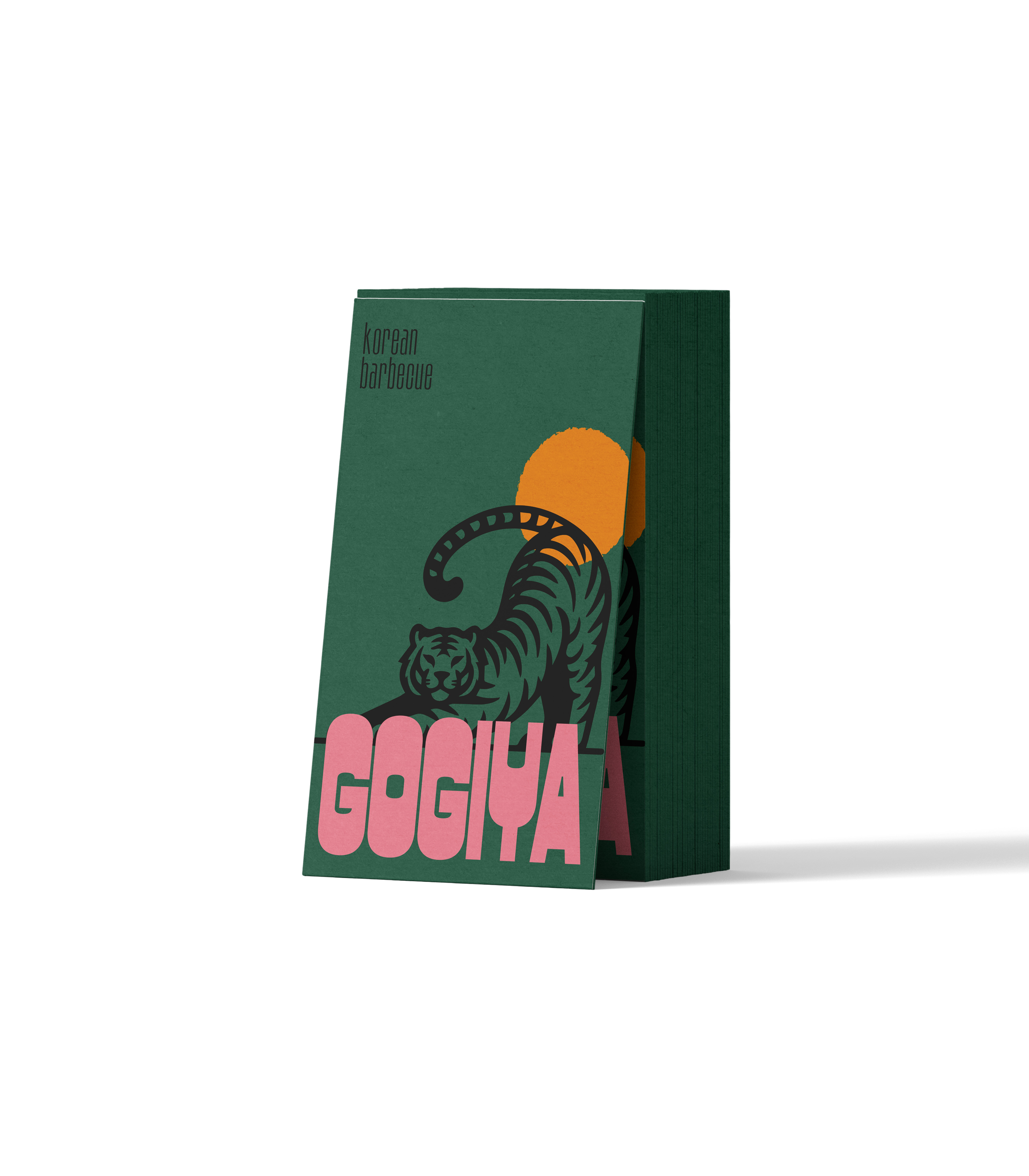
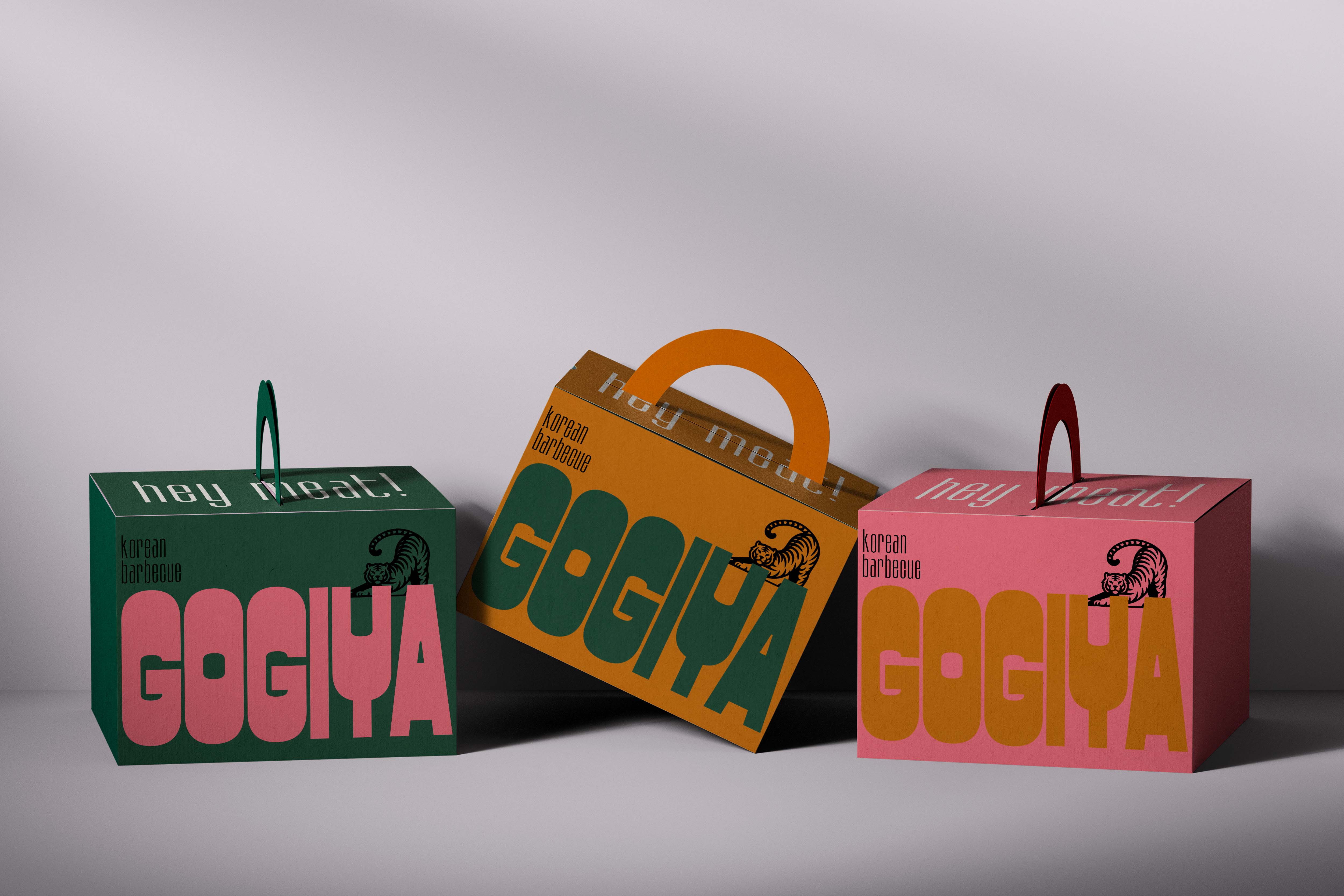
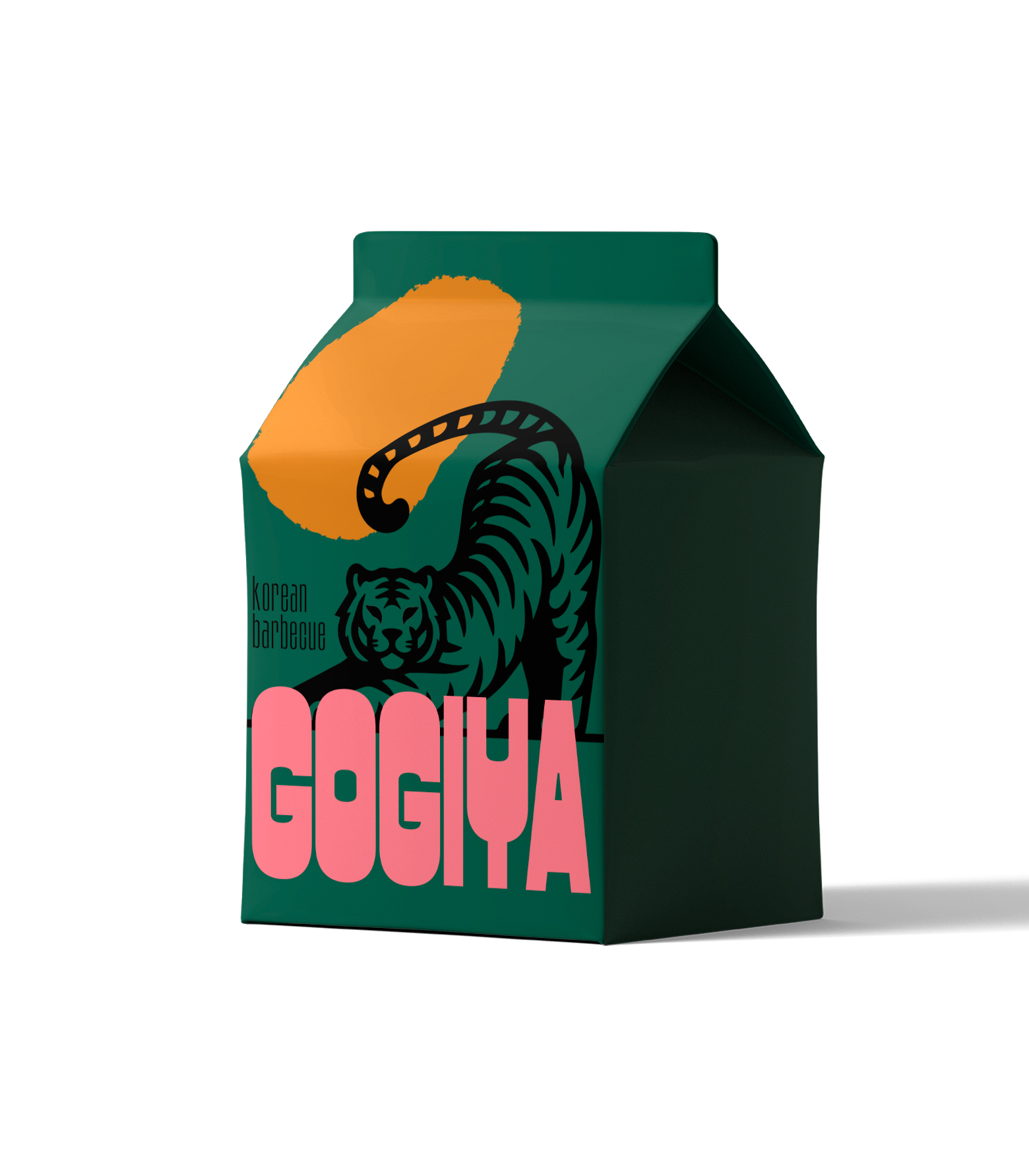
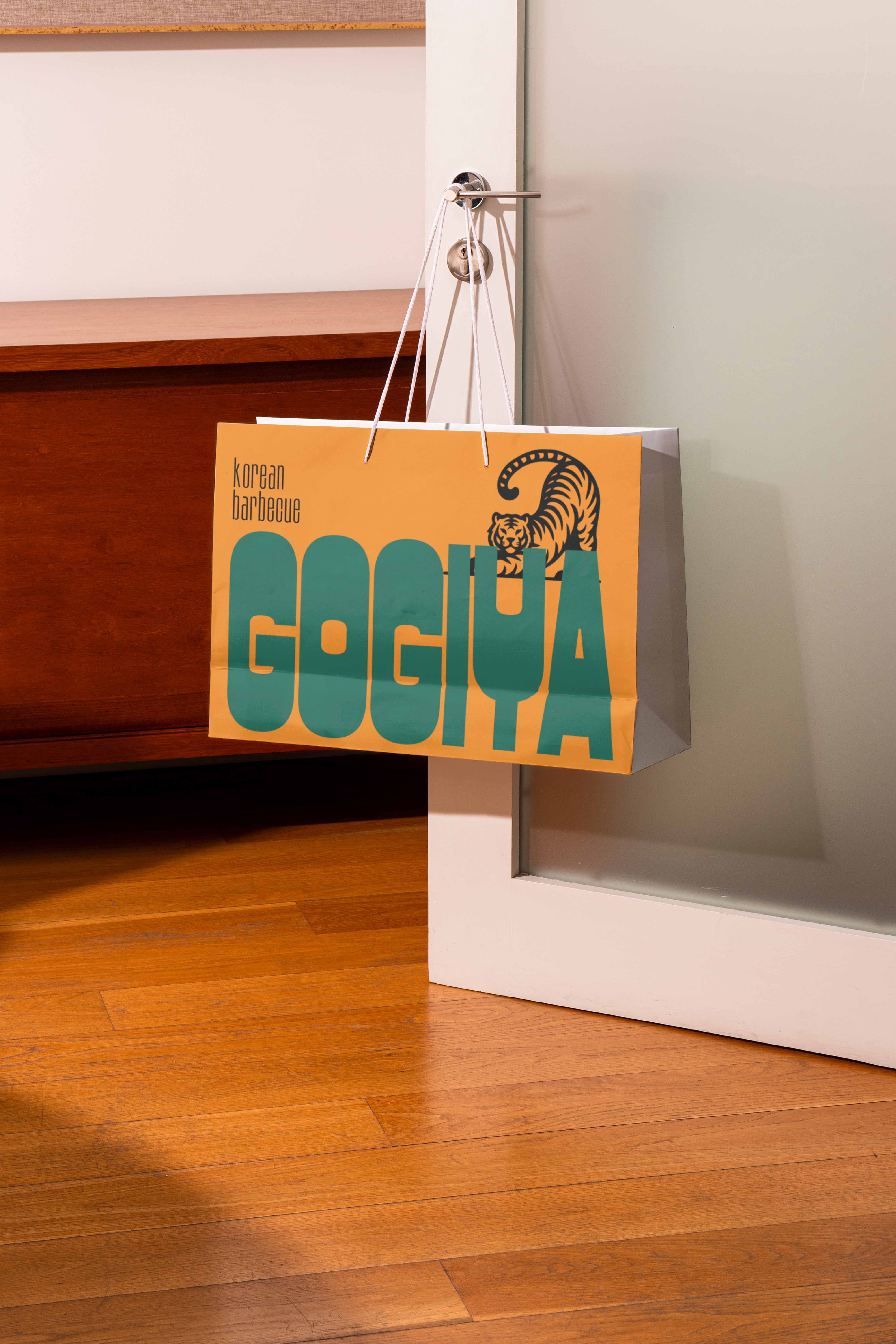
“Gogiya”, in all caps and a bold (PC Merchis) font that’s rounded and kind of “puffed up,” really gives off a strong vibe and tons of personality. It almost plays with the space around it, like it’s saying, “hey, look at me!”
Then there’s “Korean Barbecue” (Kirgina), a narrow sans serif font sitting above it — super minimal, sleek, and elegant. It balances out the whole look and lets “Gogiya” steal the spotlight.
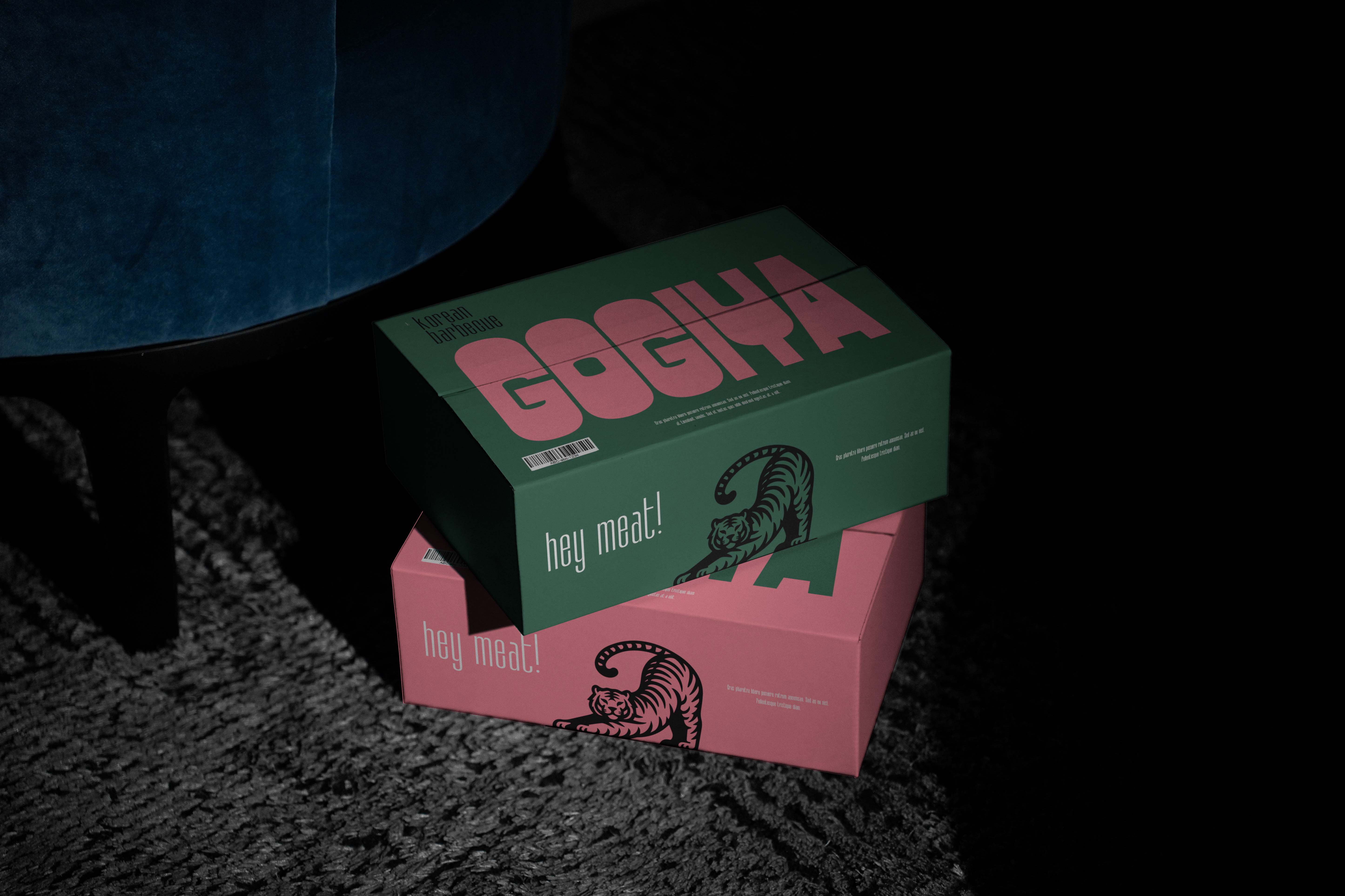
The tiger has a strong symbolism in Korean culture: it’s a guardian, a protector, and also a symbol of strength.
The tiger’s pose (with its body curved) feels dynamic and full of movement, like it’s about to leap into action — which ties in perfectly with the ideas of fire, grilling, and energy.
CREDIT
- Agency/Creative: Estudio Marciano
- Article Title: Estudio Marciano Ignites Korean Barbecue Branding with Dynamic Visual Energy
- Organisation/Entity: Agency
- Project Type: Identity
- Project Status: Published
- Agency/Creative Country: Brazil
- Agency/Creative City: são paulo
- Market Region: South America
- Project Deliverables: Art Direction, Brand Design, Brand Identity, Branding, Packaging Design
- Industry: Food/Beverage
- Keywords: korean, korean barbecue, visual identity, brand identity, packaging
-
Credits:
Design Agency: Estudio Marciano


