


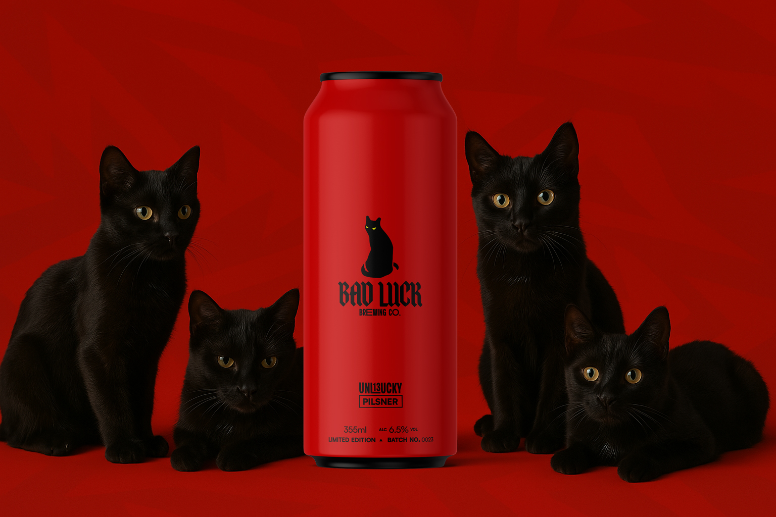
Less is more—a principle that guided the creation of Bad Luck Brewing’s brand identity and debut pilsner packaging.
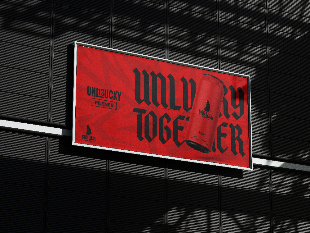
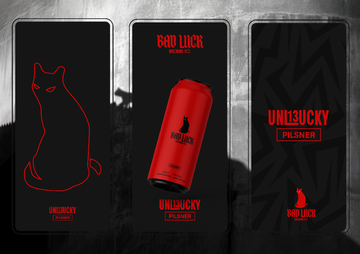
Inspired by classic symbols of misfortune—the lightning bolt, the number 13, and the iconic black cat—the final design delivers a bold, contemporary aesthetic that embodies the brand’s name with clarity and confidence.
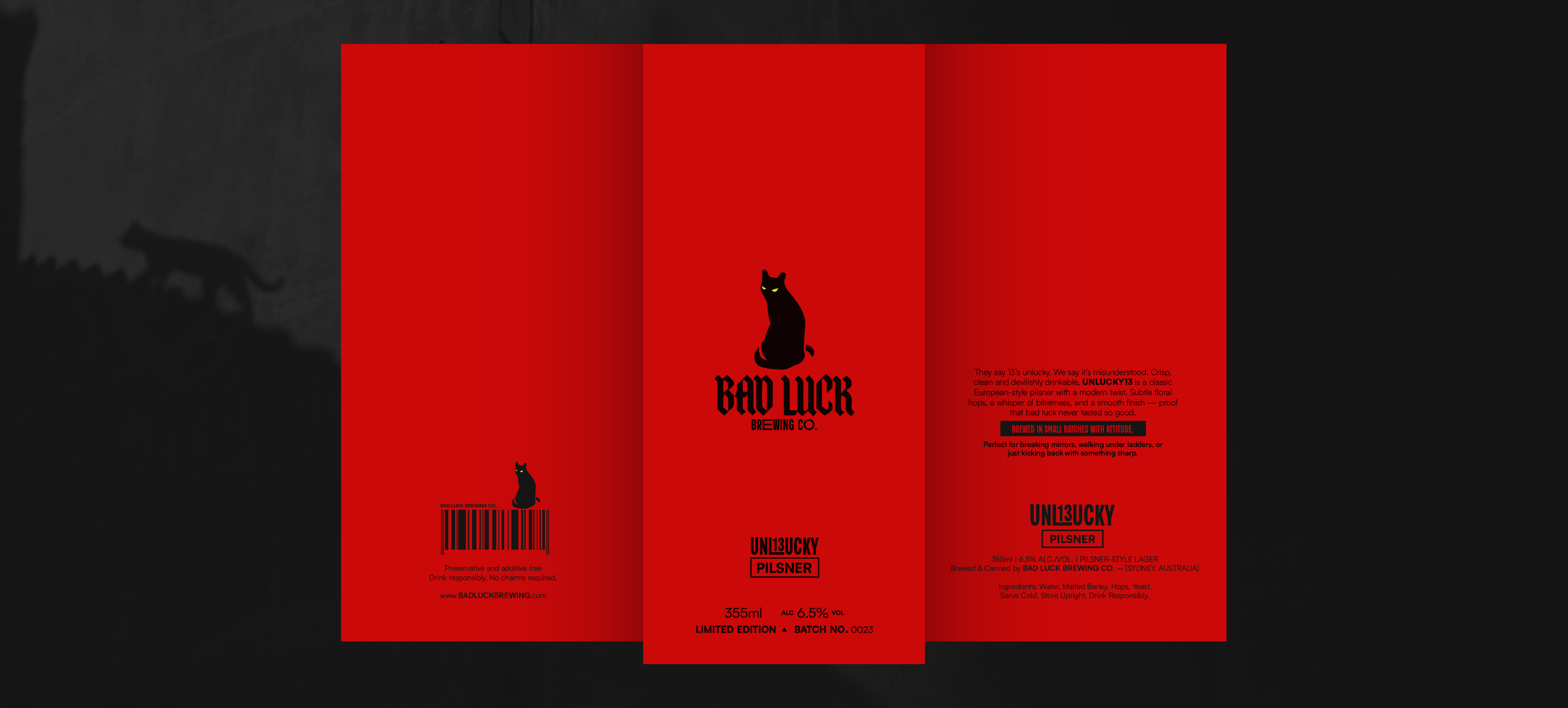
The task was to develop a striking and cohesive brand identity for Bad Luck, a new independent brewery based in Redfern, Sydney. In addition to defining the brewery’s overall visual direction, the project called for packaging design for its debut pilsner, Unlucky13. The branding needed to reflect the brewery’s name—channeling themes of misfortune, superstition, and dark charm—while standing out in a competitive craft beer market.
In a market flooded with illustrative, flashy aesthetics, Unlucky13 set out to embrace bold minimalism. Nothing showy—just a design that feels fun, sharp, and instantly recognisable, both on the shelf and in the hands of its consumers.
When someone mentions bad luck, what comes to mind? Misfortune, superstition, witchcraft and black magic, the gothic and the macabre. All of these influenced the final design.
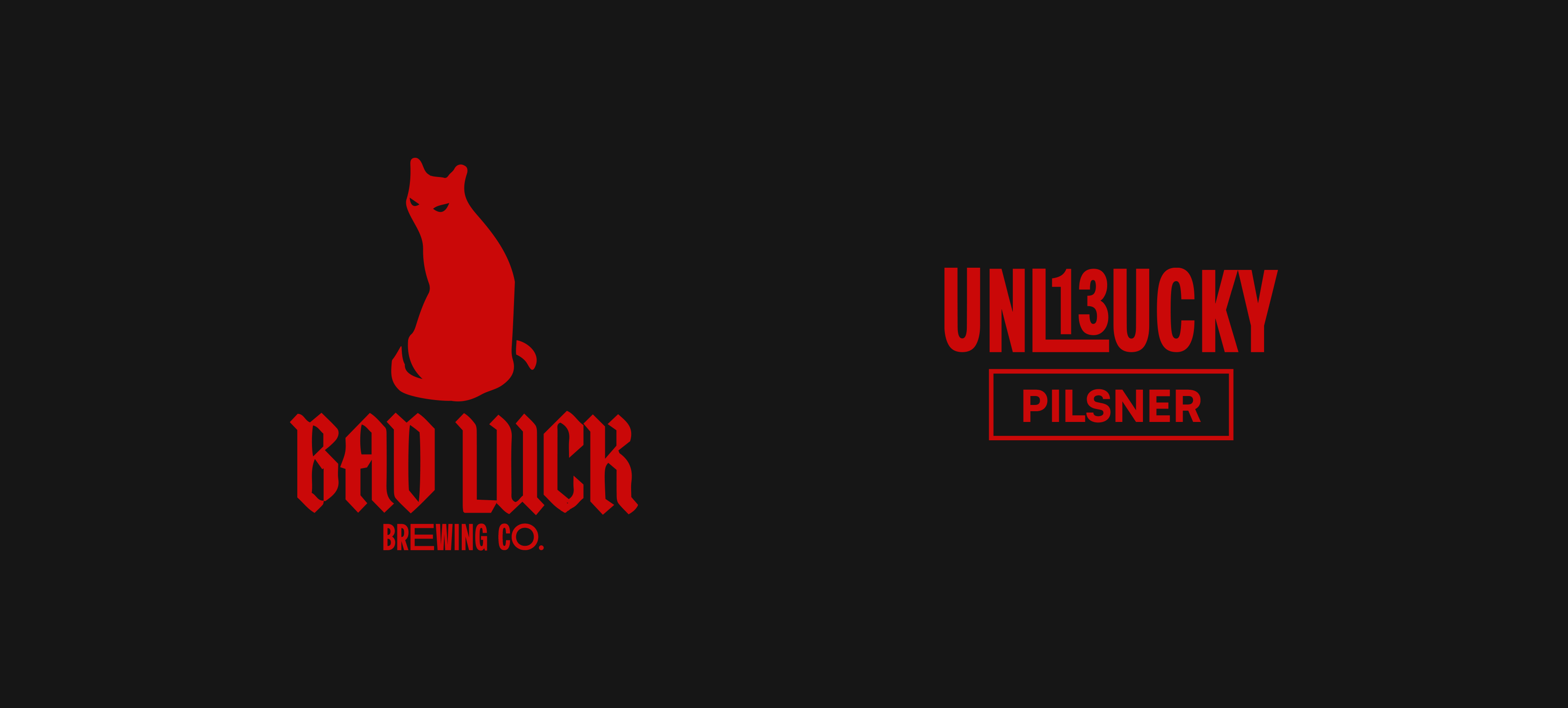
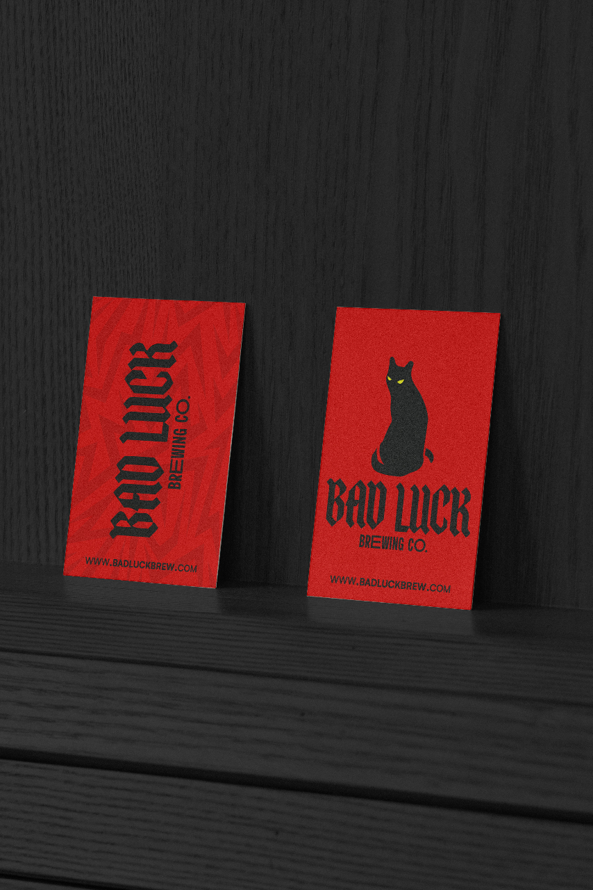
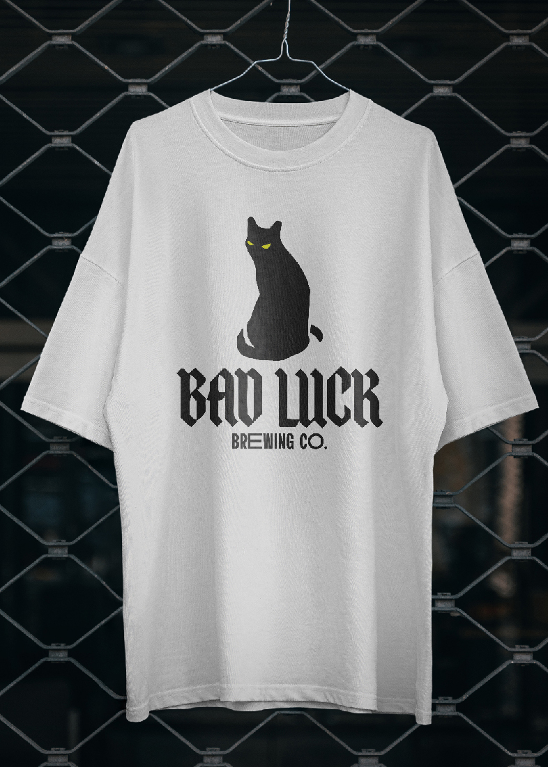
The typeface — a custom blackletter paired with a modern, occasionally elongated sans serif.
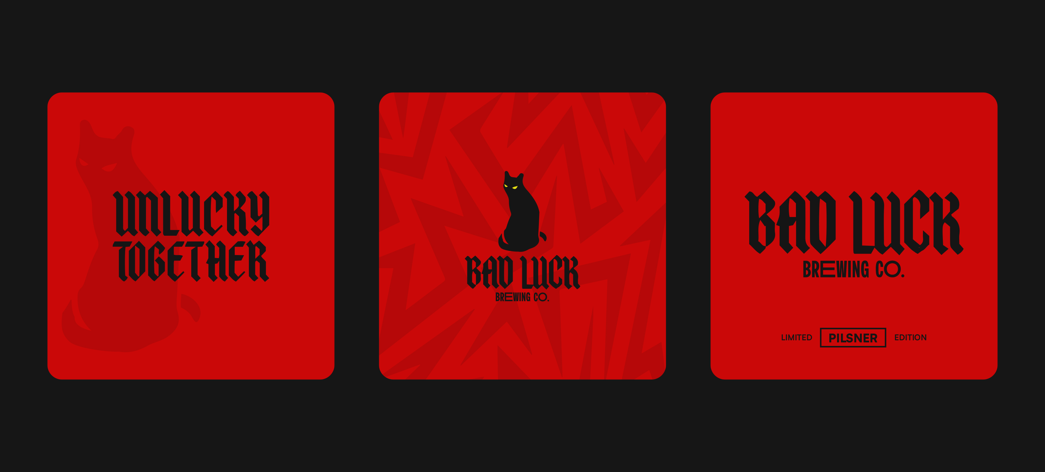
The colour — deep blood red and black, a palette long associated with horror and the supernatural.
The aesthetic — a twist of heritage and contemporary, printed matte, with zero shine.
CREDIT
- Agency/Creative: Joe Stapleton
- Article Title: Unlucky for Some: Joe Stapleton Creates a Minimal, Striking Identity for Bad Luck Brewing
- Organisation/Entity: Freelance
- Project Type: Packaging
- Project Status: Non Published
- Agency/Creative Country: Australia
- Agency/Creative City: Sydney
- Market Region: Oceania
- Project Deliverables: Brand Design, Packaging Design
- Format: Can
- Industry: Food/Beverage
- Keywords: Gothic, minimal, contemporary, dark, beer, pilsner, brewery, alcohol, can design, illustrator,
-
Credits:
Designer: Joe Stapleton


