


“On the motion” is an exhibition dedicated to the kinetic art of Alexander Calder, one of the most influential and innovative sculptors of the 20th century. Calder, an American artist, revolutionized the world of sculpture with his groundbreaking approach to movement and form. He became internationally renowned for his intricate wire constructions, which seemed to float in space like delicate sketches brought to life, and for his iconic “mobiles” — suspended sculptures that move with the gentlest air currents. His work broke away from the traditional static nature of sculpture, integrating motion and fluidity into what had previously been a solid and unchanging medium. Calder’s mobiles, in particular, redefined how we understand the relationship between art and space, as well as the viewer’s role in experiencing the work. The constant motion of his sculptures challenges the viewer to engage actively, offering a dynamic relationship between the artwork, the observer, and the environment.
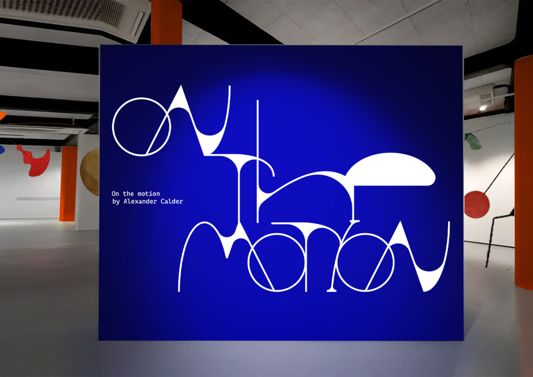
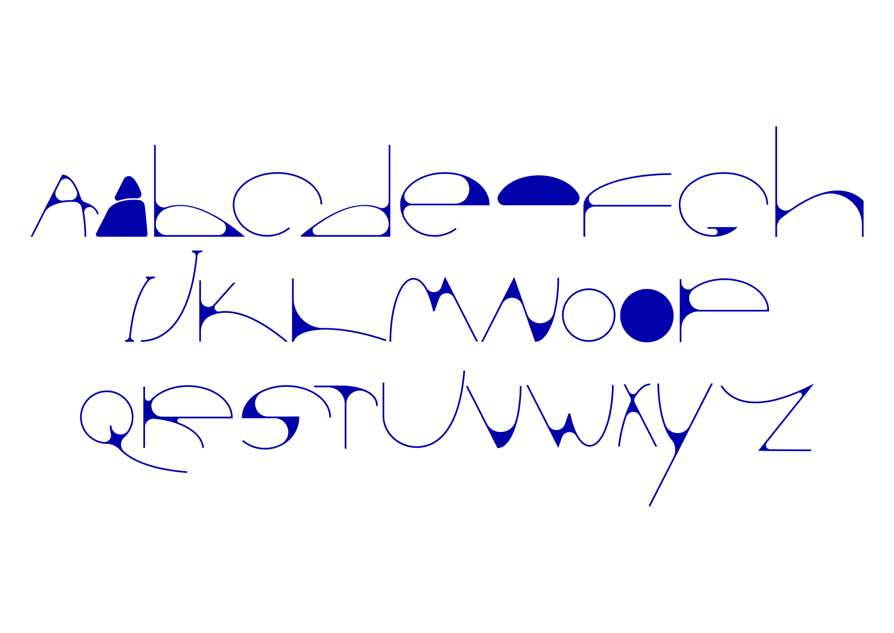
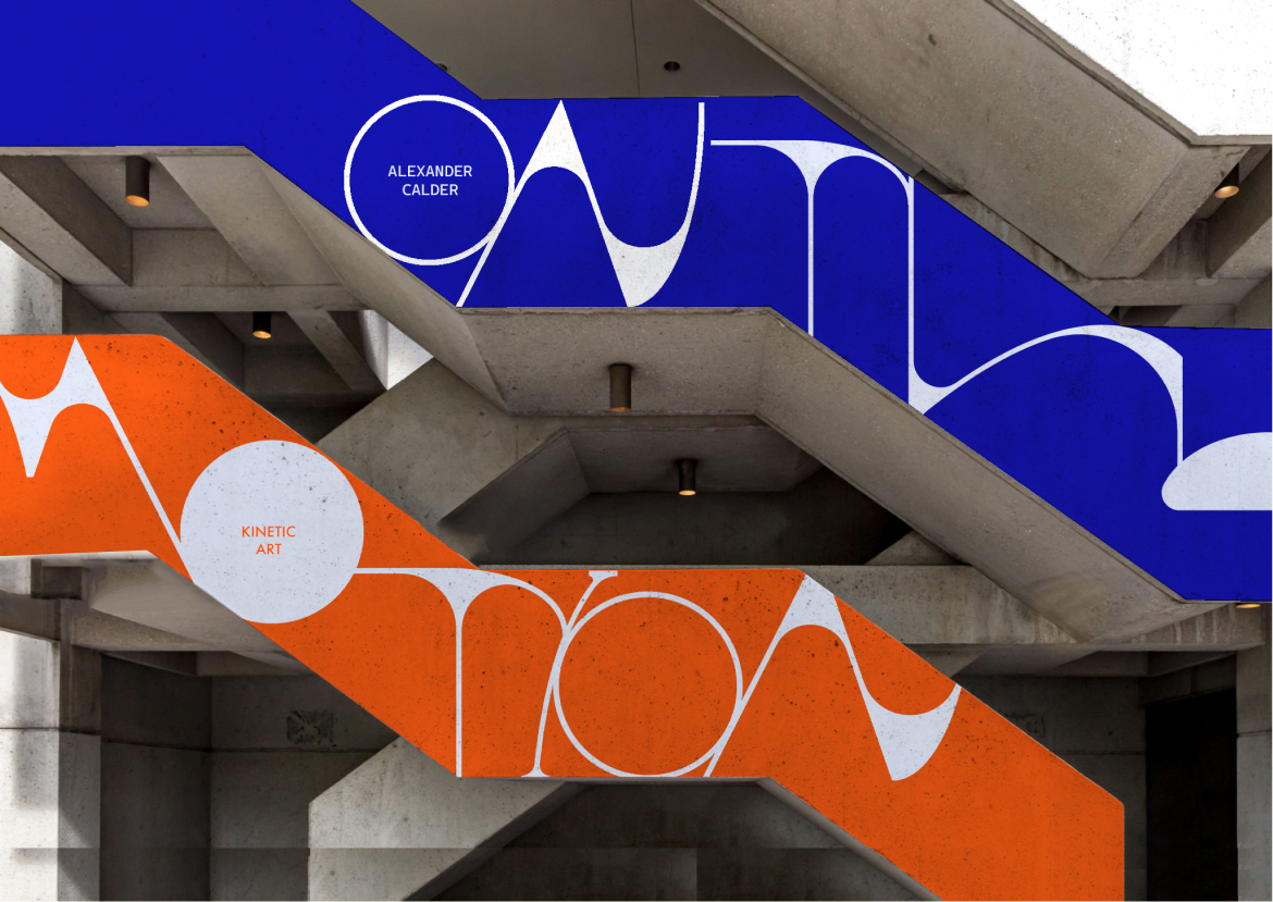
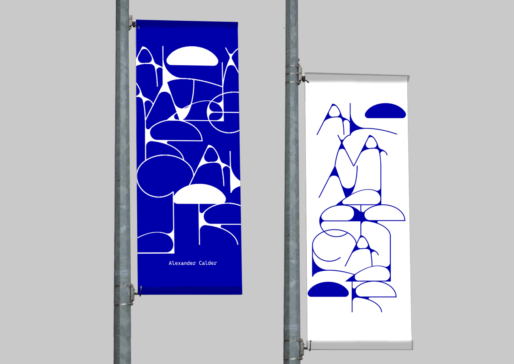
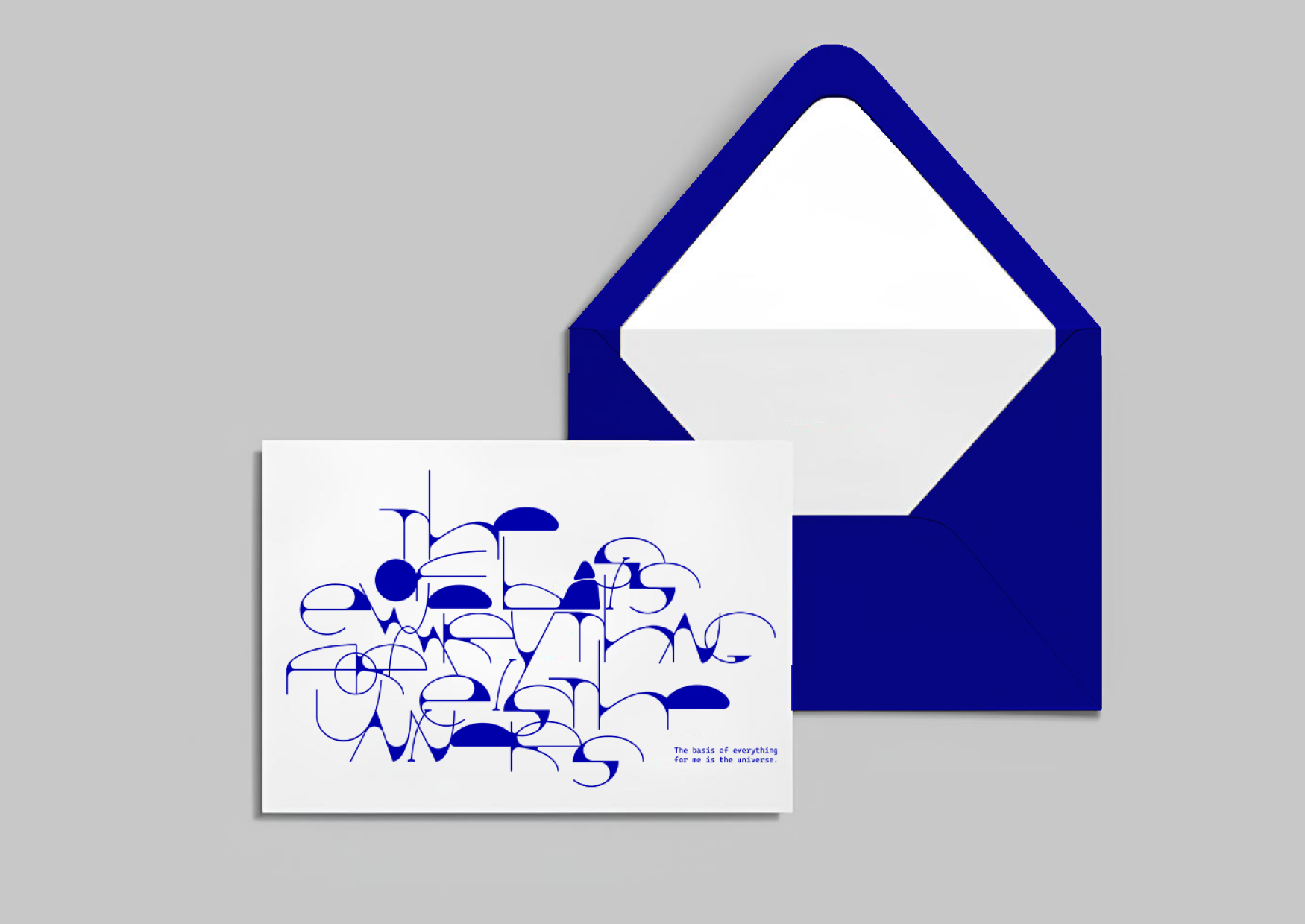
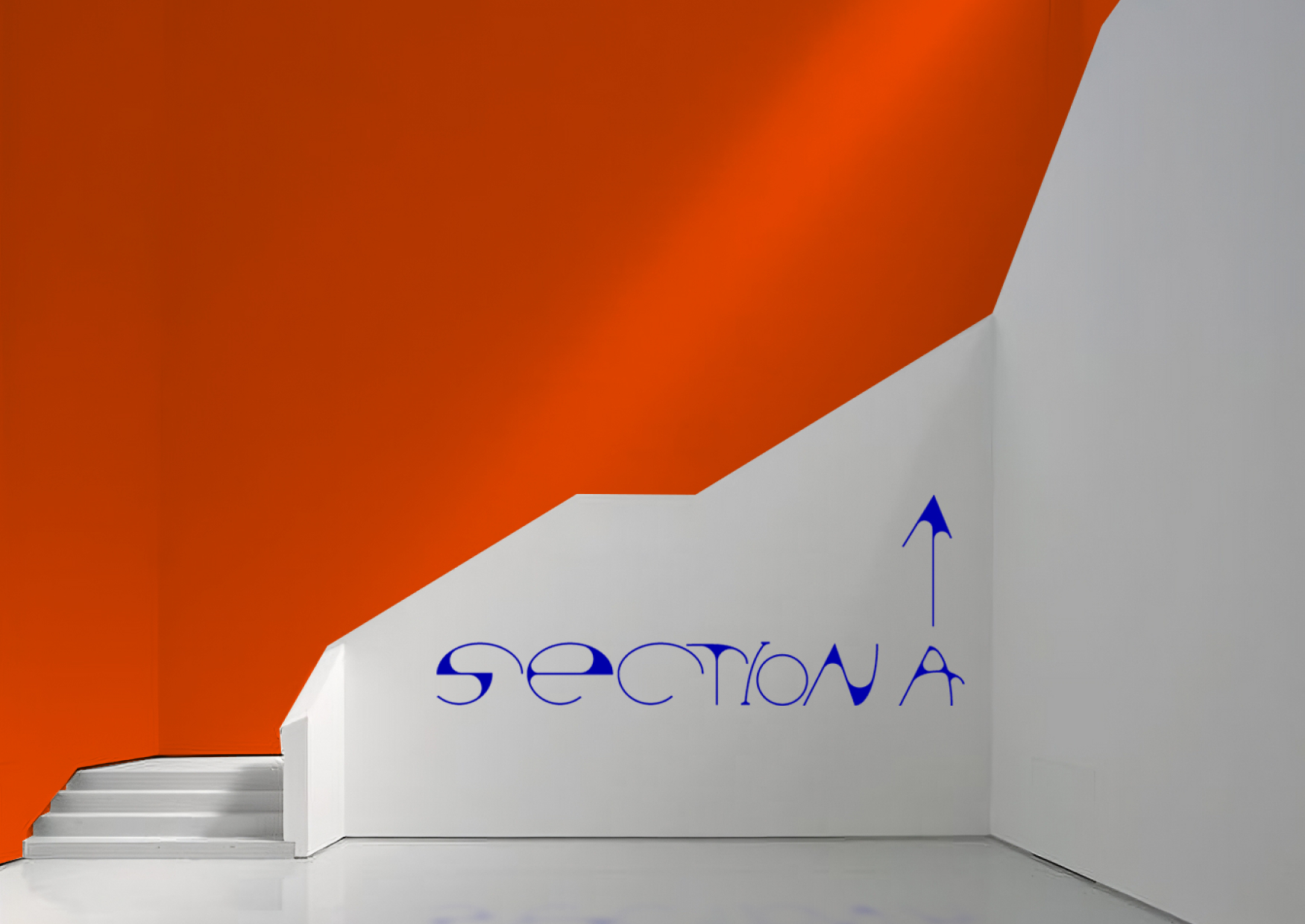
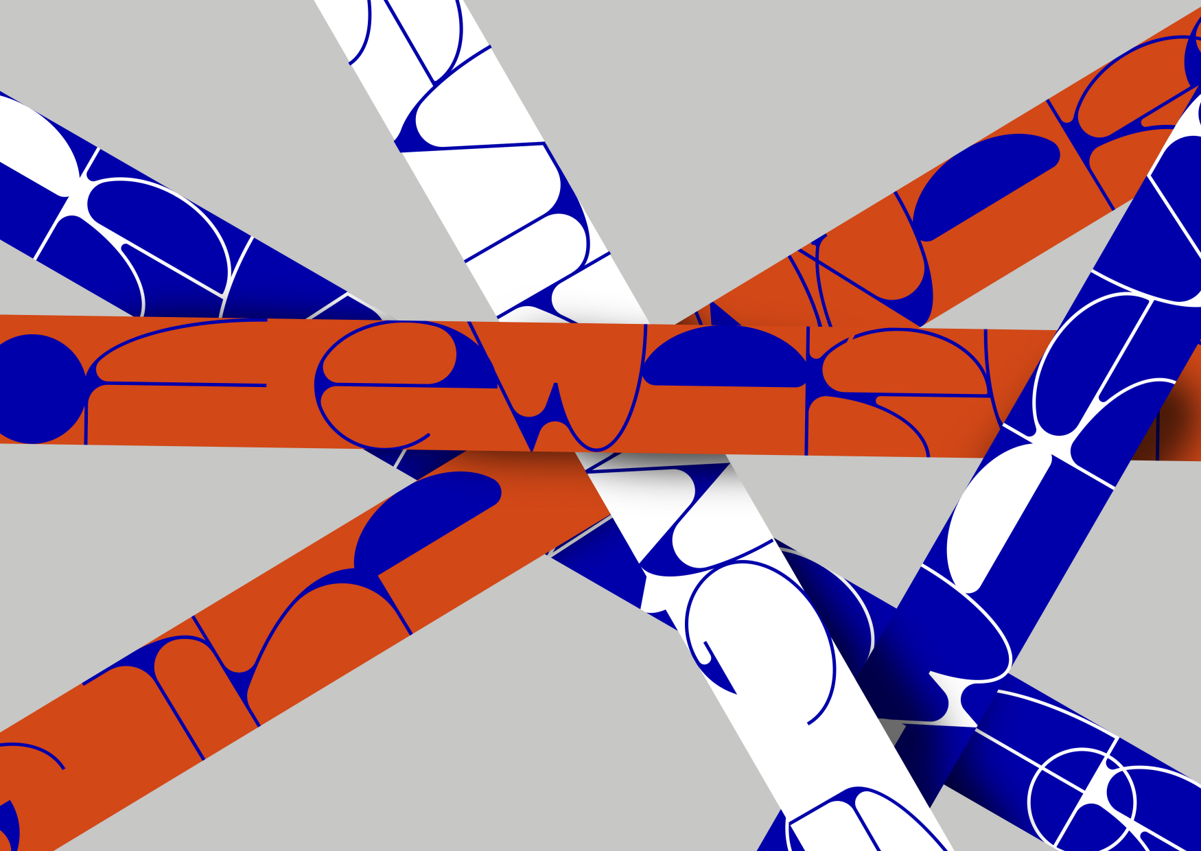
The exhibition design draws heavily from Calder’s artistic principles, particularly the fluidity, balance, and energy that define his sculptures. Central to the design is a custom typeface created specifically for the exhibition, which was inspired by Calder’s visual language and his sculptural forms. The typeface captures the essence of his work by echoing the asymmetry, irregularity, and movement that characterize his sculptures. The design of the lettering is intended to mimic the visual rhythm of Calder’s mobiles, where shapes shift and interact in a continuous flow. By employing this custom font, the exhibition not only introduces Calder’s sculptures but also immerses the viewer in a language that feels both dynamic and alive, much like the art itself.
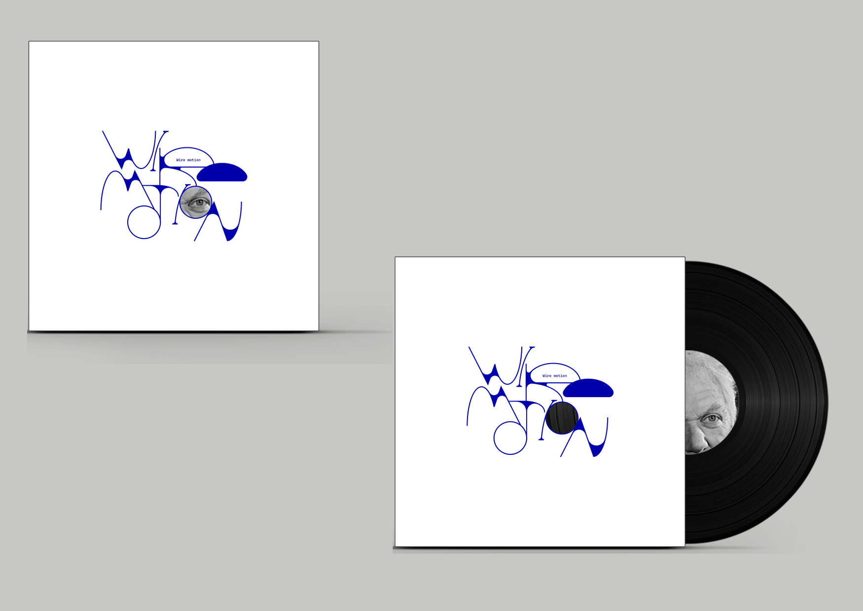
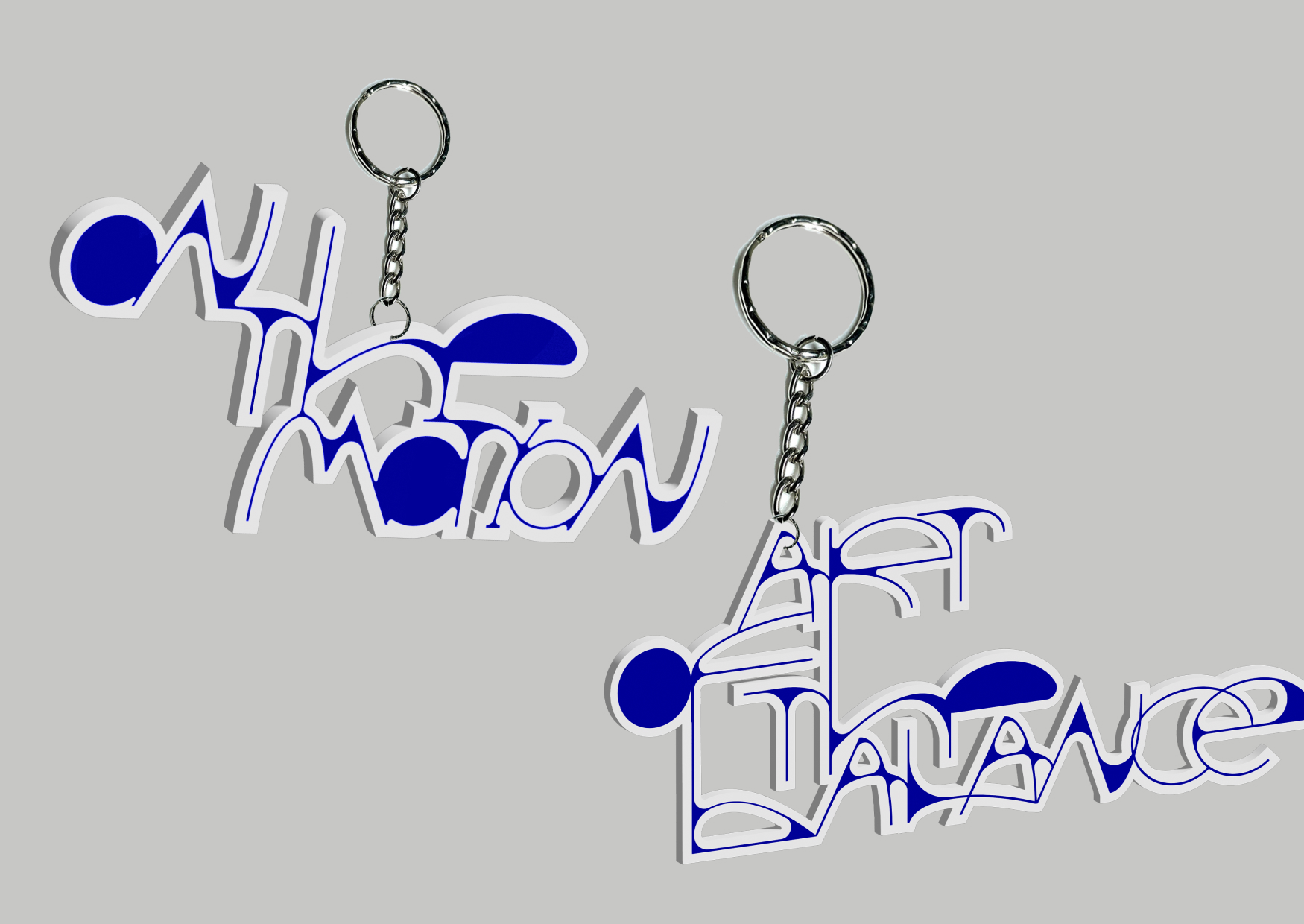
The use of this typeface and other design elements reflects Calder’s unique ability to transform something as simple as a wire into an expressive, flowing artwork. Just as Calder’s works evoke a sense of lightness and freedom, the exhibition design aims to mirror this by incorporating airy, open compositions and designs that highlight the delicate, fragile nature of the sculptures while emphasizing their inherent movement. The exhibition spaces are designed to encourage exploration and interaction, allowing visitors to experience the kinetic quality of Calder’s art in different contexts. The visuals surrounding the artwork, from wall text to printed materials, are meant to complement and enhance the fluid motion Calder imbued into his sculptures.
This visual approach serves as a bridge between the physical form of Calder’s work and the intellectual concept behind it. It’s not just about showcasing the objects themselves; it’s about communicating the philosophy of movement and change that Calder brought to the world of modern art. By translating Calder’s artistic principles into graphic design, the exhibition aims to offer a holistic experience — one that captures the joy, spontaneity, and playfulness that Calder saw in motion, while inviting the audience to reflect on the relationship between time, space, and perception. The design, like Calder’s work, is a testament to the idea that art is not just to be seen but to be felt, experienced, and engaged with.

CREDIT
- Agency/Creative: Chernyaeva Liza
- Article Title: Identity of an Alexander Calder’s Exhibition by Student Chernyaeva Liza
- Organisation/Entity: Student
- Project Type: Identity
- Project Status: Non Published
- Agency/Creative Country: Russia
- Agency/Creative City: Moscow
- Market Region: Europe, Global
- Project Deliverables: Art Direction, Brand Identity, Graphic Design, Identity System
- Industry: Entertainment
- Keywords: identity, graphic design, exhibition, font, Alexander Calder
-
Credits:
Curator: Borisovsky Pavel


