About the Festival
Every year, in the heart of China’s mountainous landscapes, the Wild Apple Festival brings people together to celebrate nature, culture, and traditions.
It’s a time to immerse yourself in the beauty of wild apple orchards, participate in the harvest, enjoy the local culture, and explore the rich history of the region. Whether you are a traveler or a local resident, the festival offers a vibrant space to reconnect with the land and its stories.
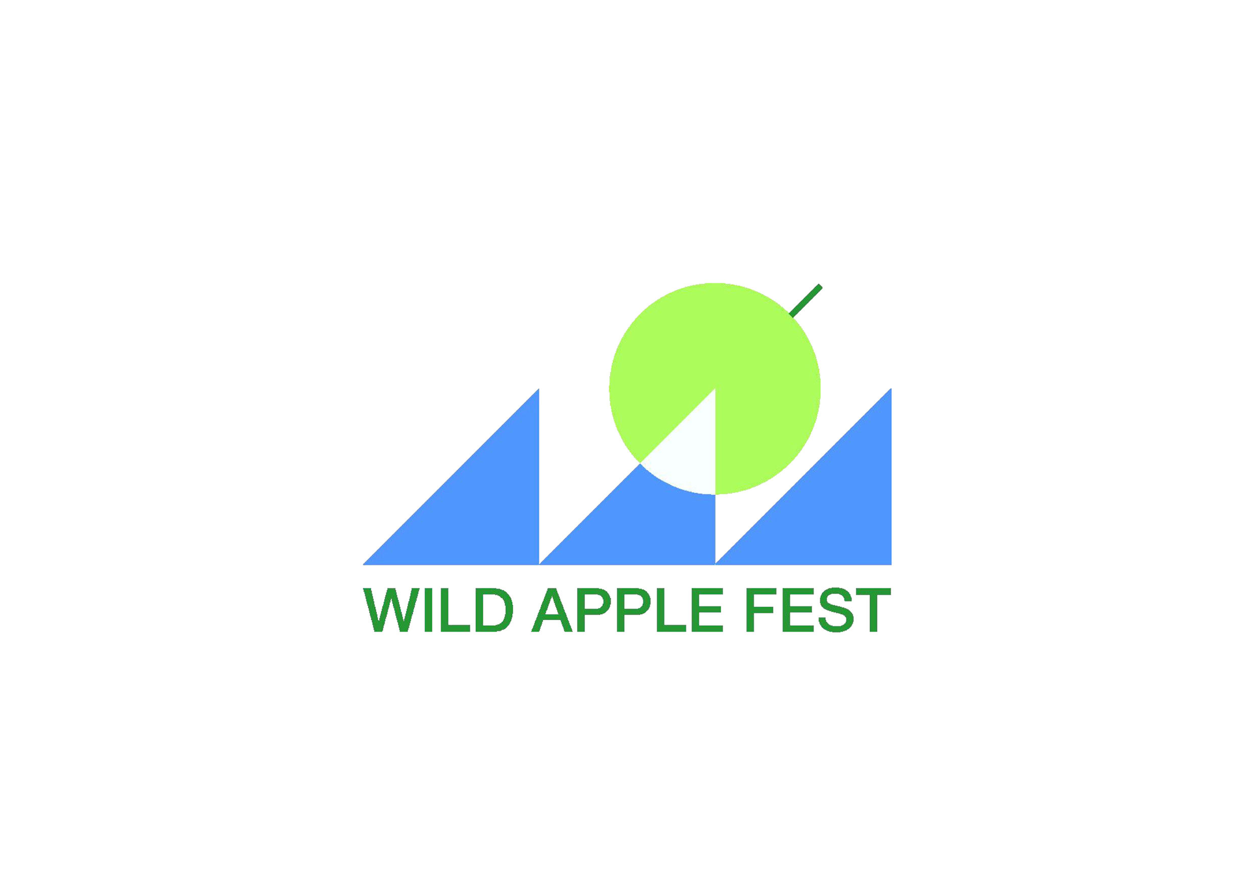
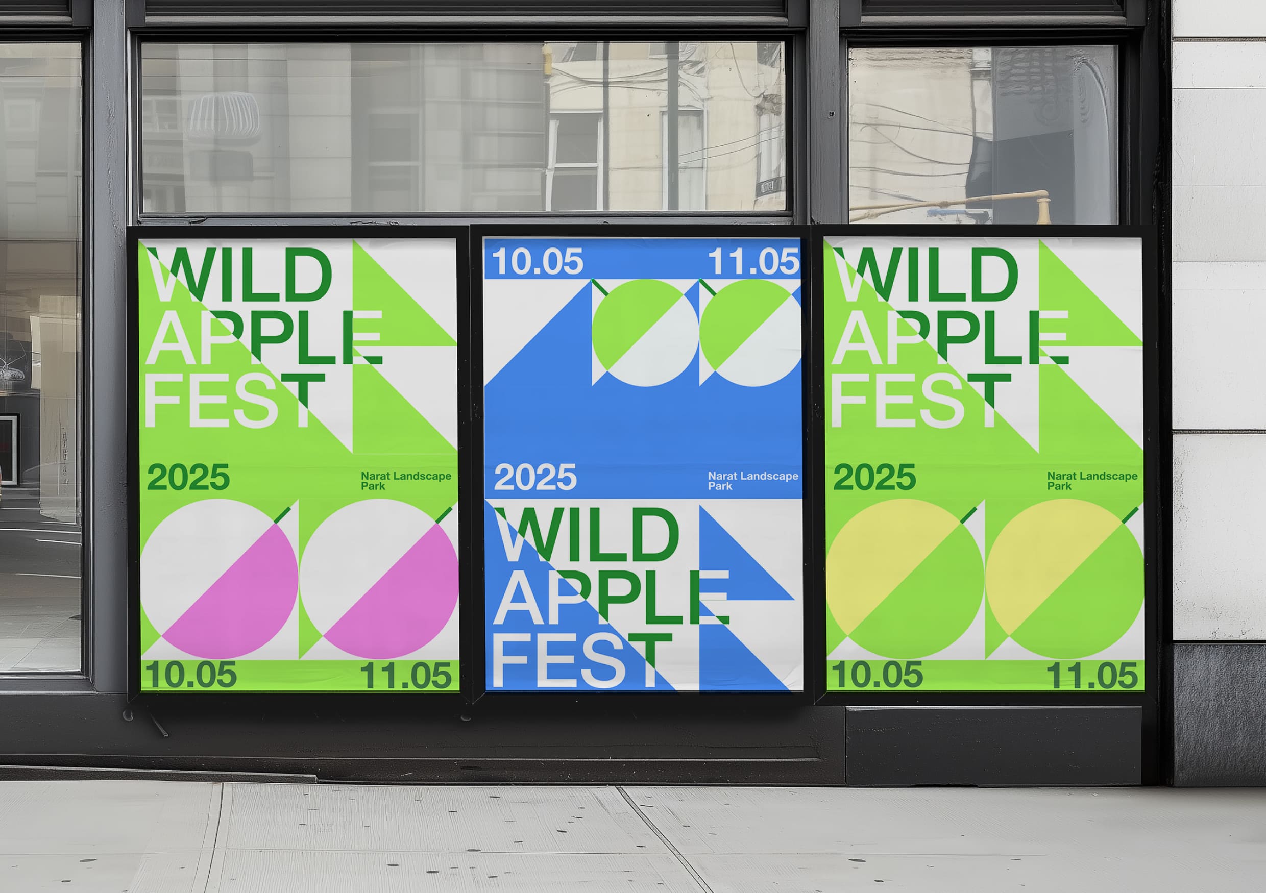
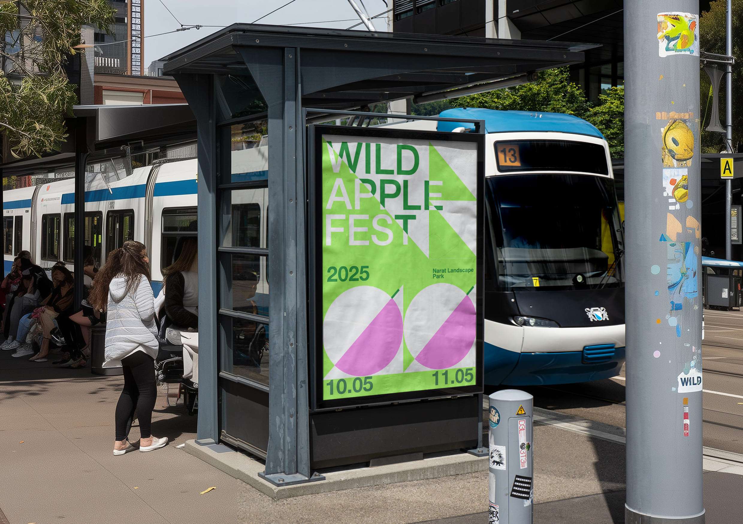
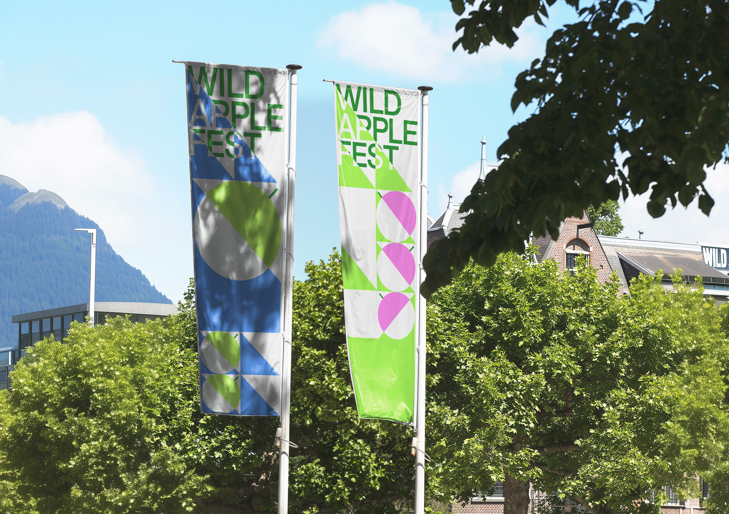
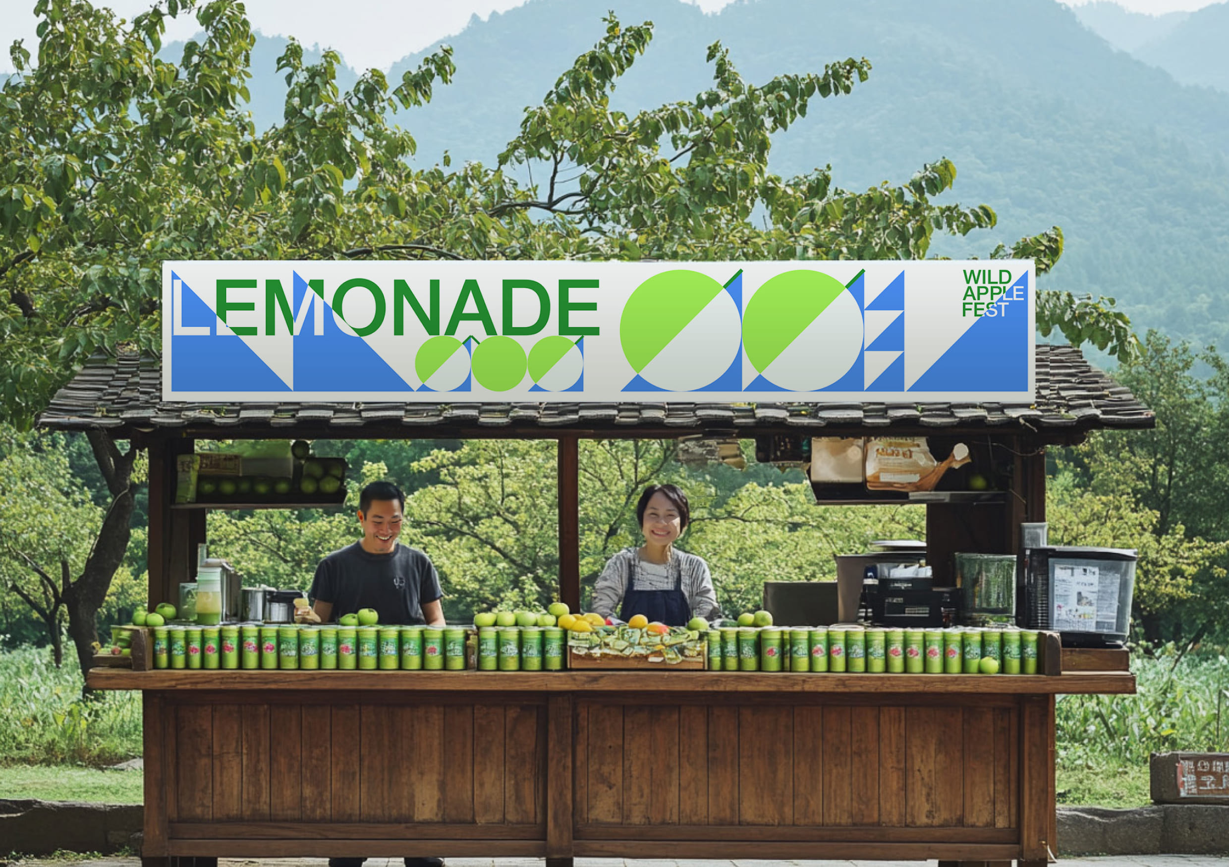
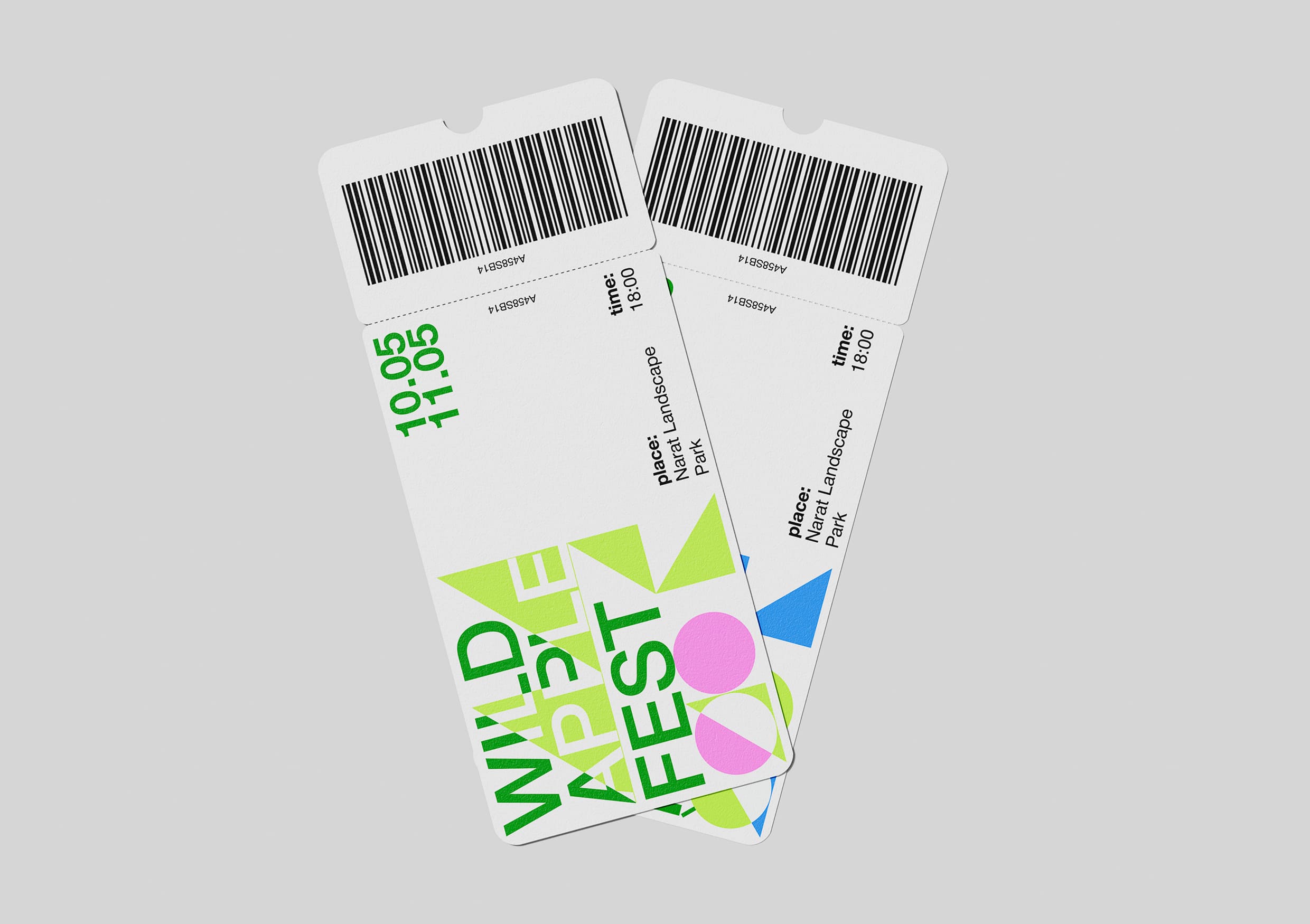
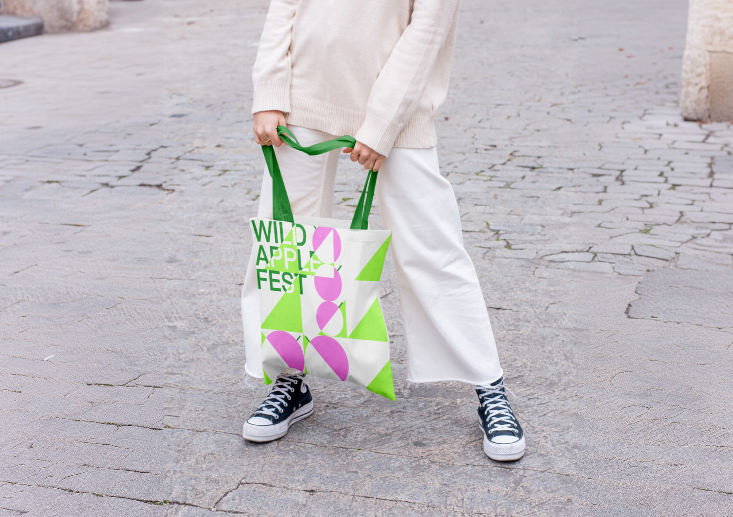
The graphic metaphor is built around two basic shapes—the circle and the triangle. The circle symbolizes the apple, while the triangle represents the mountains. These shapes engage in a dialogue with each other, intersecting and creating a dynamic compositional rhythm. This forms a visual narrative, where geometry is not abstract, but a way to tell stories about the natural landscape, fertility, and the balance between humans and their environment.
The overlapping of layers is a key technique in the festival’s design. Each layer is seamlessly integrated with the others, creating contrast and depth. This solution is not only visually expressive but also functional: it helps to structure the information and create a multi-layered composition.
The primary font is Helvetica Neue Cyrillic. Helvetica Neue Cyrillic is a modern geometric grotesque typeface. It works well in headlines, remains legible in complex overlays, and maintains a contemporary tone of communication.
The festival serves as a platform where the past meets the future, nature meets culture, and tradition meets modern design. Its identity is not a decorative element, but a functional visual language through which the brand communicates with its audience. It sets the mood, evokes emotions, helps navigate, and aids in memorability.
Wild Apple Fest is a festival where form follows meaning. Are you ready to be part of it?

CREDIT
- Agency/Creative: Anastasia Kleyman , Irishka Burakova , Michael Dzodzoe
- Article Title: Student Work Shapes a Visual Language for Wild Apple Fest Rooted in Geometry and Nature
- Organisation/Entity: Student
- Project Type: Identity
- Project Status: Non Published
- Agency/Creative Country: Russia
- Agency/Creative City: Kleyman Anastasia
- Market Region: Europe
- Project Deliverables: 2D Design, Brand Identity, Typography
- Industry: Entertainment
- Keywords: fest, branding, graphic design, corporate identity, apple, poster
-
Credits:
Designer: Anastasia Kleyman
Designer: Irishka Burakova
Designer: Michael Dzodzoe
Curator: Yaroslav Subbotin
Educational Institution: HSE Art and Design School


