


About:
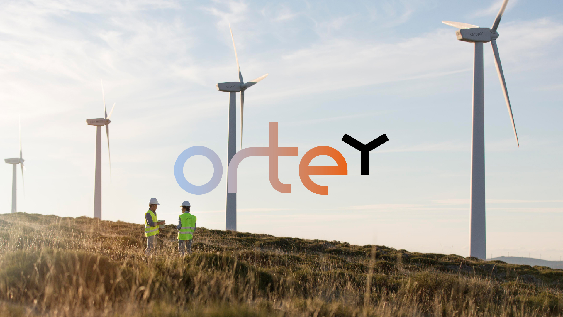
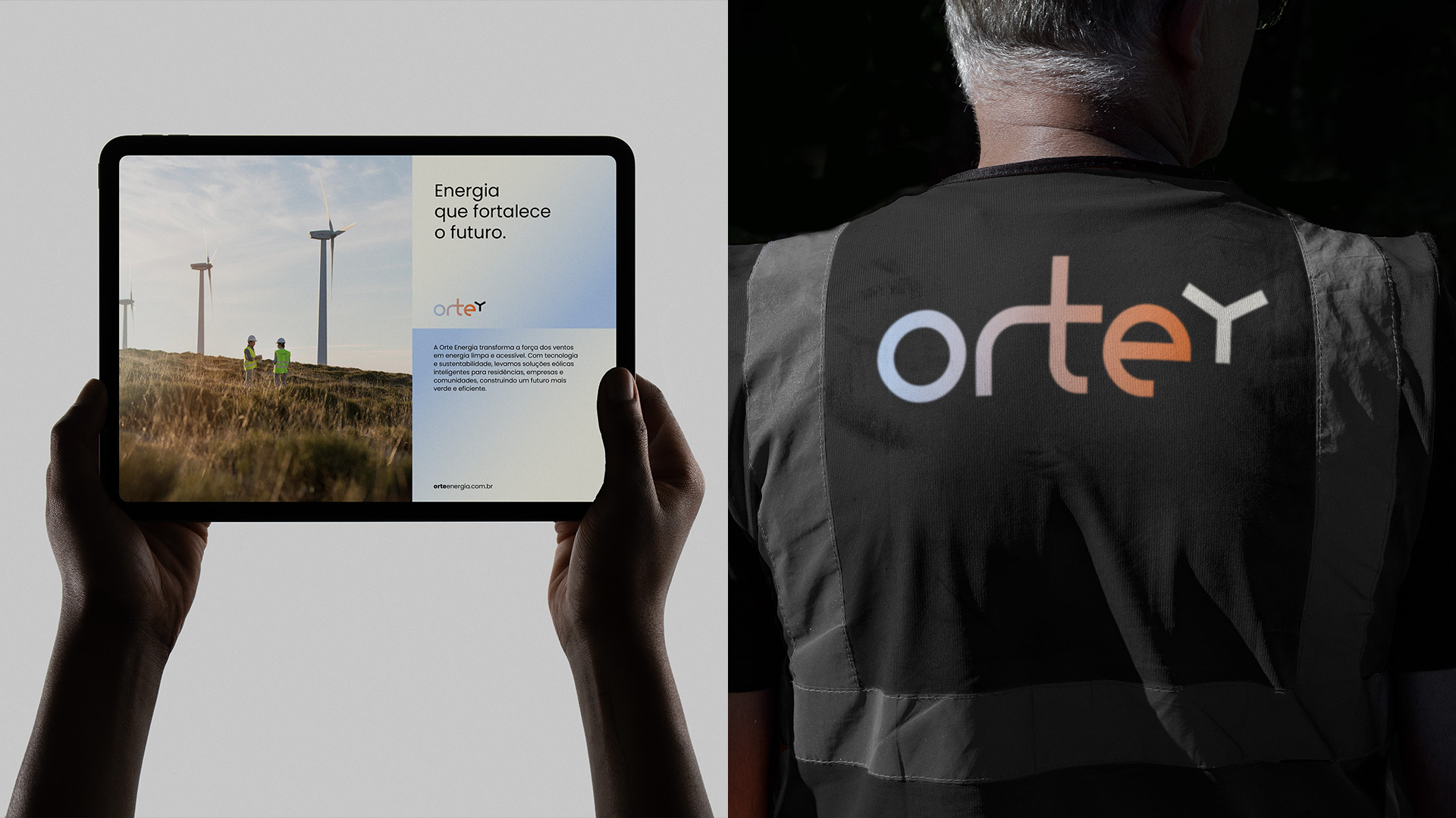
Orte is a wind energy company that combines technological innovation and environmental responsibility to deliver clean energy solutions to all sectors – from homes and rural properties to large corporations. Our vision goes beyond electricity generation: we are building a future where development and sustainability go hand in hand, transforming Brazil’s wind potential into real progress for the country.
ORTE – Naming:
“Orte” is a short and impactful name that blends “origin” and “energy,” representing sustainable solutions aligned with nature. With just four letters, it conveys strength and resilience, while its connection to “orb” and “earth” reinforces our environmental commitment – a distinctive identity for energy that transforms the planet.
Concept:
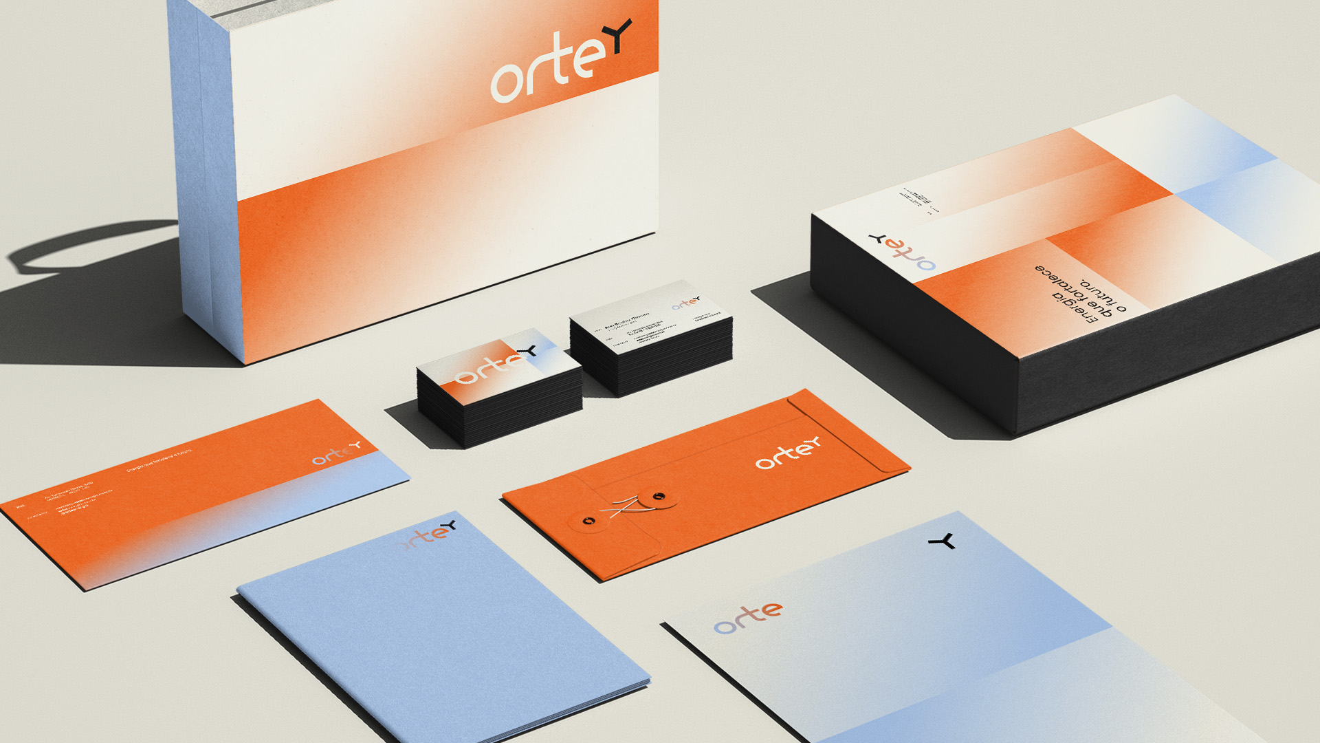
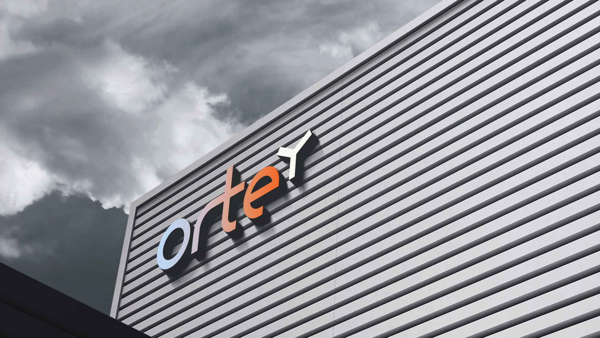
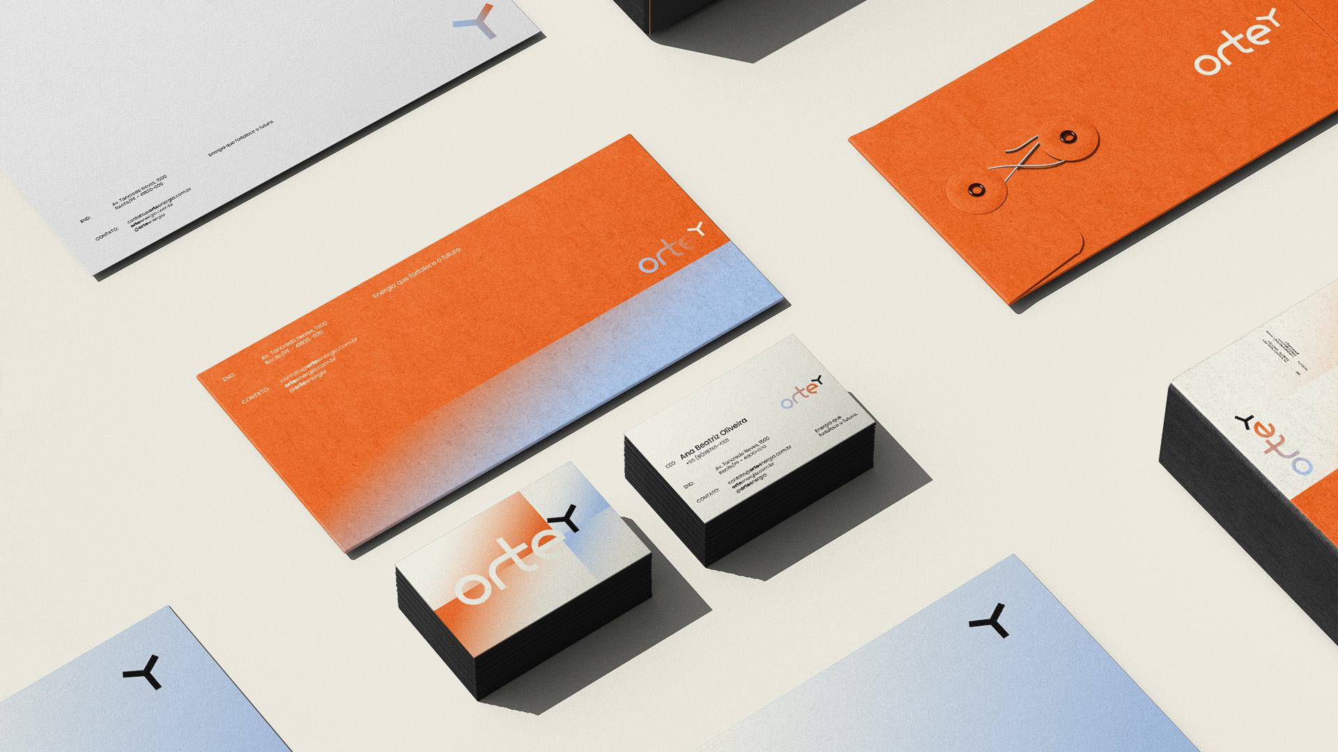
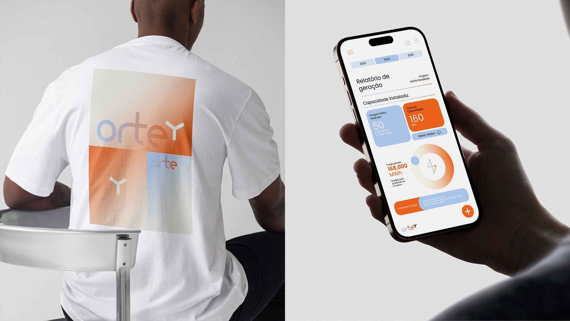
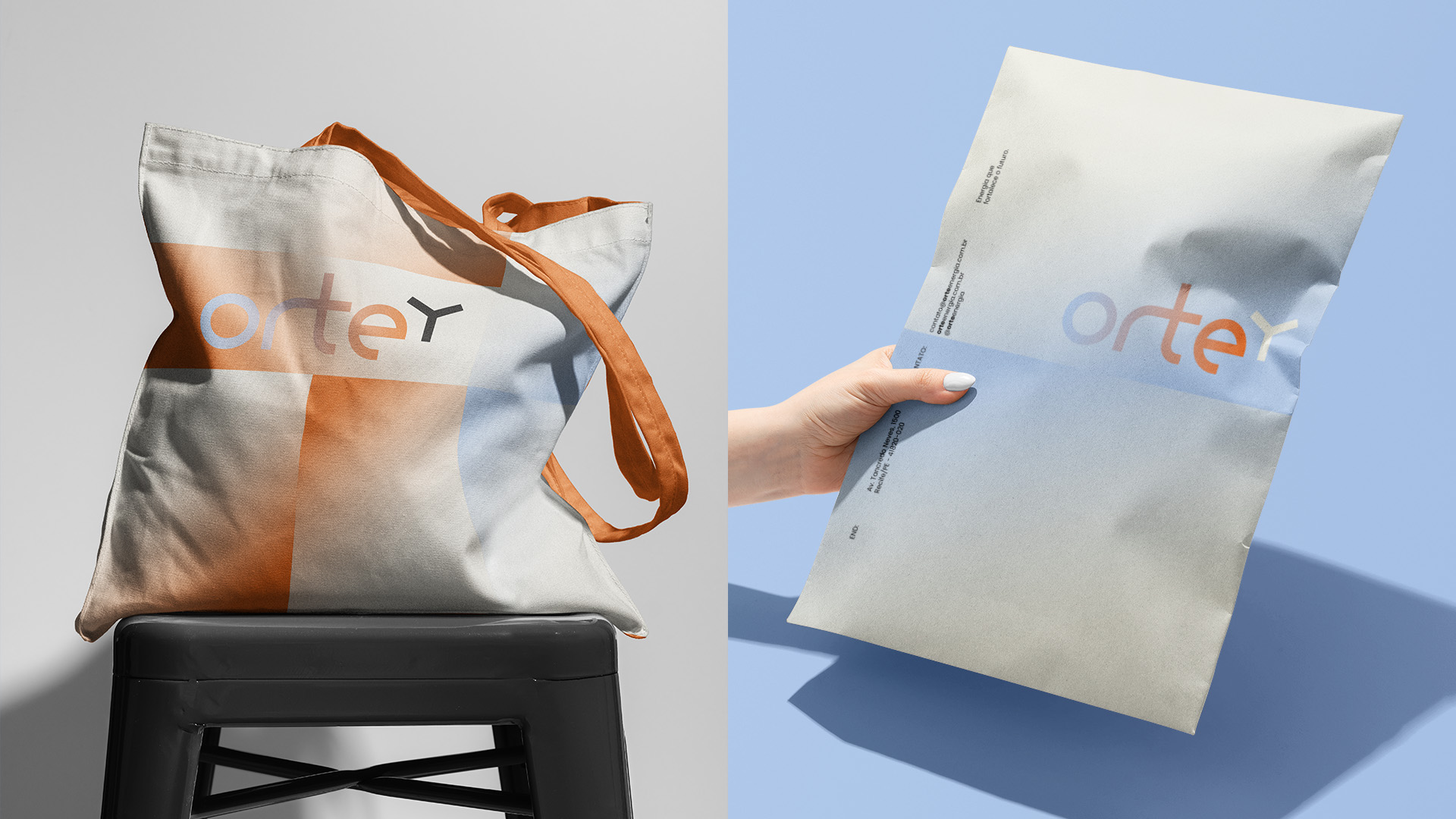
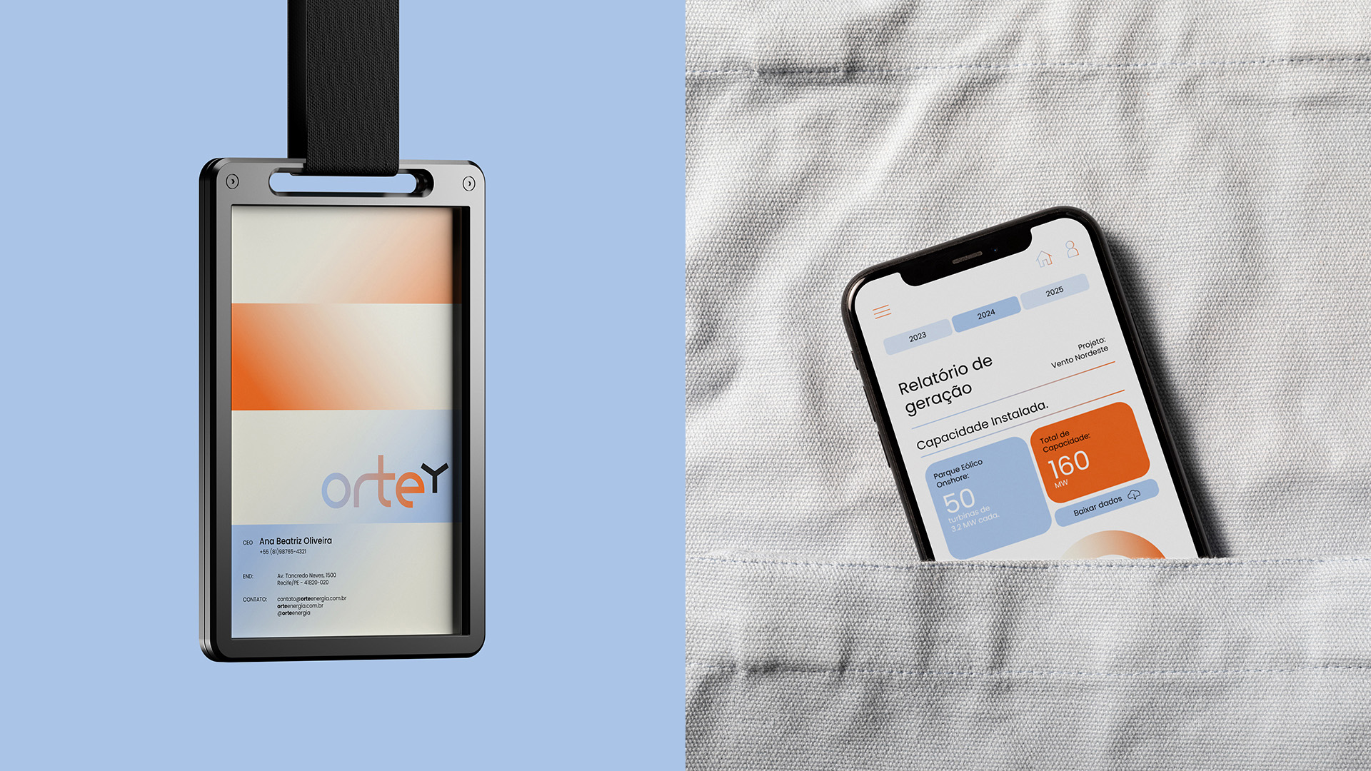
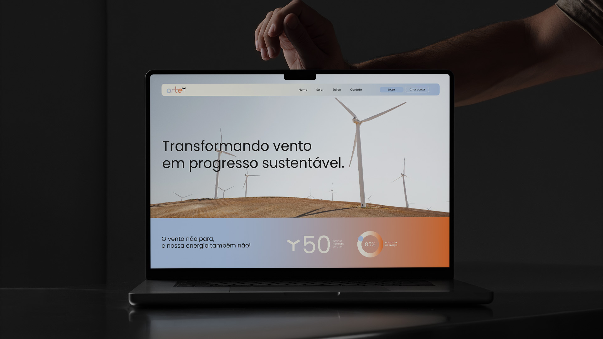
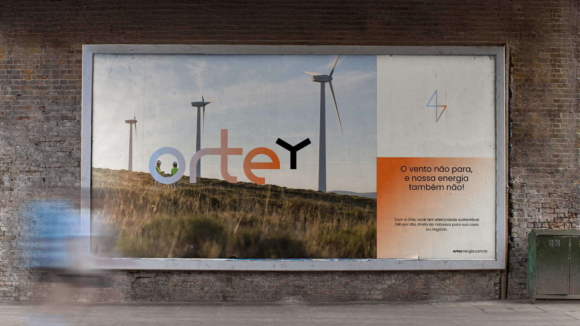
Orte’s visual identity was carefully crafted to represent its essence as a renewable energy company. The strategic use of color gradients symbolizes the continuous flow of energy we harness from wind and sun, converting these natural resources into smart solutions distributed to homes, businesses, and communities. This smooth color transition not only illustrates the process of energy generation and distribution but also reflects the shift toward a more sustainable and efficient future.
One of the most significant elements of the brand is the creative fusion of the letters R and T in our logo. This design solution goes beyond aesthetics – it visually embodies our ability to connect technology and nature, turning abundant resources into clean energy.
Each aspect of our visual identity communicates our core purpose: capturing the planet’s pure energy and converting it into sustainable progress for all. The gradient represents the full cycle of renewable energy, from its natural origin to its practical application in people’s daily lives. Meanwhile, the integration of the letters R and T forms a unique symbol that encapsulates our mission to unite advanced technology and environmental responsibility.
This identity is not just a graphic representation but a visual expression of our values and commitments. Through its colors, shapes, and elements, it tells the story of how we transform wind and sunlight into smart energy solutions, building bridges between nature’s potential and modern society’s needs.
CREDIT
- Agency/Creative: Marsi Brand
- Article Title: Marsi Brand Connects Earth and Innovation Through Orte’s Energized Visual Identity
- Organisation/Entity: Freelance
- Project Type: Identity
- Project Status: Published
- Agency/Creative Country: Brazil
- Agency/Creative City: Governador Valadares
- Market Region: South America
- Project Deliverables: Brand Identity
- Industry: Energy
- Keywords: Energy, Visual Identity, brand identity, brand strategy
-
Credits:
Brand Designer: Marcela Ribeiro


