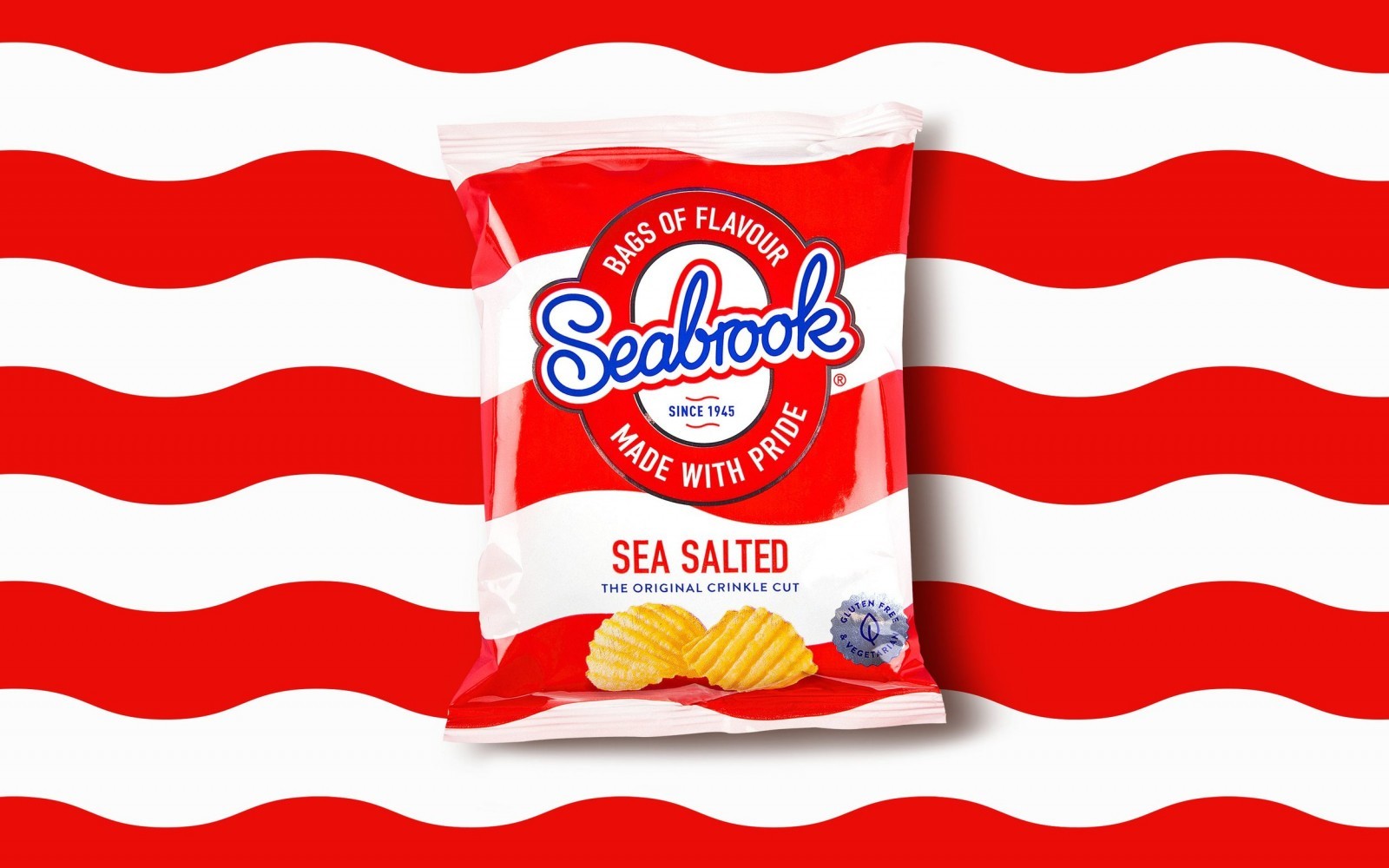
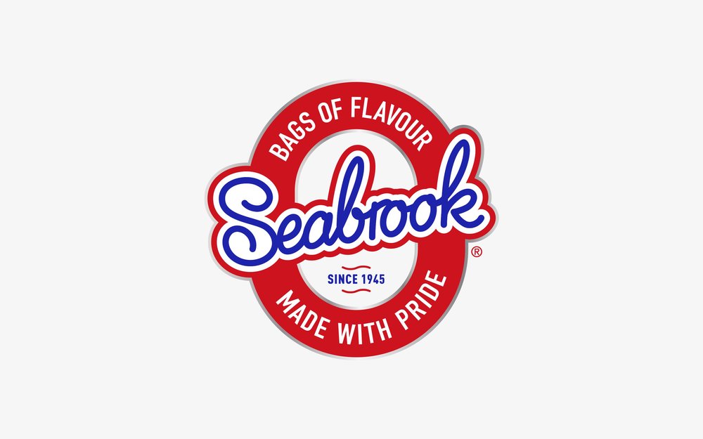
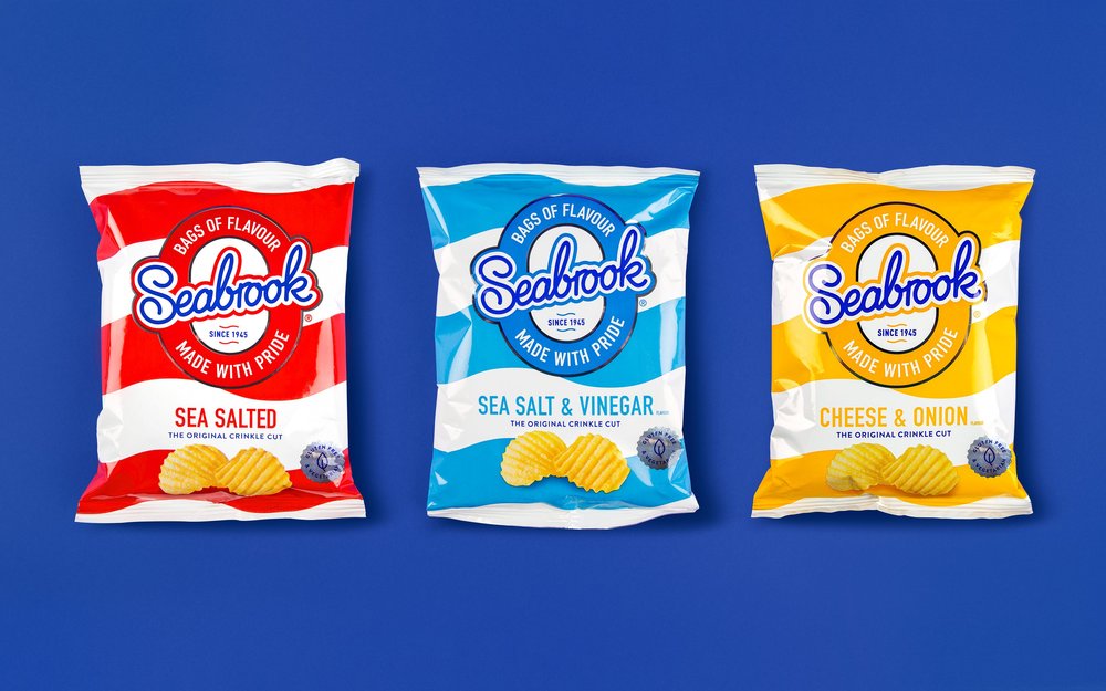
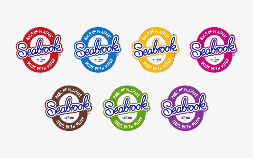
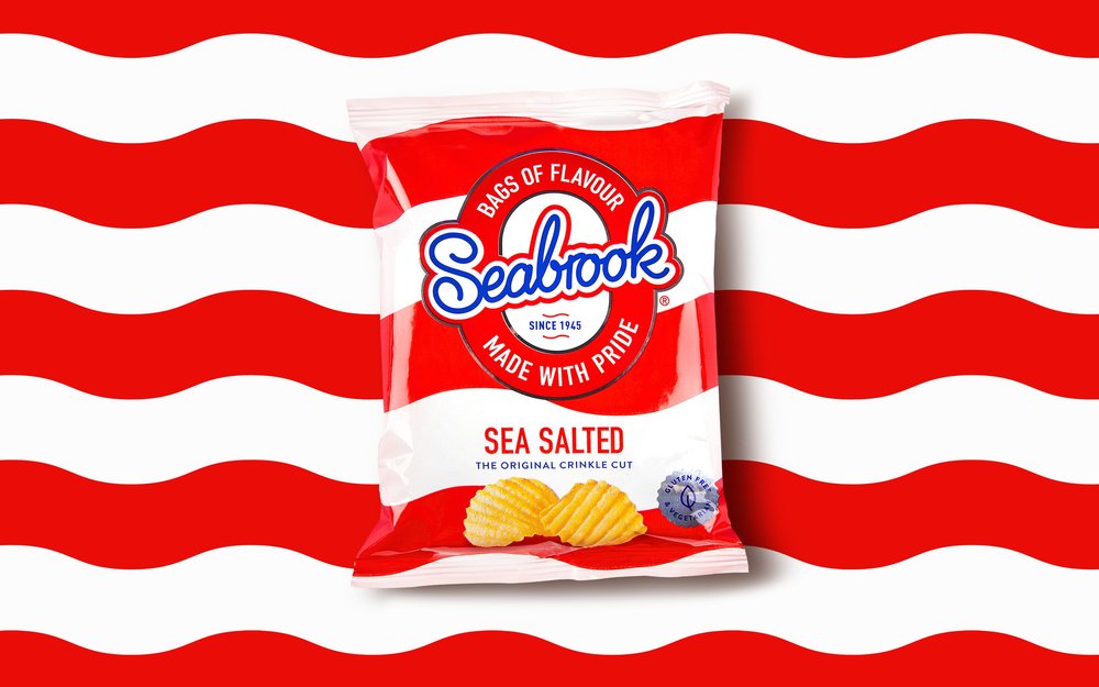
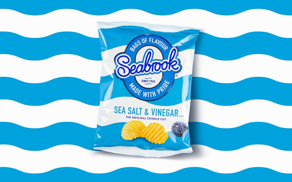
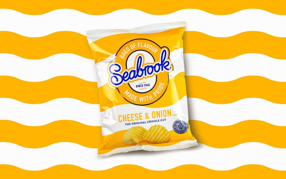
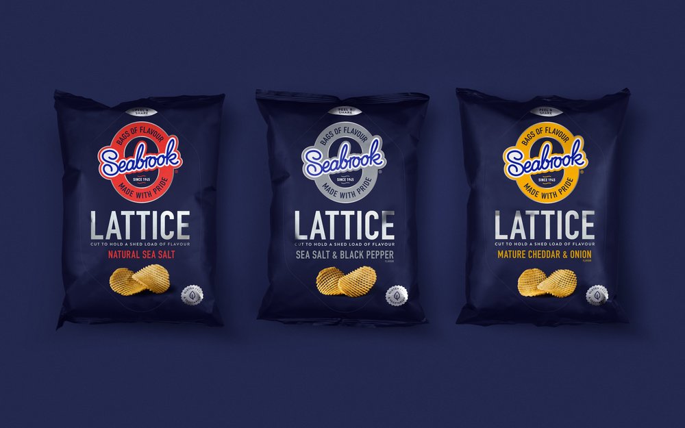
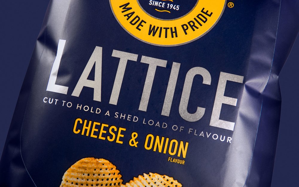
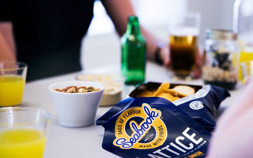
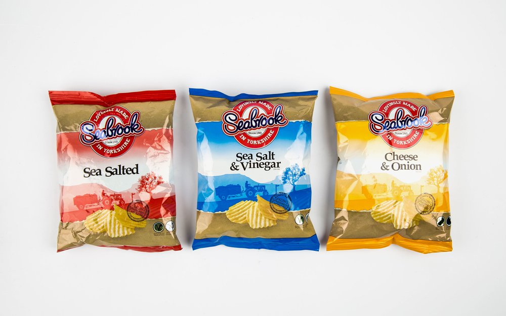
” Seabrook and Robot Food collaborate to reposition the brand, bucking mainstream norms to bag more penetration.Seabrook has an enviable heritage, holding cult status to legions of loyal fans. In an overcrowded, hyper-mature crisp category, it was time to stand out rather than blend in. The challenge was set to improve sales by increasing penetration both inside and outside their consumer heartland, and build brand value in a category driven by price and promotion.Seabrook is an everyday crisp with a no-nonsense personality, devoted to big, moreish flavour. Inventors of the crinkle-cut and the first crisp manufacturer to use sunflower oil, the Bradford brand are pioneers of flavour delivery in their field and a challenger at heart. Seabrook’s inherent urge to disrupt made Robot Food the perfect partner to strategically reposition the brand and lead redesigns of the Crinkle, Lattice and Straight Cut ranges – putting them back in the fight against the corporate Goliaths.Robot Food worked closely with Seabrook to pinpoint the brand’s unique place in the world. Through strategic insight, provocation and a collaborative brand workshop, the team was able to define a distinct personality for the brand, one that held true to its heritage but gave it the confidence to dare to be different.Clarity on strategy equals clarity on design, and Robot Food were able to strip the brand down to its core assets and rebuild it. The new brand mark is a striking evolution that stays true to Seabrook’s distinctive heritage as a key asset. Prouder and clearer, it’s the nucleus of a solid brand architecture and changes colour according to flavour, defying the expectation of corporate repetition and reinforcing Seabrook’s confident ‘challenger’ status in a playful way. The core range redesign features thick stripes of variant-appropriate colours, undulating for Crinkles and straight-edged for Straight Cut. The designs shout loud against a fresh white background, a key Seabrook brand equity. For the more premium Lattice range, Robot Food chose a rich blue backdrop and a premium foil substrate to give each flavour’s accent colour extra standout. The team also created the proud and punchy new tone of voice, including the ‘Bags of flavour made with pride’ strapline and the ‘Saviours of flavour’ brand story, which subtly nods to their northern roots.The new designs have been proven to cut down recognition time for existing consumers as well as being more compelling for non-purchasers. With Seabrook’s swagger back in full swing, Robot Food continue in their role as brand guardians, developing a new comms campaign and exciting NPD strategy that’s full of flavour – watch this space.The new branding is set to launch this month in stores across the UK.”
” Kevin Butterworth, Marketing and International Sales Director, said, “Bold flavour and authenticity are key cornerstones of our brand that Robot Food have captured and reinforced in a unique and distinctive design. The outstanding results build on strong brand pride and are sure to grab the attention of both new and existing customers. It’s a great change for Seabrook Crisps and one that we’re extremely proud of.”Martin Widdowfield, Design Director of Robot Food, said, “We smashed category rules to give Seabrook a much braver, more disruptive attitude. No more clutter, just big bold ‘look at me’ branding. Seabrook is now more relevant, without being mainstream in approach.””
CREDIT
- Agency/Creative: Robot Food
- Article Title: Robot Food – Seabrook
- Project Type: Packaging
- Format: Bag
- Substrate: Metal, Plastic


