


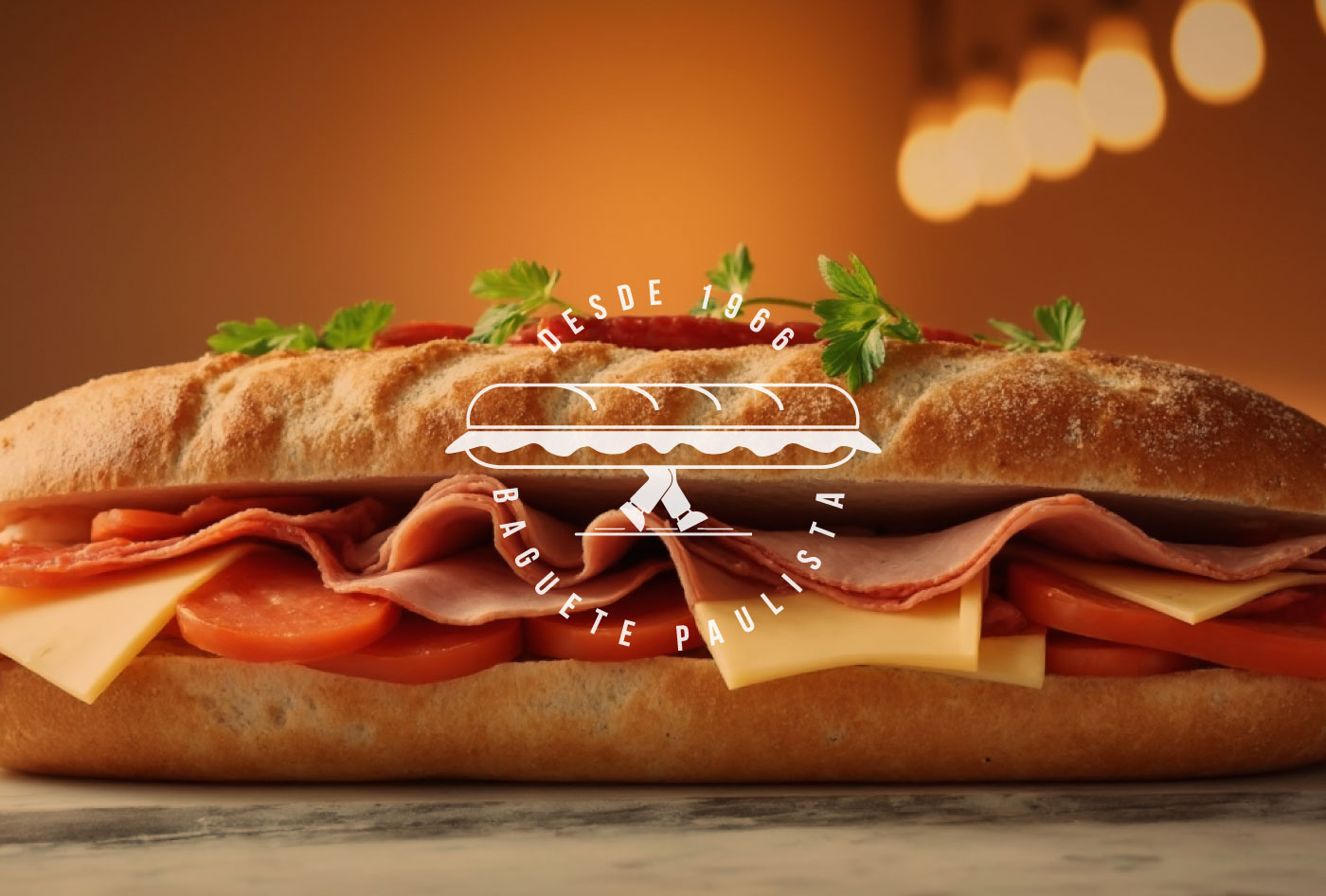
Brand project for Baguete Paulista @baguetepaulista. The choice of the sans serif font in upper case reinforces the clarity and visual impact of the brand, conveying confidence, professionalism, and modernity. This typographic choice ensures excellent readability across different applications, from packaging to digital media, strengthening brand recognition and memorability.
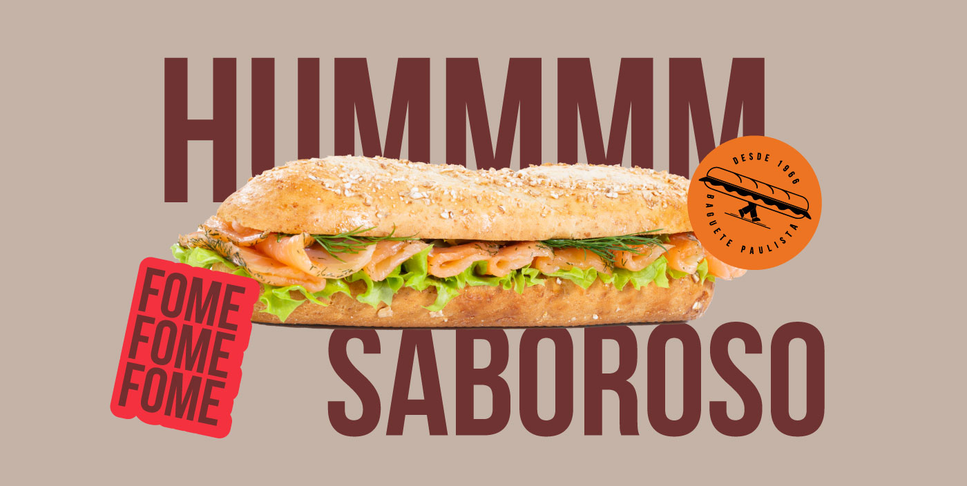
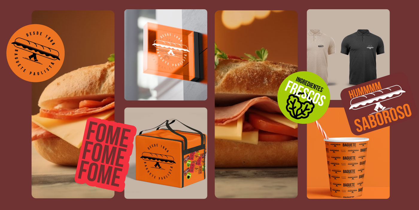
The fun and dynamic symbol, featuring legs carrying a baguette, brings a unique, lighthearted, and friendly touch, aligning perfectly with the Enthusiast archetype. This design choice makes the brand stand out, creating an emotional bond with customers through originality, playfulness, and easy association. The visual identity fosters a sense of approachability, making Baguete Paulista not just a bakery but an experience that evokes joy, comfort, and authenticity.
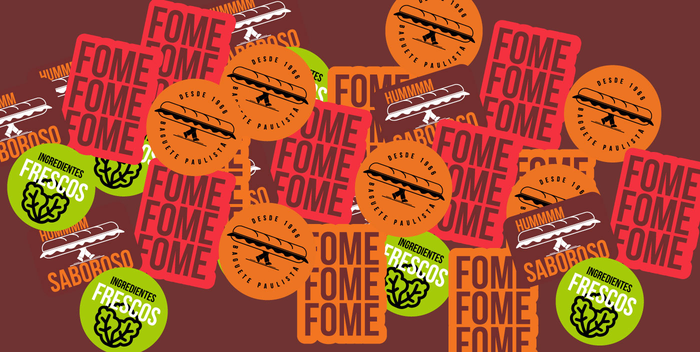
The carefully curated color palette balances vibrant orange, which conveys warmth, appetite, and energy, with sophisticated black and white, adding elegance, contrast, and timeless appeal. This combination ensures versatility, making the brand visually engaging and memorable in different contexts. The integration of these colors enhances the brand’s ability to captivate attention while maintaining a refined aesthetic that resonates with diverse audiences.
Together, these elements reflect the welcoming, innovative, and passionate essence of Baguete Paulista, reinforcing its strong connection with customers and establishing a distinctive presence in the market.


CREDIT
- Agency/Creative: Bass. Estúdio Grafico
- Article Title: Bass. Estúdio Gráfico Elevates Baguete Paulista with a Playful and Strategic Brand Identity
- Organisation/Entity: Agency
- Project Type: Identity
- Project Status: Published
- Agency/Creative Country: Brazil
- Agency/Creative City: Piracicaba
- Market Region: South America
- Project Deliverables: Brand Identity
- Industry: Food/Beverage
- Keywords: food, design, brand,
-
Credits:
Bass.: Marcos Basseto


