


“Connecting people beyond the board.”
Bōdo Club was born with the mission of creating a unique and welcoming space that combines a passion for board games with the richness of Japanese culture, where people of all ages and experience levels can connect, learn, and have fun through the universe of board games. We promote meaningful moments that strengthen bonds and create lasting memories.
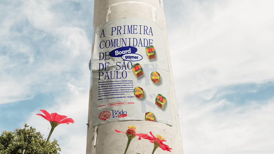
Located in Brazil, the club is much more than a place to play — it’s a community and meeting point to share stories, build relationships, and live unforgettable experiences.
Challenge
The project was based on the concept of the founders’ Japanese cultural heritage and designed to resonate with the geek audience. The greatest challenge was capturing these two elements in a visual identity that would be welcoming, authentic, and memorable.
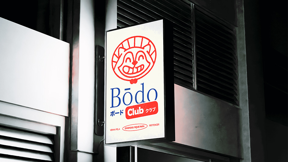
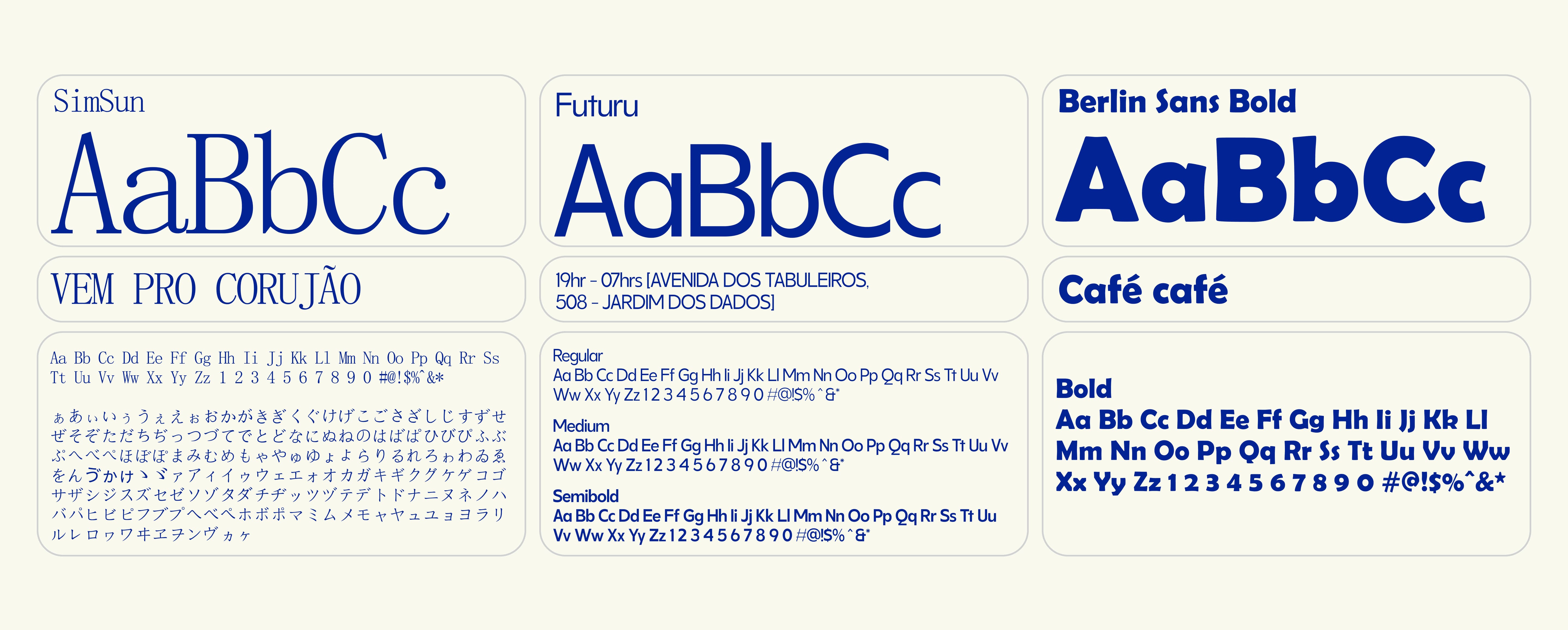
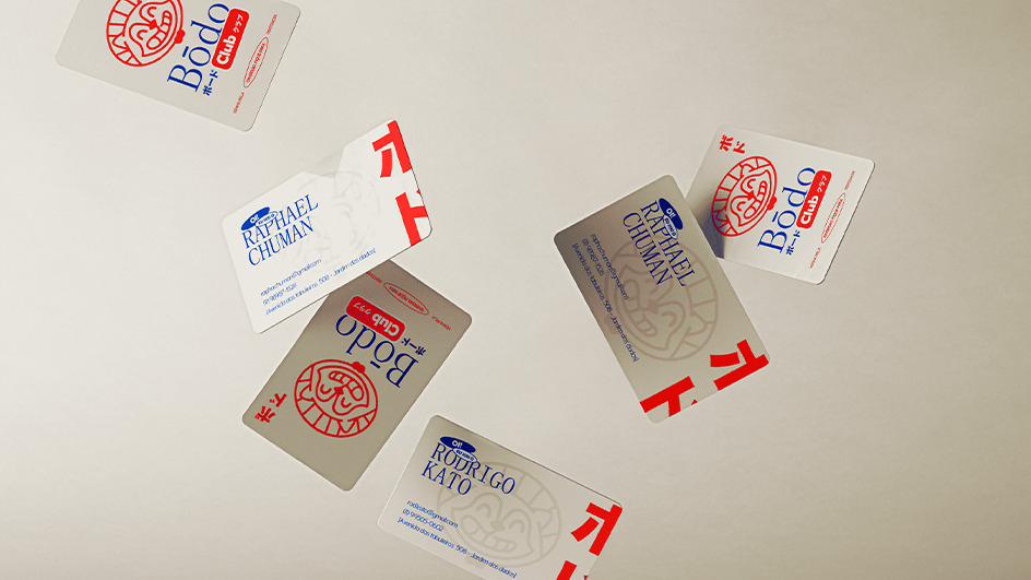
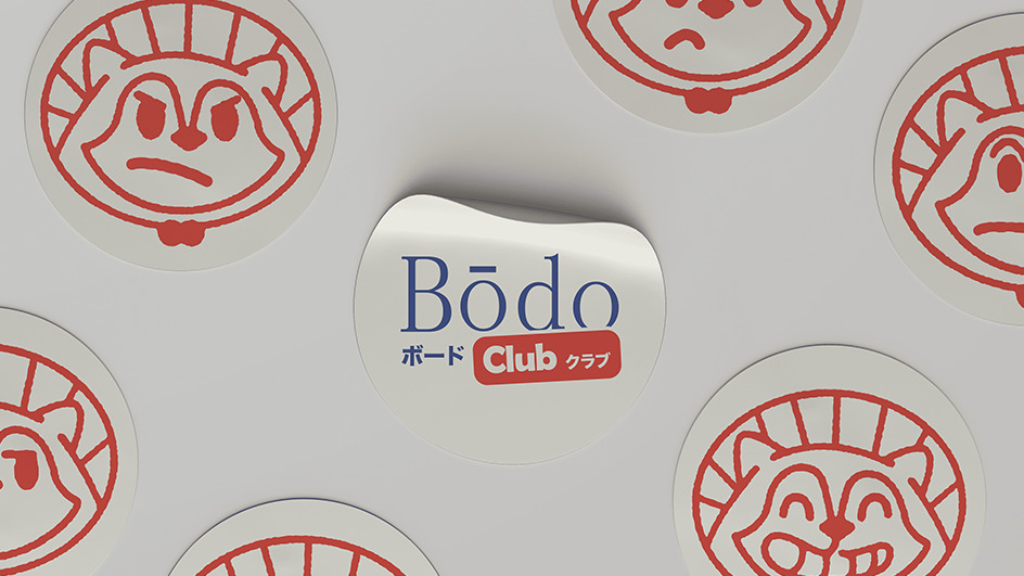
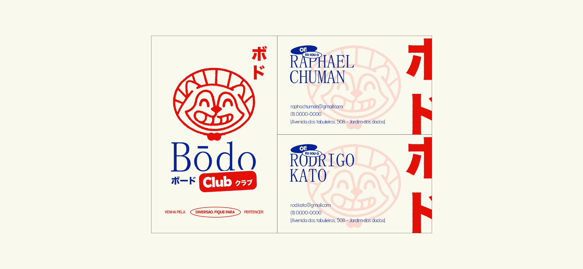
Logo
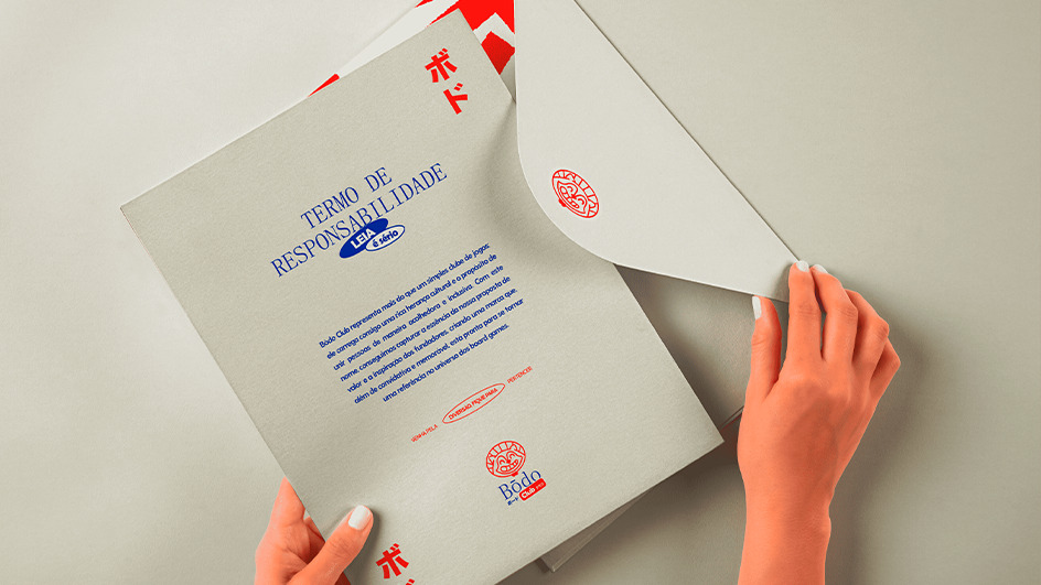
Bōdo writing is based on a Western adaptation of a typography that, in its essence, is exclusively Japanese. Below we also use hiragana writing, creating a conceptual contrast between an originally Western typography and an Eastern script.
In the supporting text that sets up the business model, “Club”, we used an essentially Western typography for its writing and in the translation into Japanese we used hiragana with an essentially Eastern typography.
With this logic, we created a concept that symbolizes a fusion between Eastern and Western roots in a subtle way.
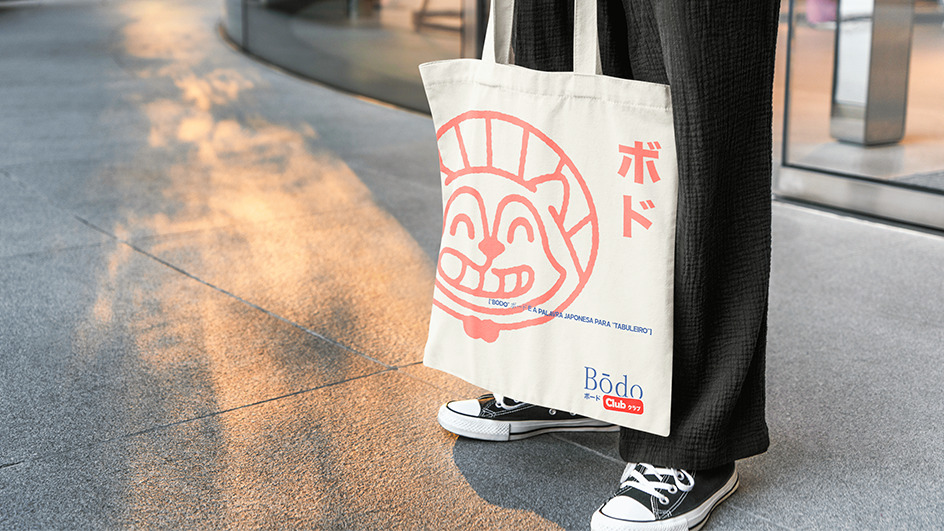
For the icon, we used references from illustrations of mascots from Japanese pop culture. Tanuki, our main mascot, is a mystical being from Japanese culture, playful, cheerful and fun. All of these aspects clearly represent the essence of the Bōdo Club brand.
With all of these elements together, we arrive at a friendly representation, full of Eastern cultural symbolism with an inviting aesthetic that translates the essence of our brand.
Naming
Inspired by the Japanese word Bōdo (ボード), which means “board”, the name brings clarity and an immediate connection to the world of board games, while communicating with the target audience.
Illustrations
“No friends, no fun”
Based on this phrase as inspiration, the set of illustrations represents one of the brand’s characteristics, which is to bring people together. With this in mind, we developed illustrations of other characters that could make up the brand’s universe linked to the Japanese conceptual context.
Tanuki, the main character;
Kitsune, the feminine and delicate link;
Son Goku, the silly friend;
Kaeru, the grumpy friend
Considering the characteristics of each character, we provide creative freedom so that the brand can use each character according to the content of the communication pieces to be produced.
Emojis
“We are a living brand”
From the moment we use Tanuki as our living brand asset, we need to develop the mood swings of this charismatic character. This way, we can create another way to express emotions through the brand and use these resources in communication materials.
CREDIT
- Agency/Creative: Pontto.lab
- Article Title: Potato.lab Design Studio Combines Japanese Pop and Traditional Culture With Board Games to Create a Strong Brand Identity
- Organisation/Entity: Freelance
- Project Type: Identity
- Project Status: Published
- Agency/Creative Country: Brazil
- Agency/Creative City: Vila Alpina
- Market Region: South America
- Project Deliverables: Animation, Art Direction, Brand Creation, Brand Design, Brand Guidelines, Brand Identity, Brand Mark, Brand Naming, Brand Strategy, Brand Tone of Voice, Design, GIF Animation, Illustration, Logo Design
- Industry: Entertainment
- Keywords: japanese visual identity brand brand design logo design gameboards culture
-
Credits:
Pontto.lab: Pontto.lab
Creative Leader: Matheus Psaltikidis:
Designer: Matheus Psaltikidis:
Strategy: Larissa Akemi & Matheus Psaltikidis:
Review: Larissa Akemi:


