


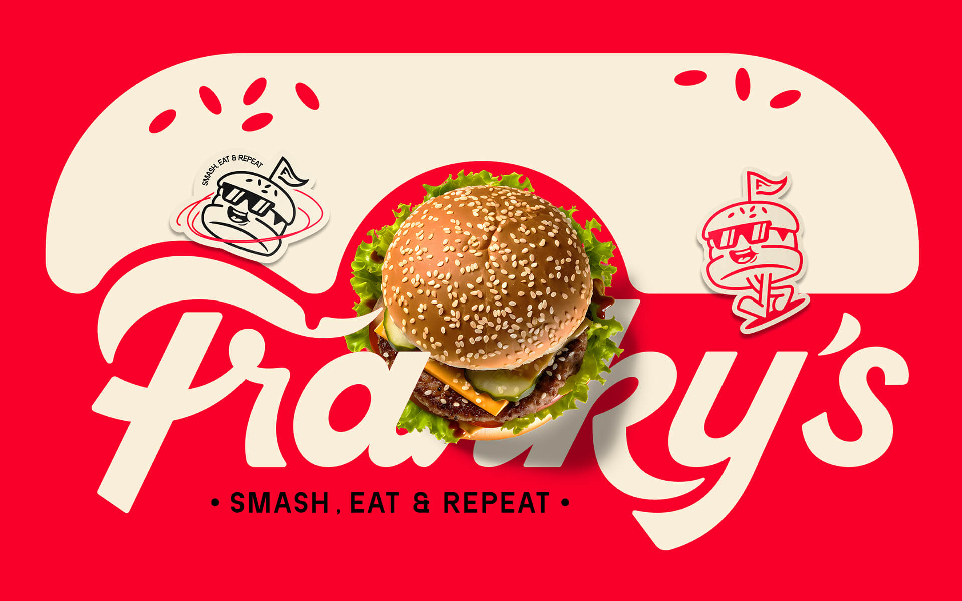
Redefining the Burger Experience in Ecuador
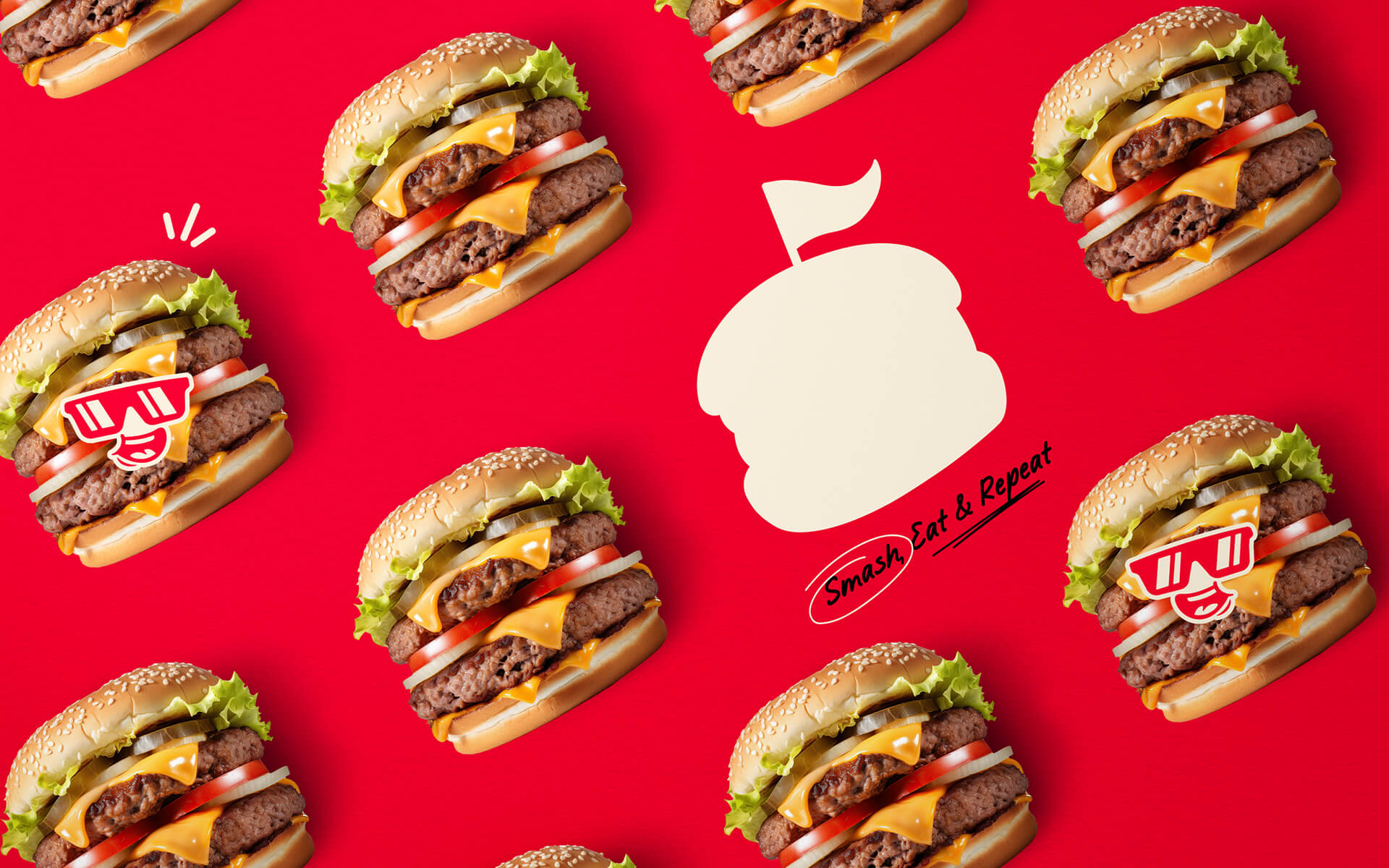
At 86Creative, we take pride in partnering with Mr. Franky’s, a smash burger brand bursting with personality, where food is not just about taste but also a visual and emotional experience. Going beyond the conventional fast-food model, Mr. Franky’s creates a space inspired by classic American diners, blending modernity with a rebellious edge. Their crispy burgers, juicy beef patties, melted cheese, and signature homemade sauces set them apart in the market and win over food enthusiasts.
Brand Inspiration: Nostalgic Yet Timeless
Inspired by iconic diners, Mr. Franky’s focuses not only on food quality but also on crafting an experience infused with retro charm and dynamic energy. Rather than following common burger formulas, the brand carves its own path by integrating locally sourced Ecuadorian ingredients to create a distinctive identity. With its explosive flavors and a powerful TikTok marketing strategy, Mr. Franky’s has quickly become the smash burger icon of Quito.
Brand Identity: Bold, Youthful, and Retro
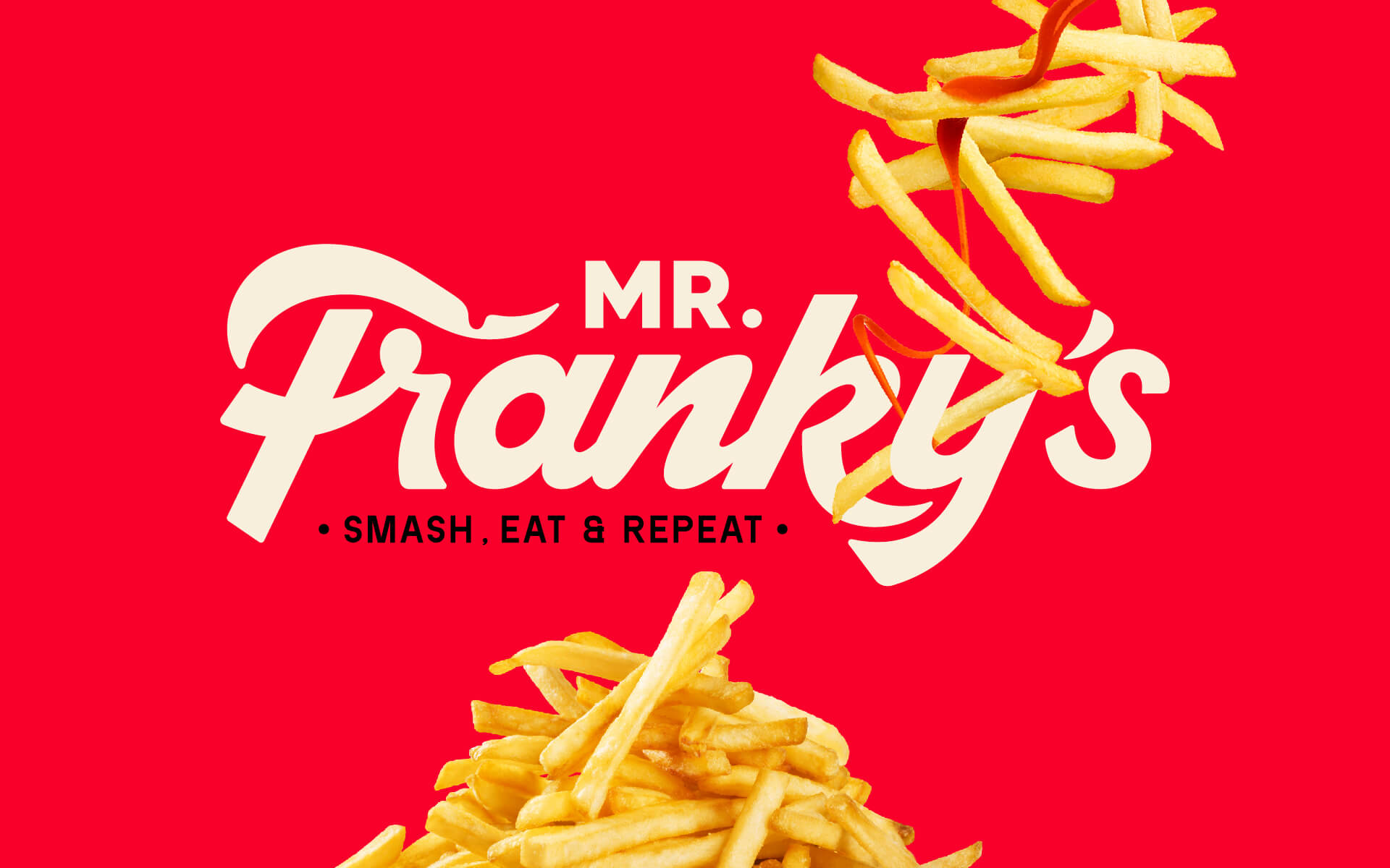
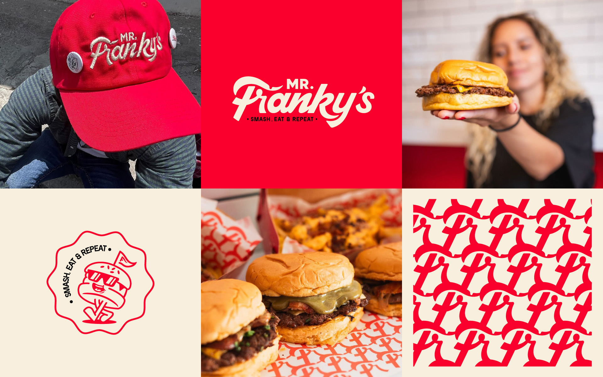
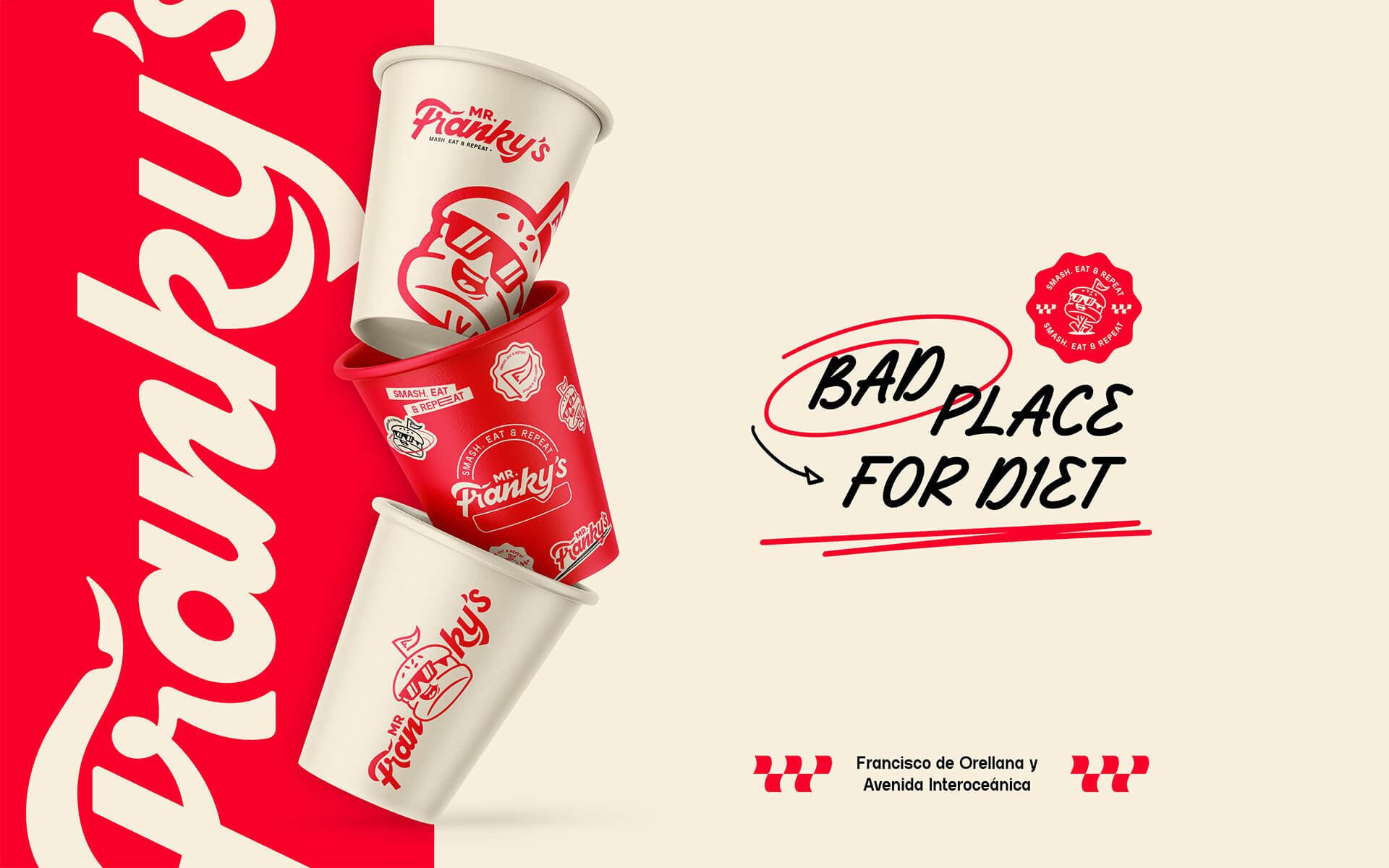
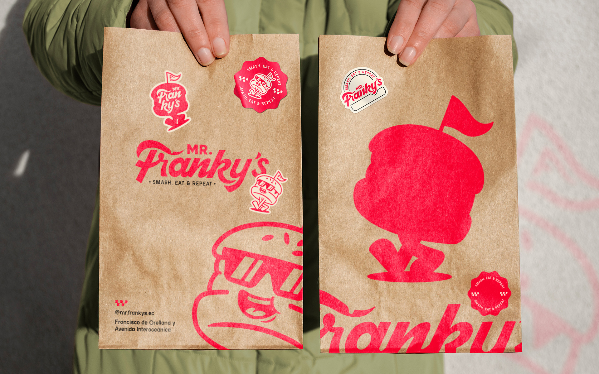
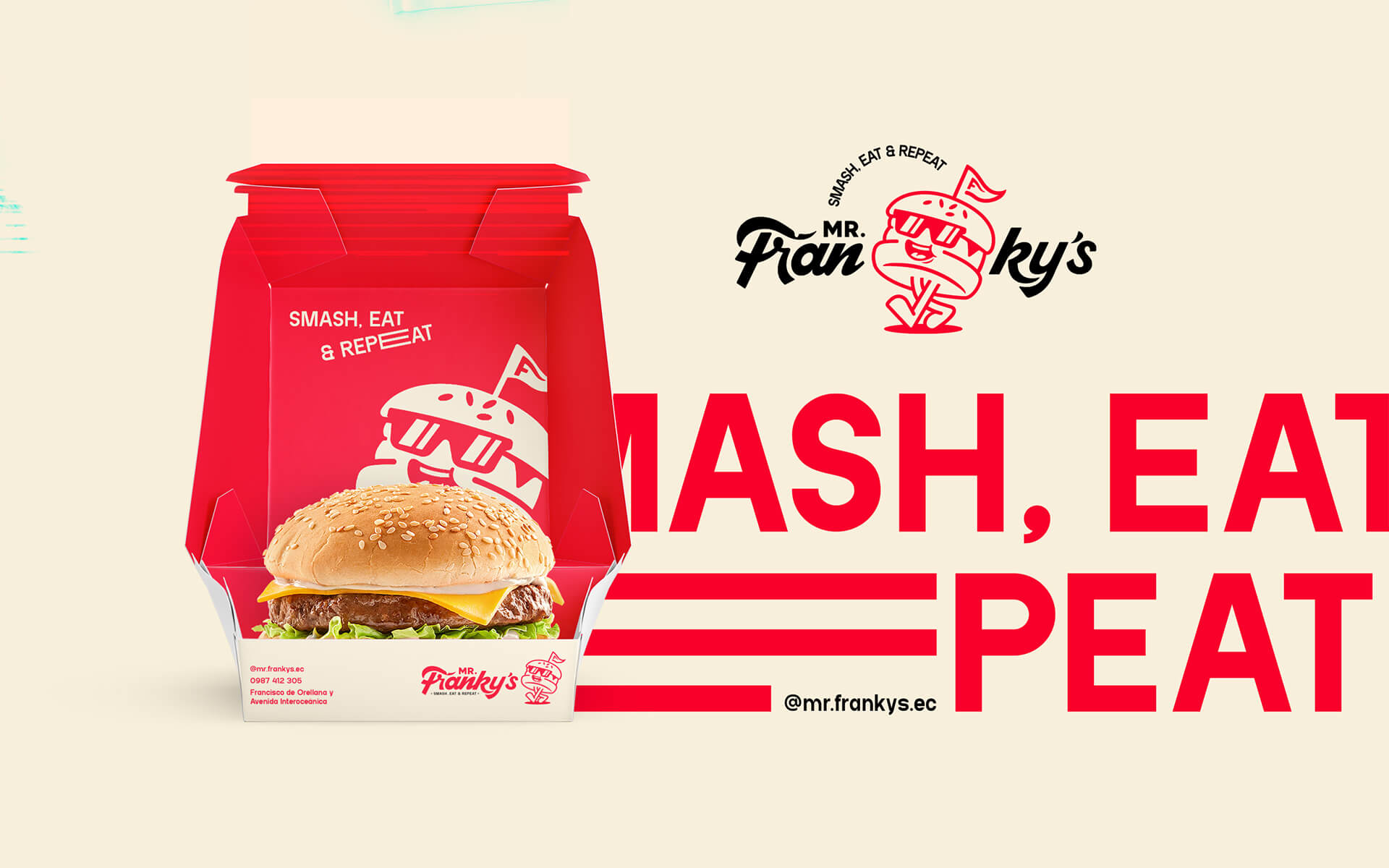
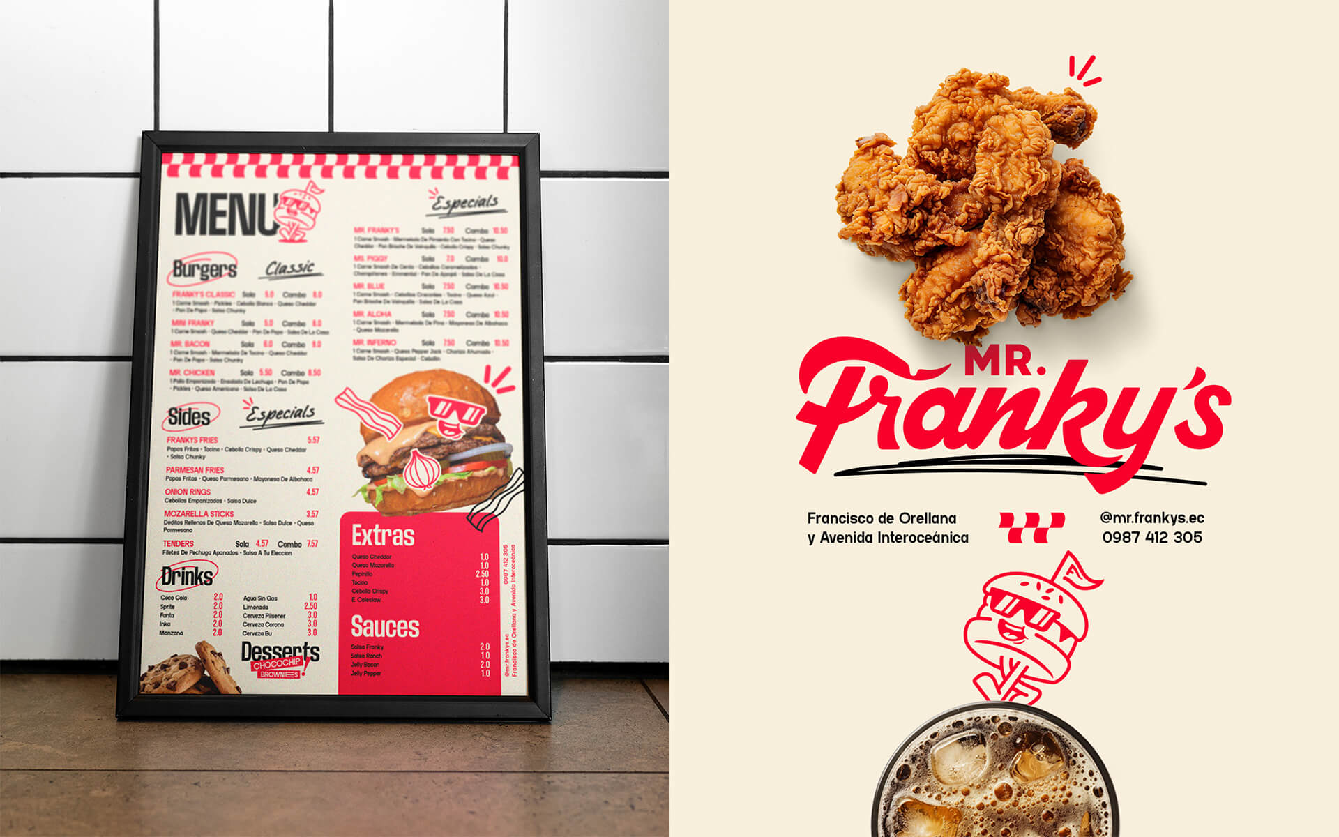
Mr. Franky’s brand identity is built on a red-and-white color palette, stimulating appetite while evoking the nostalgia of classic diners. Combined with black-and-white checkerboard patterns, the branding exudes vintage aesthetics while remaining energetic and fresh. The bold, strong, and highly legible font enhances visual impact across all brand applications. The logo and mascot draw inspiration from Franky in One Piece, embodying a strong, fun, and unconventional “smash” spirit, making the brand instantly recognizable and unforgettable.
Brand Application: A Cohesive Experience from Packaging to Space
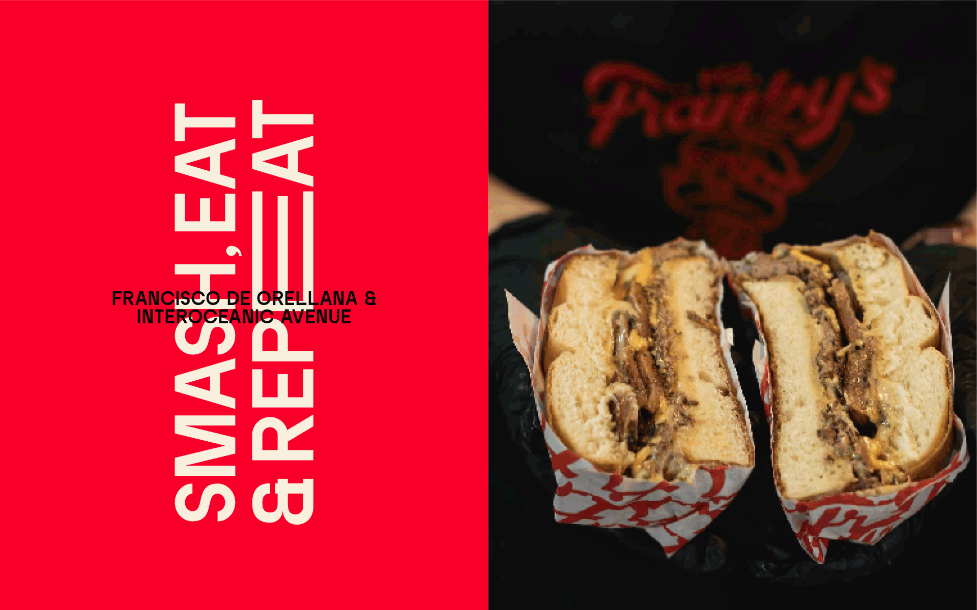
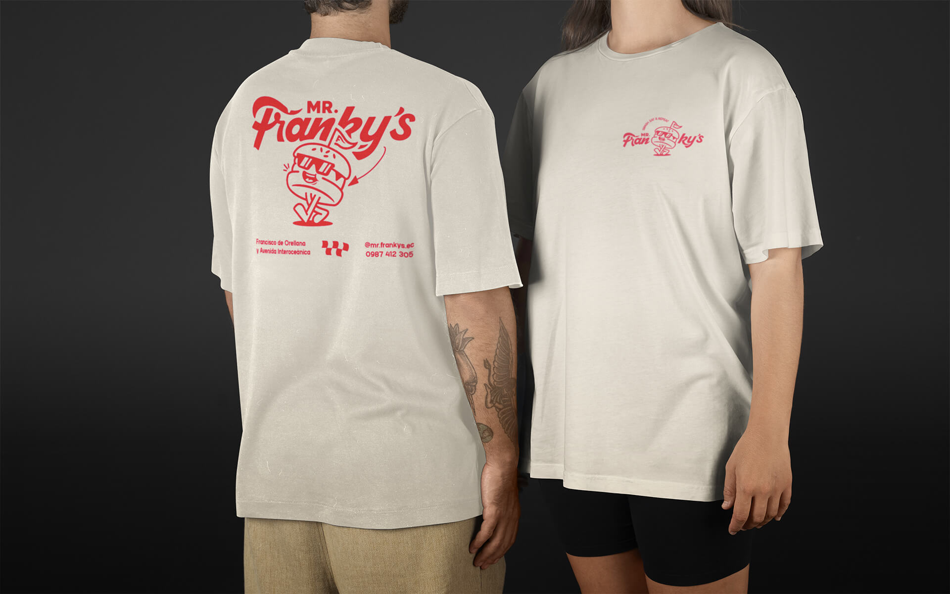
The consistency in Mr. Franky’s brand identity is reflected across packaging, marketing materials, staff uniforms, and restaurant design. Burger boxes and paper bags embrace a retro aesthetic, featuring bold slogans and striking visuals that leave a lasting impression. Marketing materials such as posters, banners, and menus maintain a unified visual identity, ensuring a seamless brand experience. The staff uniforms, consisting of white shirts, red aprons, and classic diner-style hats, strike the perfect balance between professionalism and vibrancy. The restaurant space is meticulously designed in red, white, and black, complemented by vintage diner-style furnishings, creating an engaging and immersive visual experience.
Conclusion:
Mr. Franky’s is more than just a burger brand; it is a symbol of creativity, uniqueness, and bold personality. Its meticulously crafted brand identity merges classic retro aesthetics with a modern spirit, captivating customers from the very first glance. 86Creative is honored to contribute to the development of a lively, daring, and unforgettable culinary brand, solidifying Mr. Franky’s position as the leading smash burger destination in Ecuador.
CREDIT
- Agency/Creative: 86Creative
- Article Title: Mr. Franky’s Brand Identity Project for a Bold and Retro Smash Burger by 86Creative
- Organisation/Entity: Agency
- Project Type: Identity
- Project Status: Published
- Agency/Creative Country: Vietnam
- Agency/Creative City: Ho Chi Minh City
- Market Region: Asia
- Project Deliverables: Brand Design, Brand Identity, Logo Design
- Industry: Food/Beverage
- Keywords: Burger, Fast food, Retro aesthetic, “smash” spirit
-
Credits:
Art Director: Bui Duc Duong


