


As Australia accelerates its transition to a net-zero future, Energy Networks Australia (ENA)—the leading voice for the country’s energy networks—has unveiled a bold and dynamic rebrand, crafted by Oliver Grace. Designed to reflect ENA’s evolving role in shaping the nation’s energy future, the refreshed identity embodies connection, movement, and adaptability, mirroring the very essence of energy itself.
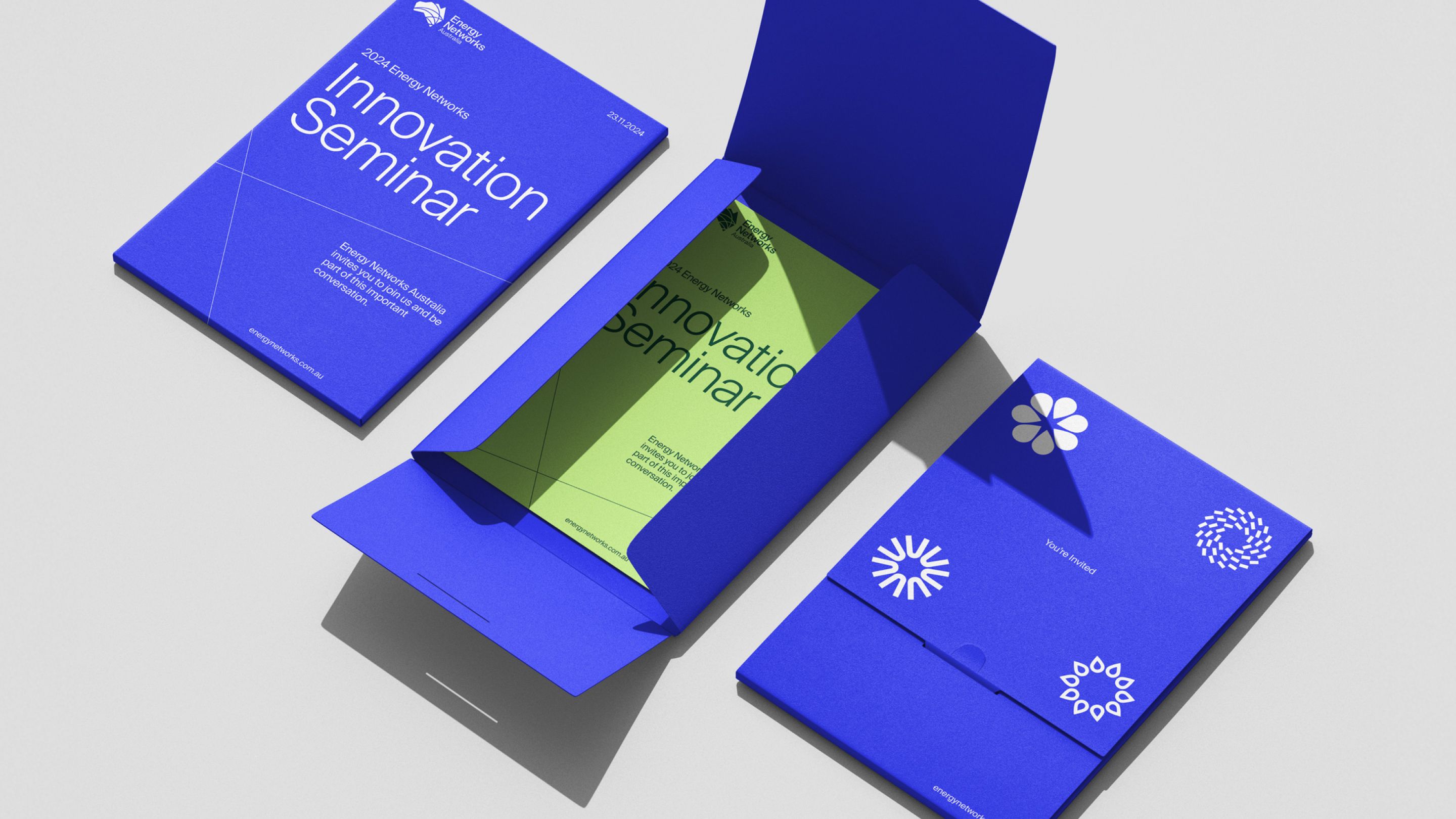
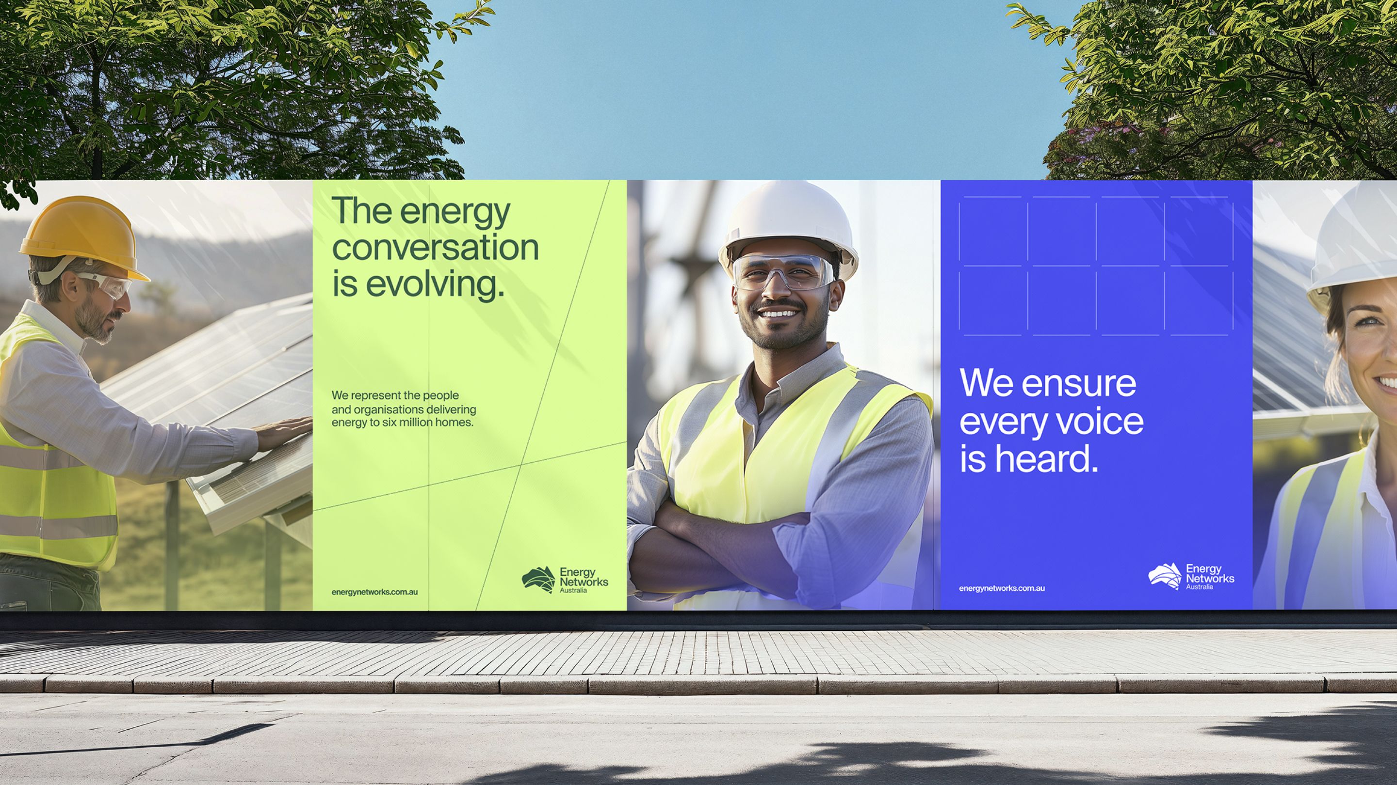
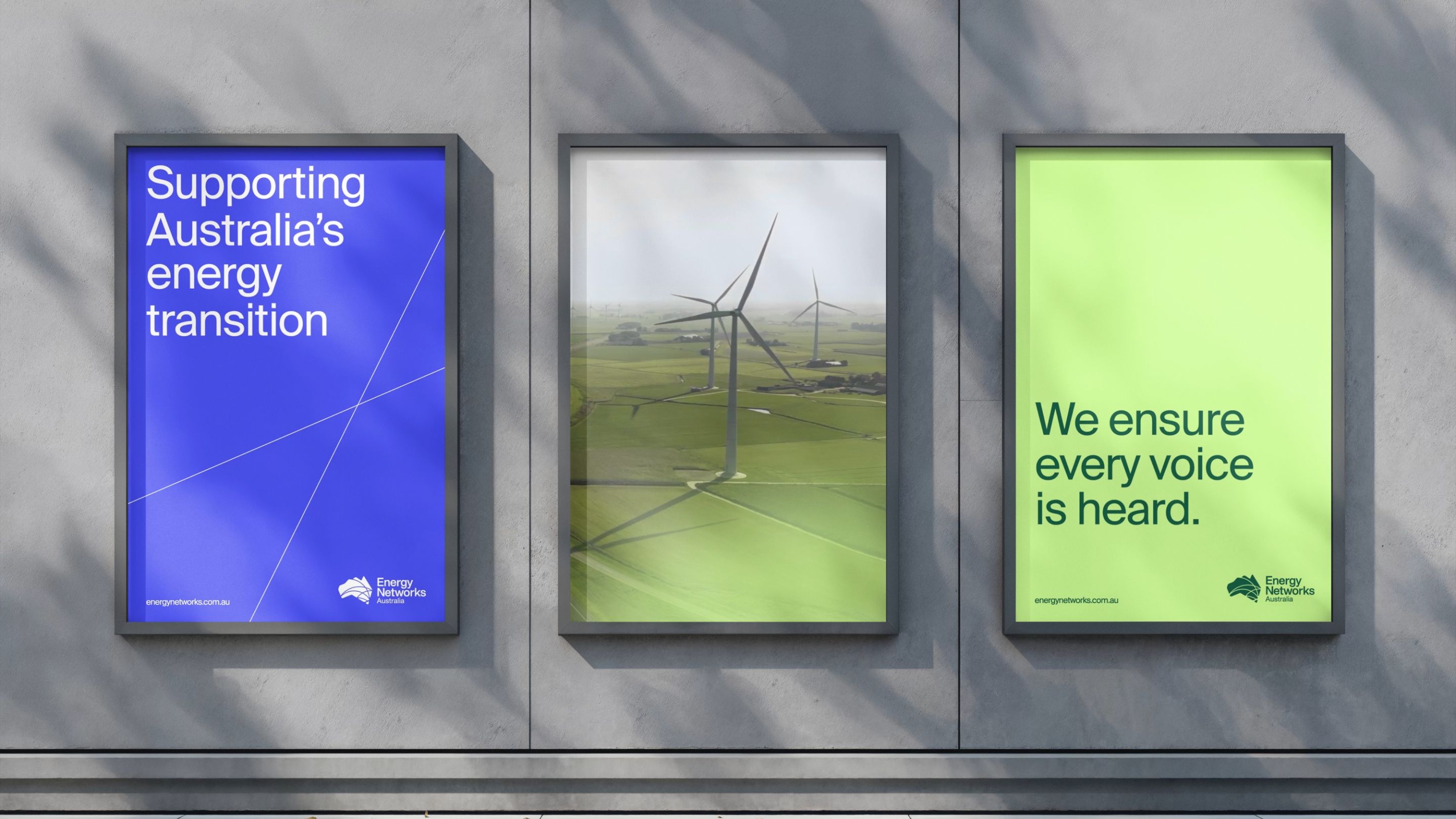
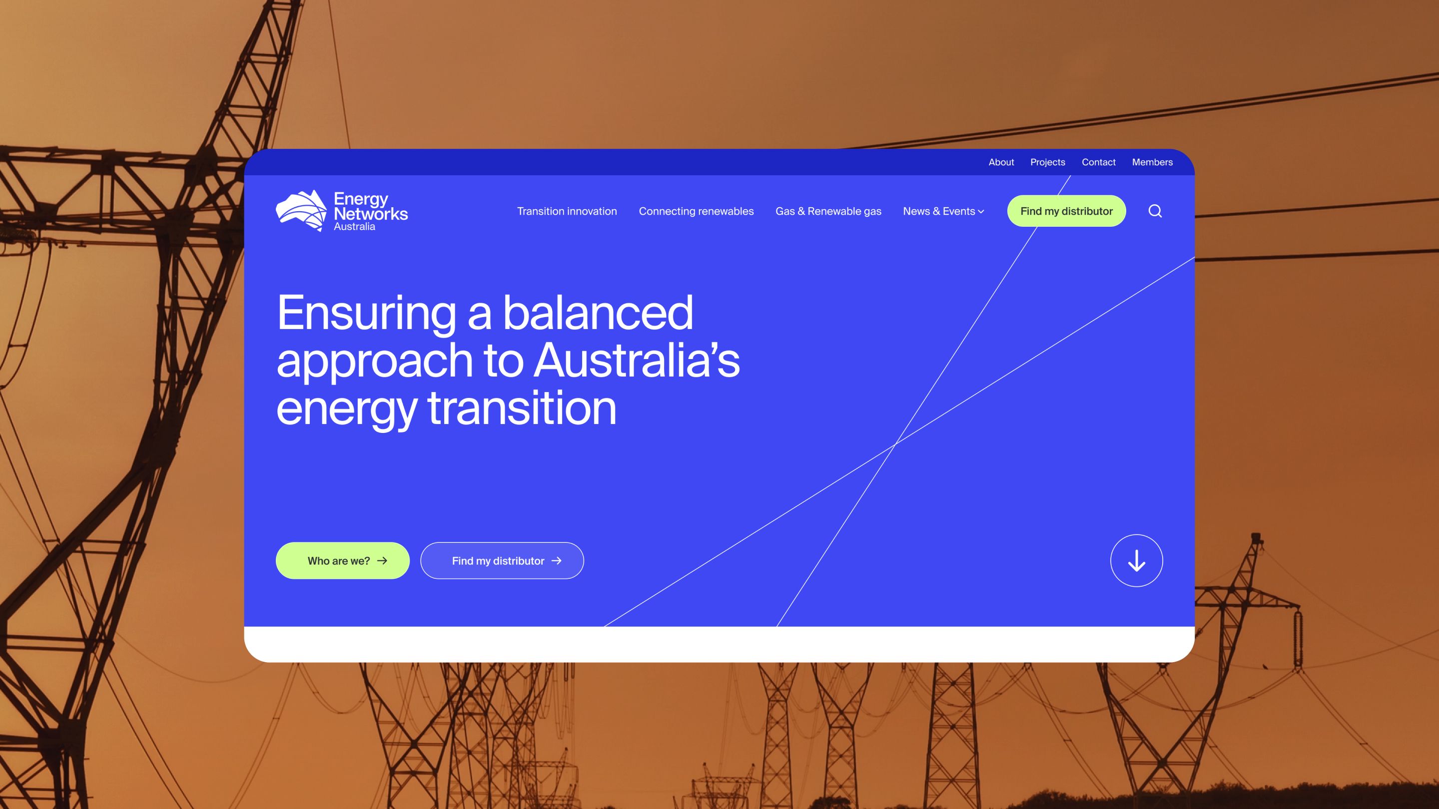
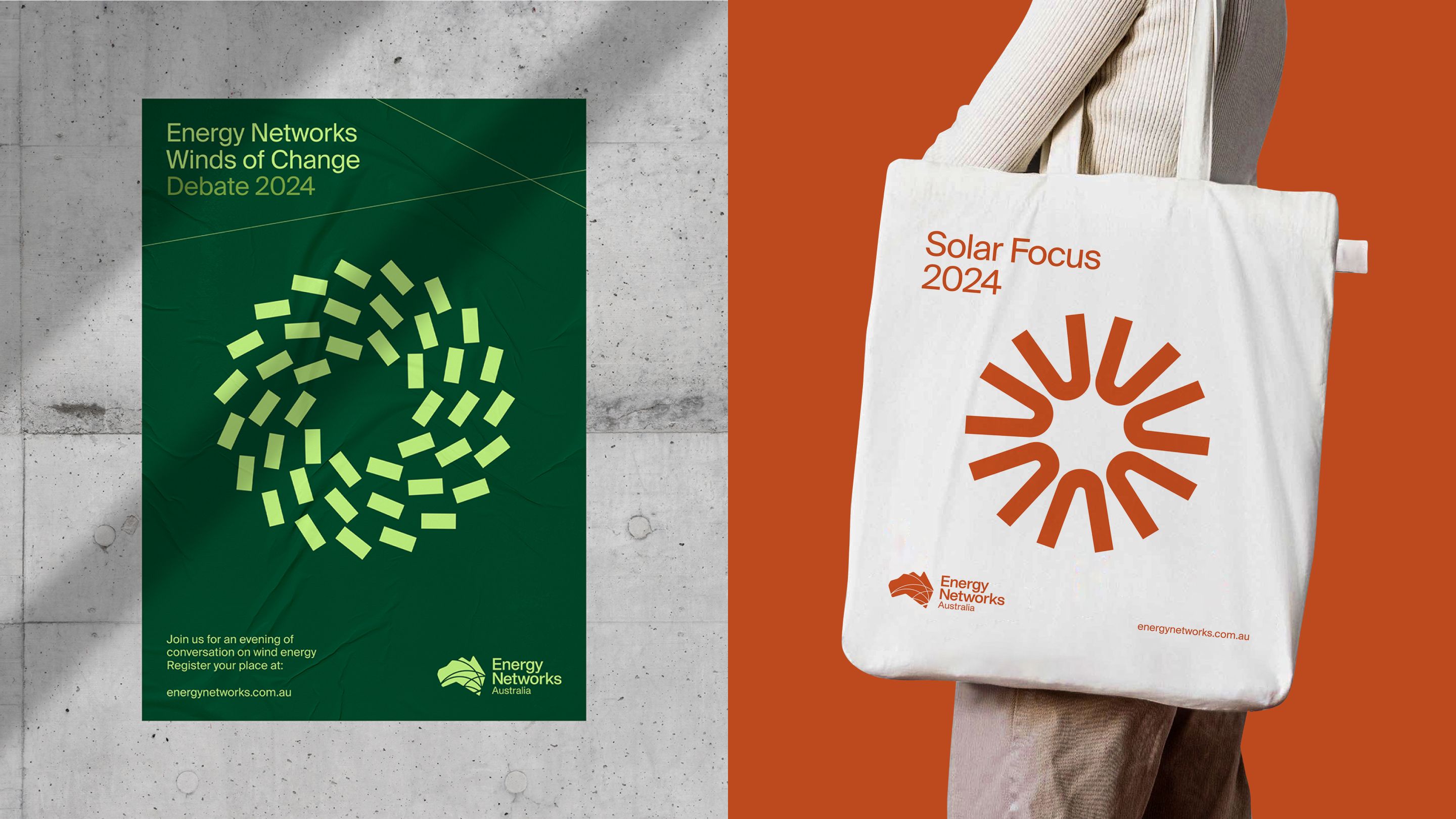
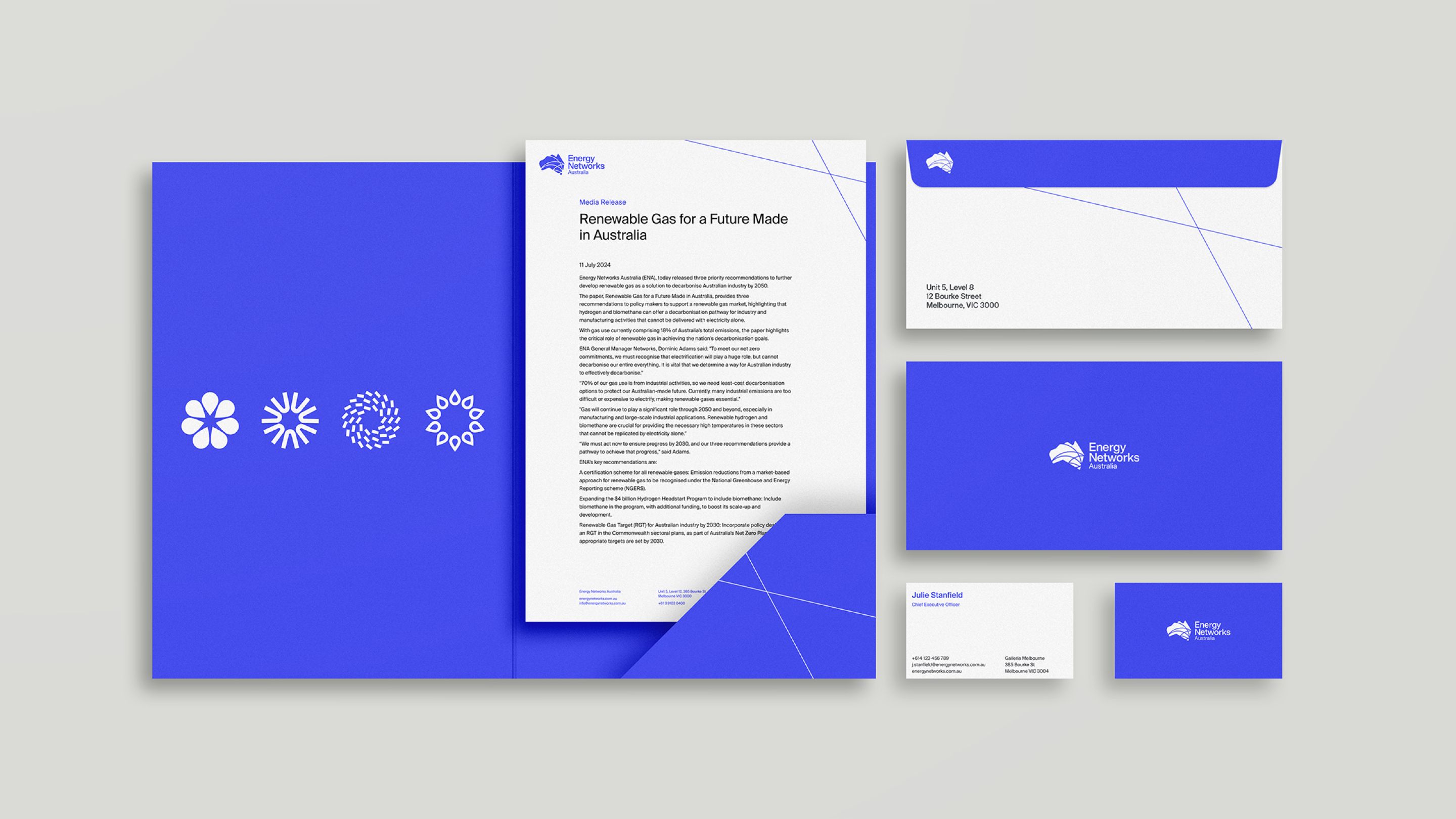
At the core of the redesign is a visual system that captures the flow of energy. Flexible line elements create a sense of momentum and transformation, symbolising ENA’s role in unifying industry players across renewables, gas, and policy. This structured yet fluid approach allows the brand to scale effortlessly across different touchpoints, reinforcing ENA’s authority while maintaining an accessible, forward-thinking presence.
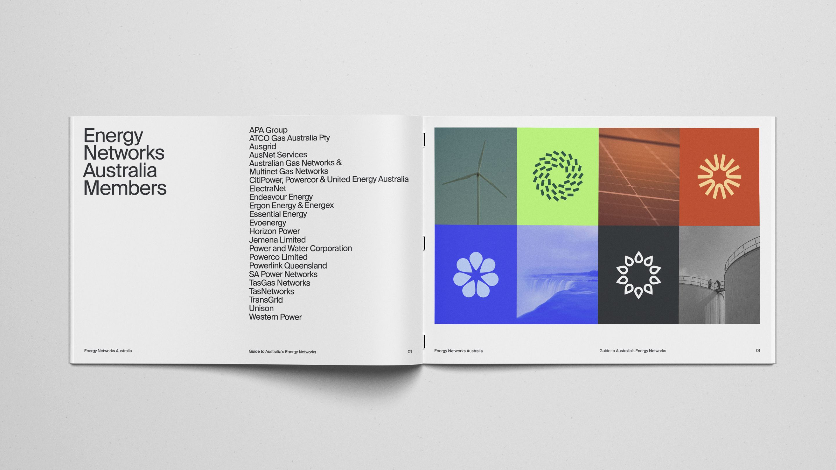
The colour palette takes cues from Australia’s natural landscapes, featuring deep Ocean blues, Kakadu greens, and Red Centre oranges to reflect the diversity of the country’s energy ecosystem. Combined with a Swiss-inspired modular grid and a refined typography system, the identity strikes a balance between technical precision and a more human, engaging brand voice.
With ENA spanning multiple sectors—from electricity transmission to policy advocacy—a structured sub-brand system was introduced to provide clarity while maintaining cohesion. This ensures that each focus area has a distinct yet unified visual language, allowing ENA to communicate effectively with both industry professionals and the wider public.
Beyond the visual identity, the rebrand extends into a streamlined digital experience. The new website prioritises user accessibility, offering a clean and intuitive platform where policymakers, businesses, and consumers can easily navigate insights, research, and industry developments. The refined tone of voice reinforces ENA’s position as a leader in energy transition discussions, balancing expertise with approachability.
“Our goal was to create a brand that felt as dynamic as the sector it represents,” says Nick Lehrain, Founder and Creative Director at Oliver Grace. “ENA is not just an industry body—it’s a powerful advocate shaping the future of Australia’s energy networks.
Every element of the new identity reflects that leadership, ensuring ENA stands out while remaining trusted and accessible.”
Reflecting on the transformation, Dominique van den Berg, CEO of Energy Networks Australia, shared her enthusiasm: “We’re thrilled with the work Oliver Grace has done on our brand refresh. The team truly understood the essence of our organisation and transformed it into a bold, memorable identity that reflects our vision for the future.”
With a strategic blend of motion, clarity, and future-ready design, Oliver Grace has delivered an identity that not only modernises ENA but cements its position at the forefront of Australia’s energy transition.


CREDIT
- Agency/Creative: Oliver Grace
- Article Title: ENA’s Visual Shift Reflects the Art of Connection in Australia’s Energy Transition
- Organisation/Entity: Agency
- Project Type: Identity
- Project Status: Published
- Agency/Creative Country: Australia
- Agency/Creative City: Melbourne
- Market Region: North America, Oceania
- Project Deliverables: Brand Guidelines, Brand Identity, Brand Strategy, Brand Tone of Voice, Web Design
- Industry: Energy
- Keywords: oliver grace, energy networks australia, ena, brand identity, brand strategy
-
Credits:
Creative Director: Nick Lehrain
Senior Designer: Adam Walton
Senior Designer: Russel Pistun
Graphic & Motion Designer: Chelsea Birrane


