


Homemade, a woman-led cloud kitchen with over 25 years of legacy, sought to refresh its brand identity to resonate with its vibrant, evolving audience. The challenge was to honor the brand’s rich history while infusing fresh, contemporary energy.
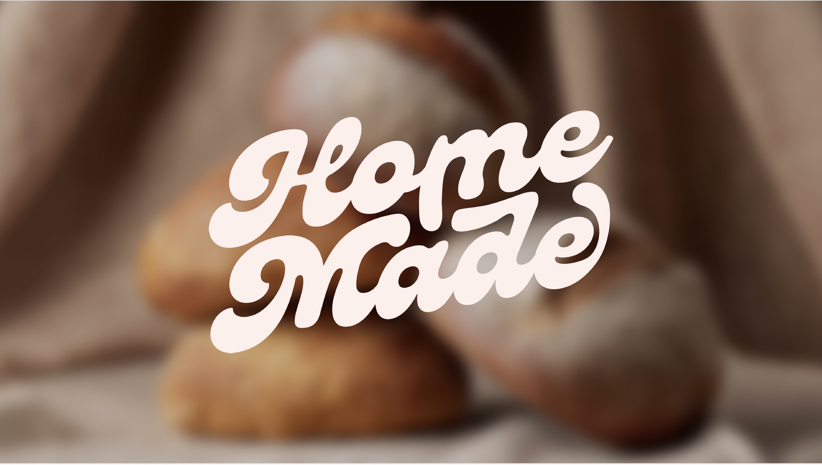
We approached this with a deep understanding of Homemade’s core values: authenticity, warmth, and the joy of food. The new identity feels like a natural evolution, retaining the brand’s essence while introducing something engaging. The redesigned wordmark is inspired by the comforting, fluid, indulgent nature of Chef Appu’s food, and makes for a strong, distinguished mark.
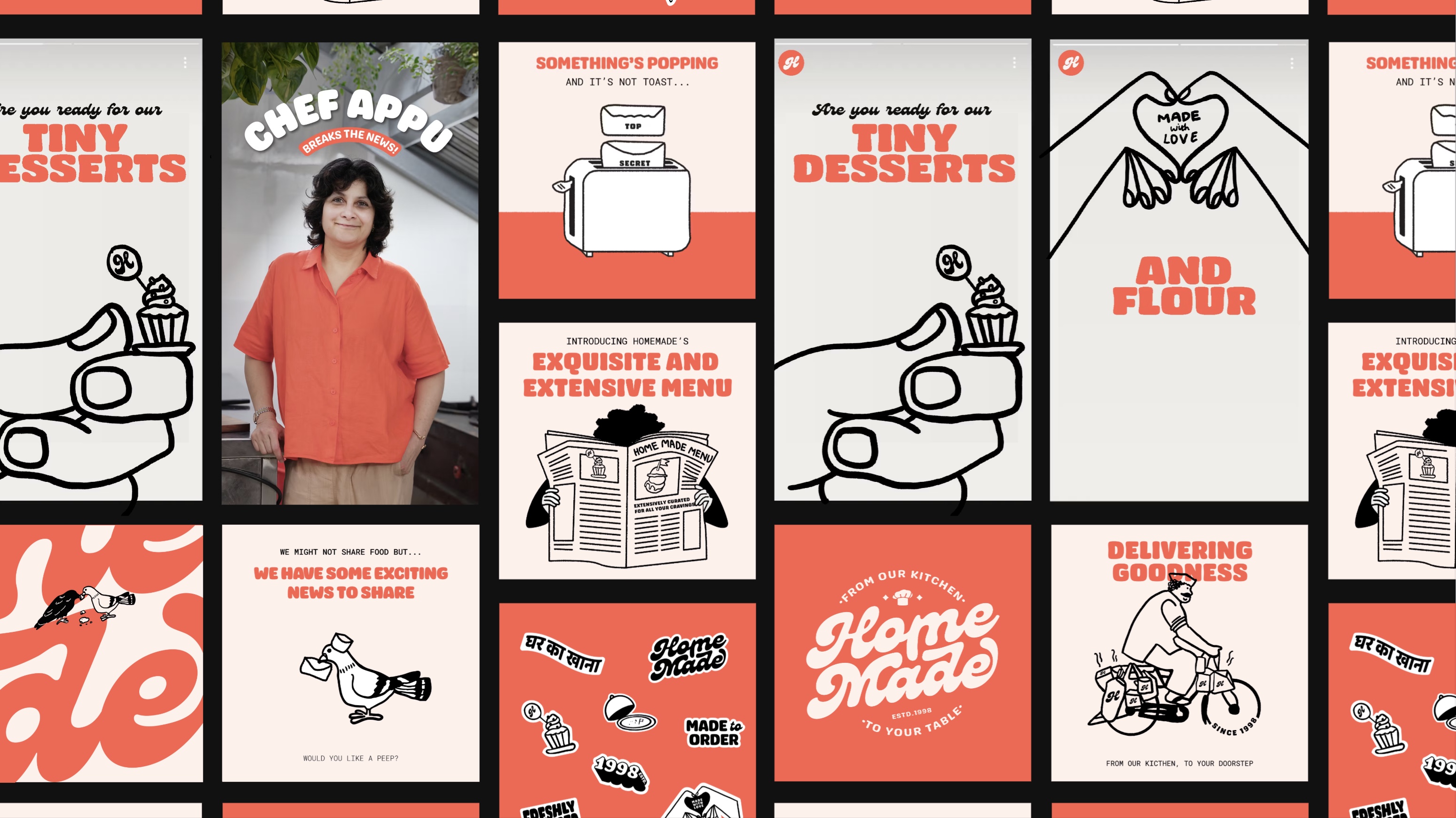
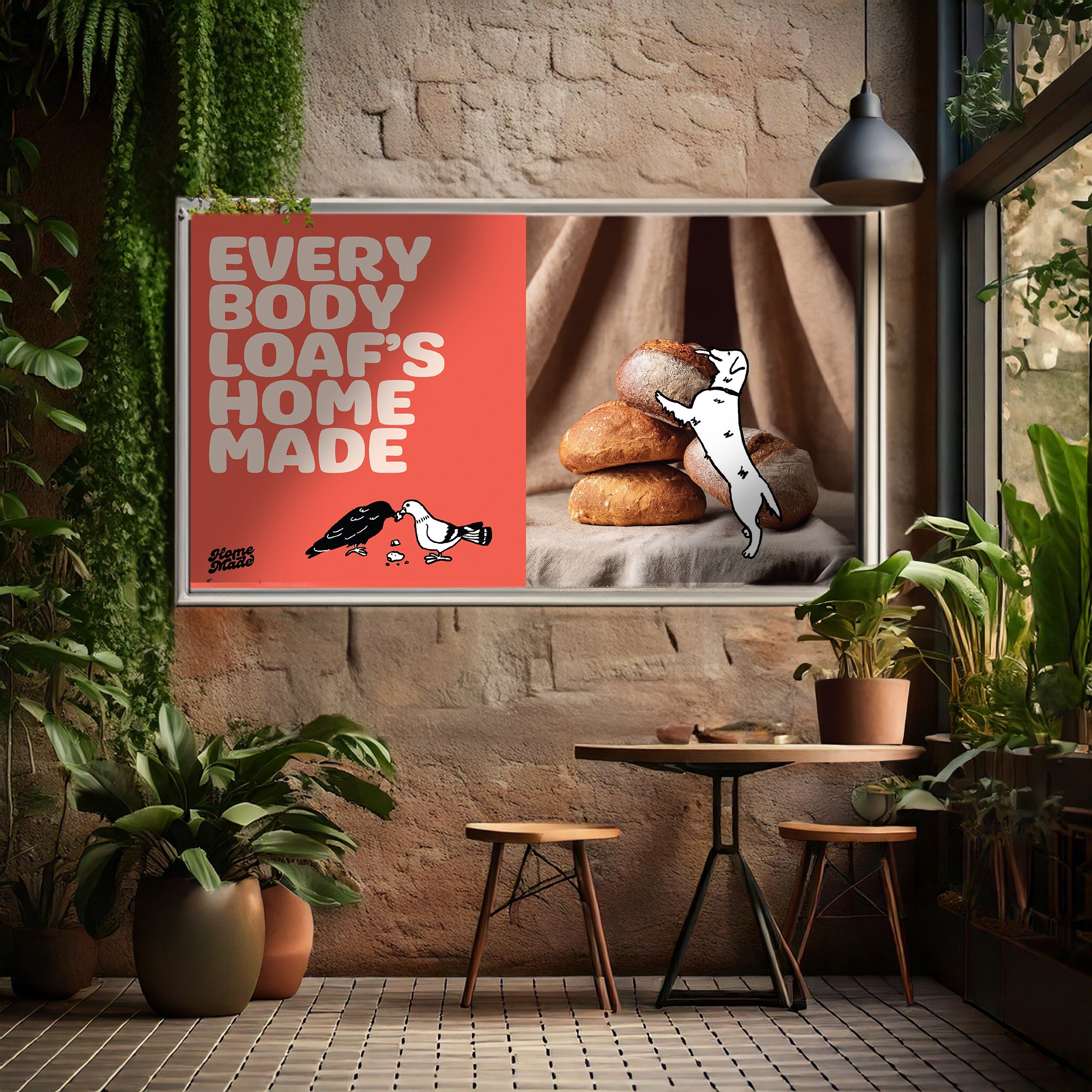
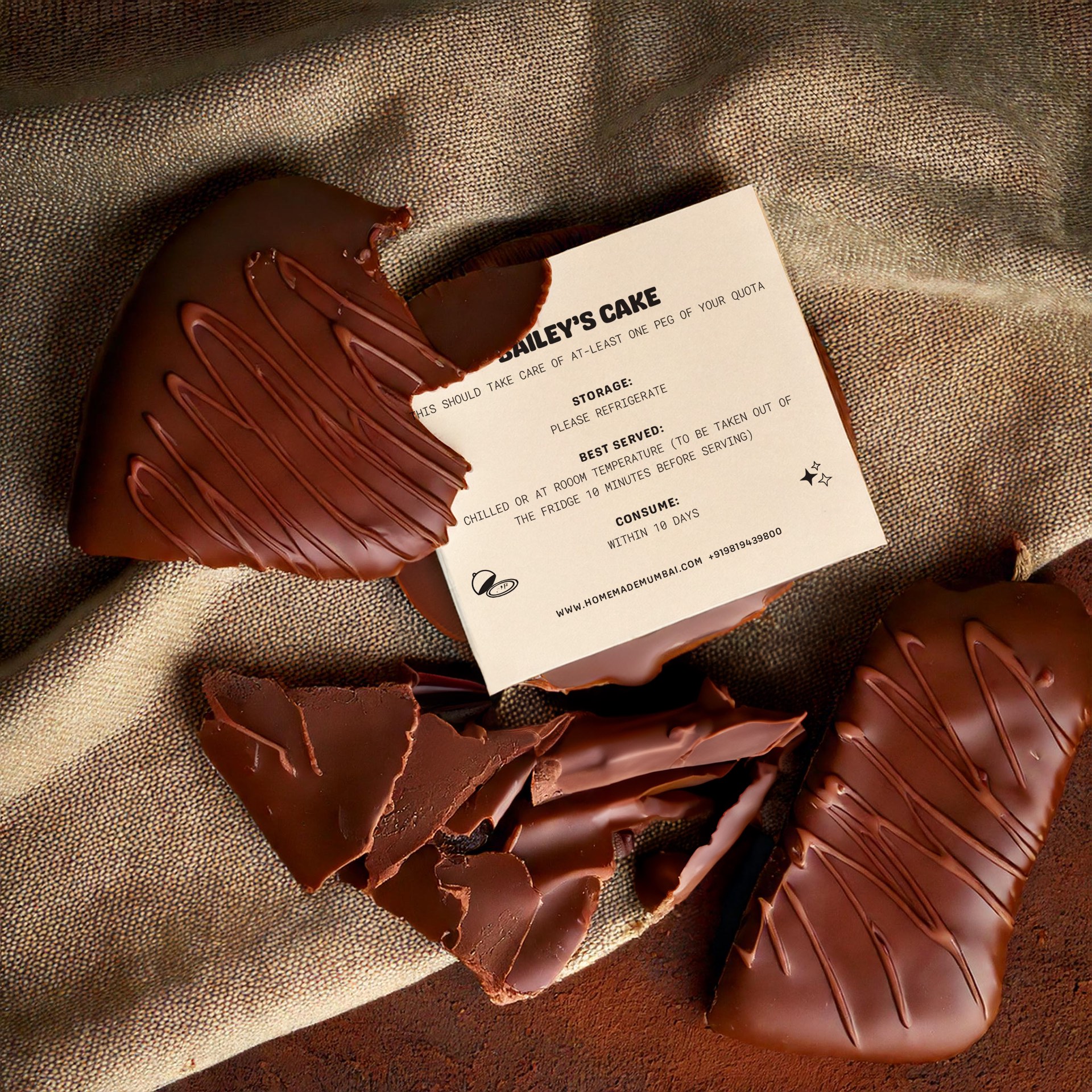
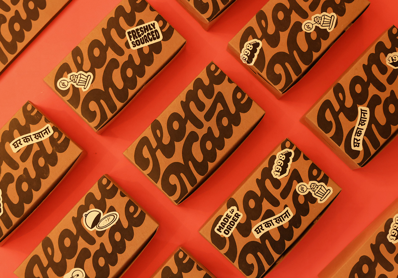
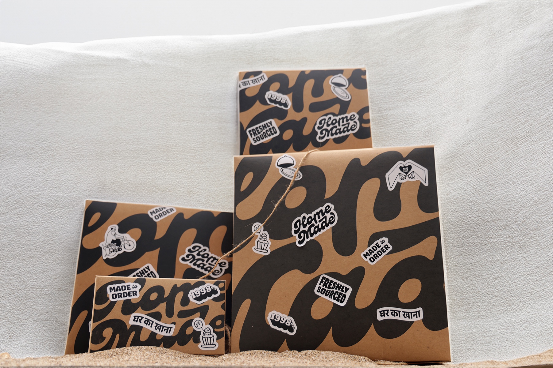
Illustrations play a crucial role in bringing the brand to life. Hand-drawn and nostalgic, they add a tactile, homey feel to the brand. The vibrant yet familiar colour palette bridges tradition and modernity.
Typography was chosen to reinforce this balance, pairing a soft, expansive primary font with a monospaced secondary font, creating a visual rhythm that reflects the brand’s fun yet grounded character.
We also introduced a playful, tongue-in-cheek tone of voice that aligns with Chef Appu’s fun personality, adding warmth and making the brand more relatable.
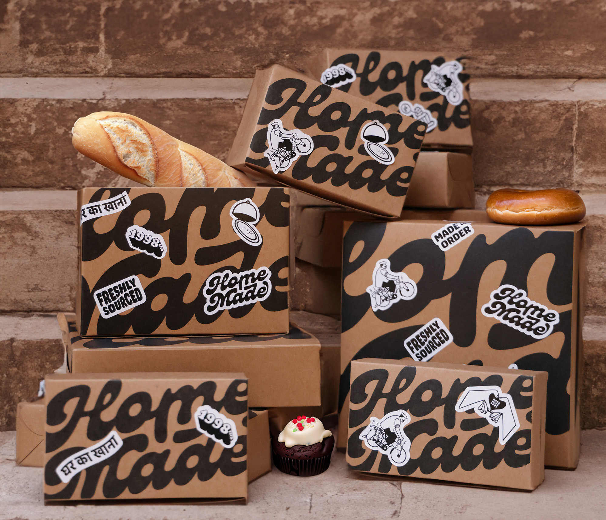
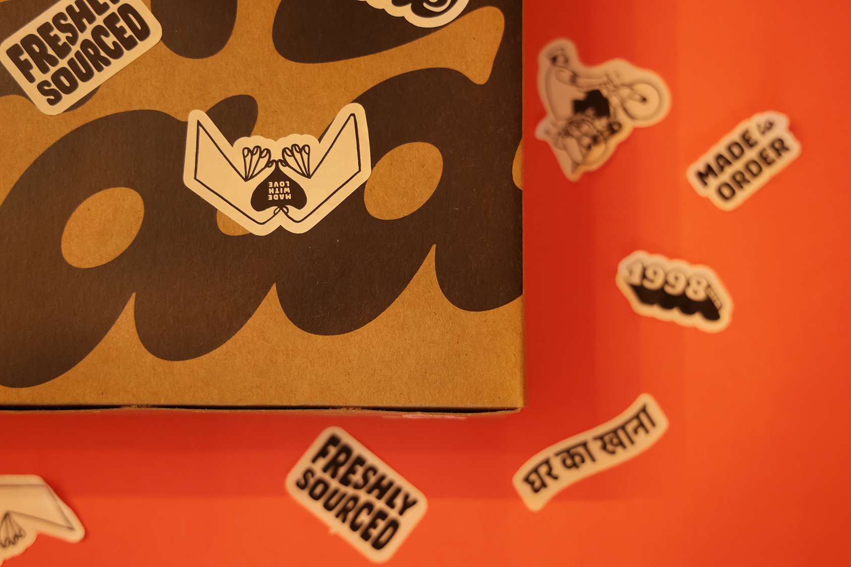
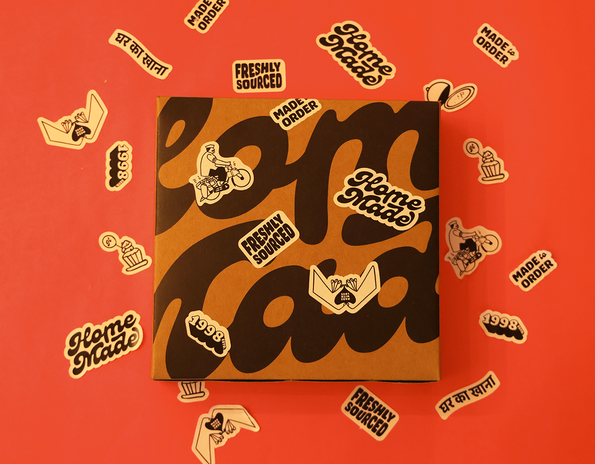
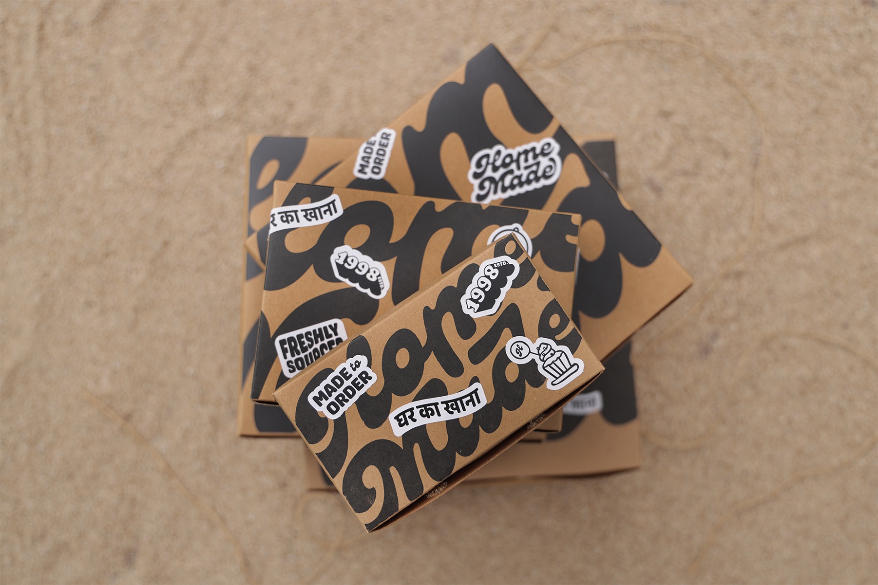
For Homemade’s packaging, we wanted a solution that was easy to implement, cost-effective, and visually strong. The team was keen on using stickers, so we built the design around that, keeping things simple yet distinctive.
1. Only black-and-white stickers – Keeps production economical while ensuring high contrast and visibility.
2. No fixed placement – Whether in the kitchen, at dispatch, or during delivery, anyone in the supply chain can place them freely. This keeps the process seamless while adding an unstructured, organic feel to the packaging.
3. Scaled-up logo as a design element: Even when not fully readable, it becomes a recognizable visual cue.
By working within these constraints, we created a packaging system that’s practical yet memorable, aligning with Homemade’s brand and operations. Sometimes, the simplest solutions make the biggest impact.
This refresh ensures Homemade continues delighting loyal customers while attracting new ones, all while staying true to its roots.
CREDIT
- Agency/Creative: Angel Salot
- Article Title: From Our Kitchen, To Your Table: Homemade Brand Identity by Angel Salot
- Organisation/Entity: Freelance
- Project Type: Identity
- Project Status: Published
- Agency/Creative Country: India
- Agency/Creative City: Mumbai
- Market Region: Asia
- Project Deliverables: Brand Creation, Brand Design, Brand Identity, Brand Redesign, Brand Strategy, Creative Direction, Packaging Design
- Industry: Food/Beverage
- Keywords: WBDS Creative Design Awards 2025/26 , branding, packaging design, logo design, restaurant branding, brand strategy
-
Credits:
Creative Director, Brand & Packaging Designer: Angel Salot
Photography: Sharvari Suralkar


