


Slice Design were tasked with redesigning the packaging for Pure Maple, a British Canadian brand dedicated to bringing 100% pure Canadian maple syrup to the UK. Founded by Canadian expats who were surprised by the lack of authentic maple syrup in the UK market, Pure Maple was created to share the rich, pure taste they grew up with. Now with its newly certified organic status, Pure Maple continues to offer a syrup that is 100% pure, sustainably sourced, and produced in Canada, ensuring an authentic flavour with every drop.
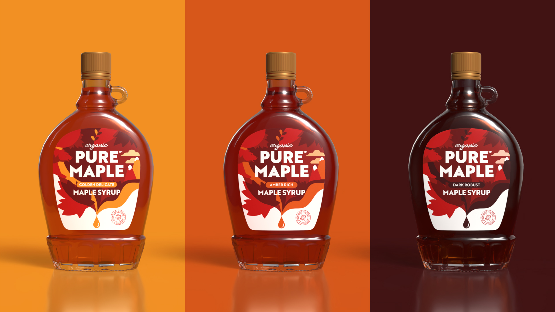
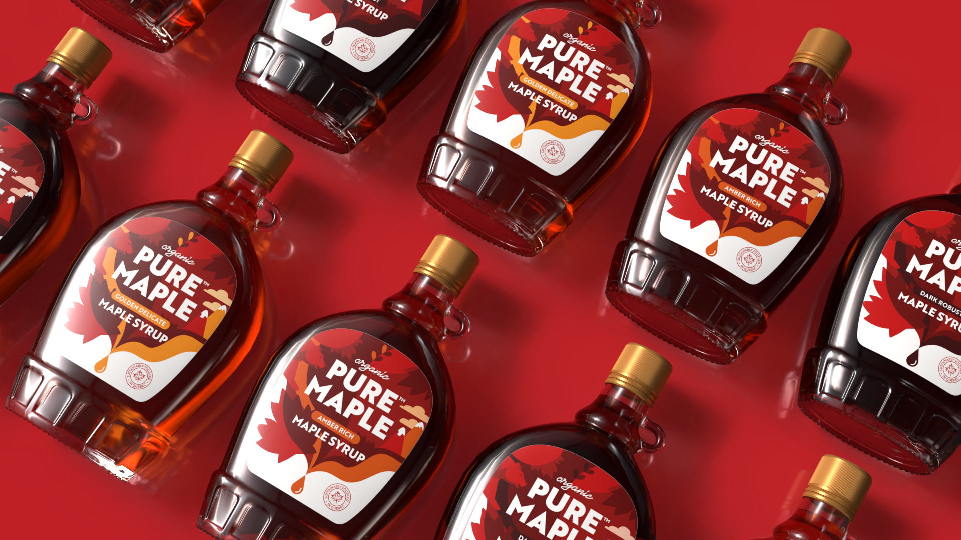
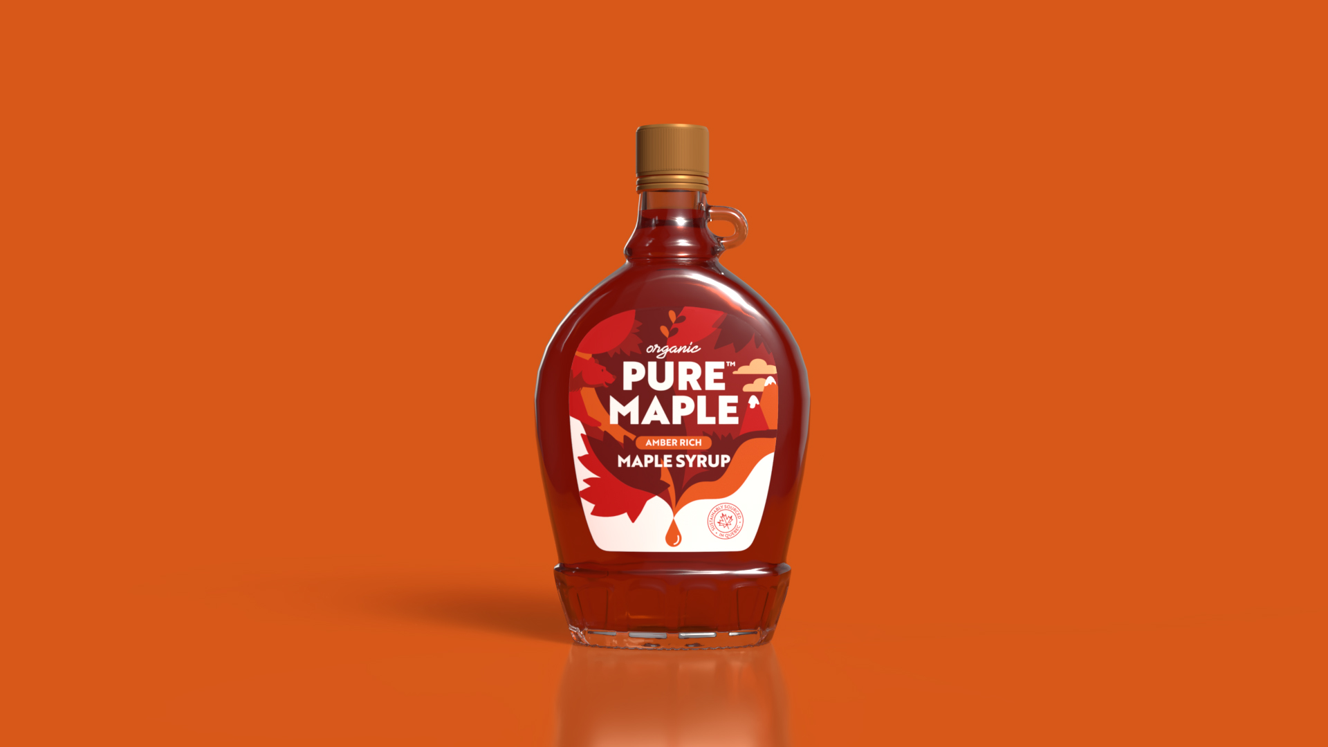
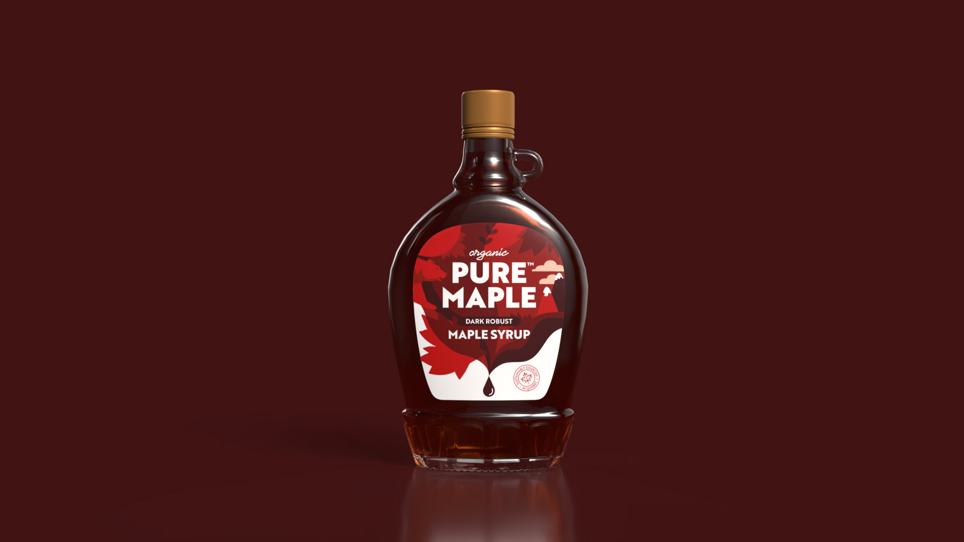
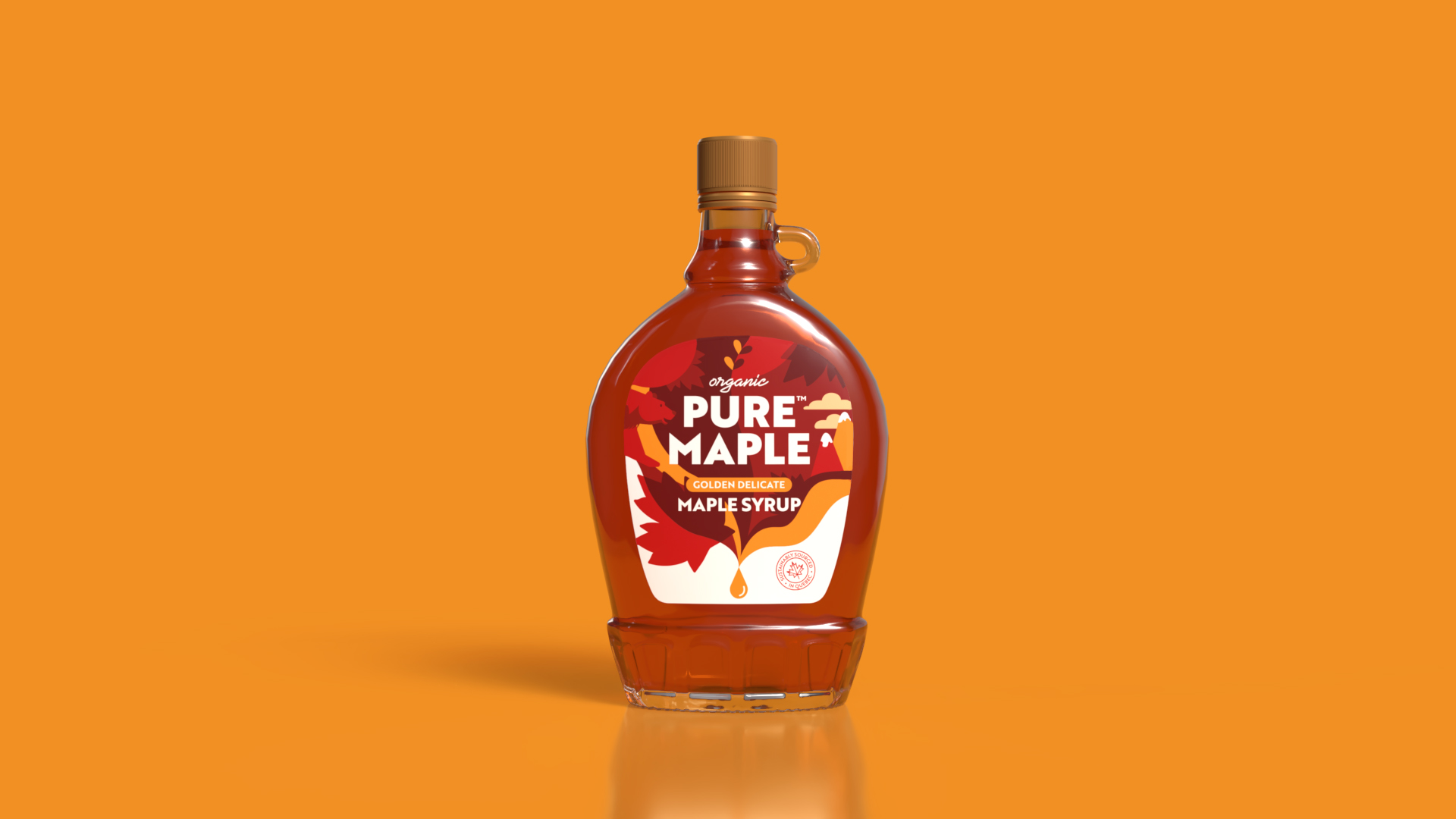
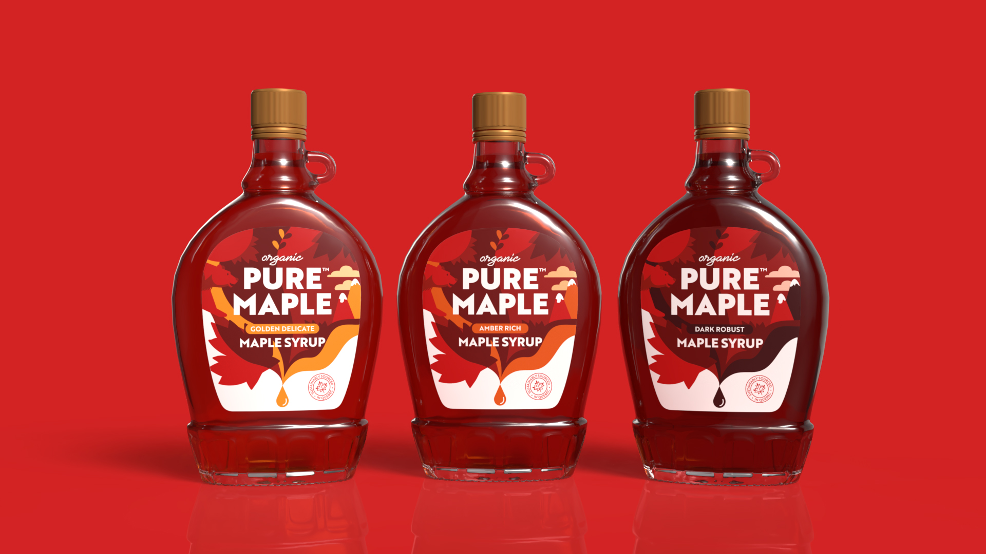
The new packaging design brings Pure Maple’s Canadian heritage to life, enhancing its shelf presence and establishing a stronger connection with consumers. The redesigned Leone bottle shape is inspired by the rich history of Canadian maple syrup, paying homage to the brand’s roots. Sustainability remains a key focus, with iconography underscoring the brand’s responsibly sourced maple syrup tapped in Quebec.
Going beyond just showcasing the syrup, the packaging tells the story of its journey. Pure Maple syrup is tapped for just six weeks each spring, and the packaging reflects this unique, moment in the syrup’s creation. Illustrations trace the sap’s path from tree to bottle, highlighting the craftsmanship and rarity of the product. This visual storytelling helps differentiate the range, with cues for the unique flavour profiles Golden Delicate, Amber Rich, and Dark Robust guiding consumers toward their preferred taste.
With this redesign, Slice Design ensures Pure Maple continues its mission of offering premium quality, organic maple syrup to the UK delivering an immersive taste of Canada in every drop.
Agency Comments (Alan Gilbody, Owner & Director)
Alan Gilbody of Slice Design Limited shared insights into the design process:
“We wanted to invite the consumer into the pristine, untouched beauty of Canada’s wilderness but in a less traditional way—mirroring the unparalleled purity of the maple syrup itself. It’s a bold visual language that underscores our deep respect for nature and drives home the ‘pure’ promise at the heart of this brand.”
Client Comments (Rob Ward Founder Puremaplers Ltd)
“We are absolutely thrilled with Slice Design’s exceptional work on our new packaging identity. They have truly captured the essence of our Canadian heritage while bringing a fresh, modern feel to our brand. The thoughtful design not only enhances the authenticity of our syrup but also beautifully conveys the story behind every drop from the maple trees of Quebec to tables across the UK. The attention to detail, sustainability focus, and striking visuals ensure that Pure Maple stands out while staying true to its roots. A fantastic collaboration, we couldn’t be happier with the results!”
CREDIT
- Agency/Creative: Slice Design
- Article Title: Slice Design Unveils New Packaging Identity for Pure Maple Celebrating Canadian Heritage
- Organisation/Entity: Agency
- Project Type: Packaging
- Project Status: Published
- Agency/Creative Country: United Kingdom
- Agency/Creative City: Slice Design
- Market Region: Europe
- Project Deliverables: Brand Design, Brand Redesign, Packaging Design, Packaging Guidelines
- Format: Bottle
- Industry: Food/Beverage
- Keywords: Packaging, Packaging Design, Branding, Brand, Pure Maple, Syrup, Canada
-
Credits:
Creative Director: Alan Gilbody
Senior Account Manager: Charlotte Burrows
Designer: Alie Brown
Designer: Ellie Welsh
Artworker: Meghann Longmoor


