


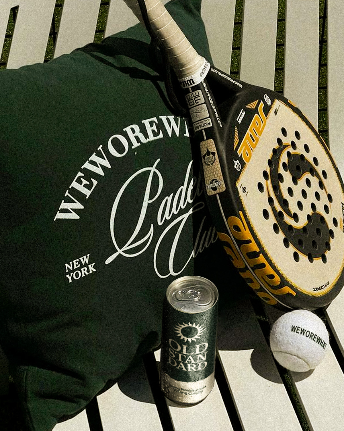
When I set out to design Old Standard, I knew I wanted to create something that broke away from the clichés of rehydration drinks. Most products in this category follow a predictable formula—bright neon colors, hyperactive typography, and an almost medicinal aesthetic. But I envisioned something different: a beverage that felt both timeless and sophisticated while still maintaining its functional, high-performance edge.
I wanted to craft a brand that felt like it had heritage, something that wasn’t just another trendy drink but rather a new classic—hence the name Old Standard. The name itself is a paradox: it suggests something long-standing, yet it introduces a new standard in rehydration drinks. This juxtaposition between the traditional and the contemporary became the foundation of the entire branding system.
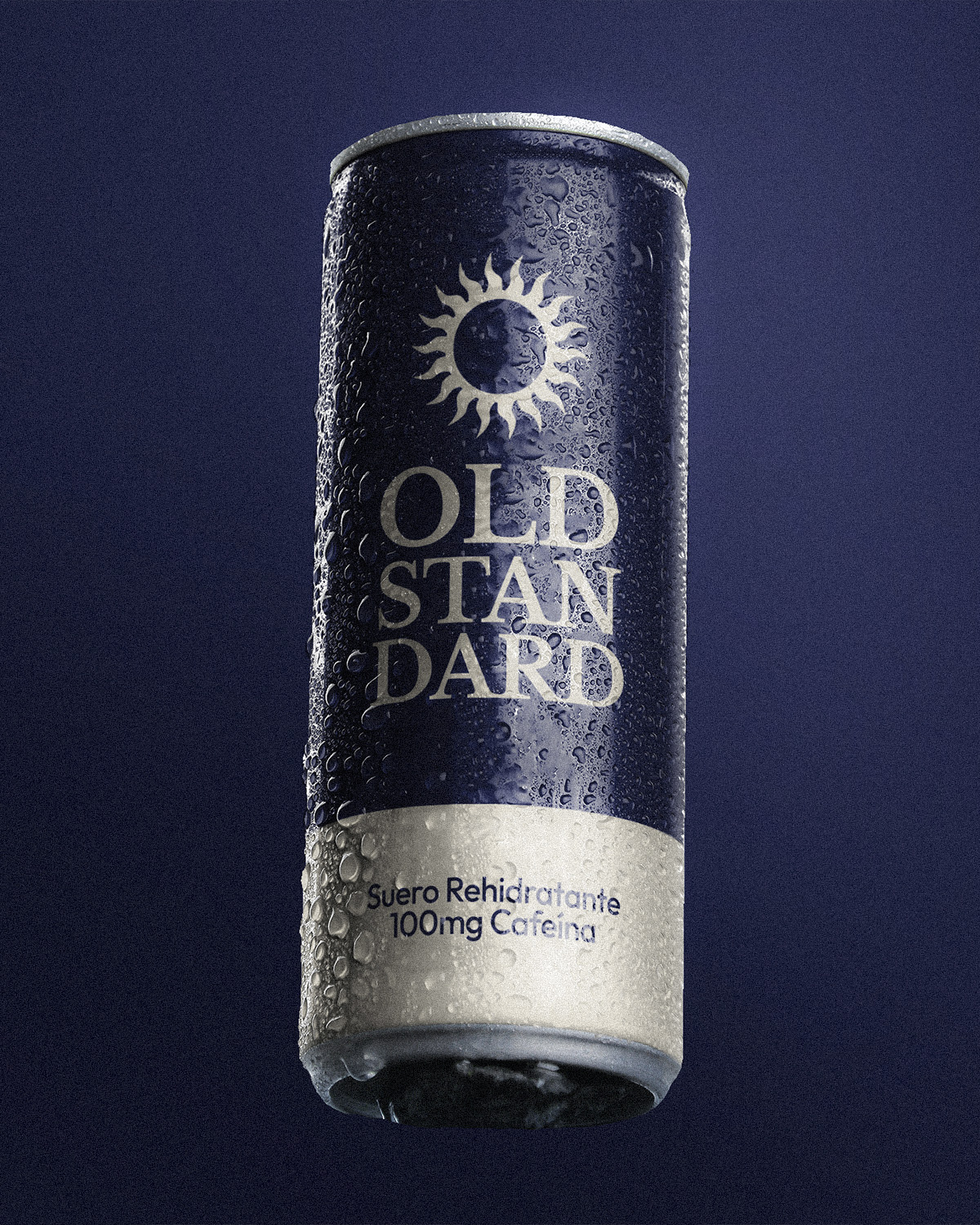
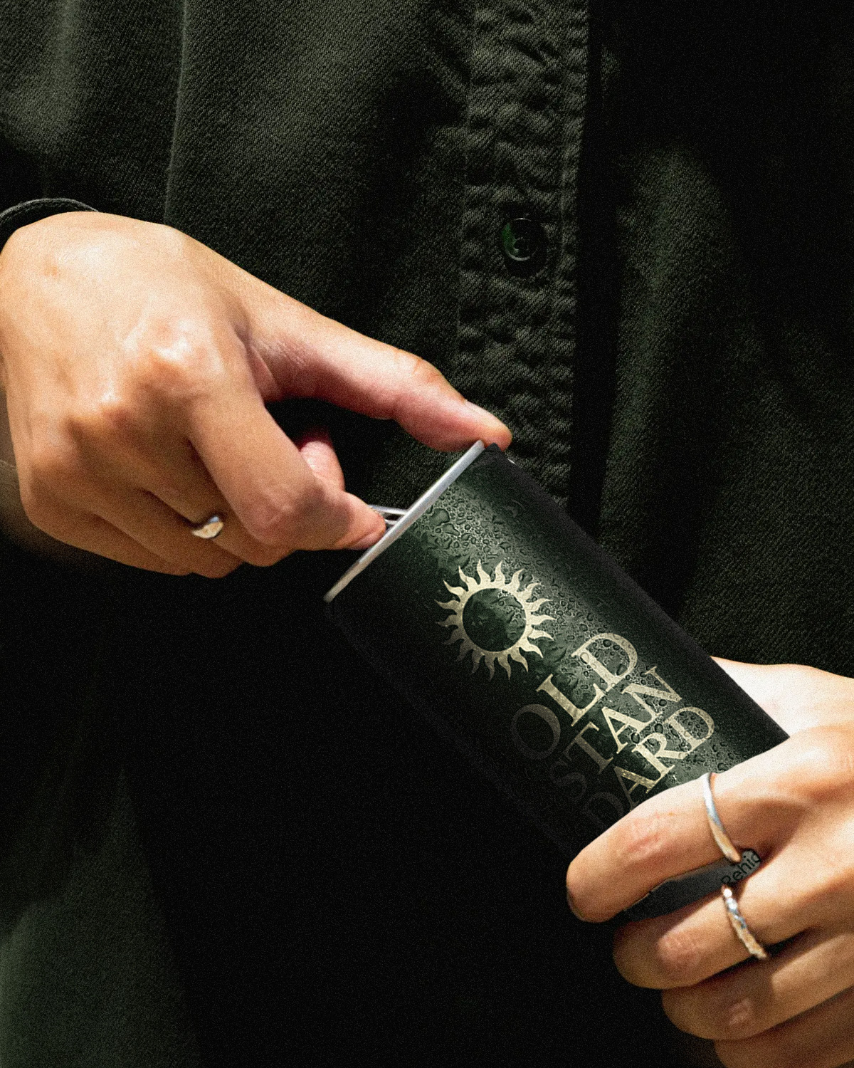
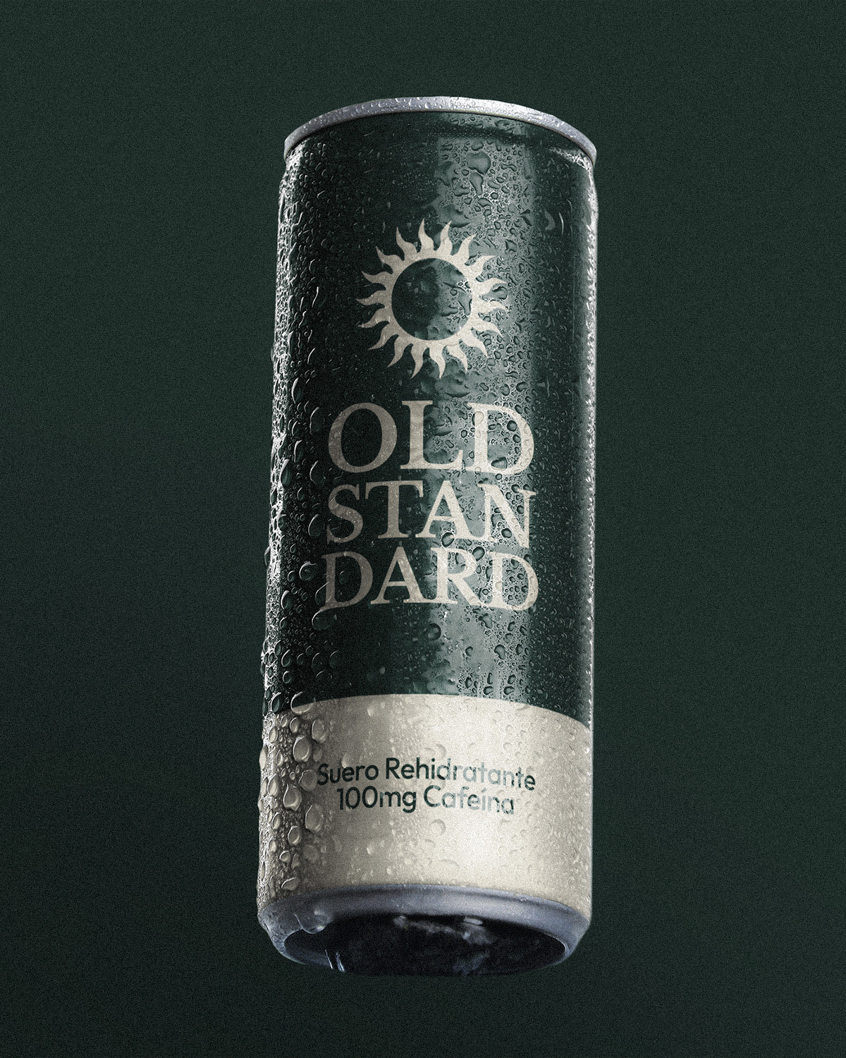
For the design, I opted for a deep, muted green—far from the flashy electric blues and oranges typically associated with electrolyte drinks. Green exudes balance, stability, and endurance, aligning with the idea of hydration as a steady, reliable process rather than a short-lived energy spike. To contrast and add a premium feel, I incorporated off-white tones, reinforcing a sense of sophistication and minimalism.
The typography was crucial. I wanted something classic yet bold, so I chose a serif typeface that carries both elegance and strength. Breaking the words “Old Standard” into a stacked layout wasn’t just a stylistic choice—it helps control the rhythm of how the brand is perceived, giving it a sense of presence and longevity.
The sun emblem on the can represents endurance, natural energy, and cycles of renewal—all essential elements of hydration. It’s a subtle nod to both the human body’s natural balance and the timeless power of nature. The slightly distorted shape of the sun prevents it from feeling too rigid, reinforcing the organic, functional essence of the drink.
The tagline “Suero Rehidratante | 100mg Cafeína” is straightforward yet essential. It tells the consumer exactly what the product is while subtly challenging expectations. Most people don’t associate caffeine with rehydration, but that’s exactly the disruptive edge of Old Standard—it’s built for people who need to recover and perform at the same time.
Creating Old Standard was about redefining what a rehydration drink could be. It’s more than just electrolytes and caffeine—it’s a statement. It’s hydration for those who appreciate quality, timeless design, and functionality without compromise. With this project, I aimed to elevate an everyday necessity into something aspirational, well-crafted, and enduring—a new standard, indeed.

CREDIT
- Agency/Creative: Fer Flores
- Article Title: Fer Flores Reinvents Electrolyte Drink Packaging with Old Standard’s Elegant Visual Identity
- Organisation/Entity: Freelance
- Project Type: Packaging
- Project Status: Published
- Agency/Creative Country: Mexico
- Agency/Creative City: Zapopan
- Market Region: North America
- Project Deliverables: Brand Creation, Brand Design, Brand Guidelines, Product Design, Product Photography
- Format: Can
- Industry: Food/Beverage
- Keywords: Can Beverage Design, Brand Design, Drink Design
-
Credits:
Designer: Fer Flores


