


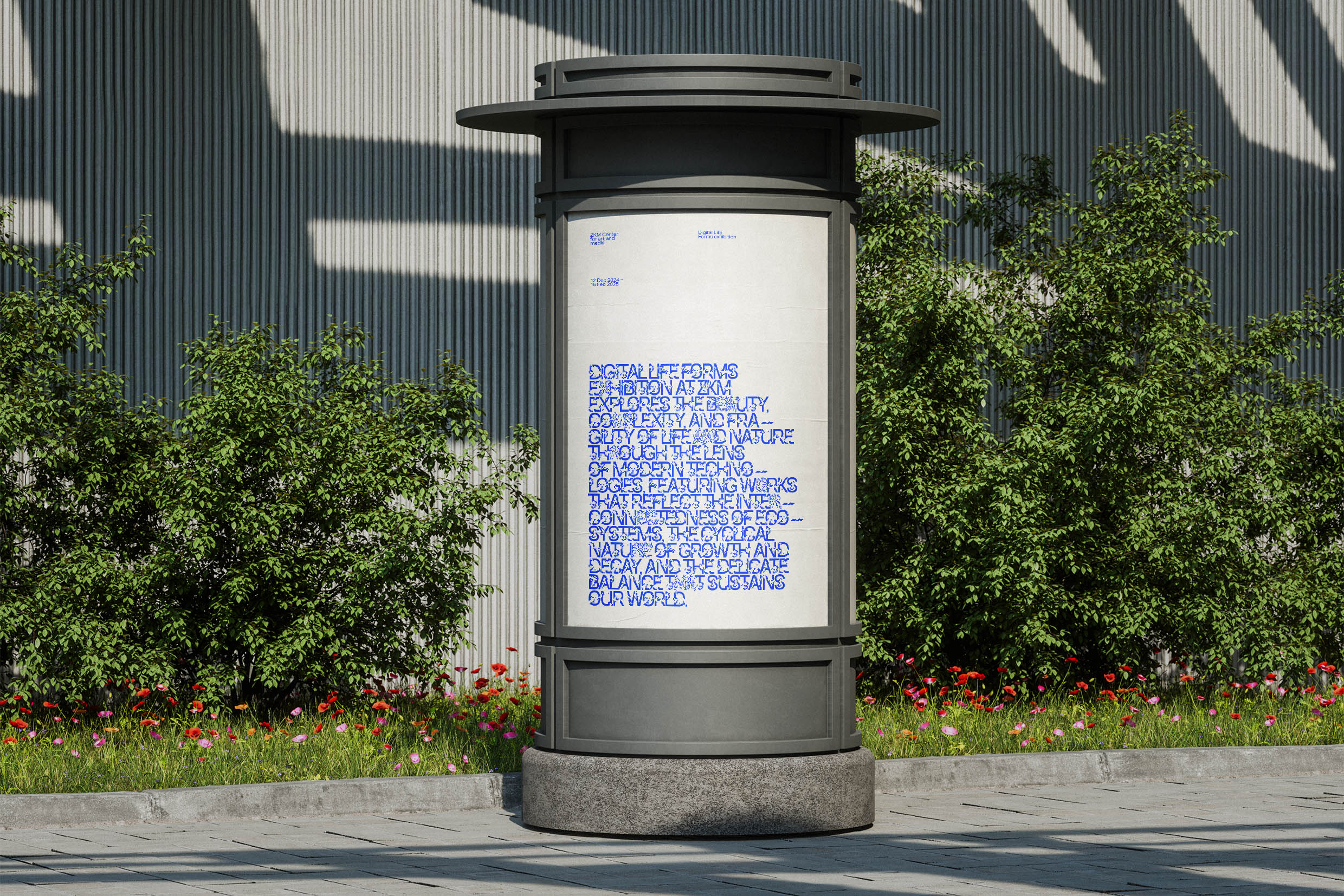
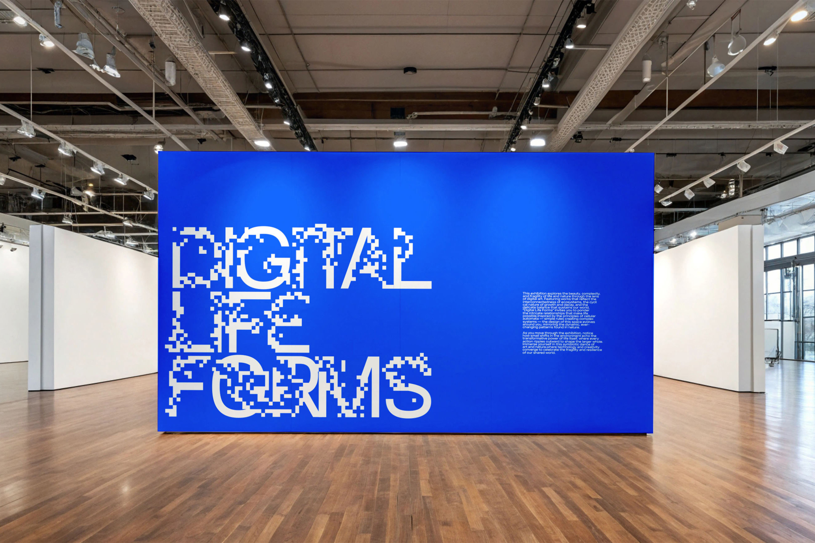
“Digital Life Forms” is an exhibition dedicated to exploring the beauty and complexity of life and nature through the lens of digital art. Featuring works that reflect the mechanisms of growth and decay, naturally occurring behavioral patterns, and relationships between living entities, the exhibition aims to offer a new perspective on the essence of life through technology.
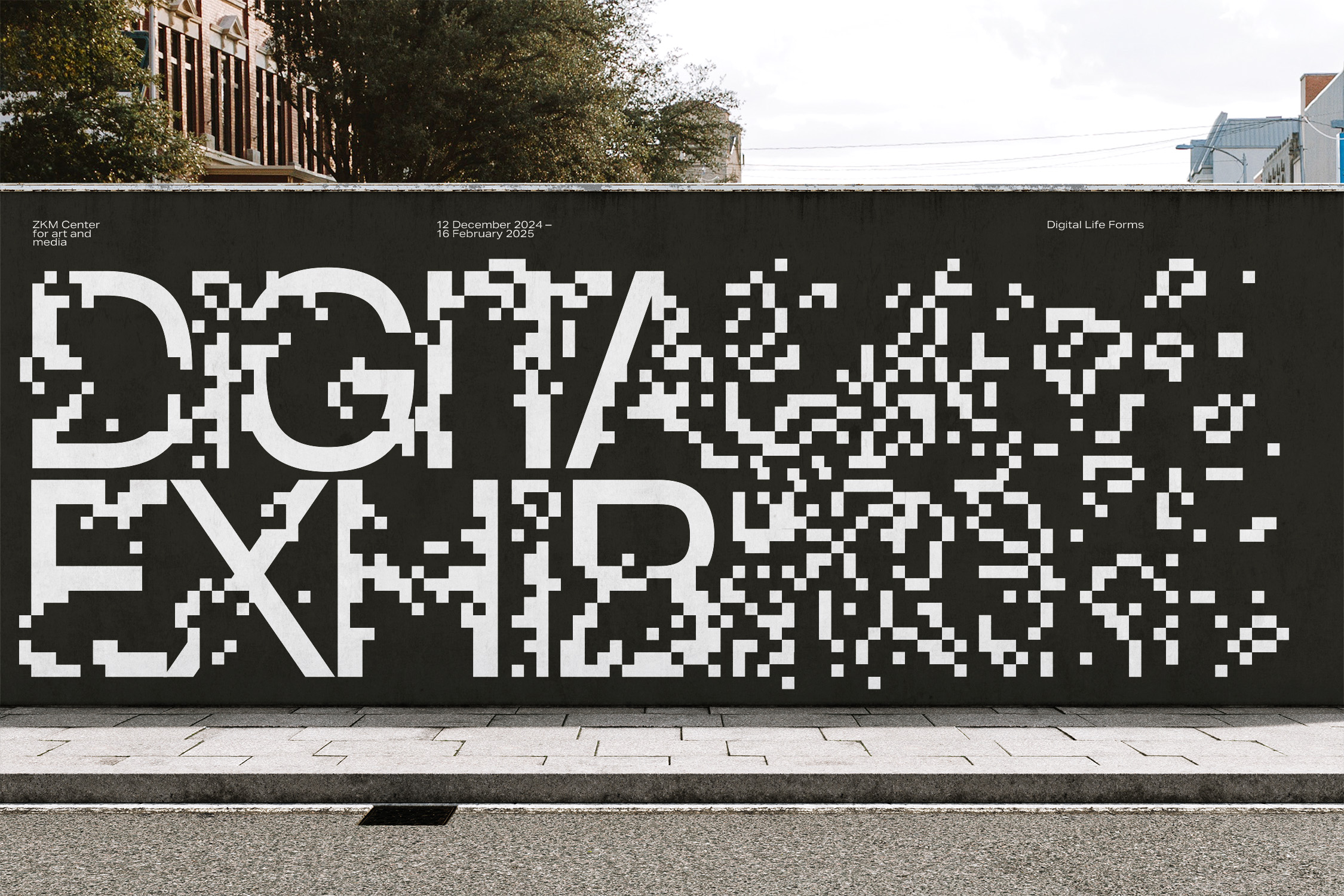
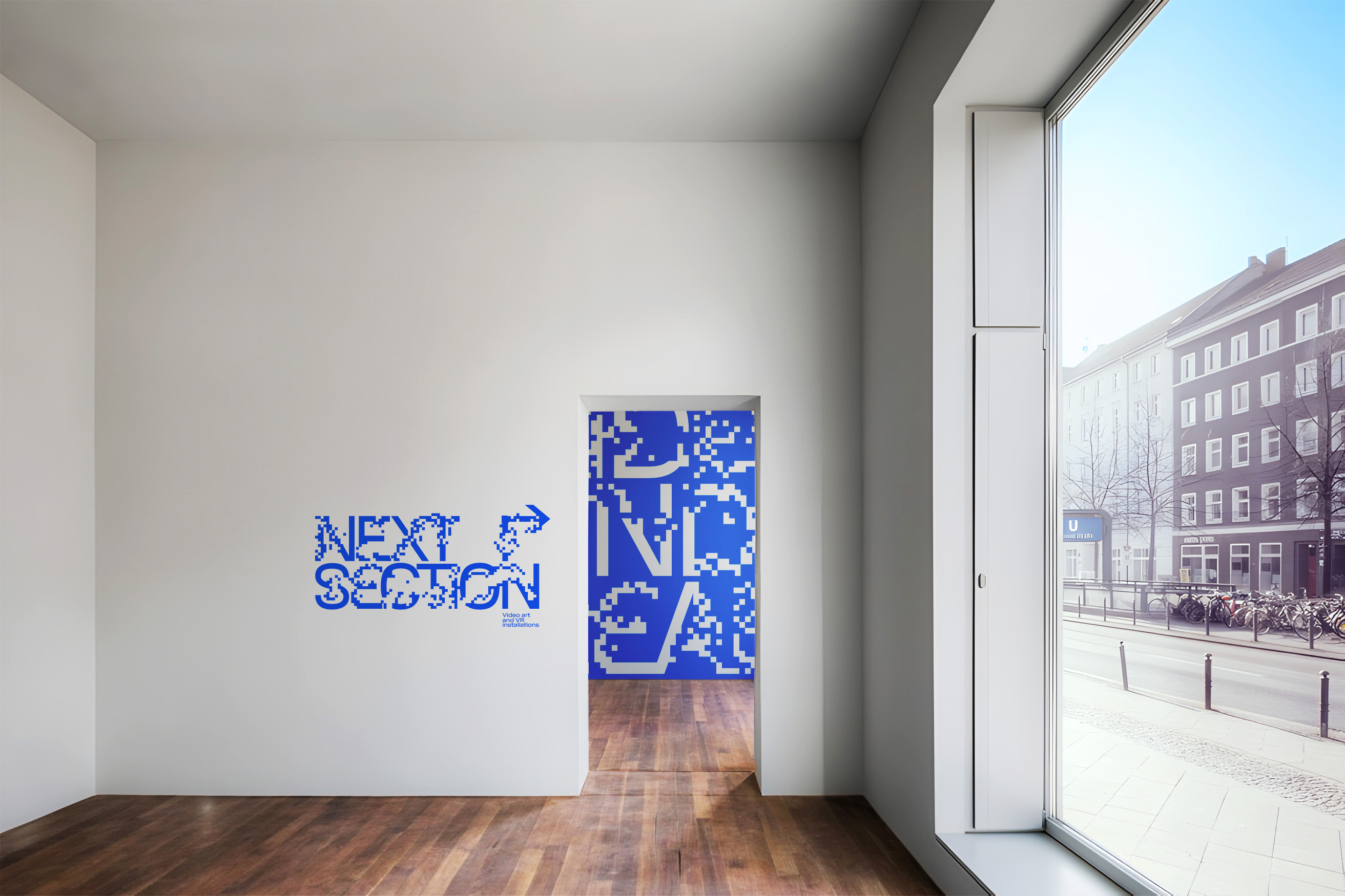
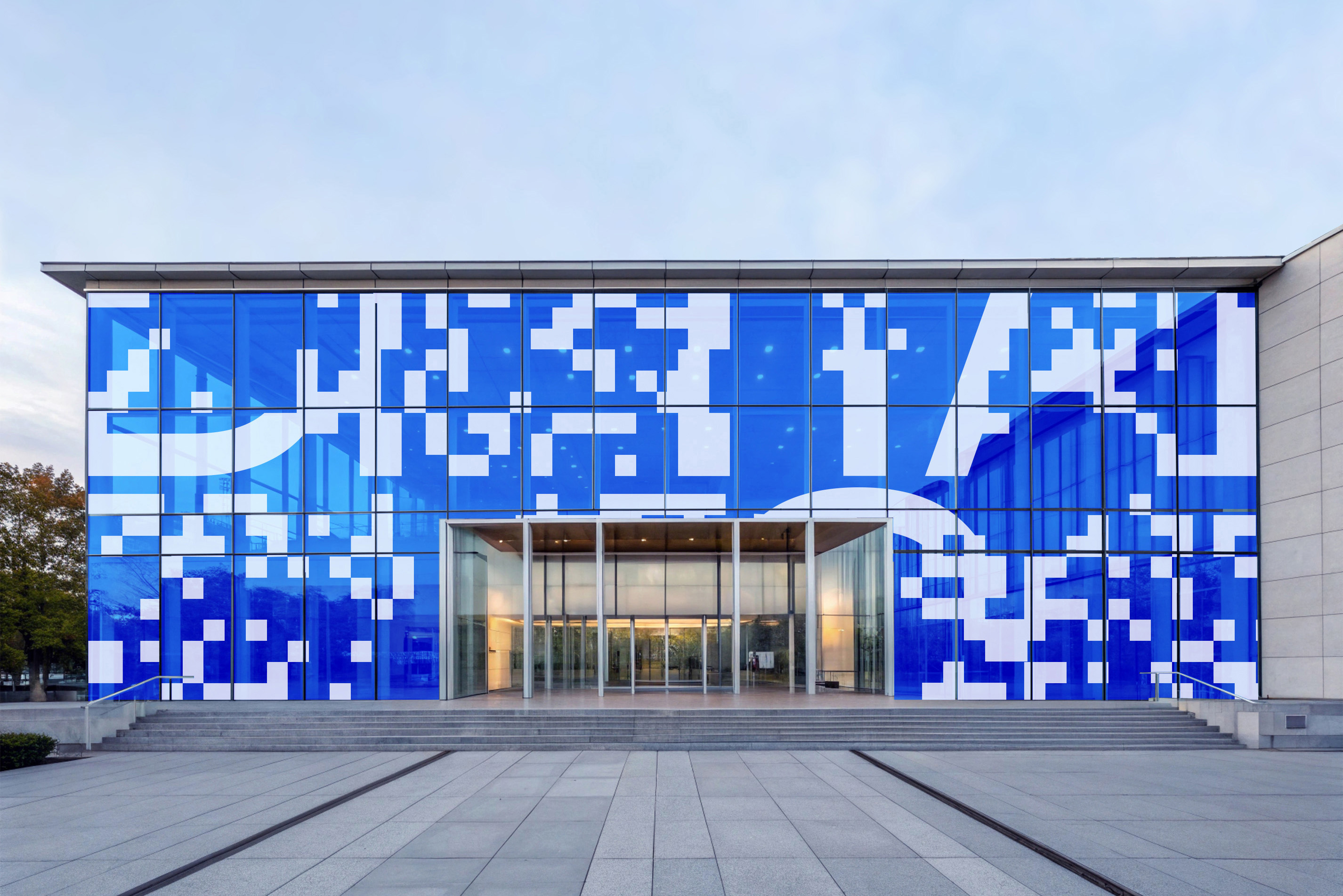
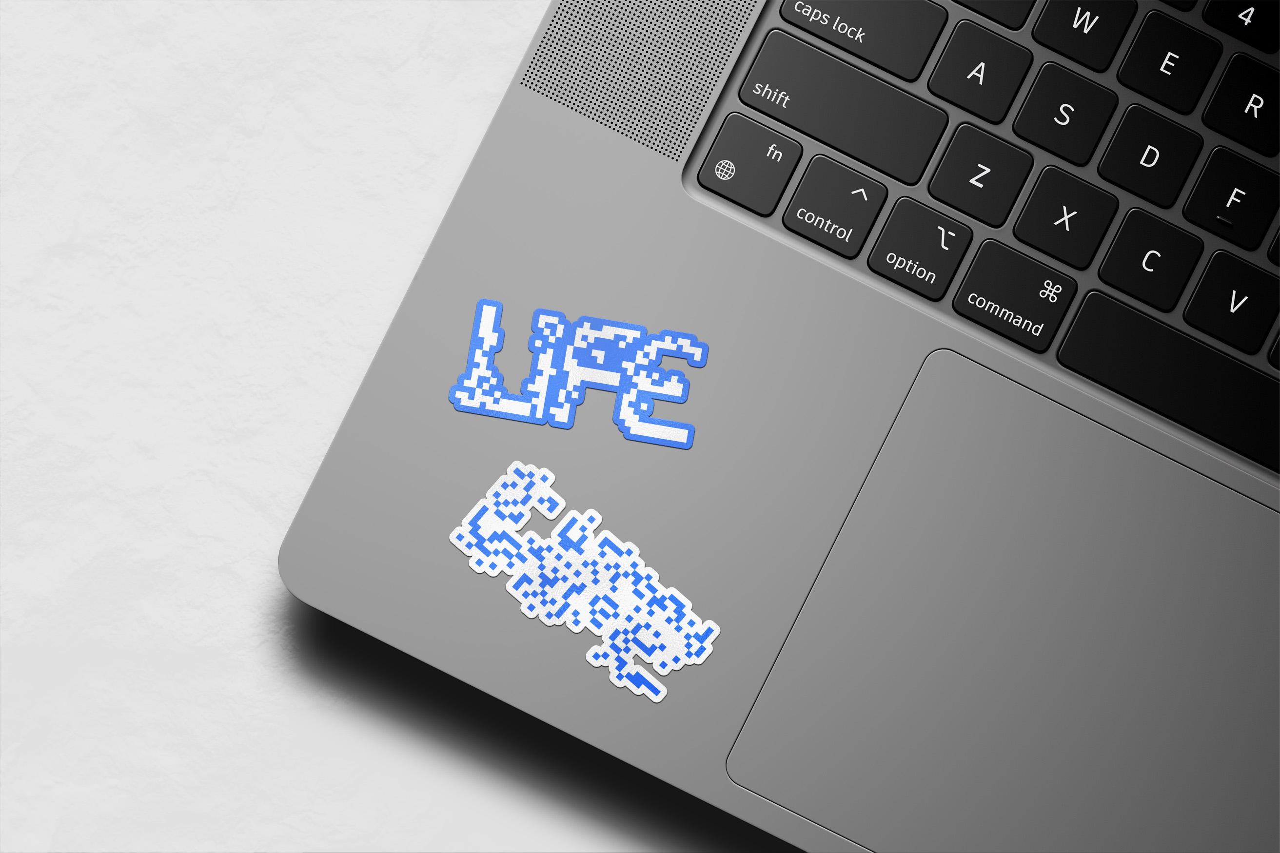
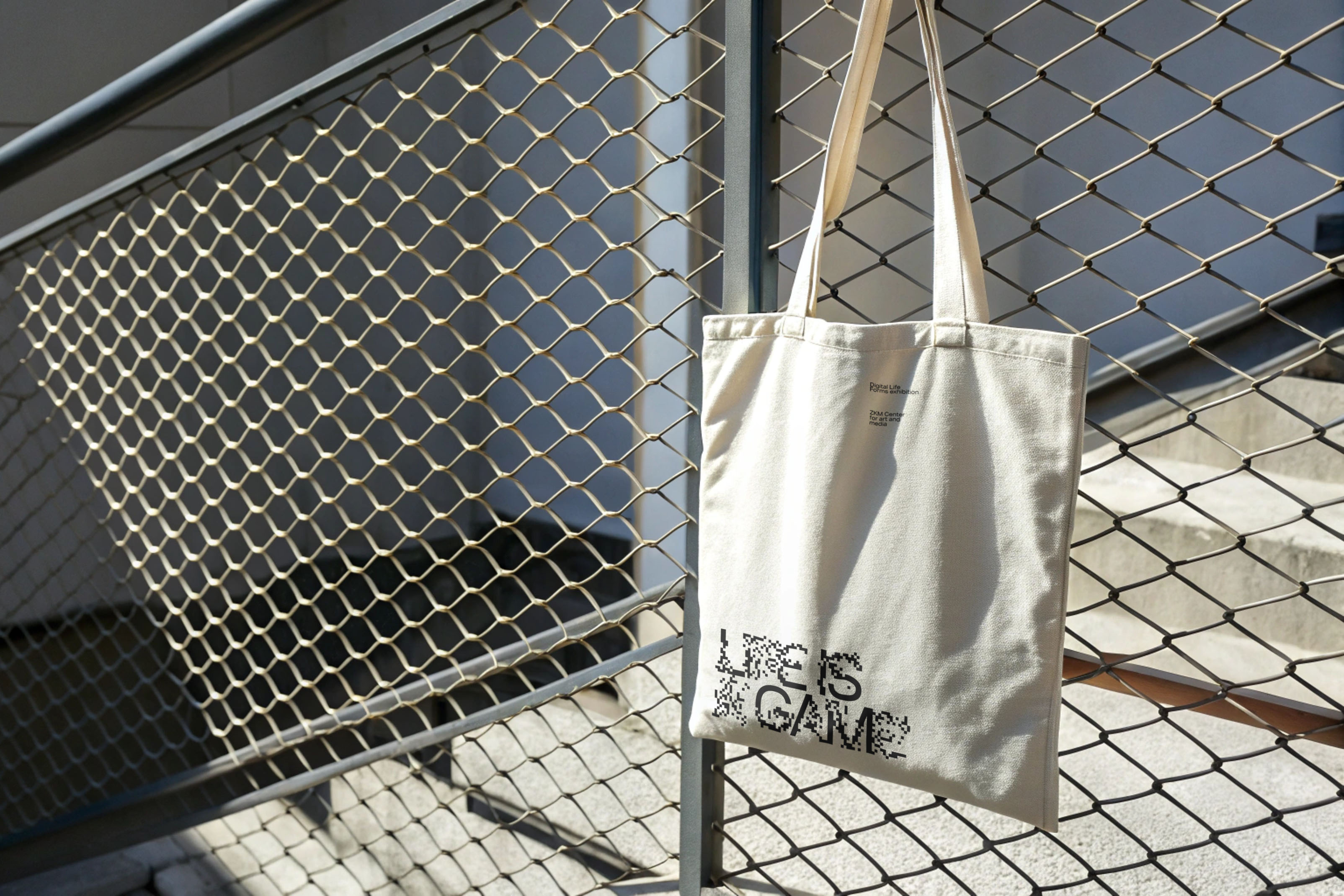
The exhibition’s visual identity is inspired by the “Game of Life”, a cellular automaton invented by British mathematician John Conway. The game is a simulation that unfolds on a grid, where simple rules dictate the evolution of patterns over time. From an initial arrangement of cells, complex, often organic-looking structures emerge, shift, and sometimes stabilize or disappear. Though the game follows strict mathematical rules, it reveals unpredictable behavior, mirroring processes found in nature. It is often seen as a metaphor for life, demonstrating how simple rules can lead to immense complexity and how order can arise from chaos.
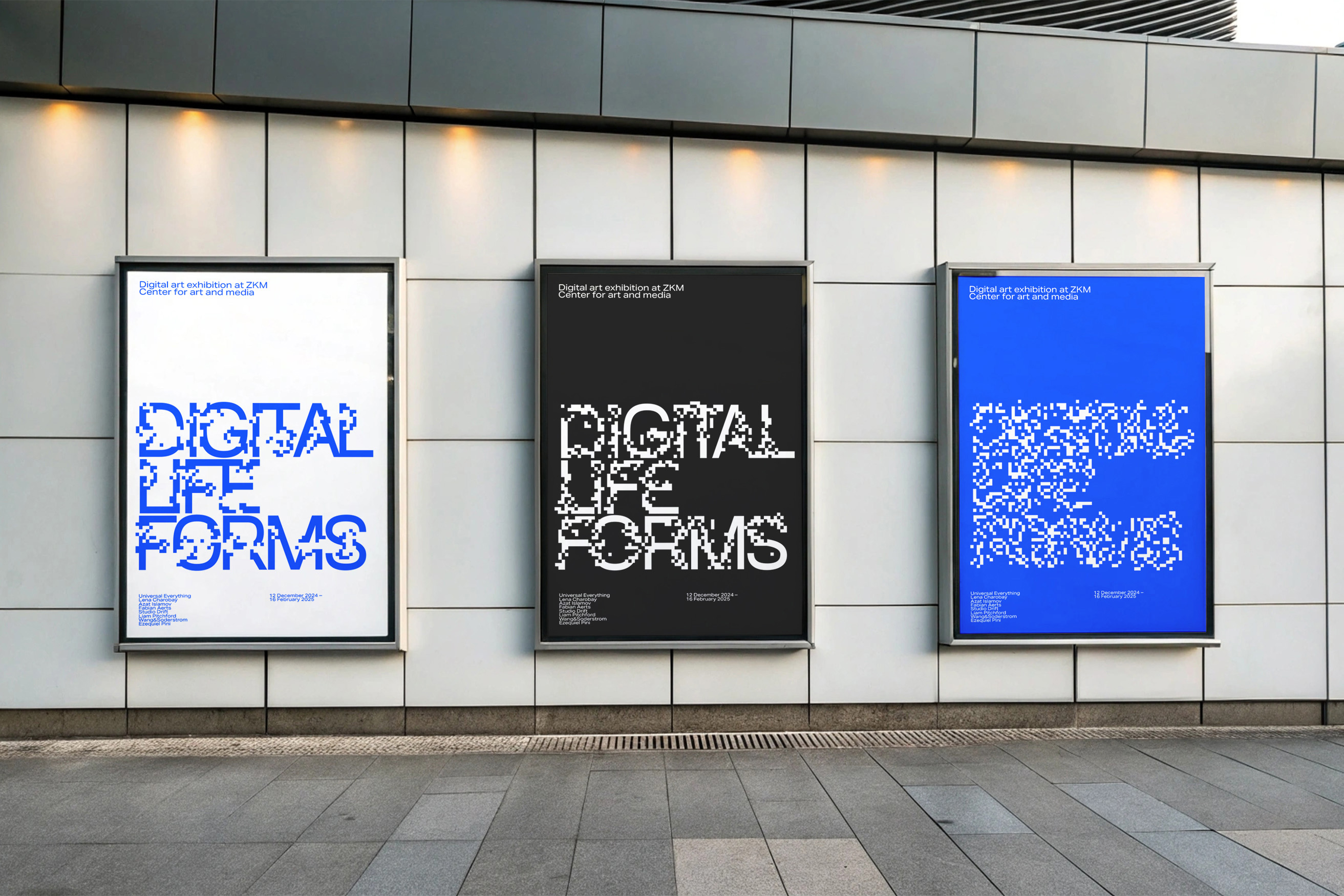
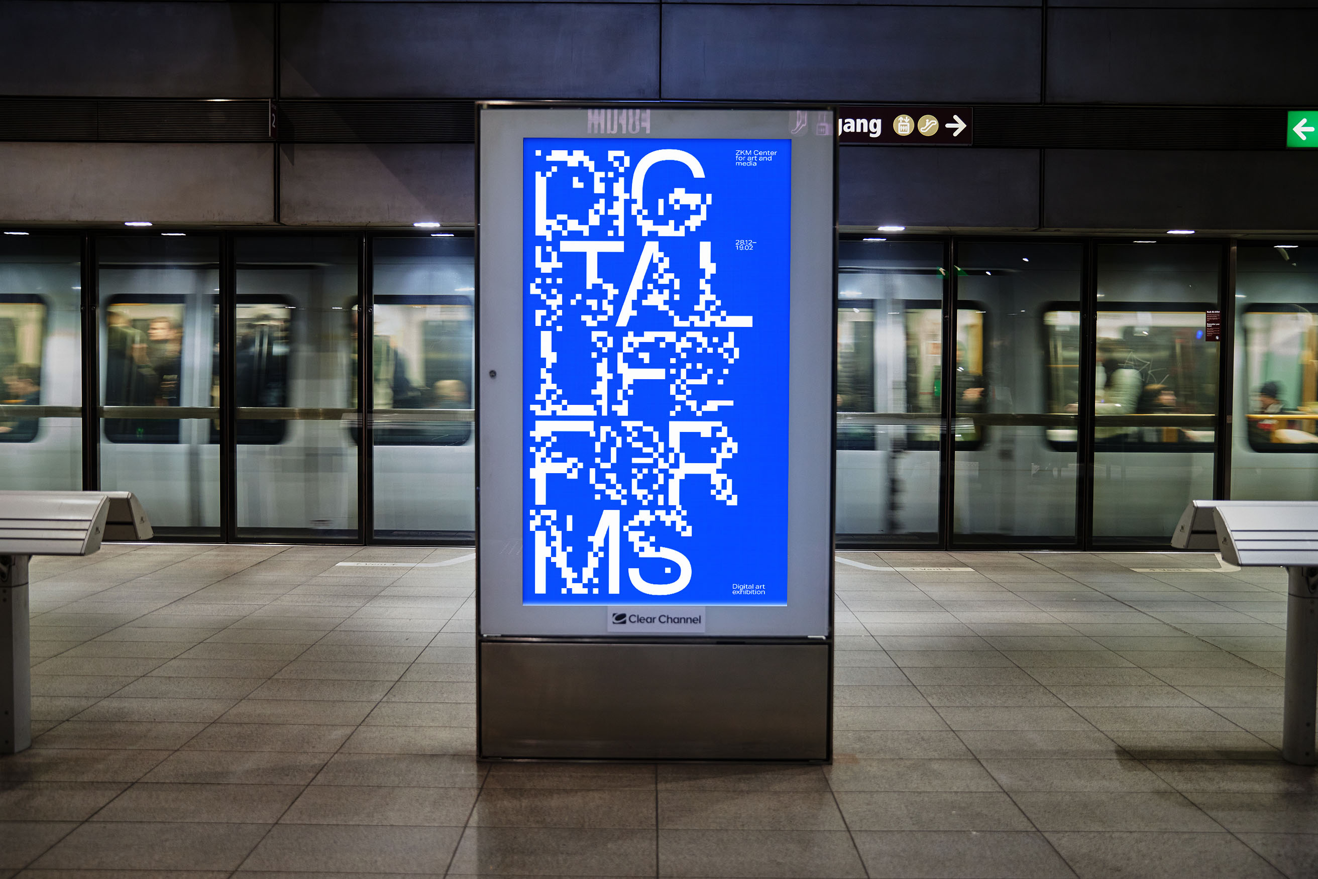
The central element of the identity is a custom typeface featuring cellular patterns reminiscent of those in Conway’s game. The typeface consists of three styles, each showing an increasing degree of glyph deformation by the cells—ranging from subtle alterations to nearly illegible structures. Typography becomes a grid where the “Game of Life” unfolds, forming uneven, chaotic compositions that mimic natural processes. A limited color palette ensures the cellular patterns remain the focal point. The only color used is bright blue, which rarely occurs in nature and therefore feels artificial, highlighting the interplay between organic and digital realms.
CREDIT
- Agency/Creative: Daniil Matveev
- Article Title: Typeface-based Visual Identity for a Digital Art Exhibition Inspired by John Conway’s “Game of Life”
- Organisation/Entity: Student
- Project Type: Identity
- Project Status: Published
- Agency/Creative Country: Russia
- Agency/Creative City: Moscow
- Market Region: Europe
- Project Deliverables: Brand Identity, Branding, Graphic Design, Type Design
- Industry: Entertainment
- Keywords: Graphic design, Identity, Typeface, Exhibition, Branding
-
Credits:
Curator: Pavel Borisovsky


