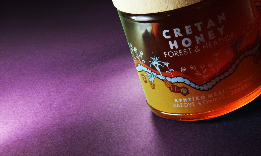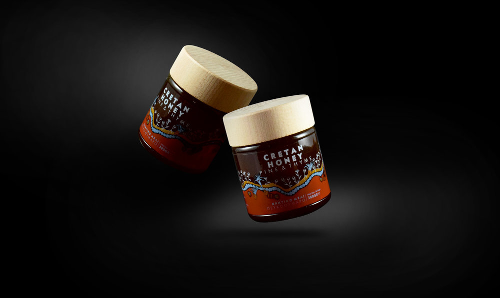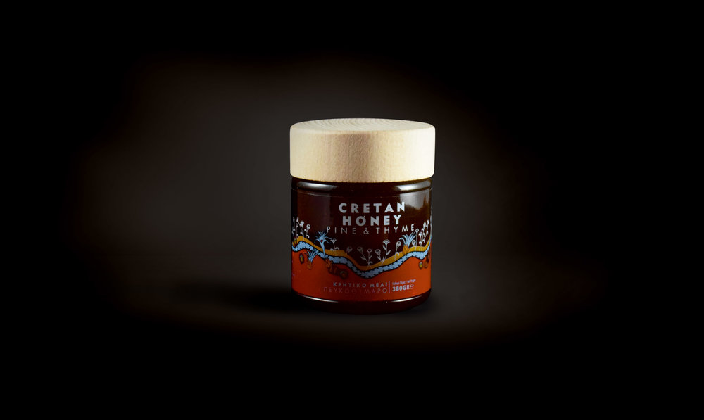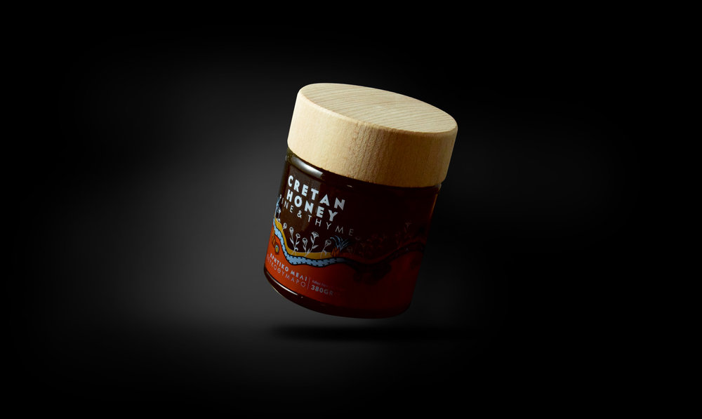
“A bold and special approach …No element referring to honey was used in the packaging design. The illustration was based on the free rendering of a fresco of the Minoan era. We used intense earthy colors that, combined with the use of the wooden lid, make up the very intense and distinct visual identity of the product.”


CREDIT
- Agency/Creative: Leftgraphic , Lefteris Panagoulopoulos
- Article Title: Leftgraphic – Cretan Honey
- Project Type: Packaging
- Format: Jar
- Substrate: Glass, Wood
FEEDBACK
Relevance: Solution/idea in relation to brand, product or service
Implementation: Attention, detailing and finishing of final solution
Presentation: Text, visualisation and quality of the presentation


