


Nestled in the heart of the vibrant city of Da Nang, P Coffee & Bakehouse is an artistic coffee shop that caters to both locals and travelers. With this rebranding campaign, P Coffee aims to redefine its positioning and craft a distinctive brand story deeply connected to the essence of Da Nang.
Concept & Big Idea
At the core of the rebranding effort is the idea of reinforcing the deep-rooted connection between Da Nang and P Coffee & Bakehouse. With its location on one of Da Nang’s central streets and the founder’s personal ties to the city, the big idea is encapsulated in the phrase “The Heart of Da Nang”.
It positions P Coffee & Bakehouse as more than just a coffee shop – it becomes a community hub and a must-visit destination for both residents and tourists. It fosters an environment where people can gather, engage in warm conversations, and create lasting memories. Furthermore, its brand story highlights the interplay between the coffee shop, the people of Da Nang, and the city’s natural beauty.
Logo & Brand Identity
A primary focus of the rebranding campaign was crafting a logo and brand identity that exudes a premium aesthetic while maintaining the essence of the original branding.
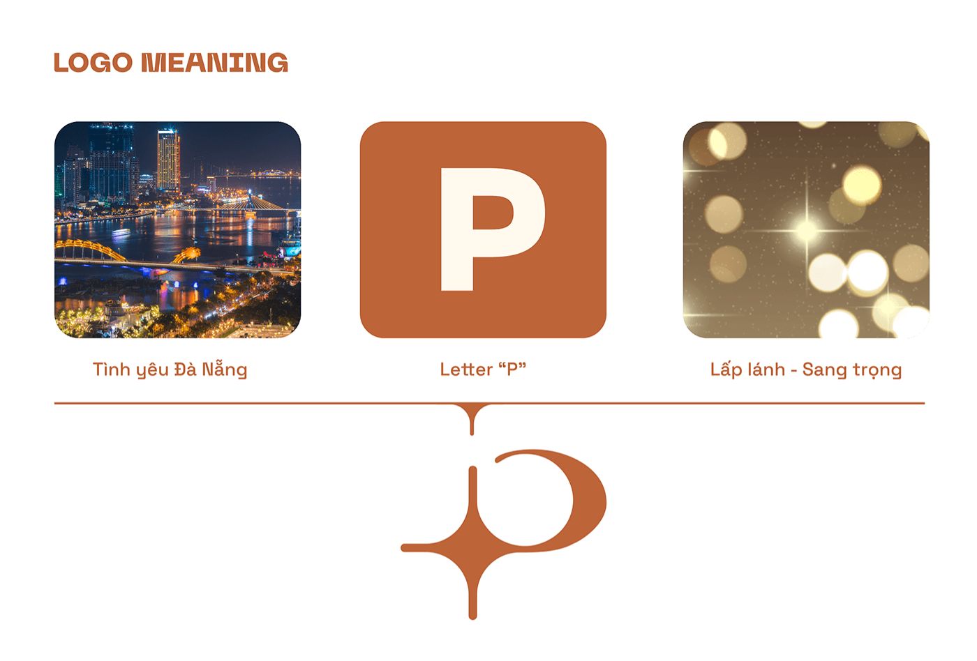
Firstly, the signature “P” from the previous logo has been reimagined into a minimalist and sophisticated form, ensuring continuity. Secondly, a twinkling star effect, embedded within the vertical stroke of the letter “P,” adds a refined touch. This element not only enhances the premium feel but also symbolizes a sparkling earring – a nod to fashion-forward aesthetics and individuality.
Therefore, the new logo encapsulates the brand’s artistic and premium nature while aligning with its storytelling approach.
Visual Identity & Application
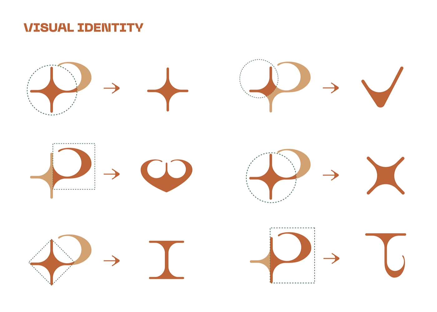
Building upon the big idea, the visual identity extends beyond the logo to create a cohesive brand experience. For example, the star shape symbolizes the sparkling, attention-grabbing quality and is illustrated by the mountain of tea and the iconic Golden Bridge, adding a unique local touch.
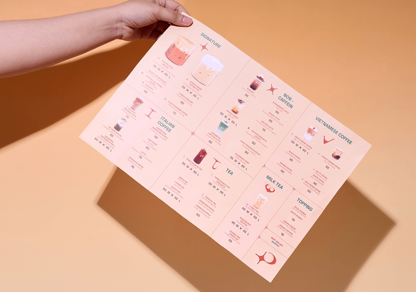
Moreover, the collection of visual identity is adapted into icons to represent different drink categories, which was designed to ensure an intuitive menu experience.
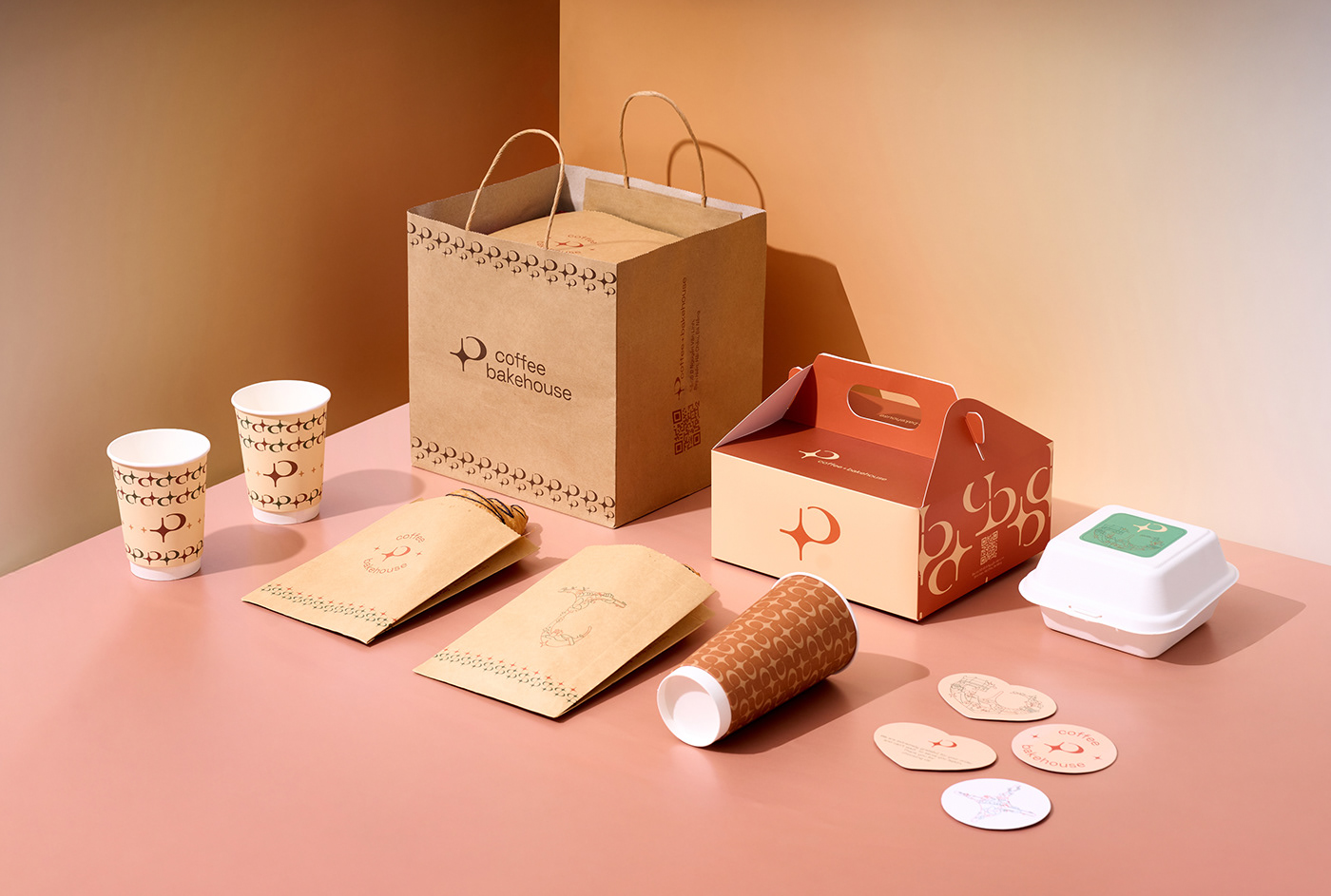
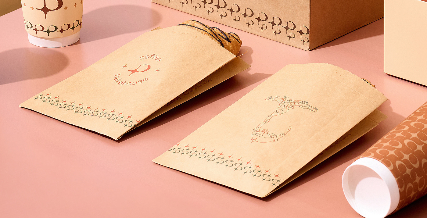
The brand identity is further reinforced through merchandise, including branded clothing, accessories, and pastry packaging, all featuring a curated color palette and modern design style.
Every touchpoint, from identity items to packaging, embodies the essence of P Coffee & Bakehouse as a refined yet inviting space.
Through meticulous execution, Rymee Creative successfully translated P Coffee & Bakehouse’s essence into a visually compelling and strategically sound brand identity.


CREDIT
- Agency/Creative: Rymee Creative
- Article Title: Rebranding Campaign for P Coffee & Bakehouse by Rymee Creative
- Organisation/Entity: Agency
- Project Type: Graphic
- Project Status: Published
- Agency/Creative Country: Vietnam
- Agency/Creative City: Ho Chi Minh City
- Market Region: Global
- Project Deliverables: Brand Identity, Graphic Design, Logo Design, Packaging Design, Rebranding
- Industry: Food/Beverage
- Keywords: Rebranding, Concept, Logo Design, Visual Identity, Packaging, Merchandise, P Coffee & Bakehouse, RYMEE Creative
-
Credits:
Creative & Art Director: Ryan
Graphic Designer: Son Thanh
Graphic Designer: Thanh Cam
Visualizer: Bao Tran
Photographer: Minh Truong


