


Holy Aioli’s new fanatical taste look
Since its launch into the condiment aisle, Tongue and Cheek’s Holy Aioli has established itself as the viable #2 brand for consumers in a category dominated by one large global brand. Proudly New Zealand-made and obsessive about good aioli, it was a brand with a perfectionist mindset.
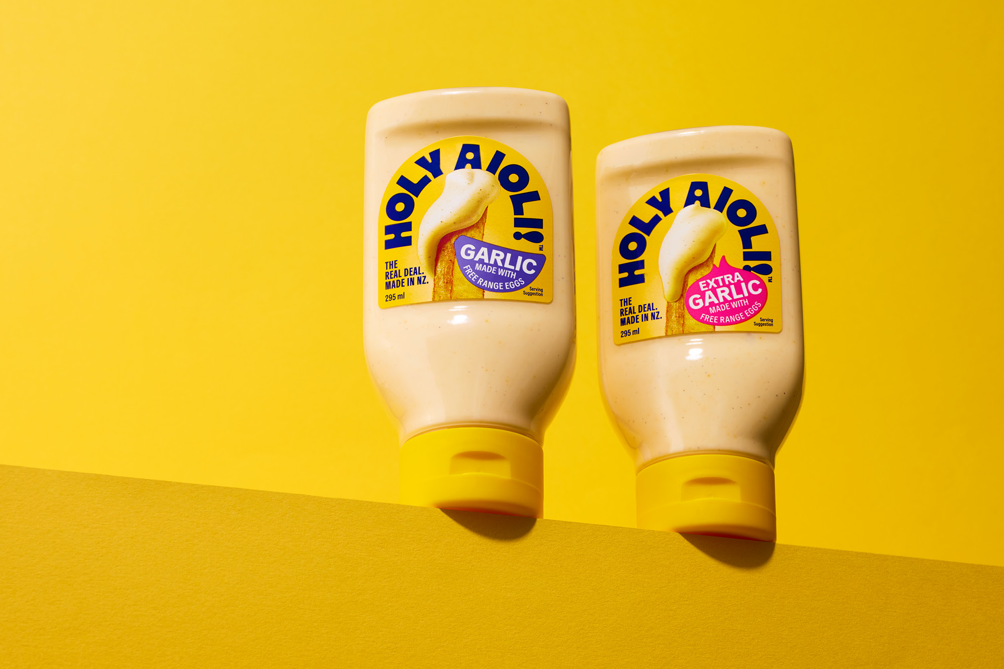
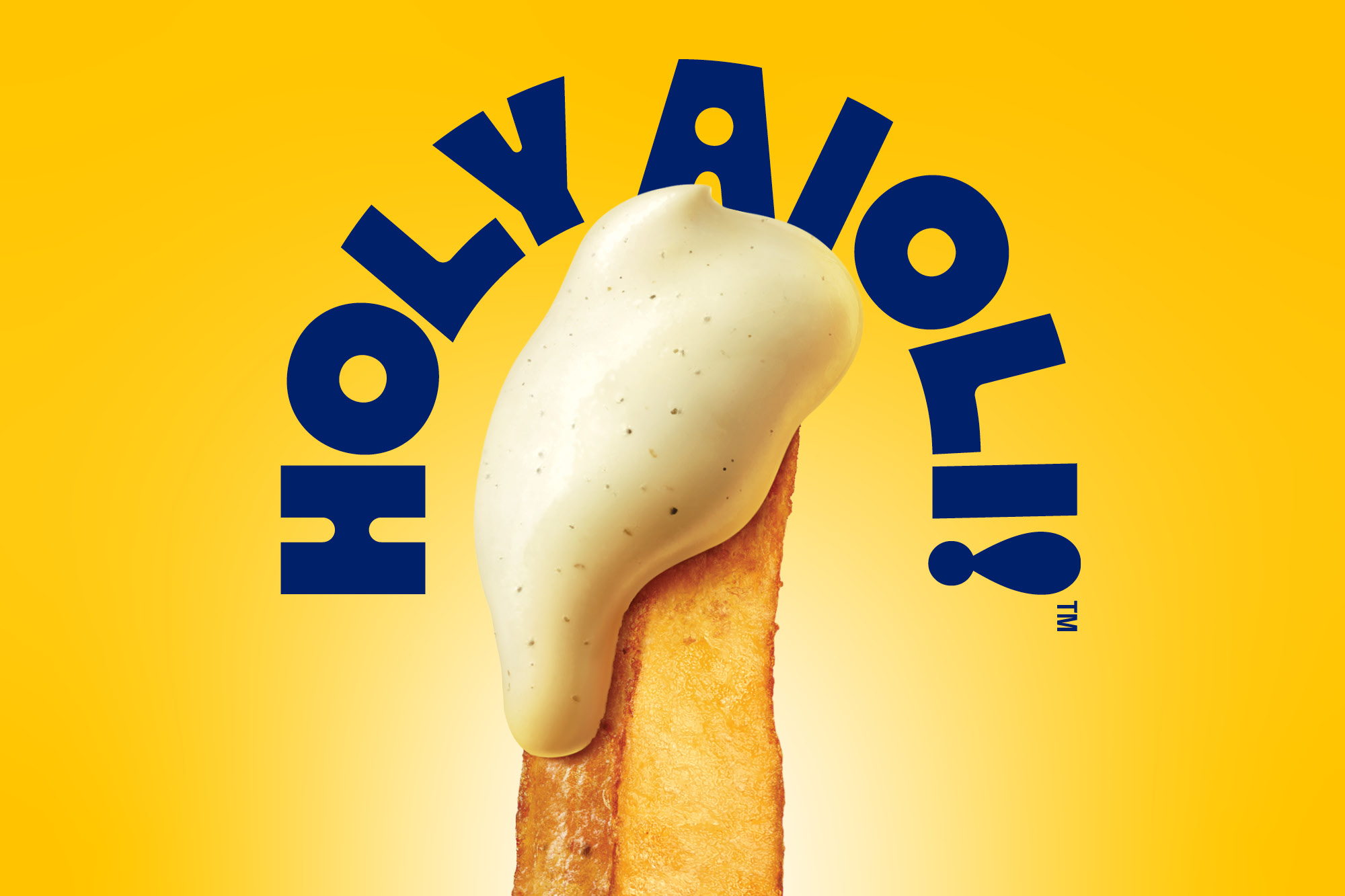
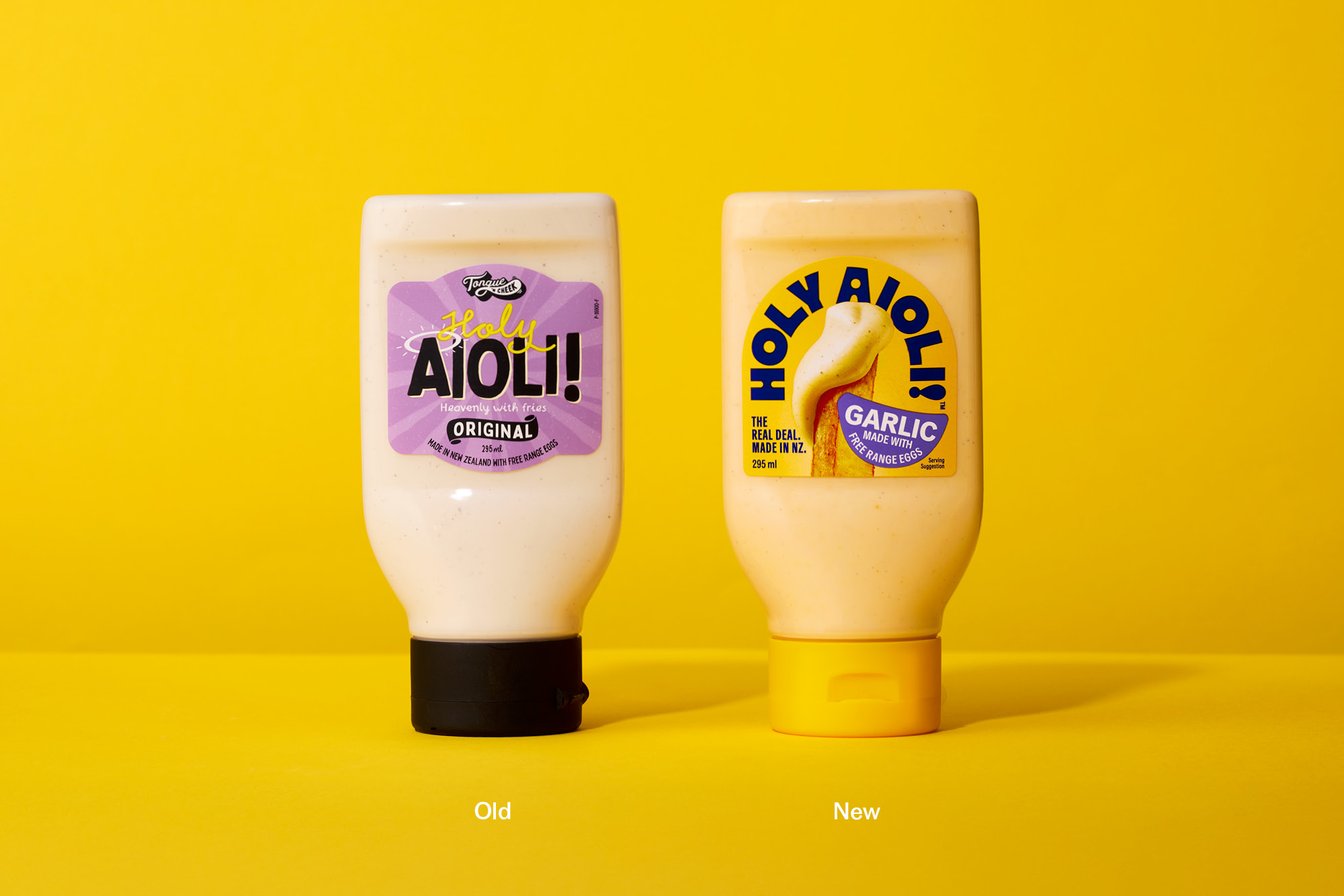
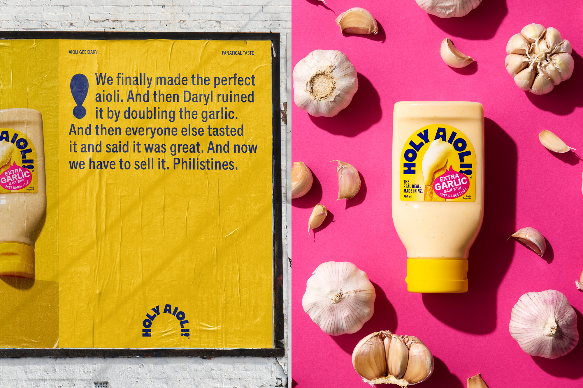
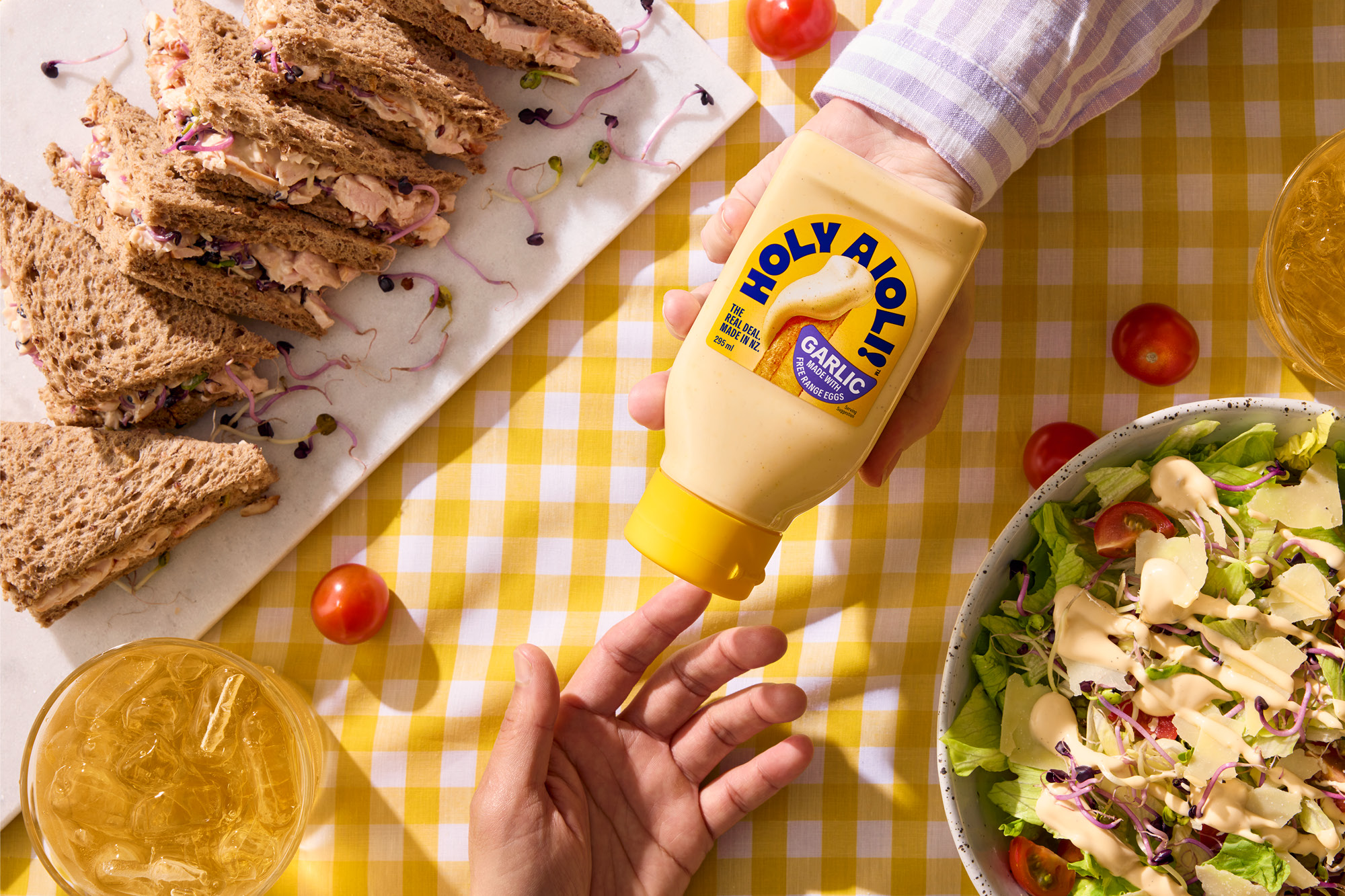
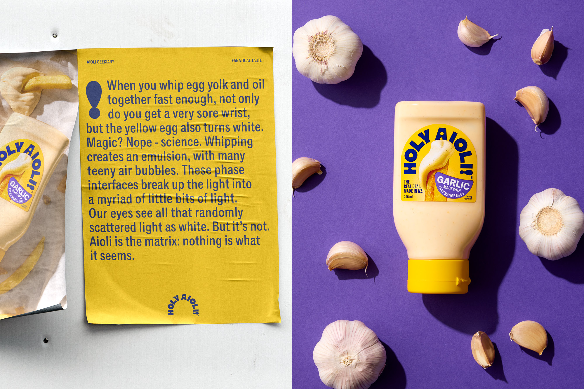
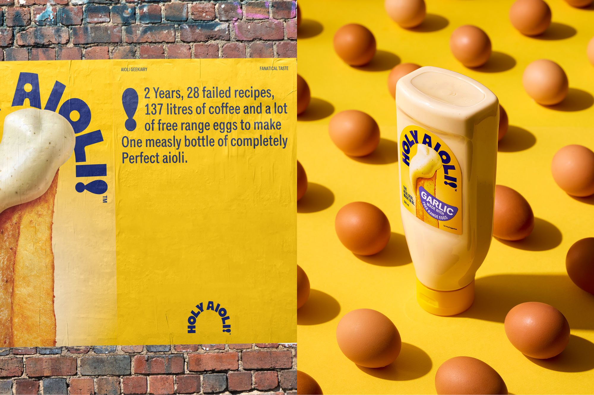
However, it lacked the desired impact, and there was a distinct misunderstanding about that brand’s name. Our work revolved around recapturing the reason why it was created in the first place: the simple notion of an aioli that is so good, tasty and creamy that it elevates the experience of eating the humble New Zealand chip to an unforgettable foodie moment. The brand became Holy Aioli, a simple all-in-one statement with so much inbuilt character to confidence, which also solved the issue of what the brand was called for consumers and retailers. Visually, it is single-minded in its storytelling. The creamy proposition is captured by a humble chip, with a perfectly dunked creamy dollop of aioli, and is shown in all its hyperrealistic, textural and oozy glory. Both flavours have subtly different chips and aioli. The label and bottle cap colour fully embrace a sunshine yellow, inspired by the free-range eggs that are a core ingredient. Simple, brightly coloured ingredient-shaped stickers define flavours. All other superfluous information has been deleted, so the focus is fully on the image. The label shape was even amended, the arched shape echoes the new typography to focus attention on the proposition.
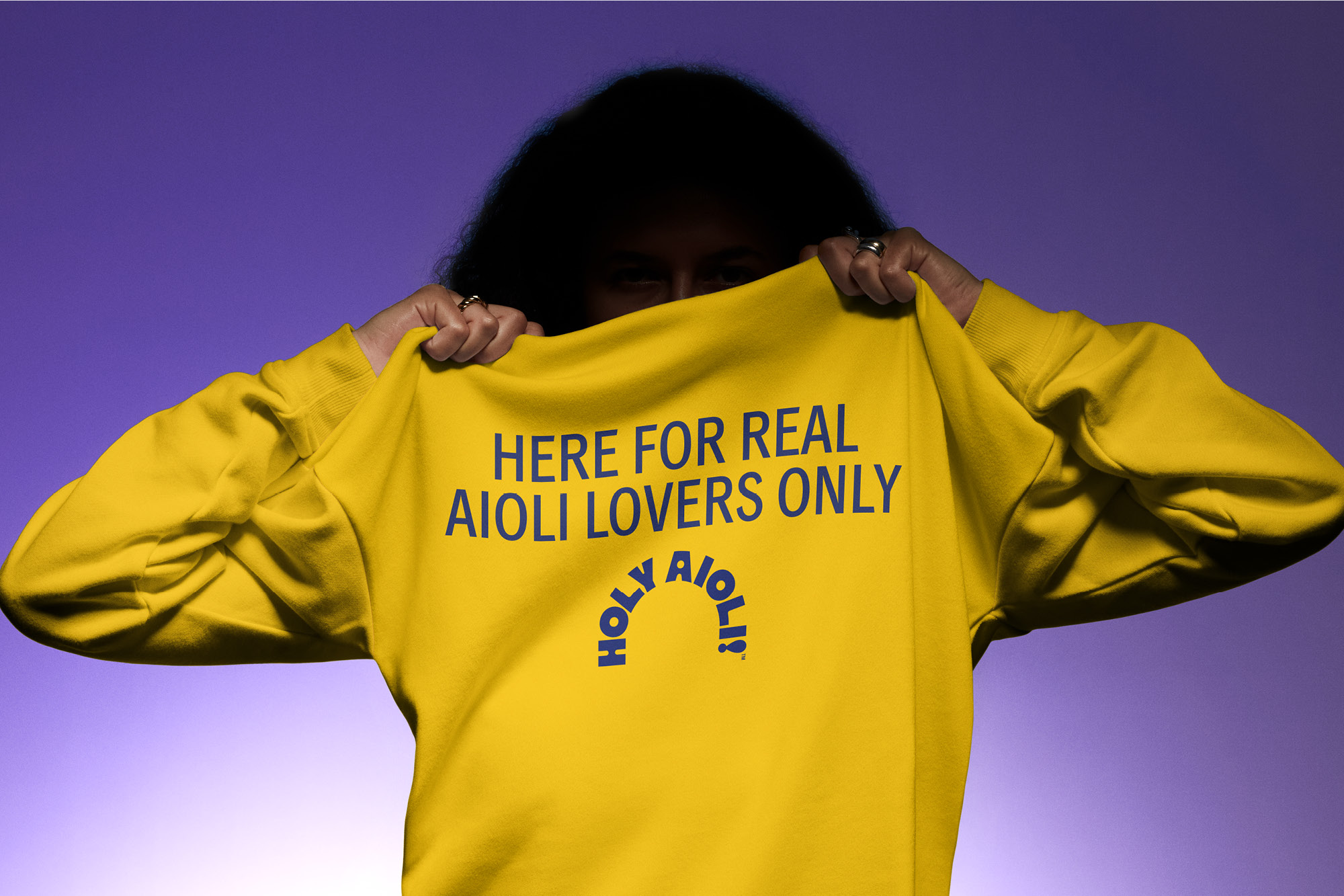
Tone-of-voice on and off pack is proudly geeky and obsessive, referencing how the aioli is made, what real aioli is, and why Holy Aioli will never compromise.
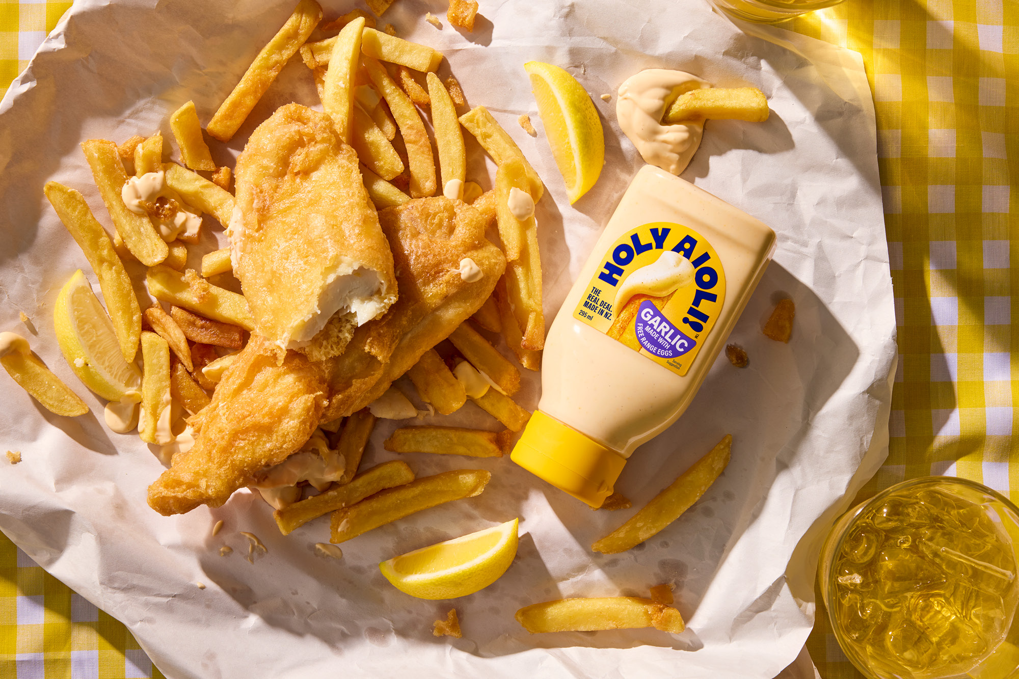
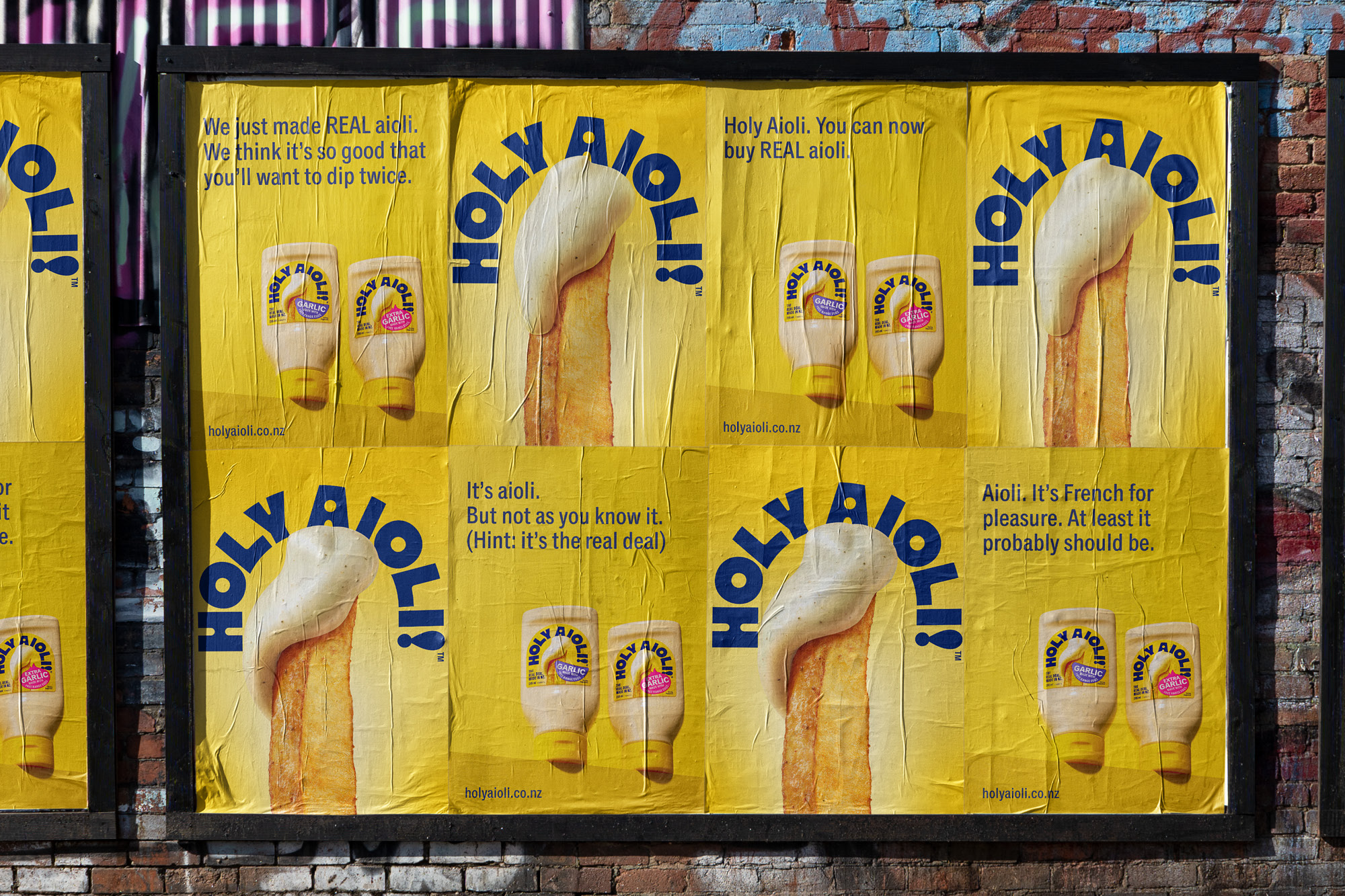
The result is an aioli on a mission: to promote what real aioli is, how it should look, and how it is made. On the shelf, it is all about the unashamedly in-your-face food porn of the perfectly dunked hot chip, as well as being an ever-so-subtle middle finger to the competition.
CREDIT
- Agency/Creative: Onfire Design
- Article Title: Onfire Design Rebrands Holy Aioli to Elevate New Zealand’s Favorite Condiment
- Organisation/Entity: Agency
- Project Type: Packaging
- Project Status: Published
- Agency/Creative Country: New Zealand
- Agency/Creative City: Onfire Design / Auckland
- Market Region: Oceania
- Project Deliverables: Art Direction, Brand Creation, Brand Mark, Brand Rejuvenation, Brand Strategy, Brand Tone of Voice, Illustration, Logo Design, Packaging Design, Typography
- Format: Bottle
- Industry: Food/Beverage
- Keywords: Packaging, Colour, Condiments, FMCG, Illustration, Hyper-realistic, Yellow
-
Credits:
Creative Director: Matthew Grantham
Design: Natasha Alimova
Illustration: Phillip Small
Strategy: Bronwyn Williams


