


A Fusion of Tradition and Modernity
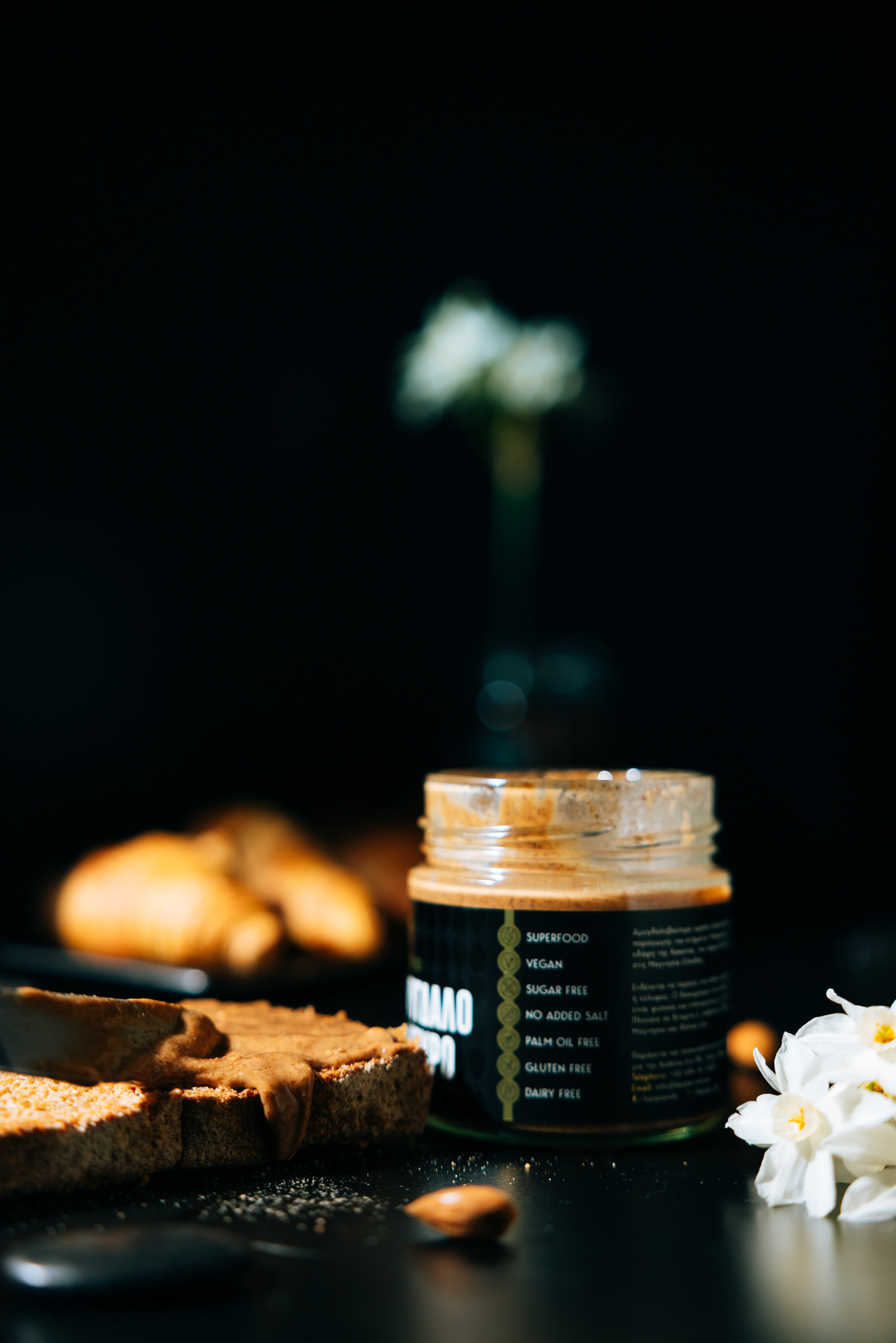
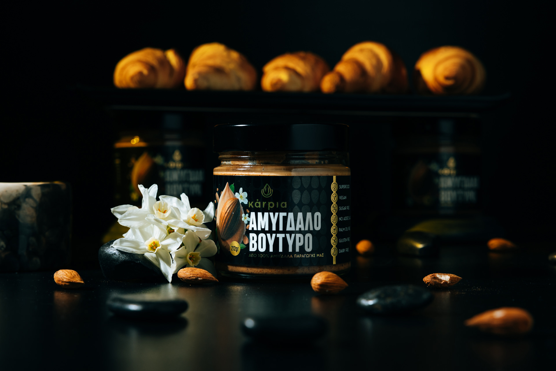
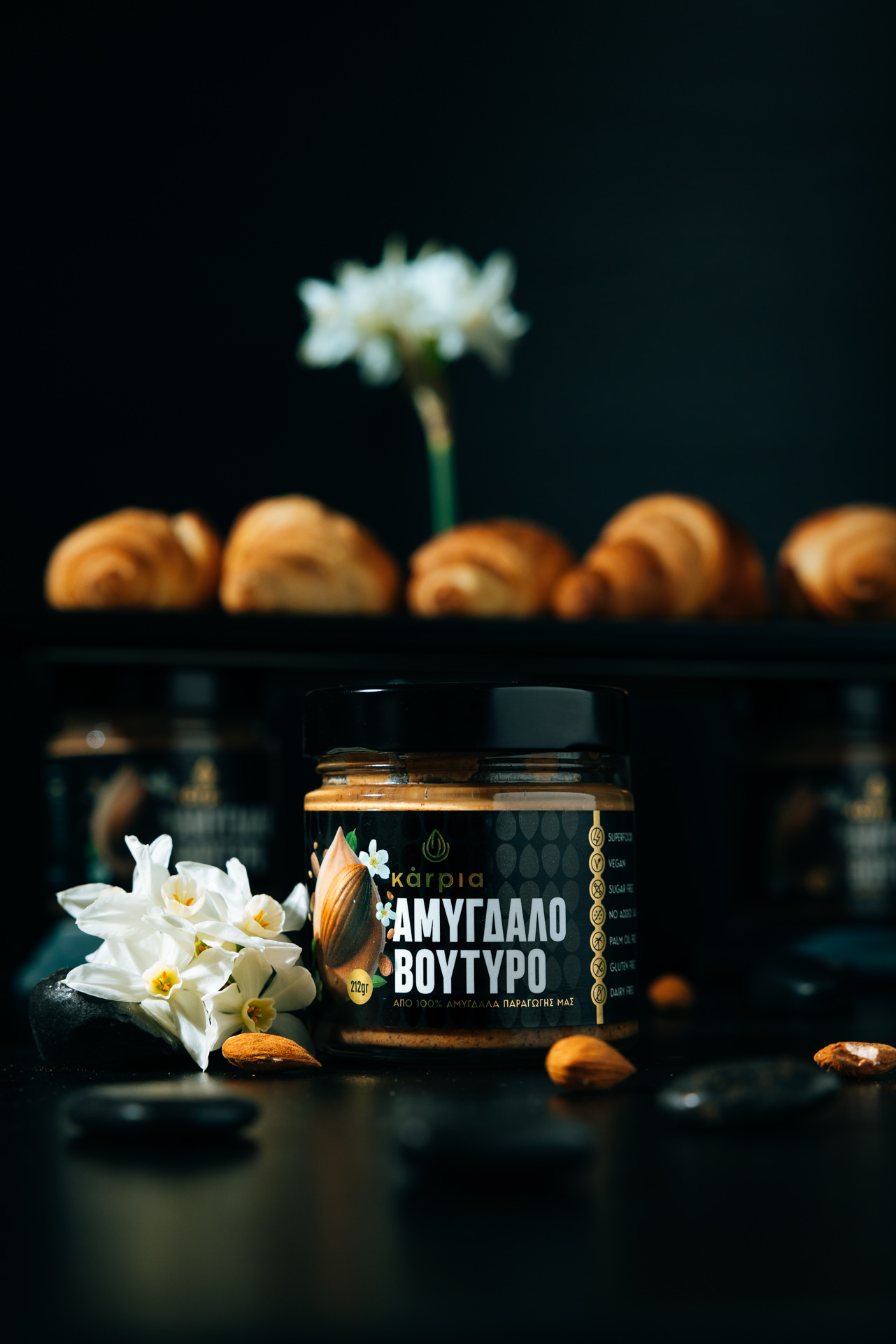
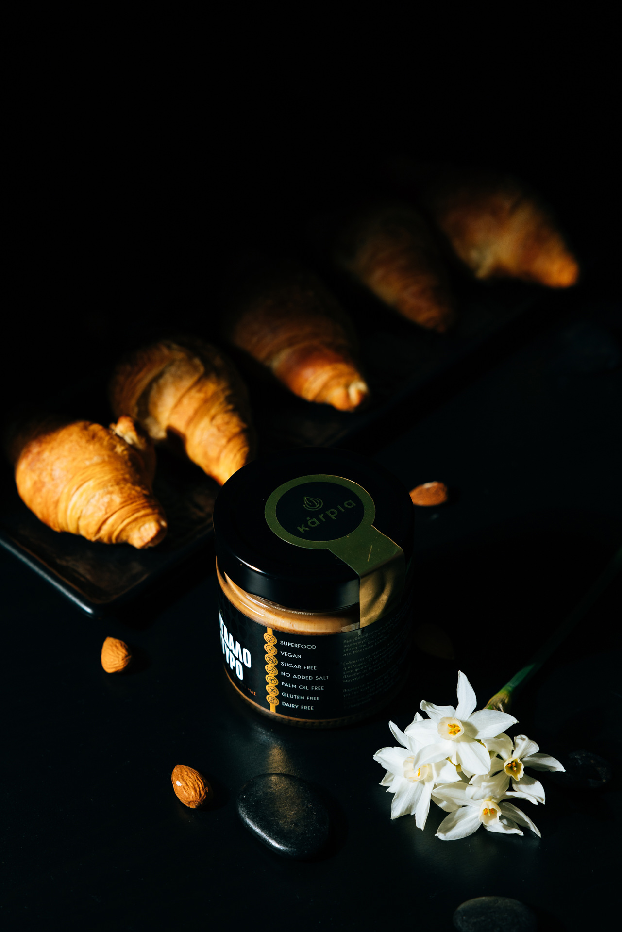
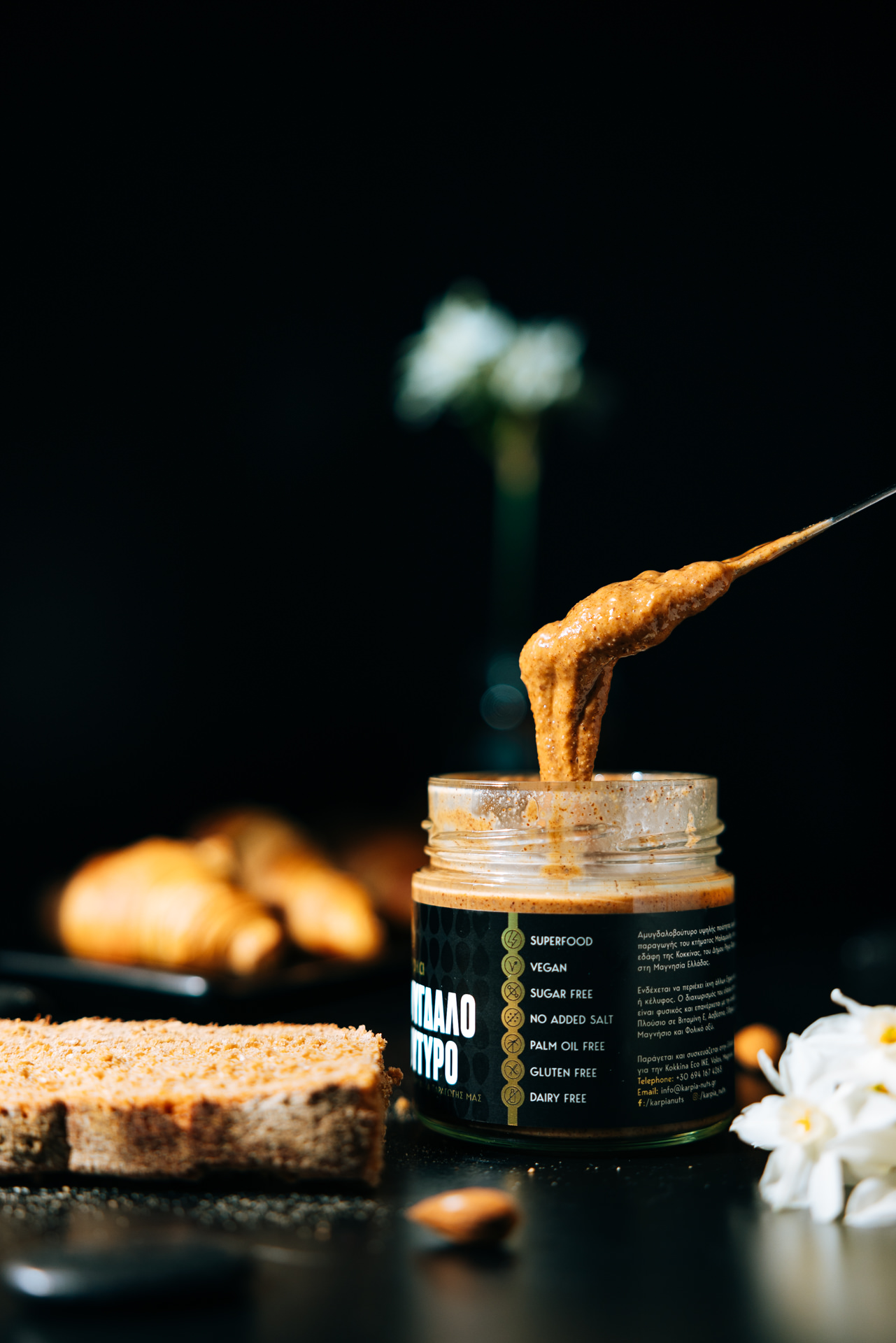
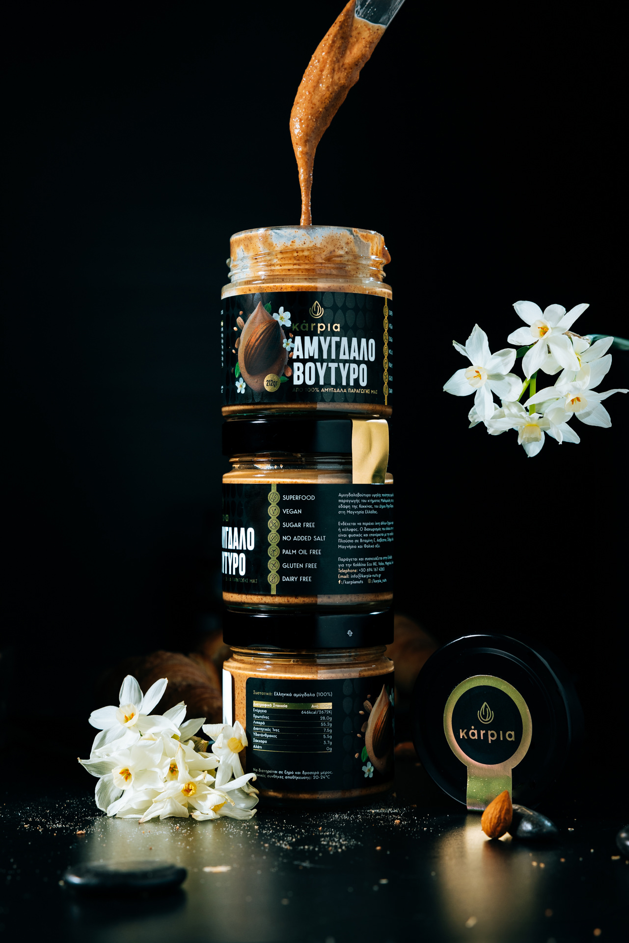
Kárpia Almond Butter’s packaging is a visual homage to both its origins in Thessaly and its commitment to quality. The sleek black label, accented with gold detailing, conveys sophistication while maintaining a connection to the earthiness of the almonds within. The brand’s name, Kárpia, is presented in a refined, minimalist font, exuding contemporary elegance while remaining true to the authenticity of its Greek roots.
The use of Greek script for “ΑΜΥΓΔΑΛΟ ΒΟΥΤΥΡΟ” (Almond Butter) pays tribute to the product’s heritage, reinforcing the brand’s commitment to preserving traditional craftsmanship. The juxtaposition of modern typography with this classic element creates a compelling aesthetic that appeals to both purists and those with an eye for contemporary design.
Every detail of Kárpia’s packaging tells a story. The rich, matte black background is reminiscent of the fertile soil from which the almonds are harvested, while the delicate golden accents symbolize the richness of the nuts and the warmth of the Mediterranean sun. The almond illustrations, subtly textured and meticulously placed, add a tactile quality that invites interaction, evoking the raw authenticity of handpicked almonds.
The geometric patterns that subtly frame the label hint at precision, structure, and quality—a nod to the careful, slow-roasting process that gives Kárpia Almond Butter its signature taste. These design elements are not merely decorative; they communicate the meticulous craftsmanship behind the product, reinforcing its artisanal nature.
Unlike mass-produced nut butters that come in plastic containers, Kárpia Almond Butter is encased in a premium glass jar. This choice is not only an aesthetic decision but also an intentional step towards sustainability and product integrity. Glass preserves the freshness and purity of the almond butter, ensuring that no external contaminants interfere with its natural flavors.
The jar itself has been designed with functionality and luxury in mind. Its weight conveys a sense of substance and durability, while the smooth curvature of the glass enhances the tactile experience of holding a truly premium product. The gold-rimmed lid adds an extra touch of sophistication, sealing in the quality that defines Kárpia.
Great packaging extends beyond visual appeal—it engages all the senses. Kárpia Almond Butter achieves this through texture, contrast, and material selection. The matte finish of the label against the glossy gold details creates a striking contrast, while the subtle embossed elements invite touch, making the experience of holding the jar as indulgent as the almond butter itself.
The choice of a minimalist yet bold color palette ensures that the jar stands out on the shelves, instantly recognizable among generic alternatives. The deep black background not only exudes luxury but also serves as the perfect canvas to highlight the golden elements, making the design both eye-catching and timeless.
Typography plays a crucial role in Kárpia’s brand identity. The balance between modern, sans-serif fonts and the elegant Greek script creates a sense of timelessness. The brand name is prominently displayed in a bold yet refined typeface, exuding confidence and sophistication. Meanwhile, the smaller, delicate lettering used for product details conveys transparency and authenticity.
Typography is more than just a design choice; it influences how the consumer perceives the brand. The carefully curated font styles and spacing evoke a sense of craftsmanship, reinforcing the brand’s artisanal philosophy. The contrast between thick, bold lettering and delicate script elements enhances readability while adding a touch of classic refinement.
Beyond aesthetics, Kárpia Almond Butter’s packaging is designed with sustainability in mind. The use of recyclable glass and minimalistic labeling reduces environmental impact, reflecting the brand’s commitment to ethical and responsible production. The durability of the glass jar also encourages repurposing, whether as a storage container or a decorative element in the kitchen.
By avoiding excessive plastic and non-recyclable materials, Kárpia reinforces its philosophy of purity—not just in its ingredients, but in every aspect of its production and presentation. Consumers who choose Kárpia Almond Butter are not just indulging in a luxurious product; they are making a conscious choice for sustainability and quality.
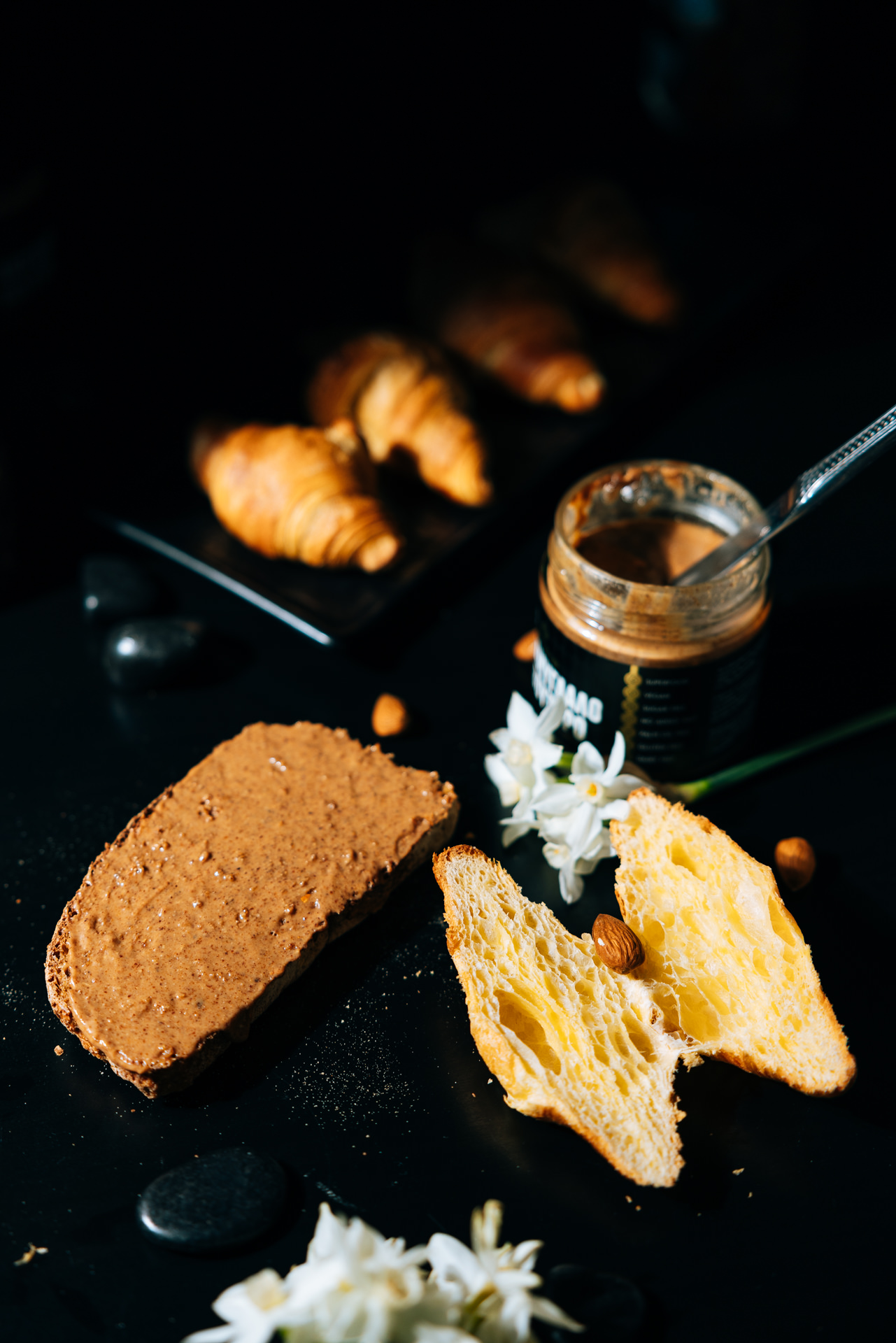
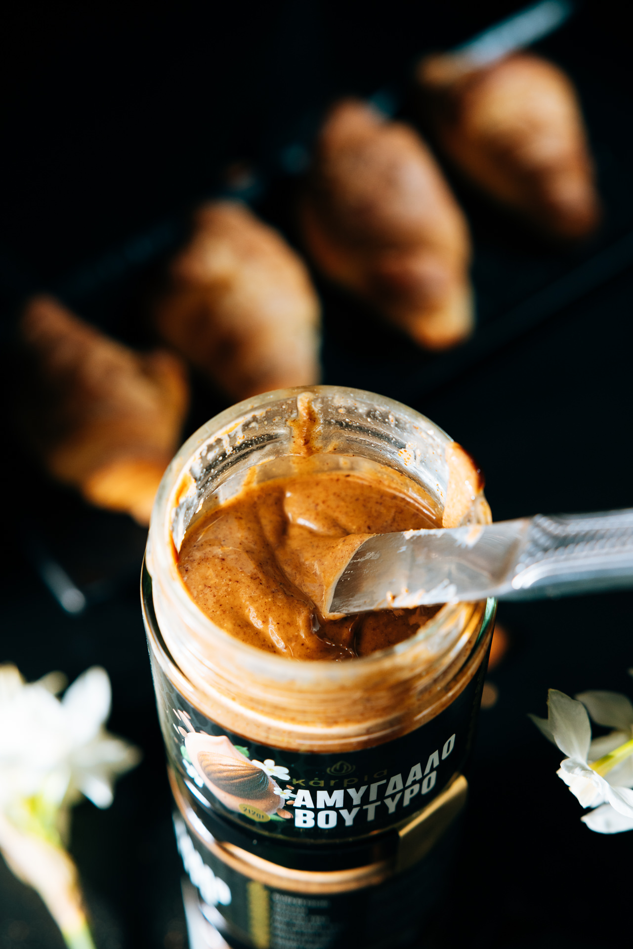
From the moment one picks up a jar of Kárpia Almond Butter, the experience begins. The weight of the glass, the cool touch of the matte label, and the smoothness of the gold detailing all contribute to a feeling of luxury. The lid opens with a satisfying twist, revealing the aroma of roasted almonds—pure, rich, and inviting. The sensory experience continues with the first taste: a smooth, creamy texture that melts on the tongue, embodying the artisanal craftsmanship promised by the packaging.
Every aspect of the design has been crafted to heighten this multi-sensory journey. The visual elegance of the packaging aligns with the rich, indulgent experience of consuming the almond butter, ensuring that the product delivers on every sensory level.
The food industry is saturated with nut butters, yet Kárpia stands out through its thoughtful packaging. In a market where many brands rely on bright colors and excessive text to capture attention, Kárpia’s minimalist, refined approach speaks volumes. The combination of black and gold, along with the choice of glass, immediately sets it apart as a premium offering.
While mass-market brands often prioritize functionality over aesthetics, Kárpia proves that the two can coexist. The sturdy yet elegant glass jar provides practical benefits—preserving freshness and allowing for easy reuse—while the sophisticated design makes it a product worthy of display. This balance between form and function is a key factor in establishing Kárpia as a leader in the premium almond butter category.
Luxury packaging is not just about aesthetics—it has a profound psychological impact on consumers. Studies show that premium packaging influences perception, making a product feel more valuable and desirable. The weight of the glass, the richness of the colors, and the refined typography all contribute to an emotional response that enhances the consumer’s connection to the brand.
By investing in high-quality packaging, Kárpia creates an experience that extends beyond the moment of purchase. It transforms a simple act—spreading almond butter on toast—into a ritual of indulgence. The packaging enhances the product’s perceived value, making it an ideal gift or an everyday luxury for those who appreciate the finer things in life.
Kárpia Almond Butter’s packaging is more than just a vessel for its contents—it is an integral part of the brand’s story. It captures the essence of Thessaly’s rich agricultural heritage while embodying modern sophistication. Every design element, from the bold typography to the intricate detailing, reflects the care and craftsmanship that go into every jar.
For those who appreciate both substance and style, Kárpia Almond Butter offers more than just a gourmet spread. It presents an experience—one that begins the moment the jar is seen, held, and opened. In a world where packaging often feels disposable, Kárpia has created something enduring: a design that honors the past, embraces the present, and elevates the simple act of enjoying almond butter into an art form.


CREDIT
- Agency/Creative: Circus Design Studio
- Article Title: Circus Design Studio Blends Greek Heritage with Modern Elegance for Kárpia Almond Butter Packaging
- Organisation/Entity: Agency
- Project Type: Packaging
- Project Status: Published
- Agency/Creative Country: Greece
- Agency/Creative City: Volos
- Market Region: Europe
- Project Deliverables: Art Direction, Brand Experience, Brand Identity, Brand Strategy, Branding, Graphic Design, Identity System, Packaging Design
- Format: Jar
- Industry: Food/Beverage
- Keywords: nuts, almond, butter, premium, product, label, gold, foil, black, luxury
-
Credits:
Phootographer: Mike Chatzigiannis


