


The philosophy of the brand Radioactive Water
Radioactive water is an energy drink that ignites a spark inside everyone who is ready to go beyond the ordinary and experience a real burst of energy! Inspired by the spirit of experimentation and discovery, the brand embodies the desire for the new and unknown. Life shouldn’t be too serious. Each medicine-like bottle contains an invigorating drink. This is your “cure” for fatigue, which will help you not only stay energetic, but also smile even on the hardest days.
Brand idea
Energy From The Depths Of The Periodic Table
Target audience
Radioactive water is a drink for those who long to feel alive, boldly discovering a new level of energy, but at the same time absolutely safe for health. The brand was created for an audience that appreciates innovation and unusual products.
Historical Connection
Radioactive Water draws inspiration from history, in particular from one of the most unusual products of the 20th century — the energy drink “Radiator”, presented by Bailey Radium Laboratories in 1918. At a time when humanity was striving to conquer new horizons, danger was part of the game. The radiator contained real radium, which led to tragic consequences. We learned the lessons of the past and created something revolutionary, safe and truly exciting.
Packaging Features
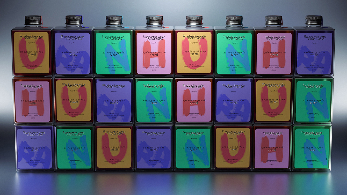
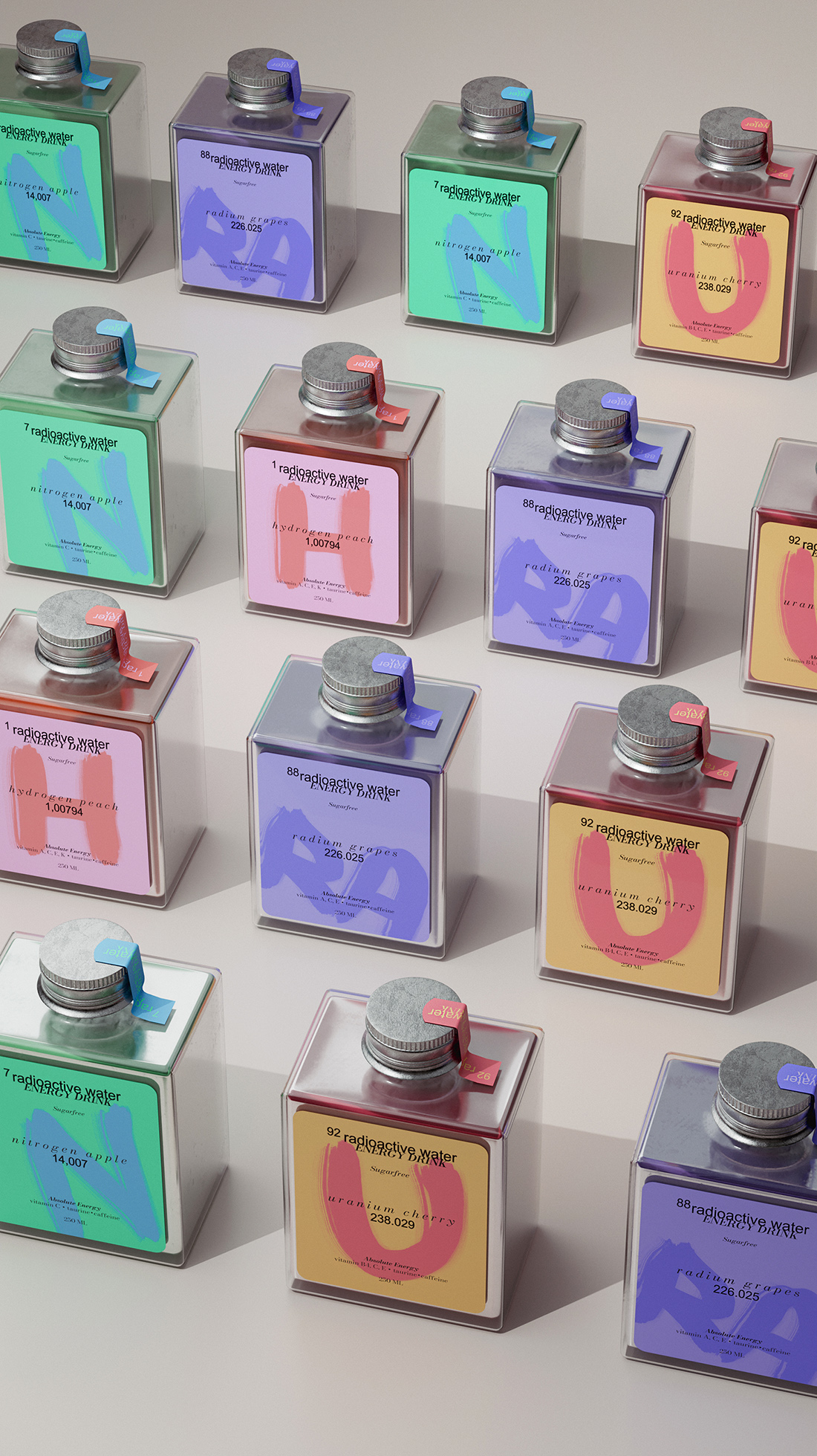
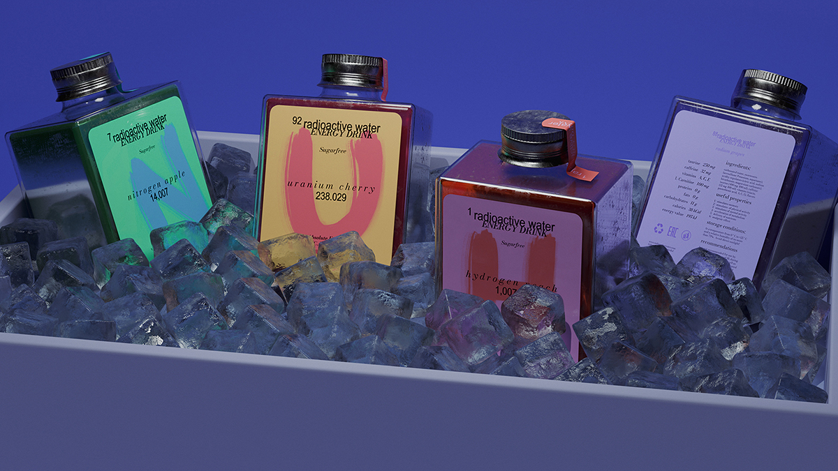
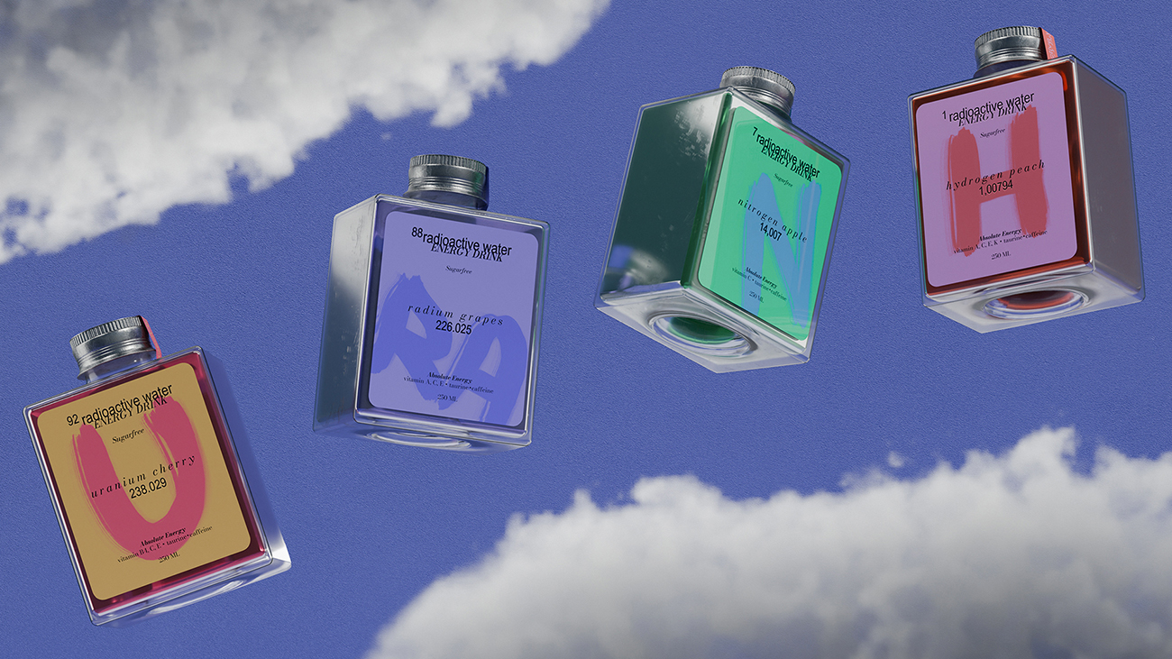
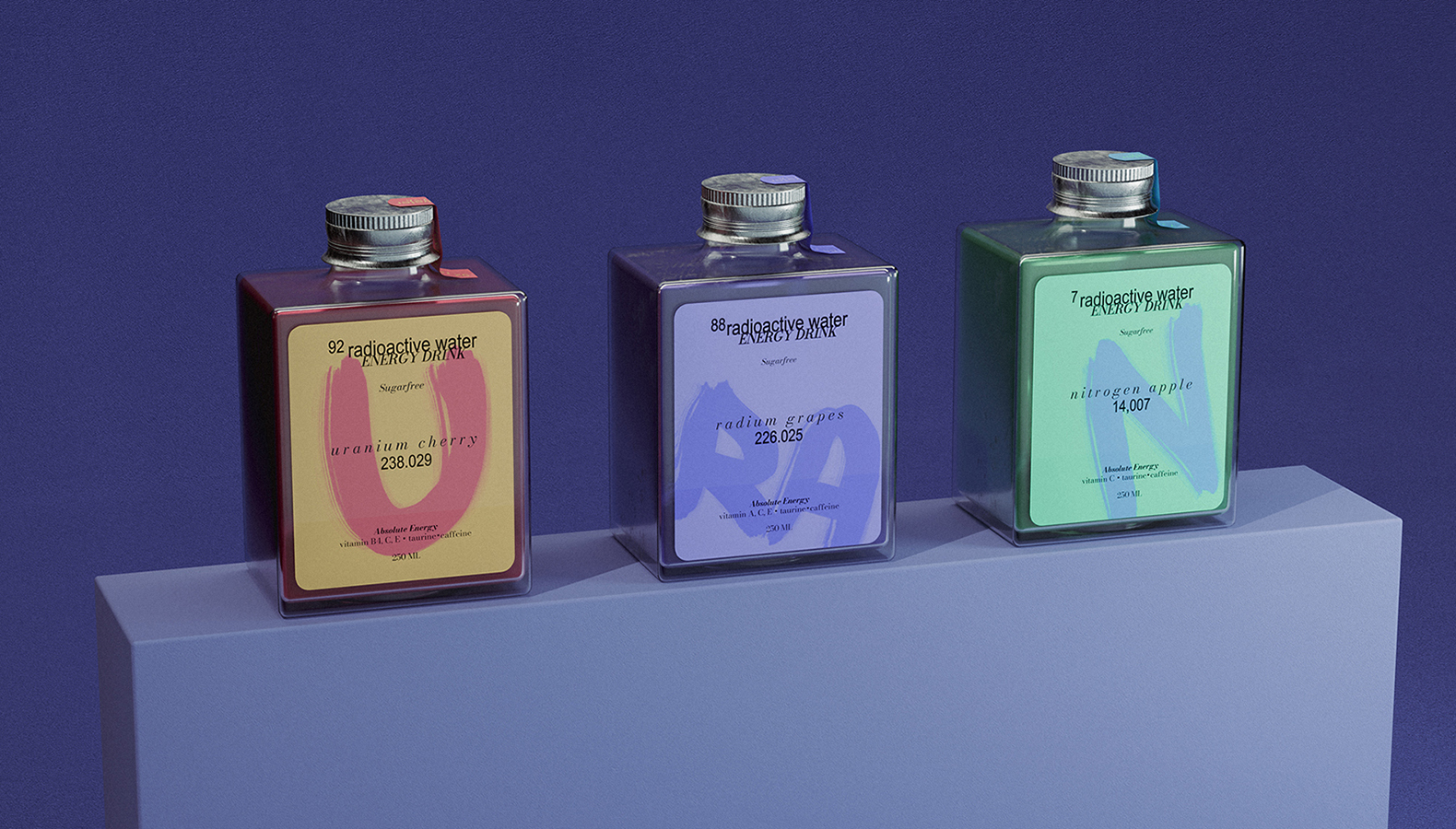
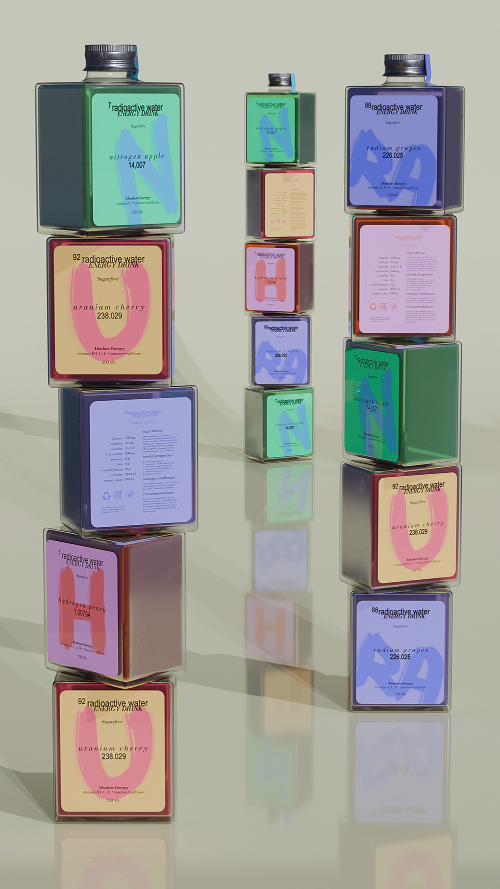
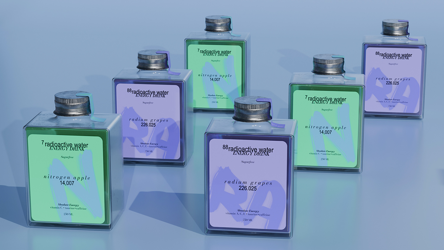
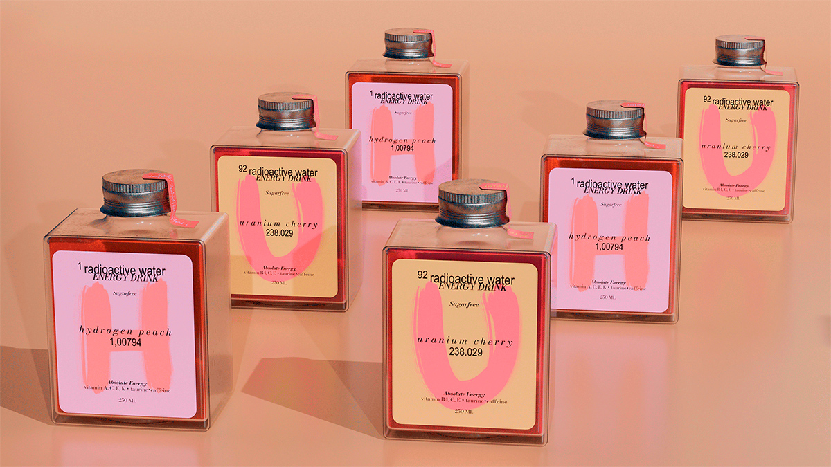
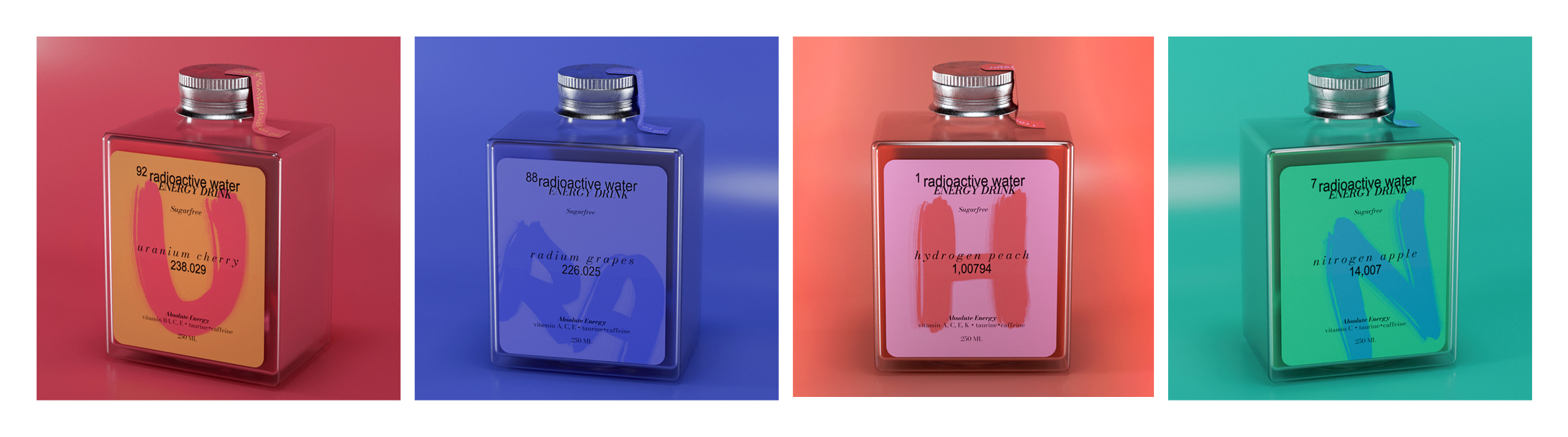
The entire series is based on contrasting colors and atypical bottle shapes. Each label is dominated by large letters and chemical elements with indexes. Names such as “uranium cherry”, “hydrogen peach”, “radium grapes”, and “nitrogen apple” are used in the descriptions of flavors, which reinforces the connection with scientific and radioactive topics. Form factor: bottles of the same geometric shape with a hole at the bottom. This form allows you to overlay them on top of each other, together they create an association with the periodic table. This visually stands out on the shelf in the store and supports the brand concept. These solutions create the impression of a “super-powerful” energy drink that offers something more than standard energy drinks.
CREDIT
- Agency/Creative: Sofya Grazhevich
- Article Title: Branding and Packaging Design for Radioactive Water Energy Drink by Student Sofya Grazhevich
- Organisation/Entity: Student
- Project Type: Packaging
- Project Status: Published
- Agency/Creative Country: Russia
- Agency/Creative City: Moscow
- Market Region: Europe, Global
- Project Deliverables: 3D Modelling, Art Direction, Brand Design, Graphic Design, Packaging Design
- Format: Bottle
- Industry: Food/Beverage
- Keywords: Energy drink, Science, Humor, Soft drinks, Typography, Packaging, Bottle
-
Credits:
Designer: Sofya Grazhevich
Curator: Leonid Slavin
3D-Modeller: Dmitry Avdeev
Tutor: Yevgeny Razumov


