


The Path — Your Guide to Nature and Unforgettable Experiences
The Path (Путь) is not just a travel agency; it’s a journey through the most breathtaking landscapes of Russia, blending nature, adventure, and emotion. We craft unique tours that focus on exploring extraordinary natural wonders—whether it’s the volcanoes of Kamchatka, endless steppes, or snow-capped peaks. The Path is your guide, helping you not just to see, but to feel, experience, and cherish every moment.
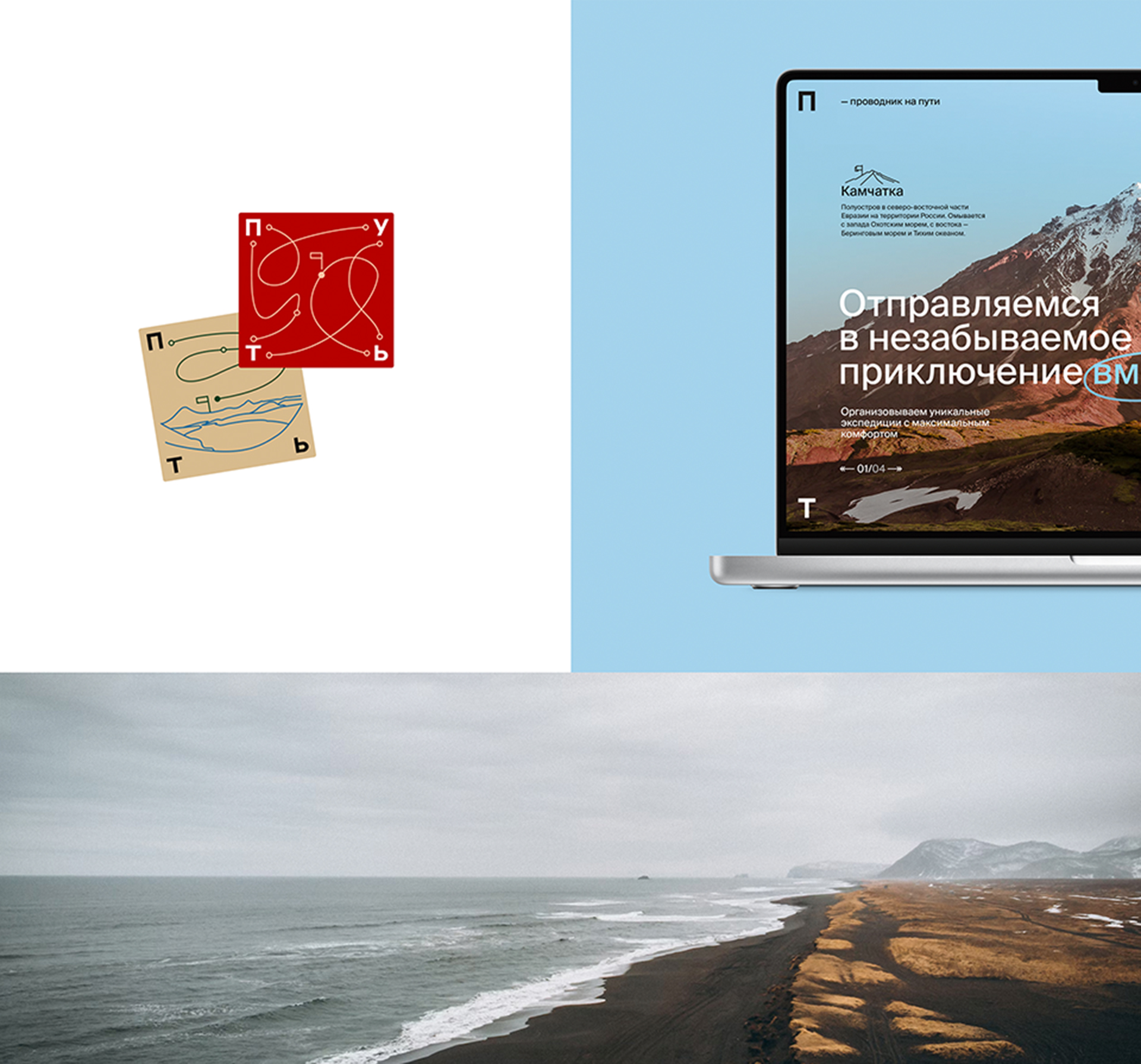
Identity That Tells Stories
When creating the brand identity, we drew inspiration from its core idea—The Path as a journey filled with emotions, impressions, and memories. The visual system is built around the concept of “content within the path.” It’s not just images and text; it’s stories that anyone can enrich with their own experiences.
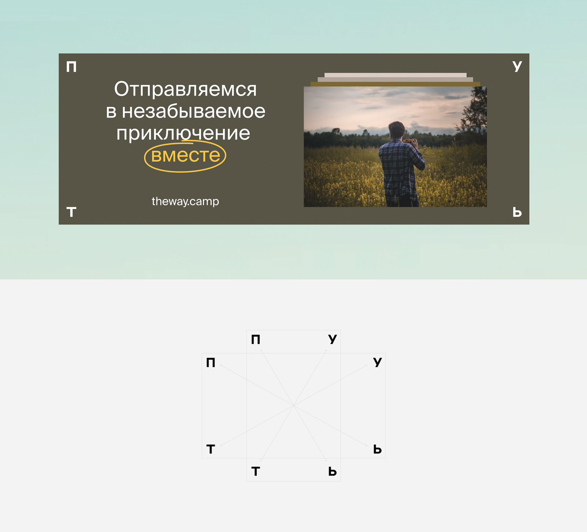
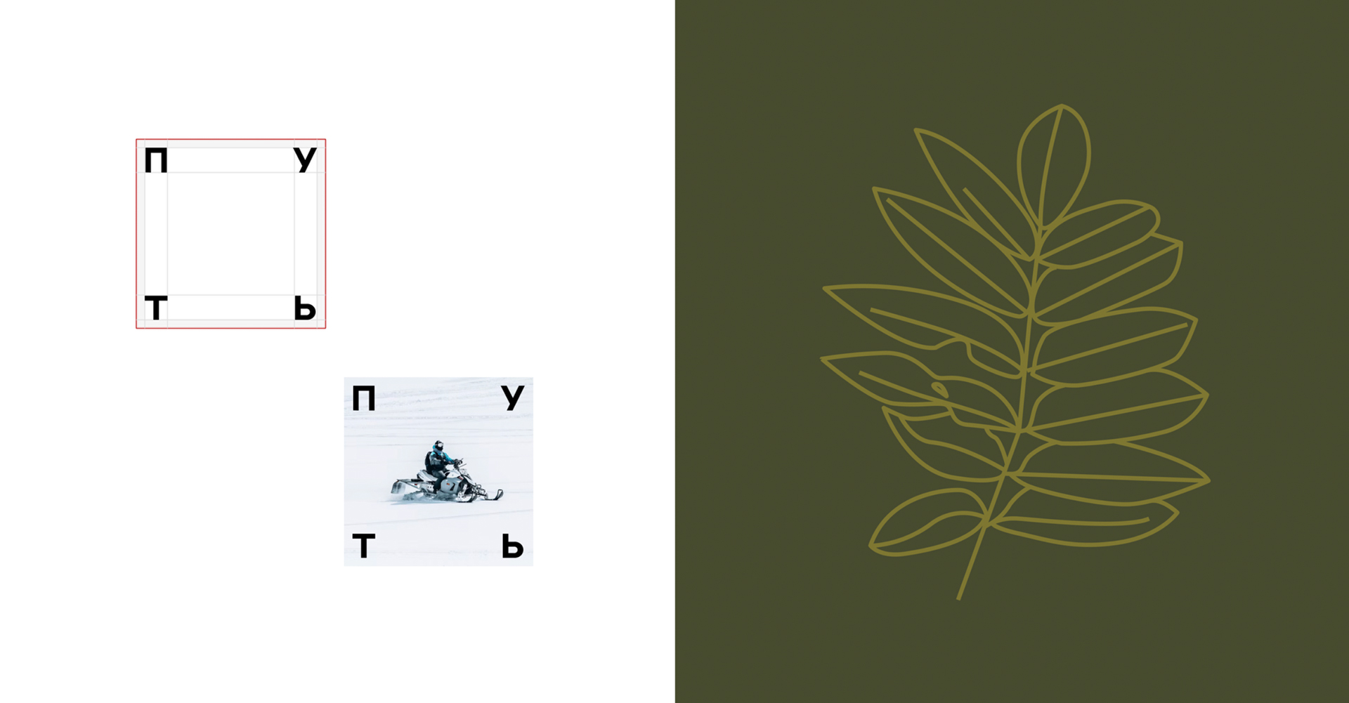
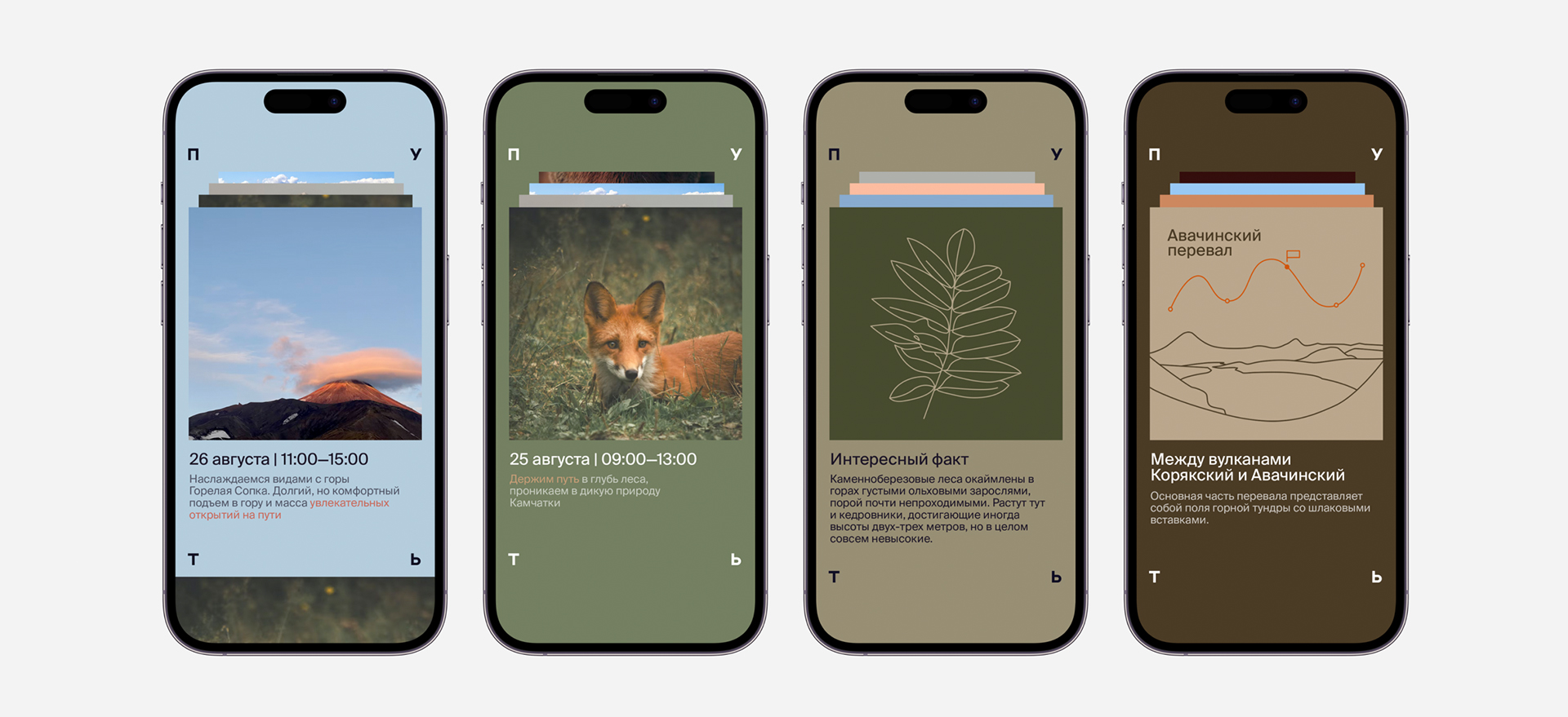
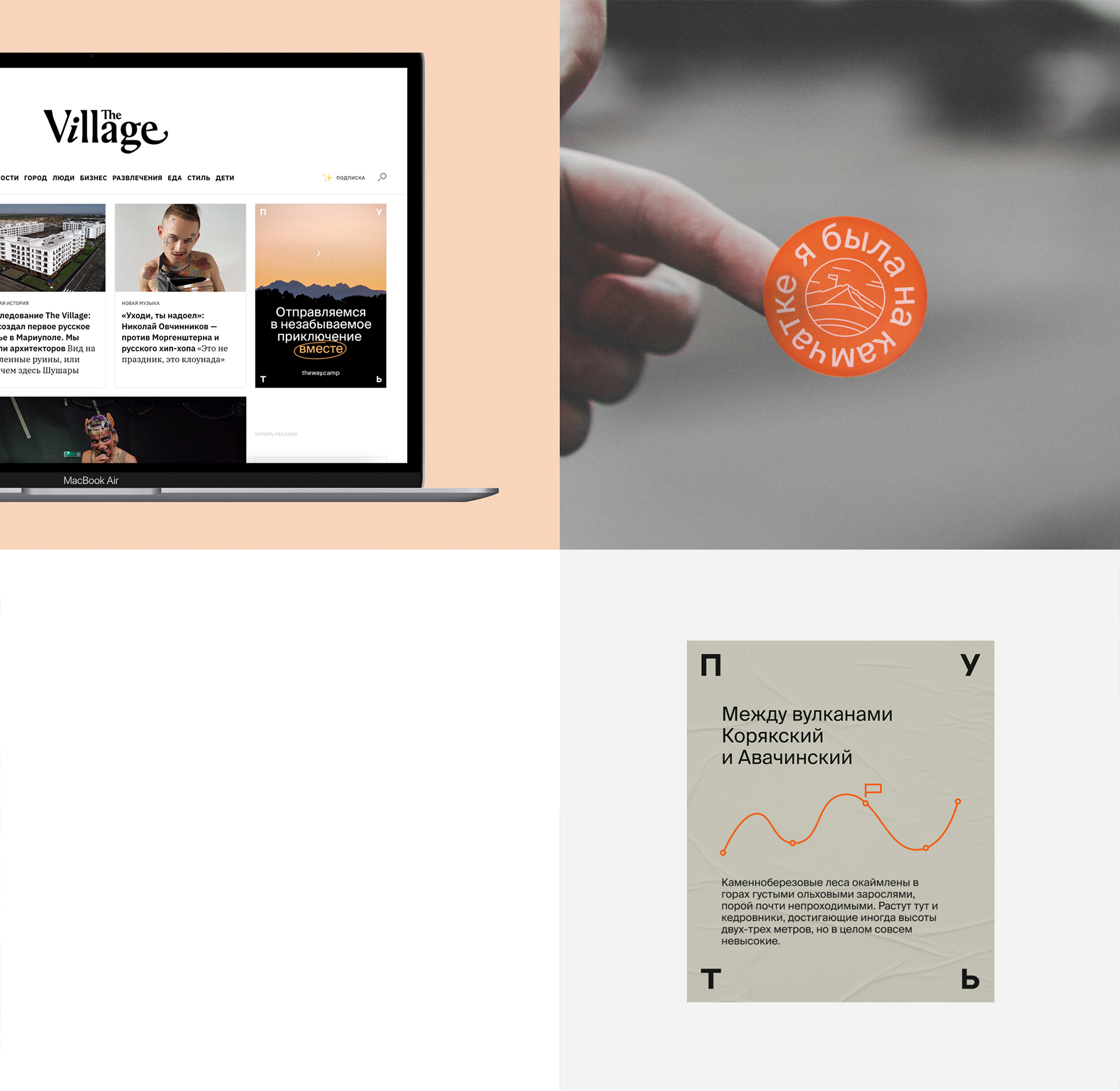
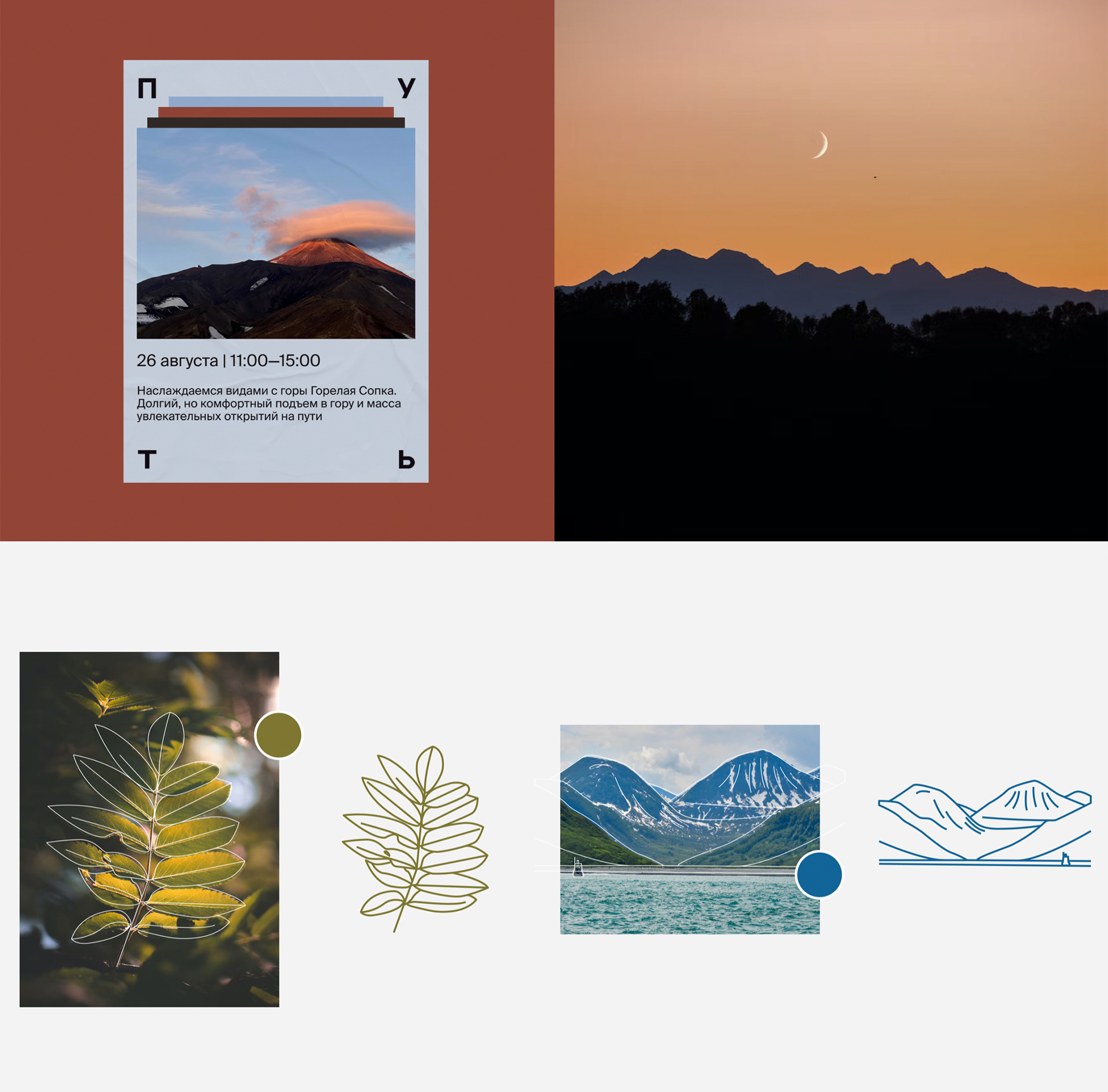
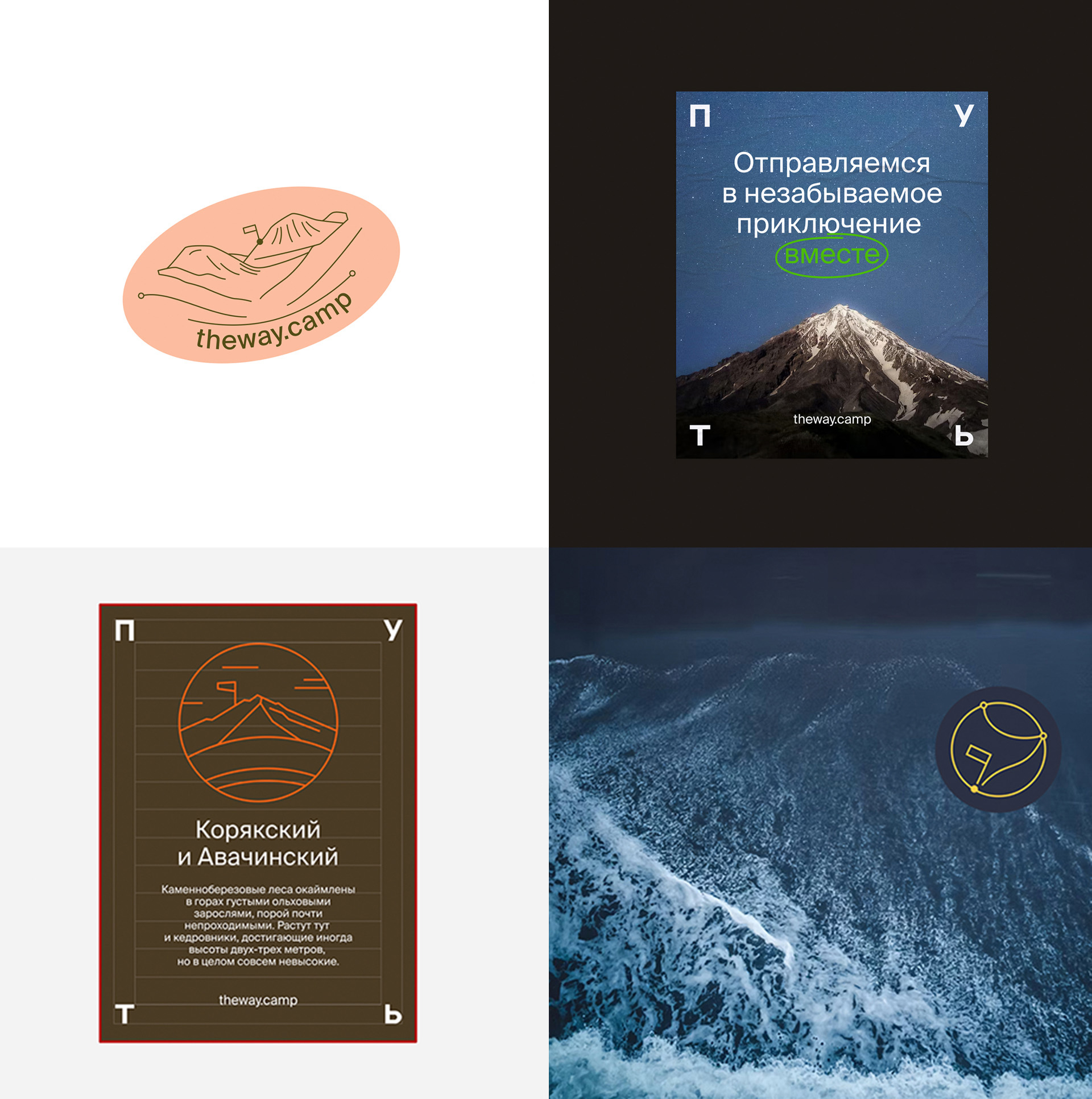
We developed a simple yet powerful scaling system where the logo’s letters always align with the corners of the layout. This creates a sense of structure and order while leaving room for creativity. Within this space lies emptiness—a metaphor for the path itself. Each person can “draw” their own illustration, their own vision of the journey. This makes the brand alive, personal, and relatable.
Color and Form: Simplicity That Inspires
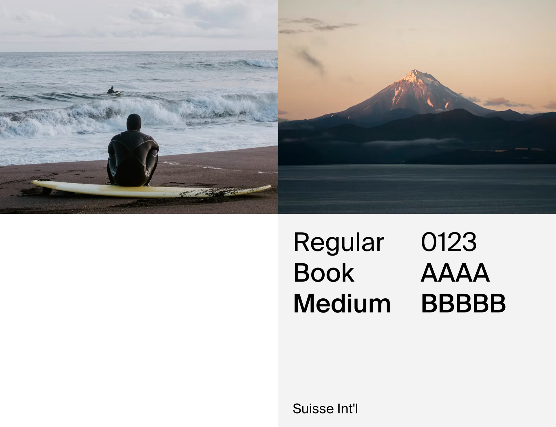
The color palette emphasizes natural beauty and authenticity. We use photos of locations as the basis for selecting colors, making each design unique and true to its origin. Images with abundant lines and textures become the focal point, transforming into illustrations that capture the spirit of the place.
We deliberately avoided complex graphic elements to highlight simplicity and accessibility. The Path is a brand that makes complex things simple. It doesn’t just show—it helps you understand, feel, and experience.
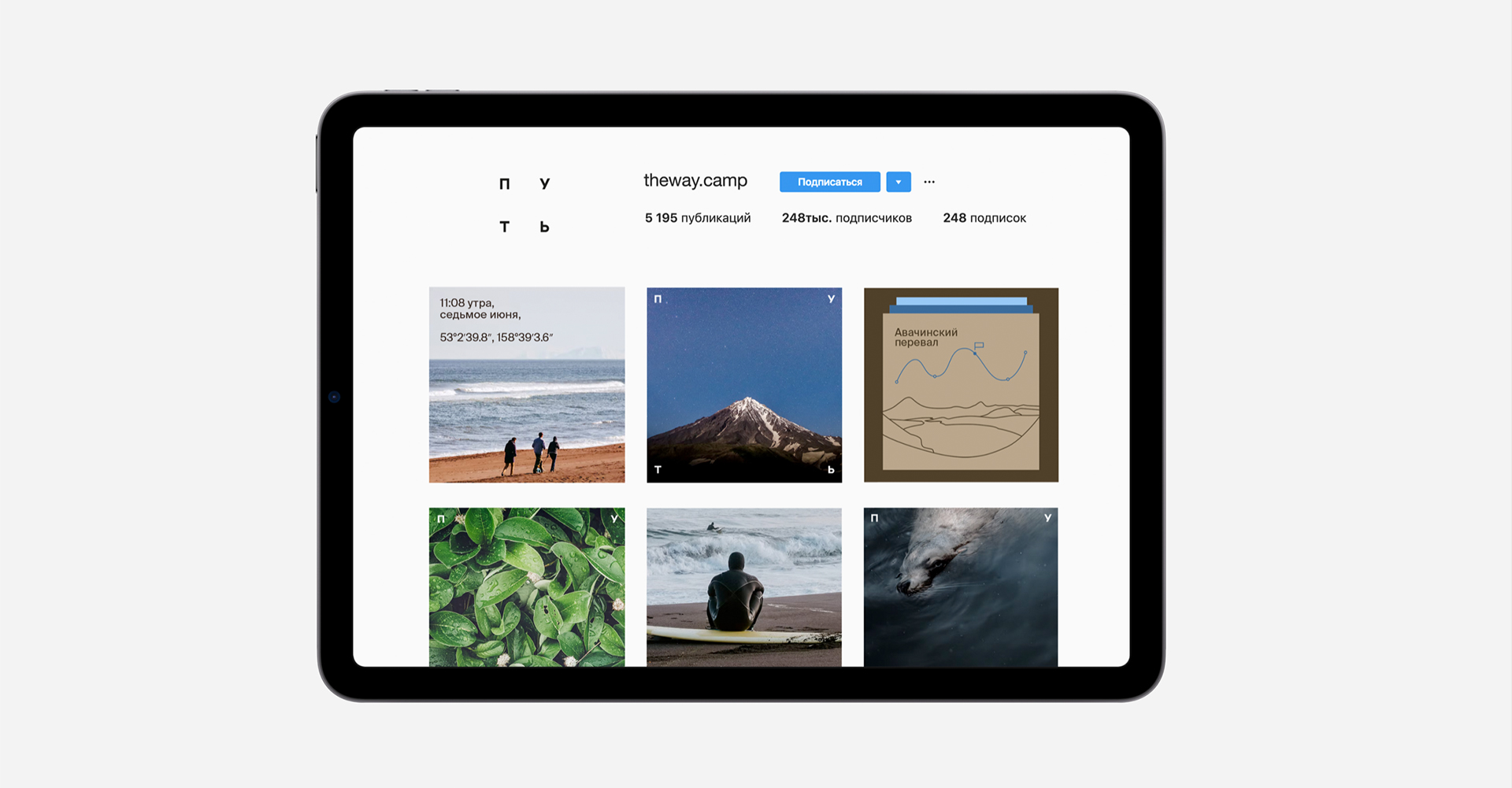
Cards as a Way to Tell a Story
One of the key elements of the system is the use of cards to tell stories. This minimalist yet powerful tool conveys emotions and impressions through text and imagery. Each card is a fragment of the journey, designed to inspire, surprise, and stay in memory.
Emotions Within, Freedom Without
The identity of The Path is more than a visual system—it’s a philosophy. We created a brand that speaks to its audience through emotions and experiences. It doesn’t impose; it invites. It doesn’t limit; it inspires. Inside, there’s emptiness—a space for your own path. Outside, there’s simplicity and clarity, making the brand recognizable and relatable.
Why It Works
We designed a system that grows and evolves with the brand. It scales, adapts, and remains relevant in any context. It’s not just a logo and colors—it’s a tool that helps the brand communicate with its audience, inspire them, and lead the way.
The Path is a brand that turns travel into something personal, emotional, and unforgettable. We’re proud to have conveyed this idea through an identity that’s not just a visual language but an integral part of the brand’s philosophy.
Our Approach: Making Complexity Simple
Our work on The Path’s identity is the result of a deep dive into the brand’s values and its audience. We created a visual system that helps the brand speak to people through emotions and experiences. Our approach combines strategic thinking and creative execution, delivering solutions that work in the long term.
If you value an identity that’s not just beautiful but meaningful, let’s discuss how we can help. We specialize in turning ideas into visual stories that inspire and resonate.
The Path: Where Cyrillic Meets Journey
The word “Путь” (Path) is more than just a name—it’s a symbol. Written in Cyrillic, it carries the essence of a journey, a movement, a discovery. In English, it translates to “Journey,” but its roots go deeper, evoking a sense of exploration and personal growth. This duality is at the heart of the brand: a bridge between cultures, a guide through uncharted territories, and a reminder that every journey is unique.
The Path begins here. Let’s walk it together.

CREDIT
- Agency/Creative: mål
- Article Title: The Path: Where Every Journey Begins with a Single Step and a Stunning Identity by mål
- Organisation/Entity: Agency
- Project Type: Identity
- Project Status: Published
- Agency/Creative Country: Russia
- Agency/Creative City: Perm
- Market Region: Europe
- Project Deliverables: Brand Design
- Industry: Entertainment
- Keywords: BrandIdentity VisualSystem MinimalistDesign EmotionalBranding StorytellingDesign CyrillicTypography NatureInspired ScalableDesign CreativeDirection JourneyBranding
-
Credits:
art director: Veronika Baida


