


Packaging design is more than just an aesthetic element; it is a crucial factor in shaping consumer perception, reinforcing brand identity, and driving purchasing decisions. In a highly competitive market, a product’s packaging can often determine its success or failure, making it essential for brands to invest in well-thought-out, strategic design solutions. When Sandhaus was commissioned to redesign the packaging for DAR Pita Chips, the challenge was clear: create a system that would not only refresh the brand’s identity but also provide a scalable and adaptable structure for future expansion. The goal was to craft a packaging solution that would stand out in retail spaces, align with modern consumer expectations, and establish DAR as a strong contender in the snack market.
The project began with an in-depth analysis of the existing packaging and its performance in retail environments. This involved a spatial study of the display cases where DAR Pita Chips were sold, observing how the product was positioned alongside competitors and how consumers interacted with it. The team closely examined visual hierarchy, shelf visibility, and the overall shopping experience to identify key areas for improvement. The research revealed that while the product itself was of high quality, its previous packaging lacked a distinct visual identity and did not effectively communicate its premium positioning. Furthermore, as the brand sought to expand its product range, the existing design did not offer the flexibility needed to accommodate multiple variations.
Understanding consumer behavior was another fundamental aspect of the research phase. By studying how shoppers navigated snack aisles, which products caught their attention, and what factors influenced their purchasing decisions, the team gained valuable insights into the elements that would make DAR Pita Chips more appealing. It became evident that clarity, recognizability, and differentiation were crucial. Consumers were drawn to packaging that conveyed key product attributes, such as flavor and quality, while also maintaining a strong and cohesive brand presence. With these insights in mind, the new packaging was designed as a modular and scalable system that could adapt to different product variations without losing consistency.
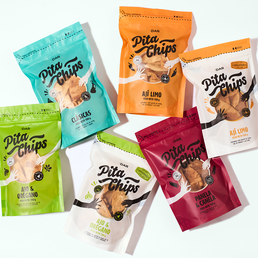
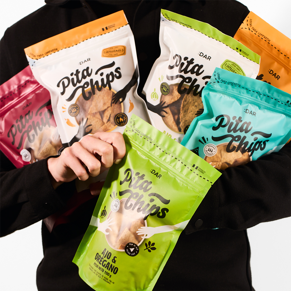
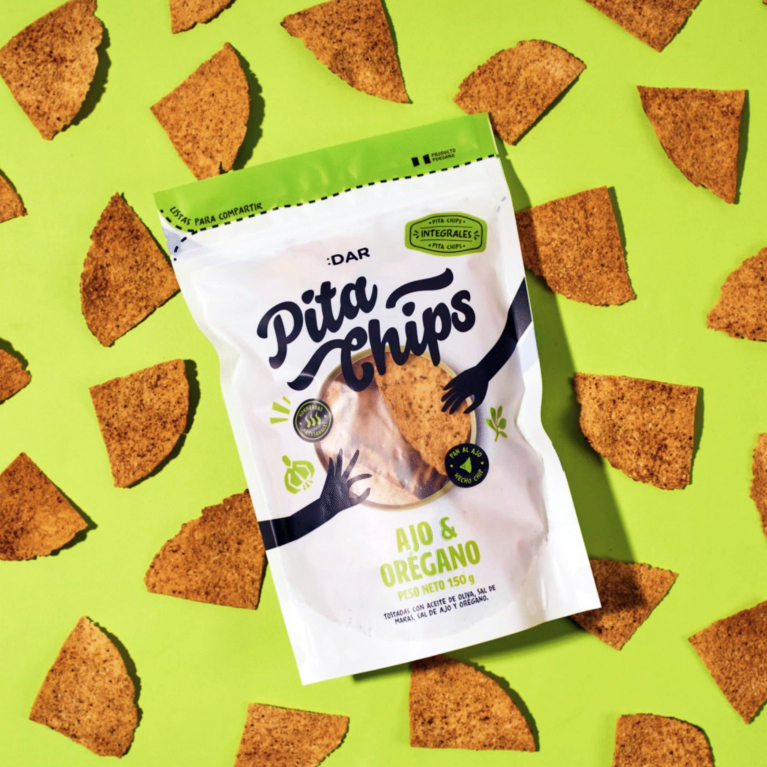
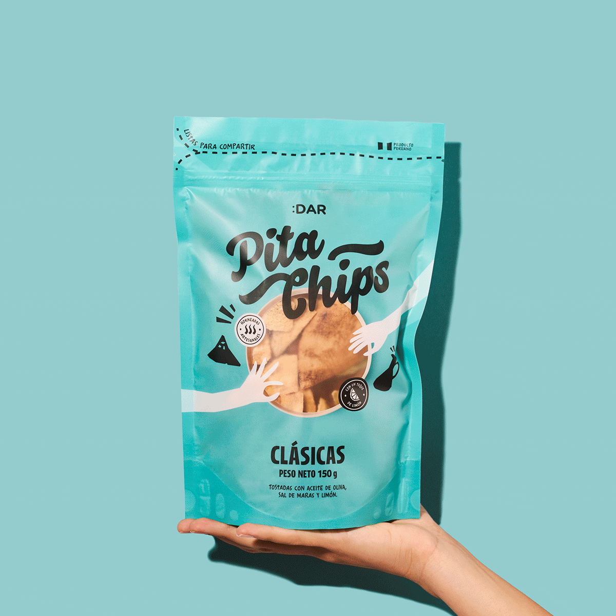
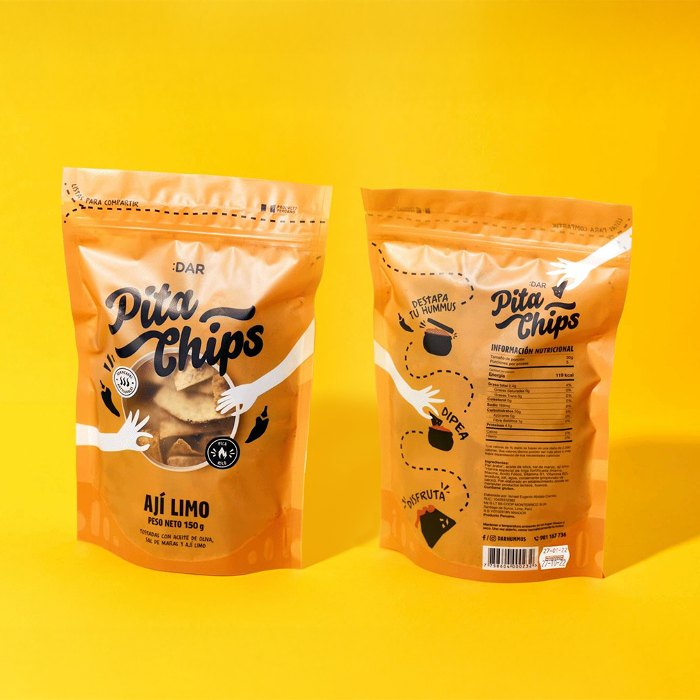
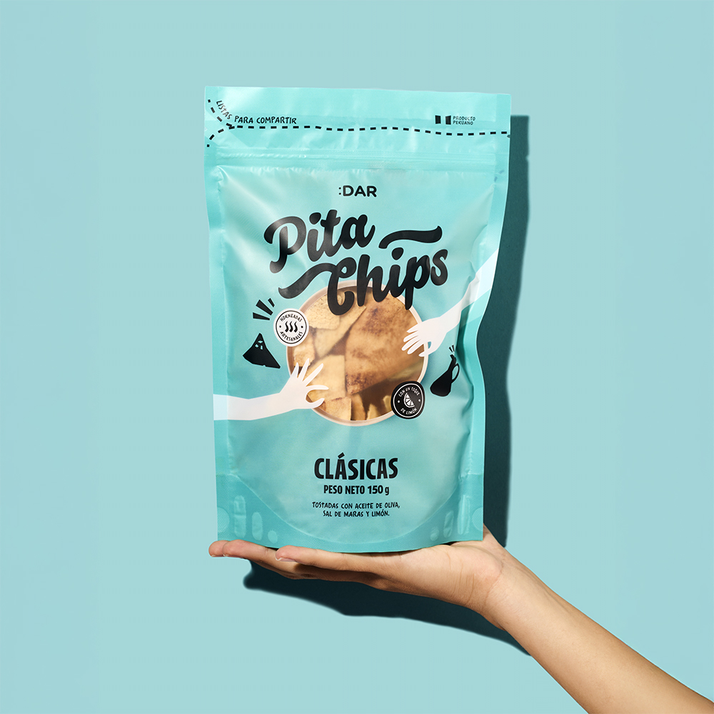
A major focus of the redesign was the creation of a structured yet flexible visual identity. This involved defining a set of graphic elements that would serve as the foundation for the brand’s packaging system. Color played a pivotal role in this strategy, with each flavor or product variation assigned a distinctive yet harmonious color palette. This approach allowed for easy differentiation between products while maintaining a unified brand aesthetic. The new design also introduced a refined typographic hierarchy, ensuring that important product information was legible at a glance. The previous packaging lacked a clear structure, making it difficult for consumers to quickly identify key details. By establishing a well-organized layout, the new design improved readability and overall user experience.
Beyond visual elements, the materiality and structure of the packaging were also carefully considered. Since DAR Pita Chips were entering larger retail markets, including supermarkets, the packaging needed to be both durable and visually appealing. The updated structure enhanced the product’s shelf presence while also ensuring practical aspects such as storage and transportation. The goal was to create a packaging solution that was not only eye-catching but also functional, enhancing both brand perception and consumer satisfaction.
Brand consistency was another crucial factor in the redesign. A strong brand identity is built on visual coherence across all touchpoints, and the new packaging system reinforces DAR’s presence through a well-integrated approach. Previously, the brand lacked a unified look, with different flavors and variations appearing disjointed. The new design established a clear framework, where the core branding elements remained consistent while secondary details varied to reflect the unique characteristics of each product. This not only strengthened the brand’s recognition but also created a more polished and professional appearance. The updated identity extended beyond packaging to promotional materials and digital assets, ensuring a seamless experience for consumers across all platforms.
One of the most significant outcomes of the redesign was its role in facilitating DAR Pita Chips’ entry into supermarkets and larger retail chains. Before the redesign, the brand was primarily sold in specialty stores, where competition was less intense. However, as DAR aimed to expand, it needed a packaging solution that would resonate with a broader audience and stand out in high-traffic retail environments. The new design successfully positioned DAR as a premium yet accessible brand, making it more attractive to both consumers and retailers.
The refreshed packaging immediately improved the brand’s shelf visibility, drawing in new customers and reinforcing loyalty among existing ones. The combination of strong visual appeal and strategic branding elements made DAR Pita Chips more competitive, helping the brand carve out a stronger presence in the snack market. Retailers also responded positively to the redesign, as the improved packaging facilitated better organization within store aisles. The structured design system allowed for easier product placement and enhanced the overall shopping experience, benefiting both the brand and its retail partners.
The impact of the redesign extended beyond aesthetics; it fundamentally reshaped the way consumers engaged with the product. By creating a more intuitive and visually compelling packaging system, the new design made it easier for shoppers to identify their preferred flavors, understand key product attributes and feel a stronger connection to the brand. This, in turn, contributed to increased sales and brand recognition. The improved user experience reinforced the idea that packaging is not just about appearance—it is a crucial component of consumer interaction and brand storytelling.
Sustainability considerations were also integrated into the design process, reflecting the growing demand for environmentally responsible packaging. While maintaining the necessary protective and aesthetic qualities, the team explored materials and production methods that would minimize environmental impact. By opting for recyclable materials and efficient printing techniques, the new packaging aligned with contemporary sustainability standards without compromising on quality or design. This not only enhanced the brand’s appeal to eco-conscious consumers but also positioned DAR as a forward-thinking company committed to responsible practices.
Beyond its immediate success, the redesigned packaging provided DAR with a long-term advantage by creating a system that could evolve alongside the brand. The modular nature of the design allowed for seamless integration of future product expansions, whether through new flavors, limited editions, or alternative packaging formats. This flexibility ensured that DAR could continue to grow while maintaining a strong and consistent visual identity. The ability to scale effectively is a critical factor in brand longevity, and the new design positioned DAR for sustained success in an ever-changing market.
Ultimately, the redesign of DAR Pita Chips’ packaging was a testament to the power of strategic design in driving brand growth and market positioning. By focusing on clarity, differentiation, and scalability, the new design transformed the way the product was perceived and experienced. It demonstrated that thoughtful packaging is not just about aesthetics—it is a vital tool for communication, engagement, and brand evolution. The success of the redesign reinforced the idea that investing in well-executed packaging design is not just an expense but a strategic move that can yield significant returns.
For DAR Pita Chips, the new packaging was more than just a refresh; it was a pivotal step in the brand’s journey toward broader recognition and expansion. By addressing key challenges, optimizing visual identity, and enhancing consumer interaction, the redesign helped establish DAR as a competitive player in the snack industry. It showcased how design can shape perception, influence behavior, and ultimately, drive business success. As the brand continues to grow, the new packaging system will serve as a strong foundation, supporting its evolution while maintaining a clear and compelling brand presence in the marketplace.

CREDIT
- Agency/Creative: Sandhaus
- Article Title: Sandhaus Transformed Dar Pita Chips’ Packaging to Drive Brand Growth
- Organisation/Entity: Agency
- Project Type: Packaging
- Project Status: Published
- Agency/Creative Country: Peru
- Agency/Creative City: Lima
- Market Region: South America
- Project Deliverables: Packaging Design
- Format: Bag
- Industry: Food/Beverage
- Keywords: Snacks, Healthy, Pita, Chips
-
Credits:
Creative Director: Ian Sandhaus
Graphic Designer: Franco Carmona
Photography: Amarga Estudio


