


About the project.
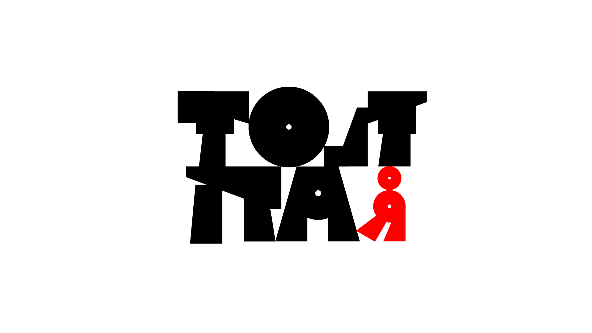
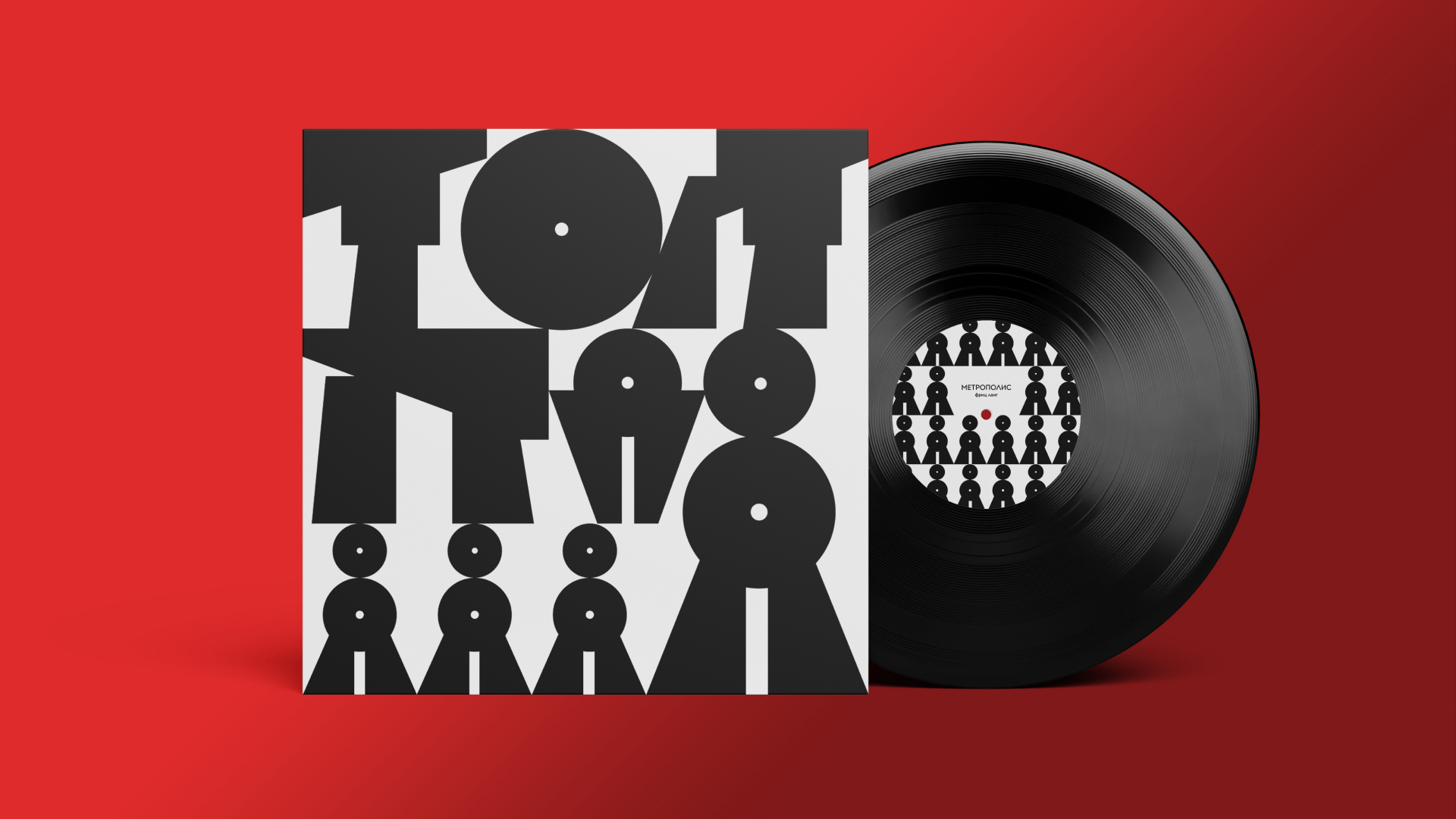
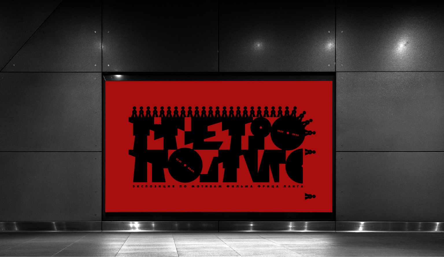
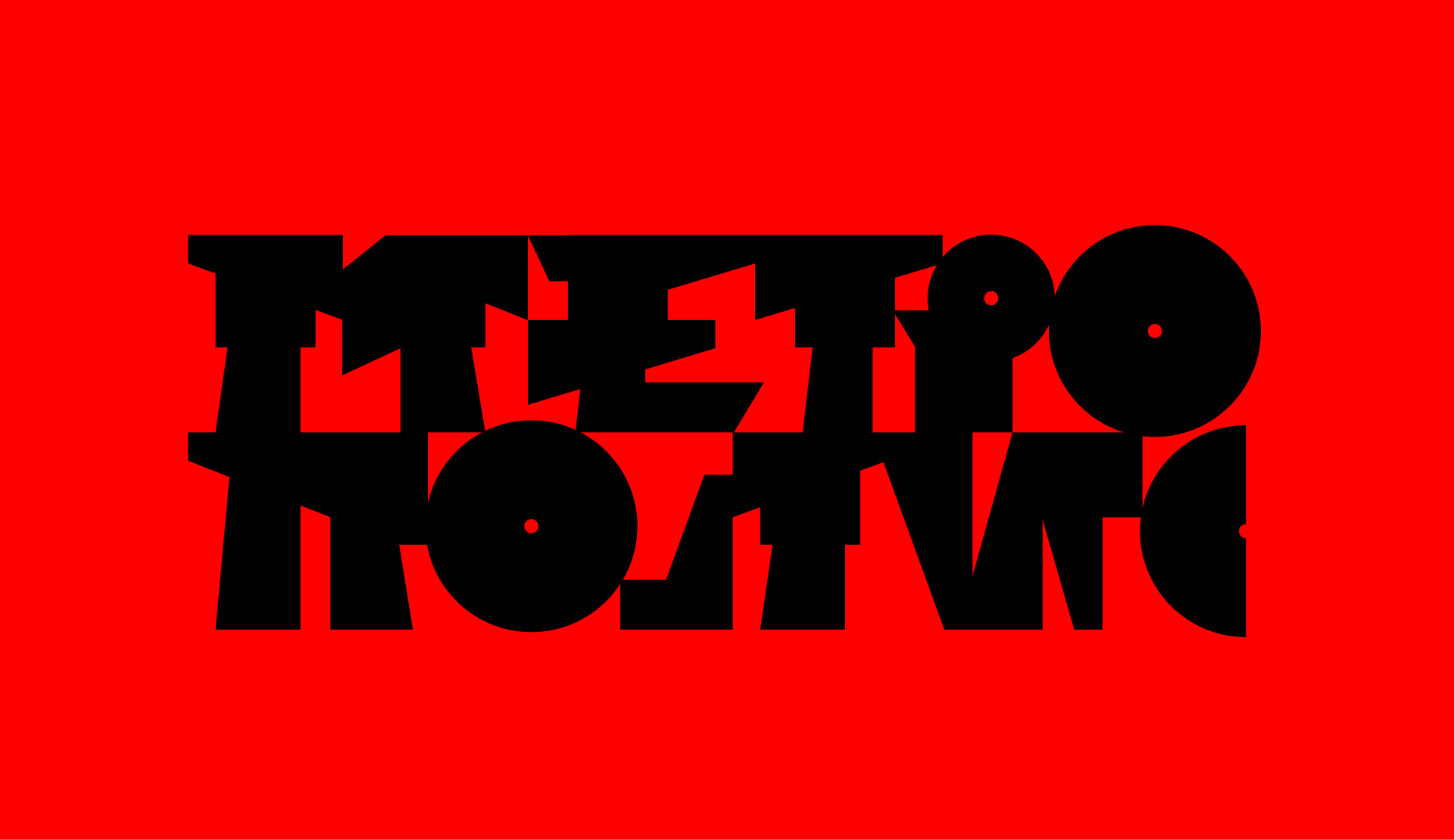
The exhibition’s visual identity for Fritz Lang was to be grounded entirely in typography. This required creating a custom typeface that captured both the spirit of the era and the unique style of the artist’s work.
About the director.
Font in the style of the science fiction author. Fritz Lang is a 20th-century director, one of the greatest representatives of German expressionism. In 1927, he shot a three-hour dystopian film that inspires artists to this day. The film tells the story of people’s rebellion against despotism and the fight for social equality.
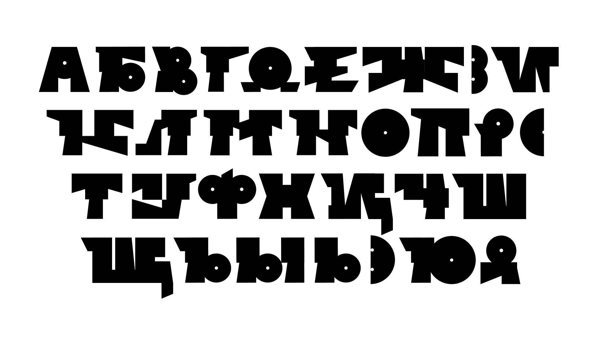
Typography.
The typeface is designed in the style of Lang’s science fiction film. Before I started creating the font, I defined the characteristics it should meet: geometric, massive, bulky, futuristic, industrial, cluttered.
The glyphs of the font are closed, like gloomy workers. The modular structure is dictated by the aesthetics of machinery.
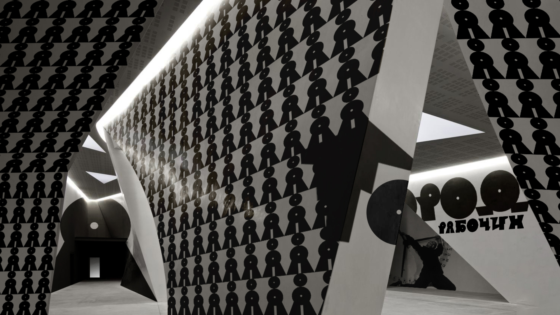
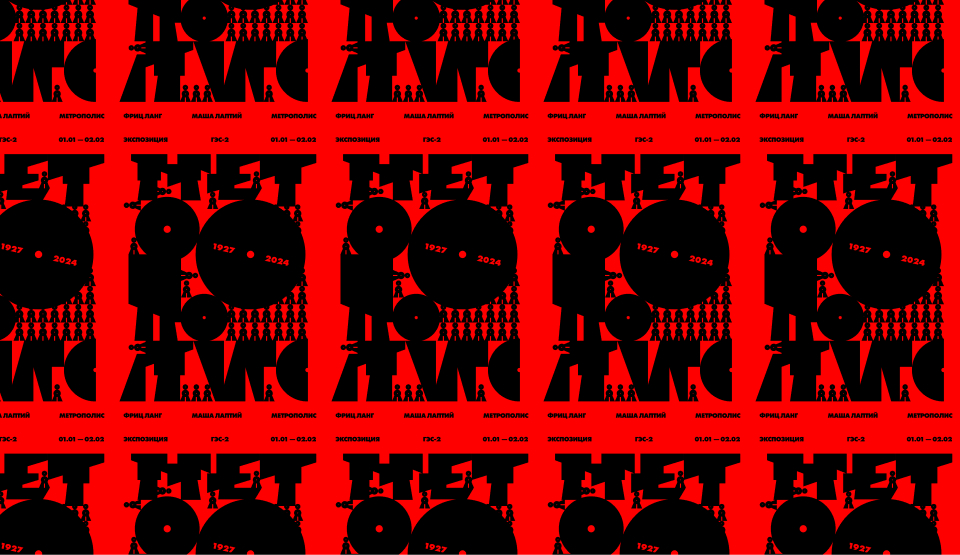
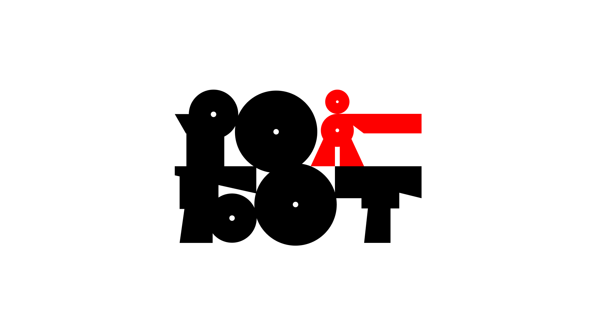
Series of logos.
A series of logos were developed to delineate the exhibition areas. The counterform of some of them gives rise to a symbol. These symbols will later serve as the foundation for the exhibition’s visual identity (patterns).
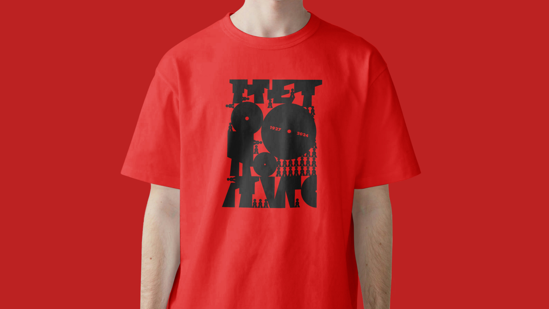
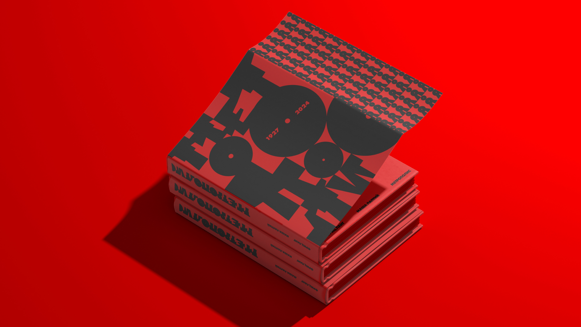
As the author, I wanted to emphasize the significance of the art director’s role throughout every stage of the project. From crafting the typeface to overseeing the reception, from designing the advertising to shaping the space itself, I believe it’s crucial to maintain a consistent corporate identity across the entire project. Only then can you fully immerse the viewer (or user) in the desired atmosphere and deliver the intended experience.
CREDIT
- Agency/Creative: Maria Laptii
- Article Title: Metropolis Identity for Fritz Lang’s The Exhibition by Maria Laptii
- Organisation/Entity: Student
- Project Type: Identity
- Project Status: Non Published
- Agency/Creative Country: Russia
- Agency/Creative City: Moscow
- Market Region: Europe
- Project Deliverables: Art Direction
- Industry: Entertainment
- Keywords: Art-direction, exhibition, identity, typography, font
-
Credits:
Supervisor: Leonid Slavin


