


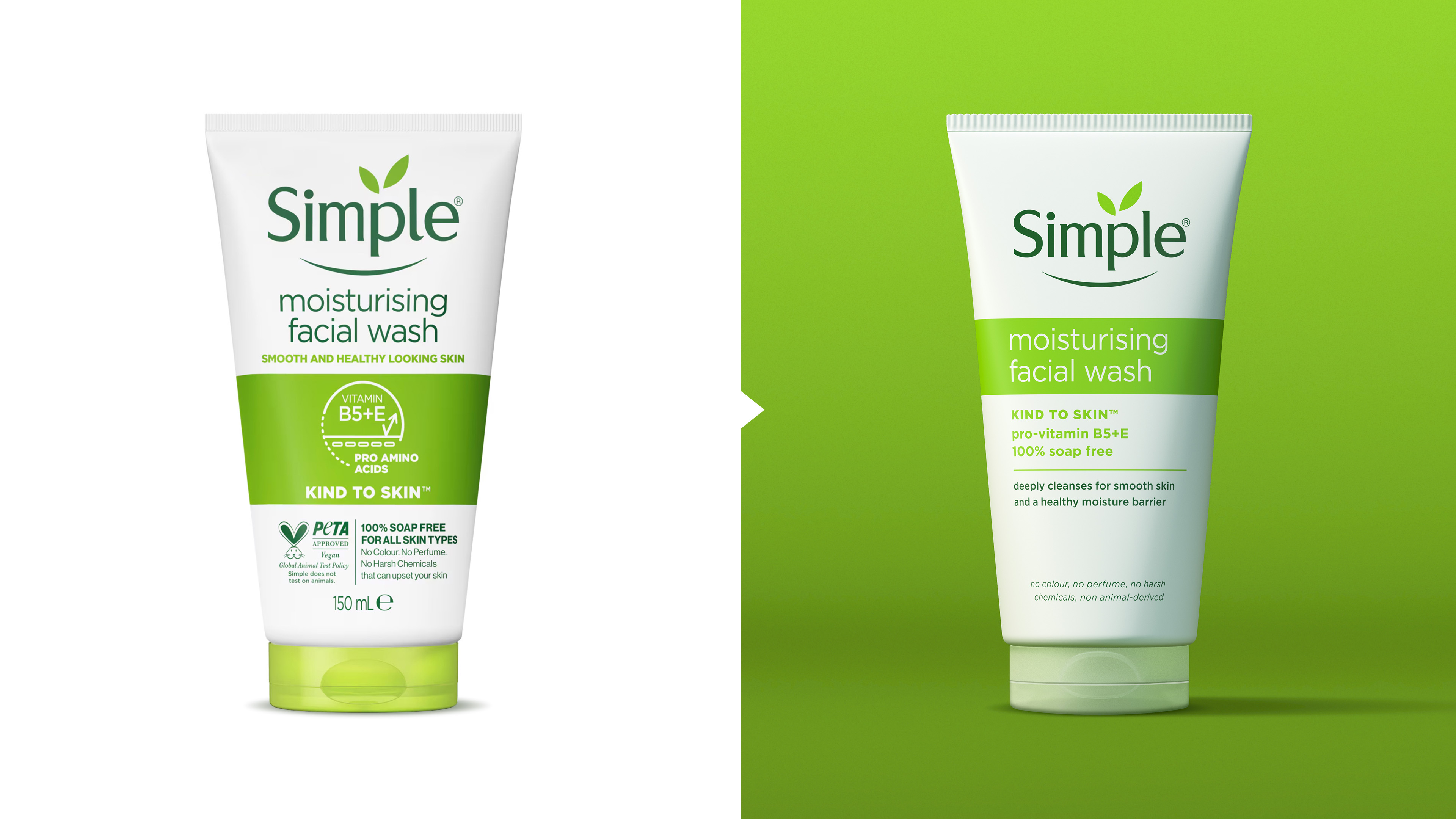
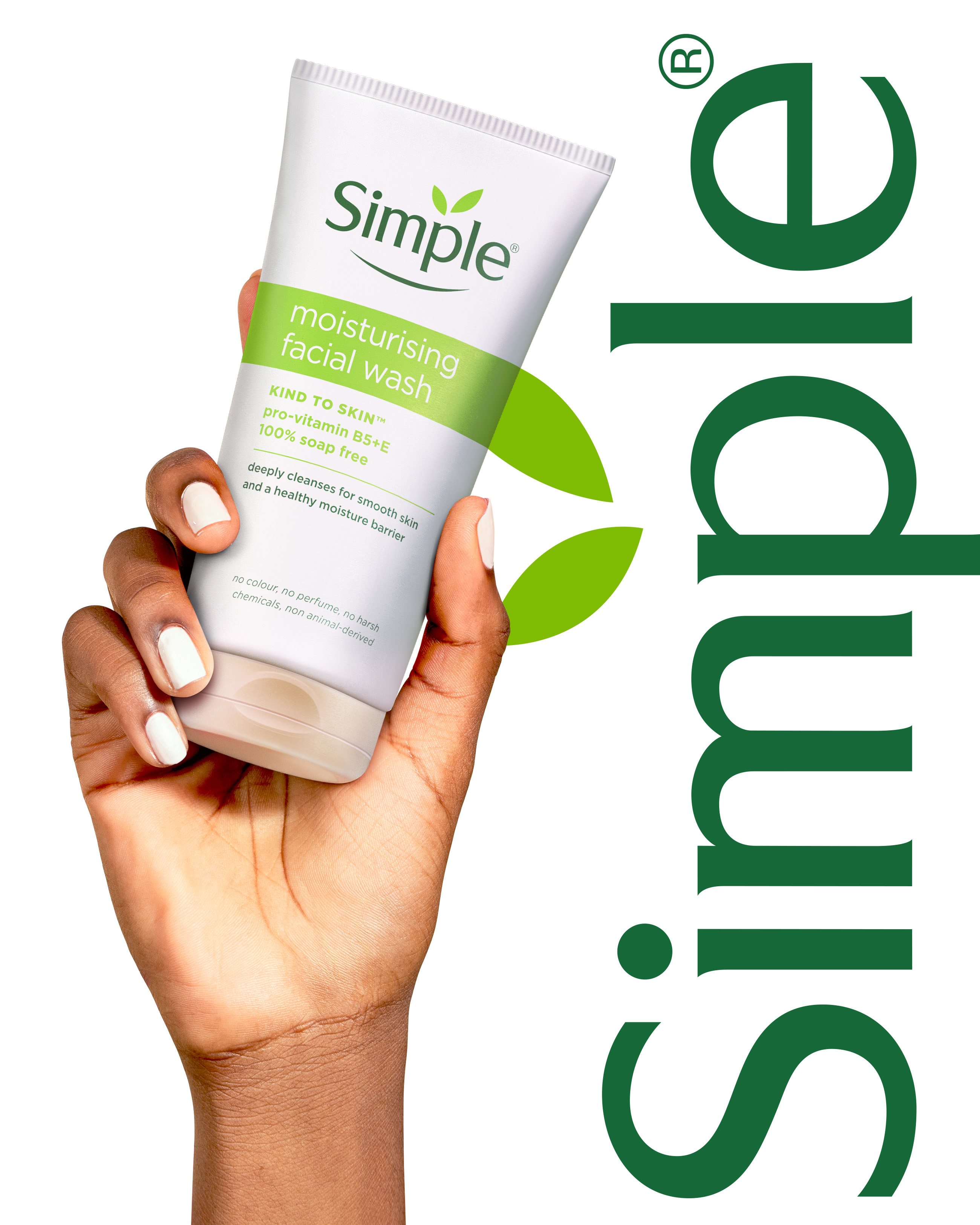
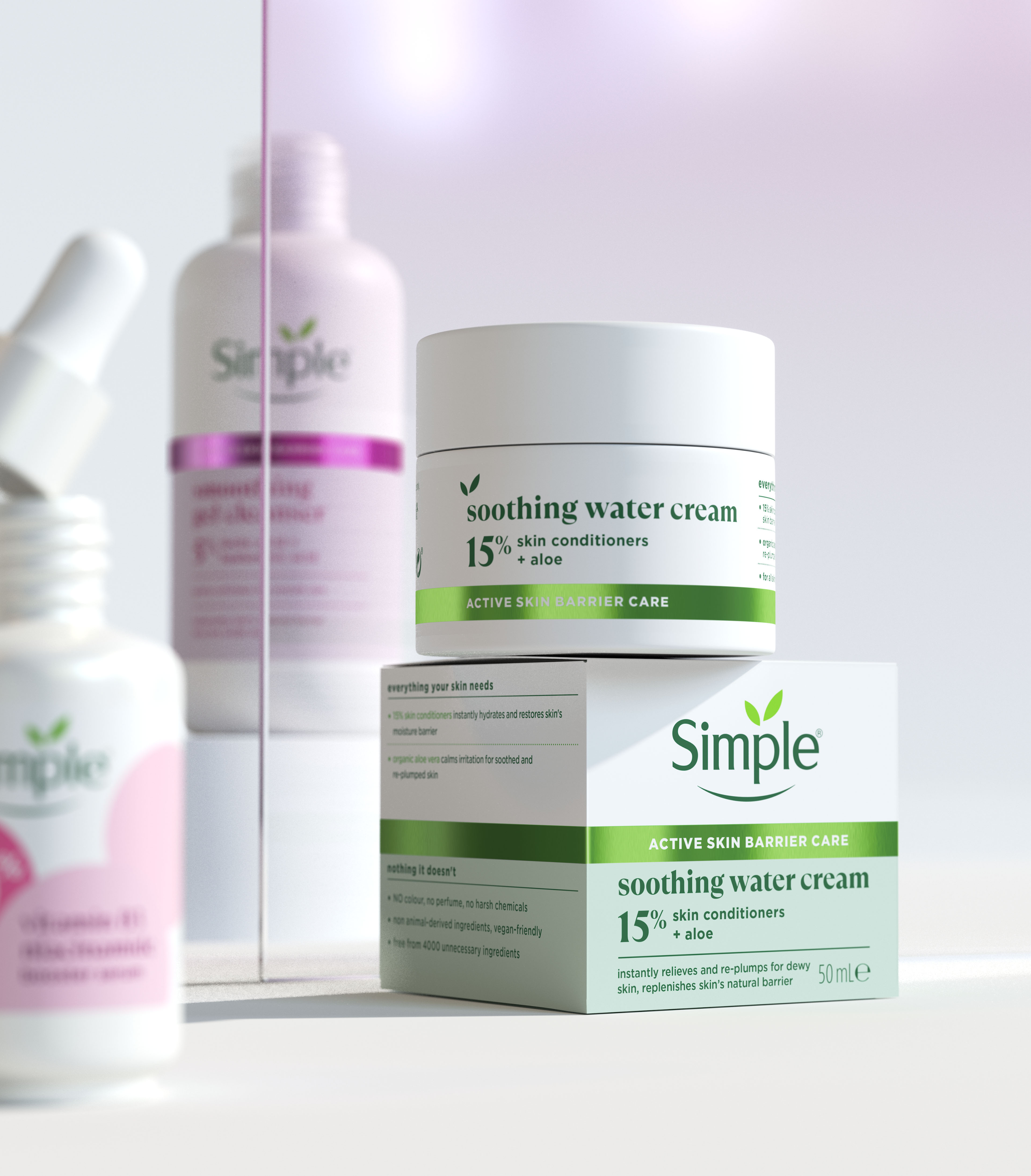
As skincare becomes increasingly crowded and complex, Simple steps forward as a beacon of clarity with a refreshed identity and packaging design by Sunhouse. The new design enhances the brand’s efficacy credentials with a premium touch, all while staying true to its ethos: “Everything your skin needs. Nothing it doesn’t.”
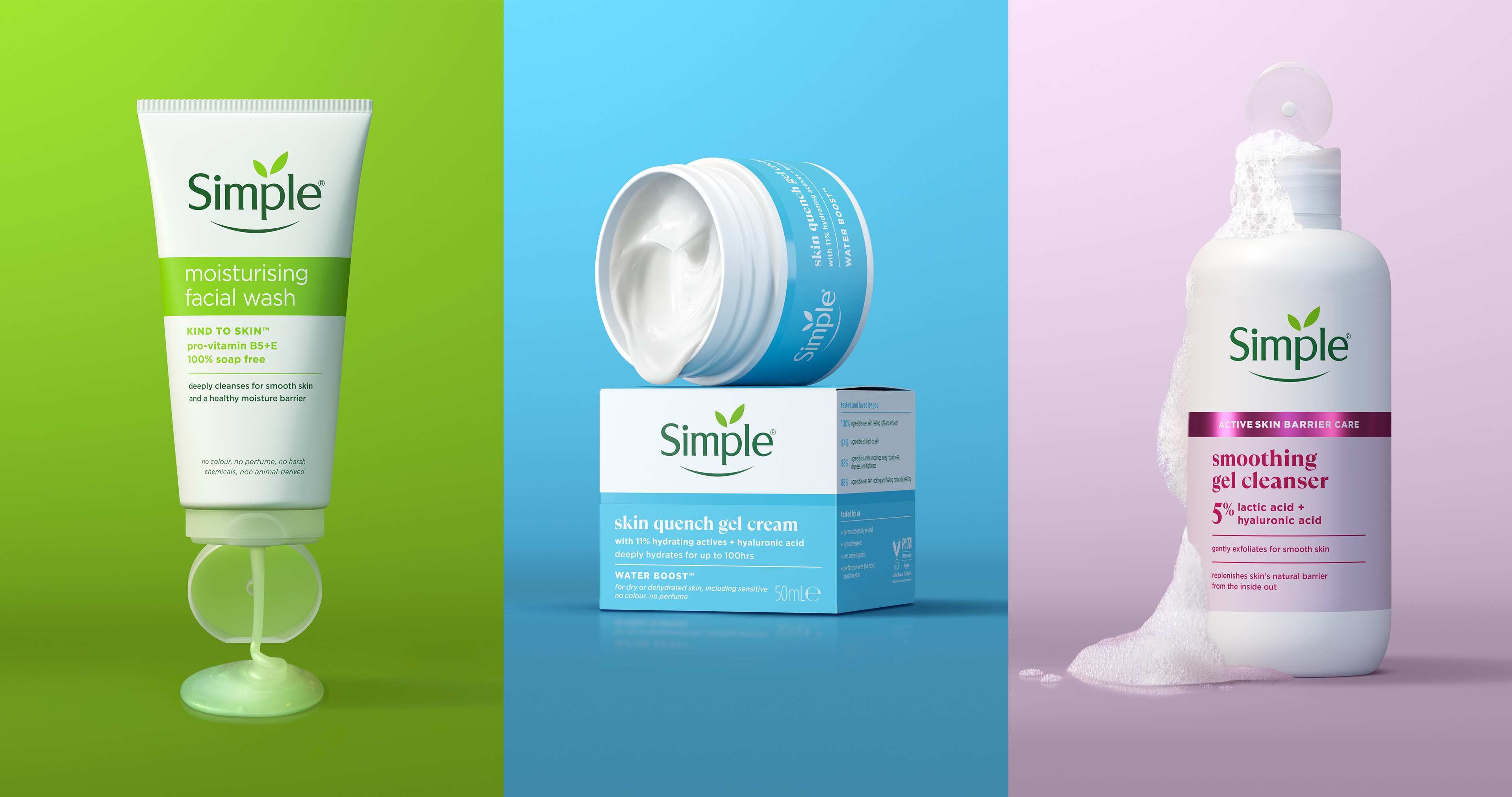
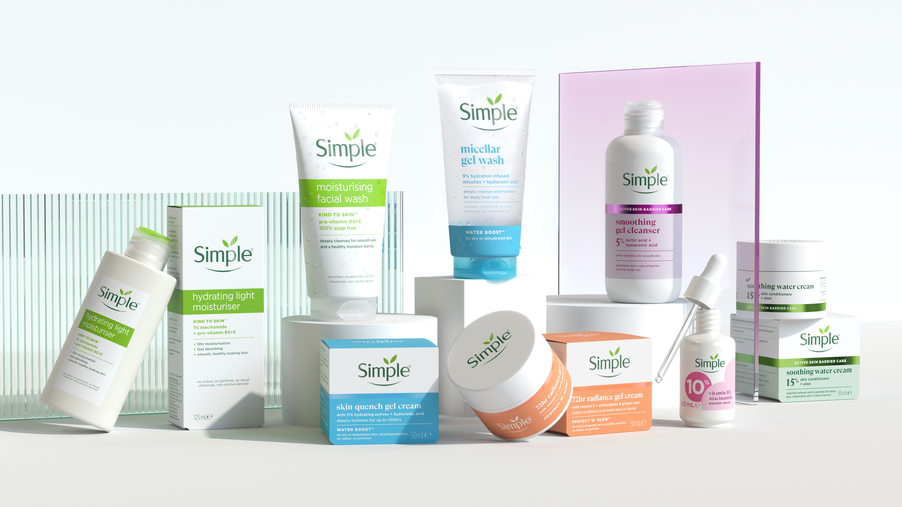
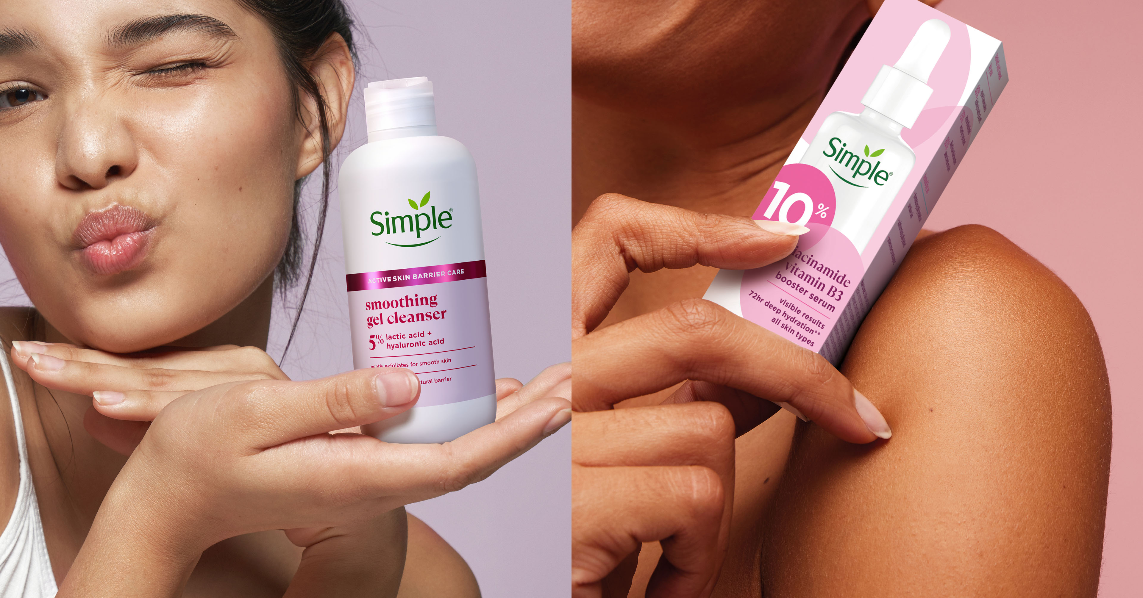
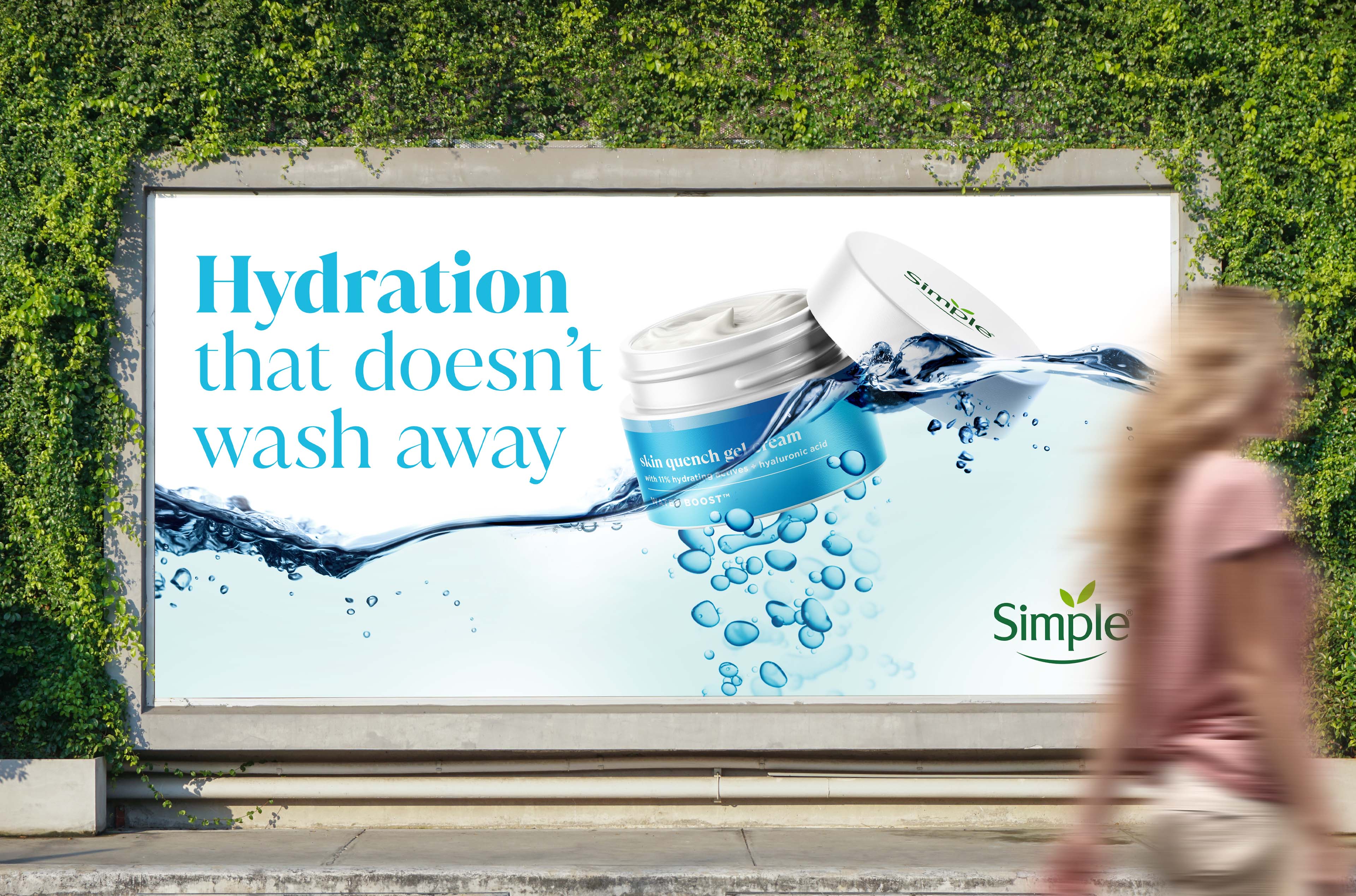
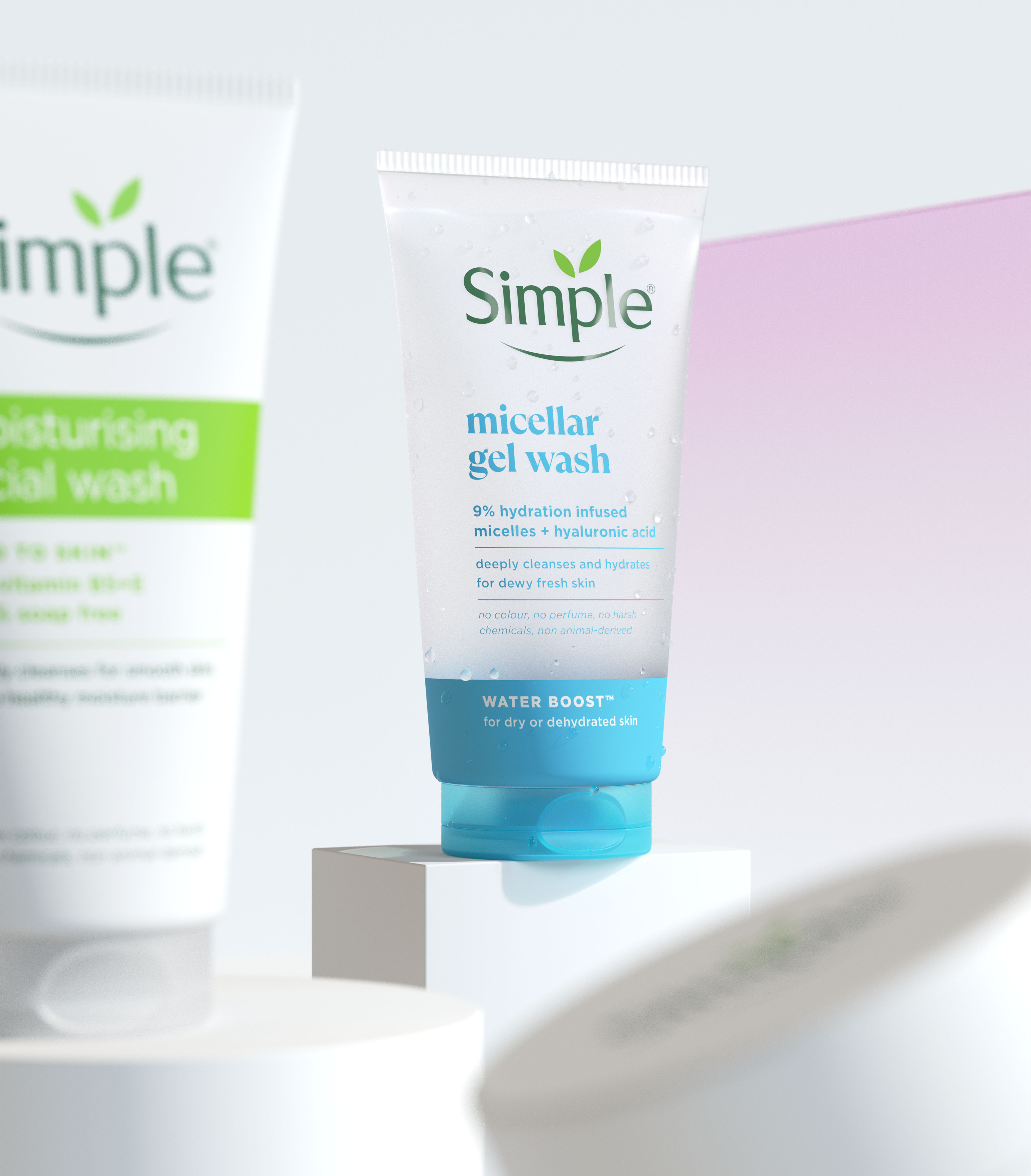
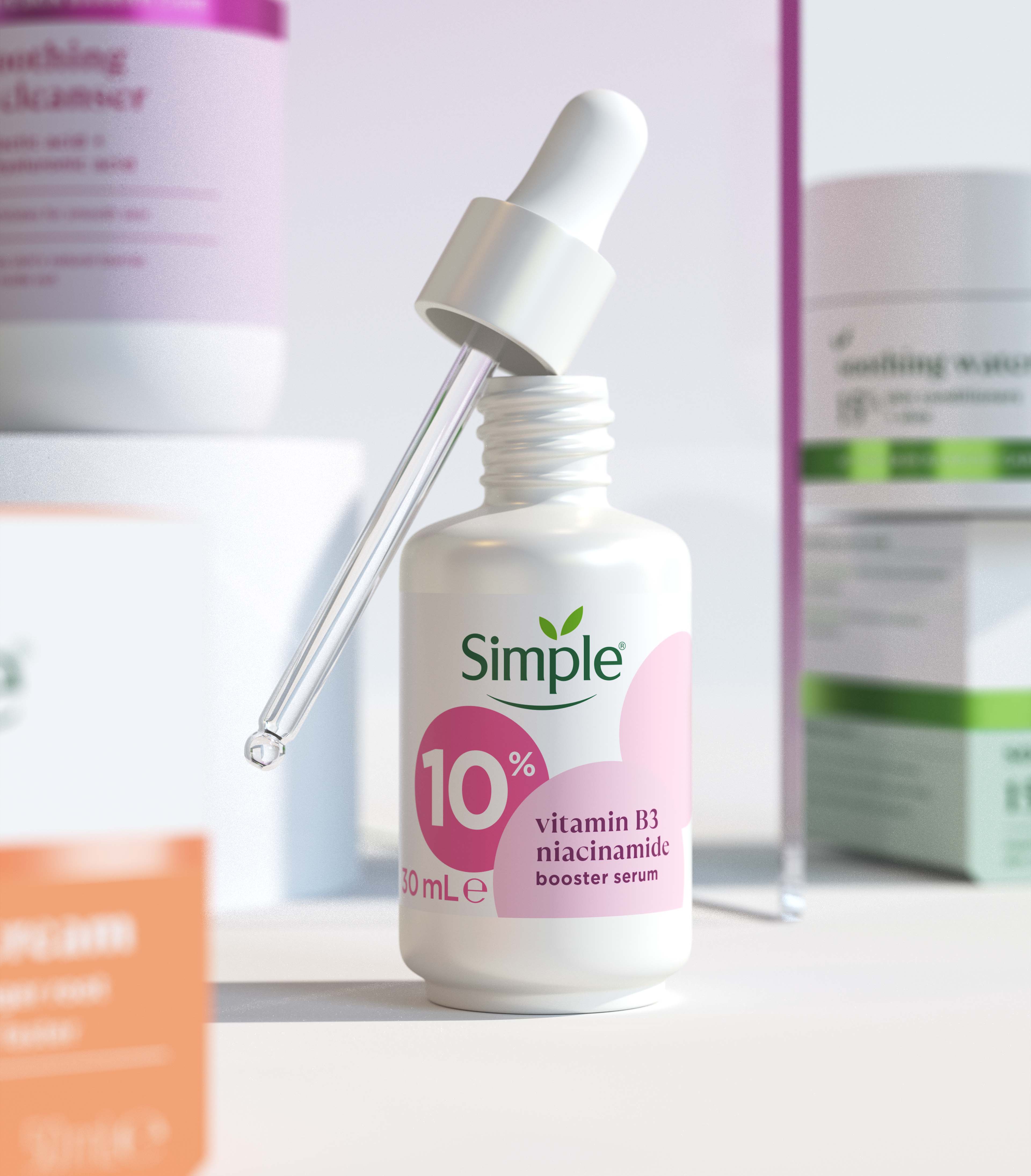
Simple has always been a trusted starting point for those beginning their skincare journey, and over time, it’s become a go-to for all ages with its gentle, everyday solutions. As skincare needs have grown more advanced, Simple has kept pace by adding cult-favourite ingredients like ceramides, hyaluronic acid, and cica to its clean beauty formulas, leading to the launch of a premium, targeted skincare range. This shift called for an evolution of the brand’s identity and packaging design to reflect its elevated status and make a stronger impact in the market.
“Consumers are seeking more from their skincare—better results and from brands they know and trust,” says Sally Knapton, Partner and Executive Director at Sunhouse. “Our challenge was to evolve Simple in a way that both honoured its purposefully kinder approach and met the rising expectations of today’s skincare consumer. From a creative perspective, this meant unlocking the brand’s inherent simplicity as a strategic tool—using it to elevate Simple’s presence and effectively cut through the category noise.”
The new design uses geometric shape language born from the leaf shapes in the logo, to balance Simple’s expertise with the inherent kindness the brand carries. The packaging design has been simplified and sharpened through intentional use of typography, colour palette, and finishes, driving efficacy and gravitas in a crowded and often complex marketplace.
“Our goal was to recalibrate the brand’s assets and messaging in a more considered way, creating a framework that reduces complexity while highlighting Simple’s optimistic, open personality,” says Chris Griffiths, Creative Director at Sunhouse. “The resulting design captures the beauty of simplicity in a chaotic world, elevating the brand’s premium credentials and enhancing its impact on the shelf.”

CREDIT
- Agency/Creative: Sunhouse
- Article Title: Sunhouse Amplifies Simplicity with Brand Refresh for Simple Skincare
- Organisation/Entity: Agency
- Project Type: Packaging
- Project Status: Published
- Agency/Creative Country: United Kingdom
- Agency/Creative City: Bath
- Market Region: Global
- Project Deliverables: 2D Design, Brand Identity, Packaging Design
- Format: Box, Pot, Tube
- Industry: Beauty/Cosmetics
- Keywords: skincare, refresh, identity, Simple, packaging, design
-
Credits:
Creative Director: Chris Griffiths


